4.6 Ratings: 14 (Yours: )
The kitchen is one of the main places in the house. It must be kept completely clean and in cosmetic order, because eating in an ugly and dirty place will cause a person to experience constant stress. Therefore, it is a good idea to do some minor renovations to your kitchen every 5 years. Arrange a rearrangement, re-glue the wallpaper, change the set. The online interior editor will help you do this quickly and clearly - in it you will recreate the visual model of the room, arrange the furniture, and choose colors for the design. Based on the layout, it will be easy to make repairs in reality.
Online kitchen planner
Working with the online kitchen designer is very simple - create a suitable room, choose materials, furniture, and colors from the options offered by the service. Drag them onto the layout and arrange them in the order you like. Don't forget that you can adjust all sizes: from width to height. After creating a suitable room, save the project to your computer (it will be loaded in DBS format, which can be opened with a special program).
You can create a unique design from scratch
You can make changes to finished projects
It’s convenient to find solutions for non-standard apartments here
Selection of building materials
To finish the kitchen you will need durable materials that are not afraid of water, detergents and sudden changes in temperature. For wall decoration use:
- Tile. Ceramic tiles are durable and insensitive to household chemicals and aggressive kitchen microclimates;
- Wallpaper with a special coating (washable). Less durable material, but will please you with a wide variety of textures and patterns on the surface;
- Decorative plaster or paint. A budget option that will have to be replaced with a fresh layer in a couple of years;
- PVC panels. Thanks to special production technology, modern plastic copes well with the peculiarities of the kitchen atmosphere. Panel walls are only afraid of mechanical damage, but if breaks and cracks form, one module is replaced with another without disassembling the rest of the structure.
Ceramic tiles, linoleum, and cork are used to cover the floor. The latter does not absorb moisture, but quickly gets dirty. It is not recommended to cover the surface with laminate or parquet boards. The first one swells when exposed to moisture, and the second one begins to rot. Self-leveling flooring is a heavy-duty, aesthetically beautiful and expensive material. It is used to decorate “highest class” kitchens in luxury apartments. For the ceiling, gypsum (different levels), PVC, paint, and plaster are used.
Tensile and suspended structures are especially popular. They can be used when the centimeters “eaten” by the structure from above will not affect the perception of the room.
Rules for arranging furniture in the kitchen
The kitchen is the most difficult place to arrange furniture due to the nature of the room. After all, there are many electrical appliances, water supply and ventilation systems.
It is not enough to be guided by your taste and aesthetics: ergonomics and compliance with safety rules are important, without which you can forget about the functionality of the room.
Minimum distances between objects:
- ✓ 50-70 cm between the table top and the top drawers. Higher - it will be difficult to reach; lower - you can hit your head.
- ✓ 65 cm from the electric stove to the hood and 75 cm from the gas stove for proper air circulation.
- ✓ 120 cm between drawers facing each other. This is relevant for those who are planning a U-shaped set.
- ✓ 90 cm from the table to the headset. This parameter is not strict, be guided by your convenience.
- ✓ 50 cm from sink to stove. Do not forget that water and electrical appliances should not be placed nearby.
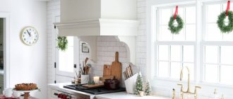
An example of a successful arrangement of equipment and cabinets
There are also rules, they are based on logic and are designed to prevent alterations:
- ✓ Modules with drawers should be far from the stove, kettle and other appliances. If there are children in the house, they can use these “steps” and get burned.
- ✓ Sockets cannot be placed close to the sink.
- ✓ In the case of a corner set, the drawers will be difficult to open if you place them in the very corner.
- ✓ Leave free space between the outer drawers and the wall so that the doors swing open without difficulty.
Modern kitchens amaze with their designs
Selection of lighting fixtures
Lighting is worked in three directions simultaneously:
- Ceiling (central). In small kitchens there is one, and in large ones there are two chandeliers located above the areas of the room;
- Working surface (local). Here we are talking about lighting above the stove, sink and table at which they cook;
- Along the perimeter of the room (additional interior). It is used exclusively “for beauty” to emphasize the merits of the design. Spotlights are usually used.
All lighting fixtures in the kitchen must be resistant to high humidity and temperature changes. Purchase special sealed light bulbs and properly insulate the wiring when carrying out repair work to avoid short circuits.
Kitchen design options
Kitchen sets can be of various designs depending on your needs and the size of the kitchen. You need to consider what equipment you have, whether it is built-in. Do you have a lot of utensils that need storage space? What kind of table and how many chairs are needed to accommodate everyone? All this directly affects the appearance of the room.
Linear
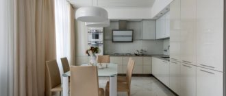
The most versatile option that is suitable for any kitchen. It is easier to design and install. All it needs is one wall. It leaves room for a dining area, and the kitchen with it is visually more spacious.
To increase storage space, you can make a second row of wall cabinets
Triangular
It is rare, but there are triangular-shaped kitchens. This is a non-standard case and somewhat complicates the choice of headset. The problem is easily solved, if such a kitchen has a right angle, then you can install a linear or corner set. Alternatively, the set simply may not reach the corner and occupy any free wall.
There are always solutions, even for such kitchens
Ostrovnaya
We have often seen islands in kitchens in foreign films and TV series and admired them. It is very convenient and stylish - additional surface and space for cooking, breakfast and storage space under the countertop. Now this can be done in any kitchen that has sufficient dimensions.
Beautiful kitchen with an island from the movie "Simple Complications"
Improvised islands also have a right to exist
Corner
Cozy corner kitchens are one of the most popular options. They are compact and can save space in a small kitchen. But their main advantage is convenience, since it is possible to implement a “stove-sink-refrigerator” triangle, which greatly facilitates the cooking process for the housewife.
An interesting option worth taking note
Deciding on a style
It’s easy to get lost in the variety of styles, because there are hundreds of them. Such a rich “assortment” is due to the presence of a large number of “branches” within one direction. They obey general laws and adhere to the same rules, but have characteristic features that make it possible to distinguish these “child” styles into subgroups. Let us note five areas that are currently enjoying unprecedented popularity:
- Classical. “Long-liver” among styles. Classic is suitable for people with impeccable aesthetic taste, who love to surround themselves with luxury and feel “at home” in such an environment. The style is characterized by the use of pastel shades and tones from a rich brown range. Natural heavy fabrics are used in textiles, and wood and glass are used in decoration. The classic loves stucco, crystal, ornaments, complex patterns and smooth lines. In such interiors, not only decoration, but also the finishing itself becomes an art.
- Loft. The trend is relevant for a studio kitchen, since the industrial style was born in free spaces that were previously used for non-living purposes. Lofts are characterized by combinations of rough finishes and elegant details, an abundance of artificial lighting, and open communication systems. The prevailing materials are brick, stone, wood, and plastic.
- Provence. Noble rustic style with a touch of refined French flair. Aged furniture (antiques), light shades, a lot of white, floral patterns, indoor plants, wood decoration - these are the main features of the style.
- Minimalism. The direction is aimed at people who do not tolerate unnecessary things in their home. As a rule, white color prevails in the interior, only the necessary minimum of furniture is used, and a series of paintings on an accent wall is allowed as decor. The style is enlivened by unusual shapes and contrasts in the textures of finishing surfaces and furnishings.
- High tech. High-tech style that keeps up with the times. An abundance of household appliances, chrome surfaces, plastic and glass, a play of contrasts, the dominance of gray, black and white in the color scheme - this is the “minimum” program for “combed” constructivism.
In addition to the above trends, art deco, country, shabby chic, art nouveau, retro, futurism, neoclassicism, fusion, abstract art, Scandinavian and eco style are relevant.
Download for free!
Renovate your kitchen with pleasure right now
Interface language: Russian
Distribution size:98 MB
How to create a kitchen layout in a 3D designer:
Step 1. Draw the room
First, create a prototype of your kitchen in the program. If you have a drawing, you can load it into the designer and trace it. But it won’t be difficult to draw a room from scratch - just select the dimensions and mark the walls with the mouse. When the room is completed, its area will be displayed.
You can monitor the process of creating a room in two windows at once
Step 2: Choose a finish
Think about the look you want to give your kitchen. Do you want to make it light and colorful or subdued and dark? In 3D Interior Design there are materials for every taste. Go to the “Properties” section of the room and switch between the “Floor”, “Walls”, “Ceiling” tabs, selecting design options. You can choose from wood and stone flooring, carpets, laminate, tiles, a variety of wallpapers and much more. You can also fine-tune the appearance of the room by adjusting the floor and ceiling skirting boards, for example.
Each finishing element can be customized independently - even the size of the pattern
Step 3. Add furniture and lighting
Now the most important part is the furniture arrangement. If you don’t know what type of headset to choose, look for options in specialized catalogs. The program has everything you need for visual modeling. There are many tables, bedside tables, armchairs, and hanging cabinets at your disposal. You can make a custom refrigerator, stove, sink - all of this can be customized in size, color, texture and other parameters. Also don't forget to choose a lamp.
Design is done clearly
Step 4. Save the project
When the kitchen layout is completely ready, you can take a virtual walk through it in 3D mode, then minor flaws in the layout will definitely not be hidden from your eyes. You can also calculate repair estimates directly in the program - it contains a convenient material cost calculator. All is ready? Save the project in DIP format or in one of the graphic formats (as a picture or PDF document). It is also possible to print the plan or switch to photorealism mode, where the visualization will be closer to reality.
Print the project to take with you to the store.
Choice of colors
There are only conditional restrictions on the color scheme in the kitchen. It is not recommended to use an abundance of cold and dark shades:
- Blue;
- Blue;
- Green;
- Black;
- Brown.
These colors suppress appetite and can create an unfavorable atmosphere in the kitchen. If the color composition is played correctly, then the above shades can be used, but with great care and compliance with the exact “dosages”. The following are considered relevant for the premises:
- Yellow;
- Orange;
- Pastel shades;
- White;
- Gray with contrasting tone;
- Red when used in moderation.
Contrasting kitchens, as a rule, look stylish and modern, but it is worth considering that such an environment can quickly get boring for the housewife and household members. Pastel colors and neutral shades do not become boring so quickly. This is their main advantage.
Design project with redevelopment
A redevelopment project is essentially not much different from an ordinary “sketch”. The only thing that needs to be taken into account is the dismantling of walls or their individual parts. On the plan, these places may be beautifully marked as free, but in reality their absence can lead to catastrophic consequences. Before you demolish something yourself, you need to prepare a project for future work. It is first given to architects, who make adjustments and approve the finished plan. Then you will have to go through a number of other authorities (fire department, sanitary service and management company). You will also need a package of documents to present to various authorities. All this redevelopment “whirlwind” can drag on for a long time. Be patient and take time. Typically, combined projects involve kitchens, living rooms and dining rooms. In the interior, it is worth taking into account not only the features of the new space, but also the zoning of the room, without which the picture will not look complete.
Specialists from design bureaus can provide free consultation on redevelopment issues online. They are also contacted for professional help when drawing up a project.
Algorithm of actions
To ensure that your kitchen design project is independently developed in accordance with modern requirements and meets fashion trends, we offer you an action algorithm consisting of ten points:
- We are deciding whether a bar counter is needed in the interior. Regular dining tables are becoming a thing of the past, and wide bar counters are rich in functionality, so they are definitely worth considering.
- We evaluate the layout and decide on the placement of furniture along the walls.
- We create a clear list of all necessary furniture and equipment.
- In the created list, we indicate the dimensions of furniture and equipment, which will allow us to determine whether it fits into the actual volume of the room, taking into account its layout.
- We divide the walls into modules for lower drawers, taking into account built-in appliances.
- We divide the wall into modules of equal width for the top drawers.
- We sketch out options for the location of the largest equipment - a refrigerator, a washing machine, if installed in the kitchen, a hob and a sink. It is advisable to come up with several arrangement options and then choose the most comfortable and practical one from the point of view of daily use of equipment.
- We decide on the type of fittings for each designated module, taking into account the fact that they can interfere with each other.
- We decide on the lighting, choose the location of the lamps, their number and the method of switching on and powering.
- If possible, we show our project to friends for evaluation, so that we can hear constructive criticism from a different point of view and, if necessary, make some adjustments.
It is important that the selected furniture does not eat up the usable area of the kitchen and is harmoniously combined with each other. Use built-in appliances that can fit seamlessly into any design. You can play with the height of the countertop in relation to your height and the personal preferences of your roommates, because if you spend a lot of time cooking, its incorrectly chosen height will be critical for you. The elbows should be slightly bent when cooking, so the countertop should generally be located in the range of 82-91 cm, taking into account the standard height difference between men and women.
Drawing a drawing
Start the drawing with a schematic sketch. Square kitchens are quite rare, so you will most likely have to get creative with rooms of complex shapes and turn their disadvantages into advantages. Now transfer the layout onto a sheet of paper, indicate with dashes the locations of windows and doors. Typical kitchenettes in Khrushchev-era buildings, as a rule, have one opening for natural light, which can go out onto the balcony. If the room is small, then perhaps you should think about tearing down the partition and combining the two spaces. In two-room apartments and studios, this disadvantage is solved by combining it with the adjacent room (zone). For owners of country houses, the task is greatly simplified, since in this case the kitchens are usually spacious and can accommodate not only the necessary “stuffing”, but also a dining area designed for large companies. Then “imaginary” furniture is placed on the drawing of the room. They start with the furniture, then the dining area for the kitchen-dining room, marking the location of accent areas and decor. The decoration of the room will be “polished” in the process. At this stage, only a conditional picture is enough. If the decoration of the rooms is complex using frame structures, then these nuances are also displayed in the drawing.
Ergonomics
This word is not clear to everyone, but still, ergonomics is about practicality and style at the same time. This is a thoughtful organization of space, where everything is in its place, nothing interferes with movement, everything is at hand and every detail is thought out.
Have you heard anything about the triangle rule? Many people think that it answers the question of how to design a kitchen project yourself. However, this rule practically does not work in life, since it does not carry any practical meaning. Also, in fact, the rule defines only three zones in the kitchen, but in reality there are four:
- Storage area consisting of a variety of drawers, wall cabinets, shelves and a refrigerator.
- Wash area: sink itself, dishwasher and dish dryer.
- Cooking area including hob, oven, multicooker and microwave.
- The free movement zone is the space between the three above zones.
Based on this, let's define some rules of ergonomics in the kitchen. There must be a surface where you can put some object. We don’t do anything by weight, so there should always be a surface at hand where you can quickly put a ready-made dish, food from the refrigerator, or that same hot brewed tea. Let's call this a work area and it is advisable that it be in the center of the kitchen - this is the most practical location, proven in practice.
It is also important to think about which direction all the doors of appliances and furniture open, which will allow you to correctly arrange everything together so that the “neighbors” do not interfere with each other’s normal functioning. If something gets in the way, the doors can be re-hung, which is easily done in the refrigerator and in some cabinet designs.
Otherwise, all the prescribed ergonomic rules are purely individual, since the interior must be equipped for specific users. It is important that everything is at hand and at the same time freedom of movement is maintained, and there is also the right number of seats for eating.
Designer.
Any furniture showroom will welcome you with open arms and assign a professional designer to provide advice and develop a kitchen project.
Don't forget to take with you a sheet of paper with your measurements taken in advance.
After the preliminary design has been approved, a surveyor will most likely be sent to your home to more accurately measure the kitchen and detect hidden pitfalls.
