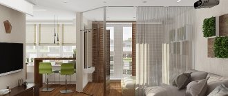
Converting a small one-room apartment and creating a full-fledged apartment with two rooms from it is quite a difficult task. In this case, it is necessary to sacrifice something or find a way to combine several zones.
Once again, Anna Elina took on the task of looking for a solution. She graduated from the International School of Design, and then decided to enter the construction university in Moscow, which she succeeded without difficulty. After graduating, I decided to gain experience from professionals and went to work at the LLC SH-Trading studio, and three years later I founded my own design agency.
Anna, in a fairly short period of time, created more than a hundred interiors of residential and public premises with great success. Her pride is the design of the City Yoga sports club.
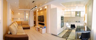
A new project that she did a good job on is a small apartment of 45 square meters. Here the young designer found an excellent compromise option, which helped make the interior comfortable not only for parents, but also for their children.
The designer wanted to create the most comfortable room, where there would be a place for relaxation and spending time together for a family with a five-year-old child.
Layout
The apartment that needed to be remodeled initially had an open plan. The main task was to carry out zoning and be sure to separate areas for personal use. Therefore, there was nothing left to do but turn the one-room apartment into a full-fledged two-room apartment.
Kitchen
The kitchen area is made as functional as possible - with built-in appliances and a powerful hood (the last point is especially important for families with children - you have to cook a lot and often). Depending on the layout of the studio apartment, the kitchen unit is placed along the wall or a corner option is chosen. The separation of the kitchen from the dining area (dining room) is often achieved through the use of different floor coverings (practical tiles are laid near the work areas, and laminate or linoleum is selected for the dining room, where the family gathers around the table). You can also use a podium or bar counter for zoning purposes.
Style
The style chosen for this apartment is very similar to constructivism of the early 20th century. This trend arose in the 20s of the last century and replaced pretentious art decor. For this small room it turned out to be the most acceptable and convenient. It is evidenced by niches in the kitchen of an unusual shape, amazing ceiling lamps, clear lines on the wallpaper and the absence of unnecessary details.
Stylish transformation of a one-room apartment - an elegant and practical option for a family of three
Converting a small one-room apartment and creating a full-fledged apartment with two rooms from it is quite a difficult task. In this case, it is necessary to sacrifice something or find a way to combine several zones.
Once again, Anna Elina took on the task of looking for a solution. She graduated from the International School of Design, and then decided to enter the construction university in Moscow, which she succeeded without difficulty. After graduating, I decided to gain experience from professionals and went to work at the LLC SH-Trading studio, and three years later I founded my own design agency.
Anna, in a fairly short period of time, created more than a hundred interiors of residential and public premises with great success. Her pride is the design of the City Yoga sports club.
A new project that she did a good job on is a small apartment of 45 square meters. Here the young designer found an excellent compromise option, which helped make the interior comfortable not only for parents, but also for their children.
The designer wanted to create the most comfortable room, where there would be a place for relaxation and spending time together for a family with a five-year-old child.
Lighting and shades
In the color design, it was decided to use a coral shade, which is evident in many details in the kitchen. And for the bedroom we chose a rich lime tone.
The most difficult part of this project was creating the lighting. It was necessary to create two rooms from one room, which means that in one of them the light source would be only lamps.
Of course, each of us gives the best to our children, so the parents completely agreed that their bedroom should be in the corner. The child was assigned to that part of the room where there was a window and, therefore, natural light.
In the parents' room, in addition to wall sconces, additional hidden lighting was created under the bed. Built-in lamps were installed in the living room and hallway, which form fancy lines. All lighting fixtures were selected from online resources.
How to organize a sleeping place for a child in a one-room apartment
A one-room apartment is a privilege not only for a young married couple or a lonely bachelor. Unfortunately, quite a few families with a child in our country cannot afford to increase the square meters, so they have to equip the interior of a one-room apartment with a child.
Where can you arrange a sleeping place for a baby or an already grown-up schoolchild? Which corner should be allocated for organizing a workspace or for creative activities?
If the child is still very small, then to divide the room you can use one of the methods listed above - screens, curtains, sliding partitions. For older children, the following solutions will appeal to you.
Sleeping place in a niche
By the way, a cozy niche can serve as a place to relax not only for the child, but also for the parents. Having carefully thought through the design, in just a few square meters you can organize a sleeping area, a work area, and storage areas, using the entire volume (namely volume, not area) of the allocated area.
To install such structures, you can use wooden beams and plywood or a metal profile and drywall. The sleeping place can be rented both at the usual level (35-50 cm from the floor) and at the very top, but you can only get there by stairs or steps.
Sleeping place in the attic
A room with a child in a one-room apartment can really benefit from using it to its full height: multi-tiered structures, especially in rooms with high ceilings, provide an excellent opportunity to expand the boundaries and increase the usable area. A loft bed will delight a school-age child - you can really create a cozy nest there.
And under the sleeping place it is more practical to place storage or rest areas, a work or dining area. Also, the “ground floor” can serve as a room for parents.
Bed in the closet
If you have not yet figured out how to live with a child in a one-room apartment, transformable furniture will come to the rescue - an ideal solution for small spaces. You can hide the sleeping place in a closet or make it retractable. During the day, the bed is hidden in a niche or closet, and at night it can be easily unfolded. During the day, in its place there can be a desk or a sofa, which are covered with a bed at night.
Modern manufacturers offer transformable beds to suit every budget and taste. By the way, such a sleeping place can be organized not only for a child. but also for parents - this way there will be more space in the apartment during the day.
Furniture selection
Furniture sketches were first sketched on paper, and the client looked for suitable items based on the drawings.
The cabinet where the sink was built in was made by Italian craftsmen. One of the customers works for a company that specializes in the supply of Italian furniture.
The bed was made of foam blocks, covered with wood on top, and then a mattress was placed. Above it is a beautiful canopy, which is similar in style to the bed, and therefore looks harmonious. It also has hidden lighting.
Redevelopment
Redevelopment of the apartment was impossible: the wall between the room and the kitchen is load-bearing. “It was possible, of course, to cut an opening between the kitchen and the room (subject to the obligatory condition of strengthening the wall), but firstly, this would significantly increase the budget, and secondly, customers like to gather guests, so the kitchen had to remain isolated,” - Natalya comments.
The designer did not split up the small apartment with various finishing materials: the floor in the hallway, room and kitchen was covered with Egger laminate, and the walls were covered with Rasch wallpaper. The apron in the kitchen was lined with black ceramic tiles (Kerama Marazzi). The ceilings were suspended everywhere.
“Of the overall concept, only the bathtub stands out. In order to preserve the integrity of the perception of the interior, we used porcelain tiles from Kerama Marazzi for finishing the walls and floors,” says the designer.
Small space solution
The designer decided to increase the space by combining several functions: the front door also serves as a large mirror, the painting in the kitchen depicting the famous adventurer Corto Maltese is also a clock. This decorative element was created based on sketches by Italian graphic artist Hugo Pratt. But the window sill in the kitchen was replaced with a dining table.
Storage systems have been carefully planned throughout the house. An amazing built-in wardrobe was installed in the hallway and bedroom. But if you pay attention to the living room, you will hardly notice the furniture. This makes the room seem much larger.
Parent half
Furniture. There is a lot of dark-colored furniture in the room, so it is better to choose a light rack (40 cm wide) - to match the color of the light inserts of the existing “wall”. This will refresh and unload the space. Irina Krasheninnikova advises making shelves above the level of the sofa open: the rack will let in light and the shelves can be used both from the children’s side and from the parents’ side. But it is better to make the shelves below the level of the sofa closed: they will be accessible only from the children’s side, a convenient place for storing toys. Place the coffee table on wheels so that it can be easily moved when unfolding the sofa. A red cylindrical cabinet next to the sofa will act as a side table and at the same time distract attention from the abundance of dark furniture in the room.
Making changes to the design of a room is quite simple - you will find all the necessary furniture in our selection.
- Modular system Pur from the Hartmann factory.
- Shorter sofa from the Milano Bedding factory.
- LINTARO chest of drawers from the Sawaya & Moroni factory, design by Kawamoto Makoto.
- Pouf Zen from the Andreu World factory, design by Estudio Andreu.
If you hang a mirror with a height of at least 180 cm and a width of at least 80 cm in a laconic frame in the center of the parent half, it will “spread” the space, add light and create a balanced composition. The finishing touch is to place a deep turquoise vase on the very top shelf of the “wall”. The vase will attract the eye, forcing you to look up - this will visually “raise” the low ceiling.
Mirror TERI mirror from the Ligne Roset factory, design by Benninghoff, Weigel Karsten.
Light. General - a chandelier of a laconic design in a white glass lampshade, local: on one side of the sofa there is a soffit lamp mounted on a shelving unit, on the other there is a floor lamp and a table lamp on the “wall”. Multi-level lighting will not only add comfort to this zone, but also fill the space with volume.
Arcadia lamp from the Artemide factory, design by Gismondi Ernesto, Fassina Giancarlo.
Color. The green glossy wallpaper used does not fit well with the walnut floor and existing furniture. If you change the wall covering to matte to match the color of the light “wall” inserts, the floor will “sparkle” and the space will be filled with air and freshness.
Items of pride
The main pride of this complex project was that the designer managed to realize the wishes of the clients and did not deviate from the original plan. The customers did everything themselves, and Elina only supervised, and everyone consulted together when they encountered difficulties.
Other features include bright wallpaper in the bedroom, the absence of the usual bed and window, and a combination of glass inserts and lighting on the ceiling.
Children's half
Furniture. The nursery should not be cluttered with furniture. A couch and a closet are enough. To visually increase the height of the ceiling, hang large paintings or photos above the sofa in identical frames, measuring at least 30x20 cm. Place a black and white striped carpet on the floor. This is convenient, because children love to play on the floor. A contrasting print will refresh a small room. It will seem more spacious, as the strip visually stretches the space.
Light. Attach a sconce above the couch, and a giant floor lamp in the other corner. This will change the proportions of the space, add personality to it and provide comfortable lighting.
