Choosing colors for a monochromatic bedroom
This will be one of the five most important decisions we make in the design of a bedroom or any other room.
Obviously, choose a color that attracts, and be honest about what we already have and love; let this guide your choice of room color. You can use everything around you for inspiration.
But if you're not happy with, say, a room wrapped entirely in green, just choose a neutral, like cream or gray. You can create a stunning space using only neutral tones. They play a key role in the design of the room, rather than being an inactive participant.
What does plain wallpaper look like in the interior?
Light-colored wallpaper is most often used to create an interior in a small room, because white or light gray finishing materials can visually enlarge the space. Also, light wallpaper allows you to favorably emphasize the advantages of the design, highlight furniture, decorative items, and curtains.
Plain finishing materials look stylish, do not overload the interior, promote good rest, creating a calm and peaceful environment.
They are most often used for the following styles:
- Classic;
- High tech;
- Minimalism;
- Modern.
For a classic interior, plain wallpaper in green, brown, and burgundy shades is perfect. Beautiful and deep colors will highlight the furniture and fit perfectly into the interior of a classic bedroom or living room. Art Nouveau, high-tech and minimalist styles include light, plain wallpapers, most often white and light gray; you can also use beige or champagne. Combinations of textures and shades are often used.
Decorative elements made of metal and plastic, such as bright flower pots, curtains, books, and shelving, stand out against the background of plain wallpaper.
Palette of shades for a monochromatic bedroom
The key to making one color dominate the palette is to use different shades of that particular color. The easiest way to do this is to go to your local paint store and pick up a piece (the type that has a couple of shades on it).
This will show different shades of your favorite color. Another way you can use is to find any palette on the Internet or online store. They divide their paints into all basic color schemes.
Once we know what color we will use, we can view all of their options in an easily digestible format.
Advice - choose from three to five shades and tones of the desired color, so the palette will be more diverse.
Colors, shades, tones: features of wall materials
Even the simplest plain wallpaper can become the main highlight of any design, because the main property of such materials is the ability to set the background and the right mood for the entire space .
As a rule, wallpaper of this type is used to darken or brighten the interior , less often - to highlight accents on individual walls or some areas thereof.
Since the use of plain wallpaper for walls in the interior does not imply the presence of expressive patterns on the walls, such a design may seem banal and boring to many.
To solve the problem of monotony in design, you can implement several techniques that allow you to fill the interior with additional colors and details :
- create bright accents around the entire perimeter of the room;
- choose wallpaper with a pronounced relief or textured surface;
- Plain wallpaper with a pattern created using a stencil will also attract attention in the interior;
- plain wallpaper without a pattern can be harmoniously combined with any curtains;
- The combination of plain wallpapers with each other, using companion wallpapers, is becoming increasingly popular.
In the photo of plain wallpaper, you can note many more features of such coatings: they can expand the interior, correct the irregular shape of the room, disguise the imperfections of the walls (when choosing wallpaper with a relief surface), and set the mood.
Wallpaper without a pattern for walls is an excellent basis for paintings, photo frames, shelves and other accessories.
Painting the walls in the bedroom
Painting is one of the easiest and most inexpensive ways to quickly transform a room. Before we start painting the walls, we’ll do a couple of test paintings in the room to make sure the color suits or not. You may want to purchase a different shade or two shades lighter and darker than the original one. Whatever colors we end up using on the walls, we can always repaint the furniture we want to use in our dream monochrome room.
Wallpaper is another great way to add color to your walls. We look for patterns that will be present in the palette (or use regular monochrome paper with a texture like grass cloth, which creates such depth).
Features of plain wall coverings
The choice of wallpaper directly depends on the type of room whose walls are intended to be covered.
If the owners of the room do not plan to use wallpaper in a given room for many years, it is more advisable to buy paper wallpaper. They differ:
- many design features;
- environmental cleanliness;
- the ability to seamlessly decorate any wall in the house.
This wallpaper is preferred when renovating a bedroom. These wallpapers are extremely good for children's rooms.
In rooms where the wallpaper is at risk of deterioration because it will be constantly affected by some specific factors, it is recommended to cover the walls with vinyl or non-woven wallpaper.
Non-woven vinyl wallpaper can be mechanically cleaned. It is this important quality that will allow the walls to maintain a satisfactory appearance for a long time.
Directly plain non-woven wallpaper differs from other types of coating in its highest strength and wear resistance. In addition to these parameters, the relief texture characteristic of this wallpaper will additionally emphasize the unique style of the interior.
Furniture for a plain bedroom
When purchasing furniture and accessories for a monochromatic room, it is important to pay special attention to the texture and silhouette of the item. Since everything will be the same color, the eye will crave contrast, and you can enhance that contrast with interesting shapes, luxurious materials and finishes.
- In most rooms, the two elements that take up the majority of visual space are the sofa or bed and the window openings.
- Sure, it's a little scary to think about investing in a colorful sofa or bed, but it will prove to everyone that you're a cool and fearless decorator (you know, if that's what we want to show the world).
- Now, if we're making a completely neutral room, buying white furniture is scary for trivial reasons (let's protect it from stains! And use a good cleaner!),
- But the challenge will be to minimize contrast changes. We are looking for fabrics (for pillows, side chairs, rugs) with a subtle pattern without any added color.
- Textiles with lots of texture (like heavy tweeds and knits) are another way to make a monochromatic room feel rich and purposeful rather than just lazy.
Ideas for combining wallpaper in the interior
Despite the fact that the very idea of combining plain wallpapers of different colors is considered far from new, however, the emergence of modern and unusual textures, complemented by various effects, has forced designers to reconsider their previous developments in many respects. Now such a move has risen to a new height of popularity.
The issue of combination in practice is always resolved with the obligatory consideration of the height of the room, the location of window and door openings, as well as the shape of the room.
- Where there is a lot of space, it is possible to use any combinations you like that you saw in photographs or in life.
- The main problem lies in the secret of creating a more comfortable atmosphere.
- If you apply a successful combination of two different patterns, the environment will become comfortable, without the need to add additional details or pieces of furniture.
It is better to decorate a small room in one color, using fragments of bright decoration on one or two walls. A small pattern will add volume to the room, while a large one is better used in large rooms.
A dark, bright tone can somewhat reduce the size of an overly elongated wall. Using a light tone, the wall will noticeably increase in size.
A successful wallpaper combination will help add a touch of playfulness to the design of the nursery, just like the design in the bedroom.
Decorative elements for a plain bedroom
In a monochromatic room, the palette may be based on just one color with different shades, but this does not mean that you should not use other finishes through metallics and woods.
Let's think about cabinet fittings, lampshades, sofa legs. These are small areas where you can add a little variety by following a color palette.
For example, gold or brass trim looks stunning against green, while blackened metal or wrought iron can feel rustic or modern against an all-white interior.
Advantages and disadvantages of plain wallpaper
Each material has a number of advantages and disadvantages. Plain wallpapers are no exception; among their advantages it is customary to highlight:
- Wide variety of species.
- Huge color palette.
- Eco-friendly paper type.
- Easy gluing process.
- Very nice appearance.
- High levels of moisture resistance of some types.
- Possibility of cleaning certain types of material.
Among the disadvantages of such wallpapers are:
- High cost of some types.
- Rapid wear of paper wallpaper.
Difficulty caring for some species.
What color is better to use?
- White. We use it for decoration, furniture, ceilings or anything that we want to paint white, even walls. We stick to one white color and always keep it on hand for touch-ups.
- Bold color. This is the color we use when we want to create a big wow factor.
- Accent color. This color should be used sparingly or intentionally on walls to create a certain feel in the room.
- If it is a complementary color, it should be used sparingly and only in areas where it will complement the other colors. If the color palette is blue and green with orange as a complementary color, only use orange in an area where the adjacent rooms are blue or neutral, not green.
- If it's part of a monochrome or similar color scheme, you can use it almost anywhere, such as as a second color.
- If it's neutral, it should be more dramatic. For example, the accent color is dark gray, it is called zinc. We choose it to make the bedroom more cozy.
Types of monochrome wallpaper
Single-color wallpaper, like many other types of wall decoration, is divided into categories according to a number of characteristics:
- depending on the material used in the production of the panel (paper, vinyl, fiberglass, non-woven),
- by number of layers (single-layer, multi-layer),
- according to surface relief (smooth, textured),
- according to the nature of the coloring (factory tinting, for painting).
Most often, classification by type of material is used to divide wallpaper into categories, so in specialized departments of hardware stores you can find vinyl, paper, non-woven wallpaper rolls, as well as single-color glass wallpaper.
Vinyl wallpaper has gained popularity due to its durability and aesthetics. In addition, canvases of this type allow you to hide some of the defects of the walls, so they can be glued even to surfaces that have minor defects.
Paper webs are inexpensive finishing materials that cannot boast of high strength indicators. This coating is considered environmentally friendly, so it is often used to decorate the walls of children's rooms.
Non-woven wallpaper is stronger than paper wallpaper, but is slightly inferior in strength to vinyl coverings. Non-woven fabrics are easy to paint, so they allow you to periodically change the design of the room without re-pasting the wallpaper.
Fiberglass wallpaper is considered one of the most reliable among all wall coverings. This type of finish allows air to pass through well, so mold or mildew will not appear under the fiberglass sheets.
Photo of bedroom design in solid colors
Selecting a shade
Even a simple monochromatic covering can become the highlight of the most sophisticated design, because in any interior it is very important to use wall decoration to set the mood of the space, which is then emphasized by all sorts of decorative details.
When choosing a wallpaper color, you must take into account the geometry of the room, its dimensions and purpose. Dark wallpaper visually reduces the space, while light wallpaper, on the contrary, visually adds volume to the room. Wallpaper in milky and sunny shades is often used to decorate irregularly shaped rooms, since such cladding can hide the asymmetry of space.
When decorating rooms intended for relaxation, it is better to avoid bright and saturated colors, since they are more conducive to dynamics than to calmness and relaxation.
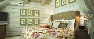
For hi-tech or minimalist designs, monochrome wall decoration in cool colors such as white, blue, indigo or gray is suitable. A warm color palette is used when decorating rooms in country or Provence style. The decoration in chocolate and golden shades is more typical of pretentious baroque.
White plain wallpaper is quite often used when decorating rooms in a modern style. White walls add lightness to the room and serve as an excellent backdrop for displaying colorful furniture or whimsical pieces of art.
Beige wallpaper without a pattern is considered a universal material for creating interiors of a wide variety of stylistic orientations. A coating of this color goes well with most types of decorative finishes, and also helps create a calm and friendly atmosphere in the room.
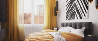
Yellow wallpaper is widely used in spring interiors. This color fills the room with positive energy, so it is suitable for decorating walls in a nursery or living room.
Green wallpaper is the most popular finishing material for creating eco-designs. Such coatings are in harmony with wooden furniture, so they are usually used in the decor of offices and kitchens.
A blue wall covering can refresh any room, and in combination with glass doors or furniture it will visually expand the space. In addition, such cladding has a calming effect, which is why it is often used in bedroom design projects.
Decorators recommend using finishing materials in deep and dark shades, such as purple, blue or black, in limited quantities. As a rule, canvases of this color range only highlight specific areas in the interior.
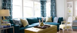
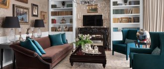
Plain decoration for the living room
The living room is considered one of the busiest rooms in the home, so when decorating this room you can safely use bright and dynamic colors that will provide the inhabitants of the house with an additional charge of vivacity and energy. You can cover all the walls of the room with monochrome wallpaper in rich shades only if the furniture is light and neat. Otherwise, the interior will turn out provocative and tasteless.
Also in the living room, a combination of single-color surfaces and sections of walls decorated with trim with a variegated pattern looks good. This move allows you to divide the room into zones, but at the same time maintain a balance between style and extravagance.
What shades are suitable for different types of rooms
Each space requires its own color scheme.
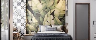
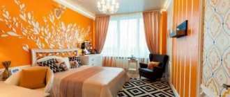
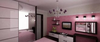
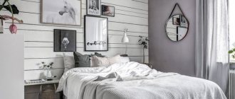
Plain wallpaper for the bedroom
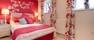
They are selected taking into account the perception of the residents of the room of a certain shade. Yellowish, pinkish subspecies provide warmth and comfort, while brownish or grayish ones do not set the mood for a comfortable stay, but create a touch of aristocracy.
Sleeping spaces require light-colored surfaces and eye-catching color combinations for accentuation. The combination of similar and rich paintings allows you to highlight a separate part of the room and create a pleasant environment for sleep and relaxation. The bedside area is covered with colored stripes, where they will not attract unnecessary attention.
For children, it is also necessary to take into account these features. Light variations are pasted near the child’s crib, and rich and interesting ones in the play area: with orange, yellow, lilac and other colors.
Variation with a combination of two types of paintings
For the living room
A public place is necessary for receiving guests, holding festive family events, and active recreation. It requires the most dynamic shades.
If there is enough space, then it is conditionally divided into two zones:
- to the bright one - with its own style, a solemn look;
- standard - calm and harmonious.
Wallpaper material in living rooms can be of any color. The style allows for a combination of monotonous wallpaper and patterned stripes. Against a generally uniform background, canvases decorated with:
- stripes;
- geometric shapes;
- natural floral patterns;
- classical ornaments;
- large images.
The combination will be successful only if the characteristics of the coating textures are taken into account. If the canvases have different densities and thicknesses, then the joints will stand out and form conspicuous, ugly seams throughout the space.
Idea for the hall
Plain wallpaper for the kitchen
Used to create an environment that stimulates the appetite. Preference is given to canvases with warm and lightened shades; cold or dark ones are resistant to dirt, but will cause subconscious denial and a desire to quickly leave the dining room.
Saturated variations are also popular, used as the basis of the entire project or as an auxiliary material to accentuate a protrusion, a niche, or form an elegant insert on the wall.
Juicy greens for the kitchen
To the hallway
Simplicity and lightness allow them to fit into the overall concept of the home.
The color scheme is selected in accordance with the size and lighting of the space. For expansion and lightening, beige, white, and yellow variations are suitable.
Bright hallway