How to arrange a gray kitchen, what materials, finishes and accessories to choose? We'll tell you in our article!
Gray continues to reign supreme in modern interiors because it pairs well with other colors and materials, and the right shade doesn't overwhelm even a small space. A kitchen in ash or graphite shade will not cease to be fashionable for many years to come.
Read our article to find out how to design an interior that will stand out from others with a similar color scheme. We will tell you how to choose colors so that a kitchen in anthracite, gray or light gray will delight you with its extraordinary appearance.
What will you read about in the article?
- Gray kitchen - what colors to complement it with?
- Gray kitchen furniture - what appliances should it be combined with?
- Which countertop is suitable for a gray kitchen?
- Gray kitchens - modern interiors
- Gray kitchen with wood - a fashionable combination for all times
Gray kitchen - what colors to complement it with?
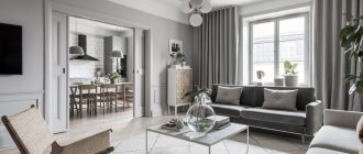
Wall coverings, floors or gray furniture will create an excellent basis for a spectacular kitchen design. You can design both modern and classic spaces. A gray kitchen is also an opportunity to design an industrial or Scandinavian interior.
It all depends on the accessories, and they can have different shades, because shades of gray are so versatile that they look great in combination with different colors.
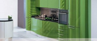
A kitchen in gray tones will not be boring if you complement it with a rich color, such as red. White walls, light tiles and gray cabinetry will look great paired with red glass mosaic tiles placed directly above the countertop. Such a spectacular surface finish will give the decor an original character, and will also well protect that part of the wall that is most susceptible to contact with moisture or grease.
If you want red to be a more prominent touch, choose furniture in that color and pair it with gray walls and flooring in a similar shade.
Gray kitchens are also a great opportunity to showcase patterns that might be overshadowed by a bright shade on the walls or hardware. Combine muted tones with original floor tiles. Pastel blue tiles decorated with a fashionable Moroccan motif are perfect.
A white and gray kitchen shouldn't be too boring either. In addition to the light finish of the floors and walls and ashen furniture, it is worth taking care of attractive furniture. If you plan to use the kitchen as a dining room, place transparent chairs in it - the Louis Ghost .
Don’t forget about decorations - cookbooks with multi-colored covers and porcelain with unusual patterns will add a little color to the interior and, thanks to them, a white and gray kitchen
A gray kitchen will also look good in combination with black if the interior is spacious enough. Dark blue is also worth considering, but also light colors such as yellow. However, it is not necessary to choose a second, important shade in the interior. A gray kitchen can look great without bright accents, so it all depends on your preferences and design ideas.
Gray kitchen - what colors go well with it?
- Red in the form of a mosaic above the tabletop,
- Blue tile with Moroccan pattern,
- White or black on the floors and walls.
Gray and purple
You can also add lilac with its shades here. Light, preferably white tones of the ceiling and walls or small bright accessories will help to dilute this concentration.
For the best color combination, designers advise considering:
- saturation as well as brightness. The first is the concentration of gray, the second is the ratio of black and white in combination;
- visual share of color - the more of it, the less brightness and saturation;
- contrast.
Gray kitchen furniture - what appliances should it be combined with?
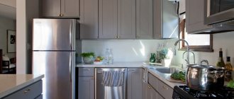
When arranging a kitchen, one of the most important stages is the choice of household appliances . The devices will affect not only the comfort of using the room, but also the interior design. Gray kitchen furniture can be combined with appliances of various shades. This is yet another proof that a gray kitchen is a universal solution.
The most popular solution is the silver and black technique, the advantage of which is that they are easy to adapt to different styles. Devices in these colors will look good in modern, minimalist and industrial interiors. Do you prefer retro compositions? You can easily find a black oven with a vintage style thanks to the handles and clock.
Vintage appliances are available in a variety of shades, such as sky blue. A small refrigerator of an interesting shape, a range hood, a gas stove and even a kettle - each of these elements will allow you to create a retro composition in the kitchen. Choose models from the same series - thanks to this, the interior will be harmonious.
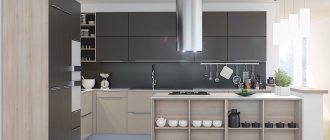
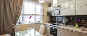
White appliances such as an induction hob or oven are becoming increasingly popular. They look extremely modern, but will also fit into the Scandinavian atmosphere. Gray kitchen cabinetry with wood countertops and white appliances is the perfect combination.
- A gray kitchen will look good with silver, white and black appliances, which will suit modern interiors and lofts. To decorate in a retro style, choose equipment in a vintage style, for example, in a blue shade.
Gray goes well with silver, white and black appliances.
Which countertop is suitable for a gray kitchen?
A workspace in the kitchen is especially important, especially if you like to cook a lot. You can choose from a variety of materials that vary in properties, price and appearance. Resistance to water and stains, insensitive to scratches and color - these elements should be paid special attention to ensure that a kitchen in gray will delight you with the comfort of use for many years.
When considering which countertop to choose for a gray kitchen, it is worth considering granite models. This is an expensive solution - the cost includes not only the material itself, but also transportation and assembly, for which you will pay more due to the heavy weight.
The undoubted advantage of granite is its durability - the top of this stone is insensitive to scratches, high temperatures, mechanical damage and stains. A gray kitchen will look great with a black stone countertop enriched with lighter spots and stains.
A gray kitchen with a wooden countertop will look great, but this material requires a little modification before use. Pay special attention to models made from exotic woods - rosewood, merbau and teak. Trees that are ideal for tabletops include oak, beech and acacia, while pine and birch are too soft. No matter what material you choose, impregnation will be necessary - it will protect the workspace from moisture and stain absorption.
A wooden countertop will give a gray kitchen a dramatic look, but it may cause you some problems. Impregnation will not provide complete stain resistance, so any spilled colored drink should be wiped up immediately. A wooden countertop is also not resistant to high temperatures, so you cannot place a hot pan on it, which is possible with a granite countertop.
A graphite or light gray kitchen can also be finished with cheaper materials, such as a laminate countertop. You can easily find models that imitate wood or stone, but also plain ones, such as white.
When choosing a laminated countertop, pay attention to those whose manufacturer promises resistance to stains and abrasion. Unfortunately, it will not be possible to protect the material from scratches, so you will need an additional board for cooking.
When thinking about the best countertop for a gray kitchen, consider quartz, which is just gaining popularity. The material is resistant to scratches, abrasion and chemical cleaners. Quartz agglomerate can imitate marble - it looks no less impressive, but at the same time is resistant to stains. You can also easily find countertops that look like other materials, such as concrete.
Gray kitchens - which countertop is right for them?
- Black Granite with Bright Dots - Resistant to stains, scratches and heat;
- Wooden - requires impregnation, but also looks impressive;
- Laminated - imitates other materials well, but is sensitive to scratches;
- Quartz agglomerate is resistant to abrasion and cleaning agents, perfectly imitates marble and other materials;
A natural stone kitchen countertop is the perfect complement to a gray kitchen.
Wood texture work surface
The texture of the working surface depends on the financial capabilities of the buyer of the kitchen. It is made from chipboard with a laminated wood finish, natural wood and stone.
The first type is a standard offer from manufacturers of furniture sets. The second type is made by the client himself according to an individual order. The main difference between these countertops is not only the use of natural material and the difference in price. First of all, it is the appearance, which can emphasize the elegance and uniqueness of the interior. A perfectly polished work surface, an enlarged window sill, a bar counter or a table top made of oak, beech, or ash attract the eye, decorate and perfectly support the created image of an expensive white kitchen. Although it should be recalled that such surfaces require special attention and care.
In terms of practicality, chipboard wins. It goes well with white, provided it is used in doses in the interior. Inexpensive and quite a good selection.
White and wood kitchen surfaces can be paired with natural or faux stone work areas in a wide range of colors to complement wood countertops.
Gray kitchens - modern interiors
A gray kitchen is the ideal backdrop for an industrial interior and loft style. Metal, brick, concrete - use these materials to give the interior a loft character. Start by choosing your equipment—gray kitchen furniture is ideal. Choose models with a matte facade and without handles - this will make them look raw.
A gray industrial kitchen will look stunning if you contrast it with another shade. To do this, use red brick over the countertop, but be sure to saturate it. This is a material that is resistant to mechanical damage, but sensitive to greasy dirt and moisture. To protect the brick, use silicone or acrylic impregnation, and before purchasing, make sure that it will not affect the shade of the wall covering.
Don't be afraid to use gray flooring in combination with similarly colored appliances. Porcelain stoneware that imitates concrete is perfect. Choose glazed tiles that have low water absorption levels. Porcelain tiles are easy to clean, which is especially important in the kitchen.
If you want to further emphasize the industrial character, use accessories. A metal shelf for cookbooks will be a practical decoration. A gray industrial kitchen will become much more interesting with the right lighting.
Use a lamp with a shade that illuminates the bulb - in a small room, use one at a central point on the ceiling, and in a spacious interior, hang three next to each other, such as over a kitchen island.
- A light gray or graphite kitchen can take on an industrial character - just complement it with metal accessories, for example, in the form of a hanging shelf for cookbooks. Place red brick over the countertop, lay out porcelain tiles that imitate concrete on the floor, and use lamps that expose light bulbs for lighting.
A graphite wall and brick in the kitchen will create an industrial atmosphere.
Gray kitchen with wood - a fashionable combination for all times
A gray kitchen with wood is a popular choice due to the ongoing affinity for Scandinavian style. Usually a combination of ash furniture with a top made of natural lightweight material is used. However, this is not the only way to decorate a gray kitchen with wood, as natural raw materials can also appear on the walls or floor. If you are concerned about the poor reaction of wood to moisture, use materials that imitate it.
Facade materials
Is a gray wood-effect kitchen your dream? Or do you want some other gray kitchen design in the interior? Let's look at the materials that will help you realize all this. This point is useful because it will help you speak the same language with furniture makers.
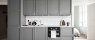
- MDF with enamel coating - the surface can be matte/glossy/semi-matte. The enamel tone can be selected according to NCS/RAL palettes;
- veneer/solid wood coated with paint;
- Chipboard/MDF coated with acrylic;
- laminated chipboard;
- Chipboard/MDF covered with plastic. In this case, plastic can imitate stone or concrete;
- MDF covered with PVC film.
What's better?
The most expensive and high-quality option is MDF with enamel or plastic coating. Such facades can be plain, smooth, milled, or textured.
A dark gray matte set looks great in a kitchen-dining room or living room. But if you have a small apartment and a kitchen space, for example, like in a Khrushchev-era building, then it is better to give preference to glossy options.
Of course, there are exceptions to the rules, but they are very few, and they are difficult to implement.
A light gray kitchen is a completely risk-free option because it will look great no matter the size of the room.
Wall decoration
There are no less materials suitable for wall decoration. Often in the kitchen they try to combine different options. This is due to the specifics of the room. An apron is required in the work area. The rest of the space is decorated to your own taste. Usually the choice is made on the following materials:
- wallpaper;
- dye;
- Wall panels.
Decorative plaster, natural stone blocks, brick, and wood are used less frequently. Using “play” with materials, color, and texture, it is customary to divide into zones. In this case, it will be possible to purposefully emphasize or distract attention.
When choosing finishing materials, special attention is paid to the practicality of the options. A smooth matte surface is easier to care for. Texture and gloss require special attention.
Color is no less important. The darker the finish, the more kitchen dirt will be visible. It is better to place options that are inconvenient for cleaning away from the work area.
5 layout options for a modern kitchen in gray
The first step in creating any design is, first of all, the choice of a set, its components, configuration, arrangement of furniture in the kitchen as a whole.
The layout can be:
- straight;
- corner;
- in the shape of the letter “P”;
- with a peninsula/island;
- with a bar counter.
Trends characteristic of a gray kitchen in a modern style
Surely, when looking at the design of a gray kitchen in a modern style in references or photos, you noticed that sets with handles in this case are presented quite rarely. And they are almost all with upper cabinets up to the ceiling, or without them at all. And, of course, a frequent guest here is built-in appliances.
These are the trends that are a priority now. Therefore, take them into account if you want to create a truly fashionable interior.
Secrets of proper planning
From the photo of the gray kitchen it is clear that the interior must be designed taking into account the square footage and features of the room layout. Particular attention should be paid to orientation in space:
- For a northwest kitchen, warm shades are needed. It is acceptable to use bright, life-affirming colors or moderate options. Don't forget about additional lighting.
- When creating the interior of a south-eastern room, strict restrictions are not required. Both warm and cold shades are appropriate. Gray can easily be made the center of attention.
- To design southwestern and northeastern rooms, you need to focus on the predominant side of the world. Various solutions are possible.
A predominance of dark shades is not suitable for a small or narrow room. The presence of a gray glossy kitchen will help expand the scope of the interior. The absence of upper cabinets in furniture will visually expand the height of the boundaries.
Color combination in the kitchen interior: gray + ...
Brown/beige
Gray gets along well with these colors in the same space. Using the degree of saturation and warmth of beige, you can regulate the degree of severity and formality of the interior.
Such combinations will look best in tandem with wood surfaces. This could be a dining group, tabletop or apron.
Light blue/blue
These colors are just as cool as grey. And even if a lot of natural light penetrates into the kitchen space from large windows, such a duet will look great.
Incorporating interesting textures and bright accents into the interior will help get rid of possible boredom and impersonality.
Yellow
This color, as well as shades close to it - orange, mustard, turmeric - look just great with gray!
But try not to get carried away, because too many bright accents can be annoying. The optimal amount is no more than 30%.
Green
The duet of gray with this color, as well as with light green, emerald, and malachite shades, is beautiful! This happens quite often in nature. Green copes perfectly with the task of balancing the severity and coldness of gray! Most often, green is used as an accent.
Designers advise using it when decorating aprons and window spaces. Another great solution would be to place indoor plants in black/white pots.
Order a tabletop with a wood pattern
Our website is a convenient and understandable platform where you can inexpensively order your favorite countertop model at any time of the day. We have a huge variety of offers to choose from to suit every taste and budget. But our main advantage is direct supplies from the best factories and manufacturers, which reduces the cost of our services.
We also make it easy to choose everything you need to decorate the kitchen of your dreams (for example, cabinet furniture or sinks with mixers), because all offers are combined into colorful catalogs, where each model is accompanied by photos and detailed descriptions of technical parameters.
You can buy a tabletop from us by placing an order by phone or email. We will arrange delivery at a reasonable and reasonable price and can help with installation by additional agreement.
Kitchen design in gray colors: about styles
Gray is the perfect companion to other colors in the palette, so it can be used in almost any style. However, there are some directions in which gray will look most appropriate.
Minimalism
Gray here is monochrome. Looks great in duets with white and black. As a result, the kitchen creates the impression of a rather ascetic space, which you just want to complement with brightly colored details. However, the only decorative details that are appropriate here will be textures: wood, marble and other natural stones.
Facades with hidden handles or without them at all will help not to violate the canons of minimalism.
Loft
A gray set with a paneled or smooth facade will look perfect in this case.
Dark colors will add brutality to the kitchen. If the room is small, then it is better to abandon them in favor of light gray tones or simply leave dark colors to decorate the facades of the lower cabinets, and make the upper ones light.
Neoclassical
Modern classics in gray tones are a fashionable alternative to beige classics. It goes well with accessories in the form of gold handles, designed to look like antique bronze, brass, forged items, etc.
Tips for decorating a room
Even at the stage of creating a design project, you need to think about what and what color will be in the kitchen. Make notes on the project and account for each element. Only this will help create a truly harmonious palette in the design.
- Maintain a balance of light and dark - if you have chosen a dark gray set, then it is better to make the walls light. It is also appropriate to do the opposite. It is better not to use more than three colors. However, you can experiment with their shades.
- Make only non-voluminous objects bright and accentuated: vases, curtains, chairs, etc.
- Think over and decide what exactly you would like to get in the end - a cheerful and bright interior or a dark and brutal interior? Or maybe you need neither one nor the other, but a calm design with a predominance of pastel colors?
Ceiling
As for the ceiling, a white matte ceiling would be a universal solution. This is a 100% win-win option.
In what case would an emphasis on the ceiling be appropriate? Only if he is tall. But you still don’t need to use too bright shades. It’s better to complement the surface with something interesting, original and textured. For example, an insert into a suspended structure that imitates concrete, which can also be complemented with a beautiful lamp.
Most often, PVC film is chosen for decoration. Thanks to it, the ceiling is perfectly flat. Another advantage is that in case of flooding, it will retain water.
The palette of suspended ceilings is very diverse. And the gray color is represented by a huge number of shades: from light to almost completely black. The texture can be matte, glossy, satin, with a metallic or pearlescent sheen, or suede.
Please note that dark ceilings will visually appear lower.
But PVC film is far from the only option for decorating kitchen ceilings. You can also:
- paint;
- cover with wallpaper;
- trim with plastic panels;
- cover with ceiling tiles;
- use armstrong;
- plywood;
- drywall.
Floor
If we touch on the topic of floor design, then in a kitchen in gray colors the following will look best:
- gray tiles - tones can be different - from the lightest to the warmest;
- porcelain stoneware, laminate, parquet, PVC tiles - and all this in shades of natural wood;
- poured floor in light colors;
- tiles imitating marble (it is better not to use natural marble, because it is porous, which means that it will be almost impossible to clean it from stubborn dirt);
- tiles in neutral pastel colors.
In order not to visually make the room narrower than it actually is, it is better not to use dark gray tones when decorating the floor.
Walls
A gray kitchen in the interior suggests that the walls can be any color. Therefore, when thinking about the choice of design, consider, first of all, the concept:
- Gray paint or wallpaper is a wonderful overall background. If the kitchen is small or you have already chosen a dark set, make the walls lighter. This will open up the space and create a beautiful contrast. In large rooms you can afford darker, deeper shades.
- if you decide to make the interior monochrome, experiment with textures. For example, choose embossed wallpaper that imitates decorative plaster. Or use gypsum plaster straight away. Using very simple techniques, it can be made to look like concrete;
- if you paint the walls a warm shade of white or beige, the room will become more comfortable;
- use wallpaper with a pattern - it can be graphics or flowers;
- really want something bright? You can make one wall an accent wall.
Tabletop
Which countertop should you choose if you want a stylish gray kitchen? A kitchen top with a solid wood look and white or light-colored countertops will go well with a set in this color.
An interesting option is to choose a countertop that matches the facades and make it thin.
Those who like spectacular accents will like a set with a tabletop in bright colors. Imagine, for example, a gray set with a yellow countertop. Looks unusual, doesn't it?
When choosing a countertop, keep in mind that on dark surfaces, water stains will be most visible.
Apron
The gray facade provides an excellent opportunity to experiment with the design of the apron. Pay attention to tiles with a bright, unusual design or interestingly colored tiles.
At the same time, be sure to take into account what style the kitchen will be in and its overall color scheme. For example, the coolest option for finishing an apron for a loft interior is the texture of brick/stone masonry or concrete.
Contrasting grout when laying the backsplash with pentagonal tiles or “hog” tiles in a light shade is an interesting and at the same time quite universal solution.
Appliances, furniture
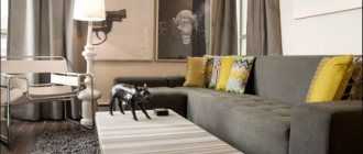
The set + dining group form the basis of the vast majority of kitchens. What to do if you have a gray kitchen-living room? This increased space can be supplemented with a sideboard and a sofa. It is not advisable to choose a furniture design that matches the walls. This will create the impression of a solid one-color spot.
How to proceed?
If the design of the kitchen-living room is in gray tones, that is, monochrome, then in order to somehow highlight the furniture against the general background, choose it a tone lighter or darker than the overall design.
How to glue - step by step instructions
If you choose vinyl or non-woven fabric with embossing, then you will also need glue for heavy wallpaper that can fix it to the wall . If you choose liquid wallpaper, then take care to prepare the mixture correctly: mix the composition only with your hands and in the amount of water indicated on the package.
Non-woven vinyl wallpaper is best suited for covering kitchen walls . They are moisture-resistant, non-staining, and can withstand temperature changes well. It's easy to stick them on if you do everything right.
Let's start work. So :
- You should start gluing by cleaning the walls from the old coating . It can be easily removed with a spatula if the lining is soaked with water in advance. Non-woven wallpaper can be removed without leaving any residue, but vinyl wallpaper has two layers - the decorative layer is removed, but the backing remains on the wall. If vinyl covering is to be used again, it can be used as a base, provided that there is no obvious damage to the walls.
- The second step is to check the surface of the walls for chips , deep cracks and irregularities. Defects are removed using putty and sanded with sandpaper. At this stage, the kitchen walls are treated with an antiseptic if there is the slightest suspicion of the possibility of mold or mildew.
- Following the instructions on the package, dilute glue suitable for the selected type of wallpaper. There is no need to save on glue; this is the case when a penny saving can result in large additional costs.
- The next stage is slicing . If wallpaper with a pattern is chosen for the walls, then the roll is rolled out with the pattern facing up. The strips are cut to a length 7-10 cm greater than the height of the wall, so that there is room for trimming.
- It is recommended to apply a vertical line to the wall using a plumb line so that the first strip of wallpaper lies flat. They start gluing from the window.
- The prepared panels are turned over with the pattern down and the top piece is coated with glue . To ensure uniform impregnation with glue, the panel is folded with the adhesive side, turning the ends towards the middle, and left for 5-7 minutes. Glue is not applied to vinyl wallpaper.
- Apply glue to the wall , carefully coating the corners, top and section of the wall above the baseboard.
- Unfold the panel , align it along the top edge and vertical line and glue it to the wall, leveling it with a roller or dry cloth from the middle to the edges to remove air bubbles and excess glue.
- Dense material is glued end-to-end , making sure that the pattern, if any, is observed.
- The top and bottom edges of the wallpaper are aligned by cutting off the excess with a wallpaper knife.
- First, whole pieces of canvas are glued , then small areas above the window and door are glued.
- In the room where wallpaper is being glued, windows should not be opened to avoid drafts.
- start painting only after the canvases have completely dried.
Take your time and do everything carefully and consciously. Our instructions will help you avoid mistakes.
The most frequently asked questions about gray kitchens
1. Gray set + gray walls = too pale combination?
If you play the shades correctly and choose textures, then no!
A good example: combining concrete with materials that have a smooth surface. Brutal interior solutions are trending now. And the texture of concrete cannot be called boring - the material is heterogeneous and with each application it forms various, unique configurations and patterns. Another good thing is that the grayness of concrete can be balanced by using black and white details.
If brutal notes in the interior are not an option for you, but the very possibility of boredom from total gray scares you, use the classic technique: duets of glossy and matte surfaces and materials. For example, the entire set can be made matte, but the inserts can be made glossy. Inserts made of dark solid wood are also appropriate.
Sometimes, to add variety to a monochrome interior, just one bright detail will be enough. For example, such a detail could be a bright red high bar stool. Imagine it on a neutral gray background - it looks very impressive!
And, of course, don't forget about countertops. If you make them white, cabinets with gray fronts will become visually lighter.
Grey/beige: which color is better?
Both shades are classic solutions for creating the most neutral and calm interiors. Plus, they look good together. Therefore, when looking through photos and references of popular designs, you will notice that such a color duet is found in them quite often.
For example, you can make the backsplash and walls beige, and the upper and lower cabinets of the kitchen set in various shades of gray.
And don’t forget that the dining group is also one of the components of the kitchen interior. In this case, you can make the table gray and the chairs in beige wood shades. Or vice versa.
There is another interesting way to combine gray and beige tones in the kitchen. For example, order a set of an ambiguous, complex shade, the perception of which depends on the lighting. The more complex the color, the lower the risk that you will get tired of it soon.
The same technique can be used in the process of painting walls. If you're having trouble deciding on a paint color, add a little gray to the jar. It will add nobility to any color.
To choose the right shades of beige and gray, follow these rules:
- do not create harsh contrasts. For example, if you chose a dark shade of gray, then the beige should be quite dense;
- a combination of light shades of baked milk with gray. The former will make the space warmer, the latter will cool it down. The result will be something in between.
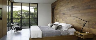
Is it possible to combine gray with wood?
Of course yes. Moreover, this is a classic combination! Wood, just like beige tones, will “insulate” the interior, and gray will “cool” it.
For example, you can make the floor wooden, and gray slats on the ceiling. The result will be a truly Scandinavian interior. The effect will be enhanced if you decorate the backsplash with white tiles.
However, in the absence of any additional accents, perhaps such a design will still look too pale. Therefore, you can decorate the floor with tiles with some active pattern in a gray-blue tone.
Note that wood of a reddish hue has reappeared in trends. If it is combined only with milky and beige tones, there is a risk that the renovation will take on a touch of past years and will not seem modern. To avoid this effect, dilute the design with dense gray textures.
Gray tinted wood is another fresh trend. As a rule, plywood is tinted. And they do it in just one layer. That is, in some places the natural shade of wood still shows through.
What about stone textures?
The most popular option in this case is gray facades in combination with aprons made of material that imitates marble. If you dilute all this with accents of brass and gold, it will turn out very beautiful and stylish.
Option for the more daring: facades similar in tone to elephant skin + stone slab in ocher tones. Here the gray on the facades combines beautifully with the veining in the stone.
The combination of gray concrete and marble is a great idea for modern interiors. Here the whole “trick” is in an interesting contrast: the brutality and rough surface of concrete is contrasted with shiny smooth stone.
Features of color perception
Gray color became a trend a couple of years ago and is still at the peak of popularity. Fashion changed his perception. If previously the gray color scheme was perceived as gloomy and boring, today, with the help of the right shade, the interior acquires status, luxury and nobility.
The risk of getting a really boring gray spot is always less if achromatic tones are complemented by complex textures. Wallpaper with a relief pattern will look more interesting and will save a monochrome design that is boring at first glance.
Another important nuance that can influence the perception of the interior is lighting. If the kitchen windows face the shady side and the room is sunny most of the day, in this case it is better to dilute it with warm, light shades to compensate for the lack of light.
If, on the contrary, there is always bright sun in the kitchen, then with the help of gray you can establish a balance by slightly dimming the natural light.
Before going to Salonoboev.com, we recommend that you read the instructions on choosing the appropriate material and design.