Finishing is the most static element of the interior; it cannot be replaced at any time, like textiles or a bouquet of flowers on the table. And to prevent such a desire from arising, designers advise choosing neutral, visually comfortable colors for the walls. In this article we will talk about the most popular and win-win option - beige wallpaper in the interior. How to choose them, what to combine them with and what shade to choose.
Which curtains will go with beige wallpaper?
Photos of the most stylish options on the Internet or in magazines can help you choose the right curtains for wallpaper in beige tones. But in order to make an individual choice, you must first determine the depth of tone of the room, then decide on the style of the room.
First of all, you need to determine the color tone of the walls in the room.
It is ideal when the curtains are plain or in a very small print, and have the same shade as on the walls. But in this case there is a risk of making the room boring and monochrome. To prevent this from happening, designers recommend using additional accessories in the interior in the same color scheme, but different in tone. This will create volume in the space and make it airy, light, and warm to perceive.
- Warm beige tone in light shades easily combines wheat, coffee, milk, cream or ecru.
- The predominance of a cold grayish tone in beige allows you to choose gray, mouse, and blue shades for curtains. White tulle and curtains will also look organic. Printed fabrics include gray wood, plaster or pinstripe.
- Beige color with peach and apricot notes goes well with brick, pink, and even red curtains. A mahogany tone would also be appropriate. White ones are beyond competition; they will create a feeling of airiness and slightly dilute the reddish tint of the walls.
- Beige with a greenish tint is successfully complemented by curtains and accessories in the colors of sea wave, green grass, and khaki. In this option, you need to be careful not to overload the room with unnecessary color spots, which will make it cold.
- For dark beige tones in the color of café au lait or milk chocolate, deep brown curtains are suitable. But in the case of light or white furniture, it is better to give preference to curtains in the same colors, so as not to create multi-colored chaos in the room.
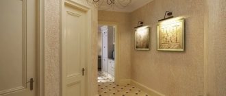
For kitchen
In the kitchen and dining room, the tone of wallpaper or wall painting is in most cases combined with kitchen furniture. Curtains for windows in this case can be printed in country or Provence style, with a pastel pattern on a beige background of the same shade as the walls. It will look stylish and organic, create comfort and a coherent composition.
In a beige kitchen, curtains in the country style or Provence of a similar shade will look organic.
If a powdery beige or grayish-beige tone is used for coloring the walls, natural-colored burlap, gray linen fabric on the curtains, blinds made of cane, bamboo or jute will look stylish in the decoration of the windows. Of course, preference is given to natural fabrics and short versions of curtains and drapes.
In the kitchen, a bright accent on the window in a completely different color is also allowed, but it must be combined with some dishes and kitchen accessories.
You can use a color accent in the form of contrasting curtains.
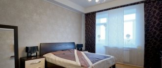
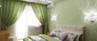
For the bedroom
The main functional purpose of curtains for a bedroom is protection from light and prying eyes, so curtains and tulle should be thick and not let in the sun's rays when spread out.
Curtains for the bedroom should be made of dense material.
For the bedroom, long curtains made of double fabric or lined, in a tone slightly darker than the walls, are suitable. A print made from drawings with thin lines on a dark beige background also looks stylish.
For the bedroom, long massive curtains of a darker shade than the walls are suitable.
For the window in this room, a modern style solution can be applied, when the curtains are the same shade, and the lambrequin and swags are a little darker. This installation goes well with pillows and bedspreads of the same shade solutions.
For children's
In a children's room, the beige color of the walls should not become boring, so it is complemented with curtains decorated with prints, for example, fairy-tale characters or funny scenes on a beige or milky background. It is convenient to complement such curtains with thick Roman or roller blinds in darker colors to cover the window during the child’s nap.
But in the nursery, it is important to avoid bright colors that tire the eyes and interfere with restful sleep, so you need to stick to muted options.
In a nursery, the shade of curtains should not be too bright so as not to interfere with a restful sleep.
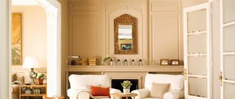
Living room
In the question of which curtains will suit light-colored beige wallpaper and brown furniture, the tone of the walls and furniture is important - cold or warm. Tulle or its analogues are often chosen in white or milky tones, which is a classic.
Often white or milky tulle is chosen for the living room.
At the same time, the color of the curtains is variable:
- If the beige color on the walls has a gray undertone, gray monochrome goes well with it, as well as any other colors with a “dusty” effect - dusty burgundy, muted aqua, dusty blue, etc.
- If the walls have a warm tone, it is better to choose curtains in the same warm colors; you can have a different color - brick or pink, yellowish-red, cocoa or coffee.
As a rule, long curtains are used in living rooms in combination with organza or tulle. Sometimes curtains are combined with Roman or Australian curtains, fabric roller blinds, curtains made of long threads, which looks very stylish, modern, light, without disturbing even the most austere style of the room.
Often in the living room they use a combination of long curtains with tulle or organza.
Dimensions of living room, bedroom, kitchen
As you know, dark, as well as overly saturated, bright colors can visually hide space, so for small rooms (most often a kitchen, but sometimes a small hall can be too), it is better to prefer a lighter color for the curtains, and the curtains themselves should be made of light, thin fabrics , ideally made of tulle. The color of the walls themselves should also be light beige.
A simple solution - beige curtains with beige wallpaper
The influence of color and combination of shades on beige wallpaper
Wallpapering or painting walls in elegant shades of beige requires a tonal combination of walls and curtains. When decorating a room, it is important to consider whether a cold or warm undertone was used in order to choose the right color schemes for curtains and tulle.
Note! It would be a mistake to believe that beige is a neutral color and that almost any curtain color will go with it. An incorrect combination of tonality and warmth of shades can disrupt the holistic image of the room, making the curtains alien to it, as if taken from another interior.
The choice of curtains depends on whether the walls have a warm or cold undertone.
Cold
Cool shades of walls are used more often in classic and Scandinavian interiors. This tonality goes well with blue-gray curtains and furniture, white curtains and roller blinds in a gray and white design.
Curtains in sea green, deep blue, or greenish-gray tones also look good. Pillows in the same color and carpet will give the room a harmonious look.
Blue shades go well with the cool undertone of the walls.
Warm
Warm colors in the design of the walls of the room allow the use of curtains in straw yellow, coffee or chocolate shades.
Keep in mind! In this case, it is better to avoid strong contrast so that the window and walls do not look separate from each other.
Coffee-colored curtains match warm-colored walls.
Neutral
Among the entire range of beige shades, there are those that can be called relatively neutral - ecru, milky color, a shade of aged white, the color of grayed wood.
These tones allow you to expand your choice because they can be combined with any color in the palette. The main condition is to use no more than three suitable shades in the interior, and two of them must be of the same tone. For example, the burgundy color of upholstered furniture and two-tone curtains in beige and brown tones. Using burgundy curtains in this option would also be too much color.
A neutral shade can be combined with all colors, but it is necessary to observe the measure in the number of tones.
More warmth, more tenderness!
If you take the warm shades of the peach palette and red-brown, golden-red shades, you will get a cozy, romantic interior composition. This shade looks good with warm tones of brown. Therefore, your curtains can use fabric in shades of bitter or milk chocolate, chestnut or oak, walnut or caramel. The interior will be harmonious, filled with warmth, elegant and respectable.
Do you want to add not only warmth, but also brightness to your surroundings? Combine peach-colored wallpaper with rich coral shades.
You should not avoid light yellow or pink-coral shades: shades for peach interiors are complex, but promise a romantic effect if you like oriental interiors.
Well, lovers should recommend curtains with golden sparkles, like champagne bubbles: they sparkle with luxury and romance.
Styles
When choosing curtains and tulle for rooms with beige wallpaper, it is important to take into account not only the tone of the walls, but also the style of the room.
The choice of curtains largely depends on the overall style of the room.
Empire style
In an Empire style room, curtains with gold thread or satin, gold or sand-colored, would be appropriate. Lambrequins and swags are widely used in window decoration, and ordinary tulle or organza is replaced with Australian curtains, tulle fabrics with draperies and rich ruffles.
Curtain tiebacks with tassels, fringe, and multi-layering are widely used. Successful photos of Empire style rooms from powdery to coffee shades will help you decide on the selection of curtains and accessories for them.
Empire style features golden tones and decorative elements in the form of tassels and tiebacks.
Baroque
Baroque is characterized by multi-layered curtain installations and the use of prints on curtains. Curtains with a beige background to match the walls look good.
Sometimes wallpaper with a patina or velvet effect is used in the design of a room, which allows you to choose velvet, velor or matte silk curtains that will create an overall harmonious composition with the walls.
Baroque is characterized by dusty shades and layers.
Provence
This style requires simple shapes and light shades, so it is better to choose straight and long curtains. A print on curtains is acceptable, but it should not be bright, and in terms of tonality, shades of lavender, sea wave, dusty turquoise or grass are better suited.
In the Provence style, long straight curtains with a soft print would be appropriate.
Modern
In a modern interior, the main trends are in the overlapping styles of high-tech and loft. But, if when decorating the first, more gray or dusty colored tones are used, then the second is characterized by warm shades of brown, green, and brick colors.
- With gray-beige walls in a high-tech interior, it is better to choose curtains in a gray-blue color scheme without additional decorations or assemblies.
- In the loft style, long curtains with a simple cut in brick tones look good.
Modern styles correspond to curtains of a simple cut without unnecessary decoration.
The choice of curtains for rooms with beige wallpaper must be approached wisely, avoiding both strong contrast and complete matching in shades. To make the space voluminous and not boring, designers recommend using no more than three shades of furniture, walls and curtains, as well as accessories in the design. Correctly selected curtains for a room in beige tones will make it cozy and stylish.
How to properly decorate the interior in powdery shades
Powdery refers to lightened shades, and therefore the same rules apply to it as for white. It is the shade of powder that significantly expands the space. But, if you have chosen this particular color, do not rush to fill the entire space with it in order to avoid immaturity. It is allowed to add gray and white to the interior.
Idea! Do you want to add a touch of freshness to your interior design? Then use powder for these purposes. For example, create harmony with gray when creating a loft style: the coatings can be darker, and brightness will be created by light furniture, decorative elements, and textiles.
Tatiana Nabokova
Interior designer since 2010. Completed more than 100 design projects for apartments and countryside real estate
Ask a Question
Also, the color of powder is suitable for such style trends as: romance, minimalism and Scandinavian style. Modern and classic.
Curtain options for beige walls in the photo
Plain or printed
A curtain made in one tone is a familiar classic option. If you like non-trivial options, then pay attention to textiles with discreet patterns. You can choose any prints from strict geometry to romantic colors.
A bright curtain will complement the beige color of the wallpaper very well. This combination is suitable for a children's room, living room or kitchen.
When choosing a pattern, be careful, otherwise the emphasis will shift to the curtain and distract from the wallpaper.