Home/Articles/Milk color in the interior – design, combinations, photos
The milky color used in the interior is a special shade of white; it is softer than snow white, but in appearance it is much more expressive than ivory, that is, the tone of ivory. In any case, milky colors are complex and subtle shades. They contain a combination of yellow, blue and even muted red, but these differences are not always visible to a layman.
Of course, the milky color owes its name to milk. Perhaps due to this, the use of any milky shades in the interior gives us a feeling of security and calm.
A design that combines milky color with other tones in any proportion can be considered neutral. This interior is devoid of intrusiveness, it is always comfortable and cozy.
There are several shades with which the milky color goes perfectly.
- The combination of milky and straw colors always looks soft and natural. However, due to the golden shades of straw color, the interior may feel somewhat pompous.
- The combination of milk and denim color allows you to make the design contrasting, which is clearly visible even in the photo.
What other shades can be used if milky color is used in the main interior? Green herbal shades, matte bronze, and soft chocolate will look optimal in combination with the color of milk.
Milky shades (in particular, the color of baked milk) create a cozy and homely atmosphere in the apartment. But everyone knows: in order not to spoil the first impression of the house, it is necessary to use only calm, “soulful” tones in the interior.
The combination of milky and white in any interior visually expands the space, and therefore this design option is ideal for small spaces.
Matching Styles
Milky color, along with classic white, black and gray, is included in the universal palette used in the interior of any room. Beautiful milky shades (this can be seen from the photo) are combined with delicate pastel colors, natural materials - cotton, linen, wild stone, wood.
The milky color gives some vintageness to the interior and at the same time does not deprive it of its nobility. It is difficult to imagine a modern high-tech style decorated in milky tones and, conversely, it is easy to imagine the color of milk in an interior that uses Empire, Rococo, Provence and even a combination of them.
A delicate, light milky shade is one of the most universal tones, highlighting bright and contrasting details in the interior. The color of milk in the morning will help you recharge with a positive attitude, and in the evening it will help you relax after a hard day.
Perception of milky shades in the interior
It is eternal that the color of the environment affects the subconscious, which is especially important for city residents who are tired of the grayness of the “concrete jungle”.
A calm interior in milky cream colors will balance the emotional coloring and balance the overall mood.
- A bright office or living room in milky beige tones will set you in a working mood. Furniture with eco-leather upholstery and blinds is always appropriate here - all in the same color.
- A bedroom with light furniture combined with natural wood will always be cozy and bright. This decision will help you restore strength in the evening, balancing your emotional state, and in the morning, instill good spirits and activate muscle tone.
- In a children's room, milky cream colors can easily create a feeling of peace. The atmosphere of a child’s room is more important than design and parental preferences, so it’s worth listening to the opinions of psychologists.
Important! Rough eclecticism is not suitable for a monochromatic light interior when there is no single stylistic solution. All the charm of a monochrome solution can easily be reduced to zero, violating the harmony. When starting a renovation, try to get rid of unnecessary items, old furniture and anything that creates a feeling of discomfort.
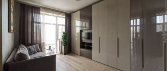
Pay attention to the atmospheric photo of the dairy interior - the living room is a way to impress even the most discerning guests. It seems that it is always warm and cozy here, the atmosphere is conducive to confidential communication.
Living room arrangement
Dairy can dominate a spacious living room without causing any discomfort.
In the center of a bright room, a comfortable corner sofa and a snow-white table are most often placed, opposite them there is a wall with a TV. This idea is easy to implement in most modern apartments.
Note!
- Red interior - 140 photos and videos of rules of use and subtleties of placement when decorating the interior
- Black interior: 160 photos of interesting options on how to use black correctly
Dark interior: 140 photos and video description of how to create a unique style in dark colors and shades
A milk sofa and armchairs will harmoniously fit into the cozy and airy snow-white interior. The floor is usually made in darker colors and stylized as natural wood.
How to combine milky shades in the interior
It can be argued that milky color in the interior is a standard; it combines perfectly with its related tones in single-color solutions. For example, milky-colored furniture will look great in the bedroom - in addition to curtains and bedspreads in creamy shades against a background of white wallpaper.
This yellowish-white color has the unique ability to combine several warm and cool shades together, but at the same time fades into the background as a background.
Against this background, “unwinning” tones in the bedroom will seem more cheerful:
- Pale green;
- Grey;
- Lilac;
- Pink beige.
It’s easier to play up bright colors in the living room by diluting the milky color of the wallpaper with pink-beige textiles. Against this background, beautiful curtains and upholstery look simply gorgeous.
Note! Milky shades of the walls will make any room brighter and more comfortable, even if it is a narrow Khrushchev-era building, a small studio apartment or a small one-room apartment.
Milky tone is a type of white color; it has several shades, depending on the admixture of yellow:
- Pure white (protein or marshmallow);
- Creamy;
- Cream;
- Vanilla
- Condensed milk color.
A private home is often dark in the summer due to tall trees and lush vegetation in the patio. It is recommended to use the interior in milky tones, eliminating as much as possible bulky furniture and cluttering the space.
A balanced design that supports daylight in a shaded kitchen-living room involves using about two-thirds of a milky color and a third of the total space in close tones:
- Beige;
- Light brown;
- Shades of milk chocolate.
In a teenager's room, you can use bright accents - red, yellow, turquoise and purple. An effective color scheme should be based on some interesting idea.
Children's room
Sets in warm colors are perfect for decorating a nursery. The sterility and coldness of white can irritate a child, in contrast to softer milky tones.
Bright pillows, curtains, blankets and original rugs will add a “zest” to the interior. An unusual floor finish can also become an accent in the room.
How to choose curtains and tulle
Harmony in interior design largely depends on the color and tailoring of curtains. Traditional white tulle often duplicates milky wallpaper in the interior.
When it's cloudy, there will be enough light in such a room so as not to use artificial lighting.
Note! Today, textile manufacturers offer curtains of different designs. Often on sale you can find a fashionable duo - “coffee with milk” in the form of curtains and curtains for them.
A light curtain will effectively complement drapes or multi-layer curtains in coffee tones. They will fill the room with a positive attitude.
The following variations will suit the “delicious” chocolate palette of curtains:
- Creamy and creamy tone of curtains;
- A hint of boiled condensed milk;
- Tone of pineapple pulp;
- Champagne splash color.
These shades always look more luxurious than just white tulle and brown curtains.
Important! Tulle is the central part of the window design, which should let in as much light as possible while filtering excess sunlight. Therefore, “night” curtains are traditionally made from denser and darker fabric. The most exquisite “duets” are one color, but materials of different densities.
Current curtain design for modern interiors:
- Gradient (color transition from the lower beige part of the curtains to the milky top with a gradual “dissolution” of color);
- Curtains made of photo fabric with a floral pattern;
- Print, print or drawing on the theme of a city panorama;
- Large floral pattern in blurry and pale colors.
A friendly combination of milky color in the interior with most other shades is a good opportunity to find your own option. Light colors will visually expand the small area of the room and fill it with light and air. We invite you to evaluate ready-made solutions in our photo selection.
Classic style
For an elegant classic style, milky curtains with a lambrequin made of jacquard or heavy and saggy fabrics are best suited. They will form heavy, regular shapes, creating a regular and clear geometric space.
Milky brown curtains look very elegant, the pattern on which can be either vertical stripes or with floral patterns.
Photo of the dairy interior
Correct lighting
After arranging the furniture and decorative items, you need to decide on the lighting. Even a very bright room can give a gloomy impression due to lack of sunlight.
To find the optimal location of lamps, it is worth considering the total area of the room and assessing the visual impression at different times of the day.
It is important to choose the right color of lamps: yellowish lighting will make the room warmer, while blue lighting may “cool” the room too much. Therefore, it is better to stay with the neutral option.
Upholstered furniture for sleeping areas
A bed with a soft texture will match soft pastel colors - choose beds with a massive headboard covered in smooth and velvet fabrics. The first option is suitable for modern eco-styles. The second option will be in harmony in interiors with an emphasis on tradition. Light, airy linen in papyrus tones will make your relaxation area most comfortable.
Relaxing bath of a “modern Aphrodite”
In the bathroom, light coffee furniture is most often installed, and the floor, walls or ceiling are made of brown, beige, caramel, etc. This solution is timeless. You can be sure that the fashion for such a design will not pass. Streamlined shapes, open shelves, and wooden facades are welcome.
Bath in coffee shades
To decorate the bathtub, and not only, products made of light ceramics, graphics, boxes and wicker boxes of chocolate color are suitable. LED bulbs placed around the entire perimeter will add a special highlight to the room. A coffee and dairy living room or bedroom cannot be complete without a laconic floor lamp and a beautiful table lamp. Do you love a comfortable homely atmosphere? Be sure to order small fluffy rugs.
Glossy or matte facades
The correct choice of surfaces for façade design influences the design. For small kitchens, glossy cabinets are often chosen. Smooth surfaces reflect light, making the kitchen space visually larger and lighter. This option is also used for popular urban styles, for example, minimalism, high-tech.
Glossy facades
To create an intimate, cozy atmosphere, matte coatings are used for kitchen facades. They don't show stains and prints as much, but they are more difficult to care for due to the porous structure of the surfaces. A universal option suitable for decorating spacious and small kitchens. Used for traditional styles: classic, modern.
Matte facades
A color scheme
The monochromatic use of shades of the same color allows you to visually preserve and increase the area of the room. Each color has many shades; combinations of them will allow you to create an original and unique interior of the living room.
Without overloading the interior, by painting the walls in different shades, you can zone the space or focus attention on a certain area.
The neutral color of the walls gives more opportunities for flight of fancy. Muted and delicate shades are suitable for the classic style of living room decoration.
Furniture or decorative elements that become boring over time will allow you to change the character and style of the living room. Neutral colored walls can be set off with bright accents in your living room decor. For example, light gray in combination with beige will give home comfort. The calm colors of the walls will relax you after a hard day and will play in the evening sunset.
A contrasting combination is suitable for a more modern stylistic direction.
This option is suitable for brave owners. When executed correctly, the most unexpected combinations can occur.
A harmonious combination of two colors from one half of the spectrum will give the living room the interior of a garden of Eden. The walls of the room can be made using a gradient method or a smooth transition of colors from one part of the living room to another.
Using this method is preferable for spacious rooms, although if you use light shades, a small living room will also be harmonious.
“Background” color of coffee with milk: wall paint and wallpaper
Latte is ideal for painting walls. It covers the surface evenly, masks blemishes and does not require multiple layers. Experts advise choosing a matte texture and combining coffee and milk with a brighter shade. For example, with white or blue, chocolate, lemon, terracotta, reed. Other good options are orange, apple, lavender and cream.
Secrets of coffee and milk wallpaper
This is a popular shade, so it won’t be difficult to find it in old and new collections. Almost every manufacturer has it, and various textures, bases and prints are used in the design. When choosing, first of all you need to focus on the purpose of the room.
For a small home office, look for trellises with a vertical pattern and horizontal stripes. The former will visually “raise” the space, the latter will expand it. In the kitchen, wallpaper should be washable; you can find an interesting thematic pattern or a neutral ornament. In the bedroom, darker colors are sometimes used to separate different functional areas from each other.
In the corridors and hallways, the walls are decorated with lighter shades of coffee; they are perfectly set off by brown objects. For example, a chest of drawers, a bench, an ottoman, a cabinet. If the room does not have enough volume, mirror surfaces are added.
Applying color accents
Bright flashes against a calm background refresh the atmosphere and relieve the white kitchen of the unloved effect of hospital sterility. The colored strokes are:
A classic trick is to highlight the refrigerator in a contrasting color. In a white kitchen, curtains with a small checkered pattern in orange, brown, and green look attractive. A bright shade can be carried by wall-mounted cabinets. You can select any piece of furniture. Dishes will also add brightness - red and blue pots on the stove, sets on the shelves and on the table.
Decor selection
Decorative elements can be either simple or complex, taking on the role of an accent. It is the details that allow you to complete the decor and create a harmonious interior.
Bright rugs, carpets, sofa cushions, paintings, lamps, floor vases are suitable.
By choosing a contrasting palette, you can draw the attention of guests to individual decor items. In order to make the environment even more pleasant, designers advise placing live plants in the room.