Anton
head of design studio
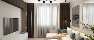
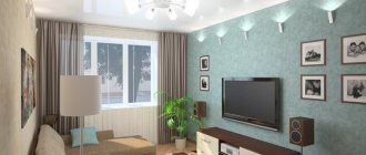
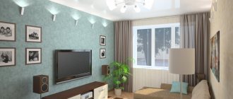
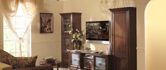
So, in front of you is still an empty, faceless room with an area of 16 square meters. How to arrange the furniture? What color and style should you choose for your living room? What will happen if the living room is combined with another room? We will be happy to answer all these questions. With useful advice from designers, your living room will become exactly the place where you can comfortably relax, do useful things or invite your loved ones to visit. We will reveal the secrets that we ourselves use to create a large, bright space and maintain a cozy homely atmosphere.
Read more
Sofa seat
in living room design 16 sq m
You probably already have an idea of how and where you should arrange the furniture in the room so that it looks beautiful and harmonious. All that’s left to do is bring the idea to life. First, visualize how you see your room. Draw a schematic plan of your dream living room with all future furniture and appliances. Why is this necessary? In order to protect yourself from unpleasant surprises that may await you if the furniture is arranged incorrectly. For example, it may turn out that the sofa will be in a draft. Without a diagram, this nuance may initially go unnoticed, but on the plan you will immediately notice it. Thus, by looking at the arrangement from the outside, you can choose the optimal place for the sofa, which is guaranteed to save you from future possible torment due to a constant cold.
The location of the sofa in the living room
. Take a look at our options for placing this item in the room. You will notice that choosing a suitable location for the sofa directly depends on the goal.
1. Sofa opposite the TV. Perfectly suited for family evening gatherings.
2. The sofa is next to the door. Are you a hospitable person and do you often have friends or relatives stay overnight? Then this location will be a wonderful solution for you.
3. Corner sofa. A universal, convenient option. A sofa placed in the far corner from the door will not narrow the space and will look cozy.
Correct opening of the door in the living room
In or out?
Opening the door in the living room
. If you don’t want the door to draw unnecessary attention to itself, then this invisible model without platbands will look great in your future ideal living room. If you paint the “invisible” wall the same color as the walls, it will become completely invisible.
Open inward or outward? The decision is yours. The main thing is that the door did not interfere with free passage and did not limit access to the dressing room or cabinets. Depending on the layout, in some cases it makes sense to either move the doorway, or focus on a sliding compartment door or a folding book door.
1. Acceptable option. The door leaf does not block the corridor and does not interfere with the passage into the room. However, there is also a minus - when opening the door will touch the cabinet doors.
2. Not the best option. Here the door blocks the entrance and visually reduces the space. If possible, change the direction of the door. If not, then it makes sense to install a folding door-book or accordion.
3. Bad option. It is very inconvenient to open the door to the living room if your apartment has a narrow corridor. In addition, in order to open it, you have to step back every time. Uncomfortable, right? Here it would be more logical to install a folding or sliding door.
4. An excellent location option, which is also good from a fire safety point of view. The door leaf does not interfere with the approach to the room and does not touch the furniture.
TV in the living room
size and location
Placing a TV in the living room
. A large diagonal looks beautiful and laconic in the interior.
Location
. The best solution would be to place the TV on the wall opposite the sofa, and the distance will not matter here.
Cabinet or bracket?
What do you like best? It is important to pay special attention to the television zone. In order not to spoil the design of the room with protruding wires, you should foresee in advance where to hide them. It would also be nice to hide the numerous outlets for the set-top box, modem, sound bar and receiver. A cable channel will cope with this task, which will make your television area neat and harmonious.
Height from floor
. To watch your favorite programs and movies with maximum comfort, place the TV at eye level of a sitting person - 1 m from the floor to the middle of the screen.
Diagonal size
. Consider options from 50 inches (if you have the financial means, of course); TVs with a small diagonal can create the appearance of a lonely, inappropriate spot on an empty wall.
Film projector as an alternative
. For a projector you will almost certainly need a screen. Think about which one to give preference: manual or electric? If you prefer the second option, provide power for it in advance and do not forget about the cable channel for the wires. The choice of location for the film projector itself is also extremely important. Decide whether it will be a permanent mount or a removable one. Well, to fully enjoy the bright and rich picture when viewing, you will need blackout curtains to darken the room as much as possible.
TV in the living room
Furniture in the living room
Furniture in the living room
. This comfortable blue armchair is a color accent in a neoclassical interior, which emphasizes the special tenderness and lightness of the design.
- Armchair.
The accent item in the interior is often the chair, although its shade and shape may differ from the rest of the furniture. When choosing a chair, be guided by your habits: if you like to spend the evening reading an interesting book, climbing into a comfortable seat directly with your feet, then a chair with dimensions of 90x90 cm will be comfortable for you; if you are not a fan of books, and you need a chair in order to “just sit comfortably,” then a fireplace chair with a high back, comfortable armrests and a seat of 80x80 cm will be your good choice. - TV stand.
Now almost no one uses players, cassettes and discs, so it makes no sense to clutter the room with a huge cabinet. Nowadays, a console table or a compact cabinet is enough, which will not take up much space and will look elegant. - Coffee table.
A beautiful piece of furniture that creates a cozy atmosphere. In addition, now you can find transforming models that turn into a spacious table. Unfortunately, it is not so easy to find such specimens, and they will cost a lot. - Side tables.
If you want to leave as much free space as possible in the living room, then an alternative to a full-size table will be compact and mobile side options. And if you find a unique designer model, then such a table will also become an original art object! - Rack.
With this multifunctional type of furniture, you can beautifully arrange a variety of decorative items, as well as divide the room into zones without taking away the light. For a living room of 16 square meters. m rack will definitely become a useful piece of furniture. - Additional storage cabinet.
If you have space in the living room, you can place the sofa almost in the center of the room, at some distance from the wall. This will free up closet space and you won’t have to choose between ample storage space and a large, comfortable sofa. Don’t be afraid to use all the walls and niches of the room to the maximum. - Fireplace.
Here we mean electric fireplaces, which can be of completely different styles: classic, antique, modern. Therefore, it is important not to overdo it with creativity and choose a style that matches the design of the room. The correct size is also important: a large wall with a high ceiling needs a proportionate fireplace portal, otherwise it will look ridiculous. This piece of furniture can also be multifunctional - humidify the air in the room and provide heating, so 3-in-1 fireplace models will bring you undoubted benefit.
Black and white living room. Photo of the project
Author of the project Individual
The living room is decorated in black and white colors, but with bright splashes. The main style is minimalism, and notes of the African direction add variety and make the interior more interesting. A black sofa with white pillows, a snow-white coffee table and a fleecy table are the main interior items.
Opposite is a TV. And other pieces of furniture remain in the shadows, because they are made in such a way that it seems to be just a continuation of the wall. This is a TV stand and cabinets on both sides of it. They are made in glossy black. There is a black and white leopard painting on the wall and a leopard print on the opposite one. But the main accent is the bright red curtains.
Kitchen + living room
An increasingly common option is to demolish the partition between a too small kitchen and an equally small room, increasing the space and turning it into a bright, spacious room. I agree that this solution is not suitable for everyone, but let's look at it in more detail. Perhaps it is in you that a new fan of the combined space will appear.
Kitchen-living room design
. Who said that only one bright accent looks advantageous in the interior? Even several combined shades can transform a room and make it original.
By combining the kitchen with the living room, we get a room with at least two windows - that is, a large, bright space. In addition, a full-fledged dining area appears, which, unfortunately, is not always possible in a small separate kitchen. By the way, when choosing a dining table, you need to count on at least 70 cm for each person.
Ideas for the kitchen-living room
Bedroom + living room
A living room combined with a bedroom is not the most common option for combining two rooms, but young owners of a one-two apartment may take a closer look at it. An excellent partition will be a shelving unit that will not reduce the space and will retain natural light. In addition, it will provide additional storage space for books and various small items.
Bedroom design with living room
. Take a look at what a colorful and interesting example of a bedroom-living room design for a one-room apartment!
Delimiting space with a translucent shelving
Author of the Zukkini project
For a one-room apartment, the design of the living room-bedroom is important in terms of practicality and functionality for a comfortable stay. The color scheme is black and gray with warm splashes. The proposed option is made in a combination of several styles.
The main element is a white sofa with massive pillows and a soft pouf, which plays the role of an impromptu coffee table. The bed is on the left, and it is separated by an original wardrobe with square shelves where decorative elements can be placed. The TV is located on the opposite wall with the ability to view from both the living room and the bedroom. And under it there is a TV stand for personal little things.
Living room + office
In a small apartment there is not always enough space for a desktop, so it is often placed either in the bedroom or in the living room.
The size and location of your desktop will depend on how often you will use it. For a table for a laptop, a width of 50-60 cm is sufficient, and for a desktop computer it is better to choose models at least 70 cm in depth.
Living room design
. In this project, we focused specifically on the eye-catching bright chair, and made the small work table and shelves invisible due to color.
We offer you three convenient options for placing a desktop in the living room.
1. Desk in the far corner. If you rarely need to work in the living room, then consider this option. To make your workplace less noticeable, you can make it match the walls or place a beautiful screen or shelving nearby.
2. A large work desk by the window is an excellent option for those working at home. This table with an extended window sill is perfect for working with a desktop computer. In addition, if your living room has a narrow and elongated trailer shape, such a tabletop will visually expand the room.
3. Desk built into the closet. An ideal option for creative individuals. With such a table, no one will see your “artistic mess”, because it can easily be hidden from prying eyes back into the closet.
Desk in the interior
Using hanging racks
Author of the project Individual
The central part of the living room looks spacious and free. The interior is dominated by sand shades in the decoration of walls, carpet, door structures and sconces. The main pieces of furniture - a wall with a TV stand and numerous hanging shelves - are located opposite. They are made in such a way that it feels like they are floating in the air. Opposite is a sofa decorated in chocolate and dark blue.
The coffee table is quite spacious and traditionally has a square shape. He is nearby. The final touch is an original bookcase made of square shelves that differ in color and size. And it kind of separates the living room from the other rooms.
Air conditioner
in the living room 16 sq m
The main rule: flows of cooled air should not blow towards the sofa or table, otherwise the person in the room has every chance of catching a cold.
Moreover, the farther the internal housing of the air conditioner is located from the window, the more difficult and expensive it is to install - after all, you will have to trench the wall.
Air conditioner indoor unit
- not the most attractive detail in the interior. In order for it not to be too conspicuous and not to violate the integrity and harmony of the design, we hid the white block on the white wall.
Let's look at the three most common air conditioner location options:
1. An excellent place to locate the indoor unit would be above the door.
2. Air conditioner near the window. Good and economical location option.
3. But we strongly do not recommend this arrangement of the indoor unit. Cold air from the air conditioner blows onto the sofa and the people sitting there. Take care of your health and the health of your loved ones - choose a different location.
Sockets
in a 16-meter living room
Make sockets with a reserve and think about their location in advance. Calculate approximately how many outlets you will need in the room. Decide where the floor lamp will be, and where the table lamp will be, and how many there will be. And don't forget about the TV zone! There will be a lot of sockets there - it’s better to hide them behind the cabinet or behind the TV itself. The same applies to the electric fireplace. By the way, you can provide a place for the New Year tree and garlands in advance. On average, you will need about 15 outlets in your living room.
Living room interior 16 sq. m: where to start?
First of all, decide what functional areas your living room will need to accommodate:
- perhaps you are planning to place a dining area here;
- or it is important to allocate space for a home mini-office;
- often there is a library and reading corner in the living room;
- sometimes there is a play area for children in the room;
- oenophiles may decide to locate an enoteca here;
- Those who like to gather a group of friends at home may find the minibar area useful;
- Owners of cats and dogs may need a pet corner.
Based on your own needs and lifestyle when planning your living room, only then will it be truly comfortable.
Photo: Ivan Sorokin. Author of the project: Denis Vasilov. Head of the design studio: Sergey Kamenshchikov
Photo: Ivan Sorokin. Author of the project: Denis Vasilov. Head of the design studio: Sergey Kamenshchikov
Design: Chdecoration
Design: Chdecoration
Architect: Oleg Klodt
Architect: Oleg Klodt
Author of the project: Natalya Naumova. Stylist: Daria Soboleva. Photo: Mikhail Loskutov
Author of the project: Natalya Naumova. Stylist: Daria Soboleva. Photo: Mikhail Loskutov
Lighting
there are 16 square meters in the living room
There is never too much light! The more light there is in your room, the more comfortable it will be. Consider several different lighting scenarios.
Living room lighting
. To create harmony with the brick wall in this interior, we used minimalist lamps - all from different collections, but in the same loft style.
Lamps
are an integral part of the decor, so they must be combined with the overall style of the room. Nowadays it is important to use a variety of lighting fixtures in the same style from different collections in one room. It’s great when there are different types of lighting in the living room: main, local and intimate light. The mood of the room and our mood depend on how we change the lighting.
overhead light
- the main type of room lighting, which includes work lights (spotlights) and a chandelier. A chandelier, in turn, can initially be a highlight in the overall style of the room, and only then perform its main function.
Toward the local light
include all kinds of floor lamps, table lamps and sconces. I would like to note that this type of lamps, such as sconces, rarely fit into the overall style of a living room, especially a modern one, so it would be better to replace one sconce with two original lamps. 
Intimate light
- these are garlands and candles. Interior garlands burn with an even, unblinking light, usually warm white, thereby creating a fabulous and uniquely cozy atmosphere in the living room and acting as a night light.
Candles
. Here I would like to note that multi-sized, single-colored candles of large sizes will look most advantageous in the interior, and white candles with a slightly rough or matte surface would be an ideal option.
Zoning
. The lamps are ideal for zoning, especially in combined rooms. A kitchen-living room requires task lighting in the kitchen area, as well as several pendant lights above the bar and dining table. The living room also needs both main light and local light. We recommend placing warm lamps behind the sofa and placing a floor lamp next to the chair.
Modern style in the living room
This is exactly the style that looks great in any size room. Elegant, beautiful and at the same time simple and comfortable.
Modern living room design
. Geometry in the form of patterns and lines is a feature of modern style.
Signs of style
. The basis of the style is discreet colors - white and black, gray and beige. For the laconicism of a modern style, bright accents are necessary: without them, the interior will look boring and lifeless. Modern design is created according to the principle “less is more.” There should be few decorative items, but all of them should emphasize the style of the room with their brightness and uniqueness. Large size posters or paintings will look great as decorative items. An integral feature of the design is comfortable and practical furniture, without intricate shapes and minimalist.
Many modern living rooms
Using multi-level lighting and backlighting
The author of the project is studio CHAMELEON
The interior of the living room is 16 square meters in modern style. It impresses with its laconicism and beige color scheme.
Interior details - cabinets with open shelves with lighting. The sofa is large, gray, soft and with pillows, located opposite the TV, and next to it there is a light coffee table. There are also interesting details: a carpet on the floor with a 3D effect and a similar picture. The latter is unique, since its own pattern opens from different angles. The composition is completed by wall lamps with yellow light.
Neoclassical style in the living room
Many of our customers choose this style. In essence, this is a modern classic without unnecessary pretentiousness. Simplicity combined with sophistication - this is all about neoclassicism.
Living room in neoclassical style
. Pillows of various sizes in various interior colors will look great in both modern and classic designs.
Signs of style
. Symmetrically arranged furniture and various accessories. Beautiful complex furniture fronts, stucco moldings, moldings on the walls, draped flowing curtains and curtains - these elements, combined with the rigor and restraint of the rest of the room, add unique charm and sophisticated sophistication to the neoclassical interior.
Living rooms in neoclassical style
Eco-style with laminate wall decoration
Author of the project JB Design
The living room is decorated in a modern style and light colors. Thanks to the snow-white walls, it is possible to achieve more space. The remaining light elements with wood textures make the freedom and ease of design more pronounced. The upholstered furniture is decorated in an original pearl tone, and it occupies the main place in the room - the center. opposite there is a massive TV stand and a TV above it. And in front of the sofa there are three coffee tables at once - two white ones of different heights and a large yellow one with a diameter.
The draped curtains, complete with Roman blinds, are also painted in pearl color. The overall composition is completed by a snow-white woven carpet.
Other living room styles
Scandinavian style
Fusion
Loft
Colors
Beige color in the design of a living room 16 square meters
Yes, yes, we know that now you will probably say how boring and banal this color is. We agree that it is not at all necessary to choose only light shades to decorate a living room. For those who are tired of boredom, there are many options for turning an ordinary living room into an original and bright one with accent walls in both classic and modern styles. However, it is beige that has undeniable advantages over other colors. “What advantage could there be in this boring color?” - you ask. This is what we will tell you about.
Beige creates the illusion of spaciousness
. The room looks brighter. For modern one-room and two-room apartments, this is an excellent chance to visually expand the space.
Universal compatibility
. Since beige is considered a neutral color, it gives room for other creative options. The friendliness of this color allows you to add completely different bright accents of both cold and warm shades to the interior. In addition, the calm beige palette will create an atmosphere of warmth and comfort, and you will never get bored.
Beige color in the living room
. The variety of cold and warm shades of beige allows you to use this color in any style.
A selection of beige living rooms
Gray color in the living room interior
Gray color in the living room
. Designers call gray the second beige. Since it is neutral in itself, it goes well with any shade.
If black tones absorb light and, if used inappropriately in the interior, make the room too dull and gloomy, and the abundance of white in the room, on the contrary, makes it boring and faceless, then gray always turns out to be a winning option in design. It will reveal and emphasize the true color of the soft shades of the design, and, on the contrary, will somewhat mute the bright shades, thereby creating color harmony.
A selection of gray living rooms
Zoning with sliding doors
Author of the project: Design and Architecture Studio MSarkisyan&Architects
The living room-bedroom is very bright and light. The main colors are shades of beige, gray and blue.
Currently reading: Curtains for the living room, photo examples of curtains in the interiorThe room has two zones: living room and bedroom. And they are separated from each other by a sliding door, which adds functionality to the interior and fits harmoniously into the overall design. An interesting detail is the gray sofa, which is complemented by a blue and beige pillow. It takes up all the space in one of the corners. And the coffee table is a kind of accent. It is round and small and mounted on three legs.
The warmest floor is a light brown color.
Other colors
In the living room design
White color in the living room
Blue color in the living room
Dark living room design
Color spectrum
You should choose a color scheme based on the chosen style. However, there are some solutions that will be successful for many style trends.
For example, white color. Its advantages are versatility, good compatibility with other colors, and neutrality.
Beige shades are also popular. A living room in light coffee or sand tones looks incredibly cozy. Green, orange, and sapphire colors can be used as accents.
The gray palette is also in demand. It is universal and neutral, just like white, but does not create a feeling of sterility. It is preferable to combine gray shades with warm colors, for example, yellow or brown.
