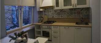
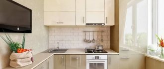
The kitchen is traditionally one of the key areas in any apartment. And if you live in a Khrushchev-era building, where only 6 square meters are allotted to it, you will have to think carefully about how to organize such a small space. But don't rush to despair.
Designers offer many interesting developments for a kitchen in Khrushchev: optimization of space, lighting and layout, correct arrangement of furniture and other tricks. It is quite possible to make the cramped kitchen multifunctional, comfortable and very cozy.
What shape to choose a kitchen set
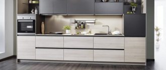
Due to serious space limitations, luxury projects will have to be abandoned. Compactness and rationalism are at the forefront. It would be quite appropriate to have a set with a linear layout, when all the appliances and cabinets are against the longest wall.
However, if there are a lot of household appliances in the kitchen, arranging them in one row will be problematic.
In this case you need to choose:
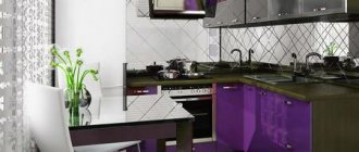
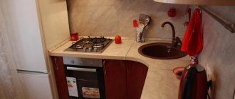
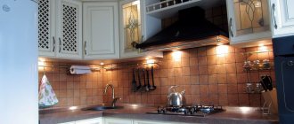
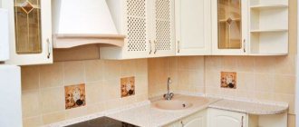
L-shaped set , located along two adjacent walls. The corner is also involved - a sink is usually installed in it. And two working surfaces will not be superfluous.
The U-shaped layout is not a very good solution for a small kitchen. It will solve storage issues, but will take up all three walls and leave no room at all even for a tiny dining table.
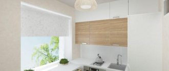
In principle, any color of the headset is possible. But the most advantageous option would be furniture in light shades using mirror and glossy elements.
Options for expanding space
Some interior partitions in Khrushchev-era buildings are not load-bearing, which means that it is possible to expand the kitchen through redevelopment.
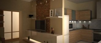
Merging with the living room
Since most kitchens in Khrushchev-era apartment buildings are gasified, it is not always possible to combine the kitchen and living room by completely demolishing the partition. But there are several options to solve this problem:
- give up gas and switch to tariffs for electric stoves. To do this, you must obtain appropriate permission from the authorized bodies. In this case, it is important to take into account the load on the electrical network, which will increase with the installation of an electric hob;
- install a glass or sliding partition that will actually separate the rooms, but visually connect them into a single space.
This is important to know:
- 5 good reasons not to abandon the door in the kitchen in Khrushchev.
- Is a door required in a kitchen with a gas stove?
Combining with the bathroom
This redevelopment can be legalized only if the apartment is located on the ground floor or if there is a non-residential premises under the apartment. In other cases, doing this is strictly prohibited!
What furniture to choose
You are unlikely to be able to gather guests in the kitchen in a Khrushchev-era building. The living room is better suited for this. And a good-quality dining table definitely doesn’t fit here in terms of dimensions. Therefore, you will have to settle on a small table and two chairs.
A model with a round or oval tabletop is most suitable. It is advisable to choose a light color; the choice in favor of tempered glass is also justified. Many designers recommend a transforming table that folds quickly and takes up minimal space.
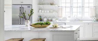
A good alternative is a bar counter. It's easy to push chairs under it. The rack will be an additional storage space, and in combined rooms it will perfectly cope with the role of a partition.
The structure can be a continuation of the window sill, work surface, or in contact with a free wall. It is made in the same color as the set or tabletop, sometimes a contrasting tone is selected. The logical conclusion is high bar stools, hard or soft, with or without a back, but not bulky or lightweight.
How to visually increase space?
The area of a kitchen in a Khrushchev-era building very often does not exceed 6 square meters. Therefore, it is important to rationally use every free centimeter. To do this, designers around the world use common tricks.
Color
The simplest option is light colors throughout. They will make the kitchen visually larger, fresher, and create a feeling of lightness and airiness. But this is not the only secret of success!
You can make a room taller and wider with light, plain walls and a bright accent floor; the same effect can be achieved by a light covering with a small contrasting pattern. The floor to match the back wall draws out the room and adds air. A ceiling that matches the back wall will help balance the proportions for elongated rectangular rooms. A bright accent far wall works on the same principle: it visually reduces the depth and increases the width of the kitchen.
A powerful tool is stripes. Vertical ones raise the ceiling, horizontal ones move the walls apart. But don’t get carried away, this is a complex solution for small rooms with such extensive functionality as the kitchen.
A good option for a base is white, beige, cream, peach, pistachio or cornflower blue shades. You can combine them with red, blue, orange, green, yellow, blue, purple, sand, wood and chocolate.
Lighting
Organized lighting greatly transforms a space. To visually expand a rectangular elongated kitchen in a Khrushchev-era building, use an even row of spotlights. But not in the center of the ceiling, but along the wall. Otherwise, you can get the opposite effect.
Wall lamps with beams directed upward help to visually raise the ceiling. Refuse massive chandeliers and any other solutions that weigh down and overload the space. Scattered and reflected light gives volume best.
Texture and materials
The best friends of small rooms are gloss, glass and mirrors. Moreover, all this is great for the kitchen. Pay attention to glossy headsets and reflective surfaces of equipment. Chrome details enhance the effect and also fit perfectly into fashionable high-tech.
Another plus is functionality. Smooth mirror surfaces are easier to clean from stains and grease compared to textured ones. Although they will have to be carefully polished with soft cloths so that there are no streaks left. Transparent details work well to increase space. And also a combination of smooth wall coverings with matte ceilings.
What curtains to choose for a kitchen in Khrushchev
In order to create a light airy space, it is necessary to choose curtains made of transparent fabrics that will transmit light well. And since in a small kitchen all work surfaces and appliances are located close to each other, the material must be resistant to dirt, moisture and not absorb odors. Curtains in cool shades visually remove the window and thereby expand the boundaries of the room.
For a small kitchen, blinds of various models and roller blinds are suitable. Their beauty is the ability to regulate the amount of incoming light, despite the fact that the lifting structures themselves do not take up extra space, do not overload the interior and get along well with curtains, tulle or muslin.
Designers often prefer Roman blinds, which combine the convenience of blinds and the elegance of curtains. This window design is easy to maintain, always looks neat and makes the kitchen cozy and modern.
Fridge in the corner
The main advantage of this placement is obvious - space saving. Even if you purchased a rather large refrigerator, it will not look too bulky in this situation. And it won’t bother anyone, which is important.
However, remember that it should not be adjacent to heating appliances or the stove. Maintain a minimum distance of at least 0.5 meters.
If you have a sunny side, then when choosing an angle, take into account the possible incidence of sunlight. It is not good if the refrigerator remains under them for a long time.
What kind of floor and ceiling to make
The floor can be laid from any materials that are moisture-resistant and impact-resistant. A covering made in light colors or with symmetrical diagonal stripes will make the kitchen wider due to the elongated pattern and reflection of light.
Wood-like colors made with tiles or laminate look very interesting. You should refrain from choosing large patterns. In a limited area, they may not look aesthetically pleasing and will visually make the kitchen smaller. But small ornaments will enliven the interior, provided that the main surfaces remain monochromatic.
For the kitchen-living room, zoning would be a smart solution. The floor should differ in texture, color or quality of coating. Let’s say there are tiles directly in the kitchen area, and laminate or linoleum in the recreation area.
It is advisable to make the ceiling suspended, since this material optically increases the volume of the room and impresses with its absolute ease of maintenance. The second acceptable option is a ceiling that is carefully leveled and painted in one tone.
More complex types - hanging, decorated, with photo printing, etc. - will only reduce the height of the room. Multi-level structures that significantly conceal space should be avoided. And be sure to make the ceiling light.
Kitchen renovation 7 sq. m.
Basic principles of small kitchen design:
- Using a light color scheme: white, beige or gray will make the space seem larger. If the colors of the materials are chosen in dark tones, then it is necessary to provide the room with additional light sources: spotlights and chandeliers with a large number of lamps.
- When choosing wall and floor coverings in the kitchen, you should consider the most wear-resistant and abrasion-resistant materials. Suitable for walls: paint or vinyl wallpaper. Flooring - ceramic tiles, linoleum or laminate.
- It is better to choose a regular whitewashed or suspended ceiling. Suspended, multi-level plasterboard ceilings should not be placed in small kitchens: they visually make the room smaller.
- The kitchen apron can also be decorated with ceramic tiles or use ready-made MDF panels covered with laminated paper.
Where to put a refrigerator and washing machine in a small kitchen
There are two traditional solutions for placing a refrigerator in a small kitchen in Khrushchev. Firstly, by the window. Next to the window, as a rule, there is a corner into which a large-sized unit fits quite well, without blocking all paths of movement.
Secondly, you can put it by the door. This way, the set and the refrigerator do not form one continuous working surface, but it will not interfere much at the entrance.
A more conceptual idea would be to place the refrigerator under the countertop. Of course, if the dimensions of such a chamber can satisfy the needs of the residents. But the best option is a built-in refrigerator.
Quick and unhindered access to its content is maintained. At the same time, such valuable space is not cluttered. You can even cover the doors with furniture facades, and then the refrigerator will not attract attention at all and disturb the harmonious appearance of the kitchen.
When placing a washing machine, there is also not much choice. Most likely, it will take the place of one of the floor cabinets. To avoid problems with laying communications, and then with the location of additional hoses and pipes, it is advisable to install it near the sink. If the kitchen does not have an oven, but a compact hob is installed, then the washing machine can be installed under it.
An original idea is to install this large household appliance in a niche under the window. The central heating pipes and radiator are moved slightly to the side. The washing machine model must be no more than 450 mm wide. Above it you can make a dining table with a hinged lid, which will become an extension of the window sill.
Decide on a design and draw a project with dimensions
If you don't plan your design down to the smallest detail in advance, you're unlikely to be completely satisfied with the result. A detailed drawing with communications markings and a schematic arrangement of furniture will help not only save time, but also money on repairs. You can complete the project in a simple online designer.
Project in Khrushchev 6 kV After renovation according to the project
Before you start planning your kitchen design in Khrushchev, keep a few important points in mind.
Choose a style
Modern styles (Scandinavian, hi-tech, eco, loft, etc.) are ideal for the design of a small-sized kitchen in Khrushchev.
Scandinavian style
Luxurious traditional styles with stucco, voluminous decor and massive furniture will not work. But it is quite possible to implement modern classics on 5-7 sq.m. Choose a set with paneled, framed facades, but compact and in light colors.
Another one of the most popular styles today is Provence.
Minimalism is always relevant for small spaces. It is characterized by furniture with smooth fronts without handles, a minimum of decor, and no curtains on the windows.
The design can be done in art deco style. Glass and appropriate decor will help with this. In this case, gloss and mirror surfaces will do an excellent job of visually expanding a small space.
See the idea of designing a cozy 5.4 sq.m kitchen in the style of modern classics in a detailed review:
Color
A bright kitchen visually seems larger and more spacious. In this case, white, all shades of beige, pastel and muted tones of any color are ideal for wall decoration.
You should be careful with dark colors. They can be used in small quantities, for example, in the design of a dining area, in decoration, in the design of lighting fixtures. You can make a two-color set with a dark bottom row, or vice versa.
Bright colors can only act as accents (15-20 percent in the overall design).
It is not recommended to use more than 3 colors in the interior.
Some general tips before starting repairs
Before you start planning and renovating, consider a few important points:
- If the apartment is gasified, decide in advance how you will use the water heater and pipes in the interior.
If the equipment is old, then it is better to replace it. Modern geysers can fit perfectly into the interior without special camouflage.
Another option is to hide the equipment. Then you need to decide in advance whether you will install it in a closet or make a box from plasterboard at the initial stage of repair.
Kitchen interior in Khrushchev with a gas water heater Important! Keep in mind that for safety reasons, there are strict requirements for installing a geyser. There must be free access to it (in the form of a door, for example), and there must be ventilation inside the box or cabinet in which the column is hidden.
- Today, it’s not uncommon to see projects with a sink next to a window.
.
This is beautiful and convenient, but it increases the risk of flooding your neighbors if a pipe breaks. In this case, sewer drainage is more difficult to do, because it will be longer. But this arrangement of furniture can be justified from an ergonomic point of view. In some kitchens in Khrushchev-era buildings, where there is no wall for the refrigerator with dimensions suitable for its dimensions, this layout option seems to be the most optimal.
On this topic, you can watch a video with a detailed overview of the kitchen with a sink under the window:
- Do not overload the interior with unnecessary details and decor.
Curtains alone can ruin the final result. Here you can abandon them completely or hang simple Roman or roll ones. Short textile curtains (tulle, curtains) are suitable for rooms in a non-classical style or in the Provence style. But here too there are some nuances of choice.
Where to hide a gas water heater
Transferring is a very troublesome matter, burdened with regulations from gas and housing services. It may be necessary to change the design and install additional gas lines. Therefore, it is more profitable to leave the column where it is.
And when developing a kitchen unit project, provide an imitation of a cabinet that will hide the water heater and the communications connected to it. The cabinet must have no top, no bottom and maintain a certain distance between the door and the column cover.
Sometimes the option of installing a speaker between the cabinets is acceptable. Of course, if its design does not cause dissonance with the facades of the furniture. To achieve harmony, you can decorate the speaker using interior stickers or by painting it in a suitable color.
How important is natural light?
If you make the most of daylight, you can preserve your vision and save money. This requires large windows, transparent curtains and light walls.
Design tips for making your kitchen lighting as comfortable as possible
- If the windows face north, they should not be filled with dust, which absorbs a third of natural light;
- Windows to the south - there will definitely be an excess of daylight. Then it is better to purchase curtains in dark colors;
- Use blinds. With their help, the flow of light into the room is regulated;
- Remember the color of the walls, which plays an equally important role. For southern apartments, wallpaper or tiles in blue, green or lilac are better.
Be sure to read the article - Decorating the walls in the kitchen .
What color to choose for a kitchen in Khrushchev
A real way to rid a small kitchen of the association with a mouse hole is the predominance of light colors in furniture and decoration. Another design trick is visual simplicity; unnecessary details will not visually hide the space.
Ideally, it is better to use white. Snow-white furniture merges with the same walls, boundaries are erased, the kitchen is perceived as more spacious and lighter, even if in reality it is a bit cramped.
Instead of white, pale gray, peach, cream, olive and other pastel colors are acceptable. It is worth paying attention to the natural palette: chocolate, sand, sky blue, all shades of natural wood.
Bright accents will help make the interior more expressive. But it’s better not to add more than two additional colors, otherwise you risk disrupting the perception of space and making the kitchen smaller than it is. You can use the most intense colors, but only on vertical surfaces and in modest quantities.
Lighting and backlighting
Half the success of a small kitchen interior is proper lighting, because light is a strong visual device. This is especially important if the windows face north and even on summer days there is constantly not enough sun.
If you want to keep the central chandelier, replace the bulky pendant structure with a neat overhead shade. Wall sconces pointing upward visually raise the ceiling. And along the work area, install several small spotlights or an LED strip.
Kitchen design 2 by 3 meters: beautiful ideas (80 photos)
Redevelopment
The most popular option is combining the kitchen with the living room. Of course, additional meters will not appear out of nowhere. However, it will be possible to move the dining group into the living room and free up space in the work area. And just visually the kitchen will seem much larger. However, there are also disadvantages.
Due to the absence of a partition, the aromas of the kitchen will spread throughout the entire combined room and permeate all textiles. The same applies to noise from the kitchen, say, from pouring water, an extractor hood, a kettle, etc.
If these shortcomings are significant for you, use another maneuver - transferring the septum. The kitchen area will increase due to an adjacent room, storage room, corridor or bathroom. However, she will remain isolated.
The idea of combining it with a loggia is considered very successful for a specific kitchen in Khrushchev.
Bright light coming from large windows expands the area. On the former balcony you can place large household appliances, equip storage space, or organize a cozy dining area. Important! Do not forget to coordinate your actions with government agencies, even if you are firmly convinced that the wall is not load-bearing.
Features of Khrushchev planning standards
Soviet designers tried to diversify the layout of apartments in mass construction. The following layout options were used: “vests” and “trams”. But, in fact, the increase in the number of rooms was achieved by reducing the size of other rooms. Three-room apartments are even more cramped than two-room apartments.
Typical door leaf in Khrushchev
A two-room apartment with two adjacent rooms became a common version of Khrushchev. In such a dwelling there is a small corridor and a combined bathroom. The kitchen turned out to be especially inconvenient, the area of which is only 6 or 9 square meters. In addition, this cramped space is exacerbated by low ceilings (2.5 m).
Since then, the standards for the size of interior openings have remained unchanged:
- Cloth for the bathroom - 2×0.6 m (box 2.1×0.7 m);
- Canvas for the kitchen - 2x0.7 m (box 2.1x0.8 m);
- The canvas for the living room is 2×0.8 m (box 2.1×0.9 m).
- The entrance door leaf is 2×0.9 m.
Important! The merit of the Khrushchev era is considered to be the standardization of the sizes of doorways, due to which the production of doors became a conveyor belt. Replacing the old door leaf of an interior or entrance door with a frame with a new one is not difficult.
But such a cramped layout, where the living area is only 40-46 square meters, does not allow modern design solutions to be implemented in the interior of Khrushchev-era apartment buildings. Designers have to show maximum imagination to turn Khrushchev into modern, comfortable housing.
Functional cabinets
For a small kitchen it is better to choose custom-made furniture. In this way, it is possible to take into account all the features of the room and make the most of every centimeter.
The absence of wall cabinets undoubtedly creates a feeling of lightness. But when there is a shortage of usable space, such a solution is not appropriate: there will be nowhere to place all the utensils necessary for the kitchen. It is reasonable, on the contrary, to increase the height (and therefore the capacity) of the top row of cabinets and use the space right under the ceiling.
Avoiding hinged doors also saves space. They can be replaced with folding, tilting or lifting doors, which are fixed at a level convenient for you. Inside the cabinets, make shelves of different heights to avoid restrictions when placing cans, bottles, and bulky boxes. A narrow, impractical niche will be filled with a built-in pencil case with a retractable design.
The lower cabinets are equipped with drawers. And in order to organize their internal contents, it is worth considering a system of separators.
Technical details
According to established standards, the standard of illumination in all types of premises is different. To find out what the lamp power should be, you need to multiply the norm and the area of the room.
For example, the area of the room is 12 sq.m. Accordingly, the total lighting in the kitchen should provide light equal to 12*150=1800 Lm.
Kitchen lighting temperature
Any shade has a certain light temperature and gives a corresponding effect. Our eyes respond well to warm light shades. When buying light bulbs, check what brightness they give (written on the package).
Yellow is suitable for the dining area, and neutral for the working area. But it is better not to use blue shades, because they will create a kind of “sterile” environment.
Shelves on the walls
The corners left empty after installing the set can be occupied by rotating shelves, which provide a complete overview of items and quick access to them, and at the same time perform decorative functions.
Another rational device is a variety of door designs designed for storing small items: jars, containers, lids, kitchen towels. Brushes, potholders, cutting boards can be hung on hooks. It is advisable to store knives and scissors on magnetic holders placed within direct reach.
Window sill table
This is, in fact, a tabletop that is located instead of a window sill. You can both cook and eat food on it. In the first case, the window sill is equipped as a continuation of the kitchen unit. The heating radiator below can be decorated with a furniture facade or another cabinet can be organized there. It will be very comfortable to cook on such a table due to the abundance of natural light.
An extended window sill can replace a traditional dining group, seating up to 4 people. You can arrange a stationary table, a folding table or a stylish bar counter.
Extendable table
It hides under the guise of a drawer or lower cabinet and extends as needed on telescopic guides. Usually the tabletop is slightly lower than the cabinet, but more modern systems allow it to be raised after being pulled out to form a single plane with the work surface. The inconvenience can be caused by the fact that you have to clean such a table every time after use. And it is impossible to rearrange it.
Arch instead of a door
An original way to transform a small kitchen is to create an arch. Psychologists have proven that smooth lines in the interior create a pleasant, relaxing atmosphere. An arch is not just an alternative to a door, but also a self-sufficient solution in terms of creating an exclusive design and expanding visibility.
The boundary between the kitchen and the next room is blurring. An arched structure can be an inconspicuous transitional element between rooms, or it can serve as an accent decoration. Thanks to the large number of intricate shapes, the doorway can become a unique feature of your home.
Lighting with suspended ceiling
Proper organization of lighting in a kitchen with a suspended ceiling will highlight the overall design of the room and change its visual perception.
Lighting options for suspended ceilings:
- Spot lighting devices (rotating, non-rotating);
- LED strips;
- LED – lamps;
- Incandescent lamps.
If you want to install lamps in the kitchen with your own hands, watch the video:
So we told you what lighting in the kitchen is and how best to install it. If you liked the article, share it with your friends via social networks.
Railings
The lack of voluminous cabinets and drawers can be compensated by the railing system. It takes up almost no space and, at the same time, allows you to keep everything you need at hand. Classic placement - above the countertop under the upper cabinets.
If necessary, the rails are stretched along the entire length of the kitchen unit, but more often they are used in the form of separate sections at different points: above the sink, above the stove, table, etc. You can attach several pendants at different heights, which is especially important for a small kitchen. If you install a vertical rail at the junction of the walls, even the corners acquire a functional load.
Refrigerator against the wall
Just put it against the wall. If your Khrushchev kitchen has an area of 5 square meters. meters, then it will be easiest to do this with a refrigerator.
Attention: it is optimal if it is located closer to the sink and work area than to the stove. Something like the photo below.
Why is this and not otherwise? Everything is simple and logical: when removing food from the unit, we most often unpack and wash it - and only then do we start cooking.
This is true for linear and corner kitchens. However, in the case of a two-row, a variety of options are possible.
