There are premises that do not please the owners with their space. These rooms include a kitchen-living room of 9 square meters. In such a limited space, it is very important to take into account every small nuance when planning repairs and further arrangement.
Designing a small space is not an easy task. There are many nuances to consider, and it’s worth starting with space planning
Kitchen layout
The first thing you need to do is to divide the room into zones on the plan, namely, allocate space for the kitchen and calculate the remaining meters. Usually about 4-5 square meters remain. On the leftovers you need to fit a comfortable seating area with a sofa.
The corner sofa is the most spacious, while it occupies less space compared to the straight model.
A straight sofa can be optimally suited for a square kitchen without a balcony if you place it along the window and place a dining table next to it
In an elongated room, a narrow sofa located along the wall opposite the headset would be appropriate
The next step when planning such a room is to take into account how much space the sofa will take up, whether it will fold out and serve as a sleeping place. The sofa will take about two more square meters.
The remaining square footage must be used with maximum rationality - put cabinets or shelves, or if this is the only room, then a desk.
For a small room, the distances between the furniture must be maintained. A comfortable distance for passage will be 0.6-0.7 meters.
In a kitchen-living room of 9 square meters, it is very important to take into account the placement of windows and the layout of the room (rectangular or square) as well as the placement of the balcony.
The balcony can be insulated and attached to the kitchen, or you can use the space in the warm season, for example, put a bar counter or coffee table there
In such rooms there are usually no windows and the only source of daylight is the balcony opening. With its proper use, we can additionally obtain valuable 2-3 square meters. The size of the balcony depends purely on the position of the room, as already mentioned, rectangular and square. In the first case, we get less area, and in the second, more.
In addition to functionality, you also want to get comfort in the kitchen-living room, and for this it is important to choose the right design option. All these nuances are described in more detail below.
Possibility of redevelopment
If desired, you can remodel the kitchen. Despite the fact that many different approval documents will be required, there is no other way to enlarge the kitchen.
When remodeling, the kitchen is combined with a living room or balcony. If the commission did not give permission to dismantle the wall between the kitchen and the balcony, you can remove the balcony door and window opening yourself. The photo shows a kitchen of 9 sq. The embodiment of this option is shown.
Design options for a modern kitchen-living room of 9 square meters
Recently, such design trends as Scandinavian, neoclassical, minimalism, hi-tech, loft, classic and country have become popular.
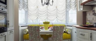
A bright kitchen in a classic style with a sofa and a corner set, the short side of which replaces the window sill
For a very small room, styles such as Scandinavian, minimalism and country will be relevant.
Which styles are not suitable:
- Neoclassical and classic - according to their canons, require a lot of space, this is due to massive furniture, rich textile trim, darker colors in the interior, which visually reduce the space.
- High-tech and loft will not be suitable due to the fact that the basis of this direction will be a lot of free space and daylight. In conditions of 9 square meters, this will be simply impossible.
The maximum that is possible in such an area is the use of some stylistic features of these interiors, for example, brickwork from a loft or glossy high-tech furniture
Now, let's look at the options that are suitable for such a room.
Features of minimalism and Scandinavian styles in the interior
- The less furniture, the better.
- Light colors of the interior (white, beige, milky, pastel shades of other colors) - in any case, they will visually increase the space.
- The absence or minimal presence of textiles on the windows - lambrequins, curtains, tulle is replaced by functional options for roller blinds and Roman blinds. In addition, it will be easier to breathe in the room due to the lack of dust that accumulates there.
- The furniture is light and weightless.
- A lot of transformable furniture belongs specifically to the Scandinavian style.
- There is a lot of light, if there is a lack of natural lighting, then it is wisely replaced with artificial lighting.
- The main principle is nothing superfluous with maximum functionality.
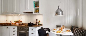
White color in furniture and decoration is a distinctive feature of the Scandinavian style
Minimalism is characterized by smooth facades, simple textiles and a minimum of decor.
Their main distinguishing feature from each other will be the simplicity of lines and shapes in the furniture. For the Scandinavian style, curves and complex furniture designs in furniture are acceptable, and for minimalism, clear geometry in furniture is important.
The benefits of country music
Country style is very similar to them, but it has its own striking characteristics:
- Wall decoration may not be smooth and monochromatic, but patterns and floral designs are allowed.
- Furniture can be massive, but should not be in excess.
- The presence of curtains and tulle on the windows.
- Many small decorative elements - pillows, blankets, figurines and so on.
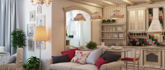
A kitchen in a city apartment, decorated in a country style, will give a relaxed atmosphere of country coziness
Natural materials are the hallmark of a rustic interior
Country style is very practical, you want to spend as much time as possible in it
In general, these styles work for us because they don't require extensive furnishings, don't collect a lot of dust, and are very affordable.
Choosing a color scheme
9 sq. meters - these are no longer Khrushchev buildings with their tiny usable space, but also not open-plan kitchens and living rooms, where square meters are not counted. Therefore, warm pastel colors are best suited for such a room, creating coziness inside and at the same time visually pushing the boundaries. This advice is especially relevant if the windows face north. In such cases, a light beige base can be safely crossed with red and orange, or added brown.
Conversely, a south-facing kitchen looks better in cool shades. Bold contrasts are always appropriate here, so you can often find bright spots in the design. An apron often plays the role of such a spot; curtains, textiles, and upholstery of a furniture group also stand out with an intense shade. The kitchen itself can be simply light or emphatically white.
Designer tips
Irina
founder of the interior studio, architect and interior designer. The main area of work is kitchen design
Ask a Question
When choosing a floor covering, keep in mind that its color should match the kitchen unit. For example, the apron and floor can be designed in a single stylistic key and thereby achieve standard color harmony. An alternative option is to match the tabletop or facade elements with the color of the floor.
If your soul persistently demands rich colors, then do not go against your inner desires, but rather work on how to correctly integrate them into a real project. Bright colors can always be offset by pastel shades next to them - and achieve an overall color balance in the perception of the room.
How to increase the space of the kitchen-living room 9 sq. meters
With such limited space, the first thing you need to do is decide how to increase the space. There are two possible solutions for this problem. The first is to obtain additional space from the balcony room, and the second is to use visual enlargement. As a rule, these two techniques are always used together.
On the attached balcony or loggia you can organize a comfortable relaxation area
By combining a kitchen-living room with a balcony, you can get a couple of square meters, which is enough to equip a kitchen and dining area there.
Organizing a work area on the balcony will require relocating communications, so usually a place for eating is set up here
The remains of the wall or the former window sill are converted into a bar counter, which will serve as both a dining and work surface. The kitchen set is placed in one line and in this case there should be only the most important things - a refrigerator, stove, sink, an additional work area and many wall cabinets. All cutting and cooking processes will take place on the bar counter. In this case, you will need to reduce the window size to a minimum.
Kitchen in neoclassical style with a bar counter in place of the window sill
The second option for using the resulting area is that it houses a work area, also known as an office. The former window sill on the balcony will serve to zone the space and also as a desk. In the former balcony, cabinets and shelves for books and things are well hidden. This option is common in apartments where this is the only room.
A chic, in our opinion, office on the balcony with panoramic glazing
Lighting
It is better to hang several lighting fixtures in the kitchen, rather than focusing only on the ceiling chandelier. If there is only a single chandelier, the light will create shadows and the room will visually narrow.
It is necessary to hang lamps in both the working and dining groups. A fashionable trend in kitchen interiors is the design of a central chandelier above the dining table, and not in the usual version - in the center of the ceiling.
Ways to visually expand space
- Choose the lightest shades for the walls. These colors include white, gray, milky, beige.
- Use mirror surfaces for kitchen units.
- Do not make complex structures on the ceiling.
- Divide the space into zones using furniture or changing colors.
- Place furniture closer to the corners of the room.
- The kitchen set should be placed either in one line or in the form of the letter “P”.
Don't get carried away with dark tones. Choose light and light colors of coatings that reflect natural light well
Don't shade the windows. If you can’t completely give up curtains, use translucent fabrics and curtain models that open the window opening as much as possible during the daytime
Current trends from the designer
Read this section carefully to stay up to date with all the latest design trends - then your kitchen has every chance of becoming truly fashionable and maintaining aesthetic relevance for years to come.
Built-in furniture up to the ceiling
If you have high-tech, Scandinavian minimalism or simply a pragmatic modern design in your kitchen, be sure to try this solution. It will allow you to place significantly more items on the shelves, and will also provide that very visual perfection for which, in fact, interiors are built.
Natural palette
For 2022, the recommended palette has, on the one hand, complex and deep saturated tones:
- blue-green;
- coffee;
- purple.
On the other hand, the trend will be dark gray, sunny yellow, scarlet, bright pink - that is, active and bright shades that create a great mood and are pleasing to the eye.
Delicate shades of pink and blue are also equally popular. The classic neutral palette also does not lose ground and is always in place for integration into the kitchen space. The main rule for successful implementation is a verified color balance, which we see most often in those cases when we go to nature and spy on its amazing organic matter.
Natural materials in finishing
This trend has been formed for a long time, but still remains relevant. Natural textures in the kitchen should be introduced thoughtfully: first choose a concept, then create a composition, correctly distributing the selected materials and “tasting” the play of textures. For example, a solid oak tabletop will go perfectly with the stone surface of the apron.
Natural materials also include decorative plaster. Classic Venetian, bark beetle, fur coat, lamb or any other type - any one is suitable.
Environmental friendliness and comfort
Give up everything unnecessary in favor of minimalism and simplicity: eco-friendly design involves choosing discreet natural textures that are easy to install, creating a cozy and natural environment in the kitchen.
You can appeal to environmental friendliness not only by using natural materials, but also by details: the presence of living plants in the kitchen is not only beautiful, but also useful, as they purify the air and make human breathing cleaner.
How to properly arrange furniture in a kitchen-living room of 9 square meters
When arranging furniture in an apartment, after installing the kitchen unit and the corresponding household appliances, the first thing to do is select a place for the sofa.
The size of the dining table and the number of chairs are selected depending on how many people live in the house
It fits perfectly under the balcony opening, thereby freeing up half the room for free movement. If there is no balcony, then the optimal place to place it would be near a window or under a window against a wall. This position will give us the opportunity to also put a coffee table.
The location of the sofa should contribute to a pleasant pastime
In such apartments, renovation begins with insulating the facades, because most rational arrangements will be irrelevant due to constant drafts.
To separate the kitchen from the living room, the best technique would be a bar counter. It takes up significantly less space than a dining table and would be a great addition to your kitchen worktop.
How to install a kitchen unit on an area of 9 square meters
There are several options for placing the headset. One of them is installation on a former balcony, described above; besides this, there are several other options. They all depend on the layout of the room, namely, it is square or rectangular.
For a square room, placement along one wall would be optimal. All cabinets should be as narrow and flat as possible.
Square kitchen with a linear set and a comfortable seating area
Another option for planning a square kitchen, in which corner models of both the set and the sofa are used
For a rectangular layout, a U-shaped zone is formed near a narrow wall, in which the passage between the sides will be at least 0.5 meters.
The work area in the shape of the letter “P” is the most convenient for cooking.
On a small heel next to it you can place a soft corner, although not as comfortable as a full-fledged sofa, but it can accommodate more people
The nuances of placing household appliances and appliances
Placing household appliances in a small area will be a serious problem. To solve this you need to use a few simple rules:
- Choose equipment that is not bulky; ideally, it should be built-in.
- Apply the triangle rule - the sink, refrigerator and stove should form a triangle, with the sink as the vertex.
- Install the refrigerator as close to the wall as possible and place additional cabinets and compartments above it.
For a modern kitchen interior with an area of 9 square meters, compact built-in appliances are best suited
Interior decoration
If the kitchen is not remodeled, then it is necessary to visually increase the space with the help of properly selected finishing materials. To do this, you need to focus on lighting the room.
Milky, white, pearl, light tones of blue and light green will make the interior of a kitchen of 9 square meters. m is more spacious and tidy.
