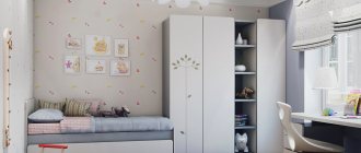
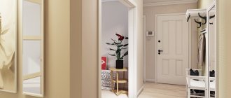
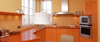
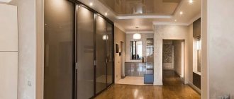
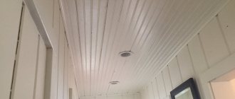
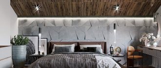
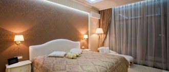
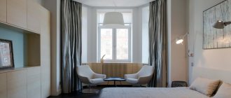
The passage room in Khrushchev has always been a headache for homeowners. Soviet architects tried to delimit the already small area of apartments, often to the detriment of functionality and ergonomics. They tried to isolate the room by all available means: cabinets, partitions, screens and curtains. But is the walk-through room as bad as it seems at first glance? Modern room design techniques can turn the disadvantages of such rooms into advantages. We tried to collect photos of the design of walk-through rooms to show how a seemingly unsuccessful layout became the main highlight of the interior.
Design Features
Passage rooms have a number of positive and negative features that affect their design. This is the key room in the apartment, which imposes a number of restrictions on its design. The first of them is through traffic lines connecting the entrances to other rooms. These conditional corridors must be free so as not to interfere with movement. It will not be possible to use their area when arranging furniture. Next come the doorways. They “cut” the horizontal line of the walls, which also reduces the usable space. Thus, the useful area of the passage room is significantly reduced. In spacious rooms, the loss of space for passages is insignificant compared to the total, but in small rooms you can lose almost half of the free space.
The walk-through room is often used as a living room, which is logical, since it is common and requires insulation less than other rooms. Modern trends in interior design gravitate towards bright open spaces and the removal of all possible partitions, and walk-through rooms are already ready for such modifications.
Small walk-through living room or study
If you often work at home, you need a free corner where you can place your computer and a comfortable chair. A small living room can replace a small office. Place a bookcase and a desk with shelves here, and you will have a personal workspace.
Redevelopment
Redevelopment in an apartment with a walk-through room is the most radical way to improve the space of a room. In Soviet times, they tried to isolate the living room by creating long, dark corridors in apartments. Modern interior design, on the contrary, suggests combining rooms, abandoning halls, delimiting the space into conditional functional zones. By getting rid of unnecessary walls, you can increase the usable area of the room.
A walk-through living room in a Khrushchev-era building is a small, narrow and dark room, so combining it with another room will make it lighter and more spacious, allowing you to organize the space more usefully. The kitchen-living room is a familiar, much-loved technique for expanding rooms. You can also increase the space by adding a loggia. In this case, you will get more options for arranging furniture, without looking at the availability of access to the balcony. Combining the kitchen and bedroom is a rare technique; they usually try to isolate this area, but light translucent partitions made of plexiglass or airy textiles are preferable for a balanced composition than blank walls. From an apartment with a walk-through room you can turn it into a spacious studio, where only the bathroom remains isolated.
Before developing a design project, you should familiarize yourself with photos of walk-through rooms to make the room comfortable and functional. Any redevelopment requires approval from the relevant authorities, and if the “extra” walls turn out to be load-bearing, then such improvements will have to be abandoned. However, you can achieve a harmonious space without demolishing walls.
Options to suit your style
A decorative partition is one of the ways of not only zoning, but also emphasizing the style of the interior:
- curtains with national patterns - Japanese;
- compositions made of wood - eco style and country;
- screens, thread fabrics - oriental;
- imitation brickwork - loft;
- thick curtain - classics;
- whatnot – minimalism;
- carved design - Arabic;
- bamboo product - Chinese;
- transparent walls - industrial.
We adhere to the general style in everything
Doors
When renovating walk-through rooms, owners and designers are faced with a large number of doorways located relative to each other in a wide variety of ways. Parallel through doors are one of the most successful locations. The passage line crosses the room, conditionally dividing it into two zones. A storage system behind sliding doors will fit well into a shallow “pocket”. And if you make the cabinet doors mirrored, the large piece of furniture will “dissolve” in space, visually increasing the area of the room. A similar technique can be used for diagonal openings. In this embodiment, the room is divided into a living room area and, for example, a dining room or office.
The adjacent arrangement of doors takes up only one corner of the room, and the rest of the space remains free, so problems with the arrangement of furniture usually do not arise. If there are two doors on one wall and a sufficient distance between them, it would be appropriate to arrange furniture and accessories symmetrically to the axis conventionally drawn between the openings. If the doors are too close, you can mask the distance between them with a mirror, the height of which should be level with the door frame.
Doors in the interior of a passage room should be as inconspicuous as possible. The effect is achieved by monochromatic painting of walls, frames and doors. Canvases with glass or mirror inserts will lighten the space. In the design of a walk-through room, it is better to focus on sliding doors. They take up less space.
Some useful tips:
- The first thing that is advisable to do is to change the doors to sliding ones, since swing structures not only eat up additional space. They do not allow placing pieces of furniture, since part of the space must be free for the doors to open conveniently. Sliding doors significantly save space. In addition, when open, they create the appearance of a unified space. If you need to retire in another room, you should simply close them.
- Doors, sliding or hinged, can be decorated to match walls or cabinet furniture. Visually, this looks very advantageous and is an excellent solution to the problem of expanding space, especially if you have not two, but three doors.
- The door can be an element of the body wall. It will be framed by cabinets on the sides and a mezzanine on top.
- Consider moving the doorway to gain space. But this is possible only after agreement with the regulatory authorities and if the opening is not located on the load-bearing wall of the building.
- Maintain symmetry when arranging your living room. If the doors are located diagonally, create symmetrical decor in different corners of the room. This will improve the appearance and make the space more cohesive. When placing doors along one wall, fill the space between them or in the corners with symmetrical decor.
- Consider whether you need all the doors. It is better to leave the door leading to the nursery or bedroom so as not to disturb the peace of family members, but the door to the hallway can easily be abandoned in favor of expanding the space. In some cases, designers advise abandoning the entrance area, making it part of the living room. Whether to make a door between the living room and the kitchen is at the discretion of the owners; odors will inevitably penetrate from the kitchen. A good option is a fully or partially glass door; it is not afraid of moisture and is easy to clean.
- If you have a small living room, when arranging it, give preference to light colors, both in decoration and when choosing furniture. This will visually expand the space and make the room more comfortable and elegant. You should also let more light into the room and make some surfaces from glass. This will lighten the atmosphere and make it more airy.
- Various glass decorative elements will add lightness and airiness to the room.
- Zoning is reasonable if the living room is designed to serve two functions, for example, to be a relaxation area and a study, or a family gathering place and a sleeping area. In other situations, zoning should not be abused.
- If zoning is inevitable, it can also be done wisely and made functional. For example, partitions can simultaneously serve as shelving, bookcases, and shelves for things.
- If the room is small, then transformable pieces of furniture will make it more functional. A smart solution is built-in wardrobes, various hidden structures.
Despite the fact that initially the option of a walk-through living room did not seem very advantageous, everything turned out to be not so hopeless. Any layout can be played to your advantage and make the most of the available space. Disadvantages can always be veiled, while creating a stylish and cozy design.
Zoning
The allocation of functional areas in the walk-through living room is tied primarily to the location of the doorways. Partitions are rarely used in such rooms, but if it is necessary to isolate a working or sleeping area for one of the family members, they will be appropriate. To prevent partitions from cluttering up an already small space, they should be as light as possible. Pass-through shelving to the ceiling will create a border without blocking natural light. A sliding screen made of frosted glass in Japanese or French style will hide the bedroom from prying eyes. The use of LEDs in the design will help create a natural lighting effect for the area left without a window.
Zoning with wall decoration, a low podium, and multi-level ceiling structures would be appropriate. Regarding the latter, it should be remembered that multi-level ceilings look good in spacious rooms; they are not suitable for small rooms.
Pros and cons of combining a living room and bedroom
Not many people can boast that they have a spacious home, in which there is a separate room for each family member and also a common area in which everyone can gather together. This leads to the fact that it has become fashionable to combine different rooms.
One such technique is to combine the bedroom and living room into one room.
Often, when these two zones are connected, you get one space that is much more comfortable than two separate ones.
The advantages of this combination include:
- Due to the fact that the combined room is more spacious than two separate ones, it is possible to create an advanced design.
- If children are growing up in a family, then it is better to leave them a separate room so that the consequences of “turbulent life activity” do not penetrate into the common area.
- You can spend time with greater comfort, since everything is always at hand.
- A suitable solution for someone who does not like loneliness and wants to always be surrounded by loved ones.
- With this combination, the living space is fully used.
A bedroom-living room in one space looks incredibly fashionable and stylish.
However, this combination also has disadvantages:
- This layout is not suitable for people with different temperature conditions, since what is good for one person is not suitable for another at all.
- For people who love privacy, such a combination will be uncomfortable.
- Such planning is not suitable for people who work from home, since it will not be possible to concentrate in such a room.
- It will also be difficult for people who have different daily routines or work schedules.
When combining, you need to remember that the room should be comfortable.
The recreation area should not be a walk-through area. The room should have a corner for your favorite activities (hobbies).
It is better to make the walls plain. Large patterns on curtains are also not welcome. Try to avoid placing bulky furniture on combined meters. It is better to decorate the bedroom - living room in a minimalist style.
Color design
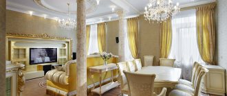
Walk-through rooms in Soviet-era apartments are not spacious or have an abundance of natural light, and a large number of doors makes the room even more cramped. These shortcomings can be smoothed out by using light shades in the design and simple techniques for visually expanding the space. The most successful combinations of white with pastel colors: pearl gray, pale pink, soft olive. A single color scheme for the walls and ceiling will blur the boundary between them and make the ceiling higher. Large patterns on walls and furniture should be avoided; they “eat up” space. It can be visually expanded with the help of reflective and glass surfaces, as well as mirrors. Framed photographs on the walls under glass, a glossy cabinet surface, and a well-placed mirror will add light and lightness to the room.
Modern layout through design
Fans of open planning, which allows them to maintain space and freedom in medium-sized rooms, use various decorative techniques to create an interior.
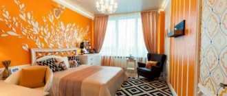
Wall decoration can visually separate rooms
The accent design combines the sleeping area and the living room area into a single composition that does not interfere with each other. For registration use:
- original wall cladding;
- textile products;
- texture and shades of floor coverings;
- a decorative baluster that continues the molding on the wall;
- stucco;
- relief image from plasterboard on the wall;
- combining materials with different textures.
The classic option for separating two zones
A border made from floor pots with indoor plants or a tall narrow aquarium, an arched or straight arch looks interesting. The use of bamboo or beaded curtains simply marks the boundaries, maintaining the unity of the style direction of the room.
The use of screens that move in both directions allows you to change the area for sleeping. In the evening it moves towards the living room area.
We separate the area for sleeping using curtains in the nursery
Different designs of walls, flooring and ceiling surfaces allow you to delimit space. For example, in the bedroom there is a tactilely pleasant carpet, in the living room there is laminate or carpet.
Decorate the walls of each zone with wallpaper of different tones, patterns or textures. The combination of contrasting shades, textures, and characteristic properties of modern materials makes it easy to achieve a harmonious result.
Zoning in a small room
For the living room it is better to use bright colors, for bedrooms - calm shades that do not irritate the eye.
An excellent design combination for zones is textiles. For example, the same upholstery of chairs and a soft headboard, matching shades of curtains and bedspreads, patterns on wallpaper and colors of window curtains.
Textiles serve as an excellent combination
Lighting
The lack of natural light forces the use of a large number of different lamps. A chandelier is traditionally used for general lighting, but this is not always appropriate for walk-through spaces. A large structure under a low ceiling will make the ceiling even lower, and the room will seem smaller. For walk-through living rooms, the best solution is spot lighting around the perimeter or a central group. Local light in the form of wall sconces is actively used. For each allocated zone it is necessary to provide independent lighting.
Flooring
The floor covering in the passage room should be resistant to wear. Linoleum, laminate, and ceramic tiles are suitable for these purposes. The laminate must be at least class 32, and for tiles it is advisable to install a heated floor. You will have to discard the carpet; it will not withstand intensive use. A small rug in the guest area will add coziness to the room, but it should not be on the lines of the aisles. Flooring is often used for zoning. It is quite possible to highlight the passage from the hall to the kitchen through the living room with ceramic tiles with end-to-end doors, and finish the rest of the room with matching laminate.
Zoning a bedroom with a loggia
If the bedroom has a loggia, this makes zoning much easier. You can place a study or relaxation area on it.
For example, a low table and a sofa are often placed on the loggia.
In this part they relax, drink coffee or read, enjoying the fresh air.
But you need to take care of insulation and heating. Otherwise, you won’t be able to use the space in winter.
Furniture
Arranging furniture in a walk-through living room often causes difficulties. An island arrangement of interior items is only possible in a spacious room. In a small room, furniture is placed along the walls to free up passages. The central place in the guest area is traditionally occupied by a sofa, but the length of the walls “cut” by doorways does not always allow the use of such a bulky piece of furniture. It can be replaced with an elegant ottoman and a pair of light armchairs in another part of the room. The room will look spacious, and if guests arrive, the furniture can be easily moved. Tables and hanging shelves made of glass look airy and do not weigh down the space. If both doors are located on the same wall, furniture and accessories are placed symmetrically to the openings. This interior looks balanced and harmonious.
Photo of a walk-through living room with a dining room
If the adjacent living room is located between the kitchen or bedroom, then it is better to organize a mini-dining room in it. Even in an interior with several doors, a table and chairs will do, and a separate place for eating is a great opportunity to spend time together. Plus, with a dining room in the living room, your guests can sit comfortably in the room while you prepare dinner and set the table.
Decor
An interior without decor and accessories looks faceless and unfinished. And although there should be a minimum of them in the walk-through living room, you should not completely abandon the decor. The main thing is not to place accessories along the aisles so as not to interfere with movement. The laconic silhouettes of Roman and roller blinds, fashionable this season, would be appropriate for window decoration. Light translucent curtains to match the ceiling and walls will look elegant and stylish. When decorating, you should avoid large patterns and give preference to small floral patterns or plain textiles.
The interior of the passage room should be laconic and stylish. Preference should be given to light colors, light translucent textiles and glass furniture to create a bright and harmonious space.

