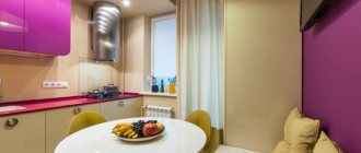
Hello! I continue the series of articles that were inspired by watching advertisements for the sale of real estate on Avito when I was choosing a new apartment for us. In them, I analyze typical mistakes in decoration that I encountered in literally every second apartment. I’ve already written about chandeliers and carpets, and now it’s time to talk about wallpaper, namely about combining different wallpapers in one room. And it looks like today there will be a mega post, because there is not just a lot of information, but a lot.
The art of combination
Combining patterned and plain wallpaper is a fresh, but no longer innovative, technique. Like all good things, it quickly caught on and became very popular.
The finishing materials market is expanding daily. A huge number of combinations makes it possible to realize the wildest design dreams.
If you are in doubt about how to combine wallpaper, listen to the advice of experts:
- Contrasting fabrics must be of the same thickness. Otherwise, the joints will stand out.
- The lower ones should be a tone darker than the light ones.
- It is more rational to place patterns and ornaments in the top row.
- It is convenient to create a horizontal border using a gypsum border (it is light in weight, so it is easily held in place with ordinary glue).
By skillfully combining light and dark, embossed and smooth, plain and colored, you can achieve a fantastic result.
But when deciding how to combine patterned wallpaper and plain wallpaper, you must not overdo it with a riot of colors. There is only one step from a truly creative solution to bad taste.
Spectrum method
Manufacturers often combine into collections species that have similarities in color or texture. Branded monochrome options are available in different colors and are marked with certain numbers or letters according to shades. Moreover, they are sometimes completed using the spectrum method.
That is, in the collection you can see both a monochrome canvas and a spectral one with a smooth transition of the same shade - from dark to the lightest possible.
Options for “spectral” gluing:
- one wall will be spectral, and the rest monochrome;
- all walls are spectral, and one is monochromatic;
- monochrome and spectral canvases alternate: chaotically or at certain intervals.
The spectral play of tones from dark to light is arranged clockwise. The peculiarity of such an interior is that it has a calming effect and is pleasant on an intuitive level. This is exactly how sunrise comes: dark, then lighter - until full dawn.
Consideration criteria when choosing wallpaper
Color selection:
- If desired, it is possible to combine wallpaper in cold and warm colors to give the interior a bright accent.
- Any modern collection of wallpaper products includes a base and a component.
- The basis is always a monochromatic color palette.
- But the component to it is a drawing, complex or simple geometry.
Balance: balance colors
This technique involves a combination of two canvases: patterned and monochrome.
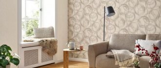
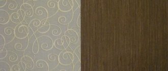
An option in which the wallpaper on one wall is with a pattern, and the others are plain, is harmonized by the balance of colors. That is, the monochrome look duplicates the color of the pattern. This rule is often used by manufacturers. They, again, combine suitable models into collections.
Therefore, renovation often becomes an exciting activity! It turns into a design masterclass for the home. The lack of professional skills is easily compensated by a sense of proportion and tact. When combining patterned and plain wallpaper, you must strive for the most harmonious solutions.
The smooth flow of shades of color from one wall to another is perceived as a treat for the eyes.
Is it possible to combine wallpaper from different manufacturers?
This is acceptable if the wallpaper is created on the same basis. For example, non-woven, vinyl, acrylic. If the production does not produce rolls that can be arranged according to tones, or the pattern does not suit, you can safely look for options from other manufacturers.
Accent wall
However, not everyone likes the smooth flow of shades. Young people love contrast. For a modern interior, the accent wall method is relevant. It can be as bright as possible and sharply contrasting with others.
As a rule, the one next to which the seating area is located is chosen as an accent wall. Essentially, it serves as a way of zoning space. Since distant Soviet times, it has been customary to decorate one wall with a large carpet. It served as a symbol of wealth and prosperity.
These prejudices are a thing of the past, but the design technique of emphasizing color remains. Popular photo panels are the best example of how wallpaper with patterns and plain colors are combined.
The panel may depict:
- fantastic flowers;
- abstract ornament;
- domestic or wild animals;
- a high-tech haphazard accumulation of luminous stripes or balls.
The accent wall method leaves room for further imagination. It can be changed endlessly. Perhaps in six months the owners will want to see not wallpaper with a pattern, but a three-dimensional composition. For example, you can combine wallpaper with 3D gypsum panels.
In any case, the dominant colors on this wall should find some tonal support in the interior. For example, a thoughtful combination of wallpaper with heavy floor vases in color will unify the palette and make the interior complete.
Interior classics: stripes
Striped designs never go out of style.
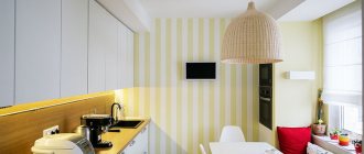
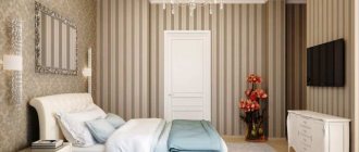
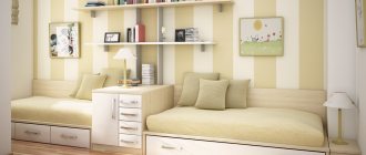
If you try to combine them in a composition with monochromatic ones, the picture will turn out very elegant. In this case, the stripes themselves can be located both vertically and horizontally. Vertical stripes on two or one wall visually raise the ceiling. This is an ancient technique for decorating small rooms. Horizontal stripes create the illusion of volumetric space. The owners of the apartment will choose for themselves which paintings there will be more - monochrome or striped. But the project must first be correlated with the proportions of the home.
Combination of ornaments
So, if the combination of multi-colored and plain types fits into the “color combination” scheme, then the “pattern + pattern” combination requires a connecting element: a horizontal molding at the junction or a ceiling plinth. Otherwise, everything will merge into unsystematic chaos. However, some people like chaos as a fundamental rejection of schemes and rules in the interior! For example, students. But there are still fewer of them.
Floral motifs are a favorite theme of manufacturers of finishing materials. The room looks amazing, where the upper part is decorated with small patterns with a pattern and a la Provence, and the lower part is decorated with a “wood” texture with a horizontal border designation.
The colored top becomes more expressive. It takes on the effect of a picture in a frame. The similarity can be enhanced by installing ceiling plinths to match the lower part. This way it is possible to achieve a combination of the most incongruous ornaments.
Features of the design of a small room
- In a small apartment, for example in Khrushchev, it is preferable to choose light shades when combining.
- The vertical or horizontal direction of the pattern or lines will help adjust the space.
- Simple drawings and patterns can also visually enlarge a room. You can see what drawings can visually expand the space here.
- Mirror surfaces can significantly help expand boundaries.
- Pairs of tall mirrors framed will completely change the appearance of the interior.
In the photo, one of the walls is decorated with wallpaper with horizontal stripes, which visually increases the width of the children's room.
In the photo, one of the walls is decorated with wallpaper with an ornament; this technique will visually make a long room of a small area more proportional.
Timeless patchwork: funny and stylish
Who among us did not love to wrap ourselves in a multi-colored quilt as a child? The patchwork technique is centuries old and is still popular. It is very easy to work in it. Stripes of different colors are glued to the wall. They do not match either in style or texture. But that’s the beauty of patchwork: a carnival of colors in one project.
You can balance the defiantly bright mosaic with a plain top of the wall. Or down? There are no strict rules on this matter. Only the owner can decide which part he will cover with rags. It will turn out to be warm and cozy at home.
Volumetric texture: tribute to traditions
You can play up the interior not only with color combinations, but also with textures. You can make rectangular niches in a wall covered with smooth wallpaper and fill them with canvas with an expressive relief surface. The resemblance to a tapestry panel will be as complete as possible. This interior tends to resemble a palace style. Especially if the edges of the niche are decorated with varnished wooden frames.
But do not forget that eclecticism is welcomed in modern design.
Classic motifs can be diversified if the same niches are filled with fragments of fashionable, expensive wallpaper:
- with a mirror or metallic effect;
- with velvet texture;
- with imitation quilted leather panel.
On the market there are exclusive collectible models with rhinestones, sequins and other decor. It would be impermissibly lordly and wasteful to decorate the entire wall in this style. It would look tacky and tasteless. But on monochrome walls such glamorous islands will look luxurious! All that remains is to frame them with matching moldings or arrange LED lighting around the perimeter.
Finally, it is allowed to combine wallpaper with other finishing materials. This technique is often used to decorate a hallway.
For example, it is fashionable to decorate not the entire corridor, but only the corners or entrance area with decorative bricks or natural stone. This “hint of a cave” looks very original.
Find the focal point
Another option for combining plain and textured types is to highlight not the entire wall, but one iconic zone. For example, background wallpaper is often used in the location of a fireplace or television equipment. They may differ from the main ones in color shade or ornament. The focal point is effectively highlighted by wallpaper with imitation brick, wood or suede.
In the most daring interior design, the background strip can extend to the ceiling and symmetrically descend from the opposite side. In this case, the room is practically divided into two parts by a simple visual technique.
In the same way, attention is focused on the location of the bed in the bedroom. But here, of course, it is appropriate to use not bricks, but a more glamorous option. This could be a canvas with floating clouds or with roses traditional for the bedroom.
Inserts
As a rule, this method serves only as a decorative element.
Pieces of wallpaper of various patterns and textures of any size are glued onto the base coating. There are no restrictions on quantity or shape - it all depends on the desired look.
The first step is to choose a place for the decorative insert. Shelves, mirrors and tall cabinets will attract attention, so it is better to choose a surface that is not cluttered with furniture.
Inserts from fragments will look like full-fledged paintings if you frame each one with molding. This option is suitable for living rooms in a classic style.
To give the interior a neoclassical taste, ornaments of complex geometric shapes are suitable. Rectangular and square ones will bring the spirit of Baroque.
Despite their simplicity of execution, wallpaper inserts can also serve as a means of zoning. Placing colored fragments within the frame can indicate a recreation or play area for children.
In this case, any number of wallpaper fragments of different sizes and colors are used. The only rule in execution is the correspondence of the textures of the “flaps”.
