Blue color looks great in any room. This shade is reminiscent of a clear sky and a serene sea, so blue curtains are liked by almost all lovers of freedom and lightness, even though blue is a cold color.
When choosing textiles for rooms, the shade of blue is of great importance. For well-lit rooms, more saturated colors (azure, aqua) are preferable. It is advisable to decorate the windows of darkened rooms with materials of light, blurry blue tones (heavenly, pale cornflower blue).
Choosing a shade of curtains
The range of blue colors includes more than 100 shades. The human eye perceives the entire palette very clearly. Therefore, it is important to choose the right shade of curtains to create a certain atmosphere.
For example, the pure, delicate blue color of curtains, similar to the clear summer sky, creates comfort and puts you in a positive mood. And dark, rich sea tones encourage creativity and activate brain activity.
The marine range with an admixture of turquoise notes is not suitable for everyone. These are extremely saturated shades that can be irritating. This color is best used not in its pure form, but in combination with more muted colors of textiles and accessories.
Aquamarine has the ability to attract the eye. Due to its moderate brightness, it is often used in interior decoration. Aquamarine curtains can become the central element of the decor. And small inclusions of the same shade in the form of sofa pillows or photo frames will create the necessary balance and harmony.
Azure, or the color of the sky, is ideal for window decoration. It is familiar to the human eye, causes pleasant sensations and associations with nature. Azure curtains look noble and unobtrusive.
Gray-blue curtains create a feeling of purity, calm, and tranquility. The intensity of the shade from light to deep dark allows you to choose curtains for almost any interior.
Peaceful calm
It’s impossible to tear yourself away from the color blue; it fascinates, awakens the imagination, and invigorates creativity. It reflects the heavens, most often since past centuries it has been used in the interiors of aristocrats, everyone had a “blue room”.
This emphasized nobility and excellent taste. It combines the sophistication of the soul in a variety of colors.
Psychologists recommend blue tones to restore mental balance. Blue is a combination of blue and white, the addition of other shades creates stunning transitions from light blue to dark blue.
These colors will help you relax, put your thoughts in order, their contemplation helps self-control and restoration of the body.
Azure color is often used in conference rooms and office workrooms. It sets you up for a fruitful and calm business tone.
The properties of the blue tint have been known for a long time:
- decreased appetite and blood pressure;
- removes headaches and negative thoughts;
- relieves nervousness;
- relieves depression;
- passive color, tunes to stability and constancy;
- sets you up for a sweet dream.
Blue curtains in the interior
There are practically no restrictions for the sky blue color scheme. Sky-colored curtains fit harmoniously into both classic styles and modern design trends. Delicate shades visually expand the space and create coziness. With the help of blue color, you can correctly place accents, highlighting or, conversely, making the area of the window opening muted.
For a high-tech room, canvases in cool colors are suitable. The absence of “flashy” areas will emphasize the rigor and minimalism that characterizes this direction.
Country style, often used to decorate country houses or kitchens in a city apartment, allows for checkered fabrics or unobtrusive patterns on a blue background. Beige and blue curtains will also look interesting.
For a minimalist design, a gray-blue palette is suitable. Calm, muted canvases will look organic against the background of other interior items. The blue color will highlight the classic direction and add freshness to the room.
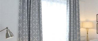
Features of using curtains of the gray spectrum and decor of living rooms
Gray curtains bring notes of restraint and tranquility to the atmosphere of the home. When designing window areas in gray tones, focus on the following indicators:
- Fabric texture.
- Color shade.
- The degree of illumination of the room.
- Interior style.
It doesn’t matter where you are going to use gray curtains: in the interior of the living room, kitchen, bedroom - you need to know the general rules for adapting them to the environment.
It is easiest to design panoramic and south-facing windows, since any colors of the gray spectrum can be used here.
There are restrictions regarding dark curtains. Dark gray shades are not used in small spaces. They require adequate lighting and a competent selection of accessories. Most often, they need a companion color in the interior, capable of diluting thickened paints.
If you have already decided on gray curtains in the bedroom or other room, then make sure that they are made of expensive fabrics. Otherwise, you can forget about the stylishness of the interior.
For luxurious baroque and magnificent classics, you need to purchase satin, silk, tapestry curtains or curtains made of embossed fabrics. Scandinavian interiors, as well as Provence and country, prefer curtains made of linen, cambric, and mesh.
Curtains can be plain, multi-layered, decorated with patterns, shiny, or fleecy. Gray suits everything!
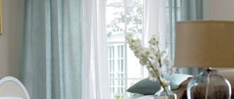
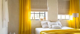
Blue curtains for the bedroom
In the recreation area, it is preferable to use light tones of blue. This will help create conditions for relaxation and stress relief. Canvases that combine marine shades with white or light gray look good.
Double curtains are often used in the bedroom. A thick cornflower blue curtain goes in a duet with a light white or light yellow veil or organza. This option allows you to let a lot of light into the room during the day, and isolate yourself from the outside world at night.
Pillows, bedside tables, paintings of the same colors will add completeness to the design. A couple of bright elements, and the bedroom interior is ready.
Unexpected touches
Red curtains under blue wallpaper look unexpected and very original. Here it is important to know when to stop and not to overdo it with other bright accents. Curtains can be chosen from a plain red fabric or with a scarlet pattern on a calmer background. In the second case, it is recommended to add a few fiery touches to other decorative items. Red shades can bring liveliness and energy to a cold space and make the room more active. See options for bright curtains.
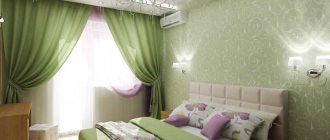
Curtains in green colors in tandem with light blue walls also look interesting. Both are of natural origin and combine harmoniously. For light wallpaper, it is advisable to choose pistachio or delicate light green tones. For darker walls, it is better to opt for olive or grass fabric.
Yellow or orange curtains in company with sky surfaces will create a summer mood. They will remind you of the warm sea and golden sand or the deep sky and a spacious wheat field. This combination is always welcomed by psychologists.
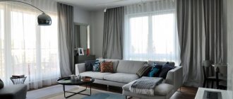
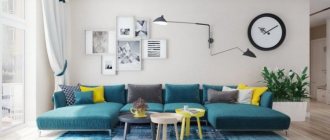
Blue curtains in the living room
The living room is a place where, in addition to all family members, relatives and guests often gather. Therefore, the design of the room should be both versatile and interesting. This is the place where you can allow unusual styles and combinations. Window textiles can be made in the form of complex structures with many folds and tiebacks.
Usually in the living room, blue curtains made of thick opaque fabric go in a duet with a light, weightless curtain. Although for rooms where there is a lot of sunny color during the day, the window opening can be decorated with light translucent blue curtains in the form of a multi-level cascade.
Classic options
There is an established tradition of combining bluish shades of walls and the following color of curtains:
- white;
- beige;
- grey.
White curtains enhance the feeling of freshness and cleanliness in the room. This combination is considered airy and romantic. It's a win-win. In addition, a neutral blue and white background will allow you to dilute the interior with other, brighter details. White curtains may not be made of a single-color, laconic fabric, but rather diluted with drawings. Blue flowers on a snowy background echo the identical shade of the walls very beautifully. It is also possible to have cream, milky, beige or turquoise patterns on the curtains.
Beige curtains perfectly complement the bluish wallpaper. This tandem gives peace and confidence to the inhabitants. It can also be diluted with a few bright notes.
It will also be interesting: How to choose and fit blue tulle into the interior?
Gray with blue looks somewhat unusual. This combination is only suitable for well-lit rooms, in which the sun's rays can soften some of the coldness of the interior. Gray and blue help to concentrate attention.
Blue curtains in the kitchen
The dining and kitchen areas are one of the most favorable places in your home for decorating with blue canvases. A wide range of shades allows you to achieve the desired effect. Curtains will help to visually expand the space, zone areas for eating and preparing food, and emphasize style.
In the kitchen, it is preferable to use simple styles so as not to overload the room.
- Washing curtains correctly: recommendations for different fabrics
- How to choose a women's handbag
Selecting stylish pistachio curtains for the kitchen