/Design/Small kitchen/
Kitchen area 5 sq. meters is often found in Khrushchev-era buildings, standard panel houses and old buildings. It is quite difficult to fit a work and dining area into such a tiny space, but it is quite possible. From this material you will learn how much depends on what furniture is selected and how it is arranged, what color the walls are painted, how the light is arranged and what curtains hang on the windows. And here you can get a lot of super ideas for design, renovation, planning and redevelopment from a selection of 50 photos of real interiors.
Correct layout option
The main task of the designer is to fit in the working and dining areas in the kitchen, if possible. This is done in several ways.
The most popular are 2 of them:
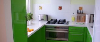
- arrangement of furniture in the letter L;
- linear layout.
In the first case, the rule of the so-called working triangle is involved. Here one of the corners of the kitchen and 2 walls are used. Near them you can conveniently place a sink, stove and refrigerator. However, the kitchen set will have to be replaced with a bar counter or a small table designed for 2 people.
Linear (straight) layout helps save some usable space. However, it is not as comfortable as the L-shaped one. The hostess will have to constantly move along the line.
An undoubted advantage of placing furniture along one line is the ability to install a dining table (for 3-4 people) in the kitchen.
Sometimes it happens that the room is used exclusively for cooking, and the dining area is moved outside of it.
In such cases, the kitchen layout is U-shaped or double-row:
- If you arrange furniture in the shape of the letter U, then all the necessary items will be at hand. But this layout looks good in a square kitchen.
- Furniture in 2 rows is an ideal option for arranging a narrow room. On one side there is a stove, a sink, a table for cooking, and a dishwasher. The other is designed for the refrigerator, oven and microwave.
Expert opinion
Olga Kovalenko
Since 2010 I have been engaged in interior design and architectural design.
In both cases, the distance between pieces of furniture should be at least 90 cm.
Kitchen finishing 5 sq. m
Walls, ceilings and floors are decorated in several ways. The main thing is that they combine harmoniously with each other.
A variety of materials can be used in the process:
- Vinyl wallpaper and decorative plaster. For kitchen renovation 5 sq. It’s better to choose light shades. This is a good idea for an interior in classic, art deco, Provence and country styles.
- Ceramic tile. Not suitable for finishing the entire kitchen, as it visually reduces the space. Typically used for work area equipment.
- Decorative concrete. Ideal for interiors in high-tech and minimalist style. The surface can be painted in any color you like (preferably light). Another option is to leave it without a decorative coating. The result will be industrial design.
- Water-based and acrylic paint. It is practical and comes in a variety of colors. Suitable for almost all interiors, regardless of the size of the kitchen.
With the help of finishing materials you can not only create a certain style, but also visually change the area of the room.
A number of design techniques will help to increase it:
- Floor tiles laid diagonally will “pull apart” the walls. The same goes for laminate flooring. An alternative is herringbone styling.
- Wallpaper with a diamond pattern or vertical stripes will “raise” the ceiling in low kitchens. However, you should be careful here. A large number of such elements narrows the room. A good option is plain wallpaper without a print. A large and colorful pattern can be placed on only one wall.
- A perspective image, for example, a street going into the distance or a road in the forest, will visually make the kitchen larger.
An interesting design solution is to decorate the work area with brick or glass tiles. These materials make the room more airy and light.
Redevelopment and reconstruction
Even if 5 square meters of kitchen space is enough for you, consider remodeling. This is an increase in space by moving doors, eliminating mezzanines, combining the kitchen with a loggia, a nearby room or storage room. Have you long dreamed of moving a sink, gas water heater or heating radiator? Such changes are called reorganization.
These modern solutions will help:
- get a lot more space;
- make movement around the kitchen more convenient;
- organize a spacious dining room and cooking area;
- place all the necessary devices and gadgets in the kitchen.
Tip: first, find the technical passport of the apartment and transfer its drawing to the online planner. Perhaps it’s worth taking down the dimensions of the rooms again, because a slight error will later come out sideways.
Choosing a color palette
When choosing a shade, it is important to remember the color combination.
Design recommendations:
- Warm colors create a dynamic interior. It is better to use those that are in the same range.
- Cool tones are peace, serenity, calm and lightness.
- Neutral and bright colors are used to highlight individual parts of the kitchen: facade, floor, parts of walls or decorative elements.
It is noteworthy that each shade has exceptional properties and characteristics. It depends on them how comfortable your stay in the kitchen will be.
- Green. Helps cope with depression, calms, gives a feeling of security, and improves mood. This color has a good effect on the process of food digestion.
- Yellow. Ideal for creative people. According to designers, it is better to dilute it with orange, blue, white or wenge.
- Red. Increases appetite, increases activity and excites. However, it absorbs light, irritates and sometimes repels.
- Blue. More suitable for those kitchens whose windows face south. Not used alone, as it suppresses and depresses, lowers pulse and appetite. Pairs with orange, coral and yellow.
- Blue refreshes the interior and calms. It also helps to organize yourself and normalize your emotional state.
- Violet gives a feeling of mysticism, reduces performance and provokes the development of a feeling of fatigue. In order to avoid such an influence, it is diluted with gold, olive or yellow.
- Orange. It evokes only good emotions, gives a boost of energy, and improves appetite. However, it significantly narrows the space.
- Brown and its derivatives, for example, beige, are considered universal and are suitable for almost all styles and interiors.
- White also helps to calm and relax. However, such a kitchen requires bright accents.
Very often the color black is used in the interior. Caution must be exercised here as it is depressing, depressing and depressing. It is better to dilute it with other shades.
Horizontal stripes of orange, yellow or scarlet visually expand a narrow room. And vertical olive or pistachio shades raise the ceilings.
In the arrangement of a small kitchen of 5 sq. It is advisable to use natural tones. You can, of course, choose bright (even acidic) colors. However, you need to show a sense of proportion and not forget about their proper combination.
Tricks for visually increasing space
Designers have dozens of projects that help make a small kitchen seem larger. Some of them relate to color design. Others use furniture and decorative elements.
- A small kitchen can be combined with an adjacent room, for example, a living room or hallway. To do this, they are covered with the same wallpaper or painted in the same colors. The rooms remain separate. However, visually it seems that this is a single space.
- Many different drawings and images tire the eyes and create a cluttering effect. If you can’t do without them, then it’s better to let them be pale or in the same color scheme as the rest of the interior.
- When decorating, it is not recommended to use more than three shades. Simple design and a minimum of contrasting details make the room more spacious.
- It is also better to choose light furniture. Only in this case it will not seem bulky and too massive. The ideal option is a set in the same color as the walls.
- Don't try to install more furniture. Items must be spacious and functional. Small details create a cluttered effect and make the kitchen appear smaller than it is.
- Transparent furniture, such as a glass table or bar counter, as well as plastic chairs, will help increase the space. They look lighter than stools made of wood or metal.
- You can save usable space by installing a round or folding dining table.
- It's good if one of the items is higher than the rest. It accents the look and raises the ceiling.
- As for textiles, they must be used with caution. For example, curtains should frame the window and not completely cover it. Do not use printed images. It is better to replace them with a material with a textured or woven pattern.
- An alternative to curtains is blinds or Roman blinds in pastel colors. They will distract the eye from the size of the room, and also make the light soft and diffused.
- It is recommended to use fewer different materials and textures. Simplicity expands space.
- Doors are removed or replaced with glass (sliding options).
Expert opinion
Olga Kovalenko
Since 2010 I have been engaged in interior design and architectural design.
A corner table will help save space in a small kitchen. Under it there is often a place to store useful little things. To do this, cover it with a long tablecloth.
Furniture
In a small kitchen, it is important to find a rational use for every centimeter. The window sill is often used as a table, work surface, raised to its level or removed altogether.
You can place shelves on the slopes, and if you have a sink near the window, then rails for towels. This will complicate the repair somewhat, but will give positive results. Open glass or transparent plastic shelves will not burden the interior.
Also useful:
- narrow drawers with baskets for bottles of oil, vinegar, sauces;
- cabinets with large roll-out compartments;
- vertical shelves for pans, lids and cutting boards;
- retractable platforms - countertops or cutting boards;
- roll-out drawers instead of furniture plinths;
- boxes under the windowsill;
- cutting boards for the sink;
- corner cabinets;
- holes in the table top that can be closed with lids - for spices, bread, and waste from the table getting into the trash can without unnecessary movements;
- storage areas in seats - poufs or sofas.
Modern sets with radius cabinets will give the kitchen a streamlined shape and make it less dangerous without sharp corners. The smooth shapes of such furniture will complement similar tables and chairs.
Table
A round table shape is the best choice for a small kitchen. If a solid model does not fit in a corner, window or wall, consider a semi-circular or semi-oval table.
Modern design is rich in all kinds of transformers. Among them is a table that, when folded, hides in a niche or closed shelving with a folding tabletop. Retractable tables on wheels will literally move out of the suite.
Book tables, fashionable in the 70s and 80s, have regained popularity. Their free interior space can accommodate folding chairs.
Chairs
Ideally, they should be in harmony with the table, and even better, slide under it, taking up a minimum of space. The best choice is reclining, retractable, folding chairs that can be hidden in a niche or vertical drawer. They will compete with a corner sofa with storage drawers.
Successful transformation of a 5-meter kitchen
How comfortable a room will be depends on many factors. One of them is arranging the necessary items, for example, furniture and household appliances. These include a refrigerator, stove, oven, sink, microwave, cabinets, and table.
Many people also install a washing machine in the kitchen. With this set of elements, a maximum of 2 people can be in the room. Therefore, you should remove those things that you can do without. A refrigerator can be placed, for example, in the living room, and a washing machine in the bathroom.
It is important to pay attention to the dimensions of equipment and furniture. A good option is long, but narrow hanging cabinets and cabinets.
There are other ways to transform small rooms:
- replace the window sill with a countertop or even a sink;
- put indoor flowers on shelves;
- make a redevelopment, demolish some of the walls.
You can also install one or a couple of small windows in the next room. They are usually decorated with colored glass and decorative elements such as candlesticks and photo frames.
Photo of interior design of a small kitchen.Refrigerator in a small kitchen
In the design of a small kitchen there are several options for placing a refrigerator. Most often this is the corner farthest from the entrance, formed by a wall with and without a window.
There are other examples:
- At the entrance near the door. If the layout is successful, there may also be a corner or niche there. If space allows, a microwave and cabinets are also placed here.
- Remodel by combining the kitchen with the living room. At the same time, part of the wall is left for the refrigerator.
- Under a countertop, window sill or in a closet. This option is suitable for products with a height of no more than 85 cm. They are either free-standing or built-in. If possible, install the freezer in the same way.
- Into an artificially created niche. Usually it is hollowed out between the kitchen and the next room. Drywall is used for decoration.
- A convenient option is to install a refrigerator in a pantry or hallway. In the second case, it is disguised as a closet.
- If the kitchen has access to a loggia or balcony, you can put household appliances there. It is important that these rooms are well insulated. Many designers combine all of the listed rooms into a single space. Then the refrigerator will always be in direct access.
It is worth remembering that such equipment does not tolerate proximity to heating devices. Therefore, it cannot be placed next to the oven and stove. Minimum distance 30 cm.
Lighting for a small kitchen
Small lamps installed under wall cabinets and shelves or along the perimeter of the ceiling are suitable for the working kitchen area. It would be better if they were rotating. In this case, the housewife will be able to direct the light where she needs it.
Another convenient option is LED strips, also installed under the cabinets. However, it is worth remembering that this is additional lighting that has nothing to do with the main one.
Expert opinion
Olga Kovalenko
Since 2010 I have been engaged in interior design and architectural design.
For the dining area, a medium-sized chandelier located above the table is suitable. You can install several products of different lengths. This will create an unusual and at the same time cozy atmosphere.
To equip lighting in a small kitchen, several types of lamps are used:
- ordinary incandescent lamps;
- luminescent;
- LED light sources.
The last 2 products have a long service life and significantly save energy.
Style, color and materials
Each style direction involves the use of a specific color scheme and materials. And here you may find yourself faced with a difficult choice between purity of style, durability, convenience and cost of your kitchen.
Designers unanimously claim that a large number of objects and decor on the work surface visually reduces the interior. And from this point of view, the best style for our kitchen will be minimalism. On the other hand, it will be tiresome to take something out of the drawer several times a day and hide it back - you know, so as not to burden the interior. After all, it is much easier to use roof rails, even if they contradict the style.
By analogy, for small rooms we recommend furniture with straight fronts without handles, which can turn out to be very inconvenient and impractical after many years of habits. Such facades are easier to clean, but they also get dirty faster.
Often kitchens in a modern style involve the use of natural materials. For example, the Scandinavian style that suits our kitchen is white walls and facades, maximum light and wooden elements. But wood is a rather capricious material that has its own requirements for humidity.
In our opinion, the best solution for a kitchen in a Khrushchev-era building would be a compromise. Choose materials that are resistant to moisture, high temperatures, mechanical damage, and are easy to clean and that match your ideas of beauty and comfort.
No matter how your kitchen is decorated - in a modern or classic style, the following will help increase the space:
- light color scheme of the walls - shades of white, blue, green, and any other colors;
- powerful multi-level lighting;
- open shallow shelves, glass or glazed facades;
- glossy, mirror surfaces or inserts;
- the advantage of light colors of furniture over bright or dark ones;
- diagonal laying of flooring;
- 3D wallpaper on the kitchen apron or near the dining area.
Small kitchen design photos
Small kitchen design can be stylish and functional. This is not difficult to achieve. It is enough to pay due attention to the color design and arrangement of furniture and household appliances.
interior of the apartment, interior design.
Even a small kitchen with an area of no more than 5 square meters. m can be convenient. Using a number of design techniques, it can be visually made airy and spacious.
A competent combination of shades, the use of the “right” textiles and finishing materials, oversized equipment - all this makes it possible to get a comfortable room in which the necessary things will be at hand.
What to do with a gas water heater?
This standard attribute in Khrushchev, and in other houses, takes up almost 1 square meter of precious space.
Here's what you can do with a gas water heater:
- give up gas in favor of electrics;
- move to the bathroom;
- hide with a furniture facade (with an indentation of at least 10 cm);
- change the design of the front panel.
You already know that in the case of moving a column, permission is required, and this is perhaps the only disadvantage of such a step.

