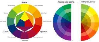
Anyone who plans to engage in interior design should know what the color wheel is. It's about representing all the colors and shades in a circular pattern. Its peculiarity is that different saturation corresponds to different degrees of distance from the central point. Colors in the interior are combined according to this diagram.
All tables compiled to simplify the combination of shades are a special case. Using a circle you can create a great many of them.
It’s not easy to understand this, but if you succeed, you will come to a different understanding of design - this applies not only to the interior
Itten circle in the interior: what is it
Itten's color wheel is a cheat sheet for choosing shades. This is a spectrum of tones that form various combinations with each other. With the help of such an invention, you will quickly and accurately determine successful combinations for the interior. You can weave into your design even such unusual shades as marsala - the color of tart red wine, which has become a fashion trend and a favorite of experimenters.
The spectrum is based on the basic colors: red, yellow, blue. The remaining shades are formed as a result of their combination. The result is a variety of tones that differ from each other in brightness and contrast.
It is difficult to determine successful combinations of shades by eye. It is even more difficult to correctly combine warm and cold tones in the decor. With the help of a circle you will learn how unusual harmonious color ensembles can be created. An example is the use of lavender in tandem with other tones.
Variant of Itten's color wheel
COLOURlovers
COLOURlovers offers tools for creating color palettes and patterns, but it is also a huge online community for design lovers around the world. If you're struggling to find the perfect palette and you're looking for other color lovers, this is the place for you. Explore existing color schemes or design your own in the tools section. You can even order your own creations from their store.
How to use the Itten circle in the interior
There are several schemes for working with a spectral cheat sheet. Each is based on a combination of different types of shades. There are ten combinations in the circle of color combinations in the interior:
- Main;
- Composite;
- Complex;
- Additional;
- Contrasting;
- Related-contrasting;
- Related;
- Monochromatic;
- Neutral;
- Achromatic.
You will find a detailed analysis of shades in the video. Your main initial task is to understand the basic principles of combining shades. We offer simple schemes.
Monochrome
Another name is analog. To get a successful combination, you need to take three adjacent shades on the circle. These will be tones from the same color scheme that will play in the interior in exactly this combination.
Complementary
This scheme is otherwise called contrasting. The combination is made of two shades located on opposite sides of the circle. Sometimes it seems that these colors cannot be combined, but they look amazing in decor.
Triad
The combination is based on three main tones. To choose them correctly, build a triangle with equal sides on the color wheel for interior designers. You can use bright pure shades or midtones. In the second case, you will get a calmer, unobtrusive decor.
Polychrome or tetrad
Color composition: main tone, two additional and one accent. To find it, you need to inscribe a square in the circle of the spectrum and take the shades that will be in the corners. This scheme is suitable for many modern interior styles. If you find the right combination, such a design will become a design find for your home or apartment.
Color Selection Schemes
Examples of using schemes for choosing shades
Standard color systems - RAL and Pantone
In order to systematize the color descriptions of products created by various industries, and at the same time for the convenience of customers, two reference color systems were created. This is nothing more than a color scheme indicated by numbers. In this way, samples were created that serve as guidelines for industrial practice.
When you order furniture, paint or kitchen countertops from a catalog, you can be sure that no matter which factory produces the product, it will be the color you expect.
Manufacturing plants produce dyes based on a reference color system, which means that the color of products labeled with the same number must be the same in both plants. The color system does not specify a specific recipe, so factories can obtain the exact color by any means.
However, it is worth remembering that material, surface finish and structure can optically change the appearance of a color, as can interior lighting and the presence of other colors. The patinated green color on matte kitchen cabinet doors may vary slightly from the color on a high-gloss countertop.
RAL - color marking system of the German institute
To classify the description of colors produced using different technologies, the RAL system is most often used. Its history dates back to 1927, but over almost a hundred years it has undergone several transformations. Initially there were 40 flowers, today there are several hundred. For design purposes, the standard RAL system has been expanded by adding shades and tones to the colors from the classic pattern. This is how RAL DESIGN was created with more than 1600 color descriptions.
RAL patterns are used by manufacturers of paints, varnishes or self-adhesive films, that is, products that must be the same color regardless of the production plant, type of product or material from which they were made. These are called corporate colors. They are used for marking or foiling on cars, interior decoration, dyeing fabrics for formal wear or creating advertising gadgets.
PMS - Pantone Matching System, that is, an American color identification system.
Printing houses often use the second color system. The Pantone color matching system was introduced in 1983 in the United States. Color identification and description are based on a set of reference colors. The creation of RAL inks is based on the RGB and CMYK color models, while additional PANTONE colors cannot be produced with four-color printing. PMS is commonly chosen for dyeing fabrics, plastics, household items, jewelry, appliances, consumer electronics, and building components.
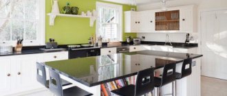
Complex combination of shades
The most popular and versatile way to create stunning decor. The color scheme is based on classic tones: white, beige and gray. They can be combined with other shades, correctly placing accents. If you want changes in the future, you can leave the basic colors and complement them with new colors. An option is to use pink in decor.
To combine classic shades in the interior, it is not necessary to use a color wheel. However, with its help it will be more convenient for you to distinguish even the slightest tints of tone and catch the contrast. You can use special online programs to select shades.
An example of a complex combination of colors in the interior
Gradient in the interior: a technique for creating exquisite wall decor
If you have mastered the color wheel for the interior of a room, you can choose shades and create soft tints. Use a monochrome scheme on the spectrum for such decor. The main rule is to move from a dark tone to a lighter one. The photo shows how much a room with a gradient design transforms.
Example of using a color gradient
Advice! To visually enlarge the space, it is better to apply a dark tone closer to the floor, and a light tone to the ceiling.
Character of color: warm and cold tones
Some colors evoke associations with summer and the sun, others with coolness, wind, ice cubes, and sea breeze. The first ones will be warm, and the second ones will be cold.
Warm colors contain more yellow pigment, cool colors contain more blue pigment. To understand the principle, the Itten color circle can be divided into two parts, as shown in the photo. In one sector there will be warm tones, in the second - cold.
There is a third group of shades - neutrals. Examples: black, variations of gray, white. Such tones do not evoke associations with yellow and blue, and therefore do not have a conventional thermal color. But they serve as an excellent base for combinations of shades. There are several ways to create a stunning interior with neutral colors.
Scheme for determining cold and warm colors on a circle
Lighting
To correctly present the range of colors, it is necessary to take into account the lighting arrangement:
- there should be no sharp transitions from shadow to light, strong shine - all this harms the eyes and tires the psyche;
- let the strong and weak zones of light correspond to the tonality of the colors;
- lighting should match the type of room.
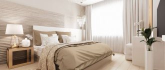
Bedroom in pleasant warm colors
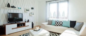
Living room interior
Bright room
The space is three-dimensional, and building the lighting by floors will highlight the depth of the spectrum. It is known that light contains all the colors, and the ability to correctly position reflective surfaces will help to perform the magic of transforming light into a colorful fairy tale.
See alsoDesign 2022. What will this year be remembered for?
How to decide on shades using a designer's circle to select colors in the interior
Experienced designers are guided by professional skills when choosing colors. And you can use their advice and add your preferences. 5 simple rules to help:
- Choose 3 main shades and combine them in your design. You should not get carried away with a large number of colors and create an excessive riot of colors - this is a sign of tasteless decor;
- Maintain a balance between warm and cool shades. Dilute the selected range based on the color wheel for interior designers;
- Remember that in a polychrome interior, the base shade accounts for approximately 60% of the decorated area;
- Use different shades of your favorite colors. To make the design stylish and harmonious, try to fit into the initially chosen range;
- Don't ignore intuitive choices. Analyze your favorite shades and try to understand what associations resonate with you when you see them. For example, you prefer green clothes because you feel comfortable in them. Perhaps this tone will also be appropriate in the interior.
Attempts to keep up with fashion trends in decor without relying on the type of room and personal preferences will fail. The interior must first of all be comfortable to perceive. A striking example is the correct use of pink in design.
Nature Snapshot Method
If you don’t have a design diploma in your bins, the following scheme is for you. This method does not have the disadvantages inherent in the color wheel and “seasons”.
All you need is an image of a natural phenomenon, it can be a flower, an animal, a complete landscape. No matter how many colors there are in the picture, they will all be harmoniously combined with each other. Nature does not make mistakes, there are no accidents in it!
The butterfly turns, the butterfly turns... into the living room interior
If you decide to use the snapshot method, remember the possibility of combining not only colors, but also textures, which often change the perception of a particular shade.
A photograph of wildlife will tell you not only possible combinations, but also the proportional occurrence of colors.
A selection of flowers based on the image of a butterfly
There are several ways to remove colors from a picture. The simplest is Photoshop and the eyedropper tool, which allows you to determine the color of even the smallest part of the picture, adjust its intensity and look at its “neighbors”.
A more painstaking but creative method is to use paints and pencils. This solution is for people with artistic abilities and the ability to distinguish the nuances of color.
Psychology of color: what shades are associated with
Each shade is reflected in the human soul, so it is wise to select colors from a psychological point of view. The right colors in the interior help you cheer up, calm down, get ready for work and even fall asleep. And on the contrary, even your favorite shade can depress the nervous system. Do you plan to regularly update your interior? Then immediately select the optimal combinations. Let's look at popular shades and their effect on the body.
White
If we consider the circle of colors for the interior, then white is not a shade, but the absence of color. But this does not prevent it from being both a base for other combinations and an independent tone in the interior. Associations with white: peace, freedom, wide space. This color visually increases the area of the room and harmonizes with bright shades. Secrets of using white will help you create a unique design.
An example of using white in design
Red
People have radically different associations with this color. Some perceive it as an aggressive shade, while others find it warm and invigorating. Red shades awaken the appetite, but can be very tiring. It is better to use it in doses, for example, in the design of accessories or as a bright spot against the background of other color combinations.
An example of using red in design
Terracotta color in design has similar properties. Like red, it excites the imagination, creates an exciting atmosphere and warms with warmth.
Black
If we take into account the Itten circle and color harmonies in the interior, then black is an accent shade. It perfectly complements other tones and creates a feeling of mystery. If you need to create an amazing ambiance and some intrigue, feel free to use it in your design. Here are a few ideas to help you experiment with black.
An example of using black in design
Orange
Orange is an energetic, rich color that creates a good mood and encourages communication. With the help of orange shades you can revive an unsuccessful interior and add brightness to the room. It is also recommended to use it in kitchen decoration because it stimulates the appetite.
An example of using orange in design
Advice! Orange makes cool tones more expressive and deep.
Grey
This color is rarely used as a main color because most people find it depressing. Shades of gray are good to combine with bright tones. In tandem with other colors, they acquire depth and evoke a feeling of peace. From another article you will learn how to successfully integrate gray color into the decor of rooms.
An example of using gray in design
Brown
It is a neutral color that blends in with most other shades. It evokes pleasant associations with reliability, protection, and tranquility. And brown can be the base color in any room. This is an ideal option if you want something original and discreet. We offer ideas for using brown in decor.
An example of using brown in design
Violet
Alluring, luxurious and mysterious purple evokes conflicting feelings. The abundance of this shade can make you nervous and tiring, but moderate use will give you a feeling of comfort and euphoria.
An example of using purple in design
Blue
This is a shade of a cold range, judging by the color wheel of combinations in the interior. Blue visually increases space and calms. Can't get ready for work or household chores? Use shades of blue in your decor. They are suitable for any room - from the nursery to the bathroom. Find out more about how to wisely use blue in the interior.
An example of using blue in design
Green
The color of nature, peace and relaxation. In the green room you will feel cozy and calm. However, you should be careful with shades - too dark ones can provoke depression. This range is best combined with other cool colors and neutral tones. The designers gave some tips on how to decorate a room using green. We also offer options for using shades: noble olive and alternative pistachio.
An example of using green in design
Yellow
A pleasant sunny tone tones and increases concentration. The color has many shades, including delicate cream ones. Yellow is a reliable assistant in creating comfort, but some may find it intrusive.
An example of using yellow in design
Blue
This color has a magical property - it can normalize blood pressure. If you need a cozy corner where you can completely relax, incorporate shades of blue into your decor. The Interior Designers Color Circle states that it is a cool tone that will visually expand a small room.
An example of using blue in design
Style and color: recommendations for different directions
When choosing a color, do not forget about the canons of interior styles. For everyone there are preferred tones that fully reveal the features of the direction. To confidently choose shades, open the Itten color wheel online or study the table.
| Style | Preferred colors |
| Classic | White, beige, brown |
| Modern | Green, blue, beige, gray, brown |
| Baroque | Combination of pastel shades |
| Eco | Beige, grass, brown |
| Loft | Dark grey, blue, green, red, orange |
| Provence | Pink, beige, blue, milky |
| Country | Brown, muted yellow, brick |
| High tech | Metallic, grey, black, white |
It is much more difficult with the directions of fusion and futurism. These directions allow you to use a riot of rich colors. Within these styles, you can experiment with bright tones: turquoise, light green, yellow. To tone down too loud combinations, include white in the combination.
Now it is fashionable to use fuchsia color in the interior. This tone can also be found on the color wheel of combinations and correctly fit into the decor.
From Moscow to New York
And now I offer you several ready-made interiors in an unusual color combination that I managed to find in different parts of our planet.
Colors! More color!
New Zealand and almost the jungle . On 270 m² there was a place for everything, each room of the house has its own amazing color scheme. There is wallpaper with a floral pattern, rich blue paint, and cheerful yellow tiles.
Will you decide to try New Zealand brightness?
Russia and graffiti on concrete . The apartment is located in the very center of Moscow. The starting point of the interior was graffiti, diluting the grayness of the concrete walls.
Russian graffiti
Germany in soft blue tones with bright colors in accents . Our next stop is the western part of Berlin. Here, in an ordinary apartment, incredibly bright paintings found their home on blue walls, which probably brought together the entire color palette.
Discreet Germany
Spain and a little magic of transparent structures . Light is worthy of a separate article; its combination with color and texture can change the interior beyond recognition. To understand this, just look at the photo of the interior. The main thing in it was multi-colored transparent plastic furniture.
The Spaniards have always loved bright colors
Vibrant France . Everything is extremely simple - white and gray as a base, rich yellow and red for contrast. Not only artistic canvases, but also door jambs painted in rich colors became the center of concentration of brightness.
Here it’s blue, and there it’s red – the concept of a bright interior in French
Scotland and a house with colorful rooms . Not everyone will decide on such a riot of colors; in this house there was a place for a blue living room, a fuchsia hallway, a pink kitchen and a beige bedroom.
Yes, this is Scotland, and no cages or bagpipes for you
Gilding and twilight in Denmark . Dark shades and shine of gilding are a combination that is timeless and fashionable. Dark walls, highlighted with elegant ornaments, became the backdrop for multiple art objects.
Let's go to the dark side
Australian turquoise with red accents . The interior is in the style of the Victorian era, implemented in a very extraordinary palette. The turquoise base is accented with pink and red accents. This project allows us to prove that even the classics tolerate a competent deviation from the rules.
Classics in non-classical colors
Shades for different rooms
For every room there are preferred and undesirable tones. For example, some are good for decorating a kitchen and are completely unsuitable for a living room. The color wheel of shade combinations in the interior of a bedroom, bathroom and other rooms will not let you get confused. In the table you can see the most popular solutions.
| Room | Colors |
| Kitchen | Yellow, red, orange, turquoise |
| Hallway | Green, beige, blue, yellow |
| Bedroom | Pastel shades, gold, silver, purple |
| Living room | White, beige, grey, brown, yellow |
| Cabinet | Blue, brown |
| Bathroom | Blue, pink |
We offer variations on the theme of kitchen design: rich design in purple tones and luxurious decor in green. If you prefer dark colors, you can use shades of blue.
Bedroom decoration also has its secrets. The room should be conducive to comfortable rest and tranquility. If you haven't decided which design to go for yet, check out the best bedroom makeover ideas.
For a children's room, it is better to choose light base colors and complement them with bright accents. Do not use flashy acidic shades - they negatively affect the child’s psyche. Be careful with red - this color can also cause overstimulation.
The bathroom is your personal spa. Why not create a cozy island there, reminiscent of gentle sea waves and clear skies using shades of blue in the interior.
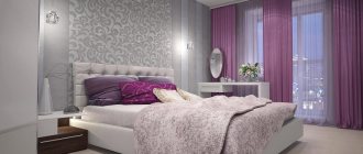
Bedroom
When choosing color variations for the bedroom, it is important to understand that this is an area for rest, relaxation and sleep. For most modern workers, the bedroom is the only refuge from the hustle and bustle of the day. Don't forget about this when choosing a color palette for a room.
- Of all the colors, the bedroom goes best with beige. It gives a chance to rest the eyes, cheers the heart, and relaxes well. As the main tone, it is very comfortable, since it will pair with the entire variety of colors. The best sets: white, black, brown and green.
- A bedroom in purple is predominantly a female solution. The freest and most daring of flowers. To prevent the bedroom from looking dull, white and brown in light colors go better with purple.
- A green bedroom is a sign of optimism and cheerfulness of its owner. Perfect for waking up early. Freshness and brightness will inspire you to have an easy start to the day and add attentiveness and energy to your thoughts. In a bright design, you can add white, yellow, light brown. Rich green will benefit from brown, blue, and thick beige.
- A bedroom in blue is the choice of romantics who dream of the warm ocean or heaven. Blue as the main color in the bedroom creates an atmosphere of relaxation, drives away a gloomy mood, and relieves tension. Blue color in the bedroom wins with white, red and brown.
- Brown for the bedroom represents a traditional approach. It goes great with green, beige, and black.
- Black for the bedroom is an unusual solution. If you are not afraid that black will put psychological pressure on you, go for it. White and shades of brown can reduce its negative impact in the bedroom.
Light blue bedroom
Interior of a bright room
See alsoMarsala color in the interior: tips, advantages, photos
Colors that should not be combined
On the color wheel you can see shades that are not in harmony with each other. This does not mean that they cannot be combined at all - if you want to experiment, give free rein to your imagination. To make it easier to be creative, study the most insidious combinations.
| Main color | Which ones doesn’t go well with? |
| Red | Yellow, chestnut, red-yellow, brick, purple |
| Orange | Red |
| Pink | Brown, purple, lilac, red, blue |
| Yellow | Pink, burgundy |
| Burgundy | Brown, red, purple, gold, blue |
| Blue | Burgundy, purple, lilac |
| Violet | Brick, terracotta, red |
| Lilac | Gold, pink, burgundy, red, blue, terracotta, brick |
| Blue | Pink, brown, green, brown, lilac |
| Grey | Terracotta, dark brown, beige |
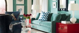
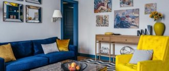
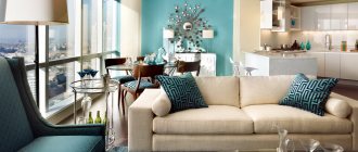
Living room
We can say that the living room is the calling card of the house. The space of such a room solves several problems at once:
- guest and holiday;
- an office for evening meetings;
- cozy home cinema.
The colors of this room are important. And the living room is especially demanding when it comes to choosing a palette.
- A living room in beige is the ideal solution. Decorating with contrasting colors will be unsuccessful; it is more profitable to choose similar tones. Beige looks great with brown details.
- Gray, as a leading color in living room interior design, is not a very common option. The main thing when working with it is halftones. Clear shades will give a mood of elegance, but darkened gray can easily turn into a hymn to boredom and despondency. Of all the colors, gray is the closest friend to orange.
- Green rich tones will not leave anyone indifferent. The best pairs for him are brown, white, yellow.
- Lilac is festive and airy. Beige and brown go well with this color scheme.
- Purple will look noble in the living room. Dark shades will add a festive feel to the space, while clear shades will add magic. In the living room it sounds nice with red, pink, orange.
- If the selection of leading colors in the living room stops you from using red, do not forget to be careful. It easily begins to “pressure” and become annoying. It is better to combine red with the following: brown, beige, gold, black.
- Traditionally phlegmatic people decorate the living room with blue. In a subdued design, it can set the theme of the room endlessly, as it is simple and tactful. Blue looks good with red and beige.
Beautiful bright bedroom
Bright white bedroom
See also African style in the interior: features, photos
Mistakes when choosing colors
Sometimes stylish interiors from pictures look different in reality. It is enough to miss some detail and choose a different shade, and the result will negate your efforts. To avoid failure, you can find a circle of color combinations in the interior online, although this is not a panacea for mistakes. And for clarity, we will give examples of unsuccessful interiors.
Abundance of white
The completely white room is more reminiscent of a hospital ward. Don't forget about accents - they will help diversify the design and avoid boredom in the interior. Sometimes one bright detail is enough: a sofa, curtains, painting or carpet.
Mistake in using white color in design
Thoughtless implementation of trends
Somewhere you saw an interior entirely in beige tones and want to repeat it? There is a risk that the room will resemble a cardboard box. The photo is just an example of unsuccessful design.
Bad design with beige color
Poor combination of artificial lighting and color
Sometimes light radically changes the perception of shades. When choosing a color, think about how the room will look under artificial lighting. It is quite possible that terracotta will turn into oppressive red, and dark gray into gloomy black.
Example of color change under artificial light
Combination of incongruous
If you use a spectral circle to select colors in the interior, the likelihood of error is much less. Relying only on fashion trends and the tastes of family members, you can create a flashy, inorganic design.
An example of an unsuccessful color combination in the interior
Aggressive use of contrasts
The design uses the technique of “playing on contrasts.” However, in reality you should be more careful with its implementation. See how you can hopelessly ruin your decor with the wrong combination of shades.
Error when using contrasting colors
Using one color
Monotony will easily spoil the interior and undo your work. The predominance of one color, even in different shades, will visually “heavien” the room and create a negative impression. For example, instructions on how not to make mistakes when using beige.
Poor design in one color
Pay attention to paintings and photographs
There is no need to look for beautiful color combinations on your own. Artists and photographers have already done this for you in their time. Here's what you can do.
- Take your favorite painting or canvas in digital form and upload it to a website that selects pixel shades. So, by clicking on the picture, you will find out exactly what colors are combined in the image you have chosen and select paint or fabric of the same tone. Look for sites that suggest colors based on the Pantone palette to make it easier to navigate the store.
- Upload the image to a site that creates collages with the main shades used. This technique is more convenient if the image is complex and consists of dozens of different colors. The program will select several of the most frequently used options.
In both situations, you can also use Pantone Studio or Adobe Capture applications.
Unsplash
Instagram: @manders_kraski