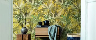
Wallpaper is the most common option for decorating the walls of different rooms, and the living room is no exception. They are easy to stick without the help of craftsmen; the choice of ornaments and colors satisfies a wide variety of tastes. But the ability to choose sometimes causes difficulties, because within one style you can find many harmonious and interesting options.
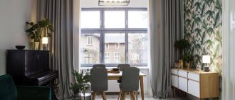
The above photo of the interior shows that light wallpaper in the living room most often acts as a background, but may contain patterns and accent inserts. Such coatings can be combined, which provides huge variations in finishing for rooms with different parameters.
Milk color wallpaper
The milky shade of white is more neutral. If you want to feel all its fullness and depth, then you need to choose a brighter companion for it, then the design will sparkle with different colors. An interior made with milky wallpaper has a purely positive effect on a person, calming him down and motivating him to work with his head.
A simple and common use of milk is as a background for walls with bright, contrasting accents on protrusions and depressions, and original interior items. In this application, the color of the milk diffuses into space, and you focus attention on the highlighted objects that are at the forefront of the design.
Milky wallpaper combined with beige, rustic style
In addition, this color shade, being a basic one, allows you to combine objects from different styles that at first glance are very different, for example, retro and hi-tech.
Light wallpaper in the living room
A light shade of the walls visually expands the room, and neutral tones can be easily combined with the color of furniture, textiles and decor.
White wallpaper
White wallpaper in the living room interior will visually expand the space of the room and become a good background for filling it. So, you can use clear contrasts in the form of a dark floor or carpet. The white color of the walls in the interior will fill the room with air; it can be combined with any colors in the interior.
To avoid the effect of a hospital room, we recommend not using white wallpaper with white furniture.
Gray wallpaper
Gray wallpaper in the living room interior with a plaster-like relief or a black and white print goes well with most colors and will perfectly highlight any shade of the interior.
It is better to choose furniture and floors that are two or three shades darker to match the gray color of the walls; this color combination will refresh the room.
Beige wallpaper
A room decorated in light colors becomes spacious, cozy and bright. Beige wallpaper in the living room interior looks elegant and at the same time calm, and goes well with natural wood of any shade. Combines well with light green, light blue, gray, black and white colors.
We recommend choosing a floor darker than the color of the walls; this will add additional coziness to the room.
Bedroom in milky shades and other rooms
Milky-colored wallpaper is most often used in the bedroom. In this room it is recommended to create a calm, peaceful interior that will promote relaxation, and classic calm tones will always come in handy here.
It is necessary to use these colors not only on wallpaper, but also on curtains, furniture, and household items. Choose curtains for milky wallpaper in darker colors, but the tulle is definitely white.
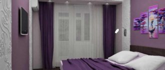
Bedroom covered with milky wallpaper
Having created a bedroom design once, it is recommended to leave it for a long time. No matter what events or renovations are done in the rest of the house or apartment, your relaxation room will always complement this interior, and it doesn’t really matter whether it’s modern or not.
In spacious houses, a living room in milky tones will look very strict and conservative. Objects placed around the perimeter of the room can enhance this effect or dilute it. I would like to note once again that it is quite acceptable to use interior items and furniture from different styles. For example, the highlight of your dairy interior can be a painting by a contemporary artist, made in the style of abstractionism.
Dairy interior of the room, in the center there is a painting that attracts attention
For a corridor, hallway or kitchen, milky wallpaper is unacceptable, since all the dirt will be clearly visible on it. Even if your wallpaper is washable and has a super-durable decorative surface, you are unlikely to be able to constantly care for it.
The lighting used in dairy decoration should be warm because cold light goes beyond the general concept.
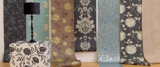
Types of wallpaper for the living room
When choosing wallpaper for your living room, you should pay attention to their quality: a wide range of prices allows you to find coverings within different budgets, but the savings are not always justified.
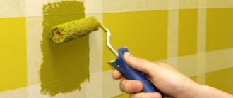
- The simplest are paper sheets . They are easy to stick on. The durability of the finish depends on the thickness of the base and cleaning features, since paper wallpaper is not wear-resistant. Their characteristics do not include moisture resistance, but this is not required in living rooms, you just do not need to wipe them with a damp cloth. The variety of decors and colors in this category is endless, especially since they can be both embossed and embossed.
- Vinyl coverings on a non-woven basis are denser wallpapers that help to slightly level the surface of the wall . The pattern is applied using different technologies. Silk-screen printing creates unique classic designs. Silk threads in the structure of the top layer of wallpaper also create fancy patterns.
- Fiberglass sheets have a “ventilation” system and are durable and strong . But the decor of such coverings is unambiguous - they are embossed, but without obvious ornamentation. The color is applied by the owners themselves, since such wallpaper is used only for painting. You can only repaint them so many times - gradually the relief becomes clogged with paint.
- Metallized canvases are non-woven wallpaper with an aluminum layer as thick as foil - up to 0.2 mm . An embossed design is applied to this surface. The color of such materials corresponds to the entire range of valuable and noble metals - these are shades of gold, platinum, bronze, copper, silver. Their durability matches the strength of alloys. In addition, wallpaper of this type does not fade or deteriorate even in rooms with high humidity.
The photo shows the interior design of a living room decorated with metallic wallpaper.
- Liquid wallpaper is a dry mixture of cellulose, silk fibers and dyes, as well as additives from metallized threads, mother-of-pearl, and minerals . The materials are diluted with water and applied to the walls. The composition already contains anti-mold agents. Externally, such coatings resemble plaster.
- Natural wall coverings - bamboo, jute, textile wallpaper . The basis is the same non-woven fabric, which makes it easy to stick the canvas to the surface. The finished finish does not fade, does not emit harmful substances, and has heat-insulating properties.
Almost all types of materials can be found in neutral and light colors, except, perhaps, metallized ones, the range of which is limited to a certain extent. The choice of palette depends on various parameters - style, lighting of the room, its size, personal preferences.
Milky color compatibility
Almost any color can be a companion for milk, here are some successful combinations.
Black will allow you to create some contrast, but not as bright as with white. This combination gives the bedroom or living room airiness, warmth and comfort.
Gray stands out against milky, like diluted black, it adds texture and luxury. This combination is mainly used in bedrooms.
Dairy wallpaper in a gigantic kitchen
Brown or chocolate color paired with milky color creates a comfortable and pleasant design. If you add antique wooden furniture in wenge color, moderately shabby, having absorbed the past years, then this would be a very soulful interior for a living room or library. In such an environment, you want to conduct dialogues over a cup of tea or read interesting adventure literature.
Color Features
People primarily associate milk with maternal care, so it makes them feel safe, creating a feeling of trust, closeness and calm. It contains notes of primary colors, so it can be classified as complex shades.
The interior in milky colors is neutral. It is absolutely non-irritating, making it suitable for decorating any room.
The ability of this color to harmonize space, energize in the morning and calm in the evening is greatly appreciated by design specialists. They are confident that everyone will feel comfortable in such a room.
You can use milk to decorate rooms in almost any style, since it is in the classic palette
Perhaps the only exception will be high-tech: this modern, dynamic style requires the use of contrasts and bright colors. Milk is too calm for him and will blur the contrasts.
Pros and cons of using photo wallpaper
Photo wallpapers have also become very popular recently.
Previously, the images on them were not of particularly good quality, but now everything has changed. With the help of modern technologies, photo printing has begun to work wonders, producing real masterpieces.
Photo wallpaper for the living room in oriental style.
Sometimes landscapes have such clear outlines and vibrant colors that it seems as if there is a window on your wall to the sea or to a fairy-tale forest. When creating an interior in a certain style, you can easily choose photo wallpaper. After all, there are so many varieties of them that it’s even hard to imagine. And this is an important plus.
In order for photo wallpapers in your living room to look advantageous, you need to allocate them a main place where they will be clearly visible - they will become the main accent in the design of the entire interior. But the wallpaper for the remaining walls should be selected in neutral light shades, or to match.
However, photo wallpaper should not become an aggressive element of the interior that will irritate you and your guests. In principle, this is their main disadvantage. It is best to place them in a place where they will not distract from the conversation or watching TV.
It will also be very difficult to combine with them:
- basic wallpaper that has too large patterns;
- or if you get a sharp contrast with the main interior details;
- Photo wallpapers do not tolerate excessive accumulation of incompatible styles.
Successful combinations
How to use milky color in design? You can decorate furniture (for example, kitchen units), walls, or both in light and warm colors.
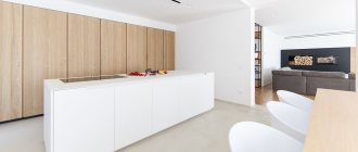
The interior of a kitchen in a classic style is usually monochrome. The design uses one color and its shades. In this case, it is complemented by brown, beige, and cream.
Modern classics allow you to dilute the light color scheme with contrasting dark shades. For example, black technology.
To prevent the design from blending into a boring monochromatic spot, it is recommended to use darker colors in the dining area or in textile decoration, for example.
A contrasting dark apron, as in the photo below, can dilute the interior.
If a monochrome design seems boring, then you can safely dilute it with bright elements. The most stylish combinations are:
- blue;
- blue-green, emerald, etc.;
- terracotta;
- coral;
- pistachio;
- blue;
- violet;
- cherry or marsala;
- yellow;
- lilac.
Modern style allows you to work more freely with these combinations.
Combining wallpaper in the living room
The combination of wallpaper in the living room is a fashionable trend that allows you to make the interior of the room more dynamic, stylish, capacious and self-sufficient. Combinations of finishes and patterns allow you to fit different elements into the decor, as well as accentuate the design on certain objects or areas. But this does not mean that the composition will be eclectic or inharmonious - the combinations can be very different, and they will be united by a single compositional thread.
- Any plain or patterned coating will look harmonious . As a rule, the decoration uses one background, and the ornament matches the accent shade in the design. The essence of the pattern itself does not matter - its choice depends on the characteristics of the style.
- To decorate the walls in the living room, canvases with plant motifs are often chosen . These can be both contrasting patterns and unobtrusive ones - in a slightly darker shade of the same palette, in silver or golden tones, textured embossing. Organic combinations involve the use of plain materials, as well as contrasting wallpaper options, when the color of the ornament on other walls becomes the background. In the case of using bright, dark, metallic bases, the coatings become accentuated.
- Combined striped wallpaper looks original when the pattern is directed vertically on one wall and horizontally on the other. In this case, it is important to choose suitable curtains - they must match the pattern of the wall according to the composition - either adjacent or opposite.
- If you choose wallpaper with large patterns for the main open surface , you can choose coverings with stripes in the same colors for other walls - more filled ones.
- You can combine materials in the same color palette, but with different patterns - abstract and floral, stripes and avant-garde. Light wallpaper looks luxurious in the living room with an accent wall with photo wallpaper.
As a rule, combinations are selected when they are present or when similar solutions are just being planned in the situation. These are different upholstery of the sofa and sofa cushions, patterns in the carpet or furniture facades, in curtains and decor.
Milky color in the interior
Peace and tranquility achieved
Traditionally, a milky background is used when it is necessary to highlight brighter and more saturated objects and accessories that deserve primary attention.
Designers assure! Milky color has a unique ability to combine those items that have a poor combination or do not have it at all, and against a milky background they can be placed in pairs.
The interior itself with a milky color, where it plays the main role, is very conservative and calm, and is used in cases where the development of room design is carried out for a long period, i.e. for several seasons there will be no fundamental changes in it. Those who do not yet know the future style of the interior can also use the milky color scheme as a base color, since when using wallpaper of this color, it will subsequently be possible to combine almost everything in the interior: from exotic paintings, to photographs of celebrities and decorative pieces of furniture.