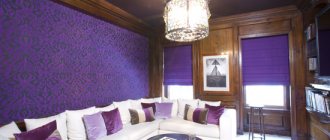
Lilac color is extraordinary in nature, mysterious and “fragrant”. It is associated with lavender, lilac, spring, flower fields, French Provence. The light and unobtrusive shade can be different - rich in a bold but mysterious atmosphere, romantic in a light, openwork setting. It will be just as sophisticated and ambiguous in the kitchen, especially in different tones - violet, amethyst, plum or grape.
Lilac color in the kitchen interior
Shades of lavender and lilac retain their character in the interior. Although a lot depends on the depth and richness of the color, such a kitchen will be very mysterious. But one cannot take away from the lilac palette freshness, coolness, and inspiration. In pastel colors, the tone can become the main one for finishing a large area, but in brighter colors it is used exclusively in details. In the interior of the kitchen, this can be the facades of the furniture, the apron of the work area, an accent wall, accessories and decor.
Of course, even light purple surfaces cannot be alone - harmony is achieved by combining this color with neutral, universal, eye-pleasing additions. Lilac kitchens are always an organic combination of two or three tones in varying degrees of saturation.
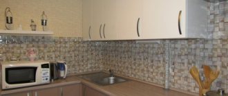
The photo shows a kitchen interior in lavender tones.
Beige-violet
Softer and more romantic natures will like the beige-lilac combination. A kind of blue-red coldness, multiplied by the natural warmth of white-brown. Whatever we choose - beige walls and violet furniture or vice versa - both options look harmonious and stylish. True, the emphasis in these options will be different. Therefore, choosing decor is a delicate matter.
Advice Do not chase mono or dichrome in the interior, limiting yourself to one or two colors. In this combination, you can find a place for silverware (vases, napkin holders) or diversify with multi-colored kitchen towels, coasters, aprons.
A kitchen in beige and purple tones looks romantic and soft. She encourages communication, calms, and sets the mood for positivity. It’s easy to breathe here, as if the aroma of violets is in the air. The sound is heard slightly muffled, and the imagination flies far away.
A watch with a beige or purple dial would be an organic addition. Standing on a shelf or hanging on the central wall, they will complement the ensemble favorably with their cozy counting of seconds.
Combination of lilac color with other shades
A classic version of a harmonious combination with lavender color is a duet with white. This kitchen turns out cool, fresh, and elegant. The snowy palette and its nuances can visually expand the space and make it easier to perceive, especially in combination with juicy eggplant or plum.
But there are, of course, other harmonious duets and even trios:
- By analogy with white, lilac goes well with softer shades - milky, creamy, champagne. The interior is not as solemn as in the white and lavender kitchen, but also bright, spacious, and comfortable.
- A duet of violet with dark gray or even black is also often found . An exotic, rather bold combination, acceptable for a spacious kitchen, is best complemented with a few more light surfaces. And it’s better to combine such dark tones with a light lilac color.
- An organic combination of lavender and gray in a light palette is a priority for technologically advanced modern interiors, where metal and glass play a leading role. Metallic coated surfaces are often found here - this is a direct emphasis on technology. However, in matte variations, these shades in a duet can be present in simple interiors - for example, in Provence style, then the combination takes on a new sound. Gray is the color of stone, lilac is lavender or violets, or the same lilac.
- Lilac and pink is another, at first glance, simple combination . In fact, the interior may turn out to be monochrome, although there is nothing wrong with this if you use surfaces of different textures and shade nuances. For example, shagreen plaster interspersed with metallic or natural mineral in the decoration of walls is originally combined with a smooth countertop surface and polished wood floors or dining area.
- A bright, cheerful combination of lilac with yellow or light green is a solution for a kitchen that needs to be made warm, more illuminated, and positive. Of course, this combination can be used in any room, but a northern room with such a duet in design will become more attractive and cozy.
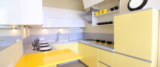
The photo shows a kitchen in lilac and yellow tones.
- Purple looks luxurious in its entire range with the natural palette of wood . Light wood harmonizes with any shades of lilac, while dark wood is best combined only with light lavender.
- A combination of violet and green can be called natural . They are organic, but require a complement, which can be sand, beige, or milky. Let's use metallic gray here too. In such trios, plant colors can be more saturated, but if you do not use a neutral addition, it is better to choose pastel greens or lilacs.
When choosing a lilac kitchen, you should understand that not all combinations with this color are harmonious - you should not experiment with red and blue. This will be an overly contrasting environment in which it will be very difficult to find balance.
White
This is a universal duet, as it will look great in any style. It is quite neutral and is not capable of causing any too strong emotions. It can be used in any room, regardless of its layout and area. This combination will be especially relevant if you have a small lilac kitchen.
Photo from source: avatars.mds.yandex.net
Tabletop “Cedar” 1205/BR Diamond light gray
Photo from source: static.tildacdn.com
Tabletop “Cedar” 2946/R Galia
Styles for arranging a lilac kitchen
The color of lilac is relevant in most modern design trends, where such surfaces often have a glossy finish. But in a matte finish, the lavender palette is relevant for Provence, modern, and classicism styles. When choosing such a range, you should prefer a laconic design - any shade of lilac is original. This is a capacious color that will fill the space no matter how much area it occupies.
- In classicism, you can prefer purple curtains, pillows on the sofa, carpet or pattern on the walls.
- In Art Nouveau , along with green, pale pink, milky and sand, the color of wisteria will be a natural part of the design.
- In Provence, lavender is a priority . Entire fields surround the houses of French Provence. The windows offer views of the sea or blue sky, and the entire expanse to the horizon is filled with purple.
- In modern interiors, purple is often used in glossy facades, in the apron of the work area, and in accent surfaces.
In any style, it is worth remembering a sense of proportion: when working with lilac, it is better to choose fewer rich details, prefer minimalism and restraint. Only then will the violet palette be organic.
Kitchen set
A purple kitchen will look most harmonious in a spacious apartment - preferably, it should be a studio combined with the living room. A purple set will become a bright and stylish design element. The main thing is to use this rich shade wisely.
For example, if all the facades of the set are purple, then the presence of this shade in other interior elements will have to be limited. You can add it in the form of a discreet ornament on light walls; it can also be present in textiles.
An excellent option for arranging a kitchen is to make only the lower or only the upper facades of the kitchen in purple tones. The rest can be white, gray, purple. As for the material used to make such a set, you should be guided by the chosen interior style.
For example, for a kitchen in a traditional style, as well as in shabby chic and Provence styles, it is best to choose a set of wood, inexpensive chipboard or MDF in white with pale purple inserts. When arranging a kitchen in avant-garde, high-tech and minimalist styles, plastic, metal, chipboard, MDF, and glass are excellent materials.
The use of mirror and glossy surfaces is encouraged. The shapes of the purple set should be simple and concise, with strict geometric proportions, and without an abundance of decorative details.
Kitchen furniture in lilac tones
The most popular solution is a kitchen set with lilac or amethyst facades.
In this case, the same shade is present in several more details:
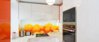
- In the ornament of the apron and/or wallpaper on the walls of the dining area. The glass wall decoration behind the stove and sink with photo printing will be attractive. Here you can use simple patterns, landscapes with lavender fields,
- In plates and other utensils.
- In textile furnishings.
- In flower arrangements - in live or dry bouquets, in decor, in paintings.
Less often they choose purple upholstery for a soft corner, and even less often - purple chairs.
Such nuances are appropriate if the setting contains some other matching details - an apron, utensils, tablecloth, curtains. If you choose a purple set or dining area, the walls should be more versatile - white, beige, sand, pastel - green, yellow, barely pink. One area can be made brighter to highlight or zone the room. This may be a more saturated shade of the background color scheme or an amethyst palette.
Corner
Kitchen units installed in one (or two adjacent) corners are relevant today. In this case, it is easy to zone the kitchen area, for example, into a food preparation area and a place for eating it. Such models will also become popular in studio apartments, where a separate room for the kitchen is not allocated.
When choosing a purple corner kitchen, you need to be careful so that it doesn’t get visually “lost.” The dark shade of the main background can be diluted as follows:
- choose a model with glass or mirrors;
- concentrate bright lighting over it;
- choose a countertop in light colors, perhaps from natural stone;
- decorate shelves and other work surfaces with white, shiny design elements and embroidered towels.
The dark shade can be diluted with many elements
Finishing in lilac tones
A kitchen in a lavender palette is not just furniture. The lilac decoration of the room looks interesting and extraordinary.
It can be different in nature and volume. The following combinations are organic:
- The walls of the dining area are painted in an unobtrusive light violet tone . There may be an apron or a pattern on it, or decorative elements in the same shade. Then the kitchen set, dining room, and other surfaces will be made in neutral shades. These can be either light or dark colors. All universal tones, as well as dark gray, black, chocolate, and natural wood, are in harmony with light lilac walls.
- Choosing a rich plum for an accent design . For example, these could be niches, curtains, part of the wall with open shelves, furniture upholstery, a suspended ceiling above the dining area. It is not necessary to have all these elements in one palette; you can choose 2-3 large-scale details against a background of a neutral tone.
- Purple wallpaper can contain a pattern of the same color as the background design or the color of the typeface. Or you can choose the opposite pattern - a purple hue on light surfaces.
The photo shows a kitchen design with a purple niche and accessories in the same colors.
Plain walls
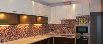
As a rule, a single-color finish is paint, plaster, brick painting, and, less often, wallpaper. When shades are combined in the decoration, the coating can be smooth, but if the room is predominantly monochrome, then textures are played out. Shagreen, perfect gloss, “velvet” to the touch materials are appropriate here.
The photo shows the design of a monochrome kitchen with shagreen surfaces.
Selection of lilac wallpaper for kitchen decoration
Wallpaper is the most popular material for decorating any room, including the kitchen. The design of coatings can be so diverse that it is difficult to even imagine. The designers' arsenal includes simple floral motifs, stripes, abstract patterns, and photo-printed coatings. A variety of subjects gives rise to the individuality of interiors. In the same setting, one drawing on the walls can change the mood of the design.
- For a classic interior, choose a large rosette pattern . But it cannot occupy too large an area - it will visually take up a lot of space, especially in purple. The pattern itself can be in the same palette, but a tone or two darker or lighter, or in the color of other furnishings.
- In Provence style, the wallpaper will be light - as if faded . A small floral pattern, coverings with photo printing depicting a French village, lavender fields, and seascapes are appropriate here.
- Modern is a complex interior with organic notes , in which a rich plum color can be a sofa in the dining area, complemented by no less bright green, pink, blue (but not blue!) details.
- Modern design trends give priority to simple ornaments . Stripes, abstraction, and photo printing are appropriate here. But the images on the walls should not be rustic, as in Provence: the laconicism and technology of the modern environment accepts macro photography, city landscapes, and non-standard solutions. The choice of plot depends on the nature of the design and the mood of the situation. For example, minimalism welcomes the absence of ornate and overly pompous patterns. Therefore, for such an interior it is better to choose macro photographs, for example, a flying dandelion. This is just an example, although such an image in a lavender palette will be especially original.
The photo shows wallpaper in lilac tones for a modern, laconic interior with photo printing.
Having determined the ornament, you should pay attention to the combinations of shades in the wallpaper patterns. For a small room, choose less contrasting solutions, although they are appropriate in small areas - a stripe near the dining table, for example. In a spacious kitchen, you can use different wallpapers - with a rich pattern on a lilac background or a light (white, silver, cream, yellow) pattern on a rich lavender base.
Looks organic:
- Gold and silver on any purple background in a classic interior.
- Luxurious chocolate on amethyst wallpaper in minimalism, Provence and Art Nouveau styles.
- A relief pattern in the same palette is appropriate in any design direction - the choice depends on the nature of the interior. Here the wallpaper can be either light or rich.
The choice of wallpaper largely depends on personal preferences, because finishing materials that seem completely different at first glance can fit into any interior. And based on the desired atmosphere, the owners select wall coverings.
Ceiling and flooring for a lilac kitchen
The selection of wallpaper, as well as the choice of accessories, depends on the type of set, dining room and floor covering. Of course, sometimes owners choose one thing, and then add other nuances to the detail they like, creating a personal interior. But this is too individual an approach, so it is impossible to consider all options.
Here are just a few universal ideas:
- A lavender ceiling is an interesting solution for a spacious kitchen with a large dining area . You can also paint the top surface in a pastel lilac color in a small room. A more saturated color can be used in a suspended ceiling above the dining group, following its contour, while simultaneously zoning the room.
- Purple floors are often ceramic tiles . You can supplement such a covering with a couple of elements from a whole list: curtains, upholstery of upholstered furniture or chairs, an apron for the work area, utensils, towels, potholders.
- The floor and ceiling in one place can be rich lilac - to place accents in the design . You can support the decorative tone with a pattern or skin with photo printing, a pattern on an accent wall, curtains, or in decor.
With such coatings, the choice of wallpaper is simplified - they will not be lilac, with rare exceptions. It is better to make the walls neutral - in a companion color chosen for the overall design.
Another nuance for a harmonious design in such a palette is the choice of accessories.
Black and purple
A special conversation about the combination of black and purple in kitchen design. It is certainly stylish and extraordinary. The main thing is to choose the right shade. An organic combination can be achieved using:
- light violet;
- lilac;
- amaranth.
Harmonious combination of purple and black
In this case, black will originally emphasize the expressiveness of colored surfaces and make them extravagant. It is very beautiful when black details are complemented by carved handles, mosaic inserts, and smooth engravings.
However, this combination requires you to think about:
- shape and size of curtains;
- design of lighting fixtures;
- appropriate style of stove, as well as other electrical appliances.
Curtains will dilute the dark duet
This is due to the fact that black visually reduces space. Long, light, light curtains can compensate for this effect.
There will be no kitchen, executed in black and purple tones, and light. Therefore, maximum attention to lighting, not only central, but also in work areas.
Advice: You should not choose a black sink for this design. It will turn out gloomy and expressionless. It is better to choose a stainless steel option, matching the color of the refrigerator or microwave oven.
The equipment does not have to be black
This may be interesting to you: REVIEW: How to Put a Small Sofa in the Kitchen? 200+ (Photos) Cozy kitchen interiors
Accessories for kitchen interiors in lavender tones: which chandelier to choose, which curtains and decor
The overall mood of the kitchen depends on the details, and not just on the color of the walls and furniture. And here it is important to find harmonious solutions that are proportional to the area of the room and consistent with the number of shades.
Kitchen accessories in such an unusual palette can be neutral, accent or lilac. Universal shades - white, cream, beige, sand. Such details can be if the design already uses three colors, and the details cannot be made bright. Using a purple tone can make the design overloaded, so more than three shades will look garish.
Lavender accessories
Purple details are a more common choice than backgrounds of the same tone. In a bright kitchen, you can safely choose a purple chandelier, curtains, tablecloths, and utensils - vases, plates, plastic items - of the same shade. One has only to take into account that there should not be too many of them. Either these will be small details in a rather rich palette, or it is better to choose a less deep color.
The choice of accessories also depends on the design style. For example, in a classic kitchen, a lilac chandelier should be chosen from several glass parts or with a fabric lampshade. This can be a fairly large lamp if it is a spacious room. Then curtains of a similar color in a traditional design are appropriate here. But for a modern design, it is better to choose blinds or roller blinds, which can also be purple, but you should no longer choose a standard chandelier. Lamps in wisteria color can be metal, glass, concrete with silicone.
Which chandelier to choose for a Provence style kitchen? In such an interior you can hang a wicker lamp or a wooden lattice lamp (with a light bulb that does not heat up), or a forged lamp. All this can be painted in a delicate lavender or a rather rich lilac color.
Accessories for lilac decoration: which chandelier to choose and other details
In a kitchen with purple trim, it is worth using other accents - a more saturated color of the same palette, in a companion color, but not a background shade.
Against the background of lilac walls or furniture, the following will be harmonious:
- pink;
- sparkling white palette;
- accessories in chocolate color;
- steel parts;
- gold inserts.
Of course, if we talk about a chandelier, it is unlikely to be dark - here it is worth remembering the purpose of the lamp. It is better to hang a wicker or forged lampshade; solid shades in dark colors are inappropriate.
The choice of such details is based on the style of interior design, its mood, and selected color combinations. Do not forget about personal preferences, because design solutions do not always take into account the individual mood and lifestyle of the owners. If the choice fell on a lilac color scheme for the kitchen, in any case you will get an extraordinary setting.
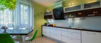
Green
Creating such a duet in the interior requires special care. After all, despite the fact that the combination is one that can be found in nature, it requires a competent choice of shades. For example, too saturated or dark green in large quantities can overload the interior and make it too gloomy.
In classic kitchens, the lilac-green duet can be found relatively often, but it is necessarily complemented by neutral light colors - white, beige.
Moderate delicate shades are characteristic of Provence. More intense ones are for modernity.
Photo from source: mebel-sirius.ru
Decor ideas
Lilac-colored details will appeal to those who want to brighten up the kitchen without resorting to large-scale measures. Lilac curtains look neat and aesthetically pleasing. Windows in a classic style are complemented by light, plain, white tulle. Roller blinds or Roman blinds are suitable for modern interiors. They take up minimal space, make the space airier and lighter, an excellent option for small kitchens.
The color of lilac is suitable for decorating drawings and paintings on walls, for ceramic figurines, and tableware. It goes well with grassy green; lilac plant pots and vases look unusual and support the style of the kitchen interior. Horizontal surfaces are decorated with violets or lavender.