How to choose the color of a kitchen set
The kitchen is a special place in the house: here we spend cozy family evenings, gather guests, cook and read the morning newspaper. That’s why it’s so important to make this room a reflection of your own character and style. This requires not only thinking through the design and lighting, but also understanding what color furniture to choose, because the kitchen set sets the mood for the entire interior. Agree, there is a difference between a massive kitchen made of natural wood and monochrome black glossy facades.
Today, the question of which colors are best for a kitchen is especially acute. Since there are many solution options, and in order not to get confused with the choice, find out how to choose the right color for the kitchen facades.
What to look for when choosing
When choosing a kitchen set, you need to start from the parameters of a particular room. I would like to visually expand the size of a small kitchen using color and make the interior spacious and bright. Therefore, it is better to avoid shades that will weigh down the space.
The spacious room allows you to use the whole range of colors for the kitchen set. But despite this, it is necessary to choose an ensemble so that the furniture does not reduce the space of the kitchen. For example, a massive set made in black will not only “eat up” the space, but will also look like a big dark spot. If you do not want to achieve such an effect, then it is better to replace black with graphite.
An elongated rectangular room can be zoned using the right color. For example, a plain light set in the same color as the wall will expand the space, visually bringing it closer to a square.
Washing
There are three main types of kitchen sinks: steel, stone, and ceramic. The first ones are the cheapest. They do not absorb dirt, are easy to clean, and allow the use of aggressive cleaning agents. But if the sink is chrome-mirror, keep in mind: to preserve the appearance, you will have to wipe it dry every time you turn on the water, otherwise there will be smudges. Another disadvantage is that the surface can be easily scratched, so rubbing with an abrasive sponge is not recommended.
Stone sinks are stronger than metal sinks, but they are more difficult to care for: you will have to clean them with special products, and also make sure that coloring products (beets, coffee) get inside. Light-colored stone sinks are among the most treacherous; they can even be damaged by tea.
Ceramic ones are similar to regular bathroom sinks. They are made of porcelain or earthenware and covered with enamel on top. The surface, although white, is wear-resistant, easy to clean, does not suffer from stains from water, and is not stained by coffee, tea, or beets.
Color combination in the kitchen interior
When choosing a headset, consider the room in which you are going to install it. The color of the walls in the room plays a big role here, because it will determine how you can combine colors in the interior of the kitchen. And there may be several options:
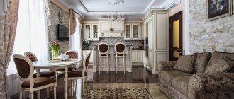
- When the color of the set is chosen to match the walls, for example, pastel shades of the walls will echo the delicate shades of the kitchen.
- The furniture will contrast with the room. Often such a photo can be seen in catalogs: a yellow monochromatic kitchen against a background of gray graphite walls. A bold and bright combination.
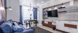
- An option that is especially popular now is painting the walls to match the color of the kitchen. Relevant for studios, it removes the emphasis from the set, dissolving kitchen utensils into the volume of the room. Matte paint is used in dark and cool shades, if space allows.
Sofa
When choosing a sofa, color should not go to extremes: white or black will get dirty too quickly. Current neutral shades (beige, gray), fabrics with patterns: stains on them are practically invisible.
Among furniture fabrics, leather - artificial or natural - is considered the easiest to care for. No need to wash, just wipe with a damp cloth. But leather has one drawback: it absorbs dyes, of which there are too many in the kitchen.
Other options to solve the problem of keeping upholstery clean:
And the last important issue is flooring. The material itself is not decisive here. The main thing is that it is not carpet. PVC tiles, laminate, linoleum or tiles are suitable.
When choosing the material or color of the kitchen, evaluate the appearance and performance properties. Sometimes you have to choose between beauty and practicality - think in advance, are you ready to sacrifice one in favor of the second?
Source
Influence of cardinal directions
Another important point to remember is natural lighting in the kitchen. If the space is constantly or most of the day illuminated by the sun, then this allows you to choose a much larger palette of colors and shades. The color of a kitchen on the sunny side can be done in both cold and warm shades. The natural colors of the wood will also be highlighted nobly and create coziness.
A more difficult question is what color to choose for a north-facing kitchen. Since the sun will only occasionally peek into the room, the space should be made lighter and more saturated. It doesn’t matter whether you choose a cold or warm shade for the kitchen, the main thing is that it is light. If you prefer wood, then use linden or oak, but not walnut or cherry. Also try to include reflective surfaces in the set and choose glossy facades.
Lighting organization
To make your kitchen sparkle with new colors, you cannot do without good lighting. Spectacular chandeliers and lamps are usually installed directly above the table. Lighting sources should also be above the tabletop and along the perimeter of the work area; they should not be brighter than the main light.
One or more lamps are installed in the central part of the room. The greater their number, the less power. When selecting a model, color temperature is taken into account; it is important to understand the dispersion angle.
Home lighting
The combination of colors in the kitchen set
If a set made in one color seems something ordinary, here is a suitable solution - a combination of several colors of facades. Knowing the main options for combining colors in kitchen furniture, you can choose the perfect combination.
First of all, pay attention to kitchens in which the upper and lower cabinets are made in different colors and shades. These can be either contrasting combinations, for example, a white top and red bottom, or less contrasting ones, with a difference of a couple of tones.
Two-color kitchens will help delimit the space: they will visually increase the distance to the ceiling.
When the facades are painted in different colors in a checkerboard or other order, this is a combined version of the kitchen. This way you can highlight the cooking area and place accents to your advantage.
That is, by playing with color and its shades, you can not only create a stylish, unique kitchen interior, but also visually transform the space. It is beneficial to emphasize all the advantages and hide the shortcomings.
Fashionable kitchen colors in 2022
Another way to make it easier to choose the right shade of a set is to find out what kitchen color is currently in fashion. In kitchen furniture, as elsewhere, there are trends that determine its relevance.
Today, spacious studio apartments or Euro-two-room apartments are preferred. In this regard, the color scheme of a modern kitchen should combine or complement the interiors of the living room and the rest of the living space. The influence of fashion is also reflected in the household appliances used.
The glossy black glass-ceramic panel goes well with light-colored surfaces, so the fashionable color of the kitchen set will be the one that harmonizes well with the appliances.
Another trend is multimateriality, that is, the kitchen should be made simultaneously from several materials or imitate them.
For example, combine glass and concrete or steel and wood.
The predominance of chrome gives the kitchen an industrial style, and natural shades give it an eco-friendly feel. This is perhaps the most fashionable solution.
Finishes and materials
For a kitchen in light colors, finishing materials are usually also light. If contrasting accents are needed, then their role in most cases is given to countertops and household appliances. Occasionally, a dark color can be used to decorate the floor, apron, and small decorative inserts. In general, a neutral pastel palette predominates, where all elements are subordinated to a single theme.
Floor
The most practical floor coverings in a bright kitchen include porcelain stoneware, ceramic tiles and self-leveling flooring. Heating can be installed under these materials, which creates additional comfort while cooking. In addition, their advantages are durability, strength and resistance to frequent wet cleaning.
For the dining area, if it is located far enough from the stove and sink, you can choose wooden parquet, natural boards or laminate, but preferably with moisture-proof impregnation. Regardless of the size of the room, it is recommended to go for a monochromatic design in neutral white, beige, light gray or wood tones.
Walls and apron
In almost any interior style, the best background for a white set is a uniform pastel color. A rare exception to this rule is Provence, where wallpaper with a small chintz pattern is allowed, as well as a loft, which cannot be imagined without exposed brickwork.
In modernism, a bright apron made of tinted glass or plastic can stand out from the overall picture, with which dining chairs and some decor should echo. For modern and classic styles, the protective covering behind the work areas is made of white brick-like tiles (the so-called hog tiles) or plain light-colored tiles. In a rustic interior, this area is lined with matte ceramics with a dim beige, gray or lavender pattern, and in a Scandinavian interior, a “patchwork” patchwork pattern is sometimes found.
Ceiling
A universal solution for the ceiling of a bright kitchen is white painting or stretch fabric of the same color. Any bright or saturated tone will visually reduce the height of the room and disrupt the harmony of the space. In ethnic styles (Provence, country, Scandinavian style) and loft, beams can be left visible; if the vertical footage allows, then hang decorative ones specifically. Moisture-resistant drywall, fiberglass or non-woven wallpaper will help hide surface imperfections for painting.
What kitchen color is the most practical?
Customers' opinions on the practical color of a kitchen set are unanimous and, at the same time, divided. The similarity lies in the monochrome, but they differ in the choice of white and black colors. If classics predominate in interior design and materials, then kitchens are chosen to look like wood. It always looks organic and can be used with other materials. At the same time, it is durable and does not lose its relevance over time.
The near-Scandinavian style with a predominance of light, cold tones enjoys unshakable authority in Russia. Just look at the photos of the interiors of Swedish houses. Beige, white, gray, desaturated blue in various shades - these colors are in harmony with each other and at the same time are interchangeable. They are flexible in terms of decoration and can be easily complemented with other colors and shades. Practicality lies in this replaceability and complementarity.
Technique
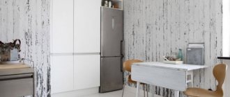
Oddly enough, white equipment gets dirty much less than black equipment. First of all, it concerns the refrigerator. If it is not possible to order a built-in one, choose the white model with a standard coating. The second option is matte gray with a prominent overhead (not built-in!) handle. Chrome and black are guaranteed to have fingerprints and smudges.
The oven, like a cooker, has touch controls. A light color is better, but a smooth dark surface is also suitable: although you will have to wash it more often.
Hoods that fit the concept of “practical” should not be dark, glossy. Look for satin metal models that meet 2 requirements:
Popular kitchen colors
Not a single kitchen style or color becomes completely unpopular. As before, some prefer wooden classics, laconic high-tech or eclecticism if a single style is not affordable.
The most popular kitchen colors remain contrasting shades in warm colors. Dark wood cladding, light beige countertops that match the color of the walls.
The second most popular is the Scandinavian laconic style. Kitchens made in white or warm shades of wood. They are loved for their simplicity and grace. This range is perfect for decoration and will not take a lot of attention. Therefore, when choosing a kitchen, many often focus on the natural color of wood.
Tabletop
Characteristics by which you can evaluate the practicality of the countertop, except for color:
Wood is a more expensive, durable option. When properly processed, it is not afraid of moisture and is easy to wipe clean. Scratches and stubborn dirt can be removed by regular sanding, which can be done an unlimited number of times. If the wood is varnished, it is not afraid of anything at all except a hot frying pan or pan.


