Dark in design
Depending on what colors are used in the overall color scheme of the kitchen interior, dark wall panels will look completely different. They can either blend in with the color of the furniture set or walls, or sharply contrast with them. And there can be so many options for playing halftones that it’s impossible to list them.
What can be the main types of combinations in terms of contrast and lightness relative to the main shades in the interior of a kitchen with a dark apron?
- Tone on tone. The color of the apron exactly matches the shades used for the walls and furniture. Does this mean that such a kitchen will definitely turn out to be gloomy and boring? Of course not. After all, if you play on the difference in textures, then all the interior details will look completely different. And correctly placed bright or light accents in the form of dishes, furniture, small household appliances and the like will help to further diversify such an interior and make it richer in color.
- Playing on halftones. There can be a lot of options for such a design, for example, the panel itself can be made of tiles in different shades of the same color, which will also be repeated in the color of the furniture or walls.
- Bright contrast. Involves the use of additional colors as well as shades that are contrasting in lightness or saturation.
Important! It is advisable not to make too sharp contrasting combinations in classic and similar style interiors. But for Modern and High-Tech, such combinations are more than appropriate.
Application styles
An apron in dark shades can be used in many interior styles, although, of course, not all. The most suitable ones would be:
- Baroque. An apron in dark shades with a baroque ornament applied to them looks especially good, and the color of the pattern can be either contrasting or almost merging with the apron itself. Aprons made of dark marble with lighter large veins on the surface will also look good in this style. And, if desired, you can choose a dark apron with a photograph printed on it for the baroque interior.
- Classical. In the interior of this style, both plain panels and those with an image will look good. Aprons in dark brown or black are especially good for this style, although blue, wine red or emerald green are also suitable.
- Art Deco. Kitchens made in this artsy and original style can be decorated with dark aprons. At the same time, when choosing a material, you should give preference to tiled or ceramic tiles. This will further add historicity to the interior and make it look like the kitchens of the early 20th century.
- Gothic. For this style, some gloominess in the interior is not a drawback, but an integral part of them. An apron in dark tones, such as black, dark cherry or dark lilac, is just what you need for the Gothic style. And the materials for making this design detail can be tiles or mosaics, natural and artificial stone, dark wood. It is also acceptable to use skins in a Gothic interior, however, the design on them must correspond to the general mood and contain “Gothic” motifs.
- Retro. For aprons in this style, dark colors such as dark brown, cherry, dark gray and black would be appropriate. And they themselves can be either single-color, perhaps with some interesting, not too catchy texture, or with an applied photograph or drawing in a similar style.
- Modern. For this style, bright, contrasting combinations of light furniture and walls or walls and an apron of any dark shade will be very good. You can also play with color contrasts, for example, by placing a black apron in an interior designed in shades of cherry.
- High tech. This style is characterized by technicality and a metallic sheen. An apron of black or dark gray colors will fit very well into such a kitchen interior, either one-color and perfectly smooth in texture, or with an abstraction image, wild animals or a city at night printed on it. It would also be very nice to complement such a panel with bright lighting.
Interesting article: Elegant kitchen backsplashes made of white tiles, as well as 5 more popular colors!
Important! In fact, there are many more styles where you can successfully fit a dark apron. But there is no point in giving any specific general recommendations on them, since it all depends on what the overall color scheme of the kitchen will be, as well as on whether the apron itself will be one color or with some kind of pattern.
Type of kitchen furniture: glossy or matte?
The type of surface is largely determined by the style, material of the set itself and the apron itself. For a black and white kitchen, the selection of aprons follows the general principles.
There are a number of advantages and disadvantages of matte options:
- Matte materials come in different textures - from absolutely smooth to grainy and rough. Today's trends are more inclined towards a smooth, uniform surface, which looks very stylish and original.
- On matte aprons, stains, handprints, and water drops are not so visible, especially for light shades.
- But! Fat easily gets imprinted into the pores of the matte apron during cooking. It is difficult to clean, so over time such an apron may lose its presentability.
As for glossy aprons - glass, plastic panels, decorative bricks or tiles - there are many more advantages of this option:
Thanks to the glossy shine, the expressiveness of the kitchen increases significantly.- Glare and a smooth surface help to visually increase the space and fill the room with airiness.
- A pattern on a glossy surface looks much brighter, like any color of any shade.
- A glossy apron can transform a black and white kitchen, add gloss, and make it “richer,” even if not very expensive materials were used for production.
- However! Any type of contamination stands out sharply on the gloss. Glass or ceramic surfaces must be polished almost daily, otherwise the kitchen will lose its appearance.
A small recommendation for caring for any type of surface, be it matte or glossy: you can wipe the apron with alcohol-based products (as for caring for windows and mirrors), which quickly remove almost any stain.
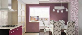
Dark in a light interior
An apron in dark shades in a light-colored kitchen will look like a bright accent spot. Moreover, it can be the same color as the walls or furniture set, although darker, or a different, similar or even contrasting shade.
Depending on the main color scheme of the interior, we can recommend the following combinations of shades:
- White kitchen. A dark apron of absolutely any shade will suit it, with or without a pattern, textured or smooth.
- Kitchen in ecru or light beige. In such an interior, a dark brown or black apron would be especially good. A combination with cherry or dark gray and dark green is also possible. But it is better to avoid blue color, as it does not go well with warm pastel colors and it would not be easy to fit it into such an interior.
- Pink or light peach kitchen. Good combination options are cherry, brown, gray and black. For cool shades of pink, a combination with dark lilac is also acceptable.
- Pale light green shade of the kitchen. A dark green apron will fit especially well into it. But dark brown, black and dark gray will also be good.
- Pale blue overall color of the interior. An apron in blue or dark blue would be especially good, but it is acceptable to use black or cool dark lilac.
- Light lilac or light purple kitchen. The ideal apron color for her is dark lilac. Cherry is also suitable for a warm primary color scheme, and blue for a cold one. The contrast of light lilac with black or dark gray will also look interesting.
Important! If you don’t want to create too obvious a contrast between the overall light color of the interior and a dark apron, then you can opt for a model with a photograph of light colors that are close to the main shade.
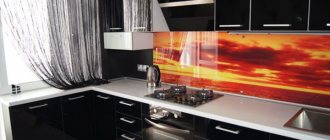
With photo printing
Skinali is called a glass panel with photo printing; it is often used when decorating walls; façade inserts for kitchen furniture are also made using this technology. Skinali, which are used for the kitchen work area, are called glass aprons with photo printing for the kitchen. As a photo print, you can use any drawings that are dear to your heart.
Black
Like white, this color is universal and can be combined with almost all other shades.
Its positive aspects:
- A black apron will fit well into almost any interior.
- It looks respectable and elegant.
- Allows you to create the most striking contrasts, such as black and red or black and white.
- Most images printed using large format printing or simply drawn by hand look good on the black surface of the panel.
- An apron of this color goes well with both regular and colored lighting.
Its negative sides:
- When you use too much black in your kitchen design, the interior may turn out to be somewhat gloomy.
- Black hides most textures and makes them unnoticeable.
- On a black apron, any speck will be visible better than even on a white one.
- On the surface of such a panel, stains and streaks from a rag or brush may be noticeable after washing it.
- Absorbs light and visually makes the kitchen smaller than its actual size.
Advice! A black apron can be painted with paint used for slate boards. This will allow you to use it as a kind of reminder for those relatives who forget, for example, to go to the store on time. You can also write down recipes on such a board, which is very convenient: you don’t need to use a cookbook while cooking, since the recipe will be right in front of your eyes.
Lilac
This color in its pure form is rarely used for kitchen panels. But, as a background on which photo printing is applied, especially with views of night cities, it is used very often. Lilac and purple give the kitchen a slight air of mystery, and its unusualness makes the interior truly interesting.
Interesting article: Elegant color combinations of countertops and aprons for the kitchen
Positive sides:
- It looks surprisingly beautiful and at the same time unusual.
- Creates a special mood, evoking thoughts of space and eternity.
- Suitable for many interior styles.
- Pairs well with other warm and cool shades.
- Photo printing with images of flowers or landscapes looks good on lilac panels.
- Perfectly emphasizes the aerial perspective.
- In combination with lighting it creates the effect of infinity of space.
Negative sides:
- In the understanding of many people, lilac and, in particular, purple, are associated with mysticism.
- This color is not easy to fit into the interior of both warm and cold shades, which is why the optimal “partner” for lilac and purple would be some neutral, achromatic shade: white, black or gray.
- It looks most successful in modern styles, not historical ones.
- A dark purple apron in a kitchen of the same or darker shade will look somewhat gloomy.
Important! Dark lilac and purple are colors for everyone. For most people, they look too unusual and extravagant.
Geometry
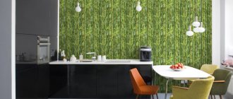
Geometric patterns have been trending since the very beginning of the concept of design. Abstraction allows you not to be tied to a certain style, making the kitchen as effective and utilitarian as possible. The black and white color of the kitchen can be diluted even with such apron combinations as turquoise polka dots on a pale green background.
The main principle of selecting a geometric pattern can be explained using the example of stripes: vertical stripes stretch the kitchen upward, but narrow in width, horizontal stripes do exactly the opposite.
Small patterns are more suitable for small spaces, and large patterns are more suitable for spacious ones. If you are unsure whether a particular pattern will look good in the kitchen, you can print out a small fragment and attach it to the countertop. Visually, you can immediately catch the correspondence. In addition, there are a large number of free interior design programs online where you can add your project.
Grey
Essentially, gray is nothing more than a toned down shade of black and goes well with most other shades.
Positive sides:
- Universal: suitable for almost any interior.
- Creates a feeling of permanence.
- Balances out too bright shades.
- Creates not too pronounced contrasts when combined with any other lighter or brighter shades.
- Well reveals the texture of the material and makes its appearance more attractive and interesting.
Negative sides:
- An excess of gray can make the interior monotonous and boring.
- Doesn't go well with shades of similar lightness.
- Needs adding bright color accents.
- Many people associate dark gray with the color of wet asphalt, cloudy skies, rain and puddles.
- For some people, gray color can cause depression.
Advice! In order to dilute the monotonous gray tone of the apron, it is better to apply a photograph to it or use materials with a pronounced texture to make this kitchen design detail. And for gray mosaic or tiled wall panels, a good solution to this problem would be to use tiles of different shades of gray, differing from each other in lightness.
Cherry color
The cherry color of noble red wine is not very often used for kitchen aprons, and, as a rule, if it is found on them, it is in the form of images of cherries.
Positive sides:
- It looks bright and interesting.
- Along with sapphire and emerald, it is a noble shade. This apron gives the kitchen a touch of respectability and luxury.
- Pairs perfectly with most warm and achromatic shades.
- The combination of cherry with white and black or dark brown is very similar to the classic red-white-black combination, but without its excessive brightness and contrast.
- Fits well into most styles.
- Brings a touch of drama to the interior.
Negative sides:
- Unlike most dark colors, it can look somewhat aggressive in the kitchen interior.
- It can be hard on the eyes, especially if the color of the backsplash is bright cherry.
- The dark cherry shade of the apron can look gloomy.
- An excess of this color does not depress some people.
- It can visually weigh down the kitchen interior and give it a touch of excessive pretentiousness.
Advice! Cherry-colored aprons will look better against a light background of furniture and walls. If you place this interior detail in an interior that is darker in overall tone, it can create a feeling of some gloom and increased anxiety.
Brick apron
There are several options for brick aprons: laying with artificial stone, brick, or fiberboard, on which a film with a brick image is applied. Despite the fact that preference is given to natural materials, artificial ones are also widely used.
The surface texture of such an apron is of great importance. In order to increase space and not absorb dirt and grease, it is recommended not to choose a coarse-grained texture. This is typical for Provence, country and loft styles. Also often used in Scandinavian variations.
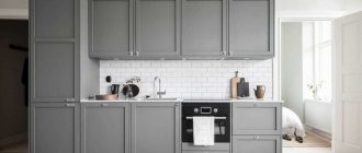
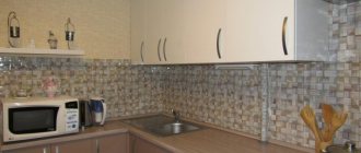
Photo
See 10 more photos of dark aprons in the kitchen below:
Useful video
Watch the video with modern aprons for the kitchen below:
You should be especially careful when choosing a dark kitchen apron. After all, this rather large detail in the design of a room can weigh down the interior, making it gloomier or more alarming. Whereas a correctly selected apron will only emphasize their contrast with the lighter colors of the main color and, if necessary, slightly muffle, elevate and make the overly bright shades of the walls and kitchen furniture less striking.
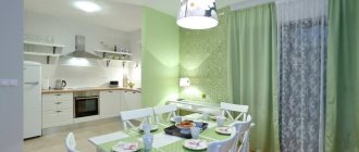
Pastel colors in the kitchen
Pastel colors of the kitchen apron will make the interior more friendly and fresh. To prevent the pastel color of the work panel from looking too faded, combine it with white or wooden cabinets, floors, ceilings or blinds.
The blue color of the walls in the kitchen calms, repels insects, and reduces appetite, so it is good for those losing weight.
The pink color of the walls, in turn, refreshes and makes the interior more delicate.