Olga
interior designer Moscow
Residential complex Garden Quarters
3-room
114 m2
2019
In what order do you think an apartment project is created? It is logical to assume that everything starts with a plan, but not this time! My clients and I spent so long developing the layout of the apartment that we even started wanting a visualization before we decided on the final layout of the walls and furniture. In the final version, by the way, we didn’t regret for a minute that we spent so much time, because we came to an option that satisfied everyone down to the last detail.
Living room design
— Why did they decide to put two identical sofas in the center of the room?
— Customers who value live communication liked this solution. When guests arrive, you can comfortably sit with a group on the sofas. On an ordinary evening, you can watch TV while lying down, without casting lots to see who owns the sofa today. And in general, why not use the space if you want? In another apartment, one could choose bright upholstery colors or different furniture models, but in this case, symmetry and simplicity of lines and colors were dictated by modern classics in the living room interior.
Layout features
Freedom is at the core of neoclassicism. The style is flexible, able to adapt to any volume of the room, if you adhere to the layout rules when decorating. They will help expand the space and fill it with light
- volumetric windows in bay or arched openings;
- high ceilings, as an option - attic type;
- furniture along the walls, strictly symmetrical to the center of the interior;
- multi-level spot lighting system.
In interior design, the term “layout” is not the technical plan of an apartment, room, or house. This is the correct arrangement of elements in space. Nikona Stroy specialists use 3D visualization when working on projects, which allows them to evaluate their work not after the renovation is completed, but at the stage of project approval by the customer. Entrust the design of your home to professionals, and all you have to do is enjoy the result.
Bedroom design
— The bedroom looks big too!
What is the footage here? - There are 20 square meters here. m of area together with the loggia, but light colors visually seem to push the walls apart. A door is visible near the bed - it leads to the dressing room, which was carved out for 7 square meters. m area. As an unobtrusive decor that will never go out of style, it is better to choose moldings - especially if you are decorating the interior in a modern classic style. The photo, unfortunately, does not convey all their charm; the moldings look much cooler in real life!
We decorate the rooms
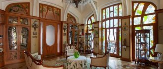
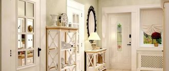
You can guess the design style of the apartment already in the hallway, which in the case of neoclassicism should be quite spacious
Living room
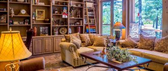
Let's start with choosing furniture. Usually, sofas and armchairs are chosen with simple shapes, but made from expensive, high-quality material. An important nuance: in addition to its aesthetic splendor, natural wood emits a characteristic smell, which will definitely add a special spirit to the overall atmosphere. It is allowed to have gilded legs on armchairs and sofas, as well as ornaments on the upholstery. The placement of interior items completely repeats the classic version: in the center there is a carpet on the floor, a table on it, and then all the other elements around the perimeter. As a rule, this is a large sofa, a couple of armchairs, and chairs with high backs. If room space and finances allow, install a fireplace.
The choice of furniture in the neoclassical style provides quite a lot of scope for creativity
Suede, velvet or velor material is found in the upholstery of sofas and armchairs
By the way, as an option, you can buy not expensive original furniture for the living room, but a worthy imitation of it. Today this is practiced quite often and can significantly reduce costs.
It is acceptable to install light, elegant models of upholstered furniture in a light shade with simple silhouettes
Lighting is another important aspect in decorating a neoclassical living room. There should be enough light (both natural and artificial). The main character, of course, will be a massive chandelier. Ideally, it should be a crystal structure, or forged with glass and crystal elements. The remaining luminous elements play a secondary role, but are in harmony with the leading “actress”. For example, floor lamps with voluminous lampshades, sconces located near the chairs, perhaps a table lamp. In neoclassicism there is an unspoken rule: there is never too much light.
In a neoclassical interior, it is advisable to use soft and diffuse lighting
Built-in lamps, floor lamps or sconces are used as auxiliary light
Accessories for a living room in a modern classic style will include vases, jugs, paintings, porcelain and ceramic figurines. And all this is not a matter of preference, but mandatory components of style.
Curtains on the windows should echo the walls or other elements of the room’s interior
Bedroom
The bedroom is one of the most important rooms in any house or apartment. After all, despite the fact that it is hidden from prying eyes, the peace of the owners depends on how comfortable it is decorated. Let's start with the design of the walls, ceilings and floors. Due to the fact that neoclassicism is often used for the design of small apartments, light colors in the decoration visually expand the room.
In neoclassicism it is customary to use the most expensive and innovative finishing materials
Neoclassicism is characterized by the following finishing techniques:
- painting the walls (ceiling) in one color;
- using wallpaper with small patterns or stripes;
- wood panels (or equivalent);
- glass wall panels or mirrors.
For ceilings, it is better to choose tension structures trimmed around the perimeter with decorative strips. The splendor of the interior will be emphasized by either a glossy ceiling without a pattern, or a matte design with a delicate print. If the ceiling is not very high, limit yourself to a single-level option. If the height of the room allows, install a multi-level structure.
Hidden LED lighting can be used as ceiling decoration
Parquet is traditionally chosen for the floor. But taking into account modern trends, you can give preference to laminate, or even poured flooring. Ceramic tiles, stylized as marble, fit very effectively into the bedroom interior.
Panoramic windows for neoclassicism are a true classic of the genre. Supplemented with decorative cornices or volumetric trims, such windows become the highlight of the overall design solution.
When planning the placement of lamps in a “neoclassical bedroom”, remember the general rule for this style: the main role is given to a spectacular chandelier, and all other lamps should “sing along” with it. The only caveat: you may decide not to purchase a very massive main chandelier for the bedroom so that it does not “eat up” the space. And arrange the rest of the lighting devices according to the multi-stage principle: sconces, floor lamps, table lamps. All light sources must be consistent with the general style: a forged base, a lampshade made of expensive fabric, or spectacular glass and crystal elements.
Despite the fact that the bedroom is intended for complete rest, it must accommodate different lighting scenarios
And, of course, the choice of sleeping place deserves attention. Modern classics provide a sufficient number of possible versions of this solution. As a rule, this is a rectangular bed with decent decoration. A spectacular headboard is, in a way, the calling card of such a bed. It can be either soft or ornately carved. A bed in a modern classic style is made of valuable wood, leather and expensive fabric.
The traditional solution is a comfortable bed with a soft headboard.
The obligatory “companions” of such a stylish bed will be bedside tables (they should be located symmetrically), a chest of drawers or dressing table with an elegant mirror, an easy chair (or maybe a sofa), and a wardrobe.
The number of pieces of furniture and their arrangement depends on the dimensions of the room
Classic design would not be such without worthy and appropriate decor. Typically, this function is performed by curtains made of natural silk, spectacular antique figurines, and paintings. Neoclassicism allows some liberties. In particular, the most varied decorations are chosen, and instead of paintings by great masters, the walls may well be decorated with modern images. Instead of natural silk fabrics, high-quality smooth fabric is used to decorate the window, matching the palette of decoration and furniture. Books on shelves, as well as vases with flowers and mirrors, even if not in antique frames, are considered a good decorative element.
One of the main elements of bedroom design are curtains made of thick fabric.
Kitchen
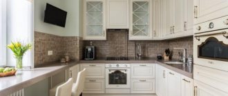
Most likely, the special atmosphere of neoclassicism will certainly be reflected in the quality of dishes prepared in such a kitchen. This is an ideal solution for those who would like to change something, but who are not ready for radical changes in the environment of their own home.
Neoclassical cuisine combines modern comfort with established traditions
In the middle of the kitchen you can place an additional work surface, which will be conveniently approached from all sides
A kitchen in a modern classic design is characterized by:
- pastel colors in decoration;
- use of moldings;
- carved decorative elements;
- exquisite fittings.
In this case, it is better to abandon gilding and volumetric stucco - the design is easier to perceive and looks more functional. Ideally, natural materials are used for finishing, but there are no strict rules and liberties are allowed: expensive natural stone can be replaced with decorative one, and let natural parquet give way to a more affordable laminate.
In furniture and decoration, a good imitation of natural materials is acceptable
However, a neoclassical kitchen should not contain the slightest sign of cost savings
The result should look chic, albeit without obvious frills, so it won’t be possible to decorate such an interior very cheaply
This interior does not tolerate diversity and excesses; everything is designed to be harmonious and appropriate. The priority is pastel colors: milky, ivory, gray and pale peach - these are ideal solutions for decorating the kitchen. An interesting feature: even simple kitchen sets in light colors look much more elegant than their dark “brothers” with lots of gilding.
A neoclassical kitchen should be furnished in colors characteristic of classic interiors
By the way, for the kitchen, as well as for other rooms, the use of white is also a great opportunity to artificially enlarge the room. Moreover, kitchen spaces, especially in apartments, do not have a large number of square meters.
An important detail: if you don’t want to decorate your kitchen exclusively in white, make it a combined one. White trim goes well with furniture in blue or beige colors.
Today there is no longer a need to choose between classic and modern; there is a good opportunity to combine both of these trends in the design of your own apartment or country house. Modern classics are a more democratic style compared to “pure” classics, and more restrained when compared with modern design trends. But the most important thing is that neoclassicism allows you to make your stay in the living room, bedroom or kitchen comfortable and enjoyable.
Children's design
— How generally is it customary to take into account the interests of the child when it comes to decorating a nursery?
— Everything greatly depends on the parents-customers and the age of the child, but still you should not focus 100% on the “wants” of the younger family member, and especially when the task is to maintain the interior in the same style. The couple we worked with this time has a preschool-age son. In terms of technical specifications, this meant that it was necessary to provide a workplace, drawers and shelves for storing office supplies, a place for games and a place in the closet where toys and clothes could be hidden.
Jade kitchen with dining area in Sicilian Marsala shade
Interior design of a kitchen-living room in an apartment in a classic style with a green kitchen set and a dining room in a wine shade
Chairs in a Marsala shade, an alder table, a marble apron in a red shade, paintings with ballerinas
In this interior, richly decorated with plaster decor and beautiful chandeliers and sconces, you will immediately notice bright color accents. For example, a kitchen set with solid solid wooden facades is made in a jade shade and complemented by an apron made of natural red Rosso Levanto marble from La Spezia, Italy. This contrast of green and dark red, almost black tone of the stone is the most important design pair of the entire project. And even the half-chairs in the dining room are an addition to this luxurious combination of expensive wood and marble. The graphic nature of the natural ornament highlights this zone in such a way that it becomes the main one in the entire interior. And only then does the eye fall on the half-chairs, which undoubtedly add depth and sophistication to the interior.
Please note that parquet is used in the decoration, which is installed both in the living room and in the kitchen, dining room and bedroom. Solid finishing without zoning is ideal for a classic interior, while in modern (loft, for example) combinations of materials are more popular.
In the dining room we see half-chairs in the wine shade of Sicilian Marsala, and next to it there is a beige sofa with pillows that repeat these shades in the living room area.
The choice of green and red in the kitchen allowed us to create a spectacular and completely unique interior in a classic style. It even feels a little Victorian, reminiscent of old Anglo-Saxon mansions in the New World, with luxurious wooden floors and carved furniture. This color scheme creates a feeling of status, good quality and quality interior. Together with a dark wooden floor, they make a harmonious trio for the kitchen.
Children's design
— Still, the style of the children’s room differs from the general style in the apartment, why is that?
— There is no goal to make all the rooms the same, modern classics in the interior can be like that, with furniture from IKEA. It was important for us to maintain the general mood, color scheme, but at the same time leave the children's room as a nursery. We strongly advise you not to neglect carpets in your rooms, because they add coziness. Here, for example, we put a practical and inexpensive mat - durable and easy to clean.
30% of our customers have at least one preschool child.
Windows and lighting
It just so happens that since the times of luxurious estates and palaces, windows have been the main source of light. As wide and tall as possible, they were framed in natural wood frames with an impeccable finish.
Today, not every room can boast of such a scale, so to demonstrate the classic style it will be enough to visually enlarge the window openings using the lightest color scheme of niches and snow-white curtains.
Daylight is replaced in the evening by stylized pendant chandeliers, richly decorated with glass and crystal. Depending on the size of the room, it can be one central chandelier, or several located along the axis of symmetry.
To complete the effect of maximum illumination, which is a mandatory parameter of a classic interior, additional light sources are also required. These can be noble floor lamps, with gilded elements and a laconic lampshade; stylized table lamps or sconces. In any case, the selected lamps must be paired and not break the symmetry.
Bathroom design
— Is a similar curtain-wall in the bathroom considered a good alternative to a shower stall?
- This apartment has two bathrooms - the smaller one has a shower. Of course, such a curtain is much more elegant than hanging curtains with a pattern! However, it requires special care - if you are too lazy to wipe off drops of water every time, then limescale will not be long in coming. By the way, special rubber brushes with a handle - the so-called squeegees, window squeegees - do a very good job of cleaning up splashes.
Bathroom with powder pink walls, classic tiles and red furniture.
The bathroom is finished with Kerama Marazzi tiles and Farrow&Ball paint. The wooden wardrobe and cabinet were designed by designers and made in a carpentry workshop. Mixer from Nicolazzi, floristry AhFlowers
Interior design of a bathroom in a classic style in a noble red wine shade. Vintage effect tiles, sliding interior door, brass fittings
The bathroom will appeal to adherents of exceptional classics and rococo, based on ancient Roman architecture, where gold and sand shades play a primary role in the interior. Please note that part of the wall under the ceiling, ceiling moldings and the ceiling itself are painted in a pink powder tone, and the custom-made cabinet is chosen in a super-spectacular wine red shade.
But the most important details of the interior were the sliding door with a mirror on the side of the bathroom and the mirror finish of the facades of the built-in storage cabinet in red frames, which create a feeling of spaciousness in the cramped conditions of the bathroom.
Beautiful white tiles for the walls are complemented by a decorative border at human height, and on the floor you will find classic tiles with an ornate pattern, which were also used in the decoration of the loggia. Small details also became very important elements: two sconces on the mirror and a faucet in pink tones. They include a heated towel rail, a flush button, holders for towels and toilet paper, and even a ventilation grill, shimmering in different shades from antique to yellow gold.
By the way!
Layout without restrictions!
We work on the layout until you are happy with it. And it doesn’t matter how many options there are: 5, 7, 10... There are no restrictions!
Cool consultation!
The manager will tell you in detail how the design is going, share his experience, help determine the budget, etc. And all this is completely free!
More than 13 years on the market!
This confirms that we offer a quality product at the best price, work honestly and you can rely on us!
1 year warranty!
We guarantee high-quality drawings! If there is an error, we will fix it free of charge and promptly. The guarantee is valid for a year after delivery of the design project!
Entrance hall and loggia with white walls and gold accents
Classic apartment design in the photo: hallway. Custom-made wardrobe, Istra Manufactory doors, Odeon Light sconce, emerald velvet ottoman in Art Deco style
Interior of a loggia with a designer armchair from MDE House in original Missoni Home textiles. Small tables purchased from Zara Home, florist AhFlowers
Last in our article we will look at the hallway and loggia with light white walls and gold accents. In the entryway we find an emerald Art Deco ottoman, while the loggia features an armchair in a luxurious Missoni finish and a pair of modular cocktail side tables with marble tops. By the way, the tiles on the floor on the loggia are identical to those used for the floor in the bathroom, as we already talked about earlier. In general, these areas have a more laconic design, since the auxiliary rooms must first of all fulfill their main function in the bright interior of this classic apartment.
Studio version
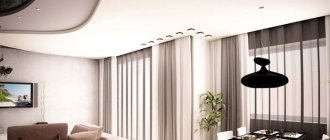
Decide for yourself whether the open space will be comfortable. The studio option allows you to increase the area. In this case, it is important to choose the zoning of the space. Usually they combine a living room and a kitchen, a bathroom and a toilet. In this case, it is necessary to install a good hood so that odors do not flow from one room to another.
Stylish studio apartment in matte black and white colors
The open space becomes larger. However, a conditional division is necessary to emphasize the functional areas. These may be mild, including :
- transparent partitions;
- decorative elements;
- individual pieces of furniture.
Open space seems big
To do this, choose partitions:
- Low.
- Consisting of beads.
- Made from tinted or decorative glass. If you choose an option similar to door block inserts, the room will acquire integrity.
For lovers of open spaces, you can use sliding doors, including radial doors. Sometimes they are closed, and kitchen odors remain indoors. Partitions are different.
Glass partitions are lightweight and do not overload the interior
Types of partitions
- The bar counter combines the kitchen and living room and serves as a dining table. Underneath there are additional shelves for kitchen appliances.
- Lightweight partitions . For construction, plastic panels, drywall, fabric stretched over a wooden frame, and glass of various textures and patterns are used.
- Racks for decorative items or books. This transparent element creates light separation and does not overload the interior. The rack can be straight, semicircular, ceiling-mounted or low in height.
- A fashionable item is a fish aquarium. The transparent water world creates a pleasant microclimate and soft lighting.
- Screens . It is worth remembering the screens of the past. This option is suitable for neoclassical styles (Rococo, Baroque, Gothic), modern: Provence, Japanese, Oriental, Indian, Chinese.
- Glass blocks . A narrow or low wall made of transparent or multi-colored blocks changes the interior, giving lightness and cozy highlights.
- A decorative podium is an interesting option. Part of the room is raised to a height of 40 cm. Pull-out sleeping places and drawers for storing bed linen or seasonal items and shoes are created under the new floor.
Option that will interest you
Tip Some decorators suggest separating the sleeping area from the living room with an open clothes hanger. You should not use this technique. The room will lose its charm and take on a cluttered appearance.
Visual zoning gives an unusual effect. Individual functional corners are determined by various finishing materials and decorative elements. For example, in the kitchen, hallway - tiles, living room - laminate, parquet boards or linoleum. The lighting for the sleeping area is soft, there is a chandelier in the living room, and directional spotlights in the kitchen.
Zone the space in a studio apartment using various materials and decorative elements
