/Design/
Surely you have noticed that the comfort and beauty of a home depends to a very large extent on the combination of colors. You may have also noticed that when decorating an interior, simply following your intuition does not always lead to the desired result. And this is normal, because most of us are not designers and do not know about “tertiary colors”, the Itten color wheel and other professional things.
But whatever one may say, knowing the basic principles of color combinations in the interior is very useful for everyone. After all, this knowledge can be used not only in choosing curtains and paint for walls, but also when choosing clothes, for example.
And fortunately, you don't need a bachelor's degree to learn how to combine colors. Today we will tell you about the basics of color theory that anyone who wants to learn good taste and make their home beautiful needs to know, in a question-and-answer format.
How many colors can be used in the interior?
A win-win option is to combine only 3 colors: primary, additional and accent (more on this in the next question). And so that the interior is not boring (this is also possible with a simple design), you can complicate it by using different shades of three colors, and by interesting textures.
If you are confident in your taste and are ready to work hard with the color wheel (we’ll also talk about it below), then you can try combining 5 colors. More colors in the interior can overload the space and create visual chaos.
- However, there is no strict rule on this matter. For example, professional designers are able to create complex palettes from a large number of shades.
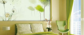
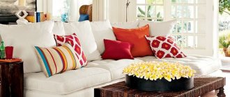
Green + beige
Muted green tones are good for creating a simple and relaxed atmosphere in the living room interior. If you have chosen rich shades of grass and greenery, rely on natural materials in the decoration - warm wood, natural beige and brown stone, wooden furniture. You can complement the decor with the color of peppermint in textiles - curtains, pillows and bedspreads.
Project authors: Dmitry Mudrogelenko, Zlata Mudrogelenko
Project authors: Dmitry Mudrogelenko, Zlata Mudrogelenko
In what proportions should colors be distributed in the interior?
In this matter, you can apply the new Pareto rule - 60:30:10. According to it, more than half of the space should be occupied by the main color (this could be walls, floors, ceilings, carpets, curtains, large furniture), 30% of the area should be allocated to an additional color and 10% to an accent color.
- Since the main color plays the role of a background, it should be calm, because pure and bright colors in large quantities tire the eyesight. But! There are always compromise options. If you really like the raspberry color, then you need to use it, but in a whitened shade or with a gray base. The blue color can be replaced with cyan or blue with a hint of gray.
- The second color should occupy half the area - only 30%. The secondary color, as the name suggests, should complement and support the primary color. What should it be like? The easiest way is to choose the shade that is next to each other on the color wheel. For example, if you chose green as your main color, then you can choose blue or yellow to pair it with.
- Since the accent color occupies only 10% of the area, it should be bright or contrasting, namely the opposite of the additional color in the Itten circle (more about it below).
Important additions:
- Achromatic colors (white, gray and black) can be ignored, since they are absolutely neutral and only “bind” all other colors.
- The universal and simplest solution looks like this: walls are the dominant color, furniture (including upholstery) is additional, interior items are accent color.
Gray + citrus shades
Gray living room walls work with almost any color combination. An excellent combination would be a combination of light gray boom, concrete-colored walls and juicy citrus shades. It is important to consider what time of day the sun hits the room - ideally when the yellow and orange hues are illuminated by the pre-sunset rays. True, in this case it is better to use a bright sunny shade carefully - as accents.
Project author: Natalia Suslina
Project author: Natalia Suslina
How to use the color wheel?
Itten's color wheel is the assistant of all designers. It allows you to visually imagine which colors harmoniously combine with each other. The basic wheel consists of 12 colors, but it can theoretically be expanded to include an infinite number of shades.
How to use the color wheel? It's quite simple, you just need to know the patterns and not be afraid to “play” with the wheel. There are many schemes for combining colors in a circle (see picture below). But there are three basic algorithms.
Scheme 1. Monochromatic combination of colors - when related shades from one segment of the circle are combined.
Scheme 2. Contrasting color combination - opposites are combined according to this principle. For example, green and red.
Scheme 3. Harmonious combination of colors - in this case, neighboring shades around the circle are selected, for example, blue, light blue and green.
- Our article on how to plan a kitchen color scheme will give you more tips on using the three schemes listed.
- You can buy a circle at an art store or use online services. For example, Paletton or in phone applications.
Light yellow and blue
A pale shade of yellow will add zest to an outdated interior and breathe new life into it. The combination of yellow and blue is a classic combination, but it never ceases to inspire designers. Shades of blue in the living room interior create a feeling of air and cleanliness. Shades of water and lemon work well together.
Project author: Margarita Sivukhina
Project author: Margarita Sivukhina
What to look for when choosing interior colors?
There is a common belief that the color scheme should be chosen based on the characteristics of the surrounding area. For example, if you live in the south or, say, in the tropics, then the interior should be decorated with bright colors or cool tones. And if we are talking about a city apartment, say, in central Russia, then preference should be given to muted, calm shades.
Many designers believe that there are no rules in choosing an interior palette, and you can choose any colors that residents like. It seems to us that the truth, as always, is somewhere in the middle. Imagine that every time you return home through the urban jungle on a cold winter day, you find yourself in an apartment in blue tones or, say, in an apartment with an abundance of bright colors. It probably won't be comfortable in the long run. However, you can always find a compromise solution, for example: instead of bright pure colors, use whitened shades or with a gray undertone, or use bright colors only in accents.
- Another simple guideline in choosing interior colors is the colors of your wardrobe. As a rule, we unconsciously choose clothes in those colors that are pleasant to us and suit our temperament, which means they will look good in our home environment.
- The third way to determine the palette, which greatly simplifies the matter: take a magazine or find a photo on the Internet and select ten interiors that you really like. This way it will become clear to you what the eye is drawn to and what shades should be included in the color scheme of the apartment. Next, you will only need to repeat the ready-made solution.
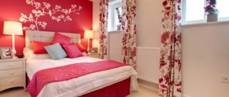
Gray blue and soft pink
The classic “Scandinavian” color of the living room walls can be enlivened with the help of ash pink, muted salmon shades. A very light blue can be used to paint the ceiling because white can look harsh next to the muted tones of this range.
Project author: Svetlana Khabeeva
Project author: Svetlana Khabeeva
What colors can be used in small spaces?
It is better to use light and neutral shades, as they have less “weight”, while bright colors visually appear heavier and larger.
Support the project - share the material with your friends on social networks:
Blue + beige
Sky blue can be surrounded by light, desaturated greys, beiges and warm neutrals to create a great combination. You can also use a combination of wallpaper of two colors in the living room: in the photo and in real life, blue plus beige will look great. Together they create an atmosphere of serenity. The morning haze color is suitable for matte and glossy furniture surfaces, while warm brown shades will add a feeling of luxury to the room.
Project author: Evgenia Mishina
Project author: Evgenia Mishina
Project author: Ekaterina Rudnitskaya
Project author: Ekaterina Rudnitskaya
Project author: Ekaterina Tretyakova
Project author: Ekaterina Tretyakova
Balance
The interior will be harmonious and pleasant to live in only if color balance is achieved in it. The balance should be: dark and light, colored and colorless, warm and cold (according to color tone). There are no unambiguous rules here, so balance is created only according to the internal feeling that is developed by experienced designers.
Well balanced interior
An important point for balance is self-sufficiency . This means that the interior must contain three primary colors - blue, red and yellow. This is due to the structure of our eyes: if in the field of view there are, for example, only blue and yellow objects against the background of a light gray wall, it will seem to us that the wall is pinkish. Once we add at least one red object, we will see the wall as it is. These three colors do not have to be present directly, as in the example, they can be mixed with other colors: for example, reddish brown or light orange will also work.
Red is present in the shade of wood and the pillow with the dog
Multicolored pop art
Pop art is a bright vintage style. Here, multicolor is a key feature, without which pop art will cease to be such. The main attribute of the style, the pop art poster, is also multi-colored.
In addition to wall decor, decoration, upholstered furniture, and accessories can be bright and colorful. Different colors come together in stripes, polka dots and other geometric shapes. The main thing is that the colors are clean, rich, and cheerful. It is possible to include “acid” tones. The color most often used is pink .
Not only the pop art style, but also retro interiors in general are characterized by the presence of many bright colors.
Retro
Retro
Why you need to follow the rules for creating interior design
The design of any room is done, first of all, for the convenience of people, comfortable rest, and productive work. Literally a couple of decades ago, people lived and worked in cramped conditions, in the cold, with insufficient lighting, and few people thought about the correct color design. Furniture, especially in the countries of the former Soviet Union, did not have much to choose from - there were only a few mass-produced models of each element on sale, and custom-made furniture was available to very few. Decor was purchased according to the principle “the more, the better” - the presence of many pictures, figurines, posters, and intricate dishes in the house was considered a symbol of wealth, but it created incredible crowding.
Today's times dictate different rules. In short, the apartment should have:
- warm, but not stuffy;
- beautiful, but not cramped;
- light, but not overly bright;
- fit everything you need, but each family member has their own corner.