About Grays and Neutrals from the 50 Best-Selling Paint Colors Palette
The best paint colors for walls and ceilings, according to a professional. The most purchased colors for interiors and facades in the world. The best shades of gray: from almost white to almost black. How does color change under different lighting?
When you're choosing a paint color for the interior or exterior of your home, it's a good idea to familiarize yourself with the palettes of the most popular and best-selling colors. Such palettes are formed based on the choice of both professional designers and owners of apartments and houses, and help not to drown in the ocean of thousands of available shades of paint and varnish products. This can often be a great starting point when finding the color that suits you best.
Below is a palette of 50 of the most popular and best-selling paints from the famous company Sherwin-Williams. Of these, we will highlight 12 of the most versatile and reliable gray ones and analyze them in more detail. There will be descriptions and tips on using this or that color, with explanations of why this color is more appropriate in certain places and conditions. The “pros” and “cons” of the selected colors will also be taken into account.
In this material we will rely on the extensive experience of US designer Cindy Alred. We give her our word:
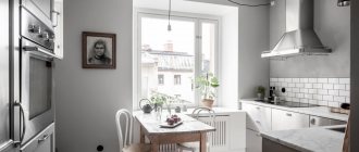
Repose Gray
The number one color in the world in all companies involved in the production and sale of paints. Of course, this cannot be said with 100% certainty, but I would be very surprised if I found out that this is not the case. Repose Gray is a fantastic warm light gray that I highly recommend to my clients because it is absolute perfection when it comes to painting all the walls in a home a neutral light shade.
Pros : Versatility. This gray is especially nice because it not only looks beautiful during the day in natural light, but is also one of those rare colors that looks great at night in artificial light. When changing the color temperature of the lighting, unpleasant shades do not appear.
Cons : In rooms with lots of natural light, Repose can produce a very faint bluish-gray cast.
By the way, all the colors on the fan card where Repose Gray is located (card 244) made the bestseller list, which is not surprising because this set is simply gorgeous. These are stunning and versatile colors and you'll see some of them below.
Style solutions
There are trends that have been around for a long time: blue and white kitchens or calming green bedrooms. However, new ideas are also interesting. They are worth paying attention to.
Calm style
You can settle on one color, for example, blue - it calms the psyche. This looks good in the bathroom or bedroom, anywhere you need to relax. Curtains, towels, bedding, accessories may be different.
Blues, lavender, carnation and soft lemon colors are a great option for a romantic atmosphere. A calm atmosphere will be created by pastel shades of warm, cold, neutral milky. Use different textures of bedding and accessories to make the decor even more attractive.
Sage, buttery golden shades will make the kitchen cozy. Choosing a wall paint color from subtle blue combinations will create a peaceful home.
Elegant style
Neutral options will create an elegant mood. This is not only a beige and milky option. An ordinary bedroom will become elegant with almond finishing patterns. Add color to pillows and vases to offset neutral tones. Don't be afraid to add structure to your accessories. Neutral wall paint colors will allow you to play with the atmosphere of your home and make it visually wider.
Various patterns of rust, mahogany or garnet will create an earthy, rich feeling.
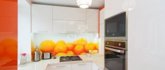
Bright style
If you want fun, then when choosing the color of the walls in your apartment, use bright combinations and their shades - such as orange and gold, red and dark purple. The nearby colors of the circle are complemented by the opposite ones on the wheel: gold and orange with purple. Red and black are chosen to create a contrast to the oriental style.
Choose two opposite circle combinations: they will play against each other. The style completely depends on your taste, it should be matched to the atmosphere.
On video: how to make your living room bright and sunny.
Sea Salt
This color is almost as popular as the previous one. The vast majority in the survey named it their favorite Sherwin-Williams color. Feel free to go for it if you are looking for a calming and serene spa color.
Pros : Calmness and serenity. In the right light, Sea Salt is one of the most beautiful shades of blue-green-gray.
Cons : Has a chameleon effect and can be finicky in certain lighting (usually in areas with a lot of natural light). It is very important to do test colors first. This color looks best in rooms with little or no natural light (bathrooms, bedrooms, etc.).
Choosing furniture for a bright room
Even before the renovation is completed, people begin to worry about the question of what color to choose a sofa for a bright room. Each color has its own effect on mood, emotional and visual perception. Warm colors bring objects closer and provide a festive feeling. Cold ones are soothing.
Classic combination of red, white and black colors
Choosing furniture color
A light-colored room will combine furniture of absolutely any shade. The main thing is not to forget that each color has its own mood:
- red – increases appetite, suitable for the kitchen, office, study, very dynamic;
- orange – ideal for a teenager’s room, improves mood;
- yellow - the living room looks beautiful in this color, it adds airiness and lightness;
- green – relaxing, calming, suitable for modern design;
- blue can be depressing, so it is not recommended for bedrooms, but it will look luxurious in a living room or office;
- blue – airy, yet cool, quite appropriate in the kitchen;
- purple is mysterious, but you need to be careful with it; if you dilute it slightly, it will be suitable for a children's room.
Green furniture is an excellent solution for a child’s room
Glossy set with lilac facades in a high-tech kitchen
It is advisable to select furniture and walls in the same color scheme. The sofa, wardrobe, bed should be in harmony with the wallpaper or paint.
Worldly Gray
This is another trustworthy warm light gray color that is quite close to Repose Gray but is a little warmer and darker. I often recommend it to clients over Repose Gray as an overall color for the entire interior if there is a lot of natural light in the room, as the former can look too white in such conditions.
Pros : In rooms with lots of natural light, Worldly Gray is ideal and versatile.
Cons : This color will appear darker in areas with little natural light, and may look a little heavier than a traditional warm light gray.
Photos of interior examples in a bright room
Light wallpaper looks very nice in the room photo design:
Idea for decorating a bedroom in light colors (photo):
Examples of living rooms (photos):
Original kitchen in white (photo):
The hallway, made in light shades, looks bright and luxurious (photo):
Options for decorating a children's room:
Now it becomes clear how to create bright light in a room. White color is universal. It will add lightness and airiness to the space.
Crushed Ice
I met Crushed Ice for the first time recently when I was redecorating my living room. I chose this as a replacement for Repose Gray (our number one), which looked a little lighter than I would have liked in this space. And in the end, I just fell in love with it, so I can confidently recommend that you try this color too. It's a little lighter, a little cooler, and has a little more pigment than Repose Gray.
Pros : Crushed Ice is a stunning warm light gray that falls between light (with subtle color) and mid tone. A rare gem in the range of intermediate neutral colors.
Cons : Crushed Ice looks better in areas with moderate natural light. Not the best choice for rooms without windows.
Dorian Gray
This is another fantastic neutral warm gray from the mid-tone range. I used it on my client's kitchen hood hood and it looks beautiful. Dorian Gray also works great as a neutral color for furniture.
Pros : Found on the same card (244) of the color fan as Repose Gray, but only two shades darker. A very versatile color for walls and cabinets.
Cons : Too much natural light can cause Dorian Gray to become cooler and no longer look like a warm gray.
Cabinet
Photo: bright office
Photo: cozy office
An office is a place where owners sometimes spend a lot of time. The interior of the office should be comfortable, not overload the nervous system and set in a working mood. The choice of style and colors depends on the size of the room, as well as the taste and work activity of the owner. Designers prefer white, beige, yellow, blue and blue, gray and brown tones for office decoration. The rules are the same: if for the south and east sides - cold and neutral tones, for the north and west - warm colors.
Photo: small offices
Dovetail
If you want something darker than a neutral mid-tone warm gray, Dovetail is a great choice. It is well suited for interior doors and cabinets. It is unlikely to be suitable for painting all the walls in the room, but an accent wall of this color will look beautiful.
Pros : Dovetail is a win-win option when you want to add contrast to a room, but don't want to use very dark tones so as not to lose the overall lightness.
Cons : Dovetail may take on a warmer tone in rooms with artificial lighting. Although this does not harm him too much, he remains beautiful.
Interior partitions
The ideal room divider that creates an accent is one that is guaranteed to attract attention. If you can’t decide, then consult with your friends. Use one that won't be hidden or boring. A balanced design involves the correct placement of furniture near the accent partition. A huge closet or long curtains should not obscure it.
You can’t leave the space next to it empty, otherwise it will look unbalanced.
A different palette of paints for walls will create a certain state. Once you find one you like, limit your choices to no more than two combinations.
Drift of Mist
If you want a neutral shade with just a hint of color, I suggest using Drift of Mist. It's a very subtle color that I think is almost the perfect neutral.
Pros : Drift of Mist is one of those rare colors that solves the problem when neither white nor more saturated colors will do.
Cons : There is a very slight hint of muted yellow (very faint). This is what distinguishes it from white, softening it to neutral. And, although I don’t like the presence of yellow, I could use this color in my home.
Children's
The psyche of children is more mobile and receptive than the psyche of adults, so tones must be chosen carefully and carefully. Otherwise, the color of the walls can negatively affect the emotional and physical health of the child. When choosing a palette, it is worth considering the following criteria:
- child's age . Bright, heavy accents can tire a child’s fragile psyche. But a dull, white space can also stunt development, as brain activity is stimulated by viewing different colors. Therefore, up to 3-4 years, it is recommended to give preference to pastel colors, and add bright colors later;
- peculiarity of a child . If the baby is temperamental and active, calm shades of the wall can serve as a balance: light yellow, blue, light blue. If, on the contrary, the child is quiet and shy, then bright colors are suitable - orange, yellow and shades of red will cheer him up and give him energy;
Photo: blue color will help calm a little fidget
- preferences . If a child insists on a color that is not included in the parents’ plans, it is still better to add it to the room, even if only as a decorative element. Teenagers usually have already formed preferences in colors, so when arranging a room you won’t have to rack your brains;
- need for zoning . The play area, as a rule, is made in brighter colors than the work area.
Photo: zoning in a children's room using color accents
Designers prefer the following colors:
- green is associated with nature and not only relaxes, but also soothes the eyes and improves memory. Perfect for decorating the wall of a study area;
- yellow . Improves mood and activates brain activity. Suitable for both active and shy children;
Photo: bright green and yellow in the children's room
- orange and red are colors that experts do not recommend overusing. Despite the fact that they invigorate and charge with energy, an overabundance of rich orange and red overstrains the psyche and negatively affects the emotional state of the baby. If the child still insists on this color, then it is better to add it in doses;
Photo: oversaturation with bright colors can have a detrimental effect on a child
- blue and blue - calm and relieve nervous tension, but shades of blue can have a depressing effect on a shy and quiet baby;
Photo: room for two children in brown and blue tones
- pink is a classic for girls. Pink, along with purple, distract the child’s attention, so it is better to use them in a muted version.
Photo: all shades of pink – a classic for little princesses
Peppercorn
It's no surprise that Peppercorn from Sherwin-Williams made the bestseller list because this color is unheard of good! This cloudy taupe has tremendous depth and is perfect for an accent wall, closets, and some very small spaces.
Pros : Peppercorn is one of the most trustworthy taupes. It always looks good on walls, cabinets and accent pieces.
Cons : I can't think of a single problem with this color. He always looks great.
Theories of palettes - warm and cold
Orange and yellow solutions visually bring the space closer to the eye. This makes the room smaller. A warm color palette is used as an accent in a long narrow room. Painting the end part with orange and red shades creates balance.
Grass, blue, and purple solutions move the space away from the human eye, making a small room look large. On an end or side interior partition, this technique will make it possible to turn a narrow room into a wide one, and from a small one into a large one.
Iron Ore
The next example is a beautiful very dark gray with a brown undertone that has become a popular choice for finishing interior doors, cabinets and façade features. Really amazing color!
Pros : Iron Ore is a stunning deep and heavy color. It adds instant contrast to a space when used sparingly.
Cons : When using this color to decorate exterior elements, be careful: make sure that it harmonizes with the overall color of the facade, even if it is almost white. This is less true indoors, but bright sunlight outside really brings out the Iron Ore tones.
Black Fox
Another fantastic dark color from the best seller list, very similar to the previous one is Black Fox. But while Iron Ore tends to lean towards dark grey, Black Fox is more of a very dark brown.
Pros : Very rich dark, ideal accent color for walls, interior elements and facade decoration. Very versatile.
Cons : In windowless rooms under artificial light, Black Fox can have a rather warm tone but still be beautiful.
Find the common denominator
What other spaces are visible from the room for which you are choosing a wall color? All of them should be combined with each other and create a complete image.
Tip: stand so that you can see the next room. Notice the patterns and colors you see at the same time. Now turn around your axis, watching what else falls into your field of vision. In order for the impression of a space to be harmonious, everything you see must have a common denominator.
Tricorn Black
Of the black colors, I most often prefer Tricorn black in my projects. First of all, because it really looks like black. And small brown-gray undertones relieve it of excessive roughness and harshness.
Pros : This is a very versatile and reliable color for both interior and exterior use. If you are in search of the best black color, you can go for this one as it is really beautiful.
Cons : I've never had a problem with this color. He won't let you down. The taupe shade complements almost any color when used as an exterior trim or accent color.
Features of painting walls made of different materials
Each finishing material is unique in its own way. And its painting should be carried out taking into account all the features. Most often, paint is applied to lining, concrete, brick, and plastered walls. In addition, there are universal wallpapers on sale that can be painted. All the painting features of each facing material will be discussed below.
Wooden
Wood walls should be painted with paint that allows moisture to pass through. After all, wooden surfaces can control the level of humidity themselves using their micropores. Alkyd oil paint or paint based on alkyd resin is well suited for wood.
It is worth considering that before painting, the wooden surface must first be primed and this layer allowed to dry.
Wood walls should be painted with paint that allows moisture to pass through.
Brick
For brick walls, acrylic or alkyd paint is used. Before starting the process, clean the surface with a sponge dipped in water. Next, you need to let the wall dry for 5-7 days and prime it. After the paint is applied, you can go over the seams with a thin brush and highlight them with a different color.
For brick walls, acrylic or alkyd paint is used.
Concrete
Concrete walls have one feature - when finishing, the paint is absorbed deep into the pores. Consequently, the consumption of paintwork will have to be increased by one and a half to two times. Before this, you also need to apply a primer solution and wait until it dries. Epoxy or latex paint works best on concrete walls.
Epoxy or latex paint works best on concrete walls.
Wallpaper
Wallpaper is painted only with a water-based coating. This is due to the fact that at any time the owner can clean the old coating and paint the wallpaper a different color.
Wallpaper is painted only with a water-based coating.
Plaster
Plastered walls must be smooth, dry and clean before painting. All kinds of chips and cracks are sealed, excess irregularities are cleaned off. This surface is painted in 2 layers using textured paint.
Plastered walls must be smooth, dry and clean before painting.
Mindful
I have been using Mindful Gray for many years, both on client projects and for myself. I think Mindful Gray is one of the nicest and safest warm gray colors out there and is great specifically for furniture.
Pros : An extremely versatile warm gray that looks best on cabinets and other furniture, as well as fronts. It's a little heavy to get a warm gray on your walls, but it's fine if you're looking for a warmer, mid-tone gray.
Cons : In rooms with plenty of natural light, Mindful Gray can look cold without losing its brilliance. However, if you want a warm gray that stays warm in these lighting conditions, then Mindful Gray is not the best color here.
Most of the Sherwin Williams colors featured on the most popular list are simply gorgeous. I haven't worked with many yellow/beige tones so I haven't given them any rating in this review.
And further. Before using any of the colors that I have given excellent ratings, be sure to test them in the room and lighting where they are intended. Lighting can change color dramatically and I really want you not to be disappointed!
You can learn about how light changes color in the article Warm and cool lighting in the interior. Color temperature of light.
To learn how to choose a light bulb with good color rendering, read the material Quality of lighting in the interior. Choosing the best lamps.
You can order paints in the colors you like right now on this website.
Articles about paints, color and design (opens in a new tab)
View products
How to choose colors
The most difficult thing is to create the desired shade yourself based on white using basic colors. When selecting paint, you can use the color mixing table and use the trial method to achieve the desired result.
The second option is to use computer selection (computer tinting), but this is possible if you have color catalogs from the paint manufacturer.
Whatever selection method is chosen, it is necessary to follow the paint application technology recommended by the manufacturer. The final result will depend, among other things, on the base on which the last paint layer is applied.
You can find out which interior wall paint you can choose from the review article on this topic.