Fresh and laconic interior, nothing superfluous, but with a twist. Elegant, graceful and simple at the same time. Today such qualities are highly valued. But let's dig deeper and consider how practical this design option is. After all, the kitchen is a place for preparing food, which means functionality and convenience come first. In this article we will analyze in detail what visually defines this style and how convenient it is to use.
How do we know that we have a Scandinavian interior?
- Color ratio. This style uses white - 70%, wood - 20%, bright accent - 10%
- Bright accent. For this purpose, only muted “dirty” shades of primary colors are used. In their pure form, these colors are not suitable. That is why the Scandinavian style is very recognizable.
- Slight negligence. This style assumes “imperfection” and this is built into its structure. The mess that arises in the kitchen during cooking fits very well into the style and does not spoil the overall perception of the interior.
- Repeating element. The shape or geometric pattern running in red throughout the interior is an integral part of the Scandinavian style.
- Simplicity is our calling card. For the Scandinavian style, the use of expensive decorative elements and interior decorations is not acceptable.
- Grace of form. The supports of the table, chairs and all furniture end in a graceful narrowing. This rule does not affect only the kitchen set itself.
- A mixture of classics and modernity. Light elegance in visual perception appears when there are elements of strict classics. And simple lines without unnecessary intricacy tell us about modernity.
- Finishing the floor and walls. They are as simple as possible and sometimes even approach the loft style. A painted brick wall or an old floor covering is very suitable for this style of interior design.
- Open storage systems. Hanging shelves, rails, open shelving and the absence of upper modules are the basis for the Scandinavian style.
In general, these are the main distinctive features of the Scandinavian style. Based on visual perception, we have decided, and now let’s move on to practice. Let's figure out how to create this interior in our real apartments.
White
Indispensable for Scandi. To avoid associations with a hospital and the sterility of its operating rooms due to the presence of white in too large quantities, it is better to dilute the interior with other tones. For example, green, gray, beige, blue. Accents in shades of graphite, turquoise, and yellow look interesting.
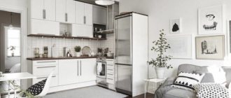
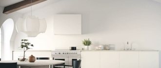
A classic white kitchen in the Scandinavian style includes a crisp white apron, light smooth surfaces, a tiled floor, and a suite that pleases with its high functionality despite the simplicity of its appearance.
Photo from source: interiorzine.com
Kitchen with white tile wall, white cabinets, black fixtures, grout, checkerboard tile floors and wood countertops:
Photo from source: digsdigs.com
Table top Cedar 232/S Oak Niagara
Why open shelves are not practical
- You cannot install a built-in hood. There is simply nowhere to put it. Meanwhile, it is compact, low cost, and does not collect dust. All that remains is to install a separate hood. In some variations of the Scandinavian style, a hood is not provided at all. Is this a thoughtful decision?
- There is no place to store clean dishes. Basic rules of convenience tell us that the best place for dishes is the module directly above the sink. But if there is an empty wall, what should you do? Place the dryer directly on the kitchen work surface or hide it in the lower module. And this will take up additional space below.
- Inability to illuminate. This is not just a design whim. Of course, with lighting, the kitchen will look more interesting due to the light from the apron and the creation of deep glare. Additional light is simply necessary. After all, if there is only overhead lighting, while cooking, the work surface will always be in the shadow of your silhouette.
- The ends of the apron. Typically, the upper modules cover the joint between the apron and the wall. But if they don’t exist, you’ll have to think about how to decorate them beautifully.
- Reducing storage space. Since there are no upper modules, all kitchen utensils will now be hidden below. Do you have enough space to fit everything? And one more nuance: you will have to constantly bend over to get the necessary thing.
What conclusion can be drawn? You shouldn’t blindly follow the rules for creating a Scandinavian style if practicality comes first. It is better to make upper modules and leave partially open shelves. At least above the sink. There is another option, forget about this rule. And save only the visual of the materials.
Grey
The climate of the northern region is very harsh. And gray is the color that perfectly conveys this. Associations arise with thick fogs, rocks, fjords, fast rivers in the mountains, heavy clouds...
Rough or glossy kitchen surfaces with a black, metallic, silver tint look interesting.
A gray Scandinavian kitchen looks great with elegant backlit cabinets, pendant lights, white stone countertops and a splashback. The “Cedar” catalog contains wonderful imitations of marble.
Photo from source: digsdigs.com Tabletop Cedar 7024/1 Imperial Marble
How to decorate a kitchen combined with a living room in a Scandinavian style
Scandinavian style is ideal for small kitchens. And if you have such a kitchen combined with a living room, nuances appear. Firstly, the appearance of disorder and slight negligence in the kitchen is not very pleasant to observe from the living room. And secondly, let's remember the dust. There is practically none in the kitchen, but in the living room sofas, carpets and curtains are its source. And dust, accordingly, will settle on open shelves and storage systems. This means that tidying becomes a regular and joyless task.
If you intend to follow the Scandinavian style according to all the rules, then we recommend making an L-shaped kitchen layout with a high module at the edge. And make all open shelves in this corner so that kitchen utensils and clutter are not visible from the living room.
If you plan to “forget” about this rule, then make a fully built-in kitchen and don’t complicate your life.
Walls
The walls are “dressed” in white, light gray, and heavenly shades.
In such an abundance of light colors, an accent black countertop looks great, which harmonizes with appliances and decor (rug, kitchen utensils) in the same colors:
Photo from source: idesignarch.com
Table top Cedar 5141/Mn Moon
Light brown, beige, “complex” tones, the perception of which depends on the lighting conditions, are also appropriate. Ivory is a typical “complex” color.
The predominance of natural beige tones creates a soft and calm atmosphere, an impeccable, sophisticated, modern style. Cabinets are made in the same color as the walls - this is one of the trends that is gaining momentum today and gives a feeling of true exclusivity and individuality. The countertops are also matched to the interior tone.
Photo from source: nordicdesign.ca
Table top Cedar 685/1 Platinum
Printed wallpaper is used extremely rarely on the walls of Scandi kitchens. They decorate the wall in the dining area. They are also necessarily light.
White walls have become a kind of “calling card” of this style. This is most noticeable when considering the huge number of references with Scandi cuisine.
The simplest forms are used. Almost everything is decorated in white, even the tabletop.
Photo from source: home-designing.com Tabletop Cedar 111/1 White
This makes the room as bright as possible.
Options for a kitchen-living room with an open top.
Just remember that in life all the mugs and plates are not in perfect order.
Floors
A massive laminate in light colors that imitates a wide board, as well as a covering made of bleached boards - a typical option for Norman interiors. In addition, it is appropriate to design the floor in cool shades and colors.
If the room turns out to be too light, including a contrasting accent, such as in a “checkerboard” tile floor, will be quite successful.
Photo from source: pinterest.ru
Options for a kitchen-living room with a closed top
Lighting Features
The Scandinavian style originated in places where sunlight is in great short supply, and winter is so long that it seems almost eternal.
To compensate for such non-resort conditions, the lightest shades are chosen for interior decoration. The main criterion is good illumination. During the day, windows with minimal decoration help achieve this goal, and in the evening - lighting fixtures in large quantities. In this case, the concept of “too” is not appropriate. The more lighting fixtures, the better: ceiling lamps, wall sconces, lighting above the tabletop, floor lamps.
Photo from source: hallofhomes.com
The usual chandelier in the center of the ceiling is a boring standard solution. A more original technique will help you move away from it - installing several lighting fixtures in different places. This will ensure uniform illumination of the entire area.
Several lamps with rotating shades or a mini lamp with a glass shade are suitable for illuminating the dining area.
Photo from source: www.pufikhomes.com
It is better to organize separate lighting for the bar counter.
LEDs are good for illuminating a work area. They will make the cooking process as comfortable as possible, regardless of the time of day, and will also help save on energy costs.
In the Scandinavian style of the kitchen, lamps in industrial, futuristic, spider lamps, street design, as well as lamps with lampshades made of wicker eco-materials are appropriate in the house.
Photo from source: home-designing.com
Kitchen to the ceiling in Scandinavian style
A kitchen up to the ceiling is always practical and beautiful. You shouldn’t blindly follow the canons of the Scandinavian style and leave yourself without roomy and comfortable upper modules. This is done only in kitchens that are installed for beauty. Just to have it and that’s it.
From a practical point of view, it is always possible to install a kitchen with the top to the ceiling.
- Ceiling up to 2.5 meters - increase the height of the upper modules.
- The ceiling is 3 meters - add a second line of modules above the main ones. This line can be deeper and hang over the main ones, creating a beautiful frame for the kitchen. Or be on the same plane with them.
- The ceiling is higher than 3 meters - create a false niche for the kitchen and build furniture into it.
Green, blue
Blue evokes associations with the sky, waters of rivers and lakes of the Scandinavian countries. This is an excellent base for a set made of wood or its imitations.
Photo from source: pinterest.ru
Green is evergreen northern forests. Thanks to this association, it is also appropriate in Scandi.
The Scandinavian-style kitchen design looks beautiful with muted green cabinetry, a wooden table, vintage chairs, gray splashbacks and marbled countertops.
Photo from source: digsdigs.com
Table top Cedar 3031/Q Gray marble
Do not overdo it with these shades, otherwise, according to tradition, the white Norman interior will turn into Provence.
Window decoration
Photo from source: pinterest.co.uk
Thick and heavy curtains in the kitchens of Scandinavian countries are completely inappropriate. Maximum - blinds.
There are very few sunny days in Scandinavian countries. And local residents are trying in every possible way to make up for this deficiency with large panoramic windows without curtains. In addition to this, a large number of lighting fixtures are installed.
If your personal preference still remains curtains, it is better to use short, roller, Roman and clip-on curtains, models made of natural, light and translucent fabrics that will not block the penetration of daylight.
Window frames that have been artificially aged or made of bleached wood are excellent for Scandi.
Photo from source: hallofhomes.com
What material is suitable for the countertop?
If you are interested in the technical characteristics of different types of kitchen countertops, check out our infographic with a detailed overview of all types of materials.
From a stylistic point of view, in a Scandinavian kitchen it is appropriate to use “red” wooden countertops (by the way, an absolute trend in kitchen design in 2022) and black matte acrylic countertops. In some cases, light-colored countertops made from composite materials will look good.
