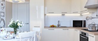
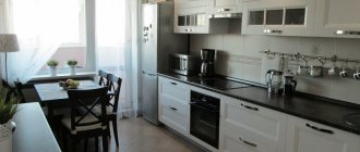
Small kitchens often cause a lot of inconvenience for owners. It seems that a small kitchen of 6 m2 cannot accommodate all the necessary things. In such a small area, you need to prepare food and seat all family members at the dining table.
And we must not forget about kitchen utensils. A minimum set of appliances must be placed here - a refrigerator, a gas or electric stove, such necessary things for everyday life.
Brief overview of the article
Layout
Layout is one of the most important parts of any renovation. A properly designed project will allow you to fit all the necessary items into a small room and create a cozy, functional, and most importantly comfortable interior.
Design a project in the Interior Design 3D program
To accurately draw a room with real dimensions and place furniture, use the 3D Interior Design program. It allows:
- ➤ make a room plan taking into account the characteristics of the home;
- ➤ specify doors and windows and select their size;
- ➤ customize the finishing of walls, ceiling and floor surfaces;
- ➤ arrange appliances, kitchen units and furniture from the built-in collection.
The application will also help you create a project estimate and indicate all repair work. You can upload the result in the form of a drawing, a three-dimensional model or a realistic photo. Download the editor for free and install it on Windows.
Kitchen design 6 square meters, photo
You can also look at our photo gallery where 320+ photos of examples of small kitchens from professional designers are presented. And also a photo gallery with ideas for arranging a kitchen in Khrushchev.
Download the Interior Design 3D program
Arrange your kitchen in 3D mode with your own hands
Interface language: Russian
Distribution size:88.5 MB
In the program you can draw any kitchen layout for 6 m2:
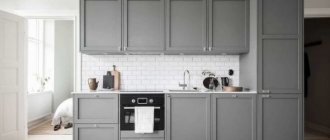
Linear
All components are located in a straight line against the wall, and you can easily use any home appliances, kitchen utensils and products. In addition to the sink and refrigerator, you can add a dining table.
Pros:
- ✔ suitable for small areas;
- ✔ the headset can be hidden behind doors or partitions (for example, in a studio);
- ✔ all items and equipment are at hand.
Minuses:
- ✘ limited storage space;
- ✘ it is impossible to create a “working kitchen triangle”;
- ✘ Only one person can cook.
Kitchenette with dining table
Implementation of linear planning
Scandinavian style
L-shaped
One of the most popular and practical options that uses corners and provides free space for a sofa, dining table, etc.
Pros:
- ✔ open layout makes the room visually larger;
- ✔ offers plenty of storage space;
- ✔ suitable for square rooms.
Minuses:
- ✘ while cooking it is inconvenient to look for the necessary accessories.
L-shaped design
Example of placing things
Lay out patchwork tiles as a backsplash
U-shaped
The name speaks for itself. If you arrange such a kitchen in 6 square meters, it will be a bit cramped. The solution is to use one of the sides as a dining table.
Pros:
- ✔ several people can participate in cooking;
- ✔ Offers plenty of storage space.
Minuses:
- ✘ works best in an open plan;
- ✘ you can’t install a dining table - there’s nowhere.
Use one side as a dining table
Place a tabletop on top of the window sill
If the room is elongated, the U-shaped design will be inconvenient for cooking
L-shaped with island table
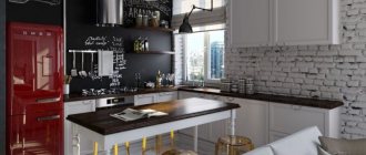
Adding an island is a popular option for this den. It provides additional workspace and storage and also acts as a seating area with chairs. If the kitchen is connected to a balcony or living room, a bar counter would be an excellent addition.
Pros:
- ✔ you can create a “work triangle”;
- ✔ Enough space for storing and eating food.
Minuses:
- ✘ Can make the space smaller.
Scandi design
Connect the bar counter with cabinets
Marble apron goes well with white surfaces and black appliances
Double row kitchen
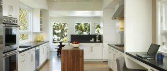
This plan places the set along two walls, with a narrow passage between them. Due to its practicality, this configuration is a popular choice in small apartments. This option will allow you to place an area for cooking and storing things, which you can increase with cabinets up to the ceiling.
Pros:
- ✔ great for small spaces;
- ✔ convenient for cooking.
Minuses:
- ✘ Only one person can cook in the room.
Double-row design with access to the balcony
Wooden doors harmonize with building beams
Scandi kitchenette
With a sofa
If you want to place a sofa in a kitchen measuring 6 meters, then there are several options for placing it:
- ➤ Install a corner set and place the seat opposite so that all the furniture forms the letter P.
- ➤ Place the sofa next to the kitchen island or table instead of chairs.
- ➤ When arranging a two-row kitchen, install a sofa at the end of the aisle.
You can also place a bar next to the sofa
Place the sofa in a niche
You can place a folding table next to the sofa
With a balcony
If the space has access to a balcony, you can visually expand the area or add square meters by demolishing walls. There are several ideas that can be implemented in a small apartment:
- ➤ Place part of the set on the balcony. If you have an insulated loggia, you can install a washing machine or dishwasher here.
- ➤ Separate the loggia with beautiful curtains.
- ➤ Combine the kitchen with the balcony. To do this, you will need to demolish the walls and coordinate the redevelopment with the city administration.
You can also arrange a pantry or a small dining room on the balcony
They should be combined with the overall color palette
Light design
With a tabletop instead of a window sill
Due to lack of sq. meters any surface must be used. For example, instead of a window sill you should install a countertop. It can be used for cooking or eating. Most often, the tabletop is made of chipboard, since this is the most budget option and the material is resistant to damage.
Window sill extension
You can install a sink opposite the window
Make a table with bar stools
Nuances of surface design
Looking at real photos of the kitchen, you can see that there are many ideas for decorating surfaces. You can stick with traditional options or try something new. When choosing ideas, it is important to take into account the advice of designers.
Style
To create a beautiful interior project, you should choose one style and follow it when choosing furniture, fittings and decoration:
Eco style
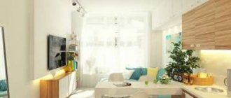
Ecological style is considered one of the most popular in the world today. Natural materials are used in the interior: wood, clay, glass, stone and fabric. The color scheme should be natural: white, brown, beige and pastel colors are used. Pale blue and light green also look interesting.
The style is characterized by original accessories made from natural materials, live plants, dried flowers and straight geometric shapes. Unity with nature is often achieved through large panoramic windows.
Eco-style
Hang the plant over the table
Choose items made from natural wood
Minimalism
A contemporary style that features simplicity, clean lines and simple shapes, wood accents, few accessories and an open floor plan. The minimalist interior consists mainly of white shades. Black and another bright shade can be used as a contrasting shade. The style is also characterized by order and empty surfaces. Items must be placed in cabinets behind closed doors.
Modern minimalist interior
Minimalism with an accent apron
Create sleek fronts for a minimalist design
Scandinavian
Scandinavian style is another hit in private houses and apartments. It is ideal for small spaces as it pays special attention to space organization. In Scandi, it is important to add drawers, open shelves, containers, sliding mechanisms and other places to store items. The style is dominated by neutral shades, light wooden surfaces, a minimalist approach to decoration and natural light.
Scandi space
Scandinavian decor
Decorate your project with patchwork
Kitchen design 6 sq. meters highlights
Efficient use of space
The main secret of properly arranging a small kitchen lies on the surface - you need to make the most of literally every square centimeter of its area.
To achieve this, you must first take all the measurements, and then select the kitchen furniture so that it fits compactly in this small room, just as the figures in the famous “Tetris” should fit.
Effective use of height
Also, owners of small apartments should fill every meter of room height to the maximum. Having chosen one, two or three walls to fill with furniture, arrange it so that it occupies the entire wall - from the floor almost to the ceiling.
Color selection
Dark colors are strictly contraindicated for small rooms, and the kitchen is no exception. The abundance of dark brown or, especially, black color will make an already small space even more cramped, and being in such a kitchenette will most likely be uncomfortable.
Light colors, on the contrary, visually expand the room, so they will be the best choice. Blurred patterns on the walls also help create an additional illusion of space - for example, you can use wallpaper with images with unclear outlines.
But this technique is more appropriate in rooms measuring 3x5 meters or more, and for a small kitchen it will be enough to limit yourself to choosing the right color scheme.
Here you can see a photo of the wallpaper.
It is also worth keeping in mind that when decorating small rooms, it is better to refrain from using bright contrasts - a harmonious color scheme without sharp transitions will work much better.
Color spectrum
If you have a 20-foot kitchen, it's important to choose colors that complement each other and create the illusion of a larger area. Check out 4 popular colors to help create a warm and cozy space:
White
This is a great idea for a small area. A light shade makes any space look larger and brighter. It goes with many other colors.
Make a contrasting apron
If you have a small kitchen, glossy white is ideal as it reflects light. It can be combined with purple, blue and even black. However, it is important to remember that white will show various markings, pet hair, and stains of dirt, grease, etc.
Add black details
Combine several light colors
Blue
Blue is a color that makes a space feel bigger when paired with the right tones. The blue tile backsplash coordinates with the white cabinets and light brown wood countertops.
Classic interior
Blue shades pair with gray and dark stone countertops.
Combine white and blue shades
A bright blue set can be combined with pastel surfaces, gray walls and wooden details.
Green
If you want your kitchen to look fresh, clean and spacious, then green is a great color choice. Dark and natural shades are ideal for matte cabinet doors. Pair them with light wood surfaces and stainless steel appliances.
Dark green set in combination with a marble countertop
If you want to use green as an accent color, then the optimal solution would be a lime or bright green wall with white cabinets.
Accents can also be placed using lamps and textiles
Install gold fittings on a dark green facade
Violet
Purple suits most interior styles, from vintage to modern and minimalist. When choosing a tone, it is important to remember that dark shades are dramatic and should be used to create accents.
Combine purple items with gold items
Light colors give the room a feeling of calm. If you want to create a calming space, use lilac on the walls or cabinets.
Lilac looks harmonious with marble
Purple kitchen module
Choosing curtain colors
Walls made in light colors and similar curtains made of light fabrics can create the effect of expanding the window.
Due to the significant amount of light penetrating and reflecting from the light walls, the kitchen space appears larger.
It is better to give preference to transparent veils that do not block the window too much if you choose the classic version of curtains.
Solid pastel colors (beige, pink, mint) will also look great in a small kitchen.
The design of curtains for a small kitchen can be complemented with a small print, embroidery, preferably floral. An unobtrusive pattern will not stand out much from the general background, but will perfectly complement the design of some styles, for example, Provence.
- Dry cleaning of curtains
- Advantages of rugged blinds
- Tulle in the kitchen: varieties and tips for choosing (100+ photos)
For a small kitchen, it is better to choose curtains in warm colors.
Especially if the windows face the dark side. Here the determining criterion will be the overall color scheme of the kitchen. Curtains are designed to complement, not stand out from the general background. After looking at the photo of curtains for a small kitchen, you can decide on a color scheme.
Furniture and household appliances
When designing a kitchen of 6 sq.m, it is important to choose suitable furniture. When choosing items, the main aspect is functionality. It is best to purchase products that can perform multiple tasks. It is also important to place the refrigerator, washing machine and gas water heater correctly.
With refrigerator
It is best to start planning a 6-square-meter room with the location of the refrigerator. In a small area, you should choose a small-sized model and place it on the edge of the headset.
Furniture manufacturers create special models with shallow depth
If your budget allows, you should give preference to a built-in item. This way the refrigerator will occupy less square footage. meters. These models are suitable for minimalist, modern, Scandinavian design and high-tech style.
The refrigerator is finished as a set
You can install a narrow model of refrigerator in the cabinet
Hang a contrasting shelf between the wall cabinet and refrigerator
With washing machine
If you want to install a washing machine, then you should think about its location in advance. The most popular solutions are:
- ➤ integrate the equipment into a cabinet with the door closed;
- ➤ install the washing machine next to the sink or stove;
- ➤ choose a model with an opening lid and use it for cooking.
This way the item won’t spoil the decor.
The unusual shape of the sink complements the decor
When the lid is closed, place the cooking boards on it
With geyser
The old foundation often has a gas water heater installed that cannot be removed. So that it does not attract attention, it is worth implementing one of the ideas in the interior:
- ➤ hide the speaker in the headset;
- ➤ place a special plastic box on top;
- ➤ decorate the column in accordance with the surrounding environment: draw a pattern, paint it in a suitable shade, etc.
Bright project with a geyser
Modern column design
The element fits into the style, as it echoes the black slab
When hiding technical equipment, it is important to remember that the distance from the column to the cabinet must be at least 3 centimeters.
Kitchen set for a small kitchen
Furniture plays a major role in interior decoration; it is its correct choice that determines whether your kitchen will be comfortable. Follow the above rules - carefully measure all the dimensions of the room before going to the store, strive to use the Tetris principle to the maximum, select light colors and avoid sharp contrasts.
Note! Finding a suitable set in a store will not be easy - most of them are designed for large and medium-sized rooms. Ideally, you need to make furniture to order - in this case, you can be sure that the interior elements are located inside your kitchen in the best possible way.
Tips: do's & don'ts
Here are some more design tips for do's and don'ts when space is tight in a small kitchen:
- ➤ Don't ignore the working triangle rule.
The distance between the hob, sink and refrigerator should not exceed 4 m. Otherwise, it will be inconvenient to move from one zone to another while cooking. - ➤ Do not use small tiles on the floor.
Large flooring material will visually increase the area. - ➤ Add open shelves.
This is a great way to maximize space and add decorative elements. - ➤ Pay attention to light sources.
First of all, a combination of functional and atmospheric lighting is required. Install pendant lights above the dining table and incandescent lights under the upper cabinets. - ➤ Do not leave a gap between the upper cabinets and the ceiling.
An empty space visually reduces the height of the room and becomes a dust collector. - ➤ Don't forget about storing items.
Without cabinets and special elements, the room will quickly become a mess. Add accessories: towel racks, spice drawers, hooks, etc.
Work triangle example
Applying a dark color palette
Convenient placement of equipment
Large beige tiles
Different floors when combining the dining room with the living room
You can also lay out glossy vinyl panels
Open storage system
Stylish decor
Hang transparent cabinets
Light up the food preparation area
Spot lighting
In the example there are several lighting levels
Tall cabinets in design
Smooth facade
Details play an important role in arranging an apartment
Hang magnetic and metal holders

