It is easy to see that the appearance of curtains in the interior of a house indicates that the home has an owner or mistress. Any environment is illuminated with comfort and becomes alive when curtains appear in it. They say: eyes are the mirror of the soul, books are the soul of the house, continuing the logic of reasoning, we can say that curtains are the warm embrace of the house. Whatever the renovation and furniture, the interior remains empty and lifeless until it is completed with draperies framing the windows.
In order for the image of the house to become complete, it is necessary to correctly select not only the style of the curtains, the type of fabric, its finishing, but also the correct color of the curtains, which is necessary for the harmonious completion of the interior ensemble.
Basic criteria for selecting curtains
Apartment owners often invite designers specializing in this topic to select textile window decoration. But if you take into account the basic rules for selecting curtains, then it is quite possible to achieve the perfect look of the room yourself.
The main thing is to determine the style of the room, the purpose of the room, whether the task is to adjust the space, and then the only thing left to do is to choose a neutral or contrasting color scheme.
How to choose curtains: fabric
When choosing fabric, you need to be guided by practical considerations. Through an open window, dust from the street falls on it. The material needs to be washed frequently. To prevent the fabric from becoming deformed and losing its appearance due to frequent washing, choose durable fabrics for curtains. Organza, veil, chiffon or tulle are best suited for sewing curtains.
Curtain fabrics can be completely different in composition, but they are united by one feature. Look for materials that drape beautifully. It is this ability that makes translucent fabrics suitable for window decoration.
Match the color of the walls or interior
This is one of the basic techniques for selecting curtain colors in any design project. The shade of the curtains lies in the same color palette as the main interior scheme. Often such monotonous spaces are called by the leading color - “gray room”, “green room”.
But it is necessary to observe an important nuance - the color match cannot be made 100%! The fabric is selected two or three shades lighter or darker.
It is necessary to correctly combine dark and light tones of the same color, shades, and halftones. Following this design law will help you understand how to choose the color of your curtains.
This method of choosing curtain colors is well suited for draping windows in small rooms. The method allows you to achieve the effect of merging the wall with the window, which helps get rid of visual boundaries and expand the space.
In addition, decorating a window to match the color of the walls is the safest - choosing the wrong shade of curtains is difficult. You don’t even have to take into account what color the furniture is in the room; the most important thing is that the walls and curtains are in harmony with each other. So, when choosing a beige color scheme for a room, the curtains can be milky or creamy.
You can even play a little with the proposed palette and choose light brown curtains for walls that have a brown finish. To add elegance and a little liveliness to the atmosphere in this case, you can hang textiles with prints and embroidery.
How to choose
Today, the range of cornices is represented by a huge palette; you can choose not only the color, but also the shades. Here the main question is: what is the guideline? In each individual case, the answer is different, and not even the most experienced designer will give clear recommendations. There are only a few general tips that will help in choosing the color of curtain rods.
Under the walls
Selecting the color of the cornice to match the main tone of the wallpaper or wall paint is a universal solution. The option is neutral, suitable for rooms of any size; the curtain mount blends in with the main color of the finish and “gets lost” in the interior. The composition turns out to be holistic, and the main aesthetic load falls on the curtains.
The texture of natural wood goes well with light shades of brown and mid-tone beige.
The color of the curtains
Cornices matched to the color of the curtains are relevant in rooms with low ceilings. This combination visually raises the opening vertically, as a result the proportions visually change. This same solution helps when the interior is overcrowded with details and you need to calm down the riot of decor a little.
Curtains that match the color of the curtains will never cause dissonance in the interior design
Contrast with the main finish
If the room is high, then cornices in contrast with the main decoration will be perfect. Prem is very effective if the colors are polar, for example:
- White black;
- cream, light beige/dark chocolate, wenge, walnut, cherry in rich colors with a red tint - this combination can be called classic;
- black, dark brown, burgundy, purple, rich red, green walls/metallic color of curtains - silver, gold, brass, light gray; fastenings for curtains in natural wooden shades - honey, amber - work well here.
Curtains, in contrast with the decoration, horizontally cut the space and align the geometry. Designers also often use this technique if they need to decorate a very long opening with several windows. Here the curtains are matched to the color of the curtains, and this composition visually breaks up the elongated wall, eliminating the feeling of being stretched out.
Contrasting curtain rods add crisp lines that are recommended to be supported by accessories such as photo frames
To the ceiling
Cornices in the color of the ceiling are a win-win option in any interior. The choice here is small - all shades of white, or a selection of shades to match the color of the stretch fabric. The cornices become invisible, blend into the overall design and do not draw attention away from other details.
Curtain rod in the color of the ceiling fits harmoniously into any interior style
Vivid contrasts
Colored curtains are an expressive accent that can completely transform a monotonous, austere interior. Designers prefer to use pure colors as base colors: white and black, yellow and green, blue and red.
However, the final solution may be too bold and tiring, so you need to take into account the overall style of the space so that the colors of the curtains in the interior are appropriate.
In this case, you can take the advice of interior decorators: if rich curtains look too bold, then they should be replaced with neutral-colored textiles that will contrast with the fundamental colors of the apartment.
Shades of a softened palette, for example, a combination of beige and chocolate colors, have a smoother contrast.
Window drapery specialists can skillfully combine contrasting colors, even in a pastel palette, to create light, airy rooms.
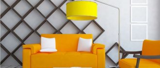
In neutral spaces, the main color of which is white, beige, gray or black, hang curtains in deep colors from the rainbow spectrum. So, a white interior can be decorated with yellow curtains, this will give it energy and warmth.
Curtains by room type
Of great importance in choosing the color palette of canvases for window design is the purpose for which the room is used. So, for the living room you can choose curtains based on the style of the interior. If you want to make this room more spacious and “airy,” it is recommended to limit yourself to light tulle without a pattern. Regarding the kitchen, functionality comes first in this room. Therefore, it is better to choose curtains that will be slightly higher than the window sill. The color of the canvas can complement the interior. Modern prints, one tone darker than the main background, are welcome. Curtains in the Provence style look great. In an adult bedroom, a good option would be thick curtains a couple of shades darker than the main color of the walls. Such canvases will protect from big city lights at night and sun rays early in the morning.
As for the children's room, in this case you can choose curtains of colorful, but not bright shades. For teenagers, sports-style curtains are a good option. Such colors will not irritate the child and will evoke positive emotions.
Back to contents
The influence of color on a person
- Red. This is a shade of energy and activity. Canvases of this color are best used in the living room. Designers do not recommend using a large amount of red in the interior. It leads to fatigue and irritation.
- Yellow. This color creates the illusion of sun even on a cloudy day. It is recommended to hang curtains of this shade in rooms located on the north side. But it is not advisable to hang yellow curtains in the bedroom. They stimulate thinking and mental acuity, which is not conducive to relaxation.
Roller blinds for windowsThe popularity of roller blinds has recently been gaining momentum; they got their name because of the twisting mechanism, as a result of which they turn into rolls, due to which they take up very little space in the house, it is very practical, see for yourself:
- White. This is a symbol of purity. In addition, it is able to expand space. But on their own they look “aggressive”, therefore, it is recommended to complement them with other, warmer shades, for example, coffee, beige.
- Orange. This tone is associated with cheerfulness and activity. It can lift your spirits and stimulate your appetite. Therefore, curtains in this color scheme will suit the interior of the living room, kitchen, and dining room.
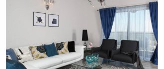
- Blue. A shade of peace. Blue canvases can be hung in the office, living room, bedroom, equipped in a sports style.
- Green. This color promotes calm and relaxation. Green curtains perfectly complement the bedroom interior.
- Lilac. Such curtains will add solemnity to the atmosphere and help the activities of creative people. Lilac curtains have proven themselves well in the living room, office, and dining room.
- Black. It is only appropriate if the windows face south and there is good artificial lighting.
- Grey. All its shades are neutral. Gray curtains in the interior will fit well into a room with a bright color scheme.
In addition, to make the room look harmonious, you should take into account the combination of colors in the design. The easiest way to do this is by remembering a photo of a rainbow and the arrangement of colors on it. For example, if the style of the room is yellow, green curtains will go well with it.
Important! By using the colors of the curtains, you can adjust the perception of the size of the room. For example, light canvases will “move away” the wall with a window, while bright ones will bring it closer.
Back to contents
Combination of curtains and furniture
The next technique for choosing the shade of curtains is a combination with the color of the furniture. In this case, there are several solutions, some of them quite complex. So, a classic case would be a related combination: the color of the wood of the furniture is in harmony with the entire beige-brown palette.
And also the color of curtains and furniture can match, but at the same time contrast with the decoration of the entire area. These window treatments are a feature of traditional, often expensive interiors.
Complex compositions are characterized by the use of three colors. So, in a minimalist style, white-brown-green solutions are relevant today.
Curtain color according to existing decor
Also, the color of the curtain fabric depends on the other elements that you will find in the interior of the living room or hall. Curtains should not be an isolated choice from other interior elements.
Whether it's the living room, bedroom or kitchen, you already have elements other than walls. The color of the sofa, carpet, bedspread and tablecloth, any other decorative element should be in harmony with the color of the curtains.
Today you can order curtains made in the EUROSHTORY salon and change the appearance of your home in a simple way.
Curtains and interior textiles
Of no small importance is the observance of the law of color harmony in the interior, when the drapery of the window matches the rest of the textiles in the room - pillow covers, bedspreads, tablecloths, etc.
Sometimes designers resort to an interesting solution - sewing curtains and decorative textiles from the same fabric. It is worth considering that here it will be necessary to repeat the pattern on the fabric on all products.
What are curtains?
It doesn’t hurt to first figure out what a curtain failure is . Many people mistakenly confuse them with a cornice ; others cannot distinguish between the concepts of “curtains,” “drapes,” and “curtains.” To avoid any difficulties in the future, let us immediately state that hailstones are thin, transparent, lightweight fabrics that decorate a window opening. Most often they are made of organza, veil or tulle , and their main task in the room is to decorate the interior, make it lighter and more elegant.
At the same time, curtains can shield a room from the intrusive glances of passers-by and become a reliable barrier to the sun's rays: passing through the translucent fabric, the light is scattered and becomes less harmful to furniture and interior items, which will not fade so quickly. Curtains can be used as an independent window decoration or together with drapes, lambrequins, curtains, blinds, etc. The main thing is that the selected elements are combined with each other, do not take up a lot of space in an already small space, and can reliably shade the bedrooms.
be attached to the cornice in different ways , and today the most common options are the following:
- on eyelets - products with plastic or metal rings in the upper part. They make it easier to string the curtain onto the cornice, its movement when opening and closing, and also provide the formation of spectacular folds, which are very easy to model and give them the desired look;
- on hinges - one of the rarest options today. In this case, the curtain is attached to the cornice using fabric loops, which can be wide or narrow, form ties, bows, have Velcro, etc.;
- on decorative braid - the most common type. Here, a special decorative braid with a cord is sewn into the upper edge of the product. By adjusting the tension of the lace, you can get folds of different sizes and thicknesses. Such curtains go well with lambrequins, which are also often equipped with similar braiding - this is one of the most favorite techniques of modern designers.
Curtain color and interior style
Of particular importance is the stylistic orientation in the design of the room. So, purple curtains with flowers will not suit a minimalist setting. And for eco-style, you shouldn’t take dark red shades, which are more suitable for a Victorian living room.
The best color combinations by style are as follows:
- in minimalism, black and white, milky and ashy, shades of gray prevail;
- in eco-style - green, sand, brown, blue, light blue, olive;
- in Scandinavian - pearl gray, delicate greens, blue shades, cream tones, white.
- in the classic - white, cream, beige, brown tones, a palette of green colors.
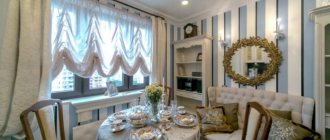
Choosing curtains for the living room and hall
Any thoughtful and stylish interior, with the sole exception of minimalism, will look incomplete without a decent window frame. However, choosing beautiful textile curtains requires taking into account 6 criteria:
- used for sewing fabric,
- color palette,
- type and quantity of drawing,
- length and width of the canvas,
- types of fastening,
- living room interior.
Let's take a closer look at each of these points to choose curtains that fit perfectly into the concept of the living room.
Deciding on the fabric
The appearance of the curtains and the method of their fastening is determined by the material from which they are made. Dense fabrics will be an ideal choice for rooms located on the ground floor, where hiding everything that happens from prying eyes is of particular importance.
If there is no need to close the window either during the day or in the evening, then the best solution would be curtains made of light fabric. They fit well into living rooms of any size, do not take up much space and do not require special fastenings.
Natural and artificial fabrics are used to sew curtains for the living room. The advantage of the latter is the impressive choice - they are varied in color palette and texture. They do not require complex or constant maintenance, do not fade under the influence of UV rays and are much more durable.
Natural fabrics are always more expensive than synthetic ones, but they are environmentally friendly and more pleasant to the touch. Some materials (such as velvet) cannot be washed at home, so you will need to use regular dry cleaning services.
For the living room, it is appropriate to choose high-quality, expensive and durable materials:
- atlas,
- silks,
- velvet,
- satin,
- velor,
- organza,
- cotton,
- brocade
Models made of chameleon organza, a plain material with iridescence, are popular. They look unusual in any interior.
Selecting the color
To choose the color of curtains for the room, you need to take into account the range of the entire interior (wall covering, upholstered furniture, decorative accessories, etc.). If you don’t have the time or desire to consider different options, then pay attention to models that are only 1-2 shades lighter or darker than the walls and furniture upholstery in the room - rest assured, you won’t go wrong.
Neutral
gamma is always relevant. When choosing curtains in a beige, sand, milky or other pastel shade for the living room, it’s hard to make a mistake. To decorate a neutral palette, you can use decorative elements - braid, lambrequin or piping, made in a contrasting color.
Bright
solutions draw attention to the window opening. Curtains of red, purple, deep blue and other intense shades will become an accent in the interior of the room, but they visually change the perception of the window - they bring it closer and make the room smaller. Therefore, do not forget about the rule - bright curtains are only for spacious living rooms.
Dark
colors are not suitable for north-facing windows. Black, brown, muted gray and even burgundy “absorb” sunlight, leaving the room dark at any time of the day. The light palette is suitable for all rooms, regardless of their location relative to the cardinal points.
White
The color of curtains for the living room easily solves the problem of visually expanding the space, but it looks unattractive. To make the room look stylish, dilute it with pastel shades: milk, coffee, beige, sand, etc. Keep in mind that the lighter the selected fabrics, the more difficult and often they require care.
A selection of the most common shades and the possibilities of their use in the living room interior:
| Color of curtains in the hall | How do they look? | Furniture color | Which ones to combine with? |
| Blue | Create a calm environment in the room. Only intense shades of blue become the accent | Light walnut, white, gray | Beige, milky, white, brown |
| Green | Has a calming and relaxing effect, but it is recommended to avoid rich green shades | Dark walnut, light walnut, white | Yellow, turquoise, white |
| Red | Any shade will become an accent in the room, so complex draperies and decorative elements should be abandoned | White gray | Purple, pink, white |
| Yellow | An ideal choice for north-facing living rooms. Visually expands the space | Light mahogany, dark mahogany, dark walnut, white | Green, turquoise, white |
| Grey | A neutral choice for any living room interior. To avoid looking dull, it is recommended to choose accessories | Beech, pine, dark walnut, black | White, black + all light tones of primary colors |
The following recommendations will help you choose the right curtains for your living room by color:
- A win-win option is to choose the color of the curtains for the living room in the same shade as the most massive piece of furniture (for example, a sofa). Then the room will have two accents that are in harmony with each other;
- Avoid contrasting curtains and furniture in the living room. The use of contrasting shades (black and purple, yellow and red, green and burgundy) looks inappropriate and tasteless. The exception is opposite tones;
- Harmonious accessories will help complement and diversify the main idea. Have you decided to choose red curtains, but there is no furniture or coverings to match in the living room? Complete the interior with several red items (a clock, a floor lamp, a vase, etc.).
Avoid complex combinations. The simpler the color palette, the neater and more attractive your living room will look.
Drawing by the curtains
To choose the right curtains for the living room, it is important to consider their pattern. Plain fabrics or small floral patterns help to visually increase the space. On the contrary, large ornaments hide it, so they are suitable for large rooms.
The basic rule is that the more pattern on the curtains, the less other decorative design. You should not match brightly colored patterned fabric with a piping or lambrequin made in a contrasting shade. It will look, at the very least, tasteless.
The location of the ornament is of particular importance:
- Vertically
. Recommended for rooms with low ceilings, since the vertical pattern visually makes them taller; - Horizontally.
The best solution for narrow rooms. Horizontal prints help expand the space.
When choosing curtains for the living room according to the pattern, be guided by the style of the room. Naturally, a small floral print will not fit into a strict classical or baroque style, but it will look appropriate in Provence or country.
Bright colors and fancy patterns are more suitable for an oriental-style living room. This also includes images of sakura, hieroglyphs and various symbols. For modernism, plain fabrics will be the best option, but in minimalism it is better to do without curtains.
We calculate the sizes
When going to choose curtains for the living room, the first thing you need to do is take measurements. Depending on the length, they are divided into several types:
| Extended | Standard | Short |
| 25-30 cm longer than the cornice-floor line | Equal to the length of the cornice-floor line (plus or minus 1-2 cm) | Reach the top of the window sill |
Keep in mind that the length of the curtains depends on how they are attached to the curtain rod. If loops or hooks are used for fixation, then their length must be subtracted from the measurements. When attaching to eyelets, you will need to take into account the distance from the edge of the curtains to the fixing elements.
The length of the curtains is selected in proportion to the area and height of the living room ceilings. For example, for a spacious room, elongated models would be the ideal solution. However, for small rooms, curtains up to the window sill are the best choice.
A curtain flowing across the floor looks stylish in the living room interior. They are suitable for both wide and narrow window openings. It is recommended to choose flowing curtains from light materials (organza, chiffon, silk, etc.).
As for the width of the curtains, it is determined:
- parameters of the window opening,
- interior of the room,
- total area of the room.
Do you want to visually expand the space? Opt for wide curtains with drapery and gathers, stretching them from one wall to another. This idea will fit harmoniously into the classical, Empire and Baroque styles.
What types of fastening should I use?
Modern curtain rods are so diverse that you can choose an unusual option for fixing curtains for any interior.
Kinds:
- Cornice rod
. Made in several rows, allowing you to fix several textile elements at the same time; - Cornice-string
. Designed for attaching curtains made of lightweight materials (organza, cotton); - Baguette cornice
. Its advantage is complete camouflage of fastening elements; - Profile cornice
. Designed for “wave” arrangement of curtains, regardless of their weight; - Telescopic cornice
. It is adjustable and allows you to secure the canvas without damaging the wall and ceiling coverings.
The fittings used to fasten textiles must be functional and beautiful. Hooks, rings, eyelets and clips are widely used for these purposes. A modern fastening option is loops equipped with buttons (less often buttons).
The relationship between shades and textures of textiles
The structure of fabric can change our perception of color. The denser the textile, the heavier and richer the curtain looks. Glossy textures, like satin, can also increase brightness and festiveness.
But when using these fabrics, you need to take into account that they are quite capricious and change their color depending on the angle of incidence of the light. But thin curtains made of light fabric make beautiful folds and give the space weightlessness and airiness.
Curtain color depending on lighting
It all depends on the brightness you would like to achieve in the room. For example, if you want a space illuminated by sunlight, you should allow the light to pass through thin fabrics. And it is better to choose a light color, or even white.
And vice versa, if you need to muffle the excessive flow of light, the curtains should be made of thicker fabric and, of course, darker.
Purpose of the room
The psychology of color is the designer’s starting point when working on creating an interior; choosing a beautiful color for curtains sometimes becomes the main task at the final stage of arrangement.
So, the black and red palette of the newlyweds’ bedroom is not suitable for a child’s room, and gray curtains are also undesirable. Light pastel shades in the office can relax and break up the pace of work. Cheerful orange color will not allow you to properly relax in the sleeping area.
White curtains in the largest room, despite their solemnity, reduce the feeling of coziness, and beige curtains will be boring in a teenage room.
Meanwhile, there are also classic, recognized palettes for rooms with different purposes:
Children's
Children's room - curtains with a slight darkening effect are welcome to provide protection from the bright sun. A good option is thick curtains in combination with a light veil.
It is not recommended to use bright, intrusive colors, as this can irritate the child and will have a bad effect on rest. For children, blackout curtains with designs of cartoon characters are sometimes hung. The traditional solution is a pastel and yellow-blue palette.
Kitchen
Kitchen - usually the color of the curtains in this room is matched to the palette of the walls, apron or furniture fronts, or to match the tone of other textiles. White and green remain the most relevant and most versatile colors for the kitchen.
If there is not enough sun in the space where you cook and eat, you can brighten up the situation with the help of warm, life-affirming shades. This is one of the rooms into which printed textiles, for example, with floral patterns, will fit well.
Living room
Living room - the color of the curtains for the main room can be varied, the main thing is that the colors of the curtains and light tulle harmoniously match the overall color scheme of the room and take into account the nuances mentioned above. In general, this is just the right room where you can experiment with color.
Bedroom
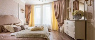
Bedroom - to decorate this room there is a whole palette of light, pastel shades, those that set the mood for rest and relaxation.
However, those who follow trends in interior design know that today the so-called intimateization of space is gaining popularity. This means that lovers of gloomy dark rooms can rejoice, because fashion is on their side - you can hang any dark shades in the bedroom, including graphite gray and even black.
Popular today are blackout curtains, which darken the room, even creating complete darkness during the daytime. They also have the effect of sound absorption and thermal insulation.
The textiles for such curtains consist of three layers. The middle one is black, visible only on the cut. The side facing the room comes in different colors. But the layer facing the window is light—usually white.
The classic color of a sleeping area is blue. Fans of delicate styles can hang curtains with flowers in the bedroom.
Cabinet
Office - universal colors for almost any workspace are all light shades that do not distract from work. By the way, scientists have long proven that the color white sets the mood for creativity.
If you want to enhance brain activity, then orange and yellow colors will help with this. But the whole palette of a conservative interior is traditional, which gives the work area laconicism and austerity; for example, you can choose green curtains.
Furniture, skirting boards, parts and accessories
Textures and textures also play a huge role in choosing the color of the cornice. If the handles on the doors and the chandelier are made of bronze, then the curtain mount should be chosen in this segment. Metallic gloss, such as chrome products, and the discreet shine of brushed metal, are recommended to be combined with gray shades in the design of the space. For gold accessories, it is better to choose a cornice in the same palette.
If furniture made of chipboard or wood, as well as baseboards and trim on doors, are made in a dark color, then the curtain rod should be in this color segment, and vice versa, this way you will avoid dissonance in the design. In modern styles (high-tech, techno), furniture made of glossy materials is often used for furnishings; cornices with metallic shades will look good here: shining polished stainless steel, gold, silver. Cornices in the color of bronze, brass, and aged gold are ideal for furnishings made of natural wood, especially in classic interiors.
Curtain rods with a metallic sheen should be matched to other furnishings.
When choosing between metallic and wood shades, it is recommended to look at the overall interior design. Sometimes a bright, shiny note needs to be added to a calm brown palette. And vice versa, if the room is already filled with details of metallic shades, then it is better, if not muted, then at least not to add shine.
Combined cornices, which combine different textures, are a lifesaver for decorating modern interior styles.
Problem solving
Draping a window can visually change the dimensions of a space. Dark, saturated colors and cool shades can visually reduce and narrow a room, making it more intimate and cool, while light colors and warm shades can expand the room and fill it with air.
So, in order to achieve a visual change in a long narrow room and make it closer to a square one, you need to make a shorter wall with a window more expressive and attract attention.
You can take curtains in rich colors with an active print or horizontal lines. If you want to create the feeling of high ceilings, then vertical stripes work well. When placing a window on an elongated side, it is better to choose textiles in pastel shades so that the wall seems unobtrusive and seems to disappear into the overall environment.
In areas with low ceilings, it is preferable to use light, light textiles; in areas with high ceilings, it is preferable to use curtains in active colors. To make the room warmer and more welcoming, it is better to give preference to warm colors: beige, yellow, ocher, brown, gold, mustard, etc.
This will be especially an ideal solution for northern rooms, where almost no light from the street penetrates into the windows. Another advantage of warm colors is that they visually bring the window closer and make it larger.
Basics of choosing curtains
It is best to choose curtains in light colors with minimal patterns on them, especially if the room is not very bright and does not boast a large number of square meters.
The color of the curtains should be in harmony with the existing interior of the room, and it is better to focus on the color of the wallpaper or furniture . Give preference to lighter shades, and it is better to have massive curtains or lambrequins for dark, saturated colors, if the room allows it. In any case, the curtains are made of translucent material, so they do not take away a lot of light, but only retain the excess and effectively diffuse the light that enters the room.
Many designers are of the opinion that curtains may differ in color from the chosen color scheme of the entire room. By playing with contrast, you can achieve amazing results: for example, in a room made in sandy shades, blue or light blue curtains, etc. will look good.
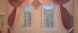
Light and pastel shades of curtains fit perfectly into the bedroom interior, giving it coziness and warmth. Dark curtains create a mysterious atmosphere, but you need to use such shades wisely, as in combination with dark curtains you can have the opposite effect and the room will turn into a gloomy crypt.
It is better to pay attention to the lighting characteristics of the room and the influence of color on its perception. So, rooms that receive little light are best done in warm colors, and the curtain should only complete the interior, so you can choose peach, sand, milky, even yellowish and pinkish shades. It is better to decorate rooms into which a lot of light already penetrates in cool shades and choose appropriate curtains: shades of green, blue, light blue, violet, etc.
If the ceiling height is not very high, then it is better to attach the curtain to the ceiling cornice. In this case, it is also not recommended to choose a product with bright large details, but forming light folds is a great idea that will even help to visually raise the ceilings a little. Another good way to make a room look taller is to choose curtains with vertical stripes.
For a narrow room, curtains with horizontal stripes are more suitable. It is advisable to hang them on a cornice that is wider than the window to create the effect of expanding the walls and increasing the space of the room.
When choosing curtains, you need to take into account the location of heating radiators in the apartment. If the radiator is located directly under the window, then it makes sense to choose a curtain that does not reach the floor. An alternative option is to extend the cornice a little so that when the fabric is free, it does not touch the battery, deteriorate, or interfere with the spread of heat.
Curtains should completely cover the window opening, and in large rooms they can have complex draperies, an abundance of folds, be supplemented with a lambrequin, etc.
The choice of curtains largely depends on the functional purpose of the room, and this is worth dwelling on in more detail.
Color and layering
Often rooms are draped with complex multi-layered compositions. But even in this case, color laws will apply; you just need to successfully arrange several layers of canvas according to the shade and learn to correctly see the color combination of curtains.
For example, if the bedroom is made in light colors, then you should not weigh it down with dark fabrics. The ideal option is several airy layers of satin, organza and tulle in bed colors.
Multi-layer curtains are most often used in the living room and bedroom, where it is necessary to give the room solemnity and splendor. In this case, curtains are often chosen in two colors, preferably monochromatic, and the third layer is in a pattern. The most difficult thing when decorating a window with multilayer textiles is not to overload it with decorative elements and prints.
When choosing curtains for your home, of course, it is important to rely on the basic criteria for choosing the color of textiles, but no less important is the owner’s own attitude and taste. Sometimes the most attractive rooms contradict all the laws of design.
How to fix the cornice and attach curtains
First of all, in any installation, follow the rule “measure twice, cut once.” This golden rule will help you estimate and mark the position of the future curtain so that it is as comfortable to use as possible, and also complements the decor smoothly and reliably.
All markings are made using a level, since not only the appearance, but also the uniformity of the load depends on this. The approximate markings are made standard at a distance from the window sill (5 cm), and thanks to the wide range and types of fastenings, ring clips, eyelets or hooks can be used.
It all depends on the type of installation and the load that will be placed on the mount.
Curtains are a great way to decorate any type of room. It is as diverse as possible and allows the designer’s imagination to swing in any direction, be it classic or new modern.
The main thing is to always be guided by the practicality of use and do not forget that only high-quality materials can serve you for a long time and bring maximum comfort to your home.
Photos of curtains
Please repost