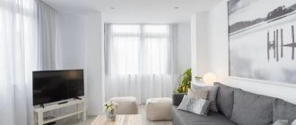
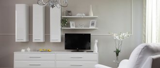
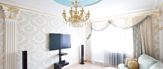
All photos In the photo: Luxurious living room in a classic style White color is a universally recognized symbol of purity, harmony and luxury. So its use when designing luxury interiors is completely justified. As a bold design solution, white became popular in the 1920s. But projects in shades of white were implemented, for the most part, in America and Europe, where architecture and design were then experiencing an unprecedented rise. In our country, such color schemes were considered impractical for a long time, but with the advent of modern materials, this problem disappeared, and the demand for projects in this color increased sharply.
All photos In the photo: Dining area of the apartment in the Rozmarin residential complex with white Italian furniture
What are the white interiors of the premium segment? What kind of decoration and furniture are used in them? We will talk about this in detail in this publication with a selection of photos from the portfolio of Angelika Prudnikova Studio (Moscow).
Pros and cons of white interior
The cold interior of an apartment decorated entirely in white has various properties that a multi-colored room cannot boast of.
Its positive aspects:
- visually expands even the smallest room, making it limitless;
- goes with almost all colors;
- gives the room a little aristocratic nobility and sophistication;
- makes the apartment brighter, as it reflects light;
- relevant at all times, does not go out of fashion for many years;
- Suitable for most well-known styles.
Negative properties:
- impractical, requires very frequent cleaning - surfaces covered with a thin layer of dust spoil the entire impression;
- it is difficult to choose a suitable palette of shades while maintaining a given style;
- without at least minimal color accents, such an interior looks uncomfortable and faceless;
- any unevenness on the walls or flaws in the furniture are very noticeable.
The complex texture of walls, stucco elements, furniture collects dust and dirt, and it is extremely difficult to wash such surfaces, so it is better not to use such parts.
Style
White color harmonizes with many styles, but only in a few of them is it the main color. This is minimalism, where there are no large structures and little decor, a loft with open brick walls and wooden floors, as well as shabby chic with retro furnishings. In the Scandinavian style, which is characterized by simple furniture, a lot of decor in discreet shades and laconic lamps, in addition to white, gray and blue tones dominate.
The influence of white on the human atmosphere
White is usually associated only with bright, positive associations - a white dove, a prince on a white horse, a bride's dress. In the mythology of the Russian people, there was a character “belun” - a brownie who brought money to the home. Many people associate the color with a hospital.
This color can irritate and tire, although at first it calms and relaxes. The eyes in such a room also quickly get tired, because the pupil, not seeing darker shades, remains narrow all the time. In a standard, not completely white apartment, this color is used to decorate window frames, ceilings, sometimes wallpaper, plumbing fixtures, tulle on windows, bed linen, some kitchen furniture and household appliances. Advice: snow-white shades are most often used to decorate apartments where people do not live permanently, but only visit periodically.
The benefits of white
Despite the comparison of white studios with hospital wards and the difficulties that arise in the process of caring for stained walls, this design has many more advantages. Decorating an apartment in light colors ensures:
- visual expansion of space;
- durability of the finish - it does not fade or fade over time;
- versatility - suitable for objects located on both the sunny and shady half of the building;
- compatibility with other styles, shades and textures;
- ease of updating the interior by replacing decor, textiles or accessories.
At the same time, a white studio apartment can be dry and unattractive even if different surfaces, accessories and materials are used. Therefore, in addition to the main shade, there should be additional colors in the room.
Stylistic solutions for white
Looks most advantageous in the following styles:
- Provence - bleached natural wood floors, light furniture, discreet rustic, floral patterns;
- country music is very popular in European countries. In Russia, in the kitchen or in a studio apartment, the central element becomes a white Russian stove, a lot of bleached flax, roughly processed wooden surfaces;
- loft - open plan, light brick walls, screens, partitions in shades of silver, steel, with deliberately accentuated rust in some places. Artificially aged furniture, as if from the Soviet past;
- minimalism – few objects, a limited number of color accents, virtually no decor, multi-level lighting;
- hi-tech - a lot of light, steel, silver, glass, straight lines. The most functional furniture, the latest household appliances. There are light blinds on the windows, mirrors on the walls, the walls themselves are smooth and light;
- contemporary – comfort, ergonomic furniture, combination of different materials. There are relatively many color accents on the walls here;
- classic - furniture made of light wood, walls decorated with light marble and silk wallpaper, strict forms, symmetry in everything;
- Baroque - an abundance of white stucco on the walls, ceilings, columns, pilasters, in combination with bleached oak furniture will create the unique atmosphere of a real palace;
- eastern - low furniture, reed mats on the plank floor, milky-white drapery in the center of the ceiling, duplicated on the windows, mostly warm shades;
- Scandinavian - apparent coldness, simplicity, roughness of decoration, but at the same time unique comfort, a lot of warm light;
- Art Nouveau - smooth curved lines of furniture, an abundance of plant patterns, including stucco, luxury in everything.
White tones: interior styles
The versatility of white tones allows them to be used in interior design of different styles. For example, a calm, elegant Provence style would be suitable for a bedroom.
Using white tones you can create a classic interior or design in a modern style.
Today it is fashionable to combine the kitchen with the living room, and white tones are ideal for creating a common studio space.
With the help of white color and its shades, you can perfectly zone a room and combine all the interior elements into one.
The combination of white tones with other color companions allows you to create unique interiors in different styles: modern, minimalism, Scandinavian, Provence, hi-tech, loft. Elements of interior decoration can have a smooth glossy or textured matte surface, each of which plays with light and shades in its own way.
What should the lighting be like?
White is the color of the midday sun. The smaller the room, the more illumination it requires. Zoning of space, one way or another, is carried out in any apartment - each zone is illuminated separately: above the bed - diffused light, where a person reads, writes, draws, works at the computer, does handicrafts, the lighting is made as bright as possible or adjustable. In the kitchen, the work area is brightly illuminated, and the dining area is slightly dimmer. In the nursery, every corner is sufficiently illuminated. In the bathroom, you need your own light source above each plumbing fixture. The loggia and dressing room are also equipped with lamps. All large mirrors are also illuminated, especially the one located above the dressing table. It is advisable to illuminate the perimeter of the floor with an LED strip, this is especially important if the family has small children and elderly people - it is difficult for them to navigate in the dark if they had to get up at night.
The warmer the lighting in the room, the more comfortable those in it feel. Warm light is associated with the sun; in a “snowy” apartment you need a lot of it. Cold lighting is only suitable for the kitchen or hallway.
White color in the interior - features of use, versatility and variety:
1. White can be different - too sharp and dead, warm and alive. If there is a lot of white and the shade is chosen incorrectly, then the room may become too cold and uncomfortable. But with the right decision, anything can appear on a white background - Scandinavian comfort or discreet minimalism, modern high-tech or timeless classics.
2. White goes well with different materials. Warm shades are chosen for classic interiors, minimalism involves cool colors, industrial interiors welcome bright shades. Color is especially relevant in rooms where you need to reveal volume and emphasize the play of shadows. It makes the interior graphic, clear, clean.
3. A room painted white will become more comfortable if you choose natural materials when choosing interior items: wooden and wicker furniture, linen and cotton textiles, paintings or photos on the walls, fresh flowers. Pleasant colors - yellow, blue, brown, red - will dilute well and make the room come alive.
4. This color will also serve well where there is a need to combine elements of different styles, to create a common background for different zones and accessories, making the space harmonious and balanced. White seems to annul the identity of objects, while uniting them with a common idea.
5. One way or another, white is the base color, present in any decor. It’s just that somewhere there is less of it, somewhere there is more. It is elegant and sophisticated, especially in different shades (look at the palette - what a variety there is!).
If there is no special idea or design project, just take white as a base, add a few bright accents, dark details for contrast, a couple of drops of gold - and the fashionable interior is ready. Designers who are brave and ready to experiment are advised to take a base color (vanilla ice cream or baked milk), mix paints and paint all the walls in different shades (which would be slightly different - pinkish, lilac, yellowish). The sun will do its job and the rays will refract, creating original effects, emphasizing the features of each shade, making the room fabulous.
6. When choosing a shade, you should take into account the climate zone - cold and harsh versions of white will be good where there is a lot of sun and blue sky; for areas with a lot of gloomy days it is better to choose warm shades.
7. White furniture is completely impractical, but it is beautiful, especially against the background of dark walls. It adds depth, some flair of drama, but does not suffocate with deliberate “chic and wealth.”
8. The white stone floor is very beautiful - for example, Philippe Starck boldly uses exquisite calacata marble in the design of bathrooms and hotel areas. This floor can be seen in the Le Royal Monceau Raffles Paris hotel, for example. But white glossy floors make the room sterile and stylish, but less cozy. To create a homely, warm decor, simply choose a fluffy carpet or laminate in a pleasant shade for such a floor - and the atmosphere will immediately change.
9. The interior in white can be made in any style - from minimalism to ceremonial pomp. The decor can be spectacular, simple, calm, luxurious, sophisticated, festive, or elegant. It was especially popular in the 20-30s, in America and Europe - then white walls were intended to emphasize the aristocracy of the owners of the house, becoming proof of their sophistication and wealth.
But in the 60s, white was already used to recreate minimalism, to emphasize laconicism and rationality, spaciousness and airiness. The Scandinavian style also gravitates towards white, with clean and simple lines, natural materials, rich and light accents. White here embodies peace, naturalness, comfort, and environmental friendliness.
10. The main condition for creating the right interior in white is the professional design of a lighting system in order to correctly play out the play of shadow and light, create a beautiful reflection of color on textiles, and highlight zones in the room. Here, one lighting source will not be enough; it is advisable to think over your own system for each zone (lamps, sconces, floor lamps, spotlights, etc.).
11. Contrasts look great in white: light and shadow, smooth and rough surfaces, matte and glossy, airy and heavy fabrics, cold and warm materials, etc.
12. Color requires texture - if it is laconic and smooth, a feeling of frozen space will appear. Different reliefs and textures, accessories of unusual shapes zone the space and cast shadows. Glass tables, fleecy trunks, vases of unusual shapes and sizes, and multi-level surfaces look good.
13. You can decorate the walls in white with any materials - wallpaper, paint, brickwork, decorative plaster, tiles, whitewash, etc. The most practical option is paint: it can be washed, and the color can be easily changed at any time by choosing a different shade.
Do you need accent spots?
Accent elements will not be superfluous - without them, the room seems boring and lifeless. Making accents in a snow-white space is much easier than in any other. To prevent the interior from seeming overly austere, textures are added - textile elements, rounded corners of furniture, glass and metal. Indoor flowers, be it violets, palm trees, cactus, complement the space well, enlivening it.
Contrasting photo wallpapers on one of the walls create a separate area - for relaxation, work, sports, etc. The draperies on the furniture match the color of the curtains, the carpet matches the screens or paintings on the walls. But there is no need to create many accents - chaos will arise.
White weakens the impact of most other colors, so their influence will be weak.
Spectacular and luxurious home design in white colors
One of the main reasons for the popularity of white house designs is their attractive appearance. Due to the white design, the house has become an accent point - it stands out clearly in the Cancun setting, against the backdrop of green spaces and the sky.
The house has a patio with a compact swimming pool. Against a white background, the open sky from here seems even more beautiful, the blue tone looks richer and harmonizes with the snow-white building. The bluish color of the water also looks even richer when surrounded by white walls.
The architects provided the opportunity to remove the boundary between the interior space and the relaxation area near the pool - a sliding panoramic structure. The patio can practically be combined with the living room area, especially since the walls outside and inside are made in the same color.
White or accent furniture
Advantages of snow-white furniture:
- pure color, beautiful shape;
- illusion of space – expands the space, being unnoticeable;
- comfort – conducive to rest and relaxation.
It is better to equip upholstered furniture with removable covers, even white ones - they are easier to wash than to wipe a stain off the sofa.
Dark furniture on a light background looks no less advantageous, but a solid closed dark wardrobe or a huge leather sofa is completely unacceptable here - a dark spot will ruin the design idea. Light-colored covers are then placed on upholstered furniture, and cabinets are decorated with silver inserts and mirrors. The kitchen set creates the necessary contrast in the room and can become the only color accent on a light background.
Most often, wooden ones are purchased, “wood-like” - stained or bleached oak, cherry, Karelian birch, spruce, light beech, alder, mahogany and others. Plastic, metal, glass, any combination of them will also fit perfectly into the interior.
It is advisable that the colors of the furniture do not blend with the floor - otherwise its beautiful shape will be completely invisible. This does not apply to shelving partitions that perform the function of zoning.
White style home design – Comfortable and calm environment
White color in home design has an important psychological meaning - it creates a calm, peaceful environment that is not oppressive. Such an interior can be considered universal - it is equally well suited for relaxation, work, active time with family, and sports.
And so that the space is not too empty and boring, accents are made here using a play of textures, glossy and matte surfaces, contrasting elements, for example, a kitchen set, fresh flowers in flowerpots, and zoned light.
White home design is a universal and effective solution. The building looks fashionable and expensive, the interior is light, light, spacious, and aesthetically perfect. The housing is suitable for a modern family.
| Architects | Warm Architects |
| Photo | César Béjar |
The versatility of white and its combinations with other colors
White color has many different shades; the following are used in interiors:
- alabaster – matte, slightly yellowish;
- dairy - like cow's milk;
- white-yellow – with a yellowish tint;
- cloudy - like clouds;
- marengo-clair – light gray;
- amianth - dirty whitish;
- beige – has a creamy-grayish tint;
- pearly - like pearls;
- whitish – dull white;
- gray – a light shade of black;
- platinum - smoky white metal;
- snow-white – snowy, bright white;
- gridepearl - pearl gray;
- ecru - like unbleached linen;
- smoky white – the color of smoke.
Whites also include ivory, linen, floral white, lemon cream, cosmic cream, ghost white, silver, Navajo, linen, antique, purple white, mint cream, sky blue, etc.
You can combine these tones with absolutely any, but no more than two. Moreover, white should account for 60-70% of the designed space. It is usually complemented with one color, which occupies up to 30% of the room, the rest are small accents.
The most beautiful combinations are with:
- emerald;
- turquoise;
- pink;
- woody;
- blue;
- pale cherry;
- lilac;
- chestnut;
- gray-olive;
- pumpkin
Pure black should be avoided in snow-white rooms, giving preference to lighter shades, since a black and white interior looks more black than white.
The combination of white with accent colors and details in the interior
When it comes to interior accents, most people first think of bright accessories. But the accent can be color, unique decor, skillfully executed lighting, and even architectural detail - everything is possible in an exclusive design!
Architecture in the spotlight
All photos In the photo: Monolithic white spiral staircase in a cottage in the Art Deco style
The main character in the design of the living room in the photo is the white monolithic spiral staircase. A spectacular spiral with a blank fence gathers the entire interior around itself and at the same time acts as a zoning element, clearly delineating the functional segments: dining room, living room, bar.
White, turquoise and brown in the bedroom interior
All photos In the photo: Bedroom in the Dynasty residential complex with bright textiles.
It’s worth adding a couple of colored accessories to the monochrome interior, and it will sound new. In a luxury white or white-gray space of any style, complex shades of blue work perfectly: azure, aqua, shining turquoise. This color can be decorative pillows and a bedspread, as in the bedroom in the Dynasty residential complex, curtains or a modern painting - the desired effect will be achieved in any case.
Shine of metal in a white interior
All photos In the photo: Unique white living room with chrome metal decor
. The chrome “edging” of the sofa, the base of the coffee table, elements of chandeliers and table lamps - in the interior of this white living room, accents are placed with the help of shiny metal parts. They make the atmosphere light, modern and in tune with reality. And the metal relief frame turns the stained glass window with the image of a forest into an art object.
Black and white monochrome and flashes of living fire
All photos In the photo: Fireplace with a panoramic firebox in a cottage in Barvikha
In the list of trendy interior accents, the fireplace, without a doubt, will be in first place. And this is quite understandable: it always attracts attention and creates a special atmosphere in the room. And its main advantage is that it easily fits into any planning solutions. In the design of the cottage in Barvikha, a fireplace with a panoramic firebox is built into the partition between the office and the living room, so that it is, in fact, a space divider.
White designer panels with lighting
All photos In the photo: White designer panels with lighting in the interior of a white kitchen.
Symmetrically located designer stained glass windows framing the portal between the kitchen and living room are unusually picturesque. Thanks to LED lighting, the skillfully executed floral pattern appears three-dimensional. The soft glow highlights even very small details and supports the ceiling design.
White kitchen in a classic interior with blue accents
All photos In the photo: Interior of a white luxury kitchen in a classic style
A small statue of a sitting lion with a family coat of arms in its paws, reminiscent of a garden sculpture, is the ideal decor for the white interior of the kitchen of a stately mansion in a classic style. It accents the T-shaped island bar and complements the lush plaster moldings and ornate cabinetry.
White and bronze. Exclusive mirror panel
All photos In the photo: Bedroom in the "Garden Quarters" residential complex with a designer panel
Textured plaster, silver leaf and artist's skill - this is the secret to creating a unique stained glass window in the interior of the bedroom in the "Garden Quarters" residential complex. The subtle Japanese motifs present in it - the trees around the stylized fountain resemble cherry blossoms - make the interior sophisticated and conceptual. And the mirror border adds completeness to the composition.
White and turquoise. Ocean breeze
All photos In the photo: Aquarium in the interior of a white loft
A large aquarium built into the partition with blue LED lighting and bright tropical fish plays the role of an interior dominant and color accent in the luxurious white loft in the photo. Such an original detail immediately attracts attention and creates a vacation mood.
White and cream
All photos In the photo: Interior of a white living room with mirror decor in an apartment on Begovaya.
Mirror decor is loved by designers for its versatility and unique ability to change the perception of space. So it is indispensable when creating luxury projects. In the white interior of a small apartment on Begovaya, specialists from the Angelika Prudnikova Studio used it to make decorative panels, decorate doors and ceilings.
Room interiors
The design project of any interior provides that attention will be paid to each room in the apartment, be it a one-room apartment, a two-room apartment, or a three-room apartment. A bright apartment looks good, especially if the intended conceptual style is fully followed. That is, if the bedroom is made in the Gothic style, the living room is not made in a grunge style, like a country kitchen. What is important, the doors for all rooms of the apartment must be made of the same color - wooden, laminated, from combined materials, etc. They must fit perfectly into the interior of the rooms, matching the color with the floor, walls or accent elements.
For cramped rooms, combinations with warm tones are preferable; for spacious rooms, colder, darker colors are chosen.
Hallway
Silver-colored wallpaper will immediately make you think of a luxurious interior. The huge mirror is framed by a frame with several shelves. A beige built-in wardrobe in the corner will allow you to hide inside everything that could disrupt the color harmony of whiteness. The flooring is light, but the doormat is brownish-gray. Several framed black and white photographs complete the interior.
Living room
One of the walls is decorated with large-format photo wallpapers depicting white and yellow camellias or roses, a snow leopard or polar fox, a mountain landscape or a snow-covered birch forest. Light wallpaper with small floral patterns covers the remaining three walls. The floors are decorated with graphite gray laminate, and the doors are the same. The middle of the room is occupied by a snow-white C-shaped sofa, opposite there is another logical accent - a TV on the console. A snow-white grand piano in combination with the same fireplace will create an unforgettable atmosphere.
It is preferable to have several sets of sofa bedspreads and curtains of different colors, textures - if one of the options gets boring, it will be replaced by another, and you won’t have to repaint the entire room.
Bedroom
In ancient times, residents of some countries believed that you should sleep in white clothes on a snow-white bed - then you will have good dreams. Since white is a symbol of purity, going to bed in a crystal clear bed will be very pleasant.
The bed is decorated with a milky shade of lace canopy, and both the bed and the dressing table are decorated with a valance. A fluffy carpet imitating zebra skin will decorate the middle of the room, adding even more coziness. It is advisable to make the floor the darkest part of the room - this will give a feeling of calm. Dark accent elements will be paintings on the walls and local patterns on the curtains.
Kitchen
White is the main color of household appliances, so you don’t even need to hide them. The kitchen apron is decorated with plastic panels “like white brick”; the entire kitchen can be decorated with vertical PVC strips, but not more than one-third of the height of the walls. The ceiling is whitewashed, and street light is allowed to penetrate unhindered through the window. Light floor tiles with a few patterns will add personality to the room, and green plants in cream-colored flowerpots will create the necessary accents. A small embroidered panel above the dining area, embroidered potholders or towels on hooks will complete the picture.
Children's
A pink and white nursery is a real dream for a little princess. Its design is associated with the ice castle of the Snow Queen or some fairy-tale Snow White. Here, at any time of the year, there is a place for snowmen made from balls of cobwebs or cotton wool, polar bears made of fur, paper doves or swans made using the origami technique. But if a child does not want or cannot keep his room clean, preference should be given to darker shades, leaving only some of the furnishings pure white.
White and blue tones and a marine theme are suitable for a boy. You can put a bed in the shape of a ship with snow-white sails painted on the wall, decorating other walls with photo wallpapers with sea views or pirate maps. A round long-pile rug in the middle of the room, imitating waves, will complement the interior.
Bathroom
A snow-white bathroom is a model of cleanliness. Smoky floor tiles and platinum wall tiles, light cabinets, sanitary fixtures. The curtain or glass partition separating the shower stall is decorated with a “frosty pattern”. All excess will be hidden in the cabinet under the sink. On the wall opposite the mirror is a bright accent of colored mosaic, depicting an abstract plot, which is partially duplicated in two different places.
White furniture in premium interiors
White interior is a multifaceted concept. It can be a completely snow-white space without bright accents, or a design with a milky finish, or an option with white furniture. The latter is in great demand among designers working in the premium segment.
Aristocratic set for a palace office
All photos In the photo: Designer white furniture for an office in the Baroque style
The designer white furniture in the photo is not inferior in luxury decor to the interior of an office in the Baroque style with an author's coffered ceiling. The sparkle of the gilded vignettes recalls the splendor of Versailles and supports the palace ambiance created by unique wall panels, exclusive stucco friezes and a crystal chandelier with imitation candles.
Exclusive white furniture in the living room
All photos In the photo: Classic living room with white Italian furniture
Luxurious white upholstered furniture from a famous Italian brand gives the living room of the apartment in the Rozmarin residential complex a solemn look. Massive classic-shaped sofas look solid and respectable, but do not weigh down the space thanks to the white upholstery. A coffee table with a glossy tabletop and a shaped base also looks light. And the role of “cherry on the cake” in this interior went to the stunningly beautiful white grand piano.
White kitchen in the interior. Photo 2018
All photos In the photo: White furniture in the kitchen of the apartment in the Setun Valley residential complex.
A marble apron of a pleasant coffee shade with contour LED lighting plays the role of an accent horizontal in the interior of the white kitchen of the apartment in the Setun Valley residential complex. It divides the gloss of kitchen facades, like a river divides the white sands of the desert. The result is a very interesting effect: the upper cabinets merge with the ceiling, and the lower ones with the floor, creating the effect of a jewelry box upholstered inside with white velvet.
Futuristic office chairs
All photos In the photo: The interior of an office in the minimalist style in Barvikha with white armchairs
. A chrome base, a seat in the form of an elegantly twisted ribbon - incredible designer chairs in the high-tech style look like guests from the future. This model, upholstered in white leather, belongs to the “vis-a-vis” series and can be used both for the relaxation of one person and for a private conversation between two people.
Bathroom with white walls and designer furniture
All photos In the photo: Bathroom in the Dubrovka residential complex with white walls and furniture
White walls in the interior of the bathroom in the Dubrovka residential complex form a single ensemble with white furniture and plumbing fixtures. This gives a feeling of harmony and purity. And the “highlight” of the project was the golden moldings that lined the walls, decorated the furniture and shower stall, as well as the original LED panel in the bathtub area, making the atmosphere magical.
Lighting ideas
Particular attention should be paid to lighting systems. This way you can adjust the space and visually increase the area.
It is better if the lighting system is multi-level. In this case, you should use different lamps and lamps.
In apartments with a small area, low light levels should be avoided. A similar design for a small studio will be relevant if you need to visually delimit the room. Choose original lamps that will match the overall design of the apartment.
- Plaster stucco decoration
- What is the difference between marble and granite
- DIY New Year's crafts in the form of a tiger for the New Year 2022
When choosing a chandelier, choose traditional models. These can be original spotlights or halogen spotlights. Try not to block the window opening so that a lot of sunlight penetrates into the room. As mentioned earlier, natural light will make a room feel more spacious.
For studio apartments, spot lighting is often used, which should be in all active areas. It can be supplemented with wall, pendant or floor lighting.
Selecting lighting will allow you to save on electricity.
Zoning
Partitions are often used to zone space. They can be decorative or represent a storage system. You can choose sliding or rotating partitions made of glass, metal, wood or plastic.
Studio apartments with a small area are complemented by transparent partitions made of glass or combined materials.
Through structures or shelving, the height of which reaches the ceiling, can also look original.
- How to decorate your office for the New Year 2022: creating a stylish festive workplace
- Sew a felt snowman with your own hands: patterns and step-by-step master classes
Paintings and posters from IKEA in the interior (100 photos)
Quite often people are depressed by freedom and want to be alone. For such purposes, you should adhere to correct zoning, which will smooth out fragmentation and make the room more comfortable.
Among the most popular zoning techniques are:
- Delineation of ceiling zones. To do this, height differences in the ceiling are used, especially if there is a junction between zones. Lamps with different configurations and power can be used.
- Delineation of floor covering. In the living room or bedroom, lay parquet or laminate flooring. A cheaper coating is linoleum. In the kitchen, install tiles that are easy to maintain.
- An alternative to walls can be arches or columns. Modular furniture, or partitions based on wood or textiles, will look original. You can zone the room with a bar counter.
