Home » Decor » Wallpaper
DesignWallpaperWall Decoration
Anton Teterekov
39346 Views 1 comment
The main finishing material will set the mood of the room. Most often, this material is wallpaper. There are nuances in texture and other parameters. But the main thing is to choose the right wallpaper color in the interior. You should approach the process already prepared. Everything will be discussed in more detail later in the article.
What can influence the choice of color?
It is not customary to design all rooms in the house in the same style.
They need to be separated from each other. This is also done with finishing materials. You immediately need to figure out how the room will be used? For the living room, the normal state is a state of fun, trouble. Guests usually gather there. The apartment owner is faced with the task of creating a bright environment so that guests do not get bored.
Color options
The opposite situation is with the bedroom. In the bedroom, most of the time is spent sleeping, so there should be a calm environment. You can’t use shades in the bedroom that give a boost of energy and suppress laziness. You won't be able to relax in this situation. The issue of dimensions cannot be ignored. Finishing material plays an important role in the visual perception of space. There are techniques that increase space. There are ways to compensate for too spacious rooms. It’s just important not to confuse the shades.
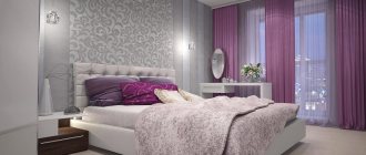
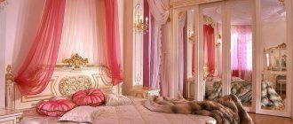
Provence style color is ideal for the bedroom
Lighting Features
The choice of color is also influenced by lighting features. When the window faces north, this leads to poor quality lighting. Poor quality natural lighting needs to be compensated. It is not enough to install lamps. You also need to choose the color of the material wisely.
Tip To avoid discomfort in a dark room with the lights off, you need to use light shades. It is advisable not to go out of style.
This color will add more light to your room.
You cannot thoughtlessly use them just because you liked their shade or pattern . Some styles are strict in this regard, for example, baroque or classic. There are fewer problems with conventional modernity, but it also has its own requirements. They affect brightness. You need to be able to combine correctly. You cannot use different shades in one composition. It is important to maintain harmony everywhere.
The color of the wallpaper should be in harmony with the furniture.
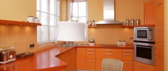
The issue of practicality cannot be avoided. Dirt on white shades is very noticeable. For a bedroom or living room this is not so important. This factor is more important for the kitchen. Ceilings and walls get dirty there much faster. The proximity of the stove, the heat from the oven, cooking, lack of free space - all this makes the walls very vulnerable.
Advice You need to choose practical materials.
This also applies to the children's room. Children may accidentally smear or write on them.
Practicality comes first in the kitchen
The location of the material is also a key factor. For one, it is better for it to be located on the wall. Others feel more at home on the ceiling. You should try on the shade in advance, even before gluing. This will help you understand the right choice.
White wallpaper
If we talk about a universal color that fits organically into any design, then it is, of course, white. It traditionally symbolizes purity and freshness.
In addition, white visually expands the room, pushing the boundaries of the walls. It has a number of advantages, which is why it has long been loved by designers.
To prevent this design from causing “Hospital” associations, the decor is diluted with bright accents: Photographs, paintings in interesting frames, multi-colored panels.
A white room, be it a bedroom or a living room, always looks luxurious. However, here it is necessary to maintain exemplary order, because chaos and dirt are not compatible with the color white.
Nuances of choosing for the hall
For rooms, there are four factors that influence the choice of material color:
- You need to look at the orientation relative to the cardinal direction.
- Evaluate the interior style.
- Determine if the furniture is multi-colored.
- You need to stick to your taste.
Black makes the room stylish
Sometimes living rooms are multifunctional. In the usual sense, the living room is needed for leisure. The kitchen is used for eating, and the bedroom is used for sleeping. If all of the above actions are performed in the living room, then versatility will be an important factor.
- It must be taken into account that people eat in the living room, which means that the chance of contamination increases. Children will be playing there, so they need to create a fun environment.
- Sleep will also take place there. Therefore, you can’t go too far with brightness either. You won't be able to sleep well with bright colors.
- Premises must be allocated separately. But there shouldn't be any obvious contrast. This is especially appropriate in situations where material needs to be changed in several rooms at once. After moving from a pale room to a bright one, your eyes may begin to ripple. This cannot be allowed.
Discreet and at the same time bright and stylish print
Color solutions for the dining area
The dining area, in contrast to the working kitchen section, is decorated with wallpaper. Color solutions mean highlighting one of the walls using a stencil design, intricate ornament or mosaic pattern.
For small rooms, use the lightest colors possible, which allow you to visually expand the room.
Optimally selected colors will help you create a beautiful and stylish interior in your apartment.
Combination of shades of furniture and finishing materials
The selection takes place after purchasing the furniture . Wallpaper should either set off the furniture or emphasize it. They should not draw attention to themselves. This sequence is explained simply. It is easier to buy new ones than to completely change furniture. If the contrast of the furniture is dark, then you should use light ones. Warm shades such as pear, mustard, and sand are allowed.
Tone matching the furniture
This rule does not work in reverse.
Advice: White furniture does not have to be set off with dark wallpaper.
White furniture gives almost complete freedom in choice.
You can’t just use white wallpaper, otherwise it will blend into the background.
Color can be:
- purple;
- emerald;
- sapphire.
Beige shades will give the room a calm atmosphere in the room.
If there is brown or reddish furniture in the room, you should use dark ones.
Cherry furniture will be combined with:
- burgundy;
- purple;
- rich green.
This range is designed to lift your spirits.
There are recommendations on the Internet - the wallpaper can be pale. This tip is more suitable for the bedroom than the living room.
Nowadays it is fashionable to buy blue furniture. It looks stylish and not cheap. Blue doesn't get boring. The background of the room directly depends on the purpose of using the living room. Using the living room for leisure requires the use of red or yellow.
To relax you need to use wallpaper:
- beige;
- cream;
- light blue.
Peach furniture is used less often. When purchasing peach-colored items, you need to make the background in the room brighter. This is a case where a brighter background will help make the furniture stand out. Looks elegant with peach:
- grey;
- blue;
- pearl shade.
Blue never gets boring
Green shades
Can't decide what color wallpaper to choose for your bedroom? We recommend paying attention to the green color. It provides incredible relaxation after a busy day, everyday stress, and intellectual work. Psychologists recommend decorating a bedroom in shades of green for people who engage in mental work, for example, teachers, researchers, engineers, doctors, and business managers. They are also suitable for those who often experience irritation, are short-tempered and overly emotional. At the same time, for the bedroom it is better to choose shades such as pistachio, olive or the delicate color of green tea.
Green shades go perfectly with beige, white, blue and light blue, brown, pink. Gray, red and rich bronze are not the best “neighbors” for green.
Location nuances
You should remember about the side of the living room when purchasing material . When facing east or west, it does not matter where the windows are installed. This does not apply to situations where the windows are blocked by tall trees. Then problems with room lighting may occur. Problems occur on the first floors when the window faces south or north or when trees obstruct the view of the window. Then there can be two options: when there is not enough light or when there is too much light.
Bright wallpaper for a room with little light
- If there is little light in the room, and the window faces north, it means that there will be very little light in the summer. Illumination comes from light reflected from the sky. Gray or blue cannot be used. These colors will match the shade of the sky in winter and summer, respectively. You cannot use pale shades or cold contrasts. You can save the room with wallpaper with bright colors.
- Too much light is also harmful. My eyes hurt and I can't concentrate on anything. Then you should use cold ones. This is a light khaki beige gray. Dark background is allowed.
You cannot add red or yellow colors to an initially bright room. The rays will be reflected from them, and the eyes will begin to get more tired. Among the neutrals, white stands out.
For rooms with good daylight
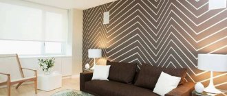
Combination of patterns
When decorating a bedroom, you should know which patterns go well with each other and which are more likely to clash. So, among the best options, the following can be noted:
- checkered and graphics;
- wallpaper without a pattern in combination with polka dots;
- plain canvases along with photo wallpaper;
- floral motifs adjacent to stripes;
- floral patterns combined with small dots located at a great distance from each other;
- stripes and pastorals;
- polka dots combined with a pattern called ikat;
- monograms and medallions that combine with stripes.
Nuances of human psychology
Red The correct choice influences whether a person wants to be in the room or not. Red colors are considered ideal for the living room . It will add a festive atmosphere and energy. It is difficult to stay in such a room for a long time. For rare stays in the room, a red shade is suitable. It is in no way suitable for relaxation; rather, on the contrary, color gives strength for further work.
Yellow It is advisable not to use only red ones, but to dilute them with neutral shades . Yellow is more calm . The presence of yellow will give the room an atmosphere of family comfort. This can also include a golden hue. It also gives a certain boost of energy, but the color is not as aggressive. Pale gold and corn can be included in this category.
Family atmosphere
Blue To create a calm environment, blue should be used. They act as a pressure and nerve stabilizer. Excessive use of blue in decoration will make guests feel overwhelmed. If the window faces north, then you can use a bright blue tint. It is classified as warm.
Green Greens give an association with nature. Some may associate it with spring, with leaves, with the forest. Like blue, green has a calming effect on people. A living room with greenery can be used for meditation. Depending on the location of the sides, the temperature of the green tint is selected. Although the beige shade is considered a classic, you can overdo it, and then the room will become boring. It does not give any surge of strength and does not affect mood in any way.
Combination of several green textures
Beige You can use beige as a neutral background . A fashion trend is the use of gray. All its shades are also included here. If the color of the furniture is too saturated, or the furniture takes a lot of attention, then they can be shaded with gray wallpaper. Materials with cold look organically for high-tech style rooms and industrial premises.
Commitment to Feng Shui
For those people who believe in Eastern teachings and are interested in the philosophy of Feng Shui, the following information will be useful.
According to this philosophy, there are several elements, and when arranging a room, you need to separate these elements.
Wood cannot collide with metal, fire cannot collide with water. Each of the elements has its own direction and its own set of shades.
- Choosing a family direction involves using red and green.
- Black and blue shades are favorable for a career.
It is also important to consider in which sector of the apartment the living room is located.
Finding a room in the northern sector obliges you to adhere to the element of Water. Then the wallpaper should be blue or black. It is important to choose warm shades of blue or black. Dark shades will make a gloomy room even gloomier. Neutral white is acceptable.
Black is favorable for career
There are different rules for rooms in the western sectors. Yellow, gold, and gray shades are welcome here. For the north and southeast, you need to use terracotta and orange, as these are the colors of the Earth.
For eastern rooms you need to use green ones. This is the element of wood. For rooms located in the south you need to use everything that resembles the color of Fire. These are red, orange, purple. But philosophy does not prohibit the use of a green tint for wall decoration.
Green – element of wood
There are not many options for the living room in the center of the apartment - these are shades of red and brown.
How to choose wallpaper for the living room?
The living room or hall is one of the most visited rooms in an apartment or house. The most popular finishing option is the use of wallpaper in various shades of the same color. Using this technique, you can zone the room, making the recreation area lighter, and the dining room slightly darkened and contrasting.
If you want your living room to be distinguished by sophistication, you should choose products made from natural materials as wallpaper. This kind of interior is always in fashion; you can also use tapestry or painted fabrics - this is an ideal option for a classic style.
A more exotic option for decorating the walls of the hall is wallpaper made from different types of plant fibers: reed, papyrus or bamboo - such an interior will look unusual, while being environmentally friendly, resistant to sunlight and moisture.
Choice for the bedroom
For the bedroom, you need to focus on the fact that the day will begin with this room. And a person’s mood depends on what color of wallpaper is used. It should be noted right away that aggressive colors are prohibited. There will be no quality sleep, and annoying ones will lead to frustration and quarrels. Too minor will also not lead to anything good, since the room should not turn a person into a lazy creature.
You should immediately consider a selection of popular shades:
Blue relaxes and calms
- Blues are often chosen because they are calming, despite their coldness. You can only use light blue, not blue. Blue is allowed only for compact rooms - it can visually expand them.
- The mood of green is perfect for the bedroom. Color gives relaxing emotions, relieves stress, and allows you to relax.
- It’s not for nothing that universal ones have such a title - they can be used everywhere. You can combine anything with white. The room will be light and open, but if there are other shades along with white. Having only white will make the room look impersonal. This is a good option for small bedrooms. It goes with most popular colors. These can be used in bedrooms with poor lighting.
- The use of yellow compensates for this deficiency. Like white, brown can be classified as a universal shade. It will never go away in reality. It has the most positive impact. In such a room you can relax.
Brown is a universal shade
Are there any conflicting colors for the bedroom?
There are several colors that can be used in the bedroom under certain circumstances. But we must immediately make a reservation – the colors are contradictory. For example, this is red wallpaper. It is the color of aggression, leadership and dominance. Leaders and easy-going people like him. The color is most often used in the living room, but it can be used in the bedroom as well. But then the red wallpaper will need to be diluted with a light finish.
Blue is cool. It definitely needs to be diluted. Otherwise, blue wallpaper will cause melancholy and depression. For small bedrooms this is prohibited.
Blue only for large rooms
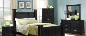
Black can overwhelm its richness, so splashes of beige or white are a must. A completely black interior for a bedroom is unacceptable.
Cardinal directions for the bedroom
As for the living room, the cardinal directions play a big role in the bedroom . Especially if the apartment owner is interested in Feng Shui. If the windows face south, then there will be no problem with light. After lunch there will be too much light, so you need to absorb it:
- blue;
- purple;
- terracotta.
All of the above rules are relevant only for spacious bedrooms. There is no need to use dark ones for compact bedrooms. When the window faces north, there will be a lack of light. Then even opening the curtains will not greatly improve the situation. You will need to use wallpaper in a beige, gold or yellow shade.
Bohemian style
Color combination of wallpaper and furniture
It is customary to plan the overall range in advance, so that in practice you do not end up with a frankly unsuccessful combination of finishing materials and furniture.
- For light furniture, you need to choose materials to match. Such wallpaper can be golden, white and beige wallpaper. In rooms with large walls you can play with contrast. That is, you can use black furniture and white wallpaper and vice versa. Warm and cold shades cannot be mixed under any circumstances.
- As for dark furniture, it refers to warm furniture. Accordingly, cool shades cannot be used in wallpaper. Suitable colors are white, sand, ocher, brown. Furniture should act as a secondary material, while wallpaper will be the main element.
There are also some bold solutions to add some light color to a dull interior. You can try combining different types of wallpaper. The point is that you need to use the same pattern structure. Colors can be any. You can make a vertical or horizontal position, as well as inserts and niches.
Horizontal stripes are good for zoning a room
Horizontal stripes are used to zone the room. At the bottom of the room, dark wallpaper with a dynamic pattern is used. At the top of the room there will be calm tones. Vertical stripes can be made monochromatic. The width of the stripes can be selected to be the same as the dimensions of the bed. The material can either reach the ceiling or go beyond it. Inserts are required to highlight space. The area above the bed is often highlighted.
Advice If there is a niche in the room, then it is worth making it the same as the other walls.
Living room decoration
The interior of the main room in the house is usually thought out to the smallest detail. Here, the choice of wallpaper will largely depend on the color and arrangement of the furniture. In addition, style features and lighting levels are taken into account.
What wallpaper color is suitable for a modern interior? If the room is furnished with dark furniture, then the walls can be decorated in light colors. Olive and light beige colors are suitable.
You can use discreet floral prints. Wall decoration should be harmoniously combined with the color of curtains and furniture upholstery.
- Depending on the total area of the living room and its illumination, choose darker or lighter colors.
- The beige and cream palette is universal; it allows for any color combinations and goes well with the texture of natural materials.
Gray makes the interior more sophisticated and stylish - it has recently become a favorite of designers. Traditionally, most people prefer soft pastel colors using a light palette. This helps create a peaceful, calm atmosphere.
For kitchen
The kitchen has exactly the same requirements for choosing wallpaper. It is necessary to take into account the degree of illumination and the size of the room. It is customary to compensate for the lack of lighting with warm colors in the wallpaper. This:
- beige;
- cream;
- yellow wallpaper.
A warm shade is not required if there is a lot of light in the room. Here you should choose neutral ones.
This is the choice:
- peach;
- wheat;
- olive wallpaper.
Muted cool shades are suitable. They will give the kitchen a cozy atmosphere.
Good tone for a large kitchen
A more aggressive red for the kitchen is considered a bold color. It can cause irritation if you overdo it with saturation. Red is the color of confident people. Feng Shui philosophy says that red light can increase appetite. If you approach the issue from this side, then red wallpaper for the kitchen will come in handy.
Advice It is best to dilute red wallpaper with black inserts or black furniture.
Cool shades are designed to soothe. But they are not suitable for the kitchen. In the kitchen, the main thing is to stimulate appetite, and blue has no effect on this process. Blue does not add coziness, but if the windows face south, they give a lot of light. Excessive lighting can be extinguished with wallpaper in blue tones. Both red and white shades look good with blue.
Print to increase appetite
There is a risk that large red inserts will disrupt the composition. Green is perceived well everywhere. This shade is suitable for the kitchen. It has a positive effect on your state of mind. This can include emerald and olive shades. Pear and pistachio are associated with natural beauty.
If green has a delicate shade, then such wallpaper can be combined with beige and yellow inserts.
This combination allows you to achieve a welcoming atmosphere. This is very important for the kitchen. Only one wall in the kitchen can be green - this will help highlight it.
Welcoming atmosphere
Design techniques
- If there are no special thoughts in your head, then you can always use white wallpaper. You can combine white and dark wallpaper. White wallpaper in compact kitchens is a classic. The snow-white furnishings make the room feel light. You can use white wallpaper as a shading background. Then you will have to focus on orange, olive or even red.
- You can solve the problem of low ceilings by installing wallpaper with vertical stripes. The color can be any. You can expand the room on the sides using wallpaper with a horizontal stripe.
Vertical stripes for low ceilings
- Too colorful ones are not suitable for the kitchen. They get bored very quickly and begin to irritate rather than delight.
- It is better to highlight one wall with a bright color, but all the walls in the room.
- If there are sufficiently large drawings, then the color should be neutral.
- If you don't have any specific ideas about color, you can choose shades of green.
- When the furniture in the room has a simple shape, and the textiles are just as simple, it is better to choose wallpaper with an ornament.
Bright furniture and bright accessories in the kitchen require a shading element. This element should be wallpaper with a light shade. In this case, patterns are not needed.
Blue and light blue
Sky blue, turquoise, deep blue, cornflower blue - all these shades calm the human nervous system and promote relaxation. Another important plus: shades of blue quickly plunge the bedroom into darkness, speeding up the time you fall asleep. Don’t forget that cold tones expand the space and make it appear larger. This means that blue and light blue wallpaper is simply irreplaceable for a small bedroom. In addition, they will “cool” the room located on the sunny side.
Blue wallpaper in the bedroom interior can be combined with white, gray, and gold. It is better to avoid using lilac and green paired with blue. Blue-hued wallpaper looks good in combination with rich blue and brown, but does not tolerate burgundy and purple tones next to it.
For children's
There is a strict distinction here based on the child’s age, as well as his gender. In the first three years of a child’s life, the child should be surrounded by wallpaper in pastel shades. Annoying colors are not allowed. In the period from three to 6 years, a child needs vivid impressions and emotions. You can choose the brightest ones.
Bright highlight of the kitchen
There is one nuance in the images. They don't have to be very big. Large figures can frighten a child. The same applies to geometric shapes with sharp corners. The presence of a composition with these elements can cause anxiety in a child. And pastel colors won’t help here. As the child grows up, you can use quite adult shades, turning the children's room into a teenager's relaxation room.
For the little comic book lover
If with boys everything is approximately clear, then with girls everything is a little more complicated . They prefer colors from the warm part of the spectrum. If possible you should use:
- pink;
- peach;
- soft green;
- warm yellow wallpaper.
For boys the situation is the opposite. It is better for them to make a room with blue or gray wallpaper. A combination of yellow and green, gray and orange is welcome. You can use red and brown finishing materials.
Completely red wallpaper should not be used for a children's room. When children of different sexes live in the same room, it is important to distinguish zones. Each zone should have its own color or texture. Even if the child has become quite an adult, it is not at all necessary to decorate the room in black tones. A large amount of black can make you sad. There's no need to talk about children.
An original solution for those who like to draw
Gray and beige
These tones can be classified as neutral. Gray and beige wallpaper in the bedroom does not bring much relaxation, but does not cause negative emotions. The only thing that should be taken into account when decorating a bedroom with such wallpaper is the location of the room: for example, in a hot room you should decorate the walls with wallpaper in gray tones, but in cool rooms it is recommended to use beige-cream wallpaper.
Both gray and beige finishing materials are combined with all shades. However, they are not “friends” with each other.
conclusions
People make the same mistakes when choosing colors. Therefore, we can highlight a few simple tips that will draw a line under the article:
- When comparing two identical rooms with green and orange works, it will be the first one that seems cold. This is assuming the same lighting.
- In any room, colors have approximately the same effect. Green always acts as a calming color. Yellow gives a cheerful mood and a warm environment. The color red is an irritant for both children and adults.
- It is important to choose the lighting in the room wisely. Cool tones require strong lighting. Warm colors allow you to dim the lighting in the room.
- Uniformity in the color of the finish is allowed in one room, but not throughout the entire apartment.
- Also, strong variation in the brightness of shades is not allowed.
- All rooms must maintain a balance of brightness.
- White ones increase space, dark ones shrink. To elongate walls and ceilings, you need to use wallpaper with vertical and horizontal stripes, respectively.
Beautiful hallway
VIDEO: The most pleasant shades for your bedroom
Favorable colors for the bedroom
Choose pleasant colors and shades
Wallpaper color and other interior details
Let's dwell on a few more details that can affect the search for wallpaper for walls by color. Often in interiors they focus not only on furniture, but also choose wallpaper to match the color of the doors . This design option does not necessarily involve the use of similar shades: it is possible to use colors a couple of tones lighter or darker.
When choosing wallpaper for walls, you can focus on other surfaces. Most often, the criterion for choosing the main shade is the ceiling. In many antique interiors, wallpaper and ceiling merge into a single composition.
How to match the color of the ceiling to the wallpaper? First of all, decide which palette will be most successful in your room: dark, light or bright, creating contrasts.
Next, analyze whether the selected shade will have a pressing effect when used not only on the side surfaces, but also on top.
If you are completely satisfied with your choice, start decorating: if desired, the ceiling can be stylized using textured materials or a glossy finish .
Attention! Wallpaper of absolutely any color will suit a standard white ceiling.
Don't forget to think about how to match the color of the curtains to the wallpaper. Curtains in the interior can imitate the background shade (differing from it by several tones) or repeat the color of patterns found in the accent areas of the room.