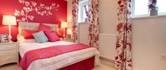
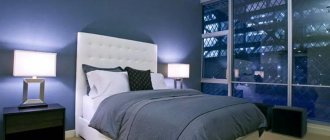
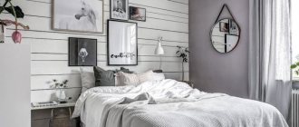
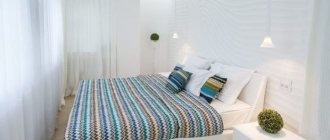
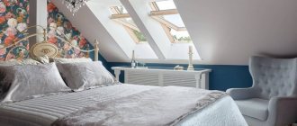
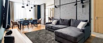
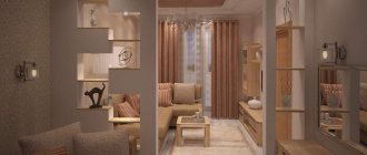
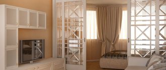
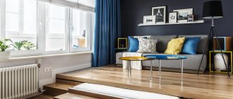
We present to your attention a new design project, which we will call “The end of the era of the folding sofa.” The solution for your small room. In one small space you can keep both the bedroom and the kitchen, and even arrange a living room and a small but cozy workspace. All four zones are separated in one room by finishing the floor, walls, ceiling, as well as using accessories and techniques.
Photo of the kitchen-living room-bedroom before the remodel:
Floor
If we consider the first zone - the kitchen - then there is a self-leveling floor, which gives a feeling of integrity with the walls and ceiling, and thermomats will provide comfort at any time of the year. In order to make it, all defects in the screed were eliminated using a careful machine.
After this, a layer of epoxy resins was spread. The surface layer of the flooring is matched to the color of the walls and furniture. Their blue tint makes the space more airy. In the dining room, the flooring is made of parquet boards.
The bedroom, as a special area of the room, was highlighted with the help of a homemade podium, which was decorated with chipboard, resistant to changes in moisture in the house. The podium also includes additional storage space. The top is decorated with oak-colored laminate.
The living area is distinguished by light parquet boards: the top layer is oak combined with white oil, and the remaining ones are coniferous wood. The strength and reliability of this type of floor is ensured by cross-sizing. In addition, diagonal laying visually expands the space.
Zoning principles
If you are arranging a kitchen not in a “Khrushchev” and its area is at least a little larger, you can apply the principles of zoning and dividing space in the kitchen. For those rooms in which a folding chair, sofa or couch is separate from the dining table, you can visually separate these two parts of the room using color schemes and different materials in the design.
For example, you can place a folded bed separately near the window, hang elegant curtains on the window, and put several bright pillows on the chair. Cozy decor and the presence of daylight from the window will make such a place suitable for reading.
If the sofa is located against a free wall, you can highlight it with color, place a soft rug on the floor near it, and a minimalist floor lamp or sconce will help complement the composition. Add a small table there and this place will attract those who like to sip coffee after the main meal at the table.
If it is expected that one of the family members will constantly rest on the sleeping place in the kitchen, it would not be unreasonable to decide to screw special curtain rails to the ceiling. At night it will be possible to close the sleeping area from household members who come to the kitchen to drink water.
Walls
The division into functional areas is also present here. Thus, a delicate blue color clearly outlines the boundaries of the kitchen, the color of wood fills the bedroom with comfort, and the white shade perfectly illuminates and expands the space of the dining room and living room. Before this, the walls of all rooms were directly leveled with plasterboard, which will act as a moisture regulator in the room.
The partitions between all functional areas of the room were divided using metal profiles and the previously mentioned drywall. And, of course, they did not forget about sound insulation - the internal cavity of the partitions is filled with mineral-based soundproofing material.
An interesting design solution is a small window that lets light from the bedroom into the kitchen. The walls in the bedroom area are covered with veneer wallpaper, which is easily attached with dispersion adhesive. This type of light oak-colored wallpaper helped bring the design idea of a wooden texture to life. To protect them from moisture, a layer of oil wax is applied on top. The loggia opening is further highlighted with matte black metal corners.
The walls of the living room and dining room are painted in bluish shades. For contrast, the kitchen used water-based paint in a richer dark blue color.
Technique 6: Make a functional partition
Align the partition with the storage system. / Photo: stroikairemont.com
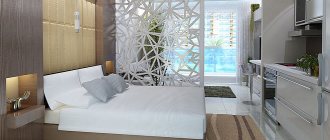
If the apartment has few storage spaces, consider making sure that even a partition dividing the space into two parts serves a functional purpose.
For example, you can safely use a design, the lower part of which will be intended for placing bedding and located in the bedroom, and the upper part will serve as a display case for dishes and books, and will be located on the side of the living room.
This is an ideal solution for a small space that should be as functional as possible, but not overloaded with furniture and other details.
Windows and doors
Panoramic glazing makes the entire room much brighter, lighter and more comfortable. Energy-saving packages will provide you with additional warmth and also maintain silence. White frames will make the window openings less heavy. And the design solution - a skylight leading from the kitchen to the bedroom - has already been discussed earlier.
As for doors, sliding interior doors help to separate all functional areas. One such partition, depending on its position, can serve either as an entrance door to the living room or as a shelving door. Another such partition - three-panel with a ribbed texture - separates the living room from the kitchen with the bedroom. All door handles are finished in a high-gloss chrome color scheme. All doors are coated with matte varnish, which facilitates the cleaning process and protects against fading.
Light
Each part of the room has its own way of lighting. First, let's look at the bedroom. The main lighting is provided by a ceiling lamp in the form of a miniature spotlight with LED lamps. Also, the LED strip is mounted in a niche and acts as a night light. The living room delights us with a triple aluminum chandelier in the form of a vine - the design work of French designers Ronan and Erwan Bouroullec.
The dining area has its own lighting system. First of all, this is a steel cone lamp. There is a sconce above the workplace.
The kitchen features many LED strips. The first of them illuminates the working surface. The ceiling lighting is provided by three cylindrical lamps.
Layout features
When it becomes necessary to zoning the living room and children's room, it is important to first take into account the age of the child. There is no need to create special conditions for a newborn. He only needs a comfortable crib and a changing table. A grown-up child needs a place to play, a schoolchild needs a workplace. The older the child, the more space he needs. Therefore, when planning, it is important to take into account age characteristics.
Living room with a crib for a newborn Source dizainexpert.ru
Another important point is the number of children. When there are two of them and they are the same age, you will have to think through the organization of space so that everyone has their own personal corner, everyone should have a sleeping and working place, and their own closet for storing things. It’s clear that if the children’s living room is in one room, it’s difficult to find space for all this. A bunk bed, a transforming table and a wardrobe with a mirrored arrangement of shelves can save the situation.
A compact bunk bed will allow you to organize sleeping places for children in the living room Source era-mebeli.ru
Furniture for living room-bedroom-kitchen
Where would we be without the integral components of any apartment - furniture. The main attraction in the sleeping area is the huge double bed. Its advantage is that it is made to order. The plywood frame, the base is decorated with the same veneer wallpaper as the walls, and the adjustable birch lattice is complemented, of course, by an orthopedic mattress.
The anatomical lattice will easily follow the shape of your body, supporting the spine in the desired position and condition. The recess at the head is equipped with LED strips that serve as a night light. The sleeping area also boasts an excellent wardrobe that literally disappears against the background of the walls. This effect is achieved by the fact that it is also decorated with veneer, like the walls. And the doors open with a simple press.
Let's consider the living room. Everything here is laconic, but with a twist. At the entrance there is a built-in white wardrobe, covered to match the walls. The rack on the other side can be easily closed with a sliding door if necessary. A striking element of the living room is a high-back sofa covered in faux leather.
What is a living room without a coffee table? In this case, it is presented in the Art Nouveau style, and its shape is similar to an unopened bud on a tree.
The dining part of the room boasts a square glass table, which, combined with the light color of the walls, seems weightless. This airy effect is complemented by beautiful chairs made of translucent plastic by designer Philippe Starck.
The work area is located on the loggia and separated using a plywood structure. Two cabinets with niches and a desk top look laconic and easily fit into the overall design of the room. A massive wooden stool completes the picture.
Despite the small area allocated for the kitchen area, it was possible to avoid unnecessary clutter with kitchen utensils. Thus, spacious wall cabinets, a kitchen unit, a refrigerator and even a dishwasher complement the overall interior of the kitchen and are made in light blue tones. The tabletop is made of artificial acrylic, also blue. The same shade of the ceiling and walls adds integrity to the space. All doors close absolutely silently, thanks to closers.
How to create a kitchen design for a large family and several generations: combining the kitchen and loggia.
Is it possible to combine the kitchen and the hallway and what will come of it? We’ll tell you at this link.
Renovation and unique design of an unusual kitchen with seven corners:
Bathroom: dark tiles are not the best option
To install the bathtub, a front wall was built from gas silicate blocks, which served as a screen. Due to the fact that the size of the room exceeded the length of the bathtub, the gap between the bathtub and the wall was closed with blocks. The whole thing was tiled on top. The tiles were chosen from a domestic manufacturer, and her husband also laid them himself. By the way, any stains are very noticeable on dark tiles, so it is better to give preference to light ones. We bought the mirror at a local hardware store for pennies and added lamps on top.
Textiles and accessories
An immediate and obligatory attribute of any room is curtains. In the case of the loggia, the choice fell on translucent linen curtains. They are equipped with a special mechanism that allows them to be securely fixed or lifted without difficulty. The bedroom got Roman blinds, but with a denser texture and a natural cream shade.
A beautiful smoky-colored fleecy carpet will make the living area more comfortable. It cleans effortlessly and is hypoallergenic.
The decoration of the entire room was simple photographic frescoes with calm scenes. Indoor flowers and extraordinary vases complemented the interior of each zone of the room.
See all the photos of the combined kitchen, living room and bedroom after the remodel:
See also the video release of Housing Issue No. 461 “The End of the Era of the Folding Sofa”:
Office on the loggia
Since the apartment is small, we decided to make the most of all available meters. After the bedroom and kitchen we took on the loggia. Initially, it was in a sad state, with holes through it. As they say, the eyes are afraid, but the hands do. They repaired the holes, laid warm floors, and insulated the walls. Laminate was laid on one wall, the rest were covered with wallpaper. It turned out to be a very cozy office.

