2019-06-03
Author: Belfan
Issues discussed in the material:
- What is the meaning of brown
- What are the advantages of a living room interior in brown tones?
- What shades of brown are there, and what colors does it go with in the living room interior?
- How to choose the right living room furniture in brown tones
- What rules should you follow when decorating a living room in brown tones?
The presence of brown in the design of a room looks natural, as it is a natural shade of wood. Since ancient times, wood materials have been used to build houses and make furniture. A fairy-tale forest hut, a hunter's house, a wooden hull of a sailboat - the appearance of brown walls is associated with such associations. But how to properly decorate the interior of a living room in brown tones? Our article will help you figure this out.
The influence of brown in the interior
Brown shades are present everywhere in nature: soil, tree trunks, fallen leaves. Largely due to its association with the natural colors of the environment, brown evokes feelings of security, well-being and confidence.
Psychologists have long found out that brown colors in the interior have a warming effect. These colors relieve tension and stress, relax and soothe, and help restore peace of mind.
Brown will have a positive effect on those who constantly worry about the future and live in anxious anticipation. An interior in brown tones will undoubtedly remove unnecessary tension, restore self-confidence, and your guests will feel more comfortable and at ease.
It is worth listening to the opinion of experienced psychologists who say that men tend to choose muted brown for interior decoration. And in order to come to mutual agreement between family members in the process of determining the color combination, you can propose implementing the interior design of the living room in brown and beige tones. And when you create a personal space, you can no longer limit yourself in your desires.
There is also an opinion that the color brown contains a great vital force waiting for creative manifestation. For now, it seems to be inactive and accumulating energy. People have always intuitively felt this and often used wooden objects in the interiors of their city apartments. The following brown wood products look natural in a living room design:
- parquet or laminate;
- doors and window frames;
- finishing panels and furniture.
Those who value comfortable rest and emotional peace intuitively tend to choose brown tones for decorating the living room and natural wood materials. They are also preferred by people with a conservative mindset, unhurried and balanced in their decisions, striving for financial stability. In times of crisis, designers have an increasing number of orders for interiors in brown, as this color scheme helps to cope with uncertainty about the future.
Thus, the effect of shades of coffee and chocolate is similar to the effect of using anti-depression medications; they help a person remain functional during prolonged stressful situations and nervous overload.
So, we can conclude that the choice in favor of the interior of a kitchen, bedroom or living room in brown tones is usually made by balanced people who make decisions after long deliberation. They are able to objectively assess the situation from different points of view. These people are a little reserved and limit their social circle. They think through their actions logically and follow the intended path towards their goals - and this is their strength.
Often, for a person who chooses to decorate a living room in brown tones, the main value is a strong family and material well-being. By choosing brown materials, people express their traditional worldview and desire for stability in life. And one more observation - brown interiors are chosen by those who, for various reasons, do not care enough about their health, and consider staying in solitude to be a cure for stress and fatigue.
Recommended articles on this topic:
- Living room interior in light colors (photo): advantages of such design
- Corner sofa made of solid wood: 5 undeniable advantages of purchasing such furniture
- Modular sofas in the living room interior: a hyperfunctional highlight of your home
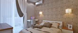
Brown bedroom
The bedroom is one of those places that can be dark. And since noble colors suit brown, a wooden bed with a turquoise or lilac blanket is a win-win option for a thematic solution.
In addition, inside a brown bedroom it is beneficial to arrange:
- Plank flooring with a single color finish;
- Light single-level ceiling;
- Wooden cornice with noble curtains;
- Wooden bedside tables with chest of drawers;
- Warm lighting lamps with lemon shades
- Leather wall covering, provided that only one plane is covered with leather.
It is not necessary for a brown bedroom to be classic. Different shades of theme color look good on vertical folding curtains, trim panels, wallpaper and laminate flooring.
Even a low platform bed, even it often comes in brown. A bright bedside ottoman or blanket can add contrast to such a bed.
Advantages of a living room interior in brown tones
We list the main reasons why you should choose brown tones for interior decoration:
- they help to relax and calm the nervous system;
- the interior looks more voluminous and self-sufficient thanks to rich basic colors, even with a small amount of furniture and decor;
- they give comfort to too large a space, as they are able to change visual perception, bringing objects closer;
- create harmonious combinations with any light shades;
- calm tones give rest to the eyes after flashing bright neon advertising, shimmering in different colors, tiresome shiny gloss, dynamic variegated colors;
- this range is ideal for creating an accent in the interior, helping to separate functional areas and mark boundaries;
- by adding literally a few chestnut, terracotta or red-brown elements to the overall composition of the living room, you can immediately change the usual picture;
- brown is the base color when creating designs in classic and modern directions.
Brown tones in the design of the room evoke feelings of wealth and self-sufficiency. They do not need additional ornate patterns, attractive textures and intricate textures. The most important thing is to combine it harmoniously with light shades, since too dark a finish will lead to oversaturation and the interior will look gloomy and dreary. It is necessary to wisely add pastel colors to get rid of shadows in the corners.
Photos of interiors with combinations of pink with gray, white and beige
view album in new window
Interior design of a living room in a private house. Photos of 2022
Combining pink with other shades in an interior can be quite difficult. It does not suit most bright and dark colors, as well as overly simple colors. He needs powdery, gray, faded and pastel colors. The exception is grayish shades, such as blue-gray or faded emerald, which can look good in complex color mixes.
So what colors does pink go best with in the interior? Let's get a look!
White and pink interior
view album in new window
Interior of a white kitchen with pink chairs in the dining room
Pink in the interior is most often combined with a light background, for example, white or beige, light brown or gray. And to create the effect of depth, in addition to it, several more shades are usually chosen (another version of pink, peach, blue, light yellow, etc.).
White and pink look as elegant as possible in any context and style. Since both shades are light, their tandem allows you to create a feeling of spaciousness and visual harmony in the interior. This color combination with pink is great for the living room, kitchen or bedroom.
Beige-pink interior
view album in new window
Cozy small living room with built-in storage systems
The option with a combination of pink and beige has proven itself well in the design of a living room. The interior becomes more traditional, cozy and classic. This range is best suited to neoclassical and American classics and any option with an abundance of wood.
Dusty pink
view album in new window
Dusty (ash) pink bathroom
A dusty or ash pink shade is ideal for a bathroom, because it allows you to use both white and gray as the main background (marble, for example). The final color combination is complex, but visually light, which is ideal for small spaces. Also, the dusty pink shade is popular in the design of bedrooms for teenage girls, in particular in the Scandinavian style.
Powdered pink
view album in new window
Kitchen-living room in a fashionable Art Deco design style
The powdered version is a pink shade with a slight powdery haze. So this color turns out to be elegant, unobtrusive and suitable even for decorating walls, and not just for placing accents.
Pink-blue
view album in new window
Cute bedroom interior in pink and blue tones
This combination is most popular in the design of classic and neoclassical bedrooms. Typically, the interior design of a room is based on a blue color scheme, and pinkish floral accents become just an addition. The reverse variation is not as popular as this classic one. It is also worth considering that pink is best matched to the wood shade that is most likely already present in the room. It should be as muted/bright as the wood.
Gray pink
view album in new window
Gray-pink interior of a beautiful bedroom
The gray-pink interior is universal and can be used in a matrimonial bedroom, a living room or even a hallway. Cool tones can create a more modern and formal feel if that's what you're going for. Gray in the original is successful in this design option as the main background, in finishing materials, cabinet furniture, and the design of curtains and walls.
Peachy pink
view album in new window
Stunning interior of a trendy bedroom in Art Deco style
One of the most fashionable combinations on the international scene is a mix of peach (or any orange) color with pink! It is ideal for a teenage girl's bedroom or nursery. In addition to them, wood of rich nut tones, ocher or a shade of milk chocolate, as well as gold, silver or any truffle-coffee shades are usually chosen.
Light pink
view album in new window
Bedroom renovation in light colors
A subtle version of this color works well for matrimonial bedrooms and children's rooms, as well as children's bathrooms. It is usually combined with beige or light brown. This option can be called traditional and as safe as possible - such interiors do not get boring over time and remain quite neutral. Along the way, we note that they can be easily changed with the help of new decorative items.
Green-pink
view album in new window
Dark colors in the design of a matrimonial bedroom
The pink interior of the room, diluted with one of the greenish shades (emerald, malachite, teal, turquoise) looks not only very fashionable, but also slightly extravagant. We recommend it only to those who are sure of their preferences. Typically, this design is chosen by single people for the interior of studio apartments. Such a spectacular design would also be suitable for a teenage girl’s bedroom.
Dirty pink
view album in new window
Elegant bedroom interior. Photos of 2022
A dirty pink interior is obtained by adding a grayish stone color, which will create an effect close to lilac, but still more cozy. Such a bedroom can have lilac, violet, purple elements, as well as a white or gray background. Textures can also add some dirtiness: decorative plaster, wood relief, shimmering velvet with capitonné.
Pink-yellow
view album in new window
Beige-pink living room interior
Pink in the interior goes well with yellow, light yellow and gold. This mix is perfect for a girl's studio, woman's apartment or master bedroom. This range is popular in styles such as neoclassical, art deco, classic and American classic.
Light pink
view album in new window
Bathroom decoration in neoclassical style
Any light shades look great in neoclassical and proclassical interiors, be it American or English style. Light pink tones (a little grayish or a little bright) look great against a white background.
Shades of brown for the living room interior
What shades can you use when decorating a room:
- Beige.
- Wheat.
- Kremov.
- Golden.
- Brown with shades of yellow, pink and gray.
- Terracotta.
- Kashtanov.
- Tones of milk and dark chocolate - these colors look very noble with a hint of ivory and are suitable for creating a bright accent.
- Colors of cognac and tea.
- Caramel.
- Cocoa is extremely popular not as the main color in the interior, but as a decorative element or accent.
- Cinnamon - this tone gives off a feeling of softness and warmth, it calms and brings a note of peace to the living room. Yellow and red go well with it. A combination with creamy or baked milk color is more suitable for a romantic setting.
- Coffee with milk.
- Different wood tones – if you add red or yellow to wood tones, you get a very effective combination. The combination of natural green tones and shades of wood in the interior looks natural - this combination gives a charge of positivity and energy.
- Wenge.
- Black and brown.
The photo below shows a modern living room interior in gray-brown tones:
The selection of combinations and color saturation should be done in accordance with the type of living room: large or not very large, what is the height of the ceiling, north or south side. Another important question about the purpose is whether it will combine the functions of a living room and a dining room or whether it will also have an office or a guest bedroom.
Individual brown tones, for example, a shade of rust, should not be chosen as the main one for decorating the interior of the living room. However, a sofa upholstered in this color will stand out perfectly against the background of light walls - it’s all a matter of skillful combination.
The peculiarity of this color is also that you can use light or dark brown shades, but bright brown or pale brown are not found. But variations of the same tone can still have different saturations, for example, the colors of blurred and thick caramel.
We also draw your attention to the fact that for each named shade of brown there are optimal combinations with other colors, allowing you to develop an interesting interior design project. It is necessary to remember about a reasonable balance and not to overload the entire space with one color. Experts have developed many examples of finished interiors, so it makes sense to turn to them, and not just to your intuition.
Colors that go with brown
To create a fashionable version of a brown living room, it is important to take into account all the details when choosing a combination of shades. As mentioned above, the main guideline for the color scheme is the size of the room.
If the living room is small, then the main tone should be a light, almost white (sand) tone in order to “push apart” the walls and make it visually larger. Against this background, small dark spots will look very good.
- Transformable table for the living room: review of 2022 models (70 photos in the interior)
- Living room interior design: furniture, best styles and new items for 2022
Bedroom-living room 18 sq.m. m: beautiful and practical organization ideas (70+ photos)
The next factor influencing the color scheme is the lighting of the room. If the room is northern, dimly lit, dark colors will not suit it.
The most popular among modern designers is the combination of white and brown shades. Rooms in these colors are considered the most respectable. This is how rooms in luxury apartments and cottages are decorated, because this combination gives the room special comfort and coziness.
Another, more natural combination is brown and green. This pair of warm colors will always be popular, just like trees and foliage. Moreover, in the interior these shades look amazing. When choosing an interior for a living room in an oriental style, it is quite possible to dilute brown tones with orange and paints; this combination brings warmth and sunshine to the room.
New time, new trends. Purple and blue shades appeared in the living room interior along with brown, but this is mainly aimed at creative clients.
Living room interior styles in brown tones
A large selection of dark and pastel brown tones allows you to decorate the interior in various styles:
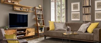
- An industrial loft cannot be realized without using different variants of brown: roughly processed furniture facades, plank floors, door panels. Warm brown tones allow you to “domesticate” an industrial space.
- Belonging to the eco trend should be emphasized with the most natural shade options. This could be a set with zebrawood-type facades, parquet flooring made of any wood (bamboo, pine, larch), paper wallpaper with ocher, coffee or peat colors.
- Discreet classics welcome the use of a universal brown palette by designers in living room interiors. Coffee, chestnut, dark chocolate tones can be successfully realized by purchasing a furniture set.
- Varieties of historical styles (Rococo, Baroque, Art Nouveau and Art Deco) include massive brown bookcases and display cases with veneered fronts, on the shelves of which magnificent collections of antique objects are placed.
- Brown is absolutely organic and compatible with rustic country and Provence styles with their love for wooden elements and surfaces.
- The originality of Art Nouveau can be complemented by smooth and light lines using beige and brown tones. All types of cream and wood shades will be as relevant as for rustic styles.
- Modern minimalism doesn't mind looking a little warmer and cozier by adding brown details to cool metal fittings, mirrored glossy surfaces and chrome decor. Finishing the floors with parquet made of natural wood or its high-quality imitation will emphasize the laconicism of the image and will perfectly complement functional furniture.
- Scandinavian style has calmly arrogated to itself the right to use beige and other light colors for wall decoration, while darker shades of brown are chosen for floors and furniture. The amount of decor should be small.
As you already understand, the main secret of the widespread use of the brown palette in interior design is its neutrality. It fits into any design, because the presence of wood tones certainly won’t make things worse: natural colors of decoration, furniture and textile decor make the atmosphere cozy and homely.
A competent and balanced selection of dark and light tones of brown, as well as a gradient that creates a harmonious boundary between contrasts, will help correct shortcomings in the geometry of the room. For example, the living room will look more spacious and the ceiling higher if you use a smooth transition from a darker brown to a lighter color in the decoration. As an example: for the floor, take parquet or laminate in the color “dark chocolate”, for the walls – cocoa-tone paint, and the ceiling can be made light cream.
Brown balcony
Yes, somewhere, but inside the balcony there is always a lot of daylight. Even if the lean-to structure faces north or west, the windows still allow you to enjoy a small but cozy space. It remains to figure out what style the balcony will be made in - classic or modern.
In the first case it is advantageous to use:
- Wooden windows and interior doors;
- Massive lining;
- Furniture made of wicker or solid wood.
The modern interior of a balcony can also be brown if you arrange characteristic dark furniture and decorate the walls with brick slabs.
In this case, windows and doors can remain white (plastic). This combination will only enhance the effect of contrast and laconicism. And of course, don’t forget about plants. To create a natural focus of attraction, the flora must be present in at least a single copy.
Living room furniture in brown tones
The color brown gets its name from the bark of trees, so it is logical that the main material used to make furniture sets for the living room of this color is wood. Such furniture always has a stylish and noble appearance. Chocolate or bleached facades add a special chic to the products. The most popular at all times remain light tones of the brown spectrum or a shade of cinnamon, close to wood textures.
The sofa plays one of the main roles in the living room setting. This popular piece of furniture is often upholstered in brown leather or fabric. Leather or fabric - make your choice based on your own preferences; families with children will most likely choose fabric upholstery: it is softer and easier to clean. A companion to the brown color of upholstered furniture can be heavy curtains in the same color.
In a small room, a compact sofa is enough, but for a spacious living room, you can purchase a modular system with a pair of armchairs in white or beige. As an accent, you can complement the composition with a pouf; it does not have to be the same shade or made of the same fabric. It’s good to add a couple of decorative sofa pillows to match the pouf.
Still, not many people want to implement a completely dark interior in their living room in the spirit of old English castles, so traditionally they buy light brown furniture to match the dark background of the walls. There are quite a few options: chocolate tones, cocoa, wood shades of different species, stained wood tone. Thanks to this, the atmosphere is filled with warmth and comfort.
Here are some tips regarding choosing furniture:
- Let's define the functional purpose.
- Choosing the right color.
- We select the right size.
In order not to make a mistake in choosing furniture items, you need a clear idea of what priority function your living room will have. For example, this room will be used for family evenings watching TV and talking, or maybe it will host entertainment events (children's party, banquet, party) or you will meet friends, relatives and acquaintances here to talk over a cup of tea.
A common option in small apartments is to combine the functions of a living room and a dining area; sometimes this room houses someone’s office or a family member’s bedroom. Or maybe a combination of all options.
All these cases require a slightly different approach to design; all the nuances must be taken into account. For example, you often have to decide on the proper division of zones and the purchase of appropriate furniture, for example, a transforming table or a folding sofa.
You can decide on the color scheme based on your own taste and the experience accumulated by professional designers. If you have a small living room, you should choose light brown tones that can visually enlarge the space. For a large living room, it is suitable to use any brown shades, even the darkest and most saturated ones.
The first step to take before purchasing furniture is to determine the dimensions of the room in which it will be installed. It is not very wise to buy bulky items that barely fit in the living room. A wall or sofa may look very nice, but purchasing furniture is a serious matter, so you need to remind yourself of the purpose of the room and how many people will use it.
Without clarifying these points, it may turn out that the furniture takes up too much space and there is nowhere to turn in the room or, on the contrary, the sofa is very small and your guests simply have nowhere to sit and relax.
After this stage, you can start choosing upholstered and cabinet furniture with suitable sizes. Think about it: maybe you shouldn’t occupy the room with one huge sofa, but it’s better to have several spare places to accommodate guests: poufs, folding chairs, an armchair. An oval table, unlike a rectangular one, will take up less space.
Combination: pink and orange in the interior
Not only the color of honeysuckle in combination with orange has won the attention of designers.
In general, it is believed that orange does not go well with pink. These colors are approximately the same in lightness and at first glance the combination gives the impression of some kind of middle shade between them. According to the laws, this combination does not convey expressiveness, but it increases the number of shades: we see pink, orange, and pink-orange and orange-pink shades - reflections of color on each other. What if there are several shades of pink in the room: from pale to rich?
Such an abundance of warm colors is typical for Indian living rooms. And perhaps this “spice” would not have been accepted by the bulk of the population, accustomed to the severity and moderation of “cold” latitudes, but the popularity of holidays in warm countries, the mixing of cultures, the thirst for travel, both spiritual and physical, made it acceptable and even popular.
The combination of pink and orange is often diluted with white, brown, gold, blue and green, less often black.
Tips for designing a living room in brown tones (+ photos)
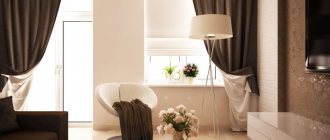
The choice of priority color plays an important role. In the future, this will influence the overall atmosphere in the living room. The predominant dark brown tones in the interior design fill with calmness and tranquility; a person in such a living room feels comfortable and under reliable protection. In this case, a living room in brown tones with a fireplace and bookcases looks ideal. Surely, you wouldn’t trade the time you can spend in such solitude with your favorite books for anything.
If you want your reception room to look cheerful and match the festive mood, then add active ones to neutral brown tones: orange, light green, yellow. In such a living room interior in brown tones with bright accents there should be a clear balance with the main color.
Light brown upholstered furniture invites you to sit on it and chat with a friend in a confidential atmosphere. The combination of light shades and coffee shades looks most comfortable for the human eye. This combination can transform a dimly lit room into a cozy space.
If you do not plan to choose brown as the leading color when decorating the room, then use it to the maximum when selecting decorative elements:
- decorate the wall above the chest of drawers with a large mirror decorated with a carved wooden frame with three-dimensional elements;
- in front of the fireplace portal, a tiger or bear skin looks good, as well as an imitation carpet with a color pattern of some animal;
- fill the mantelpiece with a collection of figurines carved from dark wood;
- large floor ceramic vases decorated with glaze and ornaments can be an excellent decoration;
- natural materials are an excellent source for a creative approach to decorating a room: ikebana, panels in brown tones and other various options.
Natural brown tones help to create memorable and impressive interiors with their noble beauty. On the Internet you can see many photos where these tones look completely different: they amaze with the luxurious look of furniture made of valuable wood, surprise with the size of modular sofas upholstered in genuine leather, and attract with the warmth and comfort of the walls of a log house.
Important note: in interiors with a predominance of dark brown tones, it is not recommended to install a system of suspended ceilings with a glossy finish. Dark objects will be reflected in the glossy mirror, their number will increase - and the living room will look heavy. The same applies to mirrored ceilings. It is preferable to choose a matte option.
You should not install stained glass windows in the living room, which reduce illumination. And when choosing plastic windows, it is better to choose brown film for the frames; It’s good when windows and doors are made in the same format.
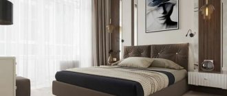
For red-brown and taupe, the combination with white is great. The ideal combination is a crystal white tone and a pinkish-brown tint. This combination is often used when decorating a bedroom or recreation area. This option is also acceptable for the living room, for example, if it is upholstery of a sofa or curtain fabrics.
The most competent approach to design is the choice of brown flooring. By the way, different types of wood combine very well in mosaic parquet. If the walls are decorated in beige, cream, peach or apricot tones, then the colors of other items can be repeated in the parquet mosaic. I want to create something outstanding in my apartment - imagine what a mirrored floor, velvet upholstered furniture and satin golden curtains will look like.
A harmonious interior decoration in brown tones will be fresh flowers in pots of any size and composition with an aquarium.
Classic design can be imagined as beige, cream, peach or white wall coverings, parquet floors made of natural wood or high-quality imitation, a set of upholstered furniture in one tone or in several, but without bright contrasts. Upholstery can be from:
- tapestry;
- jacquard;
- velor;
- chenille and other types.
The brown palette has a very large selection of shades, so you can create original combinations for a modern design. Against a darker wall background, a soft sofa in cream or light beige leather will look better.
Brown kitchen
To ensure that life does not give the slightest hint of urban infrastructure even during a meal, it is enough to create a brown kitchen interior using furniture. Is the latter expensive? If it is made of natural wood, then the answer is yes.
However, modern furniture can resemble wood, even if:
- Plastic;
- Chipboard (chipboard).
The secret is that the products are laminated with a special layer that imitates different species - walnut, oak, chestnut, cherry, etc. Only interior doors and windows can be left wooden. But even they can consist of plastic with lamination.
The kitchen should be light, so the themed room welcomes only one dark plane - the floors. Moreover, to finish the lower plane it is better to use affordable and wear-resistant laminate or linoleum. The remaining planes (ceiling and walls) remain light - beige.
Bright accents inside the kitchen are also welcome. They are created using a wall apron, curtains, tablecloths, lamps and various open utensils.
Nuances of lighting in a brown living room
Creating a beautiful and stylish interior is not easy, because you want it not to look gloomy and boring. It is important to do a good job of organizing proper lighting. Shades of the dark part of the brown spectrum require the installation of a large number of lamps, so one of the main requirements when decorating a living room in coffee tones is an abundance of sunlight or a multi-level lighting system.
The brown range belongs to the warm part of the spectrum, so when choosing lighting fixtures it is better to choose several lamps with a warm yellow or reddish tint. When decorating modern living rooms in loft, hi-tech or minimalist styles, retro lamps that resemble an Edison light bulb are popular today. They look stylish and original.
Arguments for and against a brown living room
Choosing this topic will have a lot of positive aspects:
- The presence of a variety of colors allows you to experiment with many styles when decorating;
- Brown living rooms in combination with natural wood furniture look not only elegant, but also noble and presentable;
- There is only a beneficial effect on the body without an ounce of aggression and oppressive notes;
- Practical and not easily soiled - less effort will be required for cleaning and cleaning;
- It will go well with many shades and colors (there will be no special problems with combination).
As for the negative aspects, an overabundance of dark colors in a small living room can cause the effect of gloom and limited space.
Brown in the kitchen and dining room
In the kitchen, brown is also very appropriate. It not only gives the room an elegant solidity, but also improves appetite, allowing you to get maximum pleasure from your meal.
In addition, kitchen furniture in rich brown shades is quite practical, since the slightest dirt will not immediately be visible on it. A dark brown palette (chocolate, wenge, coffee) is an excellent solution for spacious rooms. Such shades can make the interior luxurious and truly elegant.
For a small kitchen that needs visual expansion, it is worth using lighter shades. The optimal choice would be: beige-brown, caramel, nut and almond colors.
Adviсe
Some useful points that will help you choose the best combination of colors in the living room interior:
- Don't be afraid to use bright colors. Let's say you have furnished your living room in a classic design, using brown, noble beige and a little green. And everything is beautiful and dignified, but something is missing, there is a feeling of a slightly boring space. So spice up this color selection by adding unexpected pops of orange or pink. Turquoise, warm yellow and other bright contrasting shades may be suitable. Decorative pillows, wall panels, sofa upholstery and other decorative items can be made in this accent color. And you will see how the walls and furniture in the living room will sparkle, the interior will become warmer and more interesting.
- Deep blue color goes well with berry tones. Why not try decorating the walls and furniture of the living room in a blue and burgundy version with an accent, for example, in a dark green version. Only the colors should be muted, warm, natural shades, and not neon or acidic. A living room in a similar design takes on a luxurious look: the color of the walls, the upholstery of the sofa, the shade of the curtains - everything will look harmonious. At the same time, such a selection will delight with its thoughtfulness and decorativeness.
- If the living room has a strict black and white design, then you can decorate its walls with bright colors of red or yellow, or add a little green. You will see how much the interior will change after this; the living room will immediately take on a lively, warm look.
- It is better to choose warm and soft colors for wall decoration, curtain colors and sofa upholstery rather than cold ones. A living room decorated in warm colors always looks more cozy and comfortable. Beige and orange are always visually more comfortable than lilac or cool blue.
- You can try this rather bold option: paint the entire living room in light mint-sand shades. And as a contrasting tone, add dark beige, turquoise or add bright green. Such a living room will be a real source of pride for the owners and an ideal place for relaxation and meeting with friends.
- Don’t use too many details in a contrasting color - one large or two or three small ones will be enough to highlight the main decoration of the room. For example, in a grayish-beige living room, one bright red large sofa or several small pillows and a painting on the wall in a contrasting color will look great.
- The more natural the basic colors of the floor and walls, the more daring experiments with contrasting shades of curtains and sofa you can afford.
Whatever color combination you choose, do not forget to adhere to the rule of proportionality between contrasting and primary colors - and, without a doubt, even your own living room design will look great.
https://youtube.com/watch?v=_MezU8D04Uc
https://youtube.com/watch?v=3ZmwjO9eO_Y