Updated: November 3, 2022
Interior design is about achieving harmony through color, furnishings, and their arrangement. Interior design has two incredibly important principles that define the finished project.
- Small kitchen: expanding the space
- Room for a princess: design secrets
Symphony of taste: which interior style to choose?
Before you start designing an interior design, you first need to decide on the style that you will give the main role in the musical of your home. Interior style is a matter of taste, so choose it based on personal preferences and the type of your house or apartment.
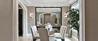
Classic style in the interior
What do we imagine by the concept of “classic”? A certain tradition and, above all, a calm atmosphere that inspires confidence. Absolutely all interior elements should confidently indicate that they were chosen not only with taste, but also with soul.
Classics are the best way to emphasize the respectability and success of the home’s owners. When choosing a classic style, remember that its principles should be adhered to in absolutely all rooms.
| General characteristics of the classical style | |
| Furniture | Traditional furniture made from natural materials is used (preferably wood). |
| Details | Carving and mosaic in its various manifestations. As well as columns, bas-reliefs, stucco with gilding. |
| Colors | Light shades look most harmonious in this style. Gilding is extremely popular. |
Japanese style in design
This style has “three pillars” on which it rests:
- conciseness;
- simplicity;
- asceticism.
In order to characterize its specificity as accurately as possible, you just need to imagine a combination of noble materials and the simplest possible forms. Also, Japanese style is devoted to tradition. The tone of the interior is definitely set by light shades, low furniture and, perhaps, smooth surfaces.
The most commonly used materials are:
- silk;
- cotton;
- linen;
- wood.
The central place in such an interior should be given to energy sources, such as small fountains, which are decorated with natural stone.
Minimalism in the interior
The presented style is characterized by simplicity and maximum restraint. Despite the minimal content of things in the room, the desire for coziness and comfort in this style is the main feature.
When creating minimalism in houses and apartments, designers use a light color scheme, giving preference to natural colors, such as:
- peach;
- creamy white;
- pink;
- lactic;
- lilac.
The lightest shades are usually used in decorating a kitchen or bathroom , while richer colors will be acceptable in living rooms.
Interior design in high-tech style
The basic principles of the interior can be considered:
- glass;
- laconic lines;
- active and very rich shades;
- plastic;
- clear forms.
The real decoration of an interior made in high-tech style can be considered a variety of details, which can be considered borrowed from the world of industry. These can be bolts, valves and chrome pipes.
The color scheme is as laconic as possible, because minimalism does not recognize any ornament or pattern, the main thing is space, light and cleanliness. The most commonly used colors are gray, black and white in the interior. You can dilute the interior with a small amount of green, yellow and red colors.
English restraint
Strictness and stiffness are the fundamental principles of the English style in the interior. But these principles do not at all interfere with bringing the coziness that every home needs into the interior. This style compares favorably with others due to the high quality of the materials used.
Loyalty to foundations and traditions runs like a red thread here. Perhaps, representativeness and some kind of calm luxury are exactly the words that come to mind when you look at such an interior.
This style gives preference to a variety of wood species, preferably walnut or oak. You can drape furniture with woolen fabrics, but it is important that they are of high quality.
Mediterranean style
The key and most important concept in this style is the sea, which always brings us incredibly pleasant emotions and the most memorable moments in life. The colors used in the interior are stolen from nature, so take a look around (especially if you are somewhere on the coast of Greece) and bring your ideas to life with nature's adjustments.
Marble or ceramic tiles are often used for the floor, but it is advisable to make the walls with a certain unevenness, which will seem to hint at man-made origin.
Modern style in design
Absolutely all accessories that are lovingly added to this style should be as calm in structure and simple in form as possible. Don’t ring the bell if the shelves in the house are half empty; the purity of style welcomes such decisions.
Colored glass, which does not have any relief deviations, and snow-white porcelain will ideally fit into a modern interior. It would be a good idea to replace bouquets of fresh flowers with twigs and brushwood.
Provence
Provence style in the interior is definitely comfort and simplicity. Such interiors are decorated in the best traditions of the French province.
Characteristic features of this style:
- light curtains (ideal if you achieve a weightless effect);
- white furniture;
- pastel shades;
- light colored floors;
- Natural flowers;
- many accessories made of fabric, porcelain and ceramics.
Country
The basic principles for creating such an interior are:
- functionality;
- simplicity;
- no pretentiousness.
The coloring of such interiors is as close to nature as possible. The use of green, blue, and terracotta colors is encouraged. This style, in fact, is characterized by multicolor, so do not give up rich colors in the interior.
What can you hang on the wall in your room directly on the wallpaper?
Select wall decor in accordance with the interior design, size and purpose of the room. Add a decorative panel made from photographs, images or natural materials to the background. But keep in mind that a Christmas tree and stones are not suitable in a nursery, just as in the living room you can’t really see compositions of children’s pictures and pillows.
Artificial animal heads
Today, of course, it is not real animal heads that are in fashion. They can be made of plaster, wood or even papier-mâché. The main thing is not to exaggerate their number, so as not to feel like you are in a zoological museum.
Watch collection
As you know, happy hours are not observed, but they serve as decoration. Hang a collection of cuckoo clocks or large dials on the wall. With such decoration, lag is definitely not a problem for you!
Stick to one style - vintage items will look out of place next to the work of modern designers.
Outline maps
Avid travelers are advised to decorate the wall with maps and pages of atlases; they will bring the spirit of adventure and romance inside. Hang up a physical map of the world, just a specific country, or just a city map. Postcards can be artificially aged and placed in an elegant baguette.
Using Cymbals
Wall plates have a special charm and sophistication to decorate your interior walls. Painted collectibles are quite expensive. However, you can make your kitchen look fancy and elegant by gluing fragments of ornaments onto ordinary porcelain or plastic plates.
This could be the splendor of exquisite Gzhel or the majestic Zhostovo painting. You can decorate your kitchen with bright motifs from Gorodets.
DIY decoupage dishes
The wall is decorated with beautiful plates of different shapes
A little imagination and your wall will sparkle with new colors
Cozy interior in light colors
Plaques on the wall with images of photographs
Wicker baskets
The wicker picnic baskets, fruit platters and beach bags we typically carry in the summer can be creative year-round decorations. They will look especially impressive against the background of white painted walls.
In the bedroom you can store laundry in wicker baskets. In the hallway, these summer accessories (of course, if you have a large dressing room) will create a festive atmosphere and remind you that summer is just around the corner.
Pictures, photo frames, wall shelves
Paintings are the perfect way to decorate the walls above the sofa in your living room. The canvases attract the attention of those entering the room, but do not distract while relaxing. The number of parts and location depend on the size.
A large or more compact canvas fits above the backrest. Images fill 2/3 of the space, they should not extend beyond the internal object.
For a better view, you need to place the canvas at eye level. The central point of the picture is at a height of 1.5 m from the floor. A decorated room will make guests feel uncomfortable. A space overloaded with canvases looks awkward and cluttered.
Decorating walls with your own hands is a very pleasant and interesting activity.
A brick wall will serve as an excellent backdrop for placing your favorite paintings on it.
The triptychs arranged in a row look harmonious. A rhythmic composition of several levels, with three paintings in each. Too much symmetry breeds boredom. To break up the monotony, you need to move the boundaries. Leave space between the canvases for:
- vases;
- flower;
- floor lamp.
Triptych of paintings in Japanese motif
Colorful interior in pop art style
Gallery placement for wall decoration is suitable for a large collection. Paintings are hung in a well-lit place or in high-quality lighting. The canvases look original in a long corridor. In the corner of the living room, using canvases, the functional parts are combined.
To complete the composition you will need a core. The key component differs from the general group in style, size or shade. All other elements are built around it, completing the central image. You don't have to use the same frames, just a few overlapping pieces between the artwork of your choice.
Wall-mounted family photo album
Shelves are a beautiful piece of furniture that will add coziness to any space. The sofa in the living room is placed inside a mobile model. Horizontal surfaces are filled with books, small trinkets or paintings. To keep the room from looking cluttered, don’t go overboard with the details.
Monochrome light walls of minimalism look dull. Separate shelf modules will help create accents in a laconic interior. Small models with a simple design are made in contrasting colors. A single decor is placed on the furniture.
Bookshelves in the nursery with a beautiful design
Refined and sophisticated interior in Scandinavian style
Shelves are added to an empty wall next to a chair. An unusual structure in the form of tree branches can be used as a keeper of books and magazines. A frame with thick circles will serve as a holder for small key rings. The solution fits harmoniously with any style, combined with a small art gallery.
Glass shelves are suitable for compact spaces. Transparent interior items do not visually hide the usable area, remaining a functional decoration.
Advice! In order not to lose the feeling of airiness, it is not necessary to force objects. In modern styles, models are combined with chrome surfaces.
This shelf will be convenient for storing books and small items.
Wooden floor shelf
Collages are often used to decorate walls. Huge black and white photographs are arranged in random order. The framed pictures are impressive. A dark and small room visually becomes larger.
Placing a clock in the center of the photo will create an interesting composition for an empty wall.
The forgotten grid became the center of attention
A thematic gallery can be dedicated to an event. In the bedroom, images of a wedding are relevant, in the nursery - periods of child growth. A festive selection for the anniversary will be a good piece of space decor. Bright pieces of paper of different sizes are nailed to the wall in the shape of a heart.
In a classic interior, photographs in rectangular frames that are arranged symmetrically are appropriate. The composition is united by a range of colors and patterns of the baguette. A family tree or a clock with portraits on the branches (instead of a dial) is beautiful. Cards can be hung on a wreath and complemented with meaningful quotes and sayings.
A garland of photographs above the head of the bed is a beautiful and romantic decoration for the walls in the bedroom
Decorating walls with patterns is a popular decor that helps diversify the interior. Triptychs, modular images consist of several elements. It is better to “scatter” parts of a large image over the entire surface. The window effect visually increases the space.
Abstract patterns are relevant in modern styles. To prevent the room from turning into a series of messes, a balanced use of furniture is necessary. In the bedroom design, the decoration is placed above the head of the bed. For an accent wall in the living room or dining room, a collage of several works is suitable.
Frames without pictures look original. Wall decoration depends on the style of the room and the preferences of the owner. Baguettes with colored paper are a bright element of the interior. If a blank frame is used, choose a color scheme that contrasts with the surfaces.
Luxurious frames for a brick wall - elegant and expensive
A dark interior will not look gloomy if it is diluted with bright and cheerful accents
Garlands and lanterns
Electric garlands are a classic New Year's outfit. But no one forbids leaving it on the wall for a whole year. The warm light emanating from the bonfires will be celebrated 365 days a year. If you add decorative food to the photo wreath, you will get a full-fledged photo installation.
Hats
Do you want to decorate your walls with original decor?
Hats are an unusual and original aspect of the quality of natural decor. If you don't mind the walls, take a small stationery head and put on different hats in different colors - different colors, styles, sizes. This decoration solves two problems at once: decorative and practical. You no longer need to think about where to store your hats. Use this pendant in your hallway.
A showcase of hats is a bright accent and a convenient storage system right on the wall
Carpet
Carpets have long been considered the best interior decoration. We remember the fantasy paintings hanging on the wall from Soviet times.
Today, this trend continues: in many European and American homes, carpets and tapestries are used as decorations, rather than paintings.
Whether you want to add a touch of oriental flair to a modern setting or decorate your interior in an ethnic style, handmade rugs with intricate patterns will come in handy.
Flowerpots
“Green” walls are a current trend in furniture. There are many options: a herbarium on the wall (open or under glass), all kinds of hanging tubs, flowerpots and flowerpots on special stands, as well as complex engineering structures with a built-in irrigation system.
Kitchen design: from baseboard to spoon
Details are important in the interior of any kitchen, so pay special attention to them depending on the style you choose. For example, high-tech accepts the use of metal surfaces and glass everywhere, so when choosing accessories there is no need to drag in spotted towels from the country style. In each of these styles, blinds will be an excellent design element.
Small kitchen: expanding the space
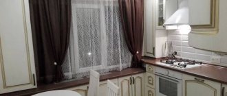
Surely, it’s no secret to you that it is thanks to design that you can amazingly expand the space of any room, including the kitchen. A small kitchen is, of course, a challenge, because there is so much to fit into it.
First of all, use glossy or reflective surfaces to expand the space. The best style choice in this case would be modern or modern style. The minimum number of accessories provided by such styles will in no case clutter the space.
More photos of small kitchens.
Kitchen design 12 sq m
This footage is most often typical for new buildings and it really is practically a gift from heaven. Moreover, apartment owners can hardly count on good-sized kitchens in a private house.
However, even with such footage, you need to be able to organize everything so that the space is as balanced as possible. You should start by choosing the style and the kitchen wall, which is the main piece of furniture. It is better to give preference to furniture with hidden sliding shelves that will hide all unnecessary kitchen accessories.
More photos of kitchen design 10 sq. m.
Large amount of bed linen
Many housewives have a whole closet dedicated to bed linen. This is also no longer relevant. It’s better to buy 2 instead of 5-6 sets, but the highest quality and most expensive ones. After a few months, repeat and please yourself with a new thing.
There will be no extra bed linen - there will be no need for bulky furniture
See alsoWhite plinth in the interior: photos, tips
Ceiling design
At first glance, it may seem that the ceilings require a very simple finish that does not require special knowledge. However, it is not. Professionals confidently say that ceilings are one of the most difficult elements in terms of cladding. This can largely be explained by the fact that you need to properly prepare the surface before doing the final work.
Ceiling decoration can be made of various materials. In modern renovations, plasterboard is most often used or a “suspended ceiling” structure is installed.
Order conditions
The owner allocated small funds for the implementation of this modest housing project. Based on them, experts were able to bring their great ideas to life.
Hallway interior design
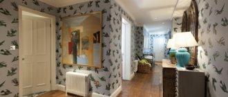
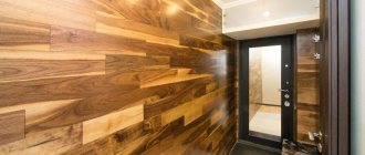
The hallway is a kind of “calling card” of your entire home, which in turn should welcome the guests you invite. And therefore, the importance of the interior of this part of the living space doubles. As they say: “You meet a man by his clothes,” the same proverb, in principle, applied to your home. After all, the hallway, or rather its design, is the “clothing” by which guests can judge your entire home.
But, nevertheless, we should not forget that the hallway should be not only beautiful, but also functional. After all, this part of the house or apartment was initially designed to be useful to you: to store your outerwear, umbrellas, bags and other equally important things. Therefore, your main task is to organize this space in such a way as to subsequently receive not only aesthetic pleasure, but also to rejoice in the fact how spacious your hallway is for other important things.
So, as for the color scheme, here, as they say: “there are no comrades according to taste and color,” so what color to paint the walls or glue the wallpaper is only your choice. Show your design imagination and don’t be afraid to experiment by combining colors that seem at first glance to be incompatible. But don’t forget about the little tricks that professionals use in their work. So, if you need to visually expand the space of the room a little, then it is better to give preference to light shades in the decor and horizontal patterns. Fans of dark shades in design should carefully consider the lighting of the room, on which the correct visual perception of space also depends.
However, you should pay more attention to the floor covering in the hallway. The strength of the material and its moisture resistance are important here, since it is this part of the apartment that is most susceptible to the negative influence of dust and dirt that we and our guests bring from the street.
The ideal solution would be to cover the hallway floor with ceramic tiles. The choice of color and shape of such a covering is also huge, but in this case you will need to take care of additional insulation of the floor, thinking ahead about cold winter evenings, when when you come home you don’t want to put your feet on the cold tiles. A good option is also to cover the floor with parquet boards. Moreover, parquet gives the room some additional home comfort, but it is more finicky to use and care for. It all depends on your capabilities and desires.
A fundamental part of the overall design of the hallway is the furniture you select. The focus when selecting furniture should still be on FUNCTIONALITY. Decide initially how many things your living room will need to store, and only then will you understand whether you should buy a massive wardrobe or whether you will limit yourself to laconic shelves in the Art Nouveau style. In any case, you should also focus on your inner sense of style and taste. Whichever option you choose, check out the possibilities of using corner wardrobes in the interior. You should also take care of the organic combination and transition of the hallway design and living room design, so that neither you nor your guests feel as if these two rooms just happened to be in the same apartment and nothing else unites them.
In general, create, but be intelligible and do not lose your sense of proportion, and then you, as a young amateur designer, will certainly have admirers.
Are form and function balanced?
A design may look cool, but poorly perform its purpose: namely, to act as a communication tool. This is one of the most difficult tasks in web design - balancing form and function. Your design should be beautiful while still communicating your message effectively.
When a designer forgets about the message and concentrates only on the appearance of the design, the project turns out to be overcrowded: an overly detailed graphic design is distracting and draws attention to itself. But design is only one component of the product, which is responsible for sales, promotion and attracting subscribers.
This illustration for Doritos corn chips effectively bridges form and function. The illustration and colors were chosen for a reason: they deepen the design and support the brand image. The mountains (and birds and sun) resemble real Doritos chips, and their colors correspond to different flavors.
DKNG/Dribbble
Bathroom interior design
The bathroom is the most intimate place in the whole house, but over time it can transform beyond recognition, combining a variety of unnecessary boxes and jars. To prevent this from happening to your bathroom, you must initially take a responsible approach to the interior design issue, which would eradicate this problem in particular.
Of course, a large part of your bathroom design depends on the fixtures you purchase for it. It is important to note that saving in this matter will not be the right decision. Having cheapened a quality product once, you will most likely doom yourself to constant repairs, because changing plumbing fixtures without causing harm to the room itself is not an easy task even for experienced professionals. So, the main rule is to buy high-quality plumbing fixtures to avoid additional stress for you and your wallet.
Another, no less important part of the interior is the choice of ceramic tiles that will decorate the walls and floor of the room. Now many stores offer ready-made options for colors and combinations of ceramics , but you shouldn’t get hung up on them. In principle, anyone with a sense of style can independently choose a color combination for their own bathroom, and therefore, if you want to be original, then this is your option.
The style of the bathroom should be unobtrusive, and most importantly, one that would appeal directly to you as the owner or hostess of the home. Nowadays the most popular styles are “modern” and “country”. Thus, “modern” provides a minimum amount of equipment and additional items, positioning the value of space as such. The color combinations are the simplest and most laconic; add to this the smooth lines in the texture and an abundance of glass and mirror objects. The country style is mostly preferred by girls, because it involves a variety of color combinations, bright elements in decor and prints.
Between all this, it is important not to forget about the functionality of the bathroom. If your home is not famous for its enormous size, then the bathroom should be designed so that it is convenient to use for its intended purpose.
To save space, you can install a shower stall instead of a full bath, so you will have more space for a washing machine and a laundry box.
Well, if you are luckier and your bathroom can be comparable in size to the size of the living room of a standard one-room apartment, then tips on saving space will not be useful to you. In any case, the bathroom should not only be comfortable, but also beautiful. This principle should be followed when thinking about the interior for your bathroom.
Related article: Bathroom furniture
See more photos of bathrooms.
Fashion trends for the kitchen
In 2022, the fashionable kitchen is open, with a transition to the living room and dining room. The designers propose to create a large open space in which the dining room will be located on the border of the kitchen and living room, creating a smooth transition from the work area - kitchen to the relaxation area.
Main kitchen trends:
- cabinets without handles with automatic lock,
- mono color without other accents,
- tall cabinets to the ceiling,
- natural details.
Children's room design
It just so happens that the children's room is considered the most comfortable place in the whole house, because, as they say, “childhood is kept” and the most important part of any family - children - gathers there, therefore the design of this room is always filled with great love and care.
Basically, parents are involved in decorating a nursery even before their child arrives, thinking through color combinations and trying to predict the character of the future baby. This activity can be both great fun and stressful for expectant parents. In order to avoid such stress, you need to focus your attention on some important issues.
Room for a princess: design secrets
So, first of all, it is worth noting that a boy’s nursery and a girl’s nursery are two completely different rooms, and therefore the secrets for decorating such rooms are also excellent.
If you are lucky enough to be the parents of a wonderful little princess, then the first thing you should pay attention to is the color of the room. You shouldn’t think primitively and paint everything around you pink, because the world is full of other equally beautiful colors. But do not forget that the decoration should not be too bright so as not to irritate your princess’s eyes. The ideal solution is a combination of pastel shades, which not only will not harm, but will also contribute to the development of the child’s imagination, allowing him to grow up in a comfortable atmosphere. But the furniture in the room and toys can be purchased in bright colors. In addition, an important point is the practicality and strength of the structures that will be used in the interior, because the health of your baby depends on it.
To decorate a girl’s room, it is better to choose soft, beautiful and comfortable furniture, especially for a child’s sleeping place.
A real man's room: how to decorate it correctly
As for the boy’s children’s room, here, too, everything is far from being as simple as it seems. In color format, the tips are the same as for decorating a girl’s room: the main rule is to do no harm, so don’t overdo it. The most important point in decorating a boy's room is to allocate space for active play . If space allows, you can make a small sports corner in which your future man would practice his athletic abilities.
In any case, the design of the nursery should also take into account the interests of your baby, because, in principle, all efforts are for him. And most importantly, do not be afraid that the interior of this room will stand out from the overall design of the apartment, because this is normal. Moreover, your child will definitely want to be individual, and not like everyone else.
The main rule that you should arm yourself with when thinking about the interior of a nursery is to create a “dream” room, and with this goal you will certainly succeed.
Is the design in the right mood?
Colors, font styles, and other elements give a design a certain mood—perhaps playful, serious, or subtly elegant? Make sure the mood of the design matches its purpose to avoid misleading users.
This banner, for example, is dedicated to a children's coloring competition that was held as part of Oktoberfest. That's why the colors are very autumnal, as well as the fonts that are fun and whimsical. With serious fonts and gray colors, the design would be completely different, and (most importantly!) it would not suit the mood of the event itself.
Emrich Office/Dribbble
Balcony interior design
Often apartment owners forget that the balcony is the same part of the apartment as the other rooms, and therefore turn it into some kind of hiding place of unnecessary things. But meanwhile, the correct design of these square meters can transform your apartment as a whole, creating another wonderful corner for relaxation.
There are many options for how to decorate the interior of a balcony, but they all come from the functional features that you want it to fulfill.
If your house is full of flowers, then the most beneficial solution for you would be to decorate your balcony in the form of a small botanical garden. Such options are actually quite popular today, because they are not only functional, but also very beautiful. True, this solution is more suitable for amateur gardeners or for those who know how to care for such living beauty. If you do not feel the strength to maintain such a small botanical garden, then it is better for you to focus your attention on some other solution, because after a month of such beauty you will have to take out the dried flowerpots from the balcony and again think about how to revive the interior of your balcony
Another functional option is to design a space on the balcony as an additional workspace. Here you can place a desk and a cabinet for storing books and documents.
Read about how to choose a desk for a schoolchild!
This design is more suitable for people who spend a lot of time at the computer. As for color, in this case it is better not to overdo it and choose light pastel colors, combining them with equally discreet furniture.
But the most popular solution is to design the balcony as a separate place for drinking tea and comfortable reading books. In this case, it is better to choose soft and comfortable furniture in pastel shades, perhaps with some bright accents. The main thing is not to overload the space with furniture, because minimalism is now in fashion.
In any case, the design of the balcony should not differ radically from the interior of the entire apartment in order to maintain the most holistic image, which, first of all, you yourself would like.
Is the text readable?
If the texts in your design are unreadable, the whole purpose of the design is lost, right? You don't want people to squint for a long time trying to find a phone number or address? These parameters can affect the readability of the text:
- Size. Sometimes font appears much larger on screen than on printed media. Make sure the font will be readable in the way your design will be used. For example, large font is absolutely useless on a business card, but on a poster or billboard it will work perfectly. If possible, print out a proof of your work on a printer or do an online test of your design to make sure the texts read well.
The fonts on this business card are easy to read thanks to the use of lowercase letters and the contrast between dark and light colors.
The Prince Ink Co./Dribbble
- Color and contrast. If the background and font colors are in disharmony (such as neon green text on a red background is the most striking example) or, on the contrary, are too similar to each other, the text becomes difficult to read. The same thing happens if the colors are not contrasting enough.
- Style. Some fonts are easier to read than others. Simple, clear typefaces (no bells and whistles) are ideal for text. “Display fonts”—that is, unusual fonts with a strong character—are more suitable for large-scale designs. Save them for times when you need to highlight one word or phrase. If you write an entire paragraph in this font, the readability of the text will suffer greatly.
In this icon we see an effective combination of a bright, ostentatious font with a pair of simple sans-serif fonts. The typography style (which perfectly complements the retro feel of the overall design) conveys a mood while remaining legible.
Steve Wolf/Dribbble
Design of a small apartment: saving space
Small-sized apartments require more attention than an ordinary apartment, because the owners want to realize all their desires in their design. And, besides, it is important not to overdo it in your efforts and not to turn the apartment into some kind of showroom for some kind of reality show.
First of all, you should decide on the style of your apartment, and only after that purchase the necessary furniture. The best looking options are those that do not involve a clutter of furniture, but rather value the space as a whole.
As for the color scheme, the choice is yours. But it’s still better to moderate your ardor a little and use bright accents moderately and tactfully.
Often in the design of small-sized apartments they try to delimit several zones at once: for work, for sleeping and for relaxation. In this case, plasterboard structures will come in handy, allowing you to turn one square room into a real functional labyrinth, ideal for living.
Those who are not a particular admirer of plasterboard structures should think about another option, when the room is only visually redrawn into two separate areas for relaxation and work using furniture. In this case, you should use more FUNCTIONAL FURNITURE, such as soft sofas or corners. Another functional piece of furniture can be a wardrobe.
But, the main advice is to follow your desires and you will succeed.
Is the color scheme harmonious?
Color has a deep subconscious influence on us - emotional, psychological, cultural - and plays a huge role in our perception of a particular design. Of course, it's important to consider what mood each color brings to the design: yellow, aqua and coral bring the energy of summer, while black and gold add sophistication to the design. However, in addition to the mood of each individual color, it is also necessary to think about the color scheme as a whole.
Szende Brassai, Adline/Dribbble Steve Wolf/Dribbble
Earlier we talked about combining different fonts, now let's talk about colors. The colors in the design should also be harmonious. Avoid colors that are too loud or too contrasting, and don’t use too many colors at once. When in doubt, use a color palette tool or study the general principles of color theory (complementary colors, split complementary colors, analogous colors, triads).
There are many colors used in this logo design, but the ones that stand out the most are the shades of orange at the top, the blue banner in the middle, and the shades of purple at the bottom. This is a scheme of split complementary colors: choose a base color, and then two more that are on either side of its complementary color. In this case it is yellow-orange, blue and purple. This color scheme has quite a strong visual contrast, but the color combinations are less dramatic than complementary ones (think: red and green, purple and yellow).
Justin Mezzell/Dribbble
Studio apartment design
Today, studio apartments are considered the most popular housing, since their cost is not such an unaffordable luxury, and meanwhile, they give us the opportunity to have our own, albeit small, home. This option is an ideal solution for young and energetic people who value their space and want to live independently.
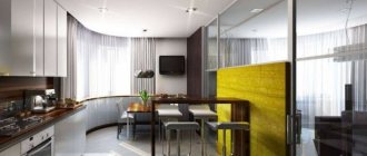
The first and main tip that you should consider when designing your “studio” is the harmonious relationship between part of the kitchen and part of the living room.
Nowadays, the option of delineating space using a bar counter, which can also serve as a dining table, is becoming popular.
Furniture when decorating should also be selected based on the general concept of your interior, but the most advantageous option is the use of practical and laconic furniture, without excessive pretentiousness.
If you want to add color, pay attention to small decorative elements: pillows, flowerpots, photo frames and other little things that would please your eye.
Personal space for work and relaxation
Is it possible today to write material on a current topic and not once mention Covid, quarantine, and that’s all? I think it's unlikely. The impact of the pandemic on our everyday life is simply difficult to overestimate.
The spread of coronavirus infection has forced many of us to reconsider the need to go to work every day. We didn’t work less, but we needed to set up our own workplace at home, either on the balcony or in the hallway.
Workplace at home in a minimalist style Workplace within a limited space Home office for remote work Workspace on the balcony
Curtains in the interior
Curtains are an important part of the interior, which simply cannot be treated carelessly, as this can ruin the appearance of your entire apartment. After all, they are the ones who bring the necessary coziness and comfort to our home.
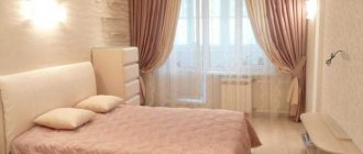
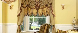
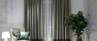
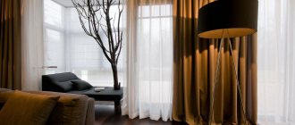
Now many people prefer to use massive curtains in brighter colors along with light tulle in pastel shades. This way you can enliven the space of your room without resorting to more drastic decisions in the form of changing the wallpaper or changing the painting of the walls.
Often, to create a lighter image, windows are decorated only with flimsy curtains. If you like this style, you will also have to take care of additional darkening of the windows using blinds to prolong your morning sleep.
It is also important when selecting curtains to understand what material they are made of, because this is directly related to their lifespan. Most often, to make curtains, manufacturers use linen, cotton or silk fabrics, which are also combined with synthetics. In addition, in the manufacture of such a product, velvet, wool, rep, and imported organza are used. Now the choice for the buyer is huge: so your eyes are offered fabrics with different textures, such as:
- shiny;
- matte;
- smooth;
- textured;
- with additional application;
- with an image.
However, decorating windows with curtains and curtains also depends on the overall interior of the room, which should be harmoniously combined with them, because curtains are their addition, and not a separate part of the interior.
Changes in plan
First of all, the internal partitions and mezzanines were removed. Old wooden floors and joists were ripped out. The ceiling height is now 290 cm. The plaster from the walls has been removed down to the brick. The new layout made it possible to economically and rationally use every section of the available space.
Design approach: simplicity, and that’s it
The choice of simplicity in residential interior design is also due to the lack of square meters and a modest budget. Owners are tempted to renovate apartments themselves. The result is not always as ideal as it seems at first. Professional designers advise adhering to a few simple but effective rules. Or use the services of a professional.
The main recommendation is that a small space should be decorated only in a light color palette. You can focus on one wall, highlighted with a contrasting darker color. The room acquires the desired depth. A way to visually expand a room is to have a single, identical floor in all zones. Any material can be used: parquet, laminate, carpet. This brings all zones closer together.
Designers also do not recommend decorating floors. Or decorate a small rug or carpet. The ceiling will noticeably “grow” if it is painted one or two shades lighter than the walls. An additional advantage is the placement of spot lighting. When decorating a small apartment, it is better to avoid furniture that is too large. Stylish, medium-sized models that “enliven” the space are appropriate. The main idea is that in houses and apartments everything should be in moderation. Photos of the interior are presented below.
Rules for creating a design (simple and tasteful)
The design of an apartment or private house can be made simple and tasteful in a short time, following a few rules:
- Richness of light shades in the palette;
- Correct placement of light;
- Refusal of unnecessary attributes of interior design;
- Lack of patterns, draperies, embroidery in the interior;
- Replace massive, heavy furniture with compact, simple and functional ones;
- Choose light and sheer curtains made of airy tulle instead of elegant curtains and drapes made of thick materials;
- Arrange furniture correctly to create an ergonomic space;
- Use only high quality materials. They don't have to be expensive;
- Try not to copy exactly what is shown in the picture in the magazine. You can use your imagination to bring your own mood and vision;
- Harmony and color harmony are in the details. Color imbalance disrupts the perception of the atmosphere and spoils the overall impression.
We can observe the following picture: beautiful is not always fabulously expensive and decorative. This is especially noticeable in the architecture of houses and apartments. The area may not be incredibly huge, the budget may be limited, but the design and idea can adequately cover these inconveniences. More and more people prefer apartments and houses decorated simply and tastefully. Simplicity and the absence of unnecessary, interfering parts and trinkets make it so popular.
Photo ideas for decorating different rooms
The best example is a visual one. Below are the interiors of apartments in a modern style, photographs of which we have selected especially for you. The kitchen, living room, bedroom and hallway are considered.
Living room
The design is wood, glass, metal. Transformable furniture does not clutter up the space. The restrained decor with a basic palette on the walls is complemented by bright details and multi-level lighting. The textiles are light and plain. Walls, floors and tables can be decorated with indoor flowers.
Studios
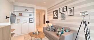
A characteristic feature of studios and one-room apartments in a modern style is their design in light colors and the division of space into separate zones. Separating functional areas with partitions optically lengthens the walls and raises the ceiling, while white or beige finishes fill the room with light.
Kitchen
One of the most functional rooms in any apartment or house is the kitchen. One way or another, it is in the kitchen that we spend a significant amount of time and are in the constant process of cooking and cleaning. Therefore, kitchen design must combine not only aesthetic appeal, but also absolute practicality.
Kitchen design, or, more correctly, in a professional sense, kitchen design is, first of all, calculated practicality, which is hidden directly behind the visible and familiar exterior.
Often, waning optimism when working on kitchen interior design is the result of old-fashioned cluster windows that don't let in enough sunlight.
Don't underestimate the available space in your kitchen if you have a window above the sink that can be used for a variety of purposes: decorating with plants, decorative items, or creating a shelf for cookbooks. And adding a garden to your new kitchen window can bring your kitchen to life like never before. You will be amazed at the amount of warm light entering your kitchen.
While large kitchens are easier to manage in terms of space, designing a small kitchen can be a challenge for many. The help of a kitchen designer, who will help increase space, accommodate large household appliances, dishes and other kitchen utensils, and also give the kitchen a unique and beautiful look, is needed nowhere more than in small kitchens.
Bedroom
A modern bedroom is a place of calm and comfort. Organic shapes, comfortable furniture and harmonious colors. Decorative furniture gives way to simple, functional bed designs and spacious wardrobes that create a spacious and relaxing atmosphere.
There is no place in the bedroom for decorations and glamor that disrupt the order. Cabinets should be large, but inconspicuous, as they are not the most important element of the interior. It goes without saying that the quality of sleep of all roommates depends on the bed, which should be comfortable, without decoration.
In modern bedrooms, every element should serve our comfort and maintain order in the room. Thanks to this, we have a feeling of harmony, nothing bothers us - we can sleep peacefully.
When designing a bedroom layout, a good place to start is by choosing a room. It is good to place it as far as possible from various sources of noise - including hallways, living room, kitchen and street.
Bathroom
As in other rooms, space should be kept to a minimum. If partitions are used, they should only be transparent. Primary colors are brown, gray, white, black and their shades. Save space with built-in and wall-mounted cabinets, shelves and vanities. Bright lighting. Liven up the interior with a shelf with a vase, an oddly shaped mirror, or pieces that contrast with the main color scheme.
Instagram @aleksandrasevastianova Instagram @varvara_design_dom
Children's room
It is important for a child to have his own space where he can relax, play and do homework at the same time. Decorating a children's room directly depends on the age of the child. Experts recommend using a bright palette as a basis. You can add a bright message on one wall if it is a room for very young children. Preschoolers and children of primary school age will be delighted with the fairy-tale character.
Older children can choose a plain surface, but with an accent color on one wall. It is best to choose floor coverings from light, natural materials that do not harm the child’s health. A bed, a small wardrobe and a desk are a necessary set of furniture for children. The room should be sufficiently lit, so the ceiling should be as bright as possible. The work place should be located near the window. Light, airy curtains and blinds allow natural light into the room.
Lighting trends in 2022
In 2022, space is created through lighting, which means that each zone must have its own light source. This approach to lighting allows you to functionally divide a large space into smaller zones and highlight functional areas in a small room.
This year's fashionable interior is well-lit. We continue to focus on clear glass lamps and regular ceiling chandeliers.
Neon signs, fashionable in the 1960s, are the new thing of the year. It is important to place LED lighting at several points in the room.
Selection of lighting
Lighting plays an important role in such interiors. Like everything else, it must serve its purpose. Often in small apartments you have to resort to zoning - placing lamps in those places where they are most important.
With decorative lamp
An excellent solution for freeing up additional space and creating comfortable lighting is the use of recessed lamps. LED lamps are especially popular - they are very compact and provide excellent light.
You can also use different types of light, such as fluorescent lamps. Colored lighting is also worth trying - with a good color scheme and similar tones and color schemes, it can create a romantic atmosphere in a room and make people feel relaxed.
