Pastels have been dominating the list of the hottest fashion and interior trends for several years now. We had a millennial era with a dominant shade of powdery pink, which was picked up by all the world's brands, releasing collections of clothes, accessories, furniture and jewelry in the most fashionable shade of ultra pink.
In 2022, a second pastel color appeared, i.e. frozen yellow is a shade of dull and slightly faded yellow that has been used by the most popular streetwear brands. The WGSN Institute, that is, experts who study the fashion, architecture and design markets, predict that in 2022 a discreet but expressive shade of green will prevail - the so-called neo-mint .
Mint shades
Mint color has a significant number of shades, but experts distinguish several basic tones:
- Menthol;
- Light turquoise;
- Pistachio;
- Sea wave tone.
It is believed that mint color is between warm and cold tones and depending on which they are combined with, the overall color palette depends.
Decorating Tips
Decorate a mint room with plenty of natural light, as this color takes on a rich and beautiful hue right in the sun. There is a risk of ending up in a “hospital room” with artificial lighting, especially when using cold halogen lamps.
Always pair mint with brass and copper accessories - lamps, kitchen appliances and more. Mint can also work well with chrome surfaces, but compared to chrome, gold materials and brass in particular, it adds warmth and brightness.
Mint is appropriate to use in a retro style interior. Mints were used frequently in the 1950s and 60s of the 20th century, and we can still see these famous kitchen appliances that survive to this day - refrigerators, food processors, stoves, as well as tiles and other mint items.
So, if you love vintage, you can use this color as inspiration for your retro interior.
Any menthol interior needs to be given a warm shade; it will need addition. Although it's so light and edgy, it's incomplete without something warm and/or dark. Noticeable energy appears in rooms where there are combinations with shades of red: coral, red, orange. Use this effect to your advantage.
Use mint pastels instead of the usual neutral shades. It makes the space light, but also calm and subtle enough to play the same role as a classic neutral. I don’t see any contradictions; I don’t consider mint pastels to be neutral.
Mint color with pastel tones
The combination of mint color in the interior with pastel colors is used very often in modern design for the bedroom and living room.
The most popular combination options:
- With soft pink or peach color - they give the interior a feeling of cleanliness and freshness, well suited for a room of any size.
- With soft light green or blue - they give the interior a feeling of freshness and warmth; this combination is considered the most pleasant to the eye.
- With a soft lilac color the palette looks very delicate and cozy.
What not to do?
Less - more. If you think mint-saturated walls or furniture would be redundant, start with the first small color.
Advice. Use it on pillows, add accents to your rooms, or add a small vase to your window. Even a small amount of menthol accessories will perfectly refresh the space. Try to recognize the color in spring, when nature wakes up and freshness is felt especially sharply.
Mint tones with base colors
Mint tones go very harmoniously with many basic colors; the most popular options are:
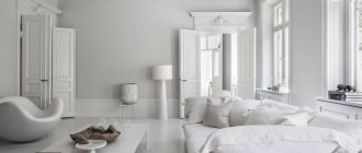
- With white color the design becomes as light and fresh in appearance as possible. Well suited for a room that is located on the sunny side. It is worth noting that this combination of colors will visually increase the space.
- With gray color you can create a design in both modern and classic style. The combination of gray and mint colors results in a noble and discreet design.
- Beige color creates a very elegant palette that gives the room additional comfort and coziness.
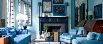
- With black color you get a palette that looks very original and elegant, the main thing is not to overdo it with the amount of black paint.
- Mint tones combine very harmoniously with green, as they are as close in shades as possible. With the right tones, you can emphasize the depth and tenderness of the main color.
- It is also often combined with yellow, but the mint tone should be a light shade. It is worth noting that rich warm tones of yellow will add warmth to the room, while mint tones will visually enlarge the space.
The meaning and features of color
A mint shade is a combination of blue and green; the intensity of the mint shade depends on the predominance of one color or another. The resulting mint is not directly related to the color of the mint leaves.
A variety of mint can be considered menthol, turquoise in a light shade, sea foam color and light pistachio.
Like the entire group of green shades, mint has a positive effect on the psyche, induces relaxation, and has a beneficial effect on the functioning of the visual organs.
The photo shows a bedroom interior with green and purple patterns and white ceiling beams that add depth.
What to decorate a room in mint color
Regardless of the purpose of the room, there are many options that can be decorated in a mint tone.
As a rule, designers suggest giving preference to some options from this list:
- Finishing material for walls.
- Textile elements.
- Furniture items.
- Decor elements.
You should not overdo it with the choice of elements, because everything should be in moderation and it is enough to choose several items, especially if mint color is used as an accent.
What points should be taken into account?
If you have a small living room and want to visually enlarge the space, you should choose furniture that matches the color of the walls. To ensure the shade is not intrusive, choose a gray or green shade. Mint does not have to be bright; on the contrary, it is better to opt for a midtone.
And so that the living room does not seem monotonous, add piquant sketches! Furniture in cheerful colors will perfectly complement the interior. Yellow curtains, orange pillows, cheerful paintings, and a soft green carpet will be a good addition. It is the details that will give the room a holistic and elegant look. You can also put figurines, red flowers, vases on the wall. Such an interior will give a charge of positivity after a hard day at work and will definitely appeal to families and guests!
If you're looking for a more casual feel, consider using pastel or white accents instead of bright decor. A milky coffee table, porcelain figurines, a cream carpet, and a light sofa are suitable. Curtains should be of a peach or sand shade. In such a living room, all fatigue and negative emotions will go away.
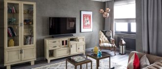
Those who love a more formal and modern interior can add dark decorations. For example, a dark wooden shelf or cabinet could become such an accent. Metallic decor and sheer curtains are also good.
The result will show a subtle sense of taste and originality. If the setting lacked liveliness and its own “character,” then ornaments and motifs will correct it. So, you can buy striped pillows or a blanket with flowers. Ornaments, patterns and geometry perfectly complement the mint-colored interior.
Mint walls
Mint-colored walls in the interior can be decorated in different tones, depending on the style direction and purpose of the room. You can also choose a mint color to create an accent color on the wall, rather than just as a base.
Most often, different types of wallpaper are chosen to cover walls in this color scheme. In order for mint-colored wallpaper in the interior to be appropriate and look harmonious, the designer is recommended to:
- If the furniture in the room is made of dark wood, then you should give preference to plain wallpaper.
- When placing a minimum amount of light-colored furniture, wallpaper with patterns or small designs will look most harmonious.
- For a small room, it is recommended to choose mint-colored wallpaper with geometric patterns or a plant theme. It is also better not to decorate the walls with decorative elements.
- Non-woven wallpaper in mint tones would be appropriate for a child’s bedroom, for both a boy and a girl.
Features of the right choice
Before you go looking for fabrics with interesting colors and patterns, decide what might influence their correct perception.
Often, in the process of interior design using textiles, a mistake is made: the curtains merge with the walls or completely contradict the color scheme of the room, as a result of which the entire design is perceived as inharmonious and causes discomfort.
If you do not have experience in design selection of curtains, but you want to achieve the desired result without unnecessary alterations, follow the following rules:
when choosing suitable curtains, consider the compatibility of shades; try to match the textures of wall coverings and curtains with each other. Light and airy wallpaper can be decorated with tulle curtains, and durable vinyl or non-woven fabric can be decorated with massive curtains; When choosing curtains with patterns, try to respect the stylistic features. It is better if the patterns are not too large, otherwise such a design will help reduce the size of the space; curtains should not create an overly gloomy interior, so dark and rich shades on the windows should be diluted with lighter elements.
How to choose the color of curtains to match the wallpaper? The colors of wallpaper and curtains should not be the same: if you stick to one palette, choose several tones of the same color. This design of the window area will allow you to create smooth color transitions that will emphasize home comfort.
If you want to create accents, do not mix conflicting colors, otherwise the selected curtains will seem redundant.
Bright colors of wallpaper and curtains are not acceptable in rooms intended for sleeping.
One of the most successful options for choosing curtains to match the color of the wallpaper is duplicating the shade used on the wall patterns. This way you can not only create a lively and vibrant environment, but also ensure the integrity and harmony of the design .
Often, several curtains or curtains are used in interiors. How to choose curtains to match the wallpaper in this case? It is advisable that one of the fabrics matches the shade of the wall coverings.
Using several different colors, you can create interesting transitions: for example, blue curtains and white tulle against the background of blue walls will look quite natural and harmonious.
Mint textile
Textiles in mint tones can be placed in the bedroom or nursery, as well as in the living room or kitchen.
Some of the most popular textile items that are placed in the interior in this color are:
- Curtains or tulle;
- Decorative pillows;
- Bedspreads, covers for upholstered furniture;
- Floor carpet;
- Apron, oven mitts, kitchen towels, tablecloth.
Mint-colored curtains look very beautiful in the interior, giving the room softness, calmness and, of course, freshness. It is worth noting that tulle or curtains in mint tones are well suited for a room on both the north and south sides.
For a small room, it is better to choose a product of a single color, this will visually increase the space. Among patterned curtains, those with a floral or geometric theme are most often chosen.
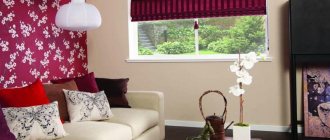
- Decorative soft pillows, bedspreads, and a mint-colored blanket will perfectly complement the interior of a bedroom or living room.
- If they help create an accent, then it is better to choose upholstered furniture of a different color.
Most often, square-shaped decorative pillows are chosen; they can be with or without decorative elements, plain or with a pattern, depending on the overall style and personal preferences.
A mint-colored floor rug is well suited to a bedroom, nursery or living room to create an accent. It is recommended to choose a small model and preferably a solid color.
Kitchen textiles in mint tones look very gentle and fresh in the kitchen. It is worth noting that this palette of textiles is suitable for many kitchen styles.
Room decoration
Bedroom. It is important to take into account elements of textiles and curtains from the point of view of the functionality of the room - it is in the bedroom that it is optimal to choose and hang thick fabrics that will not let in the sun's rays. You should not choose a massive canvas or curtains with a pattern - the best colors for curtains in the bedroom will be cream, pistachio, and pearl shades.
Living room. When choosing curtains for the living room with shades of fresh mint walls, it is important to take into account the lighting and ceiling height, as well as the size of the room itself. If the room is small, light-colored curtains will help to expand it visually. More intense shades are suitable for rooms with a large area and high ceilings - in this case, you can give free rein to your imagination and choose textiles with original decor. Emerald and dark olive, brown curtains can bring a certain solemnity to the room.
Kitchen - the freshness of mint puts you in a positive mood and gives you a surge of strength and energy. The main condition for curtains is lightness and airiness, so as not to burden the space. It is optimal to select patterned fabrics with simple patterns and ornaments, floral arrangements, or choose textiles with geometric striped patterns. It is best to choose white and beige fabrics with bright inserts, pastel colors, but not burdened with unnecessary details.
To summarize, we can summarize that choosing textiles to match the shade of fresh mint to walls and wallpaper is not a difficult task, even a beginner can do it. Just take into account all the tips described above, turn on your imagination and a little creativity - let the room sparkle in a new way, with the colors of freshness and spring.
Mint furniture
One of the popular pieces of furniture that is installed in this tone is a sofa. It is worth noting that this color is considered quite easily soiled, so when choosing furniture you should carefully look at the tone and finishing material.
You can also choose a table and chairs, a wardrobe, a dressing table in this color... It is not recommended to place all pieces of furniture in mint color in one room, for a more harmonious look.
How to combine correctly
When decorating a room, curtains need to be “played up” with additional accessories and furniture.
- Mint-colored curtains in the Baroque or Empire style are perfectly complemented by matching upholstery, pillows, canopy over the bed, bedspread and carpet.
- In loft and hi-tech interiors, the curtain does not have to be combined with additional accessories, then it will remain the only spot of color, which looks very stylish.
- Curtains with eyelets need to be combined with tiebacks and cornices, which are usually made to match the eyelets, then the composition will have a harmonious, finished look.
Curtains should fit into the overall style of the room.
Keep in mind! The choice of golden eyelets and silver cornice is the height of bad taste in the interior. The cornice should always be matched to the tone of the rings.
Mint kitchen
A mint-colored kitchen in the interior looks very good in combination with light colors or white.
- Also, natural wood furniture of various tones is ideal for this color scheme.
- If you want to place mint-colored furniture, you should give preference to several elements, for example, a kitchen set or a dining table with chairs.
You shouldn’t install all the furniture in the same tone. You can use a kitchen apron or the entire work area as an accent.
Selection of mint curtains, curtains and tulle
You can choose the right mint-colored curtains based on photos in the interior or in combination with furniture samples that can be found on the Internet.
Since the palette of mint shades is quite voluminous, in some cases the help of a specialist is needed to help you decide on the best option.
Curtains can be combined with thin tulle.
When choosing curtains and drapes, you need to decide on the design and overall style of the room. If the decor is more classic and austere, you should choose curtains that flow freely from the ceiling in combination with thin tulle.
For daring high-tech, loft or pop art designs, you can choose functional curtains such as fabric roller blinds or Roman blinds.
It is better to make sliding curtain options strictly according to the shape of the window opening. Classic strict curtains for minimalist, classic, loft and high-tech designs are best made to cover the entire height of the wall. It is better if the curtain mounts and cornice are hidden in the ceiling niche of the stretch ceiling, then the effect of curtains floating is created, which adds airiness and lightness to the room.
In a classic interior, it is better to make curtains the entire height of the wall.
Helpful advice: To choose the right curtain color, shape and design for a room that already has furnishings, you can first take a photo of the interior, and then in the store decide exactly on the color of the curtains or tulle.
Bathroom in mint color
A mint-colored bathroom is not done very often, but this palette is very suitable for its design.
- This color can be used as a base or to create an accent.
- The most compatible colors for a mint bathroom are white or cappuccino.
- The bathroom, decorated in glossy mint and matte white, looks quite original.
Selection of curtains for green wallpaper
Of course, green is a general concept. Did you know that the human visual analyzer can distinguish at least 376 shades of green? Therefore, first it is worth finding out exactly what shade of green you are dealing with. It is customary to distinguish the main color and the so-called additional tones.
The main one is a light or dark color, and the additional ones are pistachio shades, mint, shades of malachite, green with a light green tint, olive, turquoise, herbal, etc. Therefore, you must first find out exactly the shade of the main color.
According to the color wheel, one of the design solutions is selected:
- Monochrome design. This means that the color of the curtains for the green wallpaper will be in the same range, only darker or lighter by several tones.
- Neutral combination. In this case, the tones that are to the left or right of the main color will be used. And this means beige, sand or blue, gray, etc.
- Contrasting combination. In this case, tones that are opposite are used - red, brown, purple.
- Double solution. These are two-color curtains; the selected tone must be combined with beige, white, gray or black (base colors).
If you want to create a calm interior, then the curtains should have a color that is close to green on the color wheel. By using opposite colors, the interior will be bright and bold. Which solution suits your plans, as well as the functional load of the room, is the choice you should lean towards.
Photo of mint color in the interior
Children's
In a children's room, menthol is as successful as other delicate shades that are usually used to create a pleasant, light, soothing atmosphere.
Soft blue shades in the interior of a nursery
To dilute menthol and make the children's room more fun, combine it with colorful shades.
Warm sunny tones will add bright colors to the room
Advice!
If you want to use rich shades of mint, then you will need to use it in various accents so as not to “overload” the space, and the background can be left light turquoise or soft azure
What else can you combine menthol freshness with?
Not only a light palette can become a successful ally of the menthol palette. More expressive shades also cope well with this task. Being a representative of the pastel range, menthol provides a lot of opportunities for successful experiments. It looks best with green, orange, pink, yellow, coral.
Mint green interior is suitable for decorating a children's room
Living room in mint yellow with mint textiles
But we should not forget that a combination of such colorful tones in clothes will be appropriate at a party or a walk. But in the office such a multi-colored outfit looks ridiculous. In interior design, such color combinations need to be implemented very carefully, correctly placing bright accents on a pastel background.
See alsoExecutive office design: zoning, choice of decor, fashion trends