Strict elegance, sublime sophistication and slight understatement - these are the main characteristics of the gray color, which has recently found itself in the spotlight. It is loved and appreciated not only by famous designers, but also by amateurs, owners of houses and apartments. Noble and unobtrusive, but at the same time varied, gray color in the interior is an ideal basis for placing bright accents, favorably emphasizing the beauty and originality of the shapes and textures of all interior details.
Gray color in the interior
"Magic" gray
The gray palette, without exaggeration, can be called magical. In addition to the fact that it is appropriate in absolutely any room, almost all of its shades can favorably emphasize other colors. Too bright - softens, and subdued - fills with special charm.
Against a gray background, every element of the interior looks elegant and modern. Concealing the excessive massiveness of large objects, it delicately emphasizes the grace of small elements. Light, and especially glossy shades of this amazing color help to visually enlarge the space, filling it with air and invigorating light. And dark and rich ones, combined with a textured design, perfectly mask imperfections and defects of various surfaces.
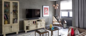
Living room in gray
Without a gray color scheme, it is quite difficult to imagine a living room decorated in one of the modern interior styles.
Often this color is used to create the main background. Light pearlescent or silver shades on the walls look very impressive in combination with richer graphite or stone shades on the floor. Furniture in such rooms can be of absolutely any color.
Cool shades of gray are appropriate in spacious, well-lit rooms. For small rooms, you should prefer warmer options. Interesting and unusual living room interiors are achieved by using contrasting textures and materials of the same color.
For many years now, the most popular piece of furniture has been the gray sofa. It is perfect for a living room in any color, but looks especially impressive in rooms with ashy or light gray walls.
For connoisseurs of calm, discreet, but elegant interiors, a combination of gray, beige and white in the living room would be an excellent solution. And for more extravagant design solutions, golden, greenish and yellow-orange shades are suitable.
Decorative plaster
For the final finishing of the walls, special decorative plaster is used. It smoothes the surface perfectly and does not absorb foreign odors, so it can be used even in the kitchen. The surface is resistant to physical impact and abrasion. In addition, repairing a small section of the wall does not present any difficulties: it is enough to cover up a scratch or chip with the same composition.
The original, patterned and textured surface of Venetian plaster creates a magnificent illusion of natural marble or other gray stone. It is usually used when decorating premises in such interior trends as minimalism, hi-tech, art deco. But, it is quite possible to plaster part of the wall, framing it with chic stucco, or organically combine classic wallpaper and a decorative mixture.
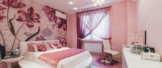
Gray color in the bedroom interior
Modern research has shown that the presence of bright colors in the bedroom can lead to excessive stimulation, which interferes with bedtime and proper rest. Gray color comes in handy here. By creating an aura of calm and tranquility, it not only helps you calm down and fall asleep, but also makes an invaluable contribution to creating a sophisticated modern interior.
Of course, the bedroom is not the best place to experiment with all shades of grey. In this room you should prefer only one, maximum two, fundamental tones. To create a light and airy interior, a combination of light gray and snow-white is ideal. A pearl-gray palette with the addition of cream or caramel will fill the bedroom with calming tenderness, and in combination with a soft light green or first green color, it will calm you down, helping to get rid of sad thoughts.
Sensual purple and romantic lilac fully manifest themselves only in the presence of gray. Such a union in the bedroom interior will add passion to the marital relationship, helping to forget about all the problems of the passing day.
In a women's bedroom, a win-win option would be an alliance of warm shades of gray with muted smoky pink.
For brutal masculine interiors, darker tones are appropriate - concrete, graphite, asphalt, in combination, for example, with shades of brown.
Shades
The activity and perception of orange depends on which direction the undertone shifts: towards yellow or towards red. The closer to red, the richer and more aggressive the color is. Proximity to yellow gives a feeling of comfort and sunshine, creating the illusion of an increase in temperature in the room. But citrus does not have to be bright and concentrated - there are almost pastel variations that do not have an active effect on the psyche. There are many shades that deserve attention.
- Citrus fruits - orange, tangerine, grapefruit. These are the most luscious tones, only the names of which exude vivacity. In the overall palette, they should take the place of a color accent that will balance neutral colors.
- Peach, apricot - in contrast to the previous bright fruits, these tones, diluted with white and beige, tend to pastel colors. They can be used in any room, not only in decoration, but also in furniture or decoration. They refresh the atmosphere, but do not put pressure on the psyche, so they are often used in the bedroom and nursery.
- Amber is a darker and deeper tone associated with the warmth of autumn. It may be lighter with a yellow tint or turn brown. Pairs well with wooden elements and natural fabrics. It can also be used for decoration, but it is better to choose a diluted version. Or use it not on all surfaces, but to highlight an accent wall.
- Terracotta is the darkest of the popular shades, as close as possible to red. Makes the space elegant and cozy, goes well with any natural textures, be it stone or wood. Can be used in any room. Whether to use terracotta as a base or as an accent depends on the richness of the tone.
Instagram @solovyeva_natalia_designer
Instagram @linedesign_studio
Instagram @zhilin_brothers
Instagram @lavkadesign
Instagram @olegkurgaev_design
Gray color in the kitchen
In kitchen design, gray is an inexhaustible source of inspiration for any designer. For a small kitchen, the ideal solution would be a shade of mountain fog. Applied to the walls, it will visually enlarge the room. An apron or tabletop made in this tone will add a touch of freshness and morning coolness.
Graphite, stone and asphalt shades will fit perfectly into the interior of a large and spacious kitchen, adding luxury and strict grandeur.
Fans of the gray palette can opt for the monochrome version. But won't an exceptionally gray environment have a detrimental effect on the mood...? A classic and win-win option is a duet of gray and white. A set made in smoky gray tones will look especially elegant against the backdrop of snow-white walls and a light floor. Milky white furniture surrounded by graphite and wet asphalt looks no less stylish. Brown and beige elements will help add warmth and comfort to an ascetic gray kitchen. Yellow-green fragments will refresh and charge you with positivity. And shining copper-golden surfaces will add unique luxury and chic.
Brickwork
Natural brickwork is an easily recognizable element of an industrial loft. To achieve a gray color, brick walls are either painted with the appropriate color, or they are initially made of gray bricks. Usually one accent wall, or even part of it, is decorated in this style, harmoniously combining with white or colored wallpaper, paint, and panels.
If the walls of the house are already plastered, but you really want to create an original interior, ordinary plaster or gypsum mixture and a stencil made of thick plastic “brickwork” come to the rescue. With the help of a trowel and level, a full-fledged illusion of masonry of the required sizes and shapes is created in a couple of days. After drying, the surface is primed and painted. You can also use wallpaper with a suitable pattern.
Office in gray
Gray color is great not only for living rooms, but also for offices. By providing a favorable atmosphere for communication, it helps to put thoughts in order and get into a working mood.
For a brutal masculine interior, a combination of gray with black and dark brown is suitable. Blue accents in a gray office will help you tune in to solving serious problems, and dark green accents will increase your productivity.
Furniture
Laconic and straightforward products are a win-win option for arranging a gray space. Moreover, themed furniture can be one of two colors:
- Bright one-color;
- Neutral, i.e. grey, black or brown.
Don’t worry about the risk of creating a “gray zone”: colorful and bright accessories will add charm to the finished interior, and with it a complete and original appearance.
Gray in the interior of a children's room
Light gray color can become a worthy background for a children's room, and for quite a long time. It will reflect and scatter light no worse than white, expanding the space and softening the brightness of other colors. As the child grows up, it will be enough to simply change the colored accessories to create the right mood.
In a room, this universal color suits both boys and girls; both a baby and a teenager, you just need to provide him with suitable companion shades:
- To avoid excessive severity and gloom, gray in the nursery must be diluted with a sufficient amount of white.
- In a room for a newborn, you should prefer soft, pastel shades.
- For children from 3 to 7 years old, bright colors are more suitable as accents - orange, yellow, green, pink, blue.
- Teenagers will appreciate the “adult” combinations of gray with beige or brown. However, some at this age prefer bold, bright splashes of black, coral, lemon, lilac or fuchsia.
When choosing neighboring shades of gray in a nursery, it is important to take into account the child’s temperament. For active children, soothing colors are suitable - light green, blue, lilac. And shy melancholic people will be cheered up by life-affirming accents - orange, bright yellow, green.
Dye
Decorating walls by painting them is very popular. The method has a number of advantages:
- it does not require much experience and knowledge; both a teenager and an elderly person can paint the prepared surface;
- no need to hire specialists, all operations are carried out on our own;
- you can choose the most environmentally friendly, safe for health, compositions - water-based emulsion, acrylic and silicone, latex and eco-paints;
- the consumer is not limited in the choice of colors. You can mix gray color of any saturation, adding the desired undertones;
- painted walls are very easy to renew, make cosmetic repairs to an area damaged by careless movement, the actions of children or pets;
- on a monochromatic background, decor of various types looks great: paintings and photos in frames, mirrors, wall clocks and original sconces, pots with climbing plants and shelves, mosaics and wall paintings;
- At any time, the walls can be repainted again using a different color.
The only negative is that painting requires a perfectly flat plaster surface. Any cracks, chips, bulges and even brush hairs on the painted surface will be very noticeable.
Bathroom
Mirror and glass surfaces, complemented by nickel or chrome elements, seem to be specially created to give the gray color a special luxury. Conveniently placed in the bathroom, they help turn this room into an example of elegance and impeccable style.
Depending on the desired effect, accents of other colors are also needed here:
- turquoise, wine and purple surfaces will add glamorous chic;
- golden-beige shades will bring cozy “warmth”;
- Snow-white and charcoal-black interior details will provide strict sophistication.
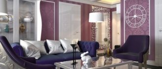
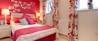
Combination of gray with other colors
The uniqueness of gray lies in the fact that it combines very harmoniously with almost all representatives of the color spectrum, helping to create unique interiors:
- Violet shades on a gray background give the room some solemnity.
- Green - calms, putting emotions in order.
- Orange and yellow - save you from depression and improve your mood.
- White - makes the interior elegant and neat.
- Black - emphasizes important details.
- Beige and brown colors against a gray background provide a feeling of tenderness and comfort.
- Pink fills the interior with playful romance.
- Gold ones add luxury.
When using gray in interior design, it is important to consider the light level. The same interior can look bright and elegant with an abundance of light, but seem boring and gloomy with a lack of it.
Accessories
Even with the yellow light provided by the lamps, a living room in gray tones seems a bit boring. And although the appropriate understanding comes with time, it must be warned in advance using:
- Decorative fireplace imitating flames;
- Multi-colored pillows (preferably they match the colors of the curtains);
- A bright green plant like a palm tree;
- Glazed color painting or medium-large format photo;
- Bright noble curtains.
There should be few accessories so that the decor range includes only two or three colors. Thanks to this restraint, a modern gray living room is achieved without any visual burden and remains modern by default.
If the decor is not enough, then it can be replaced by furniture made of wood - a wall, a coffee table, a display case. There is only one condition here - the forest must be light. Brown leather upholstery also adds solidity and charm to the interior.
Gray color in the interior - photo
The reason for the steadily growing popularity of gray shades is their neutrality. Practicality and mobility, which allows you to change the interior beyond recognition with the help of a simple placement of accents, gives designers a unique opportunity to experiment with color effects in a variety of stylistic directions.
5 1 vote
Article rating