Strict elegance, sublime sophistication and slight understatement - these are the main characteristics of the gray color, which has recently found itself in the spotlight. It is loved and appreciated not only by famous designers, but also by amateurs, owners of houses and apartments. Noble and unobtrusive, but at the same time varied, gray color in the interior is an ideal basis for placing bright accents, favorably emphasizing the beauty and originality of the shapes and textures of all interior details.
Gray color in the interior
"Magic" gray
The gray palette, without exaggeration, can be called magical. In addition to the fact that it is appropriate in absolutely any room, almost all of its shades can favorably emphasize other colors. Too bright - softens, and subdued - fills with special charm.
Against a gray background, every element of the interior looks elegant and modern. Concealing the excessive massiveness of large objects, it delicately emphasizes the grace of small elements. Light, and especially glossy shades of this amazing color help to visually enlarge the space, filling it with air and invigorating light. And dark and rich ones, combined with a textured design, perfectly mask imperfections and defects of various surfaces.
Taupe - what color is it?
Taupe is a color that is difficult to define definitively. Its unusual and now slightly confusing name comes from the French word taupe, which means... moth. Although this noun was originally used only to describe the color of a mole's fur. In the 1940s, it became the name for a whole range of warm colors from beige to gray. Currently, the intrigue of taupe boldly penetrates into salons. Taupe is a noble and neutral color. It fits easily into eclectic interiors and is used in a variety of styles. Not only matches the wall color, but also looks great on sofa upholstery, furniture and accessories. Not only can taupe be a primary color, but it can also be used as an elegant accent color. This is a fashionable alternative to cool grays and warm browns. Hence its great popularity in colonial and glamorous interiors.
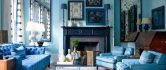
Living room in gray
Without a gray color scheme, it is quite difficult to imagine a living room decorated in one of the modern interior styles.
Often this color is used to create the main background. Light pearlescent or silver shades on the walls look very impressive in combination with richer graphite or stone shades on the floor. Furniture in such rooms can be of absolutely any color.
Cool shades of gray are appropriate in spacious, well-lit rooms. For small rooms, you should prefer warmer options. Interesting and unusual living room interiors are achieved by using contrasting textures and materials of the same color.
For many years now, the most popular piece of furniture has been the gray sofa. It is perfect for a living room in any color, but looks especially impressive in rooms with ashy or light gray walls.
For connoisseurs of calm, discreet, but elegant interiors, a combination of gray, beige and white in the living room would be an excellent solution. And for more extravagant design solutions, golden, greenish and yellow-orange shades are suitable.
Gray and other colors: successful combinations
As already noted, the smoky and asphalt range is basic: shades from it are combined with all colors. With which of them will this palette make the most harmonious and effective pair?
In the interior of this bedroom, gray is combined with all possible colors.
1. Classic monochrome combination with white and/or black. A strict and restrained monochrome combination is ideal for interiors with a “masculine character” in the styles of minimalism, loft and brutalism. Color proportions are not so important here: regardless of which tone dominates, the design turns out balanced and calm. However, in a small space it is better to use as many light shades as possible, choosing white or light gray for the background, asphalt for furniture, and black for details.
Black details in a gray and white hallway add graphic accents
White was chosen for the walls of this small room, a gray sofa became the main accent, and black details gave the interior the features of a fashionable loft.
This small minimalist room is ideally suited to a discreet combination of white, graphite and black.
2. Beige-brown color scheme . The combination of smoky and pearl with light beige and milky is ideal for the Scandinavian style. If you are thinking about how to dilute the gray wallpaper in the interior, pay attention to the decoration and furniture made of light wood (pine, bleached oak) or rattan. Brown harmonizes better with darker tones (graphite, asphalt): this combination gives the room a vintage atmosphere, appropriate in classic, English and American interior styles.
Elegant interior in light gray-beige tones
This living room successfully combines gray and beige-brown of the same intensity.
A combination of gray, beige and natural wood shades in a modern interior
3. Blue-blue palette. The calming combination of cool gray with blue and cyan is a good solution for the bedroom: it perfectly relieves stress, relaxes and promotes good sleep. This color combination is also perfect for a cozy family living room: it will set you up for trusting and open communication. Bright tones of blue (ultramarine, indigo, azure) are a great way to add colorful details to a laconic interior in smoky tones: use them on one accent wall or a large piece of furniture (a sofa or armchair).
Against the background of a gray-blue wall, a graphite-colored sofa looks harmonious
Gray furniture makes the rich dark blue shade of the walls more expressive
Ultramarine details add originality to the laconic light gray interior
4. Green tones . Natural green tones and neutral gray look good in interiors of any style - from classic to minimalist. Saturated shades of green - bottle, emerald, olive - go better with dark graphite and charcoal, and lighter shades (for example, mint) - with pearl and smoky. A rich light green color in the interior is also best combined with light tones: such a combination looks fresh and adds a trendy “eco” touch to the design.
Emerald green accents dilute the restrained monochrome interior in gray tones
The soft olive shade perfectly complements the interior in warm gray tones.
Juicy light green color paired with light gray creates a modern eco-friendly design
5. Delicate pastel . Gray color in interior design can “mute” the naivety of soft pastel colors, making the room calmer and more austere. Add it to a room in powdery, lavender or peach tones and you will create a cozy and warm, yet rather understated atmosphere. The ideal balance of tenderness and severity makes this solution a good choice for a teenage girl’s bedroom, a business woman’s office or a large family home.
Powdery accents on a gray sofa give the living room a cozy and relaxing atmosphere
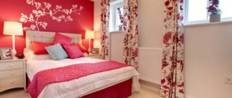
Peachy pink combined with light gray is ideal for a child's teenage girl.
Warm shades of beige and pink work well with gray in a family room in a home.
6. Red and wine shades . When combining bright red with light smoky, the color always comes to the fore, so it is better to complement it with furniture and decor of the simplest geometric shape. This color pair is a popular choice for design in a modern style, as well as hi-tech and minimalism. Dramatic burgundy and deep marsala are more versatile: they are suitable for both laconic modern styles and classics with accent quilted furniture and carved details.
A bright red carpet is the only accent of a minimalist light gray interior
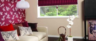
The deep wine shade goes well with the warm gray color in this interior.
Small accents of deep red break up this monochrome interior in cool, dark gray tones.
7. Positive colors. Yellow and orange are bright and “cheerful” shades, which in large quantities can cause hyperactivity and insomnia. Gray color will help neutralize this property: if you choose it as the main color, then in combination with it the optimistic tones will become calmer and suitable even for the bedroom. Choose rich colors for small accents: they will add originality, but will not overload the interior.
Muted lime yellow is chosen to accentuate a niche in a light gray interior
In combination with calm gray, yellow color is appropriate even in the bedroom interior - as textiles and an accent wall behind the bed
Textiles in citrus shades are an excellent solution for creating a seasonal mood in the warm season: bed linen, towels, curtains will help quickly transform a discreet design in smoky tones.
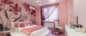
Bright yellow textiles create a summer mood in a restrained gray bedroom interior
Gray color in the bedroom interior
Modern research has shown that the presence of bright colors in the bedroom can lead to excessive stimulation, which interferes with bedtime and proper rest. Gray color comes in handy here. By creating an aura of calm and tranquility, it not only helps you calm down and fall asleep, but also makes an invaluable contribution to creating a sophisticated modern interior.
Of course, the bedroom is not the best place to experiment with all shades of grey. In this room you should prefer only one, maximum two, fundamental tones. To create a light and airy interior, a combination of light gray and snow-white is ideal.
A pearl-gray palette with the addition of cream or caramel will fill the bedroom with calming tenderness, and in combination with a soft light green or first green color, it will calm you down, helping to get rid of sad thoughts.
Sensual purple and romantic lilac fully manifest themselves only in the presence of gray. Such a union in the bedroom interior will add passion to the marital relationship, helping to forget about all the problems of the passing day.
In a women's bedroom, a win-win option would be an alliance of warm shades of gray with muted smoky pink.
For brutal masculine interiors, darker tones are appropriate - concrete, graphite, asphalt, in combination, for example, with shades of brown.
Sockets
in the living room in gray
It is advisable to make sockets with a reserve and take care of their location in advance. Decide on the location of the floor lamp, table lamps and their number. It is very important to remember about the television zone. After all, there must be a lot of sockets that must be hidden. This can be done using a cabinet or TV. The same can be said about the electric fireplace. By the way, you can think about placing the New Year tree in advance. Or rather, about where the New Year's garlands will be included. About 15 sockets will be enough for this room.
Gray color in the kitchen
In kitchen design, gray is an inexhaustible source of inspiration for any designer. For a small kitchen, the ideal solution would be a shade of mountain fog. Applied to the walls, it will visually enlarge the room. An apron or tabletop made in this tone will add a touch of freshness and morning coolness.
Graphite, stone and asphalt shades will fit perfectly into the interior of a large and spacious kitchen, adding luxury and strict grandeur.
Fans of the gray palette can opt for the monochrome version. But won't an exceptionally gray environment have a detrimental effect on the mood...?
A classic and win-win option is a duet of gray and white. A set made in smoky gray tones will look especially elegant against the backdrop of snow-white walls and a light floor. Milky white furniture surrounded by graphite and wet asphalt looks no less stylish.
Brown and beige elements will help add warmth and comfort to an ascetic gray kitchen. Yellow-green fragments will refresh and charge you with positivity. And shining copper-golden surfaces will add unique luxury and chic.
Gray furniture and decor
Slate and smoky colors are a practical and universal option for any interior items. Let's take a closer look at what color of wallpaper suits gray furniture best and what it will make a good pair with.
Stylish monochrome interior with walls and furniture in graphite tones
Cushioned furniture
A sofa in graphite or asphalt color is the most popular option for decorating a living room: this practical shade makes it easier to care for upholstered furniture. In addition, these tones are in harmony with all colors, which makes choosing pillows easier - you can easily change the design of your living room by simply changing decorative pillowcases. The most versatile will be models with fabric upholstery with a smooth texture. The background for such a sofa can be either neutral white and beige walls, or more expressive ones - for example, dark blue, emerald green, yellow and burgundy.
A laconic light gray sofa does not distract attention from the accent blue wall
A graphite gray sofa is an invariable attribute of a Scandinavian interior with white walls
A light gray sofa with fabric upholstery is a universal solution for any interior
Despite the basic shade, sofas made of leather or velvet will become the main accent of the entire room, even if you used gray paint or wallpaper in the interior of your room, as in the photo below.
Thanks to the velvet texture of the upholstery, the noble graphite shade of the sofa is revealed
An armchair, pouf or ottoman can be in the same dark color scheme, or lighter (for example, pearl) - usually they are not used as intensively as a sofa, so this solution will still be quite practical. Small pieces of upholstered furniture in these colors will help balance the bright design of the living room or bedroom, balancing the riot of colors on the walls and textiles.
Minimalist gray armchairs help balance out the vibrant interior of this living room.
A gray pouf that matches the color of the walls does not distract from the main accent of this room - a bright blue sofa
An ottoman in a calm light gray color harmonizes the bright color of the walls and the original upholstery of the furniture
Furniture for kitchen
A steel-colored kitchen is an absolutely universal solution for any style. For classic or Provence, choose a set with paneled facades, complementing it with a countertop made of natural stone or its imitation. In laconic modern styles, smooth, plain cabinets with hidden handles and a wooden tabletop (including painted) look better. Matte facades are more versatile, but glossy ones will help visually enlarge the space and make it lighter.
Kitchen in gray tones in Scandinavian style complemented by wooden details
A gray kitchen with paneled fronts and brass details is an excellent choice for the neoclassical style
A light gray set with smooth fronts is a universal option for a kitchen of any size
Gray chairs - classic dining or bar stools - are the best solution for Scandinavian-style kitchens, especially if you choose models with upholstery. They harmonize perfectly with natural wood furniture (for example, a dining table) and support the overall aesthetics of the “northern” style.
Dark gray chairs in the interior of a Scandinavian-style kitchen-dining room
Graphite gray chairs go well with natural wood furniture in the kitchen
Light gray bar stools support the laconic interior of this small kitchen
Storage furniture
Cabinets in smoky tones are a good solution for built-in storage systems: they allow you to hide bulky structures in the interior as much as possible and divert attention from them. The best answer to the question of what cabinet colors go with gray wallpaper or paint in a small room is a shade close to it.
The gray cabinets in this interior blend into the walls and make the room feel lighter and more spacious.
A light gray cabinet that spans the entire height of the room does not look bulky in a small room
Graphite cabinets match the shade of the walls and visually dissolve in space
As for small pieces of furniture for storage (pedestals, chests of drawers), they are perfect for a bedroom or nursery: bright models can distract and interfere with a comfortable sleep, while neutral gray ones will not be noticeable. They will perfectly complement a room in white, beige, blue or powder pink.
A gray chest of drawers is a great alternative to a bulky closet in a small bedroom
A light gray chest of drawers complements the interior of this nursery in soothing colors
The gray-blue bedside table matches the color of the textiles in this bedroom
Office in gray
Gray color is great not only for living rooms, but also for offices. By providing a favorable atmosphere for communication, it helps to put thoughts in order and get into a working mood.
For a brutal masculine interior, a combination of gray with black and dark brown is suitable. Blue accents in a gray office will help you tune in to solving serious problems, and dark green accents will increase your productivity.
Decorating different rooms in gray tones
Lead is considered neutral, so it is perfect as a background. By painting the walls in light gray shades, you can use furniture and accessories of almost any, even very bright, “accent” colors. At the same time, the interior will retain its zest, will not be “flashy”, will maintain consistency and peace.
The combination of gray walls and white doors in the hallway interior looks noble and rich
If there is an emphasis on details and furniture, then for the main surfaces it is better to take a light grayish tint.
Bedroom
There is no need to worry about lead in the bedroom. This tone gives the bedroom a calmness, which is what this room needs. Thanks to the gray color, the room creates coziness and harmony. A light tone will look good in the room, which goes well with elegant decorative additions: a vase, a figurine, a lamp.
The gray-green combination is pleasing to the eye, calms the nerves and promotes good rest.
Bathroom
In the bathroom it goes well with blue or beige. Gray walls will help give the room peace and relaxation. This color can also be used in the bathroom. But on the floor it will appear “dirty” and be associated with dark sand.
Gray ceramic tiles are less likely to show streaks and splashes of water.
Living room
In the living room, gray gives the effect of chic and luxury, wealth. Light gray tones will look better. The atmosphere of the room will acquire a feeling of lightness. If you use darker shades of gray, for example, wet asphalt or lead, then the room will look strict and conservative. Noble textures and bright accent colors will help make the interior smoother and less harsh. Gray will prevent the room from being too busy. But such a living room is not suitable for a studio apartment.
In a small living room, it is better for gray to play an accent role
Kitchen
Gray is a symbol of purity and innocence. The kitchen is exactly the place where this perception “works to your advantage.” Most often, cleanliness is needed in the kitchen. Monochrome kitchens are popular not only in modern styles, but also in others, even the most elaborate ones. Kitchen furniture can be anything: matte, glossy, interspersed with sparkles or not. She will invariably retain her aristocracy.
The kitchen interior is often decorated in a cozy gray-brown combination.
This color is also chosen for kitchen floors, since dirt is not visible on it. In addition, gray is the tone of natural stone, which is why such tiles are widely popular. In a kitchen with a “non-flashy” color, a person feels especially calm and peaceful, but at the same time he does not have the desire to spend too much time in it. For comfort, the monochrome color must be diluted with bright accents or wood. For example, put laminate on the floor. You can use bright tiles and wallpaper to decorate the walls. Chairs and a table can also be made from wood. Such a room acquires a special “warmth” because it is associated with a person’s natural habitat.
Living room with open kitchen
In such a living room, it is better to avoid dark gray and turn your attention to lighter colors. They look great in natural light and add sophistication to the room. The room seems more spacious.
Gray kitchen-living room in Scandinavian style
Children's room
Gray is not considered good for a children's room. However, if the child is hyperactive, then this color will calm him down. But in combination with bright accents, it will stop being so boring and joyless. It will look good in combination with red or pink.
A worthy solution would be gray wall decoration in combination with light furniture
Cabinet
The design of the office should be compatible with work. Made in gray tones, it gives the room severity and restraint. In addition to gray, you can use brown or black. Blue accents will restore a feeling of energy and relieve fatigue. Green will help you get into a “working mood”.
Ash and steel colors are considered the best shades for creating a business atmosphere
Gray in the interior of a children's room
Light gray color can become a worthy background for a children's room, and for quite a long time. It will reflect and scatter light no worse than white, expanding the space and softening the brightness of other colors. As the child grows up, it will be enough to simply change the colored accessories to create the right mood.
In a room, this universal color suits both boys and girls; both a baby and a teenager, you just need to provide him with suitable companion shades:
- To avoid excessive severity and gloom, gray in the nursery must be diluted with a sufficient amount of white.
- In a room for a newborn, you should prefer soft, pastel shades.
- For children from 3 to 7 years old, bright colors are more suitable as accents - orange, yellow, green, pink, blue.
- Teenagers will appreciate the “adult” combinations of gray with beige or brown. However, some at this age prefer bold, bright splashes of black, coral, lemon, lilac or fuchsia.
When choosing neighboring shades of gray in a nursery, it is important to take into account the child’s temperament. For active children, soothing colors are suitable - light green, blue, lilac. And shy melancholic people will be cheered up by life-affirming accents - orange, bright yellow, green.
Textiles in a gray interior
The rules for using colored textiles in gray rooms are not much different from those that exist for furniture. The exception is, perhaps, curtains, which many designers prefer to take in dark and neutral shades, transforming the solid color of the walls into smoky canvases, penetrated by rays of sunlight. It all looks very impressive, but at the same time discreet - such a contradictory combination.
Gray and white curtains on the windows
In modern styles, curtains may not be used at all, and textiles remain in the form of carpets, bedspreads, blankets and other things. Instead of curtains, roller blinds and blinds of various designs are often used.
Bathroom
Mirror and glass surfaces, complemented by nickel or chrome elements, seem to be specially created to give the gray color a special luxury. Conveniently placed in the bathroom, they help turn this room into an example of elegance and impeccable style.
Depending on the desired effect, accents of other colors are also needed here:
- turquoise, wine and purple surfaces will add glamorous chic;
- golden-beige shades will bring cozy “warmth”;
- Snow-white and charcoal-black interior details will provide strict sophistication.
Combination of gray with other colors
The uniqueness of gray lies in the fact that it combines very harmoniously with almost all representatives of the color spectrum, helping to create unique interiors:
- Violet shades on a gray background give the room some solemnity.
- Green - calms, putting emotions in order.
- Orange and yellow - save you from depression and improve your mood.
- White - makes the interior elegant and neat.
- Black - emphasizes important details.
- Beige and brown colors against a gray background provide a feeling of tenderness and comfort.
- Pink fills the interior with playful romance.
- Gold ones add luxury.
When using gray in interior design, it is important to consider the light level. The same interior can look bright and elegant with an abundance of light, but seem boring and gloomy with a lack of it.
Accessories
The implementation of gray color in the interior involves playing with both shades and texture: stonework, fur throws on furniture, dry bleached wood as an accessory or iron beams under the ceiling
Bright accents
When choosing a combination of bright colors and gray in the interior, do not be afraid of mistakes - any “live” and rich color will enliven the space without dissonating with the basic tone.
But try not to overdo it with color - red, for example, being an extremely active shade, in large quantities can begin to bother and “harm” the eye. Make a choice in favor of burgundy, wine or brick shades if they are expected to significantly predominate in the interior. Panels, vases, floor lamps, textiles and even living plants - everything will be used.
A bright sofa and a standout painting on a gray background.
A couple of “juicy” spots diversify the interior.
Textile
Gray textiles in the interior will soften the brightness of the background colors and add nobility to the atmosphere as a whole. Heavy velvet curtains, silk bed linen or fluffy carpet pile - these little things add up to the comfort and overall emotional background of the entire room.
Gray color in the interior - photo
The reason for the steadily growing popularity of gray shades is their neutrality. Practicality and mobility, which allows you to change the interior beyond recognition with the help of a simple placement of accents, gives designers a unique opportunity to experiment with color effects in a variety of stylistic directions.
5 1 vote
Article rating