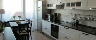
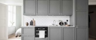
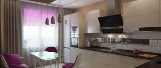
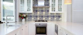
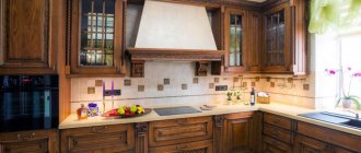
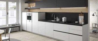
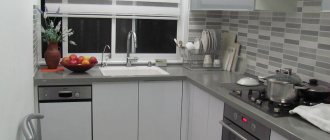
Strictness, conciseness and functionality are the three main features that ideally characterize white kitchens in the Scandinavian style. This is one of the most common solutions today. But such popularity and demand does not make it banal. On the contrary, the options for using white in the interior are truly endless!
The maximum inclusion of white combined with small accents made in natural wood or dusty shades is the embodiment of a classic white kitchen in the Scandi style.
@lottaagaton and @christianhalleroddesign
In the Scandinavian style, almost everything can be white. Sometimes it turns out total white - in this case, even the countertop in the kitchen becomes white.
Photo from source: tass-sib.ru
Tabletop Cedar 1110/S White
A completely white set can be diluted with a wooden tabletop or one imitating the structure of natural wood. This also expresses the natural orientation of this style.
Photo from source: pinterest.ru
Table top Cedar 3852/P Corsica Oak
For those who are afraid that even with a countertop in an alternative color, a white kitchen in the Scandinavian style, both in the photo and in reality, will look too inexpressive and monotonous, the option of creating a two-color set is suitable. In this case, the surface of the upper or lower cabinets can also have a wood structure and match the color of the countertop.
Photo from source: kazned.ru
Table top Cedar 2075/FL Oak Kera
Decoration of the dining area
In Nordic countries, it is customary to gather with family and friends at the table, share news, and enjoy delicious home-cooked meals, so very often there is not just a kitchen, but a living room combined with a Scandinavian-style kitchen. And in the dining area there are large, massive tables. They can be made of wood or materials imitating it. Along the table there are chairs of the same shade as the table. It looks interesting when the dining area matches the color of the tabletop set.
Photo from source: pinterest.es
Tabletop Cedar 2032/M Rigoletto light
If the kitchen area does not allow for such a large and spacious dining area, the furniture in it should be compact. In this case, the table and chairs can be made in contrasting colors. Wood texture is optional. For example, a table with a white top and wooden legs and black chairs with a varnished wooden base and wicker seats. The gray “marbled” countertop harmoniously combines these two colors and makes the transition less harsh.
Photo from source: Catherine Lazure, Alvhem
Countertop Cedar 2341/Pt Nuvolato Marble
Plastic furniture in the dining area is also appropriate. White round table, black chairs on metal legs, combined with black service on the table and kitchen utensils on the countertop. At the same time, the tabletop is in harmony with the floor in color and texture, thereby helping to dilute the bright black and white contrast and support the natural direction of the style.
Photo from source: cocolapinedesign.com Tabletop Cedar 521/Pw Birch sandalwood
The current non-standard solution is chairs of different colors and configurations:
Photo from source: interyerdizayn.ru
Furniture in a white kitchen interior: what nuances to pay attention to
A white kitchen is usually a choice in favor of snow-white furniture. When painted in this shade, the walls become only a background, and the set always remains in the foreground.
This can be the most unexpected or traditional work corner:
- Straight furniture for the workspace is a universal solution. For a classic design, choose facades with decor in the form of moldings, milling and overlays. The surfaces are usually matte. Worn whitish coatings look noble and expensive. Even a small room with this choice will look spacious and original. But a spacious living room combined with a kitchen can become more diverse. Here the top is painted in a snowy tone, and the bottom in a noble dark tone. The set is completed with an island in the same shades.
- A small kitchen is traditionally equipped with an L-shaped set. If you have a small area, straight furniture will no longer be appropriate. But if the living room is combined with this space, the choice will be wider.
- When combined with a dining room, the kitchen space can be organized using a set with an island. When painted white, it looks very compact, while remaining a functional solution.
The photo shows a set with an island and a dark countertop.
It is also important to take into account the features of the style: furniture for a classic interior will be matte and embossed. A glossy and straight surface is chosen for modern solutions.
Lighting
The following chandeliers are suitable for lighting in a white Scandinavian-style kitchen:
- from glass;
Photo from source: wayfair.com
- varnished or painted wood;
Photo from source: decorilla.com
- made of wire or chrome, spider chandeliers;
Photo from source: home-designing.com
- in the form of an incandescent lamp on an ordinary black cord - without a lampshade or in a metal lampshade;
Photo from source: pinterest.ru
- in the form of snow globes;
Photo from source: pinterest.cl
- in the form of bells.
Photo from source: interyerdizayn.ru
Disadvantages of white color and how to get rid of them
The first drawback is the notorious staining of white, which is eliminated by choosing high-quality materials. For the same reason, you should abandon wooden flooring: it is better to make the floor from tiles, stone or linoleum.
Fighters for absolute cleanliness recommend abandoning the interior with a dark countertop so that stains and fingerprints are not visible on it.
White color is often rejected because of its “sterility” and monochrome. In reality, the impression of the interior depends on the spectrum of lighting, companion shades, and surface texture. For example, it is considered mandatory to complement such a design with bright accents.
Elements from other styles in a Scandinavian interior
As the popularity of this style grew and it spread beyond the Scandinavian countries, new things began to appear in it, as if borrowed from the cultures to which they came. The ease with which Scandi can be combined and combined with elements taken from other modern styles can only be envied. This is one of its most interesting features, which designers take into account and use it with pleasure in their works.
A kind of adaptation took place - the following appeared:
— accents made in pure colors;
Photo from source: kuhnov.ru
- tiled floor;
Photo from source: home-designing.com
- furniture made of metal.
The Scandi kitchen is white with an apron imitating brickwork, black household appliances, tables and chairs in the dining room equipped with metal legs - all this is a clear example of the inclusion of elements characteristic of the high-tech style. This modern interpretation of the style is very common today.
Kitchen utensils and fittings made of oxidized black metal are relevant.
It is important to note that all metal elements that penetrated from high-tech to scandi have lost their shine in the literal sense of the word. Matte surfaces made of aluminum or stainless steel are used here.
Gray countertops will look especially good in such kitchens.
Tabletop Cedar G015/1 Galaxy metallic
Table top Cedar 1205/BR Diamond light gray
Continuing the theme of stylish duets, one cannot help but note the common combination of white scandi with loft. First of all, this solution is characterized by walls with imitation brickwork and communication pipes that remain visible, and lamps in the form of light bulbs on brutal black wires. A tabletop that imitates natural wood will help maintain the eco-oriented style and maintain a balance between scandi and loft elements.
Table top Cedar 3829/Nw Bunratti Oak
Under the apron
There is no clear answer to the question whether the shades of a kitchen apron should match the countertop. Some designers argue that if you choose similar colors, then there will be no even boundaries and lines between the elements, they will merge into a single whole, as a result, the overall impression of the kitchen will be fuzzy and blurry. Others, on the contrary, do not see anything wrong with this and recommend combining details that are similar in color. Let's figure out together what color of tabletop to choose for a snow-white apron.
A duet of white and black will look harmonious and expressive. Example in the photo.
However, keep in mind that on a dark-colored working surface, especially if it is glossy or plain, fingerprints, stains, dust, and grease will be noticeable, so it is advisable to choose products with a relief texture (stone or wood).
If you have chosen a combination of light shades, make sure that such a monochrome combination does not look too monotonous; give preference to aprons made from the following materials:
- mosaic. A simple finish is suitable for a kitchen interior in Provence or country style;
- ceramic tile. A universal option for any kitchen;
- white wood. An excellent choice for connoisseurs of eco-style, as well as for those who want to decorate a room in styles such as modern or minimalism;
- brick. This type of finishing is at the peak of popularity, suitable for any style (modern, classic style). Such tiles can be glossy, matte, as well as voluminous or embossed;
- PVC panels or glass. To prevent the combination with a white tabletop from looking dull or reminiscent of a hospital ward, you can dilute it with colored lighting.
White kitchen with mosaic splashback
White kitchen with light wood countertop and splashback
White kitchen with ceramic tile backsplash
White kitchen with ceramic tile backsplash
White kitchen with white brick tile backsplash
White kitchen with white brick tile backsplash
The apron and countertop are elements that equally influence the practicality and functionality of the kitchen. A room in which these interior details are made of a single material (ceramic tiles or marble slabs) looks expensive, stylish, and attracts attention.
White kitchen - beautiful, but impractical?
White Scandinavian kitchens look perfect in the photo. It seems that in real life such a design is completely impractical. Actually this is not true! Thanks to the fact that the materials used to create a modern kitchen repel dirt, cleaning will not be a problem. Smooth surfaces are always easier to clean than rough ones.
What else will make cleaning easier?
- spacious sink;
The contrasting combination of a white sink with a countertop in a natural light wood shade looks very interesting.
Table top Cedar 690/P Indian wood
As a harmonious addition, you can hang open wooden shelves with indoor plants and cute kitchen utensils.
— a faucet attached to the wall will make the space on the countertop freer, and a model that can be pulled out like a shower will ensure the comfort of washing dishes;
- sink with two bowls;
Photo from source: pinterest.ru
Table top Cedar 5270/FL Oak classic
— waste shredder — reduces the amount of splashes and debris;
- a separate tap with drinking water - will relieve the surface of the countertop, since a jug with a water filter will no longer be needed.
A kitchen top that protrudes forward will help protect the lower cabinets from dirt.
By the way, countertops from the Kedr factory are equipped with a special drip tray for these purposes.
Dark shades of classics
The stone surface is cold and attractive. This is what a tabletop looks like in a classic style. Highlighting the whiteness of kitchen cabinets and adding weight to the atmosphere is just a small part of what it can do.
But the stone owes its popularity to its properties:
- durable and scratch resistant;
- perfectly polished;
- wine or coffee will not leave any stains on it, thanks to its dense structure.
Dark brown color is another companion to the classic white kitchen. It can be adopted by those who are alien to stone coldness and inaccessibility.
White and clutter are incompatible: how to make your Scandi kitchen space as ergonomic as possible?
Here's how to make the most of all the storage space in your kitchen:
- narrow shelves that slide out
— convenient to store, for example, jars of spices;
Photo from source: eboss.co.nz
- roof rails
- you can hang hooks for hanging skimmers, spatulas, baskets, frying pans;
Photo from source: homestratosphere.com
- drawers;
Photo from source: pinterest.ru
- open shelves in the lower modules or kitchen island
- it is better to place beautiful and at the same time frequently used things.
For example, books with recipes; Photo from source: mydizajn.ru
- cabinets and furniture
— if the doors are made of opaque material, it is convenient to hide behind them everything that does not fit into the style.
Modules with transparent glass inserts will make an elegant set decorate the interior, while protecting it from dust; Photo from source: ikea.com
- open shelves
- an excellent solution for making the space more airy, and if you place decorative objects, dishes, glasses on them, it will also be more beautiful.
Anything that is not particularly aesthetically pleasing - lids, frying pans, pots - is best placed in wicker baskets. They will harmoniously fit into the Scandi interior and hide from the eyes everything that can visually “overload” the space;
Photo from source: shelterness.com Photo from source: pinterest.ru
Light milky shelves that match the color of the wall on which they hang give the kitchen space maximum lightness. It is appropriate to complement them with a light wooden floor of a similar shade.
An apron lined with white tiles imitating brickwork is typical of Scandi. And thanks to the combination with a white set, walls and ceiling, it also helps not to overload the space.
Bright, but at the same time calm accents in the form of a dark brown tabletop imitating wood and wooden folding chairs of the same color in the dining area make the interior less monotonous.
Tabletop Cedar 7053/FL* Taxus
One of the chairs can be hung folded on the wall above the dining table. This is a very original design move that will not only add personality to the kitchen, but also help save space. If necessary, it can always be removed and used for its intended purpose.
— in the drawers under the very ceiling it is better to place everything that is needed, but is used very rarely;
Photo from source: pinterest.co.uk
- magnetic strips
- are very relevant in this case, because many kitchen utensils are made of metal.
Photo from source: pinterest.ru
Kitchen lighting
Will decorate your kitchen. Use our designer to choose your lighting set in a couple of minutes.
More details
Clear or colored glass
A fashionable glass tabletop can fit into any interior color. White is no exception. Tables can be completely transparent and colorless. They can be opal shades. Or milk glass, which blends perfectly with the surrounding whiteness. You can choose glass of any color to complement the range of shades of white with another, brighter color. In addition to a glass countertop, you can consider a glass splashback. For example, they threw it off.
Decor
A Scandinavian white kitchen doesn't look boring at all. And you can always recreate similar solutions in your own home, using both natural materials characteristic of Scandi and their high-quality imitations. The use of bright details, black and white graphics, as well as the creation of duets with pastel shades helps to make the interior more interesting.
There are so many ways to make a white Scandi kitchen stylish and fashionable. The use of curtains, pillows, and carpets in the design will prevent a white Scandinavian-style kitchen from looking too minimalistic and utilitarian. As a rule, textiles are also made in light colors and are often decorated with ethnic motifs of northern peoples.
The abundance of white in Scandinavian kitchen design is skillfully diluted:
— a carpet in blue-black light shades, as if imitating northern mountain rivers;
- indoor plants in stylish clay pots, placed on top of wall cabinets;
- gray sheepskin with a pillow, decorated with ethnic Scandinavian patterns - a soft corner in the kitchen, warming the Nordic character of the interior and making it more cozy;
- wicker baskets, in which it is convenient to place small things necessary in the kitchen that should not be in plain sight;
- tabletop imitating natural wood;
Tabletop Cedar 7052/FL* Wotan Oak
- fresh flowers - if you put a bouquet in a vase in the form of an ordinary glass jar or aluminum bucket on a white tabletop, it will turn out very original and lively.
Tabletop Cedar 1110/S White
Secrets and energy of brown color
When thinking about the color brown, chocolate and expensive leather furniture come to mind. Something calming and kind. This is the atmosphere that fills the kitchen. In addition, a brown set is less easily soiled than black, white or made in other shades. In addition, it gives the owner a feeling of constancy, calms her down and does not distract her from her work.
Most often, work offices are decorated in brown. So that a person remains focused and does not make mistakes in his calculations. The kitchen owner also needs concentration, especially if she is preparing a complex dish. And while preparing dinner after a hard day of work, she will be able to relax and unwind in the white and brown interior.
First secret: softening brown
The shade will become softer and warmer in combination with pink, turquoise, blue or lilac. A delicate palette will add zest, depth to the kitchen and fill it with the necessary warmth. Lilac and pink are best added in the form of textiles - curtains, sofa cushions, chair upholstery. This combination is especially good in a kitchen with south-facing windows.
Second secret: less gloom - more light
Too much black and dark gray will make the kitchen look dark and gloomy. These colors should be used sparingly and minimally. Focusing on white. This will fill the kitchen with light and make it seem airier.
Third secret: brown in decoration
Thanks to this feature, it is used not only in furniture, but also in decoration. Porcelain tiles, parquet and laminate, tiles or natural stone will come in handy.
The walls can be decorated in brown tones only if the furniture, textiles and other surfaces are mostly light. Otherwise, the kitchen will look gloomy. A great option is an accent wall. Chocolate wallpaper or light wallpaper with a brown pattern, wooden panels. With this decoration, the room will acquire some intimacy and will seem more spacious.
A brown apron is also popular, but one that is too dark should be discarded, as it is too easily soiled. Designers recommend choosing lighter shades.
The fourth secret: brown is massive
When choosing a set and upholstered furniture, especially upholstered in leather, it is important to understand that in appearance it looks somewhat cumbersome. Therefore, it is better to choose white and light shades for the background. The same applies to rich brown curtains.
Fifth secret: a light shade of brown goes well with bright colors
Red, sunny yellow, and orange will fill the kitchen with warmth and will definitely cheer you up in the morning. They are close to brown and harmonize perfectly with it. But for a dark shade they are too contrasting. Therefore, chocolate cuisine, even diluted with white, will turn out somewhat stuffy if you choose red or orange.
Festive table decoration options
The Scandinavian style in the interior of the kitchen-living room also involves a special design of the festive table:
— wicker coasters for dishes instead of tablecloths, fresh flowers;
Photo from source: pinterest.ru
— cuts of natural wood as coasters, candles, spruce branches, pine cones, a tablecloth made of natural linen or cotton;
Photo from source: prazdnik-dlya-vseh.ru
Photo from source: mirposudy.ru
— decorative laconic figures in the form of trees, deer and other motifs inspired by Scandinavian nature;
Photo from source: decordots.com
Photo from source: decordots.com
Photo from source: decordots.com
- an improvised spruce made from wooden sticks, decorated with paper Christmas tree decorations in black and white, cones and transparent balls;
Photo from source: burkatron.com
- dried slices of lemons or oranges for decoration, candles in jars, sprigs of herbs.
Natural fabrics can be used as a tablecloth for the entire table, as a table runner in the center of the table, and as napkins as a stand for each dish. Photo from source: burkatron.com Scandinavian style
Wooden beauty of Scandinavia
The Scandinavian style has absorbed all the harshness of the climate of those regions: natural materials in light, cold shades and the presence of simple geometric shapes. A tabletop made of solid wood can soften the interior and give it a little warmth. This material is distinguished by its original structure and environmental friendliness - the dream of many housewives.
Preference should be given to light wooden shades, since dark ones create the impression of pressure on the fragile white walls of the cabinets.
If the structure of wood is not to your liking, but Scandinavia is your passion, a light brown countertop option made of chipboard or MDF will help fulfill your desire. The price will be even cheaper.
The most important
In the design of one compact room, two primary colors and one additional color are usually used. Plus an accent. Otherwise, the room will give a sloppy impression, and the designer's delights will seem like chaos.
The main color of the kitchen is the color of the walls. This is the largest surface in the room. The second main color is the color of the kitchen furniture facades. Additional color is the color of the countertops. Sometimes the color of the refrigerator.
There are two types of countertops in the kitchen: a work surface and a dining surface (kitchen table or bar counter). In large kitchens there may be three: a work surface, a dining table and a bar counter.
The colors of the worktop and dining tabletop in modern kitchens rarely match. This happens because they have completely different requirements. The worktop should be non-marking and functional - that’s why “stone-like” coatings and natural or artificial stone are so popular.
The covering of the dining table should, first of all, increase appetite and create coziness in the room. Therefore, modern designers offer many options for colors and materials for the dining table.
About materials
We looked at the colors. Let's move on to the materials.
Imitation stone
Surfaces that imitate stone are much more practical than those that are actually made from it. Because imitations are not so susceptible to damage and bacterial growth.
A high-quality imitation stone is difficult to distinguish from a real rock even by touch.
For example, quartz agglomerate
- This is a stone created by hands. It is chemically inert and has no pores. It is easy to care for such surfaces. They can easily withstand a large number of cycles of cooling, heating, drying, and getting wet. The range of colors is huge, so everyone will find what they need.
Acrylic is a kind of specific plastic. It also does not absorb odors or liquids, and bacteria do not multiply on such material. Its weight is much lower than that of natural stone, and it is easier to work with.
Please note that acrylic is resistant to scratches and heat because it is plastic. Acids and acetone are also harmful to it.
A natural stone
This is the most expensive work surface option. It looks beautiful, but it cannot be said that they show good resistance to factors that are often found in kitchens - elevated temperatures, large amounts of water, sharp knives, etc.
Of course, it all depends on the specific mineral. For example, granite is practically not afraid of anything - neither moisture, nor acids used in the kitchen, nor high temperatures. But it cannot be said that its aesthetic properties are ideal.
Light granite texture.
In terms of beauty, marble occupies the top of the pedestal. But its downside is that it is difficult to care for. Compared to granite, it is a real whim. Even a small drop of vinegar can cause an unsightly stain.
Marble texture.
Made of wood
Wooden worktops are very popular right now. To protect them, they are coated with a special varnish or oil. This helps make the service life longer.
A white kitchen with a wooden countertop in the interior is great! In this case, different arrays can be used - solid or glued. They differ in structure.
Solid array structure. Expensive and solid.
In the case of laminated veneer, less aesthetically pleasing wood is used inside. To make the tabletop more durable, the elements of this wood are glued crosswise. A Canadian oak countertop in a white kitchen interior is a prime example.
Glued laminated timber from natural wood.
Chipboard
Laminated chipboard countertops (pressed wood chips) occupy the majority of the market for these products. There is an opinion that their quality and durability leave much to be desired. However, the development of technology has dispelled this myth.
The unique decors of laminated chipboard countertops will not leave anyone indifferent.
Of course, we are talking about high quality products, and not about Chinese consumer goods.
For example, high-quality edging plastic can withstand hot dishes from the stove or oven, is absolutely impervious to moisture and ultraviolet radiation, is not afraid of food acids, and is resistant to damage and scratches.
A separate word - decors. The Kedr countertops factory is ready to offer you more than 200 options for countertops with unsurpassed imitation of natural materials. Even to the touch it will seem like you are touching wood.
MDF
Laminated boards are not afraid of high levels of humidity. Such countertops (like their chipboard counterparts) imitate a wooden or stone surface.
MDF is almost completely identical to chipboard in terms of characteristics. The decoration technology is the same.
Destruction of the protective layer is strictly prohibited. Otherwise, water spilled on the countertop will cause swelling or even chipping.
Metal surfaces
Metal surfaces are durable. It's a good choice. They are easy to clean from dirt, and their shine will make the look of a plain set more interesting.
Brutal tabletop made of metal.
Quite a rare option in houses and apartments. Most often they are purchased for the kitchens of cafes and restaurants, but no one forbids you to experiment.
Stainless steel is hygienic and practical. It will look best in rooms designed in a modern style. Washing with soft cloths will help it not lose its shine over time.
Glass surfaces
Glass countertops have become fashionable. They are harmonious in kitchens of any color. In this case, the surface itself can have any shade.
Milk glass surfaces will look great in white kitchens. If you want to make a statement, consider a glass backsplash in brighter shades.
A harmonious addition to the glass work surface is an apron decorated with skinali (tempered impact-resistant glass with decoration).
The tabletop is made of impact-resistant glass and is absolutely safe. Even if it breaks, the glass shards will not be able to hurt anyone. But try not to drop a heavy frying pan on it.
Cleaning with abrasives is strictly not recommended. Scratches may appear.
Beige kitchen interior with dark countertop
Most people associate a delicate beige shade with warmth, tranquility, cleanliness and comfort. It is often used to create classic kitchen interiors. One of the advantages of this color is its ability to harmoniously combine with all other shades.
The beige tone itself exists in numerous variations, but the most popular are sand, baked milk, cream, ivory, wheat, powder and caramel tones. They are ideal for creating kitchen interiors in European style, as well as in shabby chic, Scandinavian and Provence styles.
Regardless of the chosen style, you can safely install a dark countertop in the kitchen - the combination with beige will be a win-win. Suitable materials for it are artificial stone, solid wood, chipboard, plastic (the choice will depend on the chosen interior style).
As for shades of dark, these can be: black, dark gray, brown, dark green, dark blue, burgundy. To match such a tabletop, you can choose furniture fittings, flooring, decorative elements (flower pots, dishes on open shelves, spice jars, textiles, etc.).
