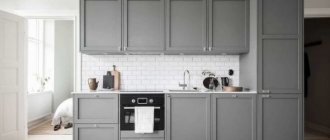
Modern designers have successfully dispelled the myth that a gray kitchen is gloomy and faceless. This color is incredibly popular in interior design today.
Firstly, gray allows you to change the interior as soon as such a desire arises, with minimal cost. All that is needed for this is to replace textiles and decorative elements.
Secondly, gray is a 100% universal color and minimizes the risk of creating a tasteless interior.
In this article we will try to consider kitchens in gray tones, the features and subtleties of their creation in as much detail as possible.
About the benefits of gray color
Photo from source: chickensmoothie.com
“Second beige” is the so-called gray color for its versatility of use. This is a kind of smooth transition and intermediate stage between black and white.
Let's consider its advantages:
— looks appropriate in interiors made in almost any style;
— always occupies a leading position in the ranking of popular colors;
- looks great in a duet with both pastel and bright colors.
Proper use of gray is the key to creating a noble and harmonious kitchen interior. Working with this color is not difficult because it goes well with all the colors of the rainbow.
And using gray as a base is an ideal solution for creating a kitchen in the following styles:
- high tech;
Photo from source: pinterest.ru Tabletop Cedar 3094/S Lavant
- loft;
Photo from source: vse-kuhni.by Tabletop Cedar 3852/P Corsica Oak
- art deco.
Photo from source: rerooms.ru Tabletop Cedar 4091/Q Damask steel
Color solutions
Modern kitchens in gray combine effectively with all shades. The main thing is to adhere to the basic principles of color.
White color is universal; in combination with graphite it looks expensive and stylish. Provides wide design possibilities due to combination with all accessories and shades.
Beige and gray kitchens fit into any interior and create a calm, welcoming atmosphere. Neutral shades look attractive both “solo” and in combination with contrasting accessories.
When choosing a green shade, it is better to focus on deep dark shades. The calming color goes well with latte, metal and white marble. The choice may fall on both finishing elements and the set.
Ivory adds a fresh, midnight blue hue. The composition can be diluted with golden cabinet handles, chair legs, lamps and other decorative elements.
The set and upholstered furniture may have an eggplant or lavender hue. You can avoid excessive darkening by using a large number of ceiling and wall lights.
In the process of choosing the current color scheme, you need to focus on the basic principles of kitchen design in a particular style. For example, Provence includes delicate pastel shades, classic – natural materials, high-tech – neutral and strict shades. Scandinavian style can include a set of wood combined with blue wall trim.
In what cases is gray inappropriate in the kitchen?
The use of dark gray should be avoided in the following cases:
- kitchen area less than 8 square meters. Here it is better to give preference to light gray shades (they will visually make the kitchen more spacious), or combine the kitchen with the living room to really increase the space;
- lack of lighting, windows facing the shady side and small size of windows - all these are obstacles to using dark gray color when decorating a kitchen interior;
— a completely monochrome design will create the impression of a cold and not entirely cozy interior.
Gray color in kitchen design: pros and cons
The merits of this color were appreciated in Russia much later than in Europe (where it received recognition back in the 17th century). Therefore, among our compatriots there are many opponents of a gray interior.
Their main arguments are the following:
- The gray color is too gloomy and boring, it smacks of distant officialdom and alarming coolness.
- Choosing a gray color for the interior of a small room with little natural light will make it even colder and more uncomfortable.
- Too much gray tone can make a person with mental problems depressed.
We just need to make a reservation: in all the above cases we are talking about pure gray pigment. This monochrome option is rarely used in design practice.
Let us now listen to the arguments of the adherents of gray in the kitchen interior:
- Being neither too warm nor too cold tones, it does not strain, does not bother, does not cause aggression, does not distract, and allows you to immerse yourself in thoughts and feelings.
- Neutral, not attracting attention, it harmonizes with almost the entire spectral range of tones, providing an excellent background for them.
- Its own tonal diversity - it includes several dozen shades - allows you to implement interesting design projects.
- The shapes and texture of furniture stand out against a gray background, and kitchen accessories look expressive.
- It is ideal for displaying still life paintings.
- Its practicality is indispensable for quickly dirty kitchen spaces.
- It is not subject to fading, neither soot nor fat is visible on it.
- Allows you to experiment with such current interior styles as minimalism, hi-tech, Provence, art deco.
- It is not without grace, mystery, and tenderness: aesthetes and poets compare it with London smog, pearls, and the depths of the sea.
About the role of gray when choosing a layout
If the kitchen area is small, it is very important to pay special attention to the choice of shade. For example, kitchen units whose facades are made in a dark gray shade will look completely out of place here.
Photo from source: ivd.ru
Tabletop Cedar 1110/S White
Eliminating the top row of cabinets will help you skillfully “get around” this trouble. The lower modules, made in gray, will thus not cause the room to be perceived as smaller than it actually is.
Photo from source: designwiki.ru
Tabletop Cedar G015/1 Galaxy metallic
Another great option would be to use gray base cabinets with white cabinets in lighter shades. This is true for both corner, straight, and U-shaped sets.
Photo from source: designwiki.ru Tabletop Cedar 3230/S Light Sonoma Oak
Translating the ideas of two-row kitchens into reality is a rather complex process, since it is necessary to take into account not only the area of the room, but also its proportions.
Glossy or matte - which facades to choose for a gray kitchen?
The intensity of the color chosen for the design of kitchen facades is what primarily influences the choice of coating.
It is necessary to take into account that even the smallest contaminants, such as traces of dried water, will be most noticeable on glossy dark gray surfaces.
Photo from source: designwiki.ru
Tabletop Cedar 4026/Q Alambra
To avoid this effect, it is better to give preference to matte facades in a light gray shade. There will be no noticeable stains or fingerprints on them.
Photo from source: designwiki.ru
Table top Cedar 1210/Br Diamond white
If you want to purchase a kitchen set in any complex deep shades of gray - gray-blue, gray-beige, gray-green (they usually look best), they will be most effective on matte surfaces.
Photo from source: stylebyemilyhenderson.com Tabletop Cedar 3027/S Granite white
Facade materials
In this paragraph we will present information that will help you speak the same language with furniture makers. Are you dreaming of a gray wooden kitchen with a wood look or some other design? The following materials will help implement all ideas:
- veneer or solid wood, which are coated with paint;
- MDF board coated with enamel - in this case, a wide variety of surface types are available (matte, glossy, semi-matte). And the enamel tone can be selected according to the RAL or NCS palettes;
— MDF or chipboard boards with acrylic coating;
— MDF coated with PVC film;
— laminated chipboard;
- plastic-coated chipboard or MDF. At the same time, plastic can quite accurately imitate concrete, stone and other specific surfaces not only in appearance, but also to the touch.
Which of the above options is best?
The highest quality, but at the same time relatively expensive, is considered to be MDF coated with plastic or enamel. These materials provide great scope for the implementation of a wide variety of facade options: textured, milled, or smooth, plain.
A dark gray kitchen with a matte surface will fit perfectly into the interior of a kitchen-dining room or kitchen-living room.
Photo from source: mudryakova.ru Tabletop Cedar 3504/XX Gray granite
However, if the room is quite small, it is better to stick with gloss. Reflection of light will contribute to the visual expansion of space.
Photo from source: alkamebel.com.ua Tabletop Cedar 1210/Br Diamond white
A light gray kitchen is considered a completely win-win option, as it fits perfectly into both large and small rooms.
Photo from source: archviz-studio.com Tabletop Cedar 3027/S White Granite Photo from source: pinterest.ru Tabletop Cedar 2349/Pt Bernini Marble
Luxury kitchen materials 2022: new design trends
Fashionable kitchen 2022 will be based on the use of luxurious, durable and original materials. Thanks to this, the kitchen part of the open space of the house will not differ in style from the dining room or living room. What materials are desirable to choose for the kitchen of 2020? For several years now, marble has been very popular, from which not only fashionable kitchen countertops of 2022 are created. In the coming season, richly decorated and exclusive versions, such as Calacatta or Carrara marble, will be especially popular. A cheaper option would be interesting granites or imitation marble and other decorative stones with high-quality digital printing. Particularly fashionable will be cladding in the colors of ultramarine lapis lazuli, purple amethyst, green labradorite or amazonite.
In addition to marble or granite, the kitchen design of 2022 also includes luxurious types of wood, such as walnut and European ash. They are used not only to create kitchen fronts, but also for decorative inserts on stone kitchen islands. Other natural, yet durable and elegant materials that are sure to appear in the latest kitchen designs include glass, metals (eg copper, brass, stainless steel, bronze). A metal surface, like wood, can be used to create large, attractive sections of frontage, as well as details on a solid stone kitchen island or in wall trim above a kitchen counter. To get a luxurious look, you should also buy trendy kitchen tiles 2022.
Characteristics of gray kitchens in a modern style
When considering many examples, references, and photos of gray kitchen design in a modern style, one can trace the following common characteristic features:
— lack of handles on the facades of the kitchen unit;
Photo from source: italybel.by
Table top Cedar 9022/S Whitened Oak
— upper modules reaching to the ceiling;
Photo from source: pinterest.ru Tabletop Cedar 3230/S Light Sonoma Oak
— lack of upper cabinets;
Photo from source: kitchendecorium.ru Tabletop Cedar 3028/S White Marquina Marble
- built-in equipment.
Photo from source: alkamebel.com.ua
Table top Cedar 0410/S Carrara marble
By following these trends, you can create a truly fashionable interior.
Decorating a gray modern kitchen
Well-chosen textile elements can become a successful accent in the interior. Bright or patterned curtains and tablecloths will dilute the overall severity of a gray kitchen and introduce playful notes into it.
Colorful plates, vases and flower bouquets will add coziness to any kitchen. Sets and finishes made from natural materials are in harmony with flower pots and green spaces: this solution makes the room more “alive” and attractive.
About the combination of colors in the kitchen interior: gray +…
1. ... brown or beige
The combination of gray with brown or beige in one space looks very harmonious. Using shades of different saturation and warmth, you can adjust the degree of formality and severity of the created interior.
Photo from source: mykitchendesign.ru Tabletop Cedar 4948K-52 Breccia Brown
2. ... blue or blue
Blue and cyan, as well as gray, belong to the cold palette. Even if the kitchen windows face the sunny side, and there will be quite a lot of light in the space, such a palette will look quite appropriate. To avoid impersonality and boredom in design, you can use interesting textures, as well as bright accents.
Photo from source: pinterest.ru
Tabletop Cedar 3028/S White Marquina Marble
3. ... yellow
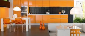
This color and all the shades that are close to it - mustard, orange, turmeric - look very original in a duet with gray. But you shouldn’t get carried away with using bright details in the interior, since the presence of too many such accents can have a negative impact on the psyche - irritate. Yellow and similar shades with no more than 30% inclusion in the interior of a gray kitchen are the best option.
Photo from source: pinterest.ru Tabletop Cedar 1110/S White
4. ... green
Combinations of gray with green and its shades - emerald, light green, malachite - are incredibly beautiful! Such duets can be classified as natural, because they can be found in nature quite often. Green perfectly balances the coldness and severity of gray. It can be used when decorating dining areas, window spaces, and kitchen aprons. In addition, green can be presented in accents - indoor plants in white or black, bouquets of flowers in laconic transparent vases, and the like.
Photo from source: verbovska.com.ua Tabletop Cedar 3027/S White Granite
5. ... purple or pink
In this case, the key to success will be the measured use of purple or pink flowers as small accents. Because gray has an interesting ability to reflect colors that are nearby.
Photo from source: static.tildacdn.com Tabletop Cedar 1205/BR Diamond light gray
6. ... white or black
White color helps correct any imperfections. For example, if the interior is too dark or bright.
Dark gray facades of the kitchen unit in combination with a white countertop will create an aesthetic contrast. It is important that the walls are also light, since in this case the space will seem visually larger.
Photo from source: kitchen.mebeltrislona.ru Tabletop Cedar 1012/Cr White ceramics
A light gray background is an excellent option for a set with black facades. If you make the walls dark gray, the interior will turn out to be too gloomy. There is only one exception to this rule: if the kitchen is spacious and has large windows. This will make the combination of dark gray and black not so gloomy.
Photo from source: mykaleidoscope.ru Tabletop Cedar 111/1 White
7. ... red
The abundance of red in the kitchen will make the interior aggressive. In order to avoid such an undesirable effect, it is better to use red only as accents, pointwise. These can be vases, pots of indoor plants, textiles, decoration of windows, seats in the dining area, small decorative details.
Photo from source: osdoors.com Tabletop Cedar 2338/S Moon metal Tabletop Cedar 2044/D Wood beam
8. ...pastel colors
An excellent option for those who prefer calm interiors without any bright inclusions. Gray in combination with delicate pastel tones will create the smoothest color transitions. It looks very beautiful and harmonious.
Photo from source: j.etagi.com Tabletop Cedar 7024/1 Marble Imperial
9. ...natural wood tones
In a gray kitchen, surfaces made of natural wood or its high-quality imitation will soften the essentially austere aristocratic gray and give the kitchen the most impressive look. This could be dining room furniture, a kitchen apron or a countertop.
Photo from source: pinterest.ru Tabletop Cedar 5140/Mn White Moon
When drawing up a design project, you need to think about the palette: what to do and what color. Each element should be noted in the plan. Clear planning is the key to creating a harmonious interior.
The following tips will also help with this:
1) White and dark should be kept in balance.
The best background for a dark gray set will be light walls and vice versa.
You should not use more than three colors, but playing with shades is quite appropriate.
Photo from source: catherineasquithgallery.com Table top Cedar 1210/Br Diamond white
2) To create bright accents in the interior, it is better to choose small objects - curtains, chairs, vases and the like.
Photo from source: t.me Tabletop Cedar 9022/S Whitened Oak
3) You should initially decide what kind of interior you would like to get in the end:
— brutal in dark colors;
Photo from source: theultralinx.com Tabletop Cedar 5141/Mn Moon
- delicate light;
Photo from source: pinterest.ru Tabletop Cedar 2062/S Transylvania
- bright and cheerful.
Photo from source: best-stroy.ru Tabletop Cedar 811/1 Metallic
Fashionable kitchen design 2022: choosing facades
Which kitchen fronts will be the most fashionable in 2022? When it comes to this year's trendy kitchen paints, we can certainly say goodbye to glossy white. Nowadays, most kitchen solutions are more daring. What color of kitchen furniture is fashionable?
Kitchen designs in dark colors taken from nature are especially popular: from the still-current matte black and graphite to unusual shades of green (for example, sapphire, gray, sage or mint brown) to burgundy, terracotta, dull red and brown combined with beige , coffee with milk, but also dark nut or chocolate. The naval theme in the kitchen is also still popular.
The big hit of 2022, which has a chance to stay for several seasons, is kitchen furniture in metallic shades of gold, copper and brass, as well as stainless steel and rusty metal sheets.
Kitchen fronts in 2022 should be elegantly simple. In practice, this means that façade doors with finishing or milling in a classic or rustic style will not be in fashion. It's also time to say goodbye to high-gloss kitchens, as satin, matte, textured or metallic finishes now dominate. This year's interior design fair in Milan saw not only sleek kitchen doors with a matte finish, but also unusual proposals for daring investors. New products include other facades covered with steel sheets, doors imitating the texture and appearance of natural stone (not necessarily smooth), or wooden facades with a convex but repeating texture with geometric patterns.
How can you make a floor in a gray kitchen?
Among the options that will look most harmonious in this case, we list the following:
- materials with shades and textures of natural wood - laminate, porcelain stoneware, parquet, PVC tiles;
Photo from source: 3ddd.ru
Tabletop Cedar 111/1 White
- tiles in gray shades;
Photo from source: garantanapa.ru Tabletop Cedar 111/1 White
— self-leveling floor;
Photo from source: abpol.ru
Tabletop Cedar 921/1 Kungur Marble
- imitation marble - it is better to avoid natural marble, as it is a porous material that easily absorbs dirt and dyes. It is extremely difficult to clean it from contamination;
Photo from source: wattpad.com Tabletop Cedar 2349/Pt Bernini Marble
- tiles painted in neutral pastel colors.
Photo from source: pinterest.ru Tabletop Cedar 9022/S Whitened Oak
If the kitchen is narrow, it is better to avoid decorating the floor surface in dark gray tones, since such a floor will visually narrow the room even more.
Features of wall design
Since gray is a universal color that goes well with all other shades of the rainbow palette, then, in theory, the color of the walls can be anything. When choosing, the first thing to consider is the concept.
An excellent general background for a gray kitchen set will be the walls, also decorated in gray. This could be wallpaper or paint.
Photo from source: stroy-siti.ru Tabletop Cedar 0410/S Carrara marble
If you have already purchased a dark-colored kitchen set and plan to put it in a relatively small kitchen, it is better to make the walls light. This will create a beautiful contrast, emphasize the depth of color of the headset and help visually expand the space.
Photo from source: mebel-v-nsk.ru Tabletop Cedar 1012/Cr White ceramics
If the room is large, then you can easily afford to use deeper, darker shades on the walls.
Monochrome interiors will be complemented by a variety of surfaces with different textures. Decorative plaster or embossed wallpaper, which creates its imitation, will help with this. In addition, using very simple techniques you can make walls look like concrete.
Photo from source: remoskop.ru Tabletop Cedar 7093/E Concrete
Walls decorated in shades of baked milk and soft beige tones will bring additional comfort to a kitchen with gray furniture.
Photo from source: mykaleidoscope.ru Tabletop Cedar 1110/S White
Do you want brightness? In this case, it is better to make only one wall as an accent wall.
Apron finishing
The facade of the kitchen set, made in shades of gray, is a great opportunity to experiment when decorating the wall in the apron area.
Bright tiles with an unusual design look original.
Photo from source: houzz.ru Tabletop Cedar 3255/M Cocobolo
Also, when choosing materials and colors for finishing the apron, you should take into account the style of the kitchen. So, in a loft interior, an apron that imitates brick, masonry, or concrete would look most appropriate.
Photo from source: behance.net Tabletop Cedar 7461/FL Redondo
About choosing furniture and appliances for the kitchen in gray tones
The basis of most kitchens is the kitchen set and dining area.
In the case of kitchen-living rooms, the furniture set can also be supplemented with a sofa or sideboard, if this fits into the interior design concept.
It is better not to choose furniture decorated in the same tone as the walls, since in this case there is a risk that a rather blurry impression of a large blurry spot will appear.
Photo from source: pinterest.ru
Table top Cedar 3031/Q Gray marble
If your goal is to create a monochrome interior, then against the background of gray walls it is better to place furniture, also decorated in gray, but in a lighter shade.
Photo from source: admagazine.ru Tabletop Cedar 5016/Pt Black Detroit
Multi-colored chairs or a bright sofa will add zest to the interior of a gray kitchen.
Photo from source: pinterest.at
Table top Cedar 920/1 Milanese marble
The equipment can also be of any color. The main thing is to maintain a uniform design style.
If the goal is to create a continuous surface of the kitchen unit, then it is better to choose appliances whose surface is made in the same colors or “metallic.”
Photo from source: inmyroom.ru Tabletop Cedar 3852/P Corsica Oak
White appliances are an excellent solution for small kitchens with light gray cabinetry.
Photo from source: tr.chinakitchencabinets.net
Tabletop Cedar 1012/Cr Ceramics white
Black appliances will create a beautiful contrast, but it is better to install it in spacious rooms. This is especially true for black refrigerators.
Photo from source: remont.boltai.com Tabletop Cedar 7024/E Imperial Marble
Colored models will successfully dilute the monochrome.
Photo from source: pinterest.ru Tabletop Cedar 111/1 White
What color combinations to use in kitchen design
A beautiful apron for a gray kitchen is best combined with the following colors in the interior:
- apricot;
- terracotta;
- purple-black;
- turquoise;
- sunny yellow;
- snow-white;
- corn orange;
- orchids;
- purple;
- aquamarine;
- chestnut;
- creamy;
- amethyst;
- Titian;
- sky blue.
A plain bright apron looks good. Choose the color that suits you best
These tones are usually used to decorate the apron itself, while the rest of the interior is completely gray - the apron will become the only color accent in the room. When the kitchen is combined with the living room, the apron becomes a full-fledged zoning element separating the food preparation area - then highlighting it with color is simply necessary.
An interesting combination of brick finishing and light tiles in the interior of one kitchen
Which apron goes best with a white kitchen? When it is decided to decorate the kitchenette only in light colors, then plastic panels to match white brick, white marble, and ceramic tiles are suitable. If the choice is gray, then you should consider its various shades:
- slate gray;
- camouflage;
- liver;
- mouse;
- asphalt;
- quartz;
- platinum;
- anthracite;
- basalt gray;
- aluminum;
- graphite;
- iron;
- black-gray;
- granite;
- reddish-gray;
- Marengo.
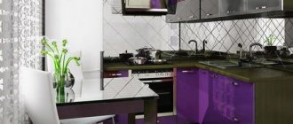
A very colorful and even respectable interior will be created with a rich purple apron.
A matte, ash-gray version is optimal for interiors in the neoclassical style, shiny mother-of-pearl for art deco, asphalt for a technogenic style, bluish for a romantic kitchenette. Combinations of creamy gray with soft pink, indigo, and emerald green look very beautiful. Gray and white checkerboard prints in the space above the tabletop look fresh and original - this design will not become outdated very soon.
If desired, you can decorate not only the apron with beautiful tiles, but also the entire wall
The apron is often matched to the color of the countertops or even made from the same material
Advice. It is not recommended to use more than two or three colors in one room. It is best to choose one main color, one additional color, dilute it with several bright accents, which will account for no more than 10% of the entire design.
A good option would be transparent tempered glass, under which you can place a photo print or simply leave a plain matte surface
About choosing a countertop for a gray kitchen set
Here's how to make a gray kitchen as stylish as possible:
- snow-white;
Photo from source: home-and-garden.livejournal.com Tabletop Cedar 1110/S White
- light gray tabletop;
Photo from source: designwiki.ru
Tabletop Cedar 4057/S Terezina
- with a surface imitating natural wood.
Photo from source: admagazine.ru
Table top Cedar 3829/Nw Bunratti Oak
An option that will make the kitchen set as seamless as possible is a countertop that matches the facades.
Photo from source: pinterest.ru
Table top Cedar 2338/S Lunar metal
When choosing a countertop, it is necessary to take into account that dirt and water stains will be most noticeable on dark surfaces.
In general, the countertop is one of the most important elements of a kitchen unit. It is important that it is of high quality, safe and retains its original appearance, despite external influences.
These are exactly the countertops produced by the Kedr factory! These are products made from chipboard, the formaldehyde emission class of which is E1, which means they are environmentally friendly. A huge selection of decors and reasonable prices - in the “Cedar” catalog you will find your ideal countertop!
Skin options for a gray headset (photo selection)
Skinali are wall panels with photo printing, highly decorative. They are made from various materials - glass, MDF, plastic, chipboard, fiberboard, metals. The picture here depends on the interior style of the room: for a loft, a photo panorama of a metropolis with skyscrapers is suitable, classics will be decorated with intricate plant patterns, and a futuristic kitchen will be decorated with stars and planets. Most often, skinals are made of glass - the material is easy to clean, does not absorb dirt, grease, water, and is durable and resistant to high temperatures. The photo image is also printed on the mirror. The product is usually made in one piece and has no seams or joints.
Among the huge assortment of images, you can choose exactly the one that fits into the design of the kitchen space
On the skin you can depict a whole plot, a complete picture
The original skins for the most beautiful white and gray kitchen amaze with their variety, but the following options are the most popular:
- sea coast with palm trees;
- wide-format images of roses, sunflowers, peonies, orchids;
- night city;
- dawn over snow-capped mountains;
- the underwater world of an aquarium with fancy fish;
- images of cute kittens, puppies, bunnies;
- open space;
- forest clearing, sunset over a summer field;
- imitation of natural stone, wood cuts;
- Cherry blossoms;
- an endless poppy and lavender field;
- savannah with wild animals;
- machines and mechanisms;
- bright exotic parrots, birds of paradise;
- large-format cherries, apples, pineapples, lime wedges;
- still lifes with vases, flower bouquets;
- copies of paintings by famous artists;
- abstractions;
- simple or intricate geometry;
- imitation of a pencil or watercolor drawing;
- antique brickwork.
To prevent the picture from fading over time, the surface of the apron requires proper care - not every material can be washed with aggressive household chemicals, abrasives, or hard metal sponges. You should inquire about the proper care of a particular apron when purchasing this item.
Glass apron with photo printing is resistant to abrasion and high humidity
The glass panel is made strictly to the size of the apron, so there are no seams on the surface, which makes maintenance extremely simple and fast
When it is decided to make the kitchenette monochrome, black, gray and white pictures are suitable: images of polar bears against the backdrop of endless snow, a panorama of a rainy city, imitation of old photographs, geometric gray and white abstractions. Less commonly, the space between the table and cabinets on the wall is finished with a skinal with gradient tints in a white and gray color scheme.
The main advantage of photo printing is the naturalness of the image on the surface.
If you plan to install sockets, switches or rails on a glass apron, their locations must be approved at the stage of ordering the product
Advice. The correct selection of skinals will make the interior unique, inimitable - if desired, they can be made to order at the nearest “copy center” that has the appropriate materials and equipment.
A contrasting apron is an ideal solution for a monochromatic interior
Lighting
Don't underestimate light as a design tool. After all, it can help change the visual perception of a room - highlight its advantages and hide its disadvantages.
In addition, light can even change the shade of gray and its saturation.
To prevent the kitchen from seeming gloomy, there should be as many lighting sources as possible. Therefore, one chandelier placed in the center of the ceiling will not be enough. It is important to supplement the main light with additional light, creating illumination for the work area, dining area and living room area if a gray kitchen-living room is being installed.
Photo from source: marinasvetlova.ru Tabletop Cedar 1110/S White
