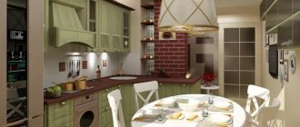
Neoclassical or modern classic - what kind of style is this? If the classic is a slender monotonous massive design inlaid with gold or silver. Then neoclassicism is not so strict! Therefore, the design of a kitchen in the neoclassical style is ready to absorb everything that you want to pull out of modernity and pour in here.
This is a kind of cheaper and modernization of the classics. But neoclassicism also has its own rules of the game, which we will talk about in this article! And this style, unlike the classics, is more suitable for our small-sized cars !
Kitchen design in the Neoclassical style: what is common with the classics and what are the differences?
So, what does this have in common with the classics:
- rich and strict interior style
- monotony of colors: exactly the same boring palette of colors, but contrasting shades already predominate
- uniform style and clear interior geometry
- light imitation of the classics: stucco on the ceiling, a little carving in the decor, arches, baguettes and plinths, but everything in moderation
- matte facades with milling, frames and glass
We will move quickly so as not to bore you with writings and move on to real work . We are studying a more down-to-earth style for our domestic market , and not for European mansions with huge areas!
Curtains and table textiles
The use of textiles in the work area has always been inappropriate for many housewives. The fire department also agrees. But when it comes to neoclassicism in the “+ living room or dining room” format, then you can’t do without curtains.
In terms of choice, you will have to start from the wall decoration. Usually preference is given to monochromatic, discreet colors, although often quite contrasting.
Curtains and table textiles in the neoclassical kitchen
What colors are preferable for a Neoclassical kitchen interior?
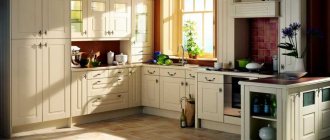
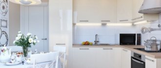
In neoclassicism, the color scheme is formed in the same way as in classical design - pallor and monotony in everything. As a rule, it is white, gray, blue and all shades of these colors. Let's go through each of them in more detail:
- white, beige, ivory (colors for both the set and the interior)
- gray and all its shades (even dark gray tones)
- blue, goes well with white and gray colors
Design Features
Neoclassicism left only the best features of the traditional style. They can be recognized in the design of finishing materials, furniture, individual decorative items, patterns and colors. In general, it is important to adhere to the general design principles:
- a bright, preferably spacious, open-plan room;
- symmetry in design;
- moderate decor;
- high-quality finishing and furniture, without the use of plastic. Despite all the democracy, neoclassicism does not accept cheap substitutes for natural materials.
Finishing floors, walls and ceilings
The walls in neoclassical style are decorated with decorative plaster or covered with wallpaper. Depending on the budget allocated for repairs, plaster can be either the simplest, imitating the texture of fabric (there are many free master classes on the Internet on how to apply it yourself and create a simple pattern), or complex, with shimmers of light and a glow effect.
In the decoration and decoration of walls, you can use moldings made of wood, plastic or polyurethane foam, painted in the color of the walls. Such a detail, when mounted in a certain way, not only decorates the room, but also corrects its shortcomings: it will add volume to the room or visually raise low ceilings.
Wallpaper can be plain, paintable, or with an unobtrusive pattern in a classic theme:
- vegetable;
- Damascus;
- meander, etc.
Furniture arrangement in Neoclassical style
In principle, the shape of a kitchen set in the neoclassical style can be any - straight, corner, U-shaped or island. It all depends on the design of the room. Proportions are important, but not as much as in the classics.
The formation of a headset can begin from any corner , and not just from the center.
If space allows, then a dining area can be provided. If everything is tight and we need to squeeze in, we combine the project with the living room or do without chic round tables. Neoclassicism will endure a lot!
Make portals and hidden modules for equipment according to your ability, desire and budget! There is no strict accent here as in the classics.
Decoration of the kitchen-living room
The interior of the kitchen-living room assumes a traditional placement of functional areas. The cooking area is located near the far wall. The dining group is separated by a bar counter or island with an additional work surface. Next is a place to rest.
The layout of the kitchen unit depends on the configuration and size of the kitchen-living room. Both straight and angular or U-shaped designs are appropriate here.
A set with an island module, ready to serve as an impromptu dining room, is also suitable. In neoclassicism, unlike classicism, taking out the dining group is optional.
The photo shows a kitchen-living room with an L-shaped set in a dark azure shade.
You can also choose a sofa as a compositional center. The rest of the furniture in this case is installed around the perimeter of the room. The furniture set is also complemented by armchairs, ottomans, a coffee table or coffee table.
A buffet with glass doors, hanging or floor-standing cupboards for dishes will fit perfectly into the interior of the kitchen-living room.
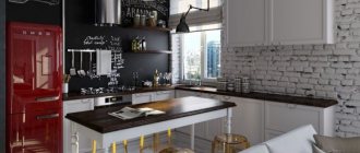
Apron in Neoclassical style
This is why we love neoclassics! You can play with colors and materials. The material for the apron is hog tiles, bricks, ceramic tiles, artificial stone with texture or similar patterns.
Sometimes they make mosaics, but then it is better to refrain from using calm, non-contrasting palettes.
One of the most exquisite combinations is white glossy tiles and gray facades !
Color combination
Blue and white
The combination of blue and white colors is widely used in marine-themed interiors. White will perfectly complement blue, but it is better if none of the colors dominates or there is more white.
However, both colors are quite cold, so it is better to add warm and bright accents to this pair - for example, yellow or orange. White will go well with both light and dark shades, so it can safely be called one of the best companions to blue.
Advice! Blue and white will look very good when creating ethnic motifs - for example, Gzhel.
Blue and yellow
Blue and yellow are the same dilution of cold colors with a warm palette that was mentioned earlier. And although these colors are opposite in the gamut, their joint use is most often successful.
Such a contrasting kitchen can also be used to create a marine-themed interior if you choose light shades of yellow and rich shades of blue.
In addition, blue will complement sandy shades of yellow well. In general, with the right selection of shades and design elements, this combination will be very successful.
Blue and orange
The effect of blue-orange is very close to the combination of colors described above. However, in practice, the personal combination of blue and orange is most common: largely due to the fact that the sunshine and cheerfulness that are characteristic of orange brighten up the coldness and detachment of blue well.
One of the possible color solutions is to decorate the walls in light shades, the kitchen unit in dark blue, and the table and chairs or sofa in bright orange.
But this combination requires a very careful attitude to shades and careful selection of every detail of the interior, so it will take a lot of time and effort to create the ideal kitchen design.
Blue and beige
Beige color is known as one of the most universal, so there is no doubt that it goes well with blue.
Being something between cold white and warm yellow and orange, beige absorbs all the advantages described above: it adds warmth and comfort to the interior, and maintains the nobility of blue. A large number of shades of beige makes various combinations available.
When beige and blue are combined, most often the first color is the main color, while the second can be present as details: the façade of the set, the apron, curtains, tabletops, etc.
It is better if there is more beige in the interior design than blue - this will avoid the cold and gloom of the kitchen.
Blue and gray
To create a discreet and elegant design, the gray-blue combination is ideal. Shades such as lavender and silver, rich blue and classic gray, soft lilac and pearl go well together.
It is worth cautioning against decorating the kitchen only in this color scheme: without warm shades, the risk of feeling cold and uncomfortable is too great.
A blue-gray kitchen most often corresponds to a modern style, although it can also be used in classic interiors. Most often, blue is used as a headset color, and gray in all other details.
Advice! Among shades of gray, metallic is a particularly good companion to blue: this combination will fit most successfully into rooms located on the warm, southern side.
Blue and black
Combining blue and black tones, there is a high risk of “drowning” in the gloom of the kitchen space. Since these colors themselves go well together, you can use them as accents in a light, for example, beige kitchen.
For example, a black apron and a blue and white set with an overall light wall design can be a good idea for decorating a kitchen. In general, the combination of black and blue is not the best option for the dining room, but it also cannot be considered unfavorable.
Blue and wood
Being somewhat of a shade of brown, wood is one of the best companions to blue. This combination can be used in kitchens of any style and design: wood will look good as almost any interior detail.
Light wood in combination with blue can create a nautical dining room design, dark wood is suitable for classics. It is better if the color of wood is present in the kitchen in the same quantity as blue, and this pair will be complemented by any of the shades listed above: gray, black, beige or yellow - they all go well with the naturalness of wood and the freshness of blue.
Basic ways to select color combinations
If you are afraid of missing out on choosing the right colors for your new kitchen set, use a color wheel (any scheme will do). You can also rely on the taste of designers and search among time-tested ideas.
These include a combination with an achromatic color. Achromatic (literally colorless) are black, white and all intermediate shades of gray. The beauty of neutral tones is that they can be combined with each other and with any other color; the result will always be flawless. If you like the color blue, but on furniture it seems overtly provocative, the best solution would be a kitchen with a blue bottom and a white top.
Another possible option would be a combination with basic tones (also called neutral). These include cream, beige, greige - gray-beige (or dirty beige) color, as well as a palette of natural wood, metal and stone. They are familiar to the human eye and go well with each other, but they must be combined with the rest of the palette with caution.
As a rule, they try to make the upper facades neutral. In addition to white and beige, sand, coffee with milk, cream, and ivory are popular. Pale variations of yellow, lilac, pink, as well as complex tones: olive, mustard are pleasing to the eye.
If the kitchen is large, the top tier can be made brighter by choosing the color of apple green, mint or orange. In this case, the facades of the lower row are made black or brown (a cool shade is needed). A bright kitchen set requires a neutral finish on the walls, floor and ceiling.
Although brown is considered a complex color and difficult to pair with pure bright colors, this is not the case with wood. Any wood in the interior gets along well with any other shade, and this property is widely used. A kitchen whose top is glossy white and whose bottom is made to look like wood is a win-win option for many styles and for rooms of any size.
A proven way to get a beautiful result is to use a monochrome combination. In other words, two shades of the same color are selected for the top and bottom, differing in lightness or saturation. You take sea green, dilute it with white, and get a lighter shade as a pair. Lilac mixed with black allows you to get a calmer, muted tone. The one tone rule is easy to follow and you don’t have to worry about the result.
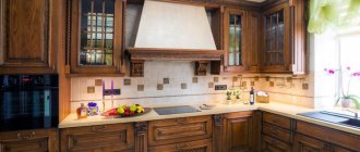
Material for countertops in Neoclassical style
Materials for countertops in neoclassical as well as classic are stone, quartz, but more often designers use wood, or rather a wood-like texture. And it doesn’t matter natural or artificial .
How does neoclassicism differ from classics?
Classic interiors are heavier, they have more details and decorative elements. Neoclassical - lighter, more ergonomic, more practical. Classics have more curved lines and complex shapes, while neoclassics has more laconic silhouettes.
Photo: Instagram @nuvointerior_design
Photo: Instagram @nuvointerior_design
Photo: Instagram @iltesoro.online
Photo: Instagram @iltesoro.online
Photo: Instagram @iltesoro.online
Photo: Instagram @iltesoro.online
Classic furnishings are limited by strict boundaries, while neoclassical furnishings are more flexible and open to new trends.
Photo: Sergey Ananyev. Project author: Ilya Shulgin, Kirill Kochetov
Photo: Sergey Ananyev. Project author: Ilya Shulgin, Kirill Kochetov
Photo: Instagram @qprojectkz
Photo: Instagram @qprojectkz
Photo: Konstantin Dubovets. Project author: Natalya Nikiforova
Photo: Konstantin Dubovets. Project author: Natalya Nikiforova
What kind of floors are in the Neoclassical style?
In a combined living room or separate kitchen, patterned tiles, laminate and parquet, mostly in light colors, look great. A dark floor will stand out and steal the spotlight!
Coating texture:
- natural wood with bevel fits well
- tiles with discreet patterns
- laminate also in wood effect
We proceed from the principle that the more monochromatic and less bright the floor, the better for style. It’s much more interesting to play around with the walls and colors of the set than to draw attention to the floor!
Individual elements of contrast on the floor will look better than a monolithic red canvas over the entire area as in the photo above.
Furniture and accessories
A feature of the kitchen, decorated in neoclassical style, is the presence of a central dining group. Another option is a functional cooking island that also serves as a dining area.
The main lighting is located above the dining center in the kitchen. Furniture should not be bulky or look too massive. Natural wood is usually chosen as the main manufacturing material.
It is necessary to observe the basics of symmetry, which are characteristic of neoclassicism. The table should have the correct shape (circle, oval, square, rectangle), stand in the middle of the kitchen, chairs should be located evenly on all sides.
Expert opinion
Olga Kovalenko
Since 2010 I have been engaged in interior design and architectural design.
The dining room space should not be overloaded with furniture.
It is customary to use traditional chairs with soft seats and backs covered with fabric. The colors of the textiles are plain or with a soft floral or geometric pattern. The upholstery of chairs or armchairs in the kitchen can be made of velvet, silk and other elegant fabrics.
When using a high table (island, bar counter) indoors, select appropriate chairs or stools made of wood with a soft textile seat.
If the kitchen is combined with the living room, the design requirements also apply to the furnishings in this part of the room. Usually there are straight sofas of a single color and a coffee table in a classic style. A fireplace near the wall is appropriate if the kitchen unit does not have a portal.
Interior decorations
Decorative items correspond to the exquisite antique design; there should not be too many of them. These are things with meaning that look prestigious and support the composition and spirit of the entire kitchen.
For decoration the following may be suitable:
- antique clock;
- china behind the glass sideboard door;
- elegant figurines;
- antique bowls;
- lace linen tablecloth;
- still life paintings in massive frames;
- fresh flowers in a minimalist vase, etc.
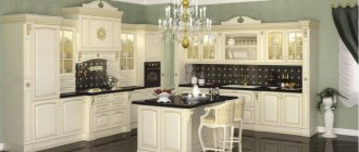
Kitchen set
Kitchen facades are usually framed, with a patina, the fittings are antique, refined, with a hint of solemnity. Stained glass windows and mirrors are also relevant, but open shelves are not welcome.
Kitchen modules are installed based on the layout of the room and the preferences of the owners. It is advisable that there is a cornice above the upper cabinets.
Often the set includes a kitchen portal - a monumental decorative element reminiscent of a fireplace or an ancient stove. There is a hob in the center, a hidden hood above it, and an oven below.
If there is no portal in the kitchen, an open air duct will do. It can have either a modern, laconic design or a traditional domed shape.
Neoclassical walls: color and design
We use wallpaper that can be painted in light colors, even white, like in hospitals. Plaster, stone and finishing small areas with bricks . By the way, photo printing and discreet drawings are possible. Interior design depends on the designer’s experience and understanding of style.
Blue kitchens: features of color perception
Only the lazy do not talk about the coldness of blue.
However, perceiving it purely through the prism of the temperature effect is a very naive simplification. In fact, it has many options - and each of them is perceived differently by a person. Thus, the darkest tones - ultramarine, indigo, sapphire, Prussian blue - due to their ostentatious self-sufficiency and thoughtfulness, will definitely go down well with those people whose temperament is dominated by phlegmatic traits. They are absolutely not loud and perfectly convey peace in all their implementations.
But only if they are carefully dosed and diluted with other, more mood-friendly shades: if you overdo it, you risk letting darkness into the room and completely killing even the most brutal appetite.
Cobalt, denim or royal blue are a more delicate and less “gloomy” group. These are universal shades that do not irritate the eyes and at the same time have a positive effect on a person’s emotional background.
Heavenly, sea wave, pale cornflower blue and gray are not as intense options as above. The motifs of sea freshness are easily read here. They charge the space with vital energy and air, so in kitchens with their predominance it is always pleasant to breathe, and a cup of coffee, drunk in the morning, invigorates the whole day.
Of course, these are not all possible shades of color. Listing to the last is a thankless task. You just need to adopt 3 simple rules with which you can successfully fit even the most capricious of them into any interior:
- Deep blue is best revealed in rooms on the south side, where the sun's rays smooth out the overall coldness of the color presentation;
- if there is not enough usable area, use light blue versions as a background (walls, ceiling, apron);
- Since this color visually makes the furniture heavier, be careful with its quantity.
Ceiling in Neoclassical style
Better standard options are original ceilings with a composition, light patterns, or matte stretch ceilings in one or two levels.
The color of the ceiling is preferably white. Shades of gray are possible. Look at the color scheme of the headset and it’s already worth dancing with.
If budgets allow, stucco molding and baguettes with classic patterns. Colors without bright excesses, as in the design of floors.
Lighting
Light also plays a big role in a neoclassical kitchen: it should not be too bright or dazzling.
There are thick curtains and tulle on the windows so that the sunlight is diffused and softly covers the room. If we talk about electric lighting, then this is only an expensive chandelier. The bigger and more beautiful the better, but don’t forget about proportionality relative to the room. An ideal option would be a forged or crystal chandelier.
Sometimes spotlights are additionally installed in the work area for convenience. The only condition is that they be invisible when turned off. If desired, you can add designer lighting in the form of sconces or floor lamps with large lampshades. Candle-shaped lamps would also be appropriate.
The details listed may seem too complex and specific to implement. For this reason, the style and design of a neoclassical kitchen is often entrusted to a designer. He may even deviate slightly from the listed requirements and create neoclassicism in an already finished kitchen, adding or subtracting something. But you should be careful, since any deviation can spoil the perception of neoclassical cuisine.
How to reduce the cost of kitchen interior design in the Neoclassical style?
Creating a kitchen design in the neoclassical style, just like the classic style, requires significant costs, although a little less. It is quite difficult to fit this style into our standard apartment designs on its own. Although everything is possible!
Therefore, you can save money, but only on condition that you entrust this work to a good and experienced designer who can create an interesting interior design project in a neoclassical style!
And that's ALL for us! We hope that you did not waste 15 minutes of time studying this material. However, we don’t say goodbye for a long time, so see you soon!
Types of directions
Modern classics can become a replica of various classical movements, simplifying them and adapting them to modern realities. Let's see how such an interpretation can look using the example of specific interiors.
English neoclassical
English classics are distinguished by a bright design and an active color scheme using red, blue, and emerald. The recognizable pattern, which is the hallmark of the English classic, is a large checkered pattern. But this is not the only print that you can afford in such an interior. The combination of different, seemingly incompatible patterns, an abundance of textiles and furniture form its basis. In a modern interpretation, you need to reduce the degree of traditional clutter by letting a little more light and air into the interior.
French
The French do not accept feigned luxury and excesses, so their classics were initially distinguished by maximum simplicity, large space and a sense of proportion. The ideal conditions for creating French classics are high ceilings and large windows. Stucco molding, snow-white colors, bohemian and rare decor are the characteristic features of this trend.
Ascetic interiors in a cold white color scheme do not cause rejection, but give a feeling of lightness and freedom.
See also: 107 of the most beautiful kitchen interiors in the Provence style.
American
The essential elements of an American-style kitchen are a spacious room, an open plan, an island kitchen with a breakfast bar, and a separate pantry.
Useful design hacks for a small kitchen:
1. Careful handling of color. You should be careful with rich, active varieties of blue in small rooms: firstly, in a limited space, a bright option will be more striking; secondly, some halftones can visually make an already small kitchen smaller.
2. Dark undertones can expand the space. Many people know about the ability of light shades to visually expand a space, but deep dark shades work in the same way (look at the photo below).
3. The more active the shade, the better the lighting. Otherwise, the tone distortion will be too obvious - and can change the entire atmosphere of the interior.