Colors have such a strong impact on a person that their influence is used in psychology to correct various conditions. Therefore, the choice of color palette for each room should be approached carefully. And the kitchen is no exception.
Kitchen interior design, namely its colors, can make a room visually larger or smaller, warmer or cooler, higher or lower. Color can control appetite and mood, so do not neglect such an effective tool. Corner and small-sized kitchens are transformed with a competent choice of shades.
Color palette scheme
Despite the fact that white, black and gray are considered universal and widely used, the achromatic range, according to psychologists, can cause depression. That is why so-called chromatic shades are always present in any design. Whether they serve as a basis or as contrasting accents is a choice for the designer and the owner of the room.
All color combinations can be divided into 4 categories:
- monochrome;
- contrasting duets;
- triadic;
- adjacent schemes.
From the name it is obvious that a monochrome design will be made in almost one color, perhaps with slight variations in shade. The rest of the combinations are based on the principle of the arrangement of colors on the color wheel.
Contrasting combinations are created from shades that are located opposite each other in a circle. It can be either two tones or 4. Then they are selected according to the principle of a quadrangle - rectangle, rhombus, square. These will be harmonious, but rather contrasting shades.
The triadic scheme involves choosing shades on a circle located at the vertices of a triangle. In fact, these are three colors that are organic in their palette, but quite different in their main shade.
Adjacent combinations are also called analogue, since they are located next to each other on the color wheel. For example, these are pink, purple and blue. Another option is green, yellow and orange. Despite the fact that, according to the laws of composition, one tone should be the basic one, you can find many interesting and rather colorful exceptions, which at the same time remain harmonious.
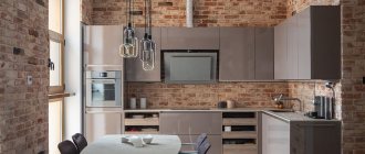
The photo shows a kitchen composition based on an equal proportion of three analogue shades.
Each scheme has its own characteristics and provides ample opportunities for implementing the range in the interior. Monochrome design always looks quite stylish, and within its framework, shades of the same color are added to the variety.
Combined solid and veneer facades: advantages, disadvantages
Front panels made of solid wood in combination with veneer - this is noble respectability, special energy in the atmosphere of the kitchen. The frame part is usually made of wood, and the panel is made of veneer panels.
Advantages of natural materials:
- excellent appearance;
- maintainability;
- plasticity of natural texture;
- variable processing capabilities (carving, inlay);
- expressive texture.
Their disadvantages include:
- high cost (although the use of veneer somewhat reduces the cost of the finished product);
- ability to absorb odors;
- moisture sensitivity.
Rules for combining colors
Whatever scheme you choose, you need to paint walls, floors, ceilings, and facades taking into account simple rules:
- Do not use more than five shades: the floor, walls, suspended ceilings, facades, and apron can be decorated in different shades. The top is usually lighter, the bottom is dark. The exception is kitchens in particularly spacious rooms.
- The walls should be lighter than the flooring. If the floors are brown, the walls will be beige. If you choose a light floor covering, then other surfaces will be white or ivory. In such interiors, pastel shades are often chosen for painting furniture.
- Kitchen facades should be darker than the walls. The dark shade for the walls is applicable only in the accent area.
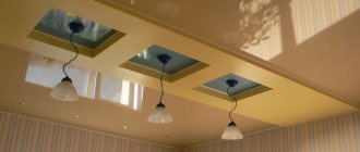
- Kitchen ceilings should be lighter than the walls and furniture. But there is also room for combination, where you can use a fairly dark tone for zoning or accentuation. If you choose suspended ceilings, you can use a multi-level design.
- You can combine light and dark, bright and neutral, universal and catchy. Two bright ones cannot be used in equal proportions, just like two dark ones. But any light color, like universal tones, can occupy large areas - not only walls and floors, but also suspended ceilings, sets, corner sets and aprons.
Combination of MDF and chipboard in facades: advantages, disadvantages
A common option when creating combined front panels is a combination of chipboard, used as a panel part, and MDF. Some pendant modules are decorated with glass inserts (frosted or transparent).
Advantages of frame facades:
- practicality;
- the ability to choose any shade;
- affordable price.
The disadvantages include:
- low wear resistance;
- profile seam connection;
- deteriorates from exposure to moisture;
The use of MDF allows you to think through the finishing details - carved elements, patination, decorative moldings on modules that create the effect of antiquity. They add originality and charm to the kitchen ensemble.
Kitchen color palette options
When developing a kitchen design, everyone chooses a palette to suit their taste and requirements regarding the correction of room parameters. For example, corner sets should be painted in a light tone, but at least the top of the facades should be such as not to aggravate the poor lighting in the corner. You can use not a plain bottom or top, but a contrasting pattern. But if we talk about island or rectilinear sets, then here you can find more options for furniture. And each of them has a harmonious solution with a special character and mood. At the same time, the chosen interior style is also important.
Technological kitchen solutions are usually painted in a rather cool palette using grey. Country styles use warm colors, muted and neutral tones. Classic and retro trends often “choose” white surfaces with luxurious gold or burgundy trim. Art Nouveau style is a natural, but quite bright interior. Obviously, every design has its own priorities and harmonious combinations.
Gray palette
Gray color is a neutral color with a universal character. But, as already mentioned, this is an achromatic tone, so a monochrome kitchen in this shade will be too depressing. But it is combined with the entire palette of the color wheel.
- The most common solution is a combination of gray and white. These are mainly modern kitchens in minimalist and technological styles. Here gloss and some third color are used in accents - absolutely any one you like. The facades can be one color and another as the background, so combined solutions directly in the decoration of the set are also appropriate. Different options apply here: both the top and bottom can be gray or white.
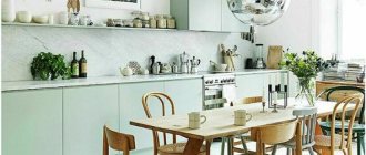
- The duet of gray and pistachio shade also looks interesting: it is a fresh combination, applicable in such a design style as modern. Light green stretch ceilings are appropriate here. The facades can be either pistachio tones on a gray background or combined.
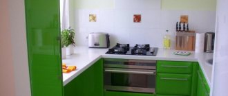
The photo shows pistachio-colored facades in combination with a gray tint: glossy tension fabrics are in harmony with the metallic shine of the pistachio set.
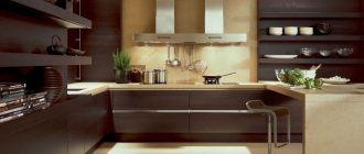
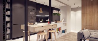
- In a matte finish, gray perfectly complements brown wooden facades. This is a natural solution that will make the headsets harmonious against any background - both neutral and quite bright. Furniture looks organic where the top is gray and the bottom is natural wood. In this case, the design will help make the room more spacious and visually taller. This is the best option for modern style, functionalism, Japanese minimalism.
- Gray goes well with any bright shades. It looks organic with red, orange, yellow, blue and cyan. A combination with a mother-of-pearl coating will look gentle and romantic; matte facades will be optimal in a metallic color, in modern or country style.
In the photo there is a kitchen in the Art Nouveau style with gray and red furniture.
Similar to gray, black and white are considered universal. Black usually colors the bottom of the furniture or the outline of it, and the top complements the light or rather rich tone. White kitchen sets can also be combined with completely different shades, which determine the mood of the interior. That is why the main impact on the character of the room is exerted by a more saturated and bright - chromatic tone.
Red gamma
This is an extravagant color that is chosen to be combined with different shades. Modern kitchens can be monochromatic, but most often the facades are combined:
- The color of fire is harmonious with gray, white and black. Perhaps it makes no sense to even mention such universal combinations. But it is important to distribute and harmoniously arrange the shades. The bottom is usually painted a brighter color, and the top of the furniture is a calmer color. Floors and walls are painted in neutral colors. Fiery-colored stretch ceilings are appropriate here in one area - above the dining group.
- Red with green or pale blue looks interesting. This interesting solution is applicable in modern styles, modern, eco and country design. When combining fiery with shades of pistachio color, the latter can become the background.
Violet tones
Lilac and purple shades look mysterious, gentle and romantic. But not everyone can use them. Therefore, the decision to combine this color is not easy:
- The combination with shades of pistachio color is a natural and quite interesting option for a harmonious kitchen. Let's use this duet in the style of modern, high-tech, romanticism. You can distribute the tones in different ways: paint the top a lighter color, and the bottom a darker one, it all depends on the saturation of the purple.
The photo shows a kitchen in a combination of lilac and pistachio colors.
- Violet is organic with yellow, pink and blue. Such combinations are used on a neutral background, but depending on the saturation of the shades, they can be used on different surfaces, or color corner sets. For example, dark purple stretch ceilings will be an excellent accent for zoning the dining area.
Palette of blue and green
These shades also have a natural palette and bright contrasting solutions. They are used in a variety of combinations and tones. For example, a shade of pistachio color is in harmony with almost the entire range, but azure will be more appropriate with neutral surfaces.
The photo shows corner solutions for a small kitchen in the Art Nouveau style: suspended blue ceilings and azure furniture.
This range is harmonious with both bright yellow and the entire neutral range. Based on blue, you can create a cozy Mediterranean style, green is closer to eco-friendly directions.
Of course, you can find many combinations and harmonious solutions; it is important to choose a range that is comfortable for yourself, because it affects the mood of all family members. It is advisable to take into account the parameters of the room in order to use color to create not only comfort, but also a functional, spacious interior.
Advantages of combined kitchens from
Our furniture factory offers comprehensive solutions for arranging kitchen and dining areas in city apartments and country houses. We are ready to implement any of your ideas, taking into account individual wishes and characteristics of the premises. Our own production, qualified employees and a wide range of materials allow us to create combined kitchen sets with an excellent set of characteristics.
- Original design.
For each buyer we develop an individual project in the chosen style and color scheme. Thus, finished kitchens can have an interesting look with two colors or a wider palette. In any case, they look stylish and presentable. - Excellent ergonomics.
Regardless of the furniture configuration, we provide maximum comfort for the set. All our projects have an ergonomic work area and well-placed sections with built-in appliances and storage systems. - Reliability.
We use only high quality materials. To create furniture we use solid wood, laminated chipboard and MDF, as well as various finishing options. The furniture is complemented by reliable household appliances and durable fittings from world brands. - Functionality.
Combined kitchens, at your request, are equipped with a variety of opening mechanisms, roof rails, retractable drying racks and containers, mesh organizers and other accessories. They make headsets convenient and practical to use. - Full readiness.
By ordering turnkey kitchen sets from us, you can create a fully equipped and ready-to-use space with furniture, a set of household appliances, a competent lighting system and other attributes.
Get acquainted with our capabilities using design photos from the catalog and apply for an individual production of a combined kitchen!
Materials
Today there is a wide selection of materials of different textures and colors. This allows you to create any style in the interior using kitchen facades.
To choose an original print or a front of unusual sizes, order an individual model of the product from the manufacturer; there are also many excellent ideas for fronts presented in the IKEA store. Among the huge assortment you can easily find facades of any size for the kitchen.
Tabletop for every taste
The range of materials for countertops makes your eyes wide open. Models made from chipboard, natural wood, glass, stone, ceramics, and stainless steel are available for sale.
When choosing a countertop, first of all pay attention to its functionality, and then to the design. A good countertop should be moisture resistant and provide you with quality for a long time after purchase. Let it not stand out from the style of your existing kitchen furniture.
WATCH THE VIDEO
Be sure to consult your retailer for proper care. The information obtained will help extend the life of the countertop and repair minor damage yourself. Just in case, ask where to go if DIY reconstruction is not possible. Combined kitchens today are truly fashionable and stylish.
