Photo: design.iconinteriors.ru Tired of overloaded and colorful kitchens? Have you long dreamed of a laconic and practical environment instead of heavy sets and massive tables? Don't know how to make your kitchen truly minimalistic and stylish, and not just empty and uncomfortable? This is not a problem, because we are already ready to share secrets and tricks. We will tell you what materials and colors to choose, how to plan the space and what furniture to pay attention to!
Features of minimalism
This style is very simple in its essence, but at the same time significantly different in its manifestations. Several distinct trends stand out: Japanese, futuristic, environmental, Scandinavian, contemporary, high-tech. But basically the lines between styles are very blurred, and even more so when original designer interiors are in fashion.
The common properties of all minimalist movements are the simplicity of forms and materials. Clear geometry always reigns here, there is no decor or complex textures, but there is maximum light. With all the rigor, there is no need for classical symmetry or pronounced centers. But working with space is relevant: zoning, unification, division.
Advantages and disadvantages
In the modern world, the minimalist trend is popular. Its versatility and conciseness attract many, but, unfortunately, they are not suitable for everyone. This is not just an interior style, but a way of life, a certain view of surrounding things and events.
Minimalism has the following advantages:
- a lot of empty space for light and air;
- comfort, the emphasis is on one precisely thought-out thing;
- ease of cleaning, absence of dust, dirt, unnecessary decorative items, dishes, textiles;
- parquet floors and painted walls are a traditional solution for this trend.
Minuses:
- This design in the kitchen is not suitable for people who are accustomed to collecting cups, plates, and souvenirs.
- The more laconic the appearance of an item, the higher the price. For this style, many products are made to order.
When deciding to renovate your kitchen, you should carefully assess your psychological readiness for sudden changes in your home environment.
Color spectrum
The color scheme of minimalist interiors is always simple and restrained. You rarely see more than 2-3 colors in one room, and there are even monocolor interiors. Think over this moment in advance so as not to make mistakes with decoration, furniture and accessories.
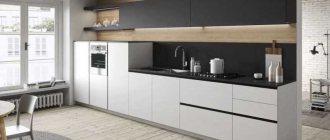
White kitchen in minimalist style
The choice of shades of white is much greater than it seems at first glance: from the bluish whiteness of futuristic interiors to the warm milky Scandinavian ones. This is a classic of any minimalist interiors, because it is the most neutral and light. Black or bright colored accents stand out especially effectively against a white background.
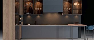
Black kitchen in minimalist style
Jet black has two main uses: as a base or as a contrast. In large, spacious and bright kitchens, you can safely use it as a basis - and your interior will always be stylish, elegant and expensive. Or use it for contrasting inserts on a light background to define zones, visually adjust geometry or increase the space of a room.
Beige kitchen in minimalist style
Warm, cozy beige in all its variations is another classic minimalist base. In the kitchen it is more practical than white, because it does not stain as easily, but at the same time it is warmer than gray - which means it is suitable for cold northern rooms. Beige kitchen is good in natural materials, with wood, cotton, linen, bamboo and fresh flowers.
Gray kitchen in minimalist style
Gray came into fashion several seasons ago, and is now used as the basis of most modern styles. In minimalism, cold steel, warm brownish taupe, and dark graphite shades are good. At the same time, gray is metal, mirrors, chrome plumbing, household appliances, and fittings.
Bright accents
In addition to neutral colors, minimalism also requires bright colors: green, yellow, purple, red, orange, pink, blue. They are becoming less and less common as the main decoration, but it can be an accent wall, facades or accessories. Such a kitchen immediately acquires its own mood and atmosphere.
Characteristic colors for kitchen decoration
To create the background, basic and neutral colors are used - white, black, brown and their shades. Bright colors are acceptable as accents that make it easy to change the mood of the interior.
To prevent the atmosphere from seeming cold and gloomy, use warm shades, combine colors close to the color wheel, play with different shades of the same color so that the monochrome interior does not seem boring and monotonous.
White
This is the base of minimalism, which goes well with any shades and bright accents. It is the light color palette that gives the style’s characteristic sensations of freedom and spaciousness. And in order not to create a feeling of sterility, it is necessary to choose the right shade of white, because there are actually a lot of them: alabaster, milky, creamy, coconut, etc. The undertone is important, as it affects the overall mood of the interior.
In rooms with a lack of sunlight, warm shades of white work well.
You will find everything about white kitchen design here >>> go.
Grey
Gray color will perfectly complement white. Depending on the level of its saturation, you can play with contrasts or, conversely, make smooth color transitions. Light gray can also be used as the main background in kitchen design, if there are no problems with a lack of natural light during the day.
Why gray kitchens are at the peak of popularity and how to add color to them, you will learn from our article.
Black
Black can be used in small quantities to create color contrasts and visual effects. For example, a black wall creates a feeling of endless space and a portal that dissolves the boundaries of the room. Light decor and wooden surfaces stand out against a black background.
The smaller the area of the room, the less black there should be.
Watch a video review of a stylish kitchen-living room with an island in dark colors:
Brown and beige
Brown can be presented in finishing materials imitating natural wood or in stone finishing.
Beige, earthy, sand and shades close to brown look softer than grey, white or black, so a pale range of brown shades can also be used as a base.
See also: 143 fashionable beige kitchen interiors.
With bright accents
Color accents are a great way to enliven the interior, give it dynamism and smooth out the severity. But it is not recommended to use bright colors in large quantities: a couple of bright spots are enough. For example, kitchen chairs or a sofa, paintings on the walls, facades of the top row of furniture, curtains can be bright.
Kitchen furniture in minimalist style
A minimalist kitchen needs the most concise and functional set. Pay attention to furniture with simple smooth facades, without handles or visible fittings. Choose modern retractable, collapsible or folding systems that can easily accommodate all kitchen utensils. This is a good replacement for massive cabinets with hinged doors.
Apartment design in Scandinavian style (80 photos)
What is a U-shaped kitchen?
The U-shaped kitchen is located along three walls, in the shape of the letter “U”. Which walls to use for this (including those bordering the window) are chosen by the owner, to his taste.
However, there are some rules that should be followed.
Decor
In a minimalist environment, meaningless decor is not appropriate: on the contrary, your task is to relieve the space of all unnecessary things. To decorate, use laconic bright accents: a poster on the wall, a composition of succulents in the corner. Even properly selected household appliances or heating radiators can become an independent accessory.
Selection of household appliances
It is highly advisable to use exclusively built-in equipment. This even applies to microwaves and coffee makers. Provide a special niche for small household appliances (blender, meat grinder and other accessories). Small devices can also be hidden in a kitchen drawer. As a rule, a built-in hood is used. If you manage to find a modern model with an unusual design, then it also has a right to exist.
The dining table should be comfortable; for this purpose, a large-sized option is also suitable. The materials used to make countertops are: solid wood, chipboard veneer, glass, natural or artificial stone; MDF can be considered as a budget option. You can choose a kitchen table of any geometric shape, the main thing here is ease of placement. A transformable table with a folding or sliding tabletop will feel great in a miniature kitchen. Try not to look at book tables.
In such a kitchen, the combination of a black or light gray countertop with chrome-plated steel legs is ideal. Light plastic in combination with natural wood also allows you to get an impressive result. The combination of these materials will bring coziness to the interior and make it more “spiritual”.
If the dining area is connected to the living room, then it is preferable to use a bar counter with a fairly wide tabletop as a table. It will be replaced by a more progressive solution - a kitchen island or window sill, covered with the same material as the countertop.
Transparent furniture will also confidently take its place in a minimalist interior. Colorless chairs are almost invisible in the interior, so they fill the space with lightness. Colored chairs will perfectly serve as a bright accent to an interior made in nude tones.
Curtains and textiles
Avoid meaningless textiles, as well as useless decorations - in the case of the kitchen, this is also practical. Instead of voluminous curtains and flowing tulle, use roller curtains. But napkins, potholders and towels in the same style will become the very functional accessory. Little things made entirely in one color, in several adjacent shades, or in bright and contrasting colors, but from the same fabric, look interesting.
Sofa
It is useful and convenient to add a corner sofa to the project. It is often combined with a dining table and placed at the end of the kitchen.
Another option is a transforming sofa. It will additionally provide a place for rest; it has storage shelves.
The dining table is often chosen to have a folding design. This saves space: The compact model is convenient to store, it unfolds easily and quickly if guests come.
Materials and design
Classic oriental style gravitates towards natural textures: wood, paper, stone, natural fabrics. And its newest trends actively exploit gloss, mirrors, acrylic, glass and chrome. The combination of the incongruous actively promotes contemporary art, another style whose formation was influenced by minimalism.
Floor finishing
For a minimalist kitchen floor, there is nothing better than tiles: ceramics, stone or large porcelain stoneware. It does not get dirty, it is afraid of moisture, does not absorb stains and is easy to clean. Choose a series with a textured or anti-slip coating - and it will also be safe.
If you prefer wood in the interior, use laminate, but take into account the specifics of the kitchen. Choose only moisture-resistant collections with special protection for all seams and junctions. Or, as a radical alternative, pay attention to monolithic self-leveling floors.
Ceiling design
In a minimalist kitchen, tension structures that hide communications and lamps look most appropriate. They delight you with a choice of colors and textures: matte, satin, glossy, in any tones and shades. At the same time, it is just a PVC film that is not afraid of moisture and can be easily washed even from grease with a soapy sponge.
Wall decoration
For minimalist walls there is no better option than the most banal painting. Just choose waterproof and washable paint - and then you won’t have problems even with light-colored surfaces. And if you want to refresh the interior, you just need to repaint the walls again.
Less commonly used are wallpaper, textured plaster, slabs or cladding panels. But the walls are a neutral background for the rest of the interior, so they should be plain. In such a kitchen there is no place for floral patterns or elaborate monograms: the maximum is geometric contrasting inserts.
Apartment design in Provence style (60 photos)
Tabletop
The most popular are black, steel and gray countertops. Artificial and natural stone fit harmoniously into a single interior concept. It is desirable that it be monochromatic, but it is also possible to use material with a slight shimmer effect and pale, not pronounced inclusions of particles.
The apron can contrast with the main color of the facades or be made in a single tone. The set where the tabletop and apron are made of the same artificial stone looks especially attractive. An ergonomic and stylish solution will impress the owner of the room and all his guests. A finished kitchen in which such a solution is implemented will perfectly support the overall aesthetics of minimalism. Glass splashbacks are also gaining popularity. They can be transparent or painted in one color. An excellent choice would be to use simple, plain tiles made to look like brick. The tile has a chamfer or is made without it.
Porcelain tiles or tiles are selected in the same shade. The use of materials simulating concrete, stone and wood is also allowed. Rectified tiles and porcelain tiles look great in a modern interior. These materials allow installation with minimal seams. The apron will turn into a monolithic surface if you use grout to match the tiles.
Lighting and backlighting
Lighting has a special role in minimalist rooms because it is one of the foundations of style. If you are lucky with panoramic glazing, be sure to keep it and give up thick curtains. Make artificial lighting multi-level and adjustable to change zoning and intensity according to circumstances.
Spotlights mounted into ceilings around the perimeter or in separate series are the most versatile option. They have long and confidently replaced massive central chandeliers. Install flat wall sconces, lighting built into the set above the work surface, LED strips for decorating shelves and niches.
Maximizing space
The fewer objects and decor in the kitchen, the larger it seems, right? Therefore, a small kitchen in this style is a very good solution that will visually increase the volume of any room. The following will help you create additional space:
- the predominance of white and its various shades;
- paint the floor in the same color as the furniture;
- same colors of walls and ceiling;
- gloss, glass, polished marble or other light-reflecting materials;
- absence of bulky chandeliers and curtains;
- sliding partition instead of a door;
- good and uniform lighting (for example, LED lighting - it can be installed around the perimeter of the ceiling, and at the junction between the wall and the wall-mounted kitchen unit).
If you are lucky with a window or bay window, make it a natural extension of the kitchen. An additional work surface can be located near the window or a good replacement for the usual table can be built in - a bar counter.
And why not, if there are only two of you in the house? And it’s more pleasant to eat while enjoying a beautiful view.
In the kitchen-studio, the bar counter will separate two different functional areas - the dining room and the living room. A kitchen layout with a peninsula is also a good way to separate, suitable for medium-sized kitchens.
Apron for a minimalist kitchen
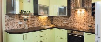
An apron for a minimalist kitchen is especially important because light paint or wallpaper gets dirty most easily. Lay it out of tiles of the same shade as the rest of the walls. Use a small mosaic of several adjacent tones with rare bright inserts. Pay attention to tempered glass or acrylic for modern minimalism or hi-tech.
How to make the interior comfortable and unusual
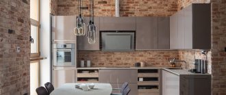
Minimalism does not mean gloom and excessive severity. Facelessness and asceticism are features that a carefully thought-out room design will lack. Experts recommend taking minimalism as a basis, and then adding rich notes to it. This will make the room comfortable and attractive, allowing it to reflect its own uniqueness and original style. In an urban environment, minimalism is perfectly combined with timeless classics, industrial style and hi-tech.
Please note: The basis of the kitchen should be a well-thought-out layout. When developing your own design project, it is important to carefully consider the ergonomics of the future headset and the surrounding space in order to find a place for convenient storage of each item. Otherwise, minimalism will turn into a mirage, everything will be filled with things.
Kitchen-living room design in minimalist style
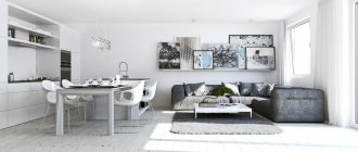
The minimalist kitchen-living room looks fresh and original, attracting lovers of open spaces. There is a minimum of furniture and things here, so you will be able to maintain the effect of a spacious and free room. Enclose the work area with a bar counter, place a sofa and coffee table as a separate island, replace massive cabinets and chests of drawers with lightweight prefabricated racks and shelves.
80 kitchen design ideas in Provence style (photo)
Preparation
When planning a U-shaped kitchen, the following parameters are taken into account:
- Area and shape of the kitchen;
- Location of windows, doors;
- Places where communications pass;
- Placement of equipment.
The desktop is made with a width of 0.7 m. But for the drawers to open conveniently, another 30 cm is required. In total, the working area from each of the three walls will be 1 m.
There should be a distance of at least 0.9 m between the edges of the kitchen set (preferably 1.2 m). This will provide the necessary comfort and avoid accidental injuries.
There is a “triangle” rule, where space is divided into three areas:
- Initial food processing area (this includes the countertop and sink);
- Cooking space (stove, oven);
- Storage area for tools and products (cabinets, shelves, refrigerator).
This ensures convenience in cooking, free access to the necessary ingredients and equipment.
Corner kitchen in minimalist style
Corner kitchen sets can rightfully be called the most functional. They fully embody the concept of using the entire space inherent in minimalism: you can build a pull-out unit, a sink or even a stove into a corner. Just watch the location of the working triangle and safe distances between communications.
Design with window
A U-shaped kitchen with a window has a number of features. The homeowner should consider how necessary such a layout is.
If this project is implemented, two problems will arise:
- Window glass will be difficult to clean;
- It is difficult to insert mosquito nets.
In typical apartments, complications with the countertop are added:
- It turns out to be higher than the window sill;
- If a heating radiator passes under the window, the kitchen countertop will block the heat flow (the temperature in the room will drop).
In the first case, a sink is installed instead of a work surface (water pipes will need to be installed).
The second incompatibility can be solved by providing slots in the body of the table top, this will ensure the passage of warm air.
Design of a small kitchen in a minimalist style
For a small kitchen, where it is especially important to use every centimeter, minimalism is the main style. Acrylic facades, glossy PVC ceilings, corner sets, organizers and storage systems will come to your aid. Use only light colors: white, beige or gray - they will make the room visually lighter.
"Island"
This model is an additional table. Can be of any shape: square, rectangle, with rounded corners. You can either cook or dine on it. Placed only in large rooms (more than 20 sq. m).
Plays the role of a decorative element. They can fill visually empty space. Additionally, it is decorated with antique utensils (items are placed on the wall, above the table).
There are two-tier projects. Their lower level (height - 0.76 m) is convenient for kneading dough, the upper level (0.9 m) is for slicing.
IMPORTANT. When placing an island, it is important to maintain color harmony with the rest of the furniture. The item is made from materials corresponding to the set.
Kitchen in minimalist style - photos of real interiors
Still doubt that minimalism in the kitchen interior is so diverse and extremely multifaceted? We are ready to demonstrate this in practice and have already collected a large gallery of photos!
Did you like the post? Subscribe to our channel in Yandex.Zen, it really helps us in our development!
Recommendations
The design of a U-shaped kitchen can be improved in various ways. To visually enlarge the kitchen, the main part of the set is selected in white with a glossy surface. This color can be diluted with colored fabrics above the workplace.
When cabinets of flashy colors are chosen, the walls should smooth out the effect - calm, light colors are suitable for them.
U-shaped modules are demanding on lighting. Light sources can be enhanced with LED lamps, spotlights, sconces and other small devices.
The bulkiness of furniture is reduced in two ways:
- Large upper cabinets are replaced with compact pencil cases;
- The interior uses a variety of open shelves.
If all the above conditions are met, then the kitchen will turn from an ordinary place for preparing dishes into a real designer decoration that pleases the eye. It will be a pleasure not only to dine here, but also to socialize, spend time with your family or a group of friends. Photos of a U-shaped kitchen demonstrate a variety of solutions and possibilities.
