Read: 8,630
An ascetic interior is a solution for those who value space and brevity above all else. An uncluttered environment combined with neutral tones is a great way to promote rest and relaxation. Even a one-room apartment will look larger - this phenomenon can be achieved by a small number of objects and an achromatic range.
Compact design will not only reduce expenses, but also create comfort and convenience in everyday life. Interior in minimalism - smooth, usually monotonous surfaces without protrusions and decorative components. Expressive and simple geometry are the hallmarks of this style of presentation. Facing building materials, furniture, and sometimes equipment are square or rectangular in shape. There are no decor or drawings. For decorations, it is customary to use wall clocks, vases, paintings, and candlesticks.
Minimalism in the interior will be complemented by several plants in pots. The predominance of one shade in several variations in some cases can be diluted with bright sofa cushions, rugs or curtains.
The individuality of such a restrained interior of the apartment is given by textured elements: Venetian plaster, marble coating, ceramic tiles, tinted glass, natural wood.
Style Features
The minimalism style originated in Europe about 70 years ago and became a new round in the evolution of design art. Picturesque idyllic motifs in design over time gave way to practical solutions, and then transformed into conciseness, simplicity and precision of form.
Just by the name it’s clear what the interior of an apartment in this style should look like. But many people misunderstand the features of minimalism, believing that having a minimum of furniture in an apartment is already minimalism.
Basic characteristics of modern minimalism in the interior:
- The predominance of function over decorativeness and quantity.
- Strict lines and simplicity of forms.
- Expensive - only the best quality materials.
Minimalism has taken care of every detail. It is practical and no frills
Textured elements add individuality to the interior: marble, porcelain stoneware, natural wood. Minimalism is devoid of luxury items in the generally accepted sense, but it is the high quality of materials that makes it not only practical, but also a respectable style.
The decoration and furniture are characterized by neutral and muted shades, which, if desired, are complemented with bright accent touches. Basic colors: white, black, gray, dark blue.
Many people believe that minimalism is identical to asceticism. It's a delusion. The design of the apartment in the minimalist style is cozy, comfortable, and beautiful in its own way.
The minimalist style, like any other, has inherent individual characteristics that distinguish it and make it unique. These include the following:
- a small number of pieces of furniture;
- zoning;
- big windows;
- placement of cabinets in wall niches;
- multifunctionality of furniture;
- lack of patterns and other decorative elements.
In apartments, the interior with the simple name “Minimalism” implies careful modeling of space. They enlarge window openings, remove unnecessary partitions, and create additional openings. This is the severity of the lines, the correctness of the forms, the ideality of proportions.
Laconism and simple geometric shapes: smooth surfaces without protruding elements characterize minimalism as a practical, rational interior style.
Expensive and practical materials, strict and proportional lines - in minimalism there is no decor for the sake of decor
Plants and flowers
Minimalism is often confused with the urban high-tech style. Therefore, owners of one-room apartments refuse to use plants in interior design. But comfortable coexistence of laconic design forms with living nature is quite possible. Thanks to plants and flowers, the interior of the apartment looks more cozy.
Why is minimalism popular?
Minimalism is ideal for busy people: surfaces do not require complex care, furniture is hidden, and its placement is safe and convenient. In its modern iteration, this style is suitable for decorating houses and apartments of any layout. And in the interior of small-sized apartments it will be a real salvation.
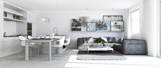
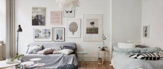
Using zoning, it was possible to separate the kitchen and living room in a studio apartment
The love for functional built-in items and smart lighting can still be seen. And these are not all the reasons to use this style in decorating your apartment.
Modern projects include everything down to the smallest detail: powerful hood, alarm, remote control
7 reasons to love minimalism
⓵ Visually increases the space
Minimalism has gained great popularity in the interiors of small apartments. Small rooms do not tolerate overload both in quantity and in color mixing. The predominance of restrained colors, simple forms and natural lighting visually adjusts the space.
⓶ Uses space efficiently
The limited footage does not allow the use of the apartment area “idlely”. The project is calculated based on the purpose of the items, no matter whether it is furniture or appliances. Functionality, which is at the forefront of the choice, allows you to get rid of the unnecessary and make room for the important.
⓷ Universal for most
If you have not yet decided on a style, minimalism will remove most of the questions. The style will fit equally well into city apartments, private houses, cottages or commercial properties.
⓸ Gets rid of clutter and unnecessary items
A proper layout will hide household appliances and get rid of bulky furniture. The motto of minimalism is less things. It will be easier to put things in order.
⓹ Recharges emotionally
The futuristic interior is devoid of background noise: excessive decor, complex and multifaceted details. It is comfortable to live in such a house, since unnecessary “pictures” in the interior overload emotionally. The brain, without being distracted by visual noise, works more productively, concentrating on the main tasks.
Minimalistic interior does not overload emotionally
⓺ Directs attention to the important
Combining conscious consumption and the rejection of excesses in favor of functionality, minimalism remains in the trend of design trends. In the world of environmental care, much attention is paid to the main thing - natural materials, their recycling and the ability to refuse what you can do without. Minimalism does not encourage hoarding, so initially plans to purchase only the necessary things.
⓻ Saves money
The high cost of finishing materials is fully compensated by the number of interior items. Of course, decorating an apartment in a minimalist style will cost a certain amount. And here you can’t get by with materials from your grandmother’s chest of drawers. But this is an investment for years - the use of “2 in 1” equipment, transformable furniture - solves several problems at once.
In addition, the choice of materials is always alternative. In the modern reading, imitation is used. For example, parquet boards will be replaced by laminate, and mirrored furniture will be replaced by products made from high-quality plastic.
An apartment in the minimalist style is an example of order. The style does not tolerate chaos, so it is preferred by pedantic business people who value an atmosphere of peace and perfect order in everything.
About textiles
Textiles in a minimalist picture are far from the most important place. The reason is simple: it is rarely used. Fabrics appear in curtains and upholstery. Preference is given to natural options, since synthetics will not fit into the concept of a laconic philosophy. Curtains use roller or panel curtains. In the first model, the canvas is wound onto a horizontally located roller, and in the second, it is completely pushed to the side. By the way, it is panel curtains, along with folding screens, that are used when zoning a room. Their surface is usually plain with a light print. Furniture upholstery is also chosen from single-color fabrics in neutral shades. Sometimes it is covered with a pair of pillows in contrasting tones.
How to choose minimalist furniture?
Simple, but tasteful - furniture in a minimalist style - without patterns, massive backs and armrests, or embossed legs. Monochrome colors are welcome in accents: pillows, small floor carpets. Conventional upholstered interior furniture in this style has strict rectangular shapes: these are small, squat armchairs and sofas on high metal legs.
Built-in furniture will save space
Minimal furniture doesn't mean you have to give up your bookshelf and store your books in the closet with your clothes or work at the dining table. The first thing you have to take care of in small apartments is the number of necessary items. And their functionality is to combine. And transforming models will help with this: a sofa-table, a bed with a niche, a coffee table that folds out into a dining room.
And the transforming one will solve several issues at once
If there is enough space, so as not to stray from the style and not overload the room, choose built-in models with a hidden storage system.
The main requirement for furniture in minimalism is compactness. But at the same time, it must be roomy. But as far as materials are concerned, options are possible here.
Minimalism – variable in materials and design
- From natural wood, linden, pine, and alder are preferable. The color palette is light, preserving the texture.
- Made of chromed steel - used as individual elements: legs, decorative inserts, tabletops, shelving frames.
- MDF gives us excellent opportunities to choose both color and texture to suit the design of the room. The surface can be either plain or imitating natural materials with complex colors.
- Plastic - not in its generally accepted sense. Modern minimalist interiors use exclusively acrylic and polycarbonate high-quality products. They are easy to care for and are not afraid of mechanical damage. By the way, plastic furniture will fit perfectly into other trends, for example, high-tech or Bauhaus.
- Glass and mirror. Glossy surfaces are used in design because of their ability to visually increase space. If this issue is relevant to you, pick something from the DG Home catalog
Materials
Apartments where minimalism “lives” are decorated using a variety of materials. This can be plain smooth or textured wallpaper, glass, natural or artificial stone, ceramic tiles. It is important to understand that all surfaces must have an ideal shape, so a high-quality rough finish is mandatory.
High-quality materials will emphasize the status of housing
As part of the style, natural wood is used in the interiors. It is used to decorate floors or walls and is used in furniture making. It is important that these are valuable, high-quality processed wood species. They will fill the space with natural warmth and emphasize the elite design.
In the minimalist style, ceilings are made in light colors; they should be smooth and unadorned. To decorate the floor, use tiles, marble, parquet, laminate or, as a budget option, linoleum. They try to make window and door openings so invisible that they simply blend into the interiors.
Frameless glazing was used in the interior of a country house
The design maneuver involves using monochrome wallpaper, painting, stone tiles, and wood panels to decorate the walls. It is possible to stylize the space “like brick” or use decorative plaster. The choice of a particular option depends on personal preference.
Minimalism does not mean exclusively white
Color palette
If we talk about the color palette, then modern style involves mixing colors: white, beige, gray, pearl. You can effectively combine light and dark tones, individually zoning the space.
In the interiors of houses you can see such combinations as white, graphite and blue, olive, and white. If earlier the style assumed strict tones, today you can find brighter solutions. Accent notes of light green, yellow, green, etc. are added to light tones.
Is it possible to use bright colors in minimalism - yes, but in combination not exceeding 2-3 colors in one room
Don't give up on color. It will enliven a muted palette
Decor
Minimalism is not rich in decor, but its correct use will stylize and complement the room. Interior accents should not go beyond the concept. For example, when developing a design, flowers are often used to enliven a space. Orchids are unlikely to work, but intricate succulents are the perfect solution.
A black and white urban photo will help diversify the design in the spirit of minimalism; you can hang a portrait. It is important to choose an accessory that matches the style. Then you will be able to achieve ideal aesthetics and harmony
Practical interior elements are suitable: mirrors, live plants, wall clocks
Prints are extremely rare in minimalism - the style prefers large, plain, smooth surfaces, preferably without frames: abstract, avant-garde, graphic. You won't see Vincent Van Gogh's masterpieces here.
Textile
Modern design projects offer some variety to the restrained palette by using accent textiles in the interior. If you choose one or two shades in the design, then using, for example, a bedspread, you can add a bright note to diversify the palette. Monochrome accent surfaces will appear in a new way.
For children's rooms, living rooms, and other rooms, the same principle applies. Natural high-quality fabrics are used: smooth or textured.
In the nursery, a richer palette is usually used
Windows and lighting
Minimalist design offers a lot of light, and preferably natural light. Therefore, if your budget and technical design allow, choose panoramic windows - you can’t go wrong.
Sources of artificial lighting - lounge devices with a soft, uniform glow. Track and string systems and LED strips are popular, filling the room with light to the maximum. Tapes installed along the perimeter of the ceiling can widen narrow corridors and add height and lightness to the room. And the floor lighting - mirrored from glossy surfaces - has a lighting effect.
Modern lighting design possibilities are endless - this includes illumination of the work area, niches, and recreation areas
Spa lighting
As an alternative, you can use regular hanging chandeliers and even their classic versions. This will slightly dilute the monotony of minimalism, especially if no other accent elements are used in the interior.
Wall sconces and floor lamps, table lamps, and spots will find their place in the office. The materials are the same: natural wood, steel, aluminum, chrome, glass.
Maximum natural light + artificial sources
This is interesting: Smart light: a detailed guide about an intelligent lighting system.
No. 4. Decoration Materials
Here again the principle of simplicity and conciseness comes into play. The decoration in the room should be restrained, without patterns or pronounced texture, so a roll of wallpaper with patterns will have to be hidden away along with a colorful carpet.
Wall decoration
The best and easiest way is to just paint the walls white . They shouldn't attract attention. Instead of white, you can use light gray, and instead of paint, plaster with a barely noticeable texture. One of the walls can be made an accent wall. This will not stop the interior from being minimalistic, but it will become more interesting and cozy. To highlight walls you can use :
- paint of a different color, for example black. Calm turquoise, light peach and some other shades are also suitable;
- wooden panels, if possible, from expensive wood species;
- facing brick;
- wide glossy tiles;
- glass;
- Even plain wallpaper without a pattern with a barely noticeable relief, or better yet without it, is suitable.
Floor finishing
For floor finishing, choose practical materials without a pronounced pattern . The selection is quite decent:
- parquet, but with a minimally noticeable texture. They lay it straight or on deck - the herringbone installation option is not suitable;
- laminate as a cheaper replacement for parquet is also suitable, but you need to be careful when choosing colors and patterns;
- linoleum, subject to the above requirements, can also be used;
- self-leveling floor, naturally monochromatic, without drawings or patterns;
- porcelain stoneware;
- ceramic tile.
In the bedroom near the bed, in the living room in the soft area, it is appropriate to lay a long-pile carpet , but it should be plain and match the chosen color scheme.
Ceiling finishing
A classic of the genre - a flat white ceiling; matte paint is used for finishing. You can simplify your life and install a stretch ceiling, but also a light, plain, matte one. White is the preferred color; beige and sand shades are used much less frequently.
If the ceiling height allows, you can create a multi-level structure. Stretch or suspended ceilings will come to the rescue. The play of color is not used - only the play of light and shadows.
Kitchen and bathroom design in minimalist style
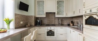
Kitchens are decorated strictly. For walls, floors, furniture, choose two or three colors. The surfaces are smooth, without decorations. The functionality must be thought out as much as possible, so furniture and fittings from leading manufacturers are used, who have already taken care of everything.
A minimalist kitchen features flat surfaces, cabinets with translucent glass and chrome details, built-in appliances, dining tables with glass tops, chairs with soft leather seats and high metal legs.
Bright inclusions are possible. For example, one of the walls or the kitchen apron
is made in contrast with the rest of the decoration.
Accent with color
The bathroom is decorated in a similar way. The surfaces of the walls and floors are made plain without patterns, the plumbing fixtures and furniture are chosen to be reliable and functional, with a strict design. When choosing this style, any pretentiousness is unacceptable. Conciseness is the main rule, thanks to which it is possible to create a high level of comfort in interiors and demonstrate the status of real estate.
This is interesting: Small bathroom: practical interior + 10 tips for storing small items.
Smooth walls in monochrome are not only practical, but also look expensive
When choosing materials for the kitchen and bath, give preference to discreet but high-quality panels: glass, wood, stone, chromed steel.
Resistance of materials to pollution, humidity and mechanical factors is a separate requirement in style. Easy surface care will eliminate the need to keep things in order all the time. After all, initially minimalism is about order. Say “no” to impractical finishing and get another bonus when organizing a comfortable interior.
Color variety
The basis of a minimalist color composition is usually a trio:
- White.
- Grey.
- Black.
As a rule, the tone concept is built on the principle of analogy or monochrome, that is, all components of the composition are shades of the same color. If the decoration turns out to be too gloomy and gloomy, the atmosphere is diluted with one or two relatively bright details. Use elements in light shades of blue, yellow, orange, green, lilac. To emphasize the whiteness of the surface, a play of contrasts with spectacular black is used. Textured materials will also help to focus attention on white: wood, metal. Preference is given to gray, beige, pearl, creamy, sand, ash and light walnut shades. They do not have the straightforwardness and uncompromising nature of white, but they play great with him in a duet.
Design of a bedroom or children's room in a minimalist style
A bedroom in the minimalist style is a maximum of space, an abundance of light and air. Everything is organized so that unnecessary items are not visible. It is possible to install a carefully thought out hidden storage system in the form of built-in cabinets and podiums with drawers.
Mirrors and paintings with abstract images can be used in interiors. Textiles for bedrooms and children's rooms are chosen in accordance with the color palette of the space.
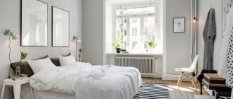
Usually there are no color accents in the bedroom. The interior is quite restrained and conducive to relaxation.
History, conceptual features
The minimalism style is a logical stage in the development of culture. It could not help but appear, because for centuries in a row people did nothing but complicate architecture, introduce new things into it, fill and enrich interiors. As a result, abundance was no longer perceived as something unusual, and the person realized: asceticism surprises and helps to stand out more than luxury.
In addition, progress has combined the functionality of many household items, simplified them, and made them more compact. Why bulky wardrobes and chests of drawers, if a wardrobe can accommodate both? Why poufs and couches if you can put a bean bag chair?..
Under the influence of such ideas, in the 60s of the 20th century, the philosophy of minimalism began to take shape, and with it the style of architecture and interior design.
Modern houses in minimalist style: design, materials, technology
The new design was inspired by the Japanese tradition of building and decorating housing, the Scandinavian experience, German modernism represented by the architect Ludwig Mies van der Rohe and neoplasticism - a concept that proclaimed the dominance of “primary elements”, that is, straight lines, primitive figures and basic colors.
The principles of minimalism are:
- simplification, attraction to trivial geometry;
- clear, expressive composition;
- maximum release of space;
- limited, non-stimulating color palette;
- the use of steel, glass, wood, concrete and more modern materials;
- plenty of natural light;
- availability of only the most necessary household items;
- a small number of accessories and moderate decor.
The asceticism of minimalism is compensated by accuracy and innovation... And the main thing is the rule that says that quality is higher than quantity: yes, a minimalist has few things, but they are all high-quality, first-class, and often exclusive.
Living room in minimalist style
The living room is decorated according to general rules: minimal furniture and decor as small touches. A minimalist living room is not boring and simple, rather it is brilliant. Everything is so thought out and functional that it seems it couldn’t be any other way.
“Minimalism for me is about keeping a space simple, uncluttered and highlighting the attractive architectural features of the space. The palette is primarily monochrome, with color used as an accent,” says Sharon Blaustein, principal designer at Interior LLC.
The furniture for the living room is functional: chairs on which you can sit comfortably, tables for drinks, a fireplace near which you can warm up and discuss something with your loved ones. Behind the apparent external simplicity lies the real art of design. Minimalism focuses on the unity of form and function.
Minimalistic interior of a living room with a fireplace in a country house
When designing a living room in a minimalist style, pay special attention to the seating area: sofa, armchairs, coffee table. By carefully selecting elements, you will create a room with your own energy - not only functional, but also harmonious.
Colors are balanced and look cohesive
Hallway in minimalist style
Tired of tripping over your shoes and having trouble finding free space on the rack? The hallway is the face of the apartment, and in minimalism this face should be clean, i.e., free from clutter.
If it is impossible to build large cabinets into the interior of a small apartment, choose minimalist narrow models with a glossy surface. Remember how gloss expands space? The minimum depth of sliding systems is 30 cm, in this case it will be possible to arrange furniture along the entire length of the corridor without hiding the space.
Built-in wardrobes allow you to hide household items
Additional storage space for seasonal items is provided on the mezzanine. Do not confuse them with Soviet versions - modern ones are ergonomic and differ in visual aesthetics. The only thing these systems have in common is their name.
In the interior of the hallway, special attention is paid to lighting. There should be no darkened corners in the room, but the light should be diffused and not cause irritation.
Plan lighting during renovation
Attention should also be paid to storing small things common to the hallway: keys, combs, shoe care products, gloves. Open shelves with various items piled on them look sloppy. Instead of chaos, choose drawers with aesthetic organizing boxes. Organize things by type and purpose and forget about clutter forever.
This is interesting: Storage system in the hallway: how to functionally organize the space.
Choose colors and materials. For a small hallway in minimalism - these are light mirror or matte surfaces. Dimensional - allow iteration: dark and light palettes and all sorts of combinations thereof.
Glossy surfaces always create a feeling of ample space
Lighting schemes
Light is the most important means of embodying this style. Minimalism pays great attention to natural sunlight and artificial light. After all, combined lighting helps to zone, gives the space multidimensionality, perspective, and comfort.
To get the maximum amount of sunlight, firstly, install panoramic glazing or make large windows. Secondly, they do not hang drapes and curtains, preferring blinds.
Glossy surfaces will also help increase the amount of light: polished furniture, glass shelves, self-leveling floors.
The artificial lighting scenario assumes:
- everyday, slightly diffused light, organized through ordinary pendant lamps and built-in chandeliers.
- Festive lighting, which is turned on for special occasions. It consists of LED strips that follow the lines of a window or wardrobe, and paint the room in a bluish, mint or lilac tone.
- Detailed service lighting includes lamps on adjustable brackets or cords above the dining table, kitchen worktop lighting, sconces in the hallway and bathroom, and a floor lamp in the reading area.
Minimalism does not recognize faceted, painted, gilded lampshades, nor fabric lampshades. Lamps can be spotlights, directional ones, with any lamps that are comfortable for vision, but certainly have laconic yet elegant contours.
Office or student's room in minimalist style
When you need to optimize your office by systematizing everything important in it, minimalism is the best choice. Even if the rooms are decorated in a different style, for example, adjacent: Scandinavian, high-tech, modern, the interior of the office may differ.
Good organization is the first step towards productivity
When everything you need is “at hand”, but securely hidden from prying eyes, the work becomes more fruitful. When organizing your office, consider 3 basic principles, regardless of whether your work area is combined with others or not.
- We need a lot of light. If this factor is alternative in the living room, then with a lack of light at the desk it will be difficult to concentrate. Place your desk or desk near the window and provide additional light sources.
- We need free space. If your office is in the living room, use zoning techniques. If the office is located in a separate room, provide a relaxation area - a place where you can sit down and lie down to relax and recuperate. If business partners often visit your home, you can install a fireplace or bar in your office.
- We need soundproofing. It is often forgotten at the stage of rough work. Later we run into problems. Indeed, in the absence of extraneous noise, working is more comfortable and calmer for the nervous system. Especially if you write reports, reports or record tracks. Maintain your personal comfort zone.) And we will help with practical advice.
