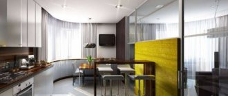
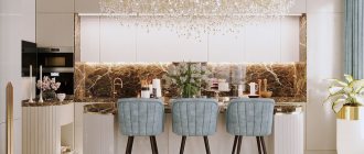
A bright kitchen is a timeless classic. Delicate shades help to properly organize space, create visualization effects, and attract attention. The lightened tones of the palette are universal, as they are used in different design directions and harmonize with many shades.
Kitchen in a light style with golden decoration Source roomester.ru
Beautiful small-sized kitchen with a corner layout Source zastavki.com
Light kitchen design - how to avoid mistakes
The kitchen is an important place where the housewife spends the most time. In order for the space to be pleasing to the eye and not cause irritable emotions, it must be properly designed. Let's look at possible mistakes that novice designers make. This will help eliminate them at the design stage:
- Cheap light ceramic floor tiles. After a few months, this coating will begin to turn yellow and the surface may crack. After heavy objects fall or dishes break, chips and deformations appear. Damaged areas begin to darken, which spoils the appearance.
- Lighting quality. Even in a light kitchen design, the work area should be well lit. If the main lamp is not enough, take care of additional lighting for the apron. It is hooked to the bottom of the hanging set. Without doing this, you risk your vision and the quality of the prepared dishes.
- No hood. In a bright kitchen this element is needed first of all. During the cooking process, all fats and soot will accumulate on the surface of the tile. If they are not noticed in time, they begin to harden and spoil the aesthetics. A working hood will remove all fumes and pungent odors to the street.
- No working wall. Any bright kitchen needs an apron. Over time, painted walls will begin to acquire greasy stains and splash marks. Such defects can be easily removed from a smooth glazed surface.
- In a bright, small-sized kitchen, you need to optimize the free space. There should be nothing superfluous in the work area: cutting boards, cutlery stands, and decorative dishes should be hidden.
- Arrangement of a snow-white island. For a kitchen in which it is planned to install a free-standing set, they try to choose a color several tones darker than the main one in the kitchen. If you leave the island white, it will aggravate the situation; the kitchen will turn out to be very bright.
- Ignoring fashion trends and conformities. When organizing a bright kitchen yourself, you need to study a lot of points regarding the harmony of shades and methods of decorating the room.
To prevent a bright kitchen from looking pale, use objects that accentuate attention: flowers in flowerpots, decor in the form of figurines, spectacular coasters for dishes, glass shelves.
Light classic kitchen with decor and clock Source roomester.ru
Kitchen with a beige facade and marble apron and countertop Source dizainexpert.ru
Kitchen in light colors in a modern design style Source akuhnja.com
See also: Catalog of companies that specialize in interior redevelopment.
Rules for arranging a kitchen space in light colors
Kitchen design in light colors: beige, cream, coffee, milk and other tones of this palette quickly gets boring. To prevent this from happening, you should follow several rules:
- Using color accents. These can be seen in furniture, flooring, window frames, and useful kitchen items. With light tones, a combination of brown, black, ash, burgundy, and dark green is relevant. Antipodal shades are used on the floor, apron, decorative elements, potholders, towels and other kitchen textiles.
- Presence of contrast. If the kitchen is half light, then it is better to use a dark shade from below: in floor cabinets, tiles, parquet boards, and curtains. The color of the tabletop on your desktop can vary greatly. The lighter the kitchen design, the darker the surface will be.
- Household appliances should be chosen in a discreet color and design. Available options are metallic, gold plated and silver. Black electrical appliances look defiant in a light kitchen. They try to purchase built-in types of equipment that are too dark. They will be successfully hidden by the light facade of the furniture.
- Cold and warm shades of light. If a bright kitchen has a lack of natural light, then it is necessary that the predominant tones remain beige, peach, cream, ivory, gray with white. For rooms with access to sunlight, you can use ash, gray, moonlight and sand - these are cool shades.
- Kitchen apron. It is important to decorate it in soft shades: peach, beige, milk, coffee, creme brulee. This type of work area is suitable for small kitchens. If the room is spacious, then when decorating the apron, you can play with contrast - use burgundy, orange, brown, purple.
Pastel shades will fit original into any room in size. It is important to follow the recommendations so as not to overdo it with lightening the space and make the design of a bright kitchen concise and practical.
Bright kitchen design with a beautiful chandelier in the center of the room Source designadvice.ru
Bright kitchen interior with built-in furniture Source dizainexpert.ru Modern kitchen with an interesting design Source alfadsp.ru
Beautiful kitchen in a modern interior style in light colors Source 1zoom.ru
Color spectrum
The light color of the kitchen is not only cold white. In fact, the choice of shades is very large: delicate pink, discreet beige, ivory, warm vanilla, refreshing pastel blue and green, strict gray, feminine violet, eccentric metallic and others.
Even white has a huge palette of shades, it’s just that people who are far from design don’t always think about it. But by combining them correctly, you can give your kitchen additional edges and textures, which will make it unique and interesting.
Light shades have many advantages:
- have a positive effect on a person’s psycho-emotional state;
- at the right time, setting the mood for work;
- visually make the room spacious and fill it with light;
- easily combined with other shades;
- Suitable for rooms designed in different styles.
Light kitchens also have disadvantages, but there are only three main ones:
- soiling;
- boring and ordinary;
- with the wrong combination of shades - coldness.
Advice! It is important to complement completely white kitchens with bright accents, otherwise they will resemble an operating room. Add a drop of black, red, orange or other catchy color to the interior, and then the white room will be transformed beyond recognition. Even pleasant little things on tables, napkins, an apron, and appliances can become accents.
Light colors most often used in kitchen design
Among the mass of shades, it is easy to get confused when arranging a kitchen. Several tones remain fashionable, popular and timeless from year to year.
Beautiful kitchen with white tiling and light ash furniture Source kitchensinteriors.ru
Snow-white kitchen furniture with a light designer island Source roomester.ru
Current combinations of light shades in the kitchen
With the help of light shades it is easy to create unique interiors. The main condition is to be able to combine tones correctly.
- Light top, dark bottom. The most popular solution. Not only the apron and wall decoration, but also the upper part of the kitchen set will be white-moon, white or beige. Floor cabinets and shelving are chosen several shades darker. The flooring is often brown, chocolate or imitating wood cuts.
- Dark top and light bottom. Also a good combination. In this case, the upper part of the kitchen furniture is decorated in black, brown, and dark blue. The floor has a contrasting shade, which is several tones darker than the lower façade of the set.
- Beige or cream walls. Surfaces of such tones are a good background for soft lilac, sand, and peach furniture without decoration. The facade of the furniture can be in a similar shade, as well as the wall cladding. For such cases, a choice of furniture in the classic style is provided, with clearly visible fittings and a heterogeneous texture of the facade surface.
- Light floor in the kitchen. When finishing it with tiles, white, beige, light brown, gray and marble tile options are used. The coating in a white-gray shade looks good. The apron is lined with white tiles or beige mosaics in several tones.
- A light kitchen and a dark countertop are a good tandem. This solution emphasizes the style of the kitchen and helps it acquire a unique aesthetic appearance. To make the accent moderate, all horizontal surfaces can be painted in a dark color: the dining table and the window sill. Additionally, dark decorative elements are used: pots for indoor plants, pottery, which are placed on open shelves.
The light tone is suitable for decorating various styles in the kitchen. But without contrasting shades, the interior will be boring and ridiculous.
Pink walls and cream furniture in the kitchen Source dizainexpert.ru
Kitchen in beige and white in a modern interior Source dizainvfoto.ru
Light kitchen with brown dining area Source pinterest.com
Which curtains to hang
Curtains in a pastel kitchen often become a “reviving” detail of the interior, giving a cozy look. Curtains are chosen darker than the furniture. Both colorful and plain curtains are suitable for classic kitchens. You can also hang light curtains in a pastel kitchen, but with a bright and contrasting pattern. If a glossy set is installed in the kitchen, then you can add coziness with the help of textured curtains.
Lilac curtains - an accent in a pastel interior
Bright kitchen in minimalist style
A kitchen in a minimalist style is relevant for city apartments. There is nothing superfluous in it. Beige furniture, a slightly darkened floor and a cream-colored apron are the main features of the declared direction. This interior allows the use of three tones: white, beige and any contrasting one.
Bright kitchen in a minimalist style Source rehouz.info
A minimalist kitchen is characterized by a sufficient number of lighting fixtures: ceiling, wall. They also cannot do without additional light above the work area. In the latter case, it is important to use concentrated, non-scattering light sources. The space is decorated without unnecessary decoration. The furniture is standard, with a perfectly smooth texture, without additions. The fittings are simple metal or plastic in silver color.
Features of pastel colors
Any color becomes pastel when mixed with white paint. Pastels are muted, soft, powdery shades. This is an extensive palette, as it has many intermediate tones and varying degrees of intensity. In the interior they look calm and unobtrusive.
Features of pastel colors:
- Positive impact on a person;
- Visually increases the space of a small kitchen and fills it with light;
- Easy combination with other colors and with each other;
- Use in any style;
- The opportunity to refresh and enliven the kitchen interior;
- The ability to create a calm environment, since pastel colors never look provocative or annoying.
There are very few disadvantages:
- Contamination is clearly visible on pastel colors;
- The wrong combination of colors leads to a faded, dull interior.
Bright kitchen in Scandinavian style
The Scandinavian style is characterized by the use of basic shades of gray, white, beige, and milky. The use of accents is encouraged. Light walls and the same façade of furniture are in perfect harmony with the bright accents in the room. The last to appear is the decor: shelves, magnets, pots and vases. They can be black, burgundy, brown and other contrasting shades.
Kitchen in Scandinavian interior style Source fi.pinterest.com
Natural and artificial light sources are welcome. In Scandinavian design, windows are not covered with a lot of textiles. Direct sunlight into the kitchen is important. Furniture is used with a matte facade without different color additions.
Advantages and disadvantages
The main advantages and disadvantages of this color scheme.
| pros | Minuses |
| Light shades have a positive effect on the human psyche. | Due to soiling, light colors are not practical. |
| They visually expand the space and fill it with additional light. | The interior may look boring and ordinary. |
| This palette goes well with other colors. | If the color combination is incorrect, the room will feel cold. |
| Fits into the design of a kitchen made in almost any style. |
Bright kitchen in Provence style
Provence style kitchens have a simple and discreet atmosphere. The main feature is the use of natural materials: stone, ceramic tiles, wood. Decorative elements are made from clay, wood, natural stones and porcelain. In this interior design, lace tulle with frills and ruffles looks beautiful. Textiles for windows are purchased in the theme of floristry without flashy tones.
Bright kitchen with arches near the windows in Provence style Source domoholic.ru
The floor is finished with parquet boards or matte ceramic tiles. The flooring can be white, gray or beige.
In the Provence style, it is appropriate to use antique wooden furniture. A free-standing sideboard or buffet with glass doors looks good. The installation of open floor shelving and pencil cases is encouraged.
Apron for kitchen set
You can use different design ideas to decorate your apron. Since the interior already has enough light colors, this area can be decorated. For example, make it from ceramic tiles with a pattern, tempered glass with a photo, or simply make a small image on a white background. For an apron, a small checkered, striped or abstract pattern is suitable.
Glass splashback with floral print
Bright kitchen in loft style
The main feature of the loft style is a minimum of finishing. This is achieved by using real brickwork or its imitation. If the kitchen is light, then the wall is painted in any pastel shade: white, soft pink, peach, coffee.
Brick wall in a bright kitchen in a loft style Source domsmam.com
You can create a brick wall using rectangular tiles. It is laid like a brick, crossing the seams.
Beautiful kitchen with an island in the loft style Source 1kuhonyi.ru
The flooring is parquet boards or long tiles with brown colors. Porcelain tiles on the floor can be laid like parquet or diagonally. This approach visualizes the length of space.
Placement of kitchen units
You can install any kitchen set in a bright kitchen. Its choice depends on the shape of the kitchen:
- U-shaped. Suitable for square and spacious kitchens. Cabinets are installed along three walls, and a dining area is usually placed near the fourth. The optimal distance for passage between rows is 1.2 m. With this arrangement, one side is occupied by a refrigerator, washing machine, microwave, the second by a sink, worktop, stove, and the third by various appliances. To improve the ergonomics of the kitchen, the three vertices of the working triangle (refrigerator, stove, sink) are placed, one on each side;
- Ostrovny. Suitable only for spacious kitchens. Part of the headset is moved to the center. You can place a hob, a sink on the island, or use it as a worktop or dining table. The minimum distance from the island to the set is 75-90 cm. It must be freely accessible from all sides;
- Straight. Placement of the headset along one wall. With this layout, the vertices of the triangle are on the same line. To get a comfortable work area, the distance between the sink, stove and refrigerator must be at least 20 cm. It is better not to place the sink near the wall - this is neither convenient nor practical, since splashes will fall on the walls. Convenient option for placing tops: refrigerator – sink – stove;
- Angular. The set is installed along two adjacent walls. The distance between the vertices of the triangle should be within 1.2-2.7 m. The distance between the stove and the sink, as well as the stove and the refrigerator should be at least 0.6 m. A convenient option for a corner layout - the stove and refrigerator are installed in different corners , and a sink is placed between them.
The kitchen set can be made of PVC film, wood, plastic, veneer or enamel. The most durable countertops are made from metal, artificial or natural stone, and stemalite.
Bright kitchens in classic style
There are no rules for setting up a classic kitchen. There is no saturation, brightness or pretentiousness here. Natural materials are used in organizing the kitchen space. The design of the furniture facade has an interesting design with gilding and beautiful elegant fittings.
Bright kitchen in classicism style with a dining area Source me-house.ru
Cream kitchen for home and apartment Source dizainexpert.ru
From the outside, the atmosphere seems restrained and impressive. Furniture is usually white or ivory. Light curtains with a discreet pattern will help enliven the room. The classic style is characterized by a snow-white lace tablecloth, beige, cream or white porcelain dishes, and decor in the form of small figurines.
Cream kitchen in L-shape Source diz-kitchen.ru
Kitchen in a bright interior with proper artificial lighting Source skedraft.ru
