Pros and cons of a dark kitchen
If you haven’t yet decided which side you’re on – dark or light, we suggest looking at the pros and cons of using muted shades in the interior.
Pros:
- Stylish and non-trivial. How often do you see black kitchens in the interiors of your friends and acquaintances? We bet that furniture and decoration in light shades are much more common. And if dark tones were wisely used in the design, then you will immediately receive 1000 points for courage and good taste, and you will definitely be known as an unconventional person with an interesting view of the world.
- Versatile. This palette of shades will fit into any style - be it classic or any modern trends (Scandi, loft, hi-tech, minimalism, etc.).
- Helps with zoning. For example, a black set will visually separate the kitchen work area.
- Calms. Muted dark shades give peace and comfort, reduce nervous excitability due to the intimacy of the interior, which they create.
- Bright accents stand out. Complex, deep, interesting tones are better revealed and look more impressive against a dark background.
Minuses:
- The kitchen may seem gloomy and uncomfortable.
- This color scheme is not suitable for poorly lit rooms or kitchens with small windows.
- It is impractical to design a work area; dark surfaces are difficult to clean. Water stains, limescale and dust are more noticeable.
- This interior color scheme requires a special approach to the choice of finishing materials and accessories; every detail must be thought through.
If you know certain techniques and tricks, you can prevent the occurrence of the above-mentioned disadvantages.
Watch also an interesting video from the designer with design tips:
How to make a small kitchen harmonious
Many people love dark colors. And housewives often choose deep brown wood tones or noble emerald, blue, dark gray. It is also possible to find a harmonious solution even for a small kitchen. Of course, the smaller the space, the fewer dark surfaces there should be, otherwise the interior will turn out gloomy. The best options are:
- only details in the selected shade;
- one strip in a duet with light walls;
- just a dark floor and a few accents;
- several parts of facades in combination with glass or another shade.
You can find an interesting design in a photo on the Internet: decide on the style, budget, materials and look for the optimal solutions just for you, because in any palette you can choose harmonious combinations with individual features. And if you like the dark deep color of chocolate, do not deny yourself the pleasure of using it even in a tiny kitchen. “Hide” the remaining details behind the light facades, putting your favorite shade first. If the kitchen itself is dark, just add light and reflective surfaces.
Design secrets
The kitchen interior will not seem gloomy and repulsive if you choose the right companion colors, finishing materials and accessories. Below we will talk about specific techniques that will help make the design harmonious.
Add light shades
Dilute the interior with white, light gray, beige or other pastel colors. Depending on the size of the room and the design concept, you can play with the ratio of dark and light shades in the interior. If you want more brutality, introduce light colors pointwise, only as accents.
If you need to let more light and air into the interior, then increase the amount of light to the desired proportions.
2. Use textured and textured surfaces
Materials that create voluminous, relief surfaces will smooth out the severity of the color scheme. Dark kitchens look especially beautiful in combination with natural materials while preserving their natural texture and texture - with wood, marble, granite, and other types of stone.
Combinations with concrete, decorative plaster and brickwork also look very nice.
Matte surfaces are a safer option than glossy ones
In addition to the practicality of matte surfaces, it is also worth mentioning their noble effect compared to gloss. On matte surfaces, dirt will be less noticeable, and such facades will look more stylish and expensive.
Gloss is more difficult to work with and less practical to maintain. However, if you want to add glamor and chic to the interior, then in small quantities you can use it in the design of those surfaces that you rarely touch: for example, in the design of upper facades, display cabinets, and decor.
Dosed use of gloss significantly reduces the risk of bad taste.
Gloss in art deco kitchen design
Don't overdo it with decor
If finishing materials and color combinations are harmoniously selected (in other words, if the three previous points are met), then the kitchen does not need extensive decoration. A couple of volumetric parts will be enough.
Add bright accents
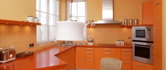
Rich, rich colors will look more impressive and stylish against a dark background - orange, yellow, emerald, blue, cyan, etc. In small quantities they can be used in decoration, in the design of small objects, such as kitchen chairs, dining table bases, curtains , apron, etc.
What nuances should be taken into account when finishing?
Wall decoration can be done using both dark and light materials. For zoning, it is best to choose wallpaper with a bright pattern or highlight one of the walls with color.
For modest-sized rooms, wallpaper in pastel colors will be indispensable. When decorating a kitchen-living room, you can delimit zones by playing on the contrast of a dark set as opposed to the rest of the space.
The white ceiling adds volume. Minimalism when decorating the ceiling relieves the atmosphere of overload.
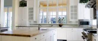
The photo shows a simple kitchen interior. Black and gray shades combine well with each other, and the combination of matte and glossy textures makes the decor more original.
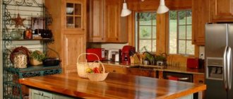
The photo on the right is an example of a dark kitchen in a classic style. Wooden floors and warm color décor make it cozier.
For spacious kitchens, an excellent solution would be a dark wooden floor, different in texture and shade from the furniture. When decorating the floor, it is better to give preference to warm colors. Black or graphite shades should be used with caution, as they deprive the environment of liveliness.
Particular attention should be paid to the finishing of the apron, for which various materials can be used. One of the best options is ceramic tiles - a rich color palette, the variety of textures and installation methods of which allows you to create interesting and original design solutions.
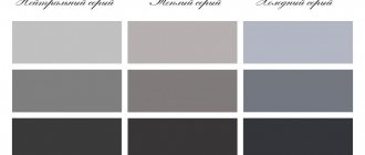
Variety of dark tones
You can create a kitchen interior in dark colors using different color combinations. You can choose one shade as a background or play with achromatic combinations from medium gray to black.
It is undesirable to make the entire interior monochromatic. Use colors of varying degrees of saturation to create zoning. For example, the kitchen area can be decorated in dark brown, and the dining area in beige or white. And vice versa.
Black
Brown
Dark blue
Dark green
Choosing the tone of the kitchen
When choosing the shade of a headset, you should be guided by personal preferences and the characteristics of each color. Achromatic tones are popular:
- Black. This classic color adds elegance and sophistication to the environment. Black harmonizes with any colors. With a skillful combination of such a set and its surroundings, you can create an original interior, which, if desired, can be easily changed using various decorative items.
- Dark grey. The combination of gray with other pastel and rich shades makes it possible to create an unusual interior. To achieve expressiveness, you should avoid excess gray when decorating your kitchen space.
The photo shows a stylish interior of a black kitchen. The matte set creates a cozy, enveloping atmosphere. White furniture and wooden decor enliven the interior.
When decorating a kitchen, the following dark tones are also often used:
- Brown. A variety of shades from dark wood to chocolate tones gives the interiors a noble look. The kitchen set with facades made of wood looks luxurious.
- Dark blue. Sapphire or azure, blue color brings freshness, adds lightness and airiness.
- Burgundy. Luxurious shades of red are especially good when arranging a kitchen in a classic style. Burgundy goes well with natural wood, carvings, and gold. In modern interiors it looks no less interesting and is revealed through the use of contrasting colors.
- Dark green. Malachite and emerald tones, combined with silver, gold, stone and wood textures, are perfect for a kitchen set in a classic style. Modern design trends suggest combining this color with white, gray, lime or yellow.
- Violet. This color helps create an atmosphere of mystery. When decorating a dark kitchen, it is best to give preference to neutral or warmer shades of purple.
The photo shows the original interior with a dark blue kitchen set. The cold tone is balanced by the textures of wood, brick, and concrete. Thoughtful lighting emphasizes the combination of matte and glossy textures and the depth of shades.
When are dark colors contraindicated?
A small kitchen area is not a contraindication for dark shades, contrary to popular belief. But a small window can really play its fatal role. Please note that dark kitchens look most impressive in rooms with large windows. But this does not mean that such shades should be abandoned altogether. Use them as complementary and accent pieces.
If there is not enough sunlight in the kitchen, dilute the interior with light shades. The less light, the more light there should be in the overall proportion.
Kitchen in black: design and interior
Let's take a look at some things before choosing a color like this, and then look at some fun and easy ways to introduce it into your kitchen palette.
Black is a color that stands out and attracts attention, which is why so many people choose to bring it into their kitchens. Another advantage is that black (like white) goes perfectly with every color and style . From traditional kitchens to modern ones, he can make almost any kitchen design look perfect!
The main disadvantage of adding black to a small kitchen is that it can make your space look even smaller if not combined and styled correctly. And since the kitchen is still an area filled with cabinets, shelves and household appliances, this color needs to be approached more carefully.
Using black kitchen cabinetry is a stylish choice that can have stunning results. Using matching cabinets allows you to choose almost any color theme or materials to get the look you want.
The right use of color in the kitchen, paired with the perfect lighting, can quickly banish these fears and transform an ordinary cooking area into a chic cooking area. That's why we recommend you start small: a dark tile backsplash covering only black cabinets, black upholstered bar stools, etc.
Tip : Black absorbs rather than reflects light; Thus, if you plan to use a lot of black, balance it with a lot of light - both artificial and natural.
Choosing a style
As we noted above, among the advantages of this color scheme is its versatility. Dark shades are appropriate in classic and modern interiors. The only difference is in the proportions: somewhere dark will dominate, and somewhere it will act more as a complementary or accent color.
Classic High-tech Minimalism
For the English style, loft and art deco, the dark color scheme of the interior is often style-forming.
Loft
English style kitchen
Art Deco
Furniture selection
In a classic interior, the ideal option would be natural wood furniture in the appropriate style. Or a more budget-friendly analogue that meets all the requirements for shape and texture. Remember about household appliances; now there is a wide range of classic ovens, hobs, refrigerators and even kettles.
Textile color range
- In the color of the base shade. If the general background of the interior is light, in white colors. Then the furniture is selected in milky, pink, golden shades. In maximum harmony with the finishing of the floor and walls.
- Darker than the base color. This solution will add more dynamics to the interior. But be careful. The main thing here is to choose the right color contrasts. For example, furniture in shades of dark chocolate will look ideal against a background of beige and sand shades.
- The base palette is gold. Furniture in milky and cream tones is suitable for a golden finish. It will highlight the elegance and grace of gold.
All smooth lines in the furniture have a clear shape that is immediately visible. To achieve this, classic chairs and a sofa are framed in solid wood, and textile trim runs in the center.
Decoration Materials
Only the decoration, furniture or facades of the furniture do not have to be dark. A black faucet, refrigerator or black apron, for example, can also add a touch of luxury and elegance to the interior.
Floor, walls, ceiling
You can experiment with the design of the ceiling, apron and walls, but some bold decisions will require certain knowledge in the field of design and a project thought out to the smallest detail.
Dark colors can be an effective tool in creating optical effects. For example, a black accent wall visually creates a feeling of endless space, therefore expanding the room, and a black ceiling appears higher.
But black or dark brown flooring is the most impractical solution. There is a lot of dust on it. Black and white tiles would be a great alternative.
Apron
When choosing the color of an apron, it is necessary to take into account not only its compatibility with furniture and other interior items, but also the operating conditions.
If you cook a lot often, then you shouldn’t choose a glossy apron.
If the kitchen set is dark in color, the apron can be made a tone darker or lighter, depending on the design concept. Or you can focus on it by decorating it in red, orange, yellow.
Backsplashes made of dark gray tiles and porcelain stoneware looking like stone or concrete look beautiful.
The boar tile can be laid out in a beautiful pattern and contrasting white grout can be used.
Other interesting options are skinali, a brick-like apron, or painted with slate paint. The last two options will fit perfectly into the interior of a loft-style kitchen.
Tabletop
The tabletop can match the set or contrast with it. To make it easier to care for, choose not black, but dark gray matte countertops made of natural or acrylic stone, laminated chipboard to look like concrete.
A black glossy countertop is the most impractical option.
A light countertop can dilute a dark interior or play in contrast with black facades.
Marble looks impressive with its beautiful, natural pattern. It is better to make an apron from the same material. With this design of the work area, practically no additional decor is required, since the unique pattern of the stone is already a decoration in itself.
Options made of wood or with its high-quality imitation will look beautiful.
What to do in dark colors in the kitchen
If a person has had light-colored sets in his kitchen all his life, sooner or later he stops in front of a dark set and thinks - maybe he can try it? A dark set in kitchen design is a very interesting solution.
A stylish kitchen with black facades, modern fittings and well-placed bright accents will be an excellent choice for large families who love cozy time in the kitchen in the evenings and for young couples who pop into the kitchen to warm up the evening pizza.
Dark curtains
Curtains are one of the key details of comfort in the kitchen. Traditionally, dark curtains are used if the windows face south or on the first floors, if this does not contradict the concept of the style being created.
Dark colors are often found in lambrequin curtains and Roman blinds, but they need to be hung in such a way that they do not block the penetration of light into the room. In any case, the curtains should resonate with some other element in the kitchen - an apron, countertop or upholstery on chairs.
Dark-colored blinds look good in modern kitchen designs. In the minimalist style - monochrome, hi-tech or loft - graphite. For an urban style, you can buy dark theme roller blinds with images of megacities.
Dark apron
A dark apron will look great in a kitchen of any style if the main background of the interior is neutral. Even in a white kitchen, a completely black apron will look elegant and graceful.
It will look harmonious in a kitchen of cream, beige, or milky colors. The apron can be the only color accent in the kitchen, or it can echo the countertop or the color of the flooring.
A dark apron, contrasted with light facades, clearly separates the work area, which makes the interior balanced. The tabletop can merge with the apron or contrast, the main thing is that the work area does not turn out to be a gloomy dark spot. If a dark apron is chosen to match the facades, then the tabletop must be contrasting. You can highlight the apron using lighting.
Kitchen with dark countertop
A kitchen design with a dark countertop is a contrasting, original color scheme and at the same time a practical, functional option. It doesn’t matter what the countertop is made of: anthracite granite, black marble, chocolate MDF or dark walnut wood - it will effectively highlight the interior in any style.
A classic of the interior genre is a light kitchen with a black or brown countertop. Kitchens with dark red countertops look extravagant. The white and emerald duet will fit perfectly into high-tech and minimalist interiors. Burgundy-colored countertops will look noble.
Kitchen with dark floor
A dark floor in the kitchen can add respectability to the room, but this option should be treated with caution. A dark floor visually makes the room smaller and, in addition, is quite easily soiled.
A classic dark floor is brown, a traditional color that exudes coziness. Black flooring is more suitable for ultra-modern interiors. Dark floors can also include other rich colors - for example, burgundy.
The most important thing when using dark flooring is to wisely choose the other colors in the kitchen so that the room does not turn out to be too gloomy.
Kitchen dark bottom
A modern design technique is a kitchen in two primary colors. However, this option looks more advantageous only in spacious kitchens. Classic colors look impressive in the concept of a light top and dark bottom. All decorative elements and equipment can be placed at the junction of two colors, which will look fresh and original.
The combination of a white top and black bottom will look traditional, but a little boring. The kitchen will look much more interesting if the white top is replaced with red or orange. Dark brown or chocolate underneath looks beautiful, smoothly turning into soft beige.
Fans of exotic modern interiors will be happy to experiment with a combination of purple at the bottom and lilac at the top.
Kitchen dark top
Although placing dark shades in furniture underneath is more traditional, inversion also creates interesting effects. A dark color usually acts as a base, so a dark top will only look good in apartments with high ceilings.
Including an additional tone in the interior will help balance the colors:
- For example, a countertop in a third neutral shade;
- For example, if the bottom of the furniture is beige and the top is dark brown, the tabletop can be gray, black or metallic;
- Another successful solution is the asymmetrical arrangement of modules on top. Dark cabinets can be hung in a checkerboard pattern, which will create a feeling of space.
Dark furniture and appliances
Since kitchen furniture is quite large in size, the easiest way is to make a dark shade the main dominant feature of the interior by choosing a kitchen set in black or another dark color.
Smooth facades without relief are easier to care for. However, should you always be guided only by practicality? Look how beautiful black sets look with paneled fronts or with carvings!
If you choose effective furniture care products and wipe the kitchen regularly after each cooking, then you will never have problems keeping it clean and well-groomed.
The choice of technology directly depends on the direction of the design. For example, in classic and English interiors, an oven or microwave with bronze elements and brass or copper-look handles will look beautiful. Patina on dark facades can be in harmony with this design of equipment.
In retro, boho, and loft style interiors, bright vintage refrigerators and ovens in red, yellow, and blue would be appropriate.
For most modern trends, especially for high-tech and minimalist styles, white, black or metallic appliances with a chrome-plated facade are suitable.
The problem of choosing a refrigerator design can be solved even simpler: it can always be built in, hidden behind the facades, if there is no need to make an accent, as, for example, in loft, retro or boho styles.
Black cabinets
Whether you're installing brand new kitchen cabinets or updating the look of existing ones, you may want to consider a bold style choice: black kitchen cabinets. Since most kitchens tend to have lighter colors, these cabinets can provide a bright, eye-catching contrast.
Remember that black does not have to mean the color of dark midnight or an inky shade.
Black kitchen cabinets in the interior
Paint manufacturers now offer a wide range of colors, many of which have interesting shades that almost fade into gray. The color and style of the other part of the kitchen, as well as the bold statement you want to make with your cabinets, will likely determine the shade of black that's right for your kitchen cabinets.
It's a different matter if you have black kitchen cabinets as the cabinet material. It shouldn't be considered an exclusively modern color, but it works well on laminated cabinets.
A softer black, sometimes with a slightly weathered effect, can also work great if your cabinets are more traditional, especially with contrast from light colors on the walls and countertops.
Add a little gray
They enhance any kitchen style, be it rustic, traditional or modern. If they were previously used in European kitchens, they now appear in all styles. This is a throwback to more traditional designs, as a reminder of the Victorian era.
In Victorian times, dark woods such as walnut, cherry or mahogany were used and stained almost black. Pairing them with cream granite or marble countertops will give you a beautiful look.
Corner kitchen with cabinets
Tip Try pairing frameless cabinetry with glass inserts, stainless steel appliances, art glass pendants, and mosaic glass tiles. The color will make the lines of the cabinet expressive and become a background for other elements in the room.
When the interior is completely in one color
Lighting
Even if you have a lot of natural light, still use the maximum amount of artificial light that your kitchen is capable of so as not to turn it into a black hole.
Tip: Dark furniture can show stains and fingerprints more easily than wood, so consider your cleaning routine.
Don't forget about good lighting
This will be interesting to you: REVIEW: How will a white kitchen with a white countertop transform the interior? 145+ Photos of styles and varieties of design solutions
ProEXR File Description =Attributes= cameraAperture (float): 36 cameraFarClip (float): 0 cameraFarRange (float): 1000 cameraFov (float): 48.2441 cameraNearClip (float): 0 cameraNearRange (float): 0 cameraProjection (int): 0 cameraTargetDistance ( float): 770.884 cameraTransform (m44f): [{1, 0, 0, 209.111}, {0, 0.00477598, -0.999891, -604.873}, {0, 0.999989, 0.0147751, 105.999}, {0, 0, 0, 1 }] channels (chlist) compression (compression): Zip16 dataWindow (box2i): [0, 0, 2999, 1874] displayWindow (box2i): [0, 0, 2999, 1874] gamma (float): 1 lineOrder (lineOrder) : Increasing Y pixelAspectRatio (float): 1 screenWindowCenter (v2f): [0, 0] screenWindowWidth (float): 1 tiles (tiledesc): [64, 64] type (string): “tiledimage” =Channels= B (float) CESSENTIAL_Direct.A (half) CESSENTIAL_Direct.B (half) CESSENTIAL_Direct.G (half) CESSENTIAL_Direct.R (half) CESSENTIAL_Emission.A (half) CESSENTIAL_Emission.B (half) CESSENTIAL_Emission.G (half) CESSENTIAL_Emission.R (half) CESSENTIAL_Indirect. A (half) CESSENTIAL_Indirect.B (half) CESSENTIAL_Indirect.G (half) CESSENTIAL_Indirect.R (half) CESSENTIAL_Reflect.A (half) CESSENTIAL_Reflect.B (half) CESSENTIAL_Reflect.G (half) CESSENTIAL_Reflect.R (half) CESSENTIAL_Refract.A ( half) CESSENTIAL_Refract.B (half) CESSENTIAL_Refract.G (half) CESSENTIAL_Refract.R (half) CESSENTIAL_Translucency.A (half) CESSENTIAL_Translucency.B (half) CESSENTIAL_Translucency.G (half) CESSENTIAL_Translucency.R (half) CGeometry_NormalsDotProduct.A (half) CGeometry_NormalsDotProduct.B (half) CGeometry_NormalsDotProduct.G (half) CGeometry_NormalsDotProduct.R (half) CGeometry_NormalsGeometry.A (half) CGeometry_NormalsGeometry.B (half) CGeometry_NormalsGeometry.G (half) CGeometry_NormalsGeometry.R (half) CG eometry_NormalsShading.A (half) CGeometry_NormalsShading. B (half) CGeometry_NormalsShading.G (half) CGeometry_NormalsShading.R (half) CGeometry_UvwCoords.A (half) CGeometry_UvwCoords.B (half) CGeometry_UvwCoords.G (half) CGeometry_UvwCoords.R (half) CGeometry_WorldPo
Tabletops
When it comes to countertops, if you have your heart set on granite or soapstone, then don't choose cabinets in that same color. Light countertops, such as light granite with dark areas or marble - if you're willing to splurge - contrast well with a dark set.
A metal countertop, such as stainless steel or a less common choice such as zinc, pewter or copper, will stand out much better with black cabinets, as they will reflect a lot of light.
With metal table top
Apron
The same goes for your apron - don't leave it in the dark. Take advantage of the black scene and go for an intricate, vibrant tile design for it.
Devices
As for appliances, dark and stainless steel are made to order. Whether you're using it as an island or one wall away from cabinetry, black appliances are the perfect complement.
White tiles on the floor
Tip For floors, you can choose white marble or limestone tiles, or oak flooring, which will give a warm combination.
This will be interesting to you: REVIEW: Freshness and safety of Green in decoration: 130+ Photos of green kitchen in the interior. What does this natural color give?
Lighting
The darker the color scheme of the interior, the more thoughtful the artificial lighting should be. The shadow from an incorrectly installed lamp or from a lack of lamps will make the kitchen gloomy and visually narrow the space. To prevent this from happening, even at the stage of a major overhaul, consider a kitchen lighting scheme.
It is important to provide general lighting and lighting in each area - working, dining, relaxation area (if the kitchen is combined with the living room).
General diffused lighting can be represented by one chandelier or several spotlights.
You can hang a pendant lamp above the dining table or install a sconce if the table is against the wall.
Furniture for kitchen
The choice of kitchen furnishings depends entirely on your preferences and lifestyle. The minimal classic set consists of the furniture set itself and a dining table.
Refuse chrome, glass, transformers and glossy acrylic facades. Classic collections never completely go out of fashion, so they can be found in the catalogs of most manufacturers.
Massive round, oval or square tables on large carved legs and with the same carved decor look good. They are complemented by dining chairs upholstered in leather, velvet or jacquard. More modern interpretations make it possible to replace the dining area with a high and wide bar counter adjacent to the suite.
Curtains and decor
Textile design occupies a special place in design. You need to choose a style and fabric for curtains based on the style of the interior and the tasks that they must solve.
In a classic kitchen, curtains, in addition to their main function of protecting from bright light, play an important decorative role. The high cost and status of a classic interior will be emphasized by curtains or a lambrequin made of dense fabrics with a rich texture - velor, velvet, gabardine, jacquard, etc. They can be combined with light organza or tulle curtains. If the window is located next to the kitchen work area, then long curtains will have to be abandoned in favor of short curtains with tiebacks, Austrian or Roman styles.
See also 110 of the most stylish ideas for curtains for the kitchen
In a modern interior, curtains can be abandoned, especially if the window is small, the room does not have enough daylight, or if the style requires it. For example, the Scandinavian direction, hi-tech or minimalism allow for the complete absence of window curtains or almost invisible roller blinds, simple transparent or translucent light curtains without excessive decor.
Curtains can perform different functions:
- The role of a bright accent. For example, curtains of a beautiful deep shade - wine, ocher, emerald or blue - will stand out effectively against a dark gray background.
- Protection from bright light and comfort. If there is no goal to focus attention on the curtains, but curtains are still necessary (not only to protect yourself from the bright sun, but also from prying eyes in the evening, if, for example, you live on the first floor), then you can choose curtains in the main, dark colors of the interior.
- Dilute the muted color scheme. Light curtains can be the very detail that will add air and light to the interior so that it does not seem too gloomy and gloomy.
Not only curtains, but also other textile elements will help diversify and soften the interior - tablecloths and table runners, napkins for cutlery, pillows on kitchen chairs. Rough textiles made from large-weave fabric with a complex texture look especially beautiful in a dark interior.
Moderate and correct decor will emphasize the effectiveness and status of the interior. Textured and textured surfaces in the design of finishing materials and furniture, bright accents in the form of small details such as jars for spices, pillows on chairs, tablecloths, and an interesting layout of tiles on the apron will serve as decoration in themselves.
The decor can be unusual chandeliers, pendant lamps with bronze, forged, glass or crystal elements.
Wicker furniture and accessories will add coziness and warmth to the interior - napkins for cutlery made of jute or seaweed, baskets, etc.
Black as main color
Something remains a classic, no matter what changes in fashion occur.
This fully applies to kitchens decorated in black. It is ideal for a modern style design if you play with contrasts. Glossy facades seem even richer if you highlight them with a white apron. This type of renovation looks better in spacious rooms - there the anthracite color will become deeper.
For a more classic design, choose matte - it looks elegant. It is important to choose the right small details - against such a background they can become stylish accents.
An interesting technique: The lampshade of the chandelier should also be made black - unusual, but effective.
Black is a deep independent color, so not every combination in this case will be winning. We recommend paying special attention to the quality of materials. For example, such a stone countertop will set off a glossy black set than a plain plastic one.
Monochrome solutions are also a good choice. If the room is spacious enough, you can highlight the beauty of the furniture. Use graphic prints in white and noble silver metallic - other colors are prohibited in such interiors.
An unexpected but very successful addition is matte dark pink tones. They harmonize well with pink, enlivening the look of the kitchen. True, it is important not to overdo it - one or two inserts, no more. And no rich caramel!
Small dark kitchen
There is a stereotype that dark colors are strictly contraindicated for small spaces. But it is not always the case. If there are no problems with natural light in the kitchen, and dark is used in doses and diluted with light shades, then the interior will definitely not suffer in any way, and will even benefit. In addition, dark colors can create visual effects and visually expand the space.
For example, an accent black wall creates the illusion of endless space, and a black apron looks like a portal, deceiving perception and dissolving the boundaries of the room.
Kitchen with dark facades
Dark kitchen facades can perfectly fit into any kitchen; it is important to find the right combination with the color of the walls, floors and countertops.
When in doubt, any color goes best with white. Therefore, no matter what color of facades you choose, light walls and floors will help create the ideal room design.
This option allows you to use dark furniture in any room layout, everything will look harmonious and dignified.
Kitchen-living room in dark colors
Kitchen apron in classic style
An apron is a very useful acquisition for any kitchen, and especially for a classic one with its valuable finishing materials. A mosaic made of small tiles, glass or mirrors looks good. Moreover, these can be ready-made compositions that just need to be carefully transferred to the wall, or original artistic solutions.
If you prefer simplicity and monumentality, cover the wall above the work area with stone. Natural marble or granite are heavy and expensive, but artificial imitations will cope with this task.
Photo gallery
Corner kitchen in classic style
Classic furniture is quite massive and monumental, so it will not fit into every kitchen. But there is a way out: corner sets allow you to use every centimeter of space, including previously useless corner areas. And at the same time, it is convenient to integrate household appliances, a sink and even a refrigerator into such a kitchen.
Apartment design in Provence style (60 photos)
Floor and ceiling decoration
It is best to make the ceiling light. Especially if the kitchen renovation needs to be done in a one-room apartment. A dark ceiling will visually make the room smaller. If the room is large, then it is quite appropriate to use rich colors. For example, choose a dark chocolate tone and decorate the ceiling with wood. It can be combined with a neutral palette - beige, vanilla or white. The color dark chocolate will harmoniously combine with dark green, burgundy and blue.
The floor can be made in any shades. For example, cover it with laminate or parquet. An interior based on this will always be cozy and homely.
If the floor is black, charcoal or graphite, then such a room will look stylish, but restrained and cold. This option is suitable for large rooms and design in a classic style.
If you plan to make a dark floor, then it is better to make the ceiling in light shades so that the room does not seem small.
How to make a dark kitchen lighter and brighter
If black or any other very deep color is chosen as the base color, you should dilute the interior with light accents and install as many lighting fixtures as possible.
Lighting in the kitchen is very important.
The room needs to be divided into several zones - sink, workplace, eating area. All these parts of the room should be well lit, so there should be several light sources.
Useful tips on how to properly install light sources:
- The more lighting fixtures, the less power each of them should have. For the dining area, dim lighting should be selected, and the place where food is prepared should be better lit.
- It is better to make multi-level lighting.
- Walls reflect only 12% of light.
- An LED strip is perfect for a work area.
Decorative items play an important role. To balance the color palette, you need to use bright accents. For example, if the room is black, you can hang pictures in light frames, put flowers in white pots or hang light curtains. Gold and emerald tones also go well with black. To keep everything in the same color scheme, you can use accents in a gray palette.
If the room is made in dark fir tones, you can additionally use gold, beige or vanilla. White or gray accents are suitable for a burgundy palette.
Kitchen interior in dark blue tones
Small kitchen in classic style
The classic style is difficult to fit into a small and cramped kitchen, but you can safely use its modern adaptations and interpretations. For example, neoclassicism is based on the basic principles of classicism, but at the same time it is much lighter and more concise. Use only light colors, discard all unnecessary details, choose functional decor.