7 basic rules for combining wallpaper in one room:
- If we are looking for budget wallpaper, then only one-color wallpaper without designs or patterns.
- We cover most of the wall area with calm background wallpaper, and one or two walls with bright accent wallpaper.
- We choose as an accent wall the least loaded with other objects, located on the axis of symmetry.
- You can understand the principles of wallpaper compatibility by viewing ready-made collections.
- The same theory applies to the combination of wallpaper colors as for any other materials. Pay attention to saturation.
- Basic background colors with a minimal chance of making mistakes are white and gray.
- Wallpaper doesn't have to be the center of attention. It is quite possible that for your style you need to choose the most neutral options, and add some zest with something else.
In modern interiors, wallpaper is used less and less and is generally considered a budget option for wall decoration. But there are situations when nothing other than wallpaper can give the desired effect. This applies to almost all classic styles, as well as designs where complex geometric or textured finishes are needed on the walls.
Well, since we’ve found out that sometimes you can’t do without them, let’s figure out how to combine wallpaper in the interior.
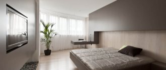
Basic rules for combining wallpaper in the living room
With the modern variety of finishing materials, decorating a living room with wallpaper becomes a real creative challenge.
By combining shades and textures, you can create a unique, memorable interior, while uniform wall coverings often make the room boring and inexpressive.
But in order for the wallpaper combination to look attractive, it is necessary to observe the laws of balance and harmony, which are based on the practical experience of many designers.
Accent wall
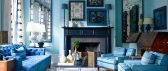
With the help of bright contrasts or noticeable prints in the living room, it is customary to highlight only one vertical. This can be a surface either behind the sofa or the one on which the TV is attached.
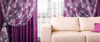
Curtains in this case should blend in with the prevailing type of decoration.
A good solution would be to repeat the accent motif in the decor - on sofa cushions, narrow borders, frames, etc. - this will give the situation a complete look.
The influence of colors
When choosing a wallpaper palette to combine, you should give preference to neutral, noble tones. Restraint in decoration emphasizes the beauty of furniture and accessories, serving as a canvas for a complete interior picture.
Colorful designs are permissible only in very spacious rooms, where creative eclecticism or avant-garde fusion reigns.
Prints
The patterns on the roll coverings that are glued next to each other must be in harmony with each other. The ideal tandem is discreet floral curls next to simple geometric lines made in the same color scheme.
If large drawings or photo wallpapers are placed on one of the areas, it is better to make the rest of the surface monochromatic.
Texture
To create a beautiful living room design, it is recommended to use wallpaper of approximately the same density and relief.
Coatings from the same series (catalog) are optimally combined. Repeating metallic shine, vintage matte or velor coating will visually unite the walls into a single composition, while different textures will introduce dissonance into the design of the room.
Wallpaper companions
The trend of combining textures has become very popular in many countries. Taking this fact into account, manufacturers began to produce entire collections of “paired” wallpapers that look together as aesthetically pleasing as possible.
If you choose one of these options, you definitely won’t go wrong, because the companions are developed by professionals and perfectly match all the necessary parameters.
The same roll width, coating density, texture, shades are the key to a truly beautiful and stylish wall renovation in the living room.
Thanks to their thoughtful design, companion wallpapers are highly compatible.
They have optimal proportions of colors and lines, and the edges are properly processed, so you can easily handle the gluing yourself. And, on the contrary, by purchasing coatings of different brands, apartment owners risk spoiling the interior with inappropriate colors and noticeable differences in thickness along the contours of the rolls.
Panels and niches for TV
A luxurious mural on the wall is one of the best ways to add zest to your living room decor. A large or medium-sized “picture” made of unusual expensive wallpaper will emphasize the impeccable taste of the inhabitants of the house.
To expand the space of the hall, plot images with a volumetric lighting effect are ideal.
3D photo wallpapers cope with this task perfectly.
But don’t remember boring landscapes with birch trees or waterfalls. Modern large-format printing studios offer countless options using computer graphics, adapted masterpieces of painting, imitation of wood carving, stucco, forging, stained glass and other fine art techniques.
When designing a niche for a TV, it is advisable to pay attention to more discreet options.
Conspicuous patterns and strong contrasts will distract the eye from the screen, making it difficult to concentrate and causing eye fatigue. The optimal solution for covering a niche (or ledge) in the living room is calm matte textures with an almost imperceptible play of light and shadow between the main and background colors and the shade of the patterns.
You can also choose to imitate natural surfaces - wood, stone, concrete, brickwork.
Vertical combination
To create a comfortable environment in the living room, the balance between horizontal and vertical lines is very important. This takes into account not only the finishing features, but also any other items.
So the natural horizontal is usually represented by a sofa, a TV, all kinds of shelves, and a low coffee table.
All this makes the interior squat and a little vague. To put the composition together, it is advisable to introduce elements that point upward. It is especially important to use this technique in rooms with low ceilings.
Ideally, vertical lines should start from the floor and end at the level of the ceiling plinth - this way they will help to “stretch” the room.
By the way, curtains should be designed using a similar principle, attaching the cornice at the maximum height. As for the wallpaper, they can either be alternated in uniform stripes, replacing the plain coating with a patterned one, or designed in the form of blocks. The second option is very convenient for zoning the living room into functional areas.
Horizontal combining
Wallpapering horizontally in design is rare. Firstly, this is a rather labor-intensive process, in which it is necessary to accurately measure every millimeter of the covering, and secondly, an expressive line along the walls noticeably reduces the height of the room.
This type of finishing is appropriate to use only in huge halls, where the abundance of free space creates the impression of excessive emptiness.
The horizontal combination is suitable mainly for living rooms in classic English or French style. In this case, the lower part occupies approximately 1/4 or 1/3 of the height of the wall. Dark, rich textures are suitable for decorating the “base”, while the top is covered with lighter and lighter wallpaper.
If the thickness of the materials differs, the joint between them is decorated with a special plinth, braid or border.
Alternate placement of wallpaper horizontally is suitable for narrow walls that need to be visually expanded.
And yet, in such cases, it is recommended to avoid too sharp color transitions, using at least one or two shades that are found in the rest of the interior and are fragmentarily repeated on other walls.
Alternating stripes
Alternating wallpaper sheets vertically is used mainly to visually increase the height of the ceiling. The thinner the alternating stripes, the more obvious the effect.
An excessively long wall will appear shorter if you apply the same method. The stripes can alternate with different frequencies and patterns.
This is also a simple way to adjust the lighting. It is enough to put in lighter colors the places where there is not enough light.
The number of combined materials can vary from two to five. The seam line does not have to be vertical - you can experiment with a zigzag or a soft wave.
The combination of light and dark options of the same spectrum will create the impression of a play of shadows, while contrasting stripes will add dynamics. Smooth canvases mixed with patterns on the same background will give the living room the solemnity of a columned hall.
- Despite the simplicity of selecting and gluing vertical stripes, you should remember some principles:
- Alternating in proportions of one to two bright canvases and monochrome ones looks very advantageous;
- Companion wallpapers should be of the same thickness;
- You can experiment with the boldest colors, including black and red, but with interesting textures.
Inserts
As a rule, this method serves only as a decorative element.
- Pieces of wallpaper of various patterns and textures of any size are glued onto the base coating. There are no restrictions on quantity or shape - it all depends on the desired look.
- The first step is to choose a place for the decorative insert. Shelves, mirrors and tall cabinets will attract attention, so it is better to choose a surface that is not cluttered with furniture.
- Inserts from fragments will look like full-fledged paintings if you frame each one with molding. This option is suitable for living rooms in a classic style.
- To give the interior a neoclassical taste, ornaments of complex geometric shapes are suitable. Rectangular and square ones will bring the spirit of Baroque.
- Despite their simplicity of execution, wallpaper inserts can also serve as a means of zoning. Placing colored fragments within the frame can indicate a recreation or play area for children.
- A patchwork panel can be considered a type of insert. Its purpose is to create a bright spot in the surroundings of the room, so there is room for creativity.
- In this case, any number of wallpaper fragments of different sizes and colors are used. The only rule in execution is the correspondence of the textures of the “flaps”.
The best wallpaper manufacturers
In order to choose the right wallpaper, study the market and make a choice only in favor of time-tested manufacturers:
- ELITIS - France.
- UGEPA - France.
- YORK - USA.
- KHROMA - Belgium.
- PALETTE – Russia.
- ELYSIUM – Russia.
What does the combination give?
First of all, the combination of different types of coating allows you to realize the owners’ ideas about an ideal interior. Photos with the idea of combined wallpaper for a living room similar to yours can be seen in the catalogs of specialized sites.
But sometimes such a design decision has other goals:
- Hide flaws. While a solid pattern can accentuate the curvature, it can be neutralized with the help of well-chosen color combinations.
- Zoning. Often the hall also serves as a dining, working or sleeping area. Marking them with a different color or pattern from the main one allows you to separate zones with different purposes.
- Balance the geometry of the hall. A narrow room will not become wider, and the ceiling will not rise, no matter what wallpaper you put on it. However, the gradation of the wall shade from darker to lighter will visually increase the volume of the room.
- Visually filling the space of a room with minimal furnishings and highlighting the furniture upholstery in contrast will allow emphasizing one wall.
- Draw attention to a significant area, be it a photo gallery or a TV, by creating a focal point. In a splash of color, things dear to your heart will look especially advantageous.
There is also a fifth reason, not classified as a designer one, but pleasing to the owners.
Construction stores are selling stock at a significant discount. You can select high-quality companion materials from an expensive collection at a very reasonable price.
Accent wall
The main thing in this technique is to choose the right wall itself.
In a living room in a high-tech or minimalist style, it will complement the decor and attract attention.
Proper use of this technique can solve several problems simultaneously. But for its successful implementation, several rules must be taken into account.
In order not to oversaturate the room, it is worth highlighting no more than two vertical surfaces.
In a narrow room, short walls are pasted in bright colors, and long walls in calm colors. This will expand the space of the hall without unnecessary reconstruction. The combination of soft warm and cold colors also allows you to visually increase or decrease the area.
Most often, the active zone (the place with the TV) or the relaxation area (behind the sofa) is emphasized. A partition with a window block is only intended to emphasize the textile design. You can highlight a certain area by playing with the textures of the coating materials, but the tone will remain unchanged.
An accent wall sets the tone for the entire room. The choice of its color scheme should be primary, the main tone of the room should be consistent with it.
The easiest way to perform this technique is to cover it with photo wallpaper. Real photos, floral drawings or shadow projections will transform the living room space and set the style axis for the interior.
Combination principles
The spectral principle is based on the selection of clothing for walls in the same color scheme, differing in tone. You can go from chocolate to beige, from aquamarine to sky blue or from lemon to orange - the choices are endless.
A combination based on the principle of balance involves choosing a bright pattern or an intricate pattern next to plain wallpaper. Moreover, the color of the latter repeats one of the shades of the main pattern.
You should combine wallpaper with different patterns very carefully, only then will you get a harmonious duet. Not only the shades used should sound in unison, but also the type of pattern.
A simple background pattern is successfully combined with a more complex and bright one for the highlighted areas.
It is better to play with the principle of contrast by using monochromatic coatings of opposite colors of the spectrum.
As an option, you can choose companion wallpapers with the same pattern on contrasting backgrounds.
When combining according to the principle of texture, choose materials in the same color scheme - this way you will achieve the greatest effect.
The combination of smooth and vinyl wallpaper will create the illusion of relief and complement your interior style.
Combining plain wallpaper with printed canvases
Now about popular printed wallpaper. In order not to create a heavy atmosphere in the living room, it is better to combine printed wallpaper with plain canvases. Don't forget about harmony here.
Important! To create a harmonious combination, the background color must be present in the print.
If the background color is duplicated in the print even in a small amount, the overall composition will already look consistent. If you can’t find such a combination, choose a color close to one of those present in the print.
The best option would be to use the print entirely on one wall, and make the rest plain.
The best option would be to use the print entirely on one wall, and make the rest plain. In this case, you can also combine different types of wallpaper. Think, for example, about popular photo wallpapers. The main thing is to choose a modern and suitable design. The landscape or flowers have already faded into the background. Pay attention to more modern options. Perhaps you'll like arthouse?
Pay attention to more modern options. Perhaps you'll like arthouse?
See alsoModern wallpaper 2022 for the hall
Tips for choosing and arranging finishing materials
It is important to imagine the final appearance of the room before starting work, since the walls are only the basic background for realizing the design idea, and not the basis of the interior. The pattern on them may differ from the furniture and decor, echo the ornament on them or shade it.
Think about what palette you want to see. Consider a few recommendations:
- For small studios and Khrushchev buildings, choose light, sunny or cool shades. They will visually increase the space.
- On large areas, any color scheme that suits the setting looks beautiful.
- If you find an interesting covering with an ornament, combine it with a plain surface. Otherwise, the end result will be too colorful. The same rule applies to bright colors.
- Choose a contrasting combination of wallpaper in the living room to visually expand, zone it or hide defects on the walls.
- The ideal number of companion backgrounds is two.
- In the store, focus on products from the same manufacturer, price category and collection. They will look harmonious.
- The texture can be smooth and embossed. Combine them with each other and you will get a beautiful effect.
- To expand a narrow space, make long surfaces light and the ends dark. You can hide an uneven area by creating a bright accent on the opposite side.
- Pay attention not only to aesthetics, but also to the practical properties of the canvas. They depend on the material.
Which ornament to choose
Some types of designs are characteristic only of a certain style, for example, with stars and polyhedrons typical of the East. A small flower - romanticism or country, lavender sprigs - for Provencal style, deer - Scandinavian interior.
A great way to emphasize the style is to stick on several stripes with a characteristic pattern.
An abstract pattern is not suitable for a classic interior, but it is an excellent solution when decorating a room with wallpaper in the avant-garde or fusion style.
A minimalist setting does not tolerate variegation, but you can successfully combine smooth and textured wallpaper or two related shades. Japanese minimalism is emphasized by stripes with branches of cherry blossoms or bamboo branches. The interior of the living room with two types of wallpaper, including hieroglyphs or photo wallpapers with Japanese geishas, looks no less colorful.
Living room design with beautiful wallpaper
Combination of light wallpaper in the living room interior
Striped wallpaper is very specific; it is used to visually expand space. It is not always possible to find a harmonious duet with other rolls. The stripes are arranged differently:
- vertical;
- horizontally;
- diagonally;
- combined wallpaper of 2-3 types in alternating stripes.
Modernism and postmodernism involve wallpaper with sinuous lines and floral patterns characteristic of this style.
Using leftover wallpaper of various types, you can create an art object on the wall in a modern style:
- recognizable black and white silhouettes;
- original collage;
- schematic images.
Properly selected combined wallpaper will help revive a boring interior, making it more dynamic and unique. To do this, it is not necessary to completely renovate; it is enough to beat up one wall by choosing wallpaper of a different type.
Living room interior with beautiful wallpaper
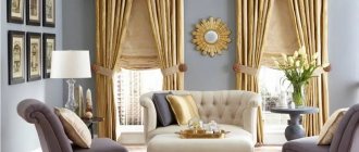
Living room with bright wallpaper
Combining wallpaper in the living room
See alsoDark wallpaper in the interior: recommendations, photos
How to choose wallpaper: characteristics of the main types
Most often, stores sell several options:
- Paper. Suitable for a living room where frequent changes of decor are planned. They come in single-layer and double-layer. They are inexpensive, but short-lived.
- Non-woven. A more expensive product, there are two varieties: with a pattern and for painting (if you don’t find the right color on sale). They mask unevenness well and do not require preliminary work to level the surface.
- Vinyl. The most durable coating, suitable for narrow layouts where there is a high probability of damage to the wall. Vinyl is washable.
- Textile. They differ significantly in cost - it is higher than in other categories. Durable, stylish.
Usually stores have stands or catalogs with ready-made selections from manufacturers. You can choose a design option from them, but it’s much more interesting to make your own project. To do this, you need to understand the principles of color.
Features of selection
Each collection includes several types of wallpaper:
- With different backgrounds.
- With designs of different sizes.
- With complex and simple geometric print.
The options offered in the catalog combine perfectly. However, this does not mean that they will also look harmonious indoors. So which wall should you use as an accent wall? In what size room will wallpaper with a small pattern look better, and in which room with a large one? And is it possible to combine different wallpapers with each other?
The first thing to remember is that accent wallpaper can be used to decorate one or two zones. Otherwise, they will get lost against each other and give the room a very strange look.
In rooms with a small square footage, it is better to avoid using accent materials altogether. In such a space, wallpaper in calm tones, without a bright, large pattern, will look better. If you don’t want to use one color finish, you can combine two or three calm tones. They will look great in a small room.
Combination of shades when combining wallpaper in the living room
In the design of a large room, you can use not only contrasting, but also related shades. These are two similar or the same tone of varying degrees of saturation.
Use the principles of the color wheel.
It is divided into 12 sectors. You can choose a range from one sector, two/three adjacent ones or from 2 opposite parts. Another harmonious combination is three palettes equidistant from each other. The picture below shows how to do this. The highlighted triangles contain shades that match each other.
There are also online services that make selection easier.
Also take into account the peculiarities of the psychological perception of gamma. For example, red and scarlet colors are considered aggressive: it is not recommended to use them in their pure form - a pattern or small inserts are enough.
- Orange. Cozy and active at the same time.
- Pink. Visually increases the space. Depending on the saturation, it can be calm or bright.
- White. A win-win in tandem with pastel colors and black inserts.
- Lilac, purple. Light variations visually expand the room.
- Green, blue. They calm you down and put you in a positive mood.
Which color combination to choose?
The area of a small room can be visually increased using the color of its design or a combination of several shades. Wallpaper in cool colors always visually expands the space, so the room with them will seem larger. Blue and light gray shades will add airiness to the living room. Golden wallpaper is also suitable for the living room; visually, it does not increase the space, but makes it more comfortable and fills it with sunlight.
How to combine wallpaper in the living room if it has a pattern
A win-win and simple option: pattern and plain coating. A little more complicated - two ornaments or geometric shapes with the same color or print. In the first case, the patterned canvas is glued to only one wall. Sometimes it resembles a big picture.
There is no need to load such a surface with objects - it looks best empty or with a mirror. Shades can be contrasting and related.
The second idea requires a careful approach to the choice of material and medium or large space. You can arrange the same or different palettes.
Look at the photo to get an idea of what it looks like.
A geometric print can be used to make a room look more formal or orderly. Some combinations look very interesting.
Children's room for growth
In the distant past, the design of a nursery in pink and blue tones was considered the norm. Bold combinations of patterns and stripes came into play. One wall carries the mood; there can be balls, bears, flowers, birds and tropical plants on it. The remaining walls are decorated with plain wallpaper, along which stripes run. They can be glued both horizontally and vertically. It’s easy to place an accent track under the ceiling or along the baseboard, then the interior design will play differently, but will maintain a catchy effect.
Two-tone wallpaper combination
Combining two colors is possible in three types: simple, moderate and complex.
A simple combination is a certain pattern of the roll call of two harmonious shades; moderate - the shades do not exactly match each other, but are organically integrated into the interior design, and complex is a combination of more than three shades of different saturation (examples in the photo).
To successfully choose wallpaper of two colors, you can choose shades that belong to the same color palette: for example, deep green with mint, a combination of red and pink.
This combination creates smooth, harmonious transitions from wall to wall.
When combining a plain shade of canvas and a patterned one, which is the main one, you should choose the color of the first roll of wallpaper in accordance with the lightest area in the pattern of the second.
The second method of selecting two colors is based on the principle of contrasts.
Choose colors that do not contradict each other, but play in contrast. For the interior of the living room, a combination of bright red and white, or bright turquoise and beige (interesting design in the photo) will be successful.
Princess room
In a space for a teenager, you can throw away boundaries. The brighter and more intense the design, the more energy it gives to the unformed nature. The combination of pink and gray is perfect for a girl, plus a romantic pattern with large hearts is organically placed on the accent wall. For a guy, you can make the same design, but replace the color scheme with blue and white.
Original solutions: ideas and photos
A successful combination of wallpaper can highlight the unique design of the living room. If you use your imagination, everyone can feel like a designer.
There are several basic, effective options for using a combination of textures and colors:
- It is best to decorate the various ledges and niches of the living room with wallpaper of a dark color or with a variegated pattern. The niche will seem deeper, and the partition will distract attention from the imperfections of the layout;
- inserting square or rectangular sections of wallpaper with a classic or other pattern into a baguette frame looks like paintings and can bring a touch of aristocracy to the interior.
- For functional zoning, an excellent option would be to combine plain materials with floral patterns, and neutral colors with geometric shapes - with wallpaper in a small pattern. The main thing is that the tonality matches and is not too saturated;
- a narrow strip of rolled material on the ceiling, as if continuing the wall, looks very original. Apart from this stripe, the rest of the background should be neutral shades.
Another common option: creating an accent wall that defines the color scheme in the living room. Typically, one of the walls that receives the main attention (the location of the sofa, TV, or opposite the entrance) is covered with bright, textured wallpaper or photo printing. The remaining walls remain neutral.
Among other things, this option will help you save money; wallpaper with a pattern or photo printing is usually expensive, but here little of it is spent.
Types of wallpaper for the kitchen-living room - colors and materials
Wallpaper that can withstand temperature changes and high humidity and does not absorb odors and grease is suitable for the kitchen. For example, inexpensive paper collections will not last even 5 years. In addition to the practical role, when choosing a beautiful combination of wallpaper for the kitchen-living room, it is important to take into account the design of the room.
Non-woven wallpaper is a modern and practical replacement for the paper version. They look more original than standard collections. Dense fabric has a fibrous structure and looks more textured.
Modern style kitchen
Vinyl wallpaper perfectly hides wall imperfections and is highly durable. They are easy to wash and repaint.
Paintable wallpaper is a great option for a large living room. Thanks to the ability to choose several shades, it is easy to create original color combinations.
See also Striped wallpaper for walls in different interior styles
Changing the visual perception of the room
It is not recommended to use large patterns in areas of the room filled with furniture; for such rooms you should use a combination of cool, solid colors.
The chosen wall shade can affect the visual size of the space, but differently for small and large rooms:
- To reduce an excessively large space, which sometimes creates a feeling of emptiness, you need to use dark colors in the interior, for example, a combination of black and blue colors on the wall. Large patterns and large ornaments will create a similar effect;
- It is better to decorate a small room in light colors or combinations thereof. One of the walls can be covered with brighter or more textured coatings so that it is perceived as the basis of the interior. Covering the wall with canvases with horizontal contrasting stripes will expand it, and vertically applied stripes of two tones will visually make the ceiling higher;
- if the wall is not perfectly flat, or there are any other imperfections on the surface, it is better to cover it with materials of dark shades. Too noticeable defects will help to hide combined non-woven or glass wallpaper; their texture can make defects almost invisible;
- different heights of the walls, and, accordingly, different levels of the ceiling will help smooth out the combination of horizontal and vertical bright stripes on the surfaces of the walls. The first ones raise the ceiling level, the second ones lower it, so you can bring the space to harmony. Combining wallpaper with horizontal borders and a combination of light and dark shades will also help lower the ceiling.
Allocation of niches
Niches in the living room give it a unique shape and serve to place equipment or display decor. And with a successful selection of design, they add bright accents to the interior and become decorations themselves.
The peculiarity of this design is that it is already dedicated. It only needs to be accentuated a little or diversified with a play of shades.
Combination allows you to emphasize a niche space and create the most advantageous background for the item placed in it. If the main wall design is monochromatic, wallpaper in more muted tones or with a pattern is suitable for niches.
The combination of materials inside a niche looks very impressive. For example, jagged stonework on top of a smooth surface, as if emerging from the plaster.
Grading shades from light to dark and back looks non-trivial and will add depth to the niche space. Also an interesting option for decoration is story-based photo wallpaper.
The textured coating of the niche surface, imitating natural materials, will create the illusion of a secret room and add coziness.
Combination principles
There are no strict rules in the selection of different wallpapers - it is a matter of your taste and imagination. But to create a harmonious and effective combination of wallpaper, it is useful to learn some secrets of professionals.
Choose combined wallpaper for the living room from the catalog of one manufacturer. As a rule, ready-made options with real photos are offered there. For a living room in the style of eclecticism, minimalism and hi-tech, coverings that are the same in texture, but different in color or pattern, are selected.
For lovers of the classics, it would be best to match single-color wallpaper with a pair with a pattern or two to four shades darker. Bright, saturated colors are balanced with muted, neutral ones.
Floral patterns look good with textured wood-look canvases, stripes and checkered patterns look good with abstractions. To avoid exposing the cuts, for vertical combinations the wallpaper must be of suitable thickness and quality.
The designs you choose may look completely different in the lighting and decor of your living room. No matter how real the photos are, it would be a good idea to check them at the repair site. Be sure to duplicate the color of the selected wall covering in the details of the furnishings, then the living room interior will look complete.
Fixing living room lighting
In addition to changing the area and dimensions of a space, lighting deficiencies can be changed through wall covering design. If the living room is overly illuminated, it is recommended to use dark-colored canvases to cover the walls, since they absorb sunlight (photo of a brightly lit living room).
On the contrary, a space with insufficient lighting will become gentle and cozy when using light coatings or with gloss, or a pattern applied to them that shimmers when light hits it.
Thus, the effect of using combined surfaces is varied: it is possible to change the dimensions of a space, correct disproportionate rooms, adjust the ceiling level, hide defects in wall surfaces, and add or remove light from a room.
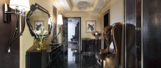
Wallpaper companions for the hall
A stylish combination of multi-colored textured canvases helps to create an extraordinary living room design. New and unexpected combinations of wallpaper when decorating walls can not only emphasize the style of the interior, but also visually change the geometry of any room (corridor, hall, bedroom, bathroom).