The living room is the center of the house and sets the overall style for all other rooms in the house. They spend a lot of time there with their family, relax and recover after a hard day. In addition, during holidays or special dates, guests and friends gather in the living room. The right color scheme will lift your spirits and relieve stress.
Color selection criteria
The color palette can expand or narrow the space of a room. Hide flaws and highlight advantages. So, what influences the choice of colors for the living room:
- Room size
- Illumination level
- Wishes of the room owners
- Functionality requirement
For small rooms, the optimal solution would be a light and pastel color palette. They will make the room more spacious and comfortable. Complement the interior with a geometric or classic pattern on one of the walls to set the dynamics and enliven the design of the room.
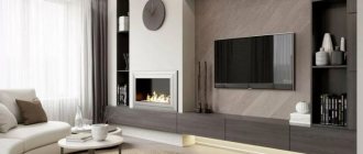
Large rooms have no restrictions on the choice of color; any shades here will look advantageous. Playing with contrasts will look fresh and bright, soft transitions and gradients will add tenderness.
Emerald scale
The deep color of the gemstone is associated with wealth and mystery. The emerald hue has a special magnetism: it will be appreciated by people with refined taste. Dark green with cold or warm notes instantly attracts attention, so it is not suitable for completely painting all the walls.
To create a harmonious living room interior, add a mustard or honey color accent.
Criterion for cardinal directions
Before turning to the cardinal directions, objectively assess the degree of natural lighting in the room. If it's dull, choose light shades. If it is sufficient and even excessive, do not deny yourself anything.
- North side
This type of room is characterized by dim lighting and coldness. To balance these parameters and make the interior harmonious, use warm colors that will softly and unobtrusively fill the room with light and “warm” the overall perception. Yellow, green, beige and brown colors are suitable for this.
- South side
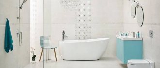
In this type of room there is a lot of heat and sun, so the opposite rules apply here. Use cool shades, so the room will be comfortable and cozy. Choose soft blue, turquoise and white shades.
- East side
For this type, a harmonious combination would be a warm and light color scheme. Pink, honey, peach tones are perfect.
- West side
This type of room “loves” cool shades. Gray, blue and mint shades look especially good.
Purpose of the living room
Design always needs to start from the end. No matter how strange it may sound! In order to choose finishing materials, textiles, pieces of furniture and decor and (most importantly!), think about the location of sockets and lighting, you need to imagine the result.
Get everyone together and discuss your wishes about how the living room should ultimately look. Be prepared for disputes and disagreements, because they are what help the truth to be born, that golden mean that will satisfy all family members.
Think about how you are used to or how you would like to spend your leisure time at home, what is closer to you: quiet, calm evenings in the company of an interesting book, an exciting movie and a glass of wine, or fun, noisy meetings with your favorite friends? Do you often receive guests? Who in the household will use this room? Does anyone have to work from home? If yes, how often? Do I need to provide an extra bed or is a sofa and an armchair sufficient? Where in your home will the dining area be located? What about books? Do you have a lot of books? Or maybe dishes? Or do you treasure a collection of tiny elephants collected from all over the planet?
There are no minor points in this matter; everything needs to be taken into account and put in its place. There are no quick answers or ready-made interior solutions here – only you decide everything. It is important not only to choose the purpose of the living room correctly and wisely, but also to set the mood that you want to convey to those who come to visit you.
Feng Shui Philosophy
Everyone has heard about this philosophy, but few really took it seriously. This is an old theory that helps create a favorable and comfortable environment by using different shades and objects. According to Feng Shui, it is generally accepted that each color carries a certain energy, which affects the general condition of a person.
The color palette is selected according to the theory of the feminine or masculine, and also takes into account the side of the world to which the room’s windows face.
How to define functionality
Before purchasing furniture paraphernalia, it is recommended to clearly define the purpose of the living room. The room can be equipped for home gatherings, watching your favorite movie or intimate conversations.
Some people prefer to decorate a guest room for special occasions and banquets.
In small rooms, the living room is connected to the kitchen, thereby creating a cozy dining area.
- When designing such a space, it is necessary to take into account the availability of free space for the correct choice of furniture.
- For example, for a small living room, an alternative solution would be to choose transformable items.
- Thus, after using the product, it can be neatly folded. Similar criteria apply to chairs, tables, sleeping and relaxation areas.
The spacious living room can be decorated with modular sofas and a large dining group. Such a room can be divided into several zones, each of which will be intended for a certain type of action. Here you can relax, welcome guests and hold special events at the same time.
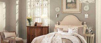
Beige palette
Shades in the beige palette are universal. They fit perfectly into any style, look warm and cozy. And if after a while the interior seems too boring, complement it with bright textiles, decorative elements, carpets, chairs, blankets, capes. The general perception will immediately change, and you will not have to make expensive repairs. Again.
Basic recommendations from designers
Despite all the subjectivity of the interior design process, you should not give too much free rein to your own imagination. There are certain design canons that should never be overlooked.
They describe, for example, what combinations of shades create comfort and put you in a creative mood, and what color combinations will only irritate, cause discomfort and secretly provoke family scandals.
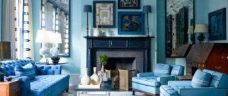
Blue palette
Such shades are associated with freshness, lightness and have a relaxing effect. For those who are constantly under stress, this solution will be optimal.
Style
Style is what fashion dictates to us. Fashion says that the entire interior of your house or apartment should be executed in the same style. If you do not maintain unity, then it will seem to you that you are in several houses at once, or a guest in your own house! The living room should be no exception and you need to follow the chosen style here too.
The style largely depends on your preferences and lifestyle, as well as the message you want to convey to your guests.
A living room in a classic style will always speak of the wealth, solidity and impeccable taste of its owners, because no matter how much fashion changes, classics always remain classics.
A modern living room will tell you that the owner of the house keeps up with the times, values his time, and loves to be “in trend.”
If, when you come home from work in the evening, you dream of sitting on a soft, comfortable and lush sofa with a fresh newspaper in your hand, then your style is classic.
If you like board games, active recreation and meeting with friends, modern is closer to you.
Classics require a large amount of furniture, textiles, and decorative elements.
Modernism is ascetic, it implies only straight lines, a minimum amount of furniture, maximum light and air.
Always choose what suits your heart. Modern trends in global furniture fashion do not limit us to a rigid choice; rather, on the contrary, they offer interior solutions for every taste, age and budget.
White palette
White colors are neutral and by adding different tones of the color spectrum they achieve different therapeutic effects. This color will add light and lightness and will become a blank canvas for the artist - the owner of the living room.
All answers have long been given
In order not to reinvent the wheel, groping for the right answer by trial and error, it is enough to focus on the reviews of experienced designers who have long ago and accurately described which color is suitable for the living room in each specific project.
Green palette
The most natural color that reflects inner harmony. Green is used to create eco-interiors, which are very popular now.
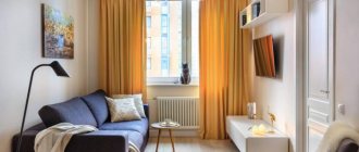
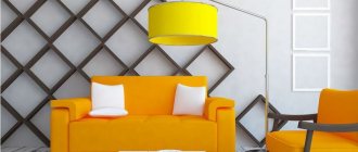
Yellow palette
The color of the sun and good mood. Our subconscious perceives it as a messenger of wonderful news. Under its influence, the depressive state goes away, energy and vitality appear.
The coolness of blue and the warmth of wood
Classic blue gained universal recognition last year, but that doesn't mean it's time to say goodbye to it: the color is still relevant and attractive.
Blue is traditionally perceived as calming, non-aggressive, and associated with the vast evening sky. Its depth and reliability are best emphasized by a warm wood palette.
Olive palette
It is made by mixing green and yellow. He took the best from everyone. The interiors in its design appear calm and positive. In addition, they look noble, solid and expensive. A unique shade that all designers love dearly.
Window orientation to north
A living room with windows facing north will look better in eye-catching colors that are pleasing to the eye. This choice is dictated by the need to make up for the lack of daylight.
The color combination in a north-facing living room should be reminiscent of a tropical beach bar. Simply put, the furnishings and decor in this case should be yellow, green, sand and brown.
Peach palette
It symbolizes the summer mood of carefreeness, the threshold of positive events. Suitable for classic, modern, art deco or fusion styles.
Turquoise palette
Creates space and an atmosphere of a fresh summer breeze. Positively affects the psyche and general state of mind. This palette consists of many additional tones. From dark deep to light and weightless.
Playing with the colors of dawn
It is difficult to find a more beautiful sight in nature than the morning dawn. This means that a living room with windows facing east should fully capture and enhance those delicate colors that spread across the sky from five to seven in the morning. Accordingly, wallpaper, wall hangings, furniture and curtains should be soft pink and peach colors.