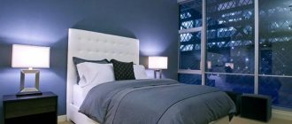
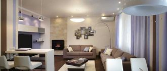
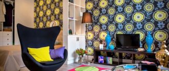
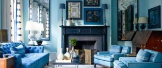
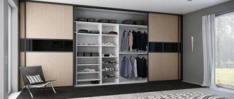
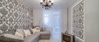
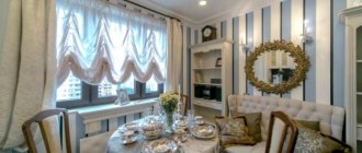
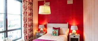
Looking through images of interiors that designers have worked on, you are unlikely to find sets of the same type of furniture there. Among professionals, it is not customary to furnish a room with items from only one set or one collection. Why? Why is different furniture better than complete furniture? Firstly, using only the same furniture is an indicator of professional timidity and lack of confidence in one’s abilities. A designer must be able to work with colors, textures, and proportions.
Secondly, the same type of elements deprives the interior of individuality, making it uninteresting, stereotyped, and faceless. Few people, for example, would dare to dress in denim from head to toe. Interiors with monotonous furniture look just as ridiculous and dull.
Thirdly, mixes are a trend of our time. Now it is fashionable to mix colors, textures, materials, styles, shapes, sizes. There is a special chic in both clothing and interior design - combining seemingly incongruous things, achieving harmonious results.
You can design your home all your life - adding something, changing something. And here you can’t do without the ability to combine different furniture.
You can always place an individual order
Nowadays the market offers a huge range of furnishings of any size and color. If, for example, you need a coffee table for a room with brown parquet, and all city stores sell only light models, then suitable dark furniture in the interior will appear after one visit to the design studio.
Nowadays there are more and more craftsmen capable of making furniture according to a customer’s design. At the same time, the quality and artistic level of such products are often two levels higher than similar indicators of factory products.
How to reconcile furniture with the decor?
Only by including an item in the interior can you say unambiguously whether it is suitable or not. What to do if the item doesn’t fit in?
You can, of course, return your purchase to the store. But if the shape, size and style of the new item suits you perfectly, it’s worth considering the option of painting. So, a birch-colored chest of drawers can be tinted dark brown or painted turquoise, mint, coral, gray. The furniture will play in a completely different way, and most importantly, it will make friends with your interior.
If the furniture clashes with the floor, a carpet or small rug will come to the rescue. It will play the role of a buffer smoothing out the transition.
If a piece of furniture stands out too much from others and creates an imbalance, you can organize a special background for it, against which it will not be so “dazzling.” Let's say a dark dining table, which is not very organic in a light interior, will look completely different if you darken the wall near which it stands. It can be covered with wallpaper, painted, covered with boards, decorated with a large mirror or a picture in a dark frame, etc.
Textiles will also help correct the error. Is the countertop completely out of place? Cover the table with a tablecloth. Chairs can be hidden under covers, and consoles and tables can be dressed up as “skirts”. It is always easier to choose a fabric of a suitable shade. To begin with, you can buy a very small piece and “try it on” to a specific interior, and then make a final decision.
Wallpaper is also used to change the image of furniture. They are used to cover the back walls of shelves and open cabinets, as well as cabinet doors, front panels of chests of drawers, etc. Read more in our article “Decoration from leftover wallpaper” .
Experiment with combinations, play with colors, get creative, change the look of familiar things. The more courage you have, the wider your opportunities!
Avoiding color clashes
The sharp expansion of product selection is caused by the fact that today residents of large cities, constantly reading articles about lifestyle, very carefully monitor the observance of color and style harmony. They are fully aware that gray furniture in the interior will come into sharp conflict with sky-colored wallpaper and a mother-of-pearl suspended ceiling.
Accordingly, retail chains strive to make their assortment as diverse, richer, and more modern as possible.
Combination secrets: quick and easy
- Wood is the most difficult to get along with other materials: in total, there should be no more than 3 shades of wood in the apartment (this also includes the floor, baseboards, doors, etc.). Warm shades (which contain red and orange pigments) are combined only with warm ones, cold shades (gray, coffee) - with cold ones. White and straw colors are considered universal;
- If you are not confident in your design abilities, choose large furniture that matches the color of the walls: for example, beige wallpaper and a creamy sofa, but the armchair and coffee table can be bright;
- Wood goes well with glass and transparent surfaces, mirrors, textiles, while plastic looks somewhat alien;
- If you see that some piece of furniture is a little out of the overall picture, you need to add similar accessories: for example, set off a dark table with a mirror in a brown frame, and a green chair with a vase of the same color;
- Color transitions look good: blue-blue, brown-beige, purple-light pink, marsh-green and other related shades. Black, white and gray furniture is considered universal;
- If you want to give the interior a little drama, use rich, deep colors and catchy textures; light colors always give the room softness and lightness.
And remember: ready-made typical sets are the choice of people who do not have the desire (or opportunity) to add zest or a touch of charm to their home. By combining furniture, you can create a stylish and individual interior!
The meaning of careful selection
Properly combined fragments of the spectrum can significantly lift your mood, inspire new achievements and evoke pleasant memories. They advantageously modulate the living space and create a friendly atmosphere in it.
Judging by the photos of the ideal combination of furniture published on the World Wide Web, skillful manipulation of areas of the gamut alone may be quite enough to turn standard housing into real palace chambers.
Living room idea
This room can easily be called the most important room in a house or apartment; the combination of furniture and wallpaper should be thought out in advance, and zoning should be done correctly.
Celebrations of special events, meetings with relatives or friends and dinners with the whole family will often take place here. Nothing should interfere with productive communication, and the environment should bring only joy and smiles to people’s faces.
Important! The living room is not afraid of contrasts; experts assure that it is inappropriate to avoid extravagance in every possible way; if there is little free space, then voluminous mirrors and light colors will help expand the space.
When choosing additions for a room, you can look at specimens of bright colors, yellow, red or red, such an approach is sure to be crowned with success. Violet, blue and green shades can add freshness and airiness to the design; black will help hide some problem areas of the living room, but visually the space will seem smaller.
A combination of shades close in spectrum
This goal can be achieved by using different halftones of the same color. For example, light pink will look nice combined with cream, caramel, early dawn, shrimp and strawberry.
A table of color combinations, which can be found in design reference books and other literature devoted to the art of design, will help you not make a mistake in selecting acceptable shades.
An alternative is to select furniture and decor in colors that are located nearby in the spectral band. These are, for example, armchairs with blue upholstery and chairs with purple, a green sofa and a bluish bed.
Combination rules
Understanding all the important nuances regarding the combination of furniture colors, every owner who has taken up the implementation of one of the ideas should remember the advice of stylists.
- White harmonizes perfectly with any other shade; there should be no problems during the design process; black will also suit almost every interior; it should be diversified with yellow, green or red.
- To refresh the room, designers use green; it can be successfully combined with gold elements, sand and brown decorative additions.
- Red is quite provocative; when choosing it, you should carefully consider all the moments; often the situation is diluted with a gray or black tint.
- The joyful and sunny yellow tone can be used productively in combination with green, black or gray.
- Blue is more calm, this design is appropriate in rest rooms, one of the successful additions would be green or yellow, you can introduce steel parts.
Spectral circle and seasons
Combining more than three similar shades in one interior will be quite difficult. If such a task is set before an experienced designer, then he will find the optimal solution using a color ring.
The theory of seasons will also be a good help in this matter. She claims that in nature you can find pleasant combinations of different colors by following the color schemes of the seasons. For example, the spring season gives designers such pleasant ideas as a combination of yellow and pink, red and beige.
Color Combination Basics
It is advisable to choose a color combination using a color wheel, which includes primary additional and auxiliary colors. Designers have developed many techniques for combining them, using various schemes. You can use:
- monochrome;
- adjacent;
- contrasting;
- triadic.
Monochrome interiors involve the use of monochromatic color schemes, where different shades of the same color are used. Thanks to the smooth transition of shades, the interior always turns out calm and soft, giving peace. This option can always be diluted:
- white;
- black;
- silver flowers.
Adjacent colors are those that are located next to each other on the color wheel. But one of the colors should be dominant, and the second should be used for accentuation. Such combinations create a relaxed and harmonious atmosphere.
Contrasting means using spectrally opposite shades, for example:
- blue and orange;
- red and green;
- yellow and purple.
Such combinations are very bold. The finished interior always turns out bright and extraordinary, but it can quickly get boring. Therefore, it is better to implement such combinations in details that can be easily changed if desired.
A triadic scheme is a combination of three colors on the color wheel that are equally spaced from each other. Of these, you need to choose one main one, the rest will be auxiliary.
Color combinations for the kitchen
Not all colors are equally suitable for the kitchen. For example, a blue tint can reduce appetite, and such as black, gray, white can provoke depression and apathy, red excites the nervous system, causing fatigue. But with the right combination of colors, you can avoid negative qualities from using each.
Combination of muted tones in the kitchen interior
Therefore, before choosing the main tone for the kitchen, you need to choose the main item on which the emphasis will be placed. It can be:
- walls;
- work apron;
- furniture or tabletop;
- kitchen accessories;
- Appliances.
There should be one thing like this if it is supposed to be in your interior. If this is bright furniture, then the wall decoration should be restrained, and vice versa.
Combination rules:
- Cold tones do not work well in the kitchen. Therefore, when choosing such colors, it is advisable to combine them with details and accessories in warm shades.
- Neutral and restrained shades of moderate brightness are suitable for the kitchen.
- There should not be more than three contrasts in the room.
- Colors such as orange, red, burgundy, which can be combined with white, beige, and black, look good in kitchens.
Advice A suitable combination for the kitchen is considered to be a brown-green color scheme, which has a beneficial effect on appetite, creates a pleasant feeling of comfort and unity with nature.
For the living room
When choosing a color scheme for a room such as a living room, you need to pay attention to the following fundamental factors:
- room size;
- its purpose, that is, its character;
- selected design style.
For small rooms, too bright, dark or saturated shades are not suitable as a base color. They will make the room even smaller, the atmosphere in it oppressive and uncomfortable. A spacious room provides more opportunities for color combinations.
The living room can be an independent room, and also serve as a place for relaxing, sleeping, receiving guests, eating, and studying. Therefore, it is worth choosing the color of the room.
To welcome guests, this room can be decorated in pop art style with bright flashy colors:
- pink;
- green;
- blue;
- brown;
- beige;
- lactic.
If this is a place for sleep and relaxation, then a pastel palette typical of the shabby chic and Provence styles is selected. These are delicate shades of blue, pink, green, purple, mint, combined with each other.
Let's consider suitable combinations of shades with the existing main color:
1 Red - to reduce the aggression and danger of this color, leaving its ability to charge with energy and create a joyful mood, you can combine it with shades of brown, even the lightest, white and gold.
In red colors
2 Orange is the color of energy. But its excess provokes the appearance of a depressing state. When combined with white, beige, blue, brown, the living room will look life-affirming. Orange accents can be textiles, one of the walls, small details in the form of pillows, stands, bedside tables, paintings, tables, curtains.
Orange is the color of energy
3 Yellow will become a symbol of prosperity and joy. For the living room, the right combinations of yellow will be with peach or coffee. If this is a triple combination, then you can choose white and lilac, orange and green. Yellow looks good in the same group with gray, milky, brown.
Symbol of prosperity and joy
4 Green - the color of harmony looks great next to shades of wood, white, light yellow, dark cherry. You can try combining it with beige, blue or blue in the living room. Light shades of green will lift your spirits, while dark shades will calm the nervous system.
Green – the color of harmony
5 Blue is a cool color that evokes associations with the surface of the sea. When combined with ivory or white, it will always transport people indoors to an imaginary seaside. You can complement the interior with blue details, choosing restrained and neutral shades of this color.
Evokes associations with the surface of the sea
6 Brown is the color of nobility. This color is a classic and versatile option for the living room, as it can go well with almost all other colors. A brown-white interior emphasizes a classic style, while brown-yellow or brown-green colors suit a modern style. An unusual design, filled with mystery, is obtained by combining brown with purple.
Brown is the color of nobility
7 Gray - can be a great neutral base to combine with a variety of other shades. Its companions are blue, light blue, pink, red, green, yellow. White or black in combination with gray will look boring in the living room, but not in a high-tech or minimalist style.
Neutral base to be combined with many other shades
For the bedroom
When creating an interior design for the most personal place in the apartment, such as a bedroom, you need to strive to embody not only a stylish design, but also be able to focus on exactly those colors that will promote relaxation, falling asleep quickly and a pleasant rest. Therefore, pay attention to the already existing correct and interesting combinations:
Greens and turquoise – this tandem can be complemented with white and brown. It gives a boost of energy and instantly relieves fatigue.
Greens and turquoise - gives a boost of energy
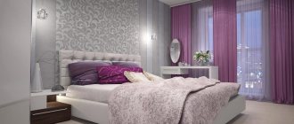
Gray and lilac - the room looks much brighter when several more shades are involved in mixing - lilac, close to purple and violet, but not saturated, as well as mustard.
Gray combined with lilac
Blue and beige – you can also choose several shades of blue and discreet dark blue. It would be good if beige with splashes of pink was used in the details.
Blue combined with beige
Berry mix with mustard - involves choosing mustard as the main tone of the walls. Its lighter shades can be used when choosing chests of drawers, cabinets, and bedspreads. For the bed and bedside tables, dark brown can be chosen. Otherwise, details such as pillows, floor lamps, curtains, bedspreads, paintings are chosen in the deepest berry shades.
Berry mix with mustard
Orange and brown, complemented by beige, gray and white, are often found in styles such as loft, modern, hi-tech, minimalism.
Orange combined with brown
Monochrome purple - a combination of different shades of this color from the lightest to the darkest will be an option for the bedroom. Here you can allow yourself to deviate towards blue, dark blue details, as well as purple and hot pink.
Purple - option for the bedroom
Black and white with blue is typical for the glamor style, especially if there are shiny, black details and ornaments with monograms. You can smooth out the harshness of black in the interior with dark brown, which goes just as well with blue.
Characteristic colors for glamor style
Gray-blue and gold with the addition of beige and brown will be a great way to bring a classic style to the bedroom.
Tip You can choose absolutely any color for the bedroom, but pastel colors are preferable. It is better to use your favorite bright colors in details so that they do not tire.
For Bath
Since a standard bathroom is a room with modest dimensions, it is important when decorating to be based on the following rules :
- No more than 3 different colors or 5 shades of the same color should be used in the interior. Two colors that complement each other will be enough.
- Brightness of colors - dark and flashy shades will reduce the already small space, while light ones will slightly expand the boundaries. But at the same time, moderation of bright colors will help you cheer up in the morning, and pastel colors will help you calm down in the evening.
- The influence of color psychology.
To make the color scheme of the bathroom look harmonious and please the owner’s eye, I recommend using some ready-made design schemes:
- white-blue;
- white-green;
- white and blue selection.
These are the most popular options, in which sometimes white can be replaced with milk or ivory.
Pink combined with lilac, purple or white is considered the second most popular combination for bathrooms. Gold accessories complement the room favorably.
Any combination of gray can create a feeling of coldness and make you feel uncomfortable. Like the interior with many non-standard bright details, it can be associated with public places.
Yellow is considered a warm shade; it carries positivity. It is enough to combine bright lemon only with white, rich yellow with white and black, pale shades can be combined with green, orange or blue.
Brown always looks stylish and elegant in the bathroom. You can choose and combine shades of brown, such as ocher, brick, terracotta, chocolate, vanilla, wenge.
It is better not to use too bright shades of green in the bathroom. They evoke associations with mold, dampness and rot.
Advice To prevent green from causing unpleasant associations in the bathroom, it is better to combine it not with white, but with yellow or cream shades.
For the hallway
The standard colors for hallways are beige shades combined with brown, as they perfectly harmonize with the front door. And often people choose wallpaper with small or dense patterns for this space.
Typically, hallways are small rooms without enough natural light. Therefore, using standard techniques becomes a big mistake.
Option for a bright hallway
Dark shades and small patterns visually reduce the space. To decorate the hallway, it would be correct to choose one of three categories of color combinations:
- Warm colors – these include brown, orange, red. When entering such a hallway, a person will feel coziness and comfort.
- Neutral shades - these include light green, turquoise, green. They are chosen by those who love coolness, freshness, and spring.
- Cold range - its main tones are violet, blue, blue. With a significant amount of lighting, such an interior will also look restrained but cozy.
Using a dark blue shade
Depending on the style of the hallway, you can choose the following combinations:
- Modern and classic - natural shades such as sand, beige, milk, terracotta, white, brown. Malachite and emerald colors are suitable for a classic style. For example, they can be used in the form of details, paintings, ottomans.
- Rococo - rich shades of pink combined with white and gold, red raspberry, purple pepper, red strawberry tones are appropriate.
- Empire style is a style of bright colors without halftones. You can choose green, blue, red, gold as the main shades, complementing them with gray, beige, sand.
- Minimalism - chooses beige, white, black, gray as a basis and bright accents in the form of brown, green, blue, red, and any other natural shades.
- High-tech - combinations of gray, metal, brown and white look great in it.
Green option
Advice: Design the hallway in such a way that the walls are always lighter than the furniture. This way the space will not seem smaller than it actually is.
Taking into account the style of the surrounding decor
The task of combining pieces of furniture of different colors is somewhat complicated by the fact that the entire furnishings should look harmonious against the background of wallpaper, linoleum and suspended ceiling.
The style of the room should be uniform. That is why the selection of decor and furniture must be done simultaneously at the stage of drawing up an interior design project.
There is a design school that even suggests starting interior design with the selection of furniture. This makes a certain sense, since the finished picture of its arrangement will directly indicate what color the wallpaper and suspended ceiling are needed. This approach allows you to get a completely harmonious combination of walls and furniture.
What is a color wheel
There are several types of color wheel.
They are divided into the circle of Itten, Newton, Goethe, Oswald. Today we will talk about the first one. Itten's color circle. This invention dates back to the 17th century and today is an indispensable tool for the interior designer. Itten's color wheel is a collection of all tones and halftones, as well as pure bright colors. All of them are located in a certain sequence. From cold to warm, and vice versa. With this tip you can easily select the right colors for your interior. The main colors are blue, yellow, red. All the remaining shades are obtained from mixing these three. Thus, on the circle there are all possible colors, from light to dark, from cold to warm, from bright to muted.
You never have to overpay
If you find furniture in a prestigious design studio that is ideal in color and style, but too expensive, you should not buy it at any cost, including taking out loans.
It is enough to photograph or remember this interior and order the production of a copy of it from some provincial furniture workshop that works according to a more affordable price list.
The effect of color on humans
- Red. An active color carries energy, increases temperature, creating a feeling of warmth, and accelerates the heart rate. The color is aggressive and fast. Pure red should be used in small quantities as an accent color, in the form of decorative items: a chair, chandelier or cabinet. Needs dilution with clean, calm colors to reduce the activity of the shade. A variety of brick, dark burgundy and red-based cherry shades are appropriate in large quantities and are used for painting walls, upholstering large furniture, and so on.
The duller and less saturated the red color becomes, the softer its effect on a person.
- Orange. Slightly excites, puts you in a friendly mood, warms you, lifts your spirits. The orange shade is perfect for living rooms or meeting rooms. Warm temperatures encourage relaxed communication while staying active. Too much orange leads to anxiety.
This color goes well with cold achromatic colors, standing out against their background.
- Yellow. A joyful color that imparts optimism and leads to absent-mindedness. Can serve as a replacement for orange. An active color that inspires confidence. Lowering saturation and increasing temperature makes yellow more calm and restrained. A mustard shade is appropriate in a classic-style dining room or living room.
- Green. This color is used for bathrooms; the walls of work rooms are painted in dark, cool shades. Green, in its diversity, can improve a person’s performance without overwork. Leads to thought and composure. Looks good as an accent color. In combination with white, it refreshes the interior and evens out the temperature.
- Blue. Inclines towards romanticism, relieves tension. Royal color. Suitable for any premises, with the exception of the kitchen. Pastel shades of blue are visually warmer and calmer. A clean blue tone needs to be balanced with creamy, pale orange and other warm colors.
When there is an excess of blue tone, anxiety arises, mood drops, and activity slows down.
- Blue. Relaxes, promotes rest, inspires confidence. A dark, rich blue hue is good for bedrooms or indoor spaces and helps reduce stress and soothe the eyes. This color scheme is combined with monochromatic colors and requires warm accents with the same saturation to maintain temperature.
- Violet. Symbolizes inspiration. Together with blue paint it is suitable for bedrooms. Creates intimacy of space, privacy, protection. The color is laconic, best used for painting large areas. An excess of purple (in different shades) causes anxiety.
- Grey. Symbolizes accuracy, restraint, regularity, and is conducive to melancholy. The gray tone is neutral, suitable for decorating any interior style. Universal shade. The addition of warm tones curbs the monotony of paint and its negative features. Dark gray colors will replace black in the interior, serve as a substrate for decorative items (paintings, mirrors, cabinets, etc.), and set off bright, pure colors.
- Black. The color of concentration, when perceived for a long time, brings melancholy. It is advisable to use black tone as an accent color. Kohler visually makes objects closer and smaller. Painting large areas black is acceptable when mixing the main shade with other tones to remove the depressive perception of color.
- White. The shade symbolizes lightness, purity, and encourages a positive attitude. Bright white tone causes fatigue. In large quantities it causes despondency, alienation, and coldness. It is necessary to dilute it with color accents. The light tone goes well with any colors. Adding warm shades to the color scheme smoothes out the harsh direction of the tone, softens and soothes.
Suitable for bathrooms, kitchens, bedrooms with north orientation. Gives additional light due to reflection of rays, increases space.
- Brown. Carries confidence, stamina, poise, creates comfort. Pure brown shade - strong, sharp, diluted tone - soft, feminine. A varied range of brown colors is used for painting walls and items in the kitchen, bedroom, and loggias. Partially used in bathrooms. Excessive use of tone leads to depression and despondency.
When using complex colors (peach, pistachio, Tiffany and others), you should focus on the predominant shade in the color scheme and its meaning.
Photos of furniture in the interior
What color of furniture to choose for the living room
One of the main questions when decorating the interior of a living room is what color to choose upholstered and cabinet furniture. Caution is needed here.
Set one or two colors as the main ones, no more. Shades of white, black, gray or beige can be auxiliary. Against the background of these neutral tones, the position of the main color combination will be more advantageous. Before deciding on a color, observe natural combinations: they are natural and harmonious and there is no need to invent incredible combinations, everything has already been created before us. The pair green and brown looks environmentally friendly - this combination is found everywhere in forests and fields, and the combination of yellow and purple is easy to see in blooming irises.
As you can see, this is a never-ending process! Photo galleries on the Internet can help you make your choice; look through albums with magnificent landscapes: sunrise in the mountains, the morning awakening of nature, magnificent sea beaches, alpine meadows with their various herbs, the winter silence of the forest. The view that has captured your imagination can be analyzed and the main shades you like selected. This picture can become the basis for further work on the interior. You can even print it and use it as a decorative element.
The living room, which is intended for holding celebrations with friends, should be decorated in bright and warm colors, for example, yellow and red. They have a stimulating and tonic effect, which means they can charge you with a cheerful mood. Shades of blue, purple and green contribute to a calm and comfortable holiday surrounded by family.
If your living room is intended for varied leisure, then perhaps beige decoration will be a godsend for you: it is a universal color and it is suitable for any design solutions. When the living room renovation is completed and the furniture is installed, feel free to add bright decorative items.
What color of furniture to choose for the kitchen
What colors should your kitchen furniture be and what should you avoid? The designers' recommendations are as follows:
- For one kitchen set, it is enough to use one or two shades.
- When decorating in two colors, the shade of the upper tier should be lighter than the tone of the lower cabinets.
- A monochromatic design looks harmonious when using the following shades: from light beige to dark brown - they are calm and pleasing to the eye. It is better when a small kitchen is decorated in a single color.
- Of the several color options used in the manufacture of the headset, only one can prevail.
- The combination of colors in furniture must be clearly verified.
If you plan to purchase brightly colored furniture, then decorate the walls in calm, neutral tones. And, on the contrary, plain furniture looks good against a bright contrasting background.
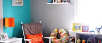
What color to choose children's furniture
Many parents understand how important it is for a child’s development to have beautiful, high-quality furniture in his room. But a nursery doesn’t just mean bright and colorful: such furnishings can tire and overload a child’s psyche. Psychologists have developed special requirements for decorating children's rooms, so it is very important to know the character of your child, his usual psycho-emotional state, consult with a specialist - and then choose the appropriate color of the furniture.
The natural palette with the colors of young or fading foliage, heavenly blue, sea wave, stones and sand, and wood always remains relevant. Such shades of furniture will help develop good taste and will have a beneficial effect on the psyche.
- The colors of green grass increase energy, energize and improve brain activity.
- A nervous and whiny child will become calmer in a blue or blue environment, but for a melancholic child one element of such a range will be sufficient.
- Almost all yellow shades, excluding aggressive yellow, neutralize children's fear and promote the development of sociability; It’s great if the child sleeps on a bed of this color. The yellow gamma is useful for the development of visual memory.
- Furniture in a natural lilac shade helps strengthen the nervous system and develop curiosity.
- The inherent ability of warm shades to excite the nervous system can help get rid of immaturity, but for nimble and restless children, an excess of warm colors is contraindicated.
- Furniture or decorative items in bright purple or orange colors can cause anxiety or spatial disorientation in an excitable child.
- White furniture is one of the frequently used options for decorating a children's room.
The photo shows a good example of how to choose the right furniture color if the room has bright wallpaper.
If moms and dads want to buy a white set for their children's room, they often encounter difficulties. Pure white is not recommended for a children's room, despite the fact that the entire apartment can be done in this tone.
It is better to choose furnishings in warm white colors (cream, ivory) or add pastel colors to white as an accent.
