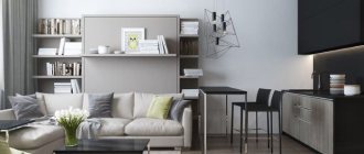
Contrasting solutions in the color scheme of any room add dynamism and energy to the interior. Strong contrasts, such as black and white, will be more aggressive and masculine. Soft combinations - chocolate and beige, dark gray and faded blue, for example, are elegant, versatile options for different styles.
Combinations in lilac and pink tones will be more feminine and playful. The choice of color for the kitchen depends on the style, preferences of the owners, their character and the area of the room.
Advantages and disadvantages of a two-color kitchen set
In terms of popularity, the two-color trend in kitchen design is second only to monochrome. Its most important advantage is originality, since an infinite number of such color “pairs” can be selected. This is often what they do, especially when the furniture showroom offers a wide selection of façade shades from a catalogue.
Modern technologies make it possible to paint materials in all colors of the rainbow, and the exact color is selected according to unified RAL or Pantone palettes.
With the right selection of shades, you can visually correct the flaws in the layout: make the kitchen more spacious or compact, “raise” or “lower” the ceiling. It is possible to find a suitable color combination for all interior styles, without exception.
Kitchen dark bottom - light top
The disadvantages of a two-tone interior are usually the following:
- fans of boho, kitsch and avant-garde styles will need to use their imagination to maintain a bright palette with a two-color set;
- the rest of the interior elements will have to be matched to the colors of the furniture, which is not always easy, especially with a limited selection of local stores;
- Sometimes serious disputes flare up between household members over the choice of shades, and it’s impossible to settle on just one.
For small corner or rectangular
The lower part of the facade should be done in dark colors with care. If the room is small, you cannot use rich combinations or use the deepest, darkest colors. Darker options are available for large kitchens, but when decorating small spaces, you should either limit yourself to a dark but pastel bottom, or choose light ones. rich colors, where even dark shades will look festive.
A large kitchen area can also impose some obligations on people embarking on renovations. It is undesirable to choose a set that is too light, however, when making such a decision, you will have to decorate the room using small details and accessories using only bright shades.
You should not choose a set that is too dark. There are always bright options, since a set in gray tones can make not only a small kitchen, but even a room with large dimensions gloomy.
Color combinations of light top and dark bottom for combined kitchens
By consulting the catalogs of well-known furniture manufacturers, you can see that some color combinations are more popular than others. Many of these color pairs have a centuries-old history of use in interior design.
Blue
This deep color has the property of calming. It does not look too cold at any time of the day, which is important for rooms with little daylight (north side). Blue is easy to combine with different neutral tones: beige, ivory, pale yellow, silver, white. It is easy to imagine a white and blue kitchen in Mediterranean, Greek or maritime styles, as well as modern.
Kitchen blue bottom – white top
Brown
Shades of chocolate or wood look elegant and are among the top 3 most popular kitchen furniture buyers. A wooden or MDF set with a light top and brown bottom can be decorated in a modern style, as well as in any classic or retro style. The brown range harmonizes with warm light tones: milky, beige, vanilla, champagne, as well as ash, white and silver.
Interior in high-tech style: the top of the kitchen is beige – the bottom is brown
If you make the bottom in brown and the top in a light, cold color, you will get an interior in the Art Nouveau, neoclassical, minimalist or country style.
Grey
The ash color scheme is subconsciously associated with stone, less often with light-colored wood. In reality, this color can be very different: dark and light, silver, whitish, beige-gray. If you combine it with warm shades (beige, sand, milky, peach, cream), you will get a very homely, cozy interior. Gray next to cool colors (cornflower blue, mint, blue, lavender) will give the atmosphere a businesslike look. Glossy facades are companions of the high-tech style, while textured and paneled ones are associated with modern classics, modern, and country.
Gray and white - a universal combination
Black
This color can have many shades, the perception of which varies greatly depending on the choice of matte or glossy texture. Black is easy to combine with any other colors, as it is basic and versatile. There are also no restrictions in the choice of style, so the black bottom can be mounted at your discretion along with wall cabinets in the shade you like. The result will be aesthetic and very practical, because it is the lower tier in the kitchen that is subject to maximum load.
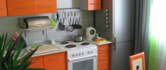
Black and orange set
Red and black kitchens are very popular. Red in such a design project looks light, no matter what specific shade is preferred.
Gold and cherry look exceptionally expensive next to black if the facades of the set have a mirror gloss.
Green
Dark tones of greenery - emerald, malachite, olive - look beautiful in classical-style interiors, but fit into the decor of a modern interior with the same ease. This color is good for conveying natural motifs, which is why wood or its imitation (chipboard) is so often painted green. The combination of a green bottom with a top in cream, beige, and sand tones looks light and pleasing to the eye.
Country kitchen: green bottom – white top
Beige
To get contrast - a dark bottom and a light top, the beige bottom tier will have to be combined with lighter shades on top: white, milky, creamy, champagne, eggshell and others. The result is an airy interior, ideal for those who like to clean things up frequently. These colors look especially impressive on facades made of natural materials.
Kitchen light top - beige bottom
Violet
The kitchen interior in purple shades looks extraordinary. This is a rather capricious color that looks really good in a room with windows facing south or east. The colors of violets, lilacs, crocuses and lavender are well suited to light warm colors: light lilac, pale yellow, white. It is difficult to imagine them in a classic-style interior, but they are perfect for modern, loft, hi-tech, and art deco styles.
Purple and white kitchen-living room in art deco style.
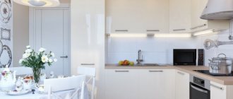
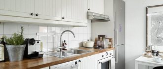
White
When you look up and see white wall cabinets, the lower tier can be decorated with any other shade (it will always look darker on a white background). This is very convenient when you do not buy kitchen furnishings immediately, but gradually. Each person has their own favorite pair to go with white. The unifying element in this case can be the glazing of the facades, as well as fittings of a certain design and color.
Kitchen white top – dark bottom
Wood shades
Very impressive combinations can be found by matching different types of wood to each other - golden pine next to rich wenge or ash-white birch against a background of warm walnut, delicate rosewood surrounded by rich sandalwood. This kitchen interior will give you a great mood and give your home an atmosphere of coziness and comfort.
Straight set of dark and light veneer
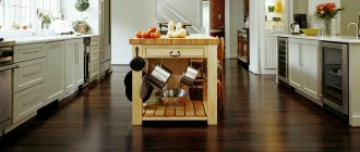
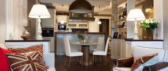
Lunch group
The table and chairs in the dining room should repeat the shades of the kitchen in order to look harmonious and the interior is combined into one composition. Solid dark chairs are practical, especially if they are complemented by soft upholstery. Most often, brown furniture is made of the same type of wood as the kitchen itself, and the table repeats their texture and materials.
Table made of the same material as the work area
Furniture in the dining area in the color of the white facades will also be appropriate, but not so practical in everyday life. According to the designers' recommendations, the countertops of the working and dining areas should match in shade and texture. Glass is used for the table if this material is present in the decoration or decor.
Kitchen facades and materials
Manufacturers offer three types of kitchen units, which are selected depending on the layout of the room:
- linear or straight, lined up along one of the walls, suitable for elongated rooms (rectangular);
- corner or L-shaped ones occupy 2 adjacent walls (corner) at once and are suitable for square rooms;
- U-shaped ones are the longest, occupying 3 walls at once. They are usually installed in studio apartments or very large kitchens with or without an island in the middle.
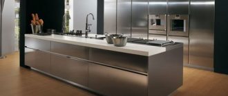
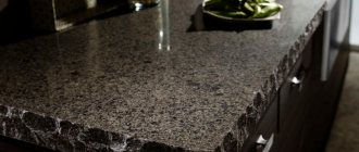
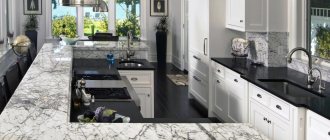
The texture of the facades can be matte, glossy and semi-glossy. Since a color contrast has been chosen between the upper and lower tiers, the texture of the cabinets may well be different, for example, a matte bottom and a glossy top. Furniture is made from wood, chipboard, MDF, glass, metal, plastic, and countertops are made from the same materials, or from natural or artificial stone.
Two-tone U-shaped kitchen
Headsets today are either built into niches or formed in a modular manner from a suitable number and type of wall and floor cabinets.
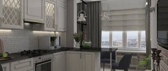
What should an apron be like?
The choice of materials for finishing the walls above the sink and stove is quite large: ceramic and glass tiles (mosaics), plastic, decorative panels. The color of the apron is usually chosen based on one of the following principles:
- for furniture - in this case, the design has something in common with the set (color, finish, pattern, etc.);
- under the floor or ceiling - tiles or decorative panels of the same color or with a similar texture;
- for accessories - the apron can match the color of curtains, lamps, tabletops, chairs, etc.
The mosaic of the apron echoes the shade of the lower tier of furniture.
Next to furniture of very bright and contrasting colors, the apron should be in a calm or neutral color scheme so as not to overload the interior and vice versa.
Wooden surfaces in a white and brown kitchen
Brown in such an interior most often corresponds to the natural color of solid wood used in the decoration of the room and in furniture. But today such material is characterized by high cost and, of course, less durability in comparison with modern technological structures. One of the most applicable and in demand is MDF - a practical, sustainable material suitable for use in the kitchen. But its color will be slightly different from natural wood, since these boards are laminated with different coatings.
The natural façade is beautiful in itself. High-quality sanded wood has a heterogeneous texture and a unique pattern. The painted surface will look more like MDF. And in this case there is no fundamental difference what material to use. A natural façade will be more expensive both to manufacture and to maintain.
It is not recommended to choose wood for kitchen flooring. But this surface in a white and brown setting is most often done in the warm honey tones of wood. In order to ensure practicality and ease of maintenance, you can choose ceramic tiles with an imitation of wood texture. However, self-leveling flooring in similar colors is also applicable here.
Combination with wallpaper, curtains, furniture and appliances
A two-color kitchen in itself is quite a bright accent, so its surroundings - the decoration of walls, floors and ceilings, as well as textiles - are selected either in tone or in neutral colors. Wallpaper with an unobtrusive pattern is suitable, as are curtains.
White and red dominate with light black accents
The colors of the dining area or island should match the colors of the cabinets. This rule does not apply to the tabletop, which may well be a third contrast. A similar rule is followed when choosing the color of household appliances. If the kitchen is designed in bright colors, then the appliances are chosen in a neutral shade. If you can’t find a headset that matches exactly, then white, silver, or chrome.
Selection of household appliances
This point largely depends on the chosen style. If you choose high-tech, modern or art deco, choose only equipment with a modern look. With chrome parts.
Modern kitchen with graphite facades below, diluted with stainless steel appliances
If possible, you can choose contrasting household appliances to the bottom of the wall to highlight it. The bottom of the wall is bronze; choose not just white equipment, but an ivory or cream shade.
Nowadays manufacturers produce a wider range of shades and choosing the right one is not so difficult. But standard colors - white, silver, black - will always be in fashion.
Accessories and decor in a contrasting dark-light kitchen
The decorative function is provided by curtains, lamps, dishes that remain visible, wall decorations, and chair upholstery. The color of these accessories should be chosen with caution. They are either selected to match the color palette of the headset, or by contrast. For example, in a white and red kitchen, accessories can be black, and next to a set in a light beige color scheme, you can allow much brighter decor in blue, scarlet, orange (to lift the mood).
Decor in a Scandinavian kitchen: dishes, wallpaper and living greens
Lighting Features
When choosing lighting, take into account the size of the room, the amount of natural light and the surface of the headset.
Matte coatings absorb light . It would be good if such a kitchen had good lighting from above. For example, a large chandelier or several small ceiling lights.
For glossy coatings, light is also very important. Such a set can be additionally illuminated with LED strip or add glare from wall lamps.
How to choose a style for a two-tone kitchen
Among the leaders is the modern style (minimalism, loft), which is what best suits the combination of a dark bottom and a light top, sometimes sharply contrasting with each other. Glossy facades in combination with beautiful floor and ceiling decor will immediately give the room a modern atmosphere.
Graphic eclecticism – when it’s too crowded within a certain style
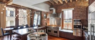
To get a kitchen interior in a certain style (neoclassical, Provence, art deco, retro), you will need to pay a lot of attention to the selection of appropriate attributes - curtains, dishes, appliances of a certain design, etc. The loft direction, characterized by deliberate constructivism, is very popular now : communications left on display, rough concrete or brick walls, next to which the glossy or matte facades of a two-color set look exceptionally impressive even in photographs.
By looking through photo catalogs of furniture manufacturers, you can choose a set to suit your taste, for example, in two colors - a light top and a dark bottom. However, this is only part of the future work to create a cozy and functional interior. For furniture you will need to choose the finishing of walls, ceilings, floors, lamps, curtains and much more. Detailed planning, for example, preliminary (even before purchasing furniture) elaboration of a kitchen design project will help you get an attractive result.
Variety of shades
If orange for you is exclusively the color of a ripe orange fruit, then get ready to break the pattern: there are more than a hundred (!) of its shades. They differ not only in color temperature, but also in their influence on the mood in the interior:
- apricot - bias towards pale yellow, zones the space well;
- aurora - lightened orange-pink;
- vermilion - bright scarlet with an orange tint;
- chestnut - reddish-brown;
- coral - pink-orange color, gentle and delicate, universal;
- tangerine - named after the fruit, creates an active, cheerful background;
- honey - between orange and brown, creates a peaceful atmosphere;
- carrot - a bright and joyful shade;
- peach - reddish light orange, better suited for wall decoration;
- orange - a burning and dynamic orange-red, for spacious rooms;
- rusty - dark, red-brown;
- tango - orange with a brown tint, optimal for ethnic interiors;
- amber is a mixture of orange and yellow, very rich and dark.