Kitchen design
1
6 916
Share
Cream color is considered a classic shade of warm tones. If you don’t have basic knowledge of the rules for combining palettes in room design, and your own preferences are chaotic, then using a cream shade when decorating your kitchen interior is a win-win option.
The chic of a kitchen largely depends on the color.
- About style and design with white, brown, beige, black, gray, green, chocolate, purple, red, orange facades, wallpaper and Roman blinds
- Advantages
- Monochromatic interior of kitchens Maria, Ivory, Nicole
- Combinations with other colors
- Modern, corner classic kitchens with a cream shade: option with an apron, glossy tiles, dark countertops
Advantages
A cream-colored kitchen avoids the risk of palette dissonance associated with the use of bright colors. If the housewife’s temperament does not need an exotic environment with bright colors, and if the muted palette in the kitchen does not have a depressing effect on her character, then this color has many arguments in its favor:
- Its lack of expression makes it neutral. This determines the versatility of white and yellow tones. Pastel colors are basic for any retro style, but they will also harmoniously fit into a minimalist interior. Pale yellow color is suitable not only for furniture, but also for decorating walls and ceilings.
- A large number of halftones allows you to achieve a variety of designs within one color.
- When describing shades of white and yellow, characteristic terms are used: “cream”, “creme brulee”, “baked milk”, “caramel”, “cappuccino”. The direct association of cream color with a person’s pleasant taste sensations creates a favorable background that promotes food intake.
- There are no categorical contraindications regarding compatibility with other colors.
- Like all other shades of the warm palette, it has a positive effect on a person’s emotional state, creating an atmosphere of comfort and tranquility.
What nuances should be taken into account?
To properly decorate your kitchen space in beige, you should listen to the advice of experienced designers.
- Is the color chosen as the leading background for the main surfaces (flooring, ceiling, walls)? In this case, it is appropriate to purchase a contrasting kitchen set and a soft corner. The choice of colors is at the discretion of the owners. Delicate pastel colors, rich floral and berry colors, emerald or olive greens, black, matte white, purple, dark chocolate or cherry wood are suitable.
- To highlight the charm of the main tone, add golden details and decorative elements. This could be home textiles with beautiful fringe or stripes, a pattern on an apron, a table top, decorative vases or paintings, upholstery on stools or a sofa.
- To illuminate a beige kitchen, choose lamps with a warm, yellowish spectrum. Ceiling lamps and sconces should also provide cozy, diffused light. Spot lighting is used only for the work area.
- Two-color kitchen facades look unusual and attractive, combining any shades of beige with bright contrast - green, blue, orange, red, etc.
- You can also use beige as accents: in the form of tabletops, curtains and carpet on the floor, sofa upholstery.
Monochromatic interior of kitchens Maria, Ivory, Nicole
The cream color is quite self-sufficient. A monochrome pale yellow interior palette will expand and brighten a small room with a lack of sunlight.
Important! The perception of monochrome pale yellow kitchens depends on the lighting. Too much light will deprive the kitchen of its warm tone, while cold lighting will turn cream furniture into off-white.
To prevent the interior of a monochromatic kitchen from turning out faceless and boring, you need to combine several half-tones of cream:
- Colors are distributed according to thickness and saturation from bottom to top. Against the background of a darker bottom, the soft cream color of the upper tier of the set will contrast favorably.
- In light, monochromatic kitchens, the furniture is often set off with a black or dark brown countertop. A win-win option is natural stained wood, natural stone.
- Cream curtains in a cream kitchen will overload the space with yellow colors, which will have a depressing effect on the perception. Darker beige curtains will look good in the interior of a light white and cream kitchen. The same applies to built-in household appliances. A metallic color product is considered most suitable for a pale yellow kitchen.
- To prevent pastel colors from looking faded, glossy facades, polished steel dishes, chrome and bronze accessories are used to enhance shine. Even in poor kitchen lighting, a cream-colored gloss will give an interesting play of glare.
- Liven up the decor with bright accessories and an original apron.
Features of cream color
Many consider this shade to be faceless, since it is neutral in nature. Of course, if you paint the entire room in such warm and light colors, abandoning bright accessories or multi-colored decor in general, then the interior design will really turn out faceless. But adding a few touches, the play of light, functional details - all this transforms the kitchen and makes it individual.
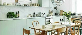
It is difficult to indicate real cream in a photo, because its shade and saturation with other tones depend on neighboring companions and lighting characteristics. This color contains notes of pink, peach, yellow, and white. In various combinations it can shimmer with green, blue and gray threads. Therefore, this shade can be combined with a palette of any color, each of which will be harmonious.
Combinations with other colors
In the interior, shades of beige are often combined with other colors. In terms of energy, it gravitates towards colors of a warm palette, from dark brown to yellow. Cream forms natural combinations with the cold part of the spectrum, adding lively notes even to synthetic pigments. Moreover, this shade will support complex “conflicting” colors. It is difficult for even a professional designer to work with purple or burgundy, but they will fit harmoniously into a white and yellow environment.
Important! Designers love to use cream in combination with other colors because it can combine complex combinations of bright colors into a cohesive composition and reduce their aggressiveness.
Cream color in the interior behaves like a chameleon: when combined with bright colors, it loses its individuality, allowing them to fully reveal themselves, and when combined with faded shades, it can reveal the potential of the yellow hue and enliven the interior. With its help, designers today are replacing white in a minimalist style. Popular light gray and cool blue colors are warmed by a light yellow background. Such weakly saturated tones make the yellowness of white noticeable against the general background.
Although cream goes well with the rest of the range of shades, it will not look perfect with all of them. On a cold blue, dirty gray, blue-green background, cream-colored material will appear beige, faded with time.
Without problems, you can combine elements of the brown palette with pale yellow. Shades of the main palette (red, green, blue) will be combined with cream if it has the same spectrum.
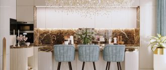
Kitchen in cream tones
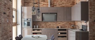
It's great that color is available for many different materials and finishes, whether it's paint for wood paneling, laminates over MDF boards, stone countertops, porcelain tile for backsplashes and floors, or even the color of centerpiece accent lamps. This variety in cream materials and accessories gives it a wide range, allowing designers to use it more flexibly in their projects.
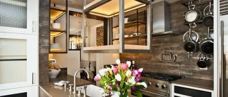
If you're looking to create the perfect family kitchen, take inspiration from this modern creamy scheme. This open-plan design features ample counter space for cooking, a stainless steel range, and chic white tiles.
Cream is a great color that catches the sun, especially when placed near a large window or door. It immediately brightens up a home, even when dark colors or finishes are placed next to it. It's also a great option for starter homes and kitchens that are still a work in progress because its neutrality welcomes new designs or bolder colors.
For a cafe-style kitchen like the one above, combine cream walls and cabinetry with an area adorned with black paint. Keep the space light and cheerful with cream painted base units and a practical wooden worktop. Continue the warm wood tones with the dining furniture, then add black and copper accessories for the finishing touch.
A cream kitchen is an ideal choice for a cottage with low ceilings as it makes the space feel light and open. As an alternative to wall cabinets, install a kitchen island in the center of the room to provide storage space.
A cream-colored kitchen doesn't have to be boring. Add interest and character with a wall feature that mimics this color scheme. The original Victorian timber floor adds warmth and the timber dining wall adds depth and detail to the space. Wallpaper can work well in the kitchen. Although the pattern is bold, the gray brings calm to a large open plan room as we see in the photo.
The cream palette keeps the look fresh, while the chest of drawers and antique wood table create a charming country look. A combination of antiques, vintage accessories and salvaged pieces give this kitchen a sense of grandeur.
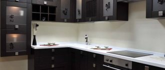
Glossy kitchen set in vanilla and chocolate colors (photo selection)
The gloss on the kitchen facades looks quite original. And due to the shine of the material, it allows you to visually expand the space a little.
You will need to decide not only on the color and finish of the set, but also on the material that will be used for the work surface.
Often, glossy kitchens are made in two colors. Darker shades are found on the lower cabinets. While a light shade is used on hanging structures.
If we talk about color combinations, vanilla is the most neutral - almost all other colors in the palette go well with it.
It is not necessary to use only one specific style; you can organically combine classic and hi-tech.
But when combining colors, you should take into account what style the room will be designed in. If this is a classic option, then it is better to use the traditional cream and chocolate range.
If you choose the lightest vanilla color and a light shade of milk chocolate, you can get a warm space that will harmoniously reflect classic interiors, colonial style, art deco, and modern.
Vanilla can be used in furniture design both as the main color and as a finish.
If you choose a brown of a darker shade, for example, the color of dark chocolate, then in this case the combination with vanilla is also suitable for modern styles.
What is good about the tone described is that it is ideal for small spaces.
The photo demonstrates quite clearly and representatively how original the chocolate and vanilla gloss kitchen looks. Only a part of the classics remains here, and the polished texture gives the interior originality and style.
Visually, such a set will expand the space.
Repair and finishing
Carefully selected finishing materials not only improve the aesthetics of the kitchen space, but also have a positive effect on the service life of the renovation.
- Floor. As a floor covering, it is appropriate to use natural wood, parquet, laminate or even planed boards. A beige kitchen will harmonize perfectly with natural stone or sandstone.
- Walls. The flat walls in the kitchen can be finished with plastic panels, covered with non-woven wallpaper or simply painted. For a more creative design, decorative textured plaster or cladding using natural materials is suitable.
- Ceiling. A stretch ceiling with a textured, matte, glossy or satin surface will be a functional and practical solution.
- Apron. For the apron area, you can use tiles, mosaics or protective glass skins with photo printing depicting baked goods or sweets. A beige set will look great with an elegant black, brown, expressive red or languid purple apron.
The photo shows a classic interior of a beige kitchen with an accent wall decorated with photo wallpaper.
In the interior of a beige kitchen, the ideal option would be windows and doors that match the color of the furniture. Wooden door leaves and window frames will help emphasize the thoughtfulness and completeness of the design.
The photo shows a brown parquet board on the floor in a kitchen interior in white and cream tones.