Wallpaper in the kitchen is the most common way to decorate walls. However, choosing the right option will not be an easy task. In addition to the fact that the wallpaper must be suitable in color and texture, it must be adapted to difficult operating conditions - humidity and sudden temperature changes, which will be especially acute in a small room.
A few practical tips will make choosing wallpaper much easier.
Rule 1. Choose practical wallpaper
The operating conditions of the kitchen area are very different from other rooms in the apartment. High humidity, condensation and temperature changes almost always accompany a room.
An ideal option for the kitchen would be washable wallpaper . This wall covering will allow you to remove food splashes and grease stains at any time, the appearance of which in the kitchen cannot be avoided. Washable wallpaper is impervious to water and soap solution, which greatly simplifies its care. Washable wallpaper is usually typical for the kitchen area, so the range of colors will match the kitchen area, which can also be considered a positive aspect, since it will simplify the choice.
Paper wallpaper for the kitchen is not the best option. It is impossible to remove stains from such a surface. Dirt will instantly be absorbed into the structure of the wallpaper, and it can only be removed by replacing the entire canvas. In addition, decorating walls with paper wallpaper in the area of the hob and sink is strictly not recommended. In the first case, this does not meet fire safety requirements, and in the second, it is extremely impractical. High humidity in the washing area will cause the wallpaper to peel off the walls in just a few weeks. It is better to decorate walls with paper wallpaper in fragments, highlighting certain areas, such as the dining room.
A practical option is non-woven . The structure is much denser than paper, this will hide the unevenness of the walls. In addition, it is possible to clean the walls from dirt using a damp cloth. Wallpaper is resistant to moisture, temperature changes and ultraviolet radiation. Another advantage is the ability to easily update the renovation with paint. You just need to paint the walls a new shade. The texture of the wallpaper gives the impression of decorative plaster. The walls look beautiful and laconic.
Vinyl wallpaper is an even more practical option for the kitchen. In addition to the advantages of non-woven wallpaper, it adds the ability to wash the walls, even with detergents. The cost of vinyl wallpaper is an order of magnitude higher than previous options. But they're worth it. Such wallpaper will last for many years and will not lose its appearance.
Fashion trends 2022
The design industry is developing dynamically, every year offering new methods of interior decoration, fashionable colors, textures and materials. The following recommendations will help you create a modern interior for a small kitchen using wallpaper:
- Walls decorated with imitation cups and plates will help you keep up with fashion. It looks unusual and fits optimally into the style of the kitchen;
- Three-dimensional wallpaper is pasted onto the accent wall;
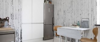
- Wallpaper that imitates natural materials is still in fashion: wood, brick, textiles, stone and leather;
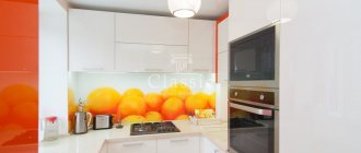
- The image of vegetable, fruit and plant motifs will refresh the room and make it bright;
- Ethnic wallpaper;
- Canvas with an unusual image or texture;
- Laundry models. The modern market offers a wide selection of colors. The ability to wash walls in the kitchen, where the level of contamination is quite high, is a big plus. This finish will last for many years.
An alternative could be decorative stickers with corresponding motifs on one of the surfaces.
Rule 2. Choose light wallpaper with small patterns
When renovating a kitchen with a small area, the main task is to visually increase the space. You can create the illusion of space by choosing the right color scheme.
The walls of a small kitchen should be made in light colors: beige, cream, milky and so on. Paradoxically, a white kitchen is not the best option for a small area. It will be uncomfortable to be in a purely white kitchen; due to the lack of colors, there will be no sense of the boundaries of the room. White wallpaper must be combined with bright shades; this will complement the interior and make it more complete. In this case, it is important not to overdo it with the decor; light colors should predominate, and bright colors should only be used as accents.
Black and dark colors are best avoided in a small kitchen or allowed in the most minimal values. For example, white kitchen wallpaper can contain a decor of thin dark lace - this will make the walls more voluminous.
When choosing wallpaper for the kitchen, you should not try to combine several self-sufficient colors at once. Variegation and large bright patterns should be avoided. This will significantly narrow the space. Light walls with small, discreet ornaments will look most noble in a small room.
It is also important to take into account the universal rule of warm and cold shades, which applies not only in the kitchen, but also in other rooms. A north-facing kitchen with minimal light needs to be warmed by design and decorated in warm cream tones.
Color influence
Designers believe that the right choice of finishing color can increase the space in a small room. The main thing to remember is that the color of the walls should be combined with the main color of the room and you cannot combine too different shades. Decorative items and furniture should be selected so that they harmoniously combine with each other in color.
Which color should I choose? Colors can be divided into cold and warm. Warm shades help increase energy and good mood.
Cold ones, on the contrary, will calm you down and give harmony.
Warm colors are not recommended for use in narrow rooms, but cold shades, on the contrary, are suitable for visually increasing the space of the room.
Also, if the windows face north, then the use of warm shades is allowed, as this will make the room warmer and more comfortable.
Rule 3. Combine wallpaper with furniture
Wallpaper in the kitchen, as in any other room, is the background for the main design and should complement it favorably.
When choosing wallpaper for the kitchen, you should give preference to the style in which the furniture is made. For example, a fashionable, stylish high-tech kitchen set will not tolerate creamy wallpaper with small wildflowers on its background. Visually it will look ridiculous and will violate the idea of the kitchen design.
In addition to style, it is necessary to take into account the texture of the furniture. So, for the glossy surface of a kitchen set, discreet plain wallpaper is suitable, and rough and textured textures are absolutely contraindicated.
It is also important to match the furniture in color.
It is worth considering the combinations of selected shades:
- A light, creamy kitchen requires warm natural tones as its background. Textured wallpaper in cold tones will spoil the impression of furniture and the kitchen as a whole.
- It is better to decorate a white set with light tones of blue, pink, and sand. All colors, both pastel and bright shades, are combined with white. But in conditions of a small wall area, it is not recommended to use bright colors.
- A bright kitchen set should be placed against a background of light shades. For example, green furniture will look stylish against the background of light gray walls.
A kitchen should not combine several different colors. Furniture, wallpaper, curtains and other items must be made in the same color scheme. The use of several self-sufficient shades in a small kitchen is unacceptable. Such techniques are best left for rooms with a large area. So, you shouldn’t try to combine a bright kitchen with equally bright walls.
Which style to choose
Unfortunately, in small rooms it is very difficult to avoid an overabundance of items. A large number of things gives a feeling of clutter.
And large and bright finishing elements only aggravate this situation.
Therefore, it is believed that the most practical design is minimalism. However, minimalism is not the only design option for a small room.
It can also be decorated in Scandi, Provence, loft, hi-tech, ethno and others. Using these styles will make your kitchen more spacious, comfortable and practical.
Rule 4. When choosing wallpaper, base it on the kitchen design style
The role of wallpaper in creating a kitchen style cannot be underestimated. The background plays an important and sometimes decisive role. Therefore, you should choose wallpaper taking into account the overall idea of the kitchen interior.
- The classic style will be complemented favorably by light wallpaper with a subtle, discreet pattern in the form of stripes, a slightly outlined checkered pattern or a floral pattern. You can decorate the dining area with photo wallpaper. Light drawings in pastel colors depicting columns or historical frescoes would look appropriate.
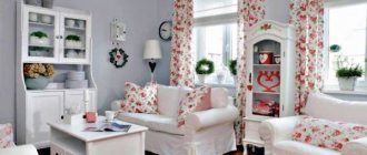
- Provence with light wallpaper with a small, discreet print in the form of flowers, leaves, butterflies and other natural colors. When choosing colors, it is better to give preference to beige, sand, wheat, olive, and blue shades.
- High-tech - ultra-fashionable and laconic design will perfectly match walls in the shade of light graphite.
- Country - the specific design of this style requires natural and natural shades of beige and cream.
- Loft - the cold and brutal style of the kitchen will go perfectly with white or light gray shades of wallpaper. The walls should be plain or with a brick pattern.
Country
Provence or country are styles for women who love to cook and spend a lot of time in the kitchen. Calm, eye-pleasing light colors, romantic prints, small flowers, birds and butterflies combined with an unobtrusive checkered pattern – this is what distinguishes Provence from other kitchen decorating styles. Also your choice is beige, sand and wheat tones, matting, imitation of untreated boards and antique tiles, plaster.
Kitchen interior in warm green with mosaic wallpaper
Tip: Never combine wallpaper from different price categories. This may result in unpleasant surprises over time. Buy companion wallpapers from a single collection, always from the same manufacturer. Cover the joints between combined wallpapers with moldings.
See also: How to choose the right photo wallpaper for a nursery
Ways to expand space in a small kitchen using wallpaper
You can try to correct the disadvantage of a small kitchen area with the help of competent wall design. Choosing the right color scheme and pattern will help visually expand the room and correct the mistakes of a disproportionate room:
- The simplest and safest option is wallpaper with a glossy texture. Due to the reflection effect, the room will expand. An ideal complement to such wallpaper would be a light kitchen set with acrylic fronts. This technique will make the room spacious and weightless.
- Decorate a free wall with wallpaper with a mirror surface. Designing a wall in this way will visually extend the room and create the effect of a large space. The disadvantage of this technique is the specific care for wallpaper with a mirror texture. The housewife will have to constantly monitor the impeccable cleanliness of this area, since the walls will be most vulnerable to dirt and drops.
- Using photo wallpaper - it may seem that the design of photo wallpaper, on the contrary, will visually reduce the area, but this is not always the case. You shouldn’t opt for bright photo wallpapers depicting a city at night, for example—this option is suitable for large rooms. The walls of a small kitchen should be decorated with photo wallpapers with discreet outlines of a city, a garden, a path stretching into the distance, and so on.
- If, in addition to a small area, the kitchen has a drawback in the form of a disproportionate shape, for example, low ceilings, a long rectangle shape, such defects will be resolved by the design of the walls. For a kitchen with low ceilings, light wallpaper with a vertical striped pattern is suitable; visually this will elongate the room. A long room will be externally shortened by a pattern on the walls in the form of horizontal stripes.
It is important to note that these techniques will only work in conditions of dim patterns on the walls. The wallpaper pattern should not be large or too voluminous. It is necessary to use not too bright colors for patterns - this will make the space seem airier, which means the kitchen will look larger than it actually is.
Basic rules for how viewers can enlarge the kitchen
How to visually expand a room? Nowadays it is possible to use optical illusions to visually increase the space of a small room.
Now designers apply several principles in their work to make the room seem more spacious. One of these principles is that light shades add visual width and height if walls and floors are painted with them. While dark shades visually reduce space.
If you want your room to look spacious, avoid large furnishings.
There should be as few such items as possible, this will help make the room more open and airy.
Wallpaper for a small kitchen: secrets of the right choice
- Features of choosing a sofa for the kitchen
- Neoclassical style in the interior: what is it, basic design principles
Why is it worth investing in custom-made furniture?
What should you know before purchasing?
Repair is a fairly expensive process, so the choice of building materials, including wallpaper, must be taken responsibly so that the invested funds provide a beautiful and practical renovation for many years.
Some recommendations necessary for choosing and purchasing wallpaper:
- As noted in the article, wallpaper has a lot of varieties and is located in a wide price range. You should not save too much and choose the cheapest option for paper wallpaper. Such walls will not last long. The wallpaper will lose its attractive appearance within a few months. It’s better to overpay once and purchase non-woven or vinyl wallpaper than to make repairs every year.
- It is not recommended to purchase wallpaper from markets and dubious wholesale stores. This product requires special storage conditions, the observance of which is necessary to preserve its performance properties.
- Before purchasing, you must carefully measure the room and calculate the required number of rolls. It’s not worth buying wallpaper back to back; it’s better to buy one more roll. If it is not useful, you can return it to the store; many building materials retail outlets offer such services.
- It is imperative to pay attention to the batch number indicated on each roll. A discrepancy between this indicator may result in a difference in shades, which will be noticeable after pasting the walls.
- If you choose embossed wallpaper, you must carefully inspect each roll for possible damage. It will not be easy to exchange or return an unpacked roll, even with a receipt.
- You should pay attention to the recommendations for using wallpaper. Not every type can be used in the kitchen.
A huge range of wallpapers today allows you to choose an option that meets all the requirements described above. There is no need to rush in this matter, then you will be able to create the perfect design of a small, warm and cozy kitchen.
How to navigate color temperature
What colors add space to a room? Everyone knows that the color of a room affects a person’s mood, including some shades that can whet the appetite, while others can affect the reduction in portion size. Warm shades can make a person feel hungry, while cool shades soften the desire to eat and can help people losing weight achieve their goal.
- Scandinavian interior and 5 solutions that will help refresh the cold northern design
Door in the kitchen: to be or not to be, a design question
- 5 convenient options for the location of the sofa, appropriate in the kitchen-living room.
It is also worth considering the location of the room and which direction the windows face, so if the windows are located on the sunny side and the room is flooded with light, then you can add cool shades to achieve balance.
If the windows face north due to lack of sun, you can add warm shades to the room, but it is worth remembering that they can visually reduce the space.
We should not forget that different shades also affect people’s feelings. So, in a room with cold tones a person may become cold himself, while in a room with warm tones the situation is different.
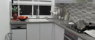
Wallpaper in a small kitchen (real photo examples)
Finishing
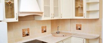
Almost all kitchen design ideas are 6 sq. m. are aimed at increasing the available space. And finishing is the main way to achieve the desired effect.
Situation
Placing all the necessary items will be the most difficult task when decorating a small space.
Kitchens 6 sq. m. with a refrigerator are usually filled in the following sequence:
- Refrigeration equipment,
- Washing,
- Work zone,
- Plate.
This is the most rational filling of the cooking area. But it is not always possible to achieve such an arrangement of objects, so often the refrigerator moves to the opposite corner, located not far from the dining area or entrance.
Instead of the usual table, you can use a transforming table, bar counter or window sill. All three options take up a minimum number of meters without losing functionality.
A corner set will allow you to gain a few more decimeters and increase the free space. Tall wall cabinets that touch the ceiling will serve the same purpose.
