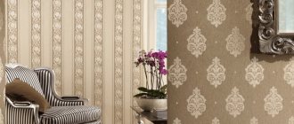
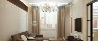
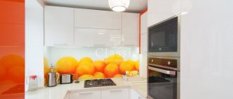
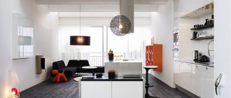
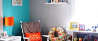
When creating the interior of a room, the greatest attention should be paid to the finishing of the wall surfaces.
It is best to stick to wallpapering the walls, as they will not only decorate your room, but will also significantly insulate it.
Currently, some residents paper not only walls, but also ceilings, combining two types of wallpaper. In this article, we will consider in more detail which wallpaper color to choose for a particular room.
Wallpaper is a building roll material made on paper or some other base. When choosing the type of wallpaper, you should consider what end result you want to get from it?
After all, correctly selected wallpaper will not only please the eye, but will also create coziness and a comfortable atmosphere in your room.
Main criteria for choosing colors
Light wallpaper helps expand the space. Dark colors, on the contrary, hide volumes, so it is not recommended to use dark colors for small rooms.
To avoid making a mistake in your choice, you need to consider:
- Total area of the room;
- Light intensity;
- Features of furniture and style;
- Room layout;
- Psychological influence of color.
How to choose wallpaper color based on lighting? It is very important to consider which side the windows face. If it is south facing, then it is recommended to choose cooler shades, and if the windows face north, it is better to rely on warm colors. This way you can harmonize the situation.
Another important factor is the smooth surface of the walls. If the wall has minor defects, then a light, unobtrusive print or diagonal pattern will help hide the imperfections. On completely smooth walls you can use plain wallpaper.
Looking at photos of wallpaper in two colors, many want to use this fashion trend. Here you need to take into account that there are shades that absolutely do not combine with each other.
For example, you cannot combine green and red in one room. Bright colors are diluted with calmer and neutral ones: gray, beige, white. Shades of the same color look very harmonious side by side. For example, green next to light turquoise breaks up much better.
Variety of colors
What material is the wallpaper made from?:
- Paper - they are made from paper, then a design is applied to the surface, mainly using a typographic method.
- Vinyl is more durable, but expensive.
- Textile - on a fabric basis.
- Glass wallpaper - the composition includes soda, limestone, quartz sand, dolomite. Such canvases can be painted.
- Liquid - they are sold in bags. They are similar to dry plaster, which is diluted with water and then applied to the walls.
You can choose wallpaper of any color: the construction market allows you to do this. Rules for choosing shades:
- Dark-colored wallpaper will look good in a room with good lighting.
- If the room is poorly lit, then it is better to choose canvases in warm colors. If the windows face south, then buy wallpaper in cool colors.
- Recently, combinations and zoning have come into fashion. The kitchen and dining room can be separated by different wallpapers: in the dining area the walls are decorated with colorful, brightly patterned or photo wallpapers; plain wallpaper is pasted in the cooking area (read about how to choose photo wallpaper for the kitchen, living room and other rooms here).
- Another option for combinations is that in the kitchen the sink area is highlighted with wallpaper with large patterns, and the kitchen itself is covered with plain linens.
- The living room is a place where you can let your imagination run wild. Here you can combine matte and glossy, glue different shades of the same wallpaper.
Attention
When choosing compositions and color combinations, follow one rule - your eyes should not ripple from the many different shades. Make sure that the furniture also matches the color of the walls. If the furniture is classic or expensive, it is best to choose chocolate or beige wallpaper. Here you still need to adhere to the canons of the classics.
The influence of color on the psyche
Experts know that colors can influence a person’s emotional state.
Therefore, when choosing wallpaper you need to take this effect into account:
- Green color creates a calm environment and helps you relax;
- Orange and red invigorate and have a tonic effect;
- Creative people often prefer gray wallpaper: it is so neutral that it does not distract attention and allows you to get in the mood for work;
- Shades of yellow lift your spirits, charge you with energy and stimulate activity;
- Designers advise using black in small quantities: if you overdo it with this color, it can cause depression;
- Shades of blue help to concentrate and improve attention; this is an excellent option for decorating a work space.
Combination principles
The second palette option is more complicated. This is a combination of different shades from the Itten circle. Four schemes are considered classic here.
- Complementary or contrasting. This scheme is based on a combination of opposite, contrasting colors. These are, for example, the following pairs: blue - orange, lemon - purple, red - green, and so on.
- Adjacent or analog. It resembles the monochrome principle of compatibility, but in fact it is several shades (often three) lying next to each other on the color wheel. This is red - yellowish - orange, purple - blue - cyan and so on. The principle is very simple. Moreover, each color can be divided into several components and played in their combinations. For example, use sky blue and indigo in combination with blueberry and emerald.
- A mix of three rays equidistant from each other is called a triad. This is a bright contrast: red - yellow - blue, purple - green - orange. Within these rays it is also possible to experiment with more complex and varied combinations without changing the essence of the approach. For example, break yellow into mustard and pastel, adding scarlet, burgundy and indigo to it.
- Split complementary harmony is an isosceles triangle. Simply put, this is one contrasting color scheme, complemented by two almost adjacent ones. In practice, it looks like this: yellow - fuchsia - violet, green - violet - scarlet, orange - turquoise - blue.
- Finally, there are more complex combinations of 4 rays. But within the framework of independent design, we do not recommend resorting to such diversity. It is difficult for a non-professional to choose such a scheme; it is easy to slide into chaos and colorful confusion.
The presented schemes work best when choosing additional and accent tones, when you are in doubt about how to dilute the basic colors. It is important to note here that against the background of achromats (gray, black and white), as well as neutral beige, any combination will look good. This is the safest way to use and introduce color into rooms.
Design: Smart Interior Design in collaboration with Olga Louis
Instagram @arianaahmad_design
Design: Sveta Khabeeva
Design: Sveta Khabeeva
Design: Sveta Khabeeva
- Living room
Combination of colors in the interior of the living room: how to choose your own shades and not make a mistake
Wallpaper for the kitchen
The main points that you need to pay attention to when decorating a kitchen are the size of the windows, their number, and the dimensions of the room. If little light enters the room, you should not use dark and cold shades. In this case, you can create coziness using warm beige, milky, yellowish tones.
Yellow and orange shades lift your spirits and improve your appetite.
The same recommendations apply to finishing a small kitchen. Colorful wallpaper with flowers will not work in this case either: in a small space, bright colors will only irritate. Therefore, the best solution is plain wallpaper.
How to choose wallpaper for the interior
Any wallpaper can be classified according to its general characteristics.
Namely:
- By the presence or absence of a pattern on the wallpaper, whether it is large or small, an ornament or pattern, with geometric shapes or a bright field of flowers.
- By color: there are wallpapers of all possible colors, even the most exotic, emerald, terracotta, gold, tiffany, coffee, sea green. The list can be endless, as a rule, the selection of options in any store is quite large.
- The texture of the surface is smooth or glossy, silk, with an embossed or sprayed pattern.
- According to the density of the material from which they are made - There are light and dense wallpapers on the market.
- According to the level of protection from water (water resistance) - The cheapest paper wallpapers, as a rule, are not waterproof; washable vinyl wallpapers very often have strong protection against moisture.
If you follow the technology for pasting walls, maintaining the required humidity and temperature in the apartment, any wallpaper can last at least 3-5 years
After the service life has expired, or simply when there is a desire to change the home environment, the rooms are redecorated by changing the wallpaper, which, as a rule, does not take a lot of effort, time and money and can be done on one’s own, without the involvement of third-party specialists.
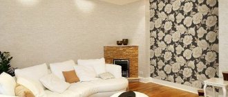
Living room decoration
The interior of the main room in the house is usually thought out to the smallest detail. Here, the choice of wallpaper will largely depend on the color and arrangement of the furniture. In addition, style features and lighting levels are taken into account.
What wallpaper color is suitable for a modern interior? If the room is furnished with dark furniture, then the walls can be decorated in light colors. Olive and light beige colors are suitable.
You can use discreet floral prints. Wall decoration should be harmoniously combined with the color of curtains and furniture upholstery.
- Depending on the total area of the living room and its illumination, choose darker or lighter colors.
- The beige and cream palette is universal; it allows for any color combinations and goes well with the texture of natural materials.
Gray makes the interior more sophisticated and stylish - it has recently become a favorite of designers. Traditionally, most people prefer soft pastel colors using a light palette. This helps create a peaceful, calm atmosphere.
Trends in canvas materials
Just recently, the industry did not indulge in a choice of wallpaper materials, and this despite the fact that wallpaper has been known for a long time.
In recent years, the situation has changed dramatically. There are so many wallpaper options that fashion trends have appeared in the materials of the canvases themselves. Which ones are the most fashionable in 2022? Textile wall coverings.
This year, designers advise not to be afraid of textile wallpaper, even though it requires careful care.
These wallpapers can be an extension of “naturalness”. The best options are linen, cotton, silk. On the one hand, such canvases are a return to the ancient traditions of wall decoration, and on the other hand, they are, as they say, “the latest in fashion.” Paper or non-woven wallpaper.
Today, these materials are the epitome of sustainability, which is already known to be a fashion trend for 2022.
Reliable imitations of natural textures.
Another fashionable wallpaper trend for 2022. Moreover, leading designers claim that, judging by the new collections of famous brands, such wallpapers, “masking” different species, for example, marble, cedar wood or textured fabric, will become favorites this year. Among the hottest hits are canvases with terrazzo patterns. The secrets lie in the high decorativeness, which is achieved by drawing or obtaining texture by pressing the top layer, for example, vinyl.
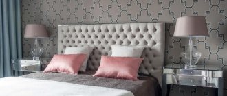
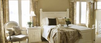
Wallpaper for the bedroom
Here the options can be very different, depending on the imagination of the designers and the design style.
All sorts of shades of green and blue are suitable: they are very calming and relaxing. These colors can be combined with yellow, white or beige.
- Blue color calls for relaxation and deep rest. But, if the room is small or the windows face north, you should not use blue and purple shades.
- White is ideal for a small bedroom. Thanks to this design, it is possible to create an airy, light space in which it is very comfortable to relax.
To highlight one of the walls, making it an accent wall, you can use wallpaper in two colors.
How to choose linoleum for wallpaper
In the visual perception of the decor of any room, the color of the flooring plays an important role; in the example we are describing, it is linoleum.
When we want to emphasize the color of linoleum, it is worth choosing a contrasting color in relation to the pasted wallpaper and furniture
If we want to emphasize the beauty of our walls, for example, photo wallpaper, then try to make sure that the geometric pattern on the linoleum visually leads the viewer’s eyes to the pasted photo wallpaper.
White wallpaper
If we talk about a universal color that fits organically into any design, then it is, of course, white. It traditionally symbolizes purity and freshness.
In addition, white visually expands the room, pushing the boundaries of the walls. It has a number of advantages, which is why it has long been loved by designers.
To prevent this design from causing “Hospital” associations, the decor is diluted with bright accents: Photographs, paintings in interesting frames, multi-colored panels.
A white room, be it a bedroom or a living room, always looks luxurious. However, here it is necessary to maintain exemplary order, because chaos and dirt are not compatible with the color white.
The best wallpaper manufacturers
In the Russian Federation, there are several domestic companies on the wallpaper market offering a huge selection of products.
Why should you choose a Russian manufacturer? Yes, because, while maintaining low prices for products, their quality is in no way inferior to the world's leading brands.
In terms of design, Russian manufacturers often lose to their foreign colleagues
The most famous and widespread companies on the Russian wallpaper market are the enterprises “Art”, “Palitra”, “Saratov Wallpaper”, “Moscow Wallpaper Factory”. Some manufacturers across the country have branded stores that offer a large selection of wallpaper, and smart managers will approach your question with soul and sparkle - how to choose wallpaper for any room and for any pocket.
Suppliers from the countries of the former Soviet Union who also supply us with wallpaper at affordable prices:
- Ukraine: , “Vinyl”, “Versailles”, “Koryukiv Technical Paper Factory”. Unfortunately, the volume of Ukrainian products on the Russian market has decreased significantly over the past 2 years, due to the outbreak of the crisis between our countries.
- Belarus: Today in the Russian Federation, the following wallpaper products are supplied by the factory “Hero of Labor”, .
Of course, with all the efforts of manufacturers in the Russian Federation and the CIS to be at the level of world brands, the leadership in the wallpaper market is undoubtedly occupied by European manufacturers, who supply us with products from France, Italy, Sweden, Belgium and other countries, so when selecting wallpaper, in this case, you will get a huge advantage compared to the average buyer.
In France, the brands “Casamance” and “Casadeco” are especially popular, in Sweden, in Belgium and “Omexco”
For all its high qualities, the product brought from Europe to Russia has one undoubted property that prevents its mass use among the population of the Russian Federation - its rather high price. But maybe it’s for the better, because we need to develop our own, high-quality producers
A wide variety of brands on the wallpaper market makes it easy to decide which wallpaper is best for a specific task. If you need good quality at a low price, then choose Russian manufacturers or suppliers from the CIS countries. If you want to create a special and unique atmosphere in your home and turn the selection of wallpaper into a celebration of quality and design, then you should take a closer look at European brands.
Pastel shades
To create a romantic atmosphere in the bedroom, you can use delicate shades of blue, mint, lavender or pink. A soft, enveloping atmosphere in the bedroom will be supported by suitable accessories and lighting.
To create a unique interior, it is recommended to use designer items: original paintings, lamps, vases and floor lamps.
Options for combining wallpaper with painting
Wallpaper panels
This is a good old decorating technique. We are, of course, not talking about panels as such, but about light stylization as a boiserie. (Boiserie - expensive wall panels originally from France; made from good quality wood).
False panels are formed from small-sized wallpaper rectangles - usually framed with strips. They are glued to a plain painted wall.
False wallpaper panels are chosen for classics, but they are also suitable for modern interiors with a classic flair.
Since in this case very little wallpaper is required, you can splurge and buy something expensive and designer. One roll may be enough to create panel imitations in several rooms.
One large panel
There is no layout done here. One large area is covered with wallpaper. Framing is possible, but not necessary.
This solution is much more universal - it will organically fit into absolutely any interior, even one that is far from classic. The main thing is that the selected wallpaper matches the overall concept.
Friezes
Friezes are wide ceiling borders. Initially, friezes were overhead: smooth or embossed, made of wood or plaster - they were attached to the wall at the junction with the ceiling. This is a decorative element.
Nowadays, friezes can be either applied or imitated. Imitation of friezes is carried out through the use of combined finishing. It can be one material in two different colors. For example, paint: light on top, dark on bottom. A combination of wallpaper and paint is also used. This option looks more expressive and “convex”.
There are two ways here. First: paint the walls and decorate them with a wide wallpaper frieze. Second: imitate the frieze with paint, and stick wallpaper below.
Low panels
In ancient times in Europe, especially in Britain, wall paneling with low panels was widespread. The panels were made of wood, which was also imported from Russia. Of course, this has always been an expensive pleasure. Therefore, people with little income learned to imitate panels by painting the lower part of the walls and decorating them with a lattice of moldings. Over time, this too became a classic.
In the English-speaking world these panels are called wainscot. They differ from the French boiserie, which we mentioned above, in size and location. Boiserie - high panels. Wainscot is more economical - the walls are covered with them only along the bottom. The goal is to protect these areas from contamination and damage. Higher walls are exposed to much less impact.
By combining wallpaper and paint, you can create a light parody of wainscot. Here, just as with friezes, there are two implementation options: wallpaper bottom - painted top or, conversely, paint below - wallpaper on top. At the junction of paint and wallpaper, you can place a decorative strip, molding, or strip. The lower part can be supplemented with a grille, which will thicken the hint on the panel. But this is a matter of taste.
Dividing the wall diagonally visually reduces the height of the room, but at the same time expands it.
Entire walls
You don’t have to cut or chop the walls into pieces, combining wallpaper and paint in pieces. There is a simple option: paste and paint entire walls, without further ado. For example, decorate one or two walls in a room with wallpaper, paint the rest. The beauty is in the simplicity.
Photo of the perfect choice of wallpaper color
Bathroom in color
The bathroom is the place where a person should feel comfortable. The bathroom is designed for relaxation, because almost every person, after a hard day at work, visits it before going to bed. To decorate a bathroom, you need to use special paint rather than wallpaper, because wallpaper will be inappropriate in this room. High-quality paint will not burst if water gets on the surface of the walls, and the paint will not deteriorate under the influence of steam.
Paint should be purchased exclusively in specialized stores, because only in this case will you be able to buy truly high-quality material.
The bathroom is characterized by a high level of humidity, so it should not look damp and dank, and it is in this situation that color will play a decisive role, because if you choose the right palette and use perfectly harmonious tones of paints, then there will be one less problem.
Related article: Graphic black and white: primary colors (+45 photos)
The color palette in bathroom design can be varied, but the best colors will be:
Red. The red color palette of the walls helps to increase strength and restore vital energy. The red color will make the bathroom interior bold and therefore only brave people choose this red color. By the way, many people prefer to combine red with orange, and it should be noted that this combination looks very stylish.
Orange. The orange hue has a calming effect on a person and fills the atmosphere with happiness. An orange palette in bathroom design will promote relaxation and help overcome stress.
Yellow. This color of the walls increases the flow of vitality and excites, but only most shades increase tension and nervousness. This color of paint is recommended for use in the design of a large bathroom, since the yellow color visually reduces the size of the room and distorts the perspective.
Green. Gives a boost of energy, vigor, and gives confidence in one’s own abilities. A green bathroom will help you collect your thoughts and improve your psychological and emotional state.
Cool shades of blue. Cool wall colors allow you to calm down and put your thoughts in order. In the blue bathtub you can relax and enjoy moments of pleasure, basking in warm water with foam. By the way, the blue shade can be combined with orange.
Black. This wall color allows you to create an incredible design in the bathroom, but only if it is not present in its pure form. A bathroom designed in black and without bright colors has a depressing effect on a person.
If black is chosen for the design of the bathroom, then it is recommended to use it exclusively as a secondary color. Ideally black will be combined with yellow, orange, red and other tones.
The right choice of palette for interior design is the key to creating an incredible room design that will delight not only the owners, but also the guests.
Related article: Sunny yellow - its shades and combinations
Video gallery
Photo gallery
digital post production: Ole Bunger www.pixoleb.com
conclusions
People make the same mistakes when choosing colors. Therefore, we can highlight a few simple tips that will draw a line under the article:
- When comparing two identical rooms with green and orange works, it will be the first one that seems cold. This is assuming the same lighting.
- In any room, colors have approximately the same effect. Green always acts as a calming color. Yellow gives a cheerful mood and a warm environment. The color red is an irritant for both children and adults.
- It is important to choose the lighting in the room wisely. Cool tones require strong lighting. Warm colors allow you to dim the lighting in the room.
- Uniformity in the color of the finish is allowed in one room, but not throughout the entire apartment.
- Also, strong variation in the brightness of shades is not allowed.
- All rooms must maintain a balance of brightness.
- White ones increase space, dark ones shrink. To elongate walls and ceilings, you need to use wallpaper with vertical and horizontal stripes, respectively.
Beautiful hallway
VIDEO: The most pleasant shades for your bedroom
Favorable colors for the bedroom
Choose pleasant colors and shades
Room dimensions
A lot depends on the size of the room. If the room is of considerable size, then there is room to roam. Here you can use any wallpapering technique, combine bright and light colors. Even if very dark colors are used, this situation cannot be ruined. They just need to be diluted with light inserts throughout the room. Many people prefer to make a very large room feel cozy and visually make it smaller. To do this, you need to select wallpaper with bright elements or light material with a pronounced pattern.
If the room is medium or small in size, you should choose the right shade that will visually increase the size of the room.
It is generally accepted that such properties are inherent in bright and warm tones. For example, beige, white, light pink, milky, peach, light green, etc.
Light wallpaper in the bedroom
Wallpaper for dark furniture
Wood
Wenge-colored cabinets and sets look very expensive, so you should buy high-quality wallpaper for them, preferably non-woven or vinyl. All shades of green, blue, pink, yellow, orange, light gray, blue, turquoise, beige, white are in harmony with this wood.
White wallpaper harmonizes well with cherry-colored furniture - it will help remove the overwhelming influence of the burgundy tone. Dark walls of violet, burgundy and purple shades will turn a bedroom with a cherry-colored bed into an elite boudoir interior.
Brown
Brown furniture is very popular. When choosing wallpaper for it, you need to take into account the following recommendations:
- Gray or yellow colors are most suitable for creating a cozy atmosphere;
- shades contrasting with brown (red, lilac, blue, sea green) will help focus attention on the sleeping area;
- For an interior in a classic style, wallpaper in sand, golden, and caramel shades is suitable.
Orange
Orange is a very bright and rich color that cannot be used alone in the interior. All shades of orange evoke a surge of energy, a feeling of joy, and encourage communication, so this color will look optimal in rooms where the whole family gathers - in the kitchen or living room.
It is better to choose wallpaper for a kitchen with an orange kitchen set in light and warm shades; white, light beige, and cream will look good. The listed colors calm, neutralizing the aggressiveness of orange, filling the room with sunlight.
You can choose brighter wallpaper for orange furniture - purple, blue, bright blue. You should avoid decorating bedrooms and children's rooms in this style.
Purpose of the room
Wallpaper for a room must be chosen taking into account its functional purpose. This is a very important point, since the wrong color of the material can lead to a certain imbalance. For example, the color red, a symbol of energy, should not be used in the decoration of a bedroom, which is intended for relaxation and sleep. Colors that will help you relax and bring calm should prevail here. These are mostly pastel colors.
In rooms where guests are usually received, bright colors are used. But the main thing here is not to overdo it and prevent the use of contradictory combinations.
Visually, such a design should be perceived without overload. When choosing wallpaper with a pattern, pay attention to its color. It should not blend into the main background. Especially if the picture is bright. The combination of a bright picture with the same background will bring color saturation. And this greatly affects psychological perception. You should also adhere to the chosen interior style. Combinations of white, black and red tones, with different saturations, are suitable for oriental style. European style has lighter and warmer tones. Although dark accents are not excluded. But it should not be abused.
Bright colors of wallpaper in the nursery
