A carefully thought-out combination of green and purple colors in the interior guarantees a comfortable environment and an original look of housing. Therefore, owners who have chosen such a tandem for implementation should carefully consider the features of its use. It is important to choose those tones that will be correctly combined and at the same time can be appropriately complemented by other inclusions. It is also worth “evenly” distributing the use of two colors or choosing one of them as the main one. This will make it much easier and faster to choose finishes and furniture. Pay special attention to the decor and textiles used for styling. They can be made in the chosen range or become soft additions in a lightened green or purple tone.
Advantages of the combination
The combination of green and purple colors in the design at first glance seems too unusual. But when studying all the advantages of this combination, the owners will easily be convinced of the profitability of such a solution for the interior. The main advantages of a non-standard tandem include:
- ease of creating a distinctive interior in any room of the home;
- the dynamism of most combinations, contributing to the comfort of living and activity of the owners;
- variety of options: from bright, rich to calm and restrained;
- ease of styling personal rooms: teenage, children's and adult bedrooms;
- modern look of any size premises;
- accessibility of the solution: in the budget category of furniture and decoration you can find a large number of options in the chosen color scheme.
It is not necessary to make purple or green the main colors for wall decoration, flooring and furniture selection. They can simply be dominant in light (sand, white, cream) rooms.
What does purple go with?
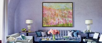
The design of a living room in purple can be either bright or delicate, in pastel colors. It all depends on the color you choose second.
Of course, the interior should have neutral tones, especially when you have chosen the first option. This will help balance bright and not so bright colors, the interior will not be too flashy.
So, purple color goes with:
White . This color goes well with all colors and shades. White in this case is a neutral shade. Against its background, delicate lilac or deep purple will be transformed and sparkle in a new way. The overall design of the room will look fresh and beautiful
Yellow . This classic color combination has been familiar to us since childhood. Yellow and purple complement each other perfectly and create a very bright, interesting room design. You can also use subtle shades such as lilac and soft yellow for a calmer interior. Don't forget to add a few elements in neutral colors such as white, beige and others.
Orange . A very bright combination for brave, creative people. It looks very beautiful and bright. However, you should be prepared for the fact that there will be bright shades throughout the apartment. Agree, a bright living room will look out of place in a house decorated in soft, soothing colors.
Sirenev . Using several shades of purple you can create very beautiful compositions, gradient transitions and much more. This combination is especially beautiful in vintage style. By the way, designers recommend using cherry wood color as an additional color.
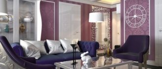
Black . A very mystical combination. If you like something unusually scary, then feel free to decorate the living room or even the bedroom in black and purple tones. However, in order for the atmosphere in the room not to be so gloomy, it can be diluted with crystal, candles and paintings. Personally, this design reminds me of an ancient castle.
Characteristics of flowers
The combination of purple and green in the interior ensures that they complement each other. An important advantage of such a union is the elimination of negative effects on a person by the predominant purple or greenish color. The lilac color and its shades promote deep reflection and increased self-esteem. Dark colors are ideal for creative people: they help them focus on themselves and their hobbies. At the same time, the purple color is not suitable for everyone due to strong psychological pressure. And its combination with green makes it possible to prevent such an impact on household members. Green color, in turn, promotes wise decision making. Natural color helps you find yourself, accept your essence and not look for flaws in yourself. It can move people to new, balanced achievements and, in addition, helps them find peace in themselves and always choose stability.
Peculiarities of perception of lilac color
You don't often see the color lilac in everyday life.
Most people find it really attractive, but do not dare to decorate their interior this way. Colorists claim that it is unique in its kind.
Lilac is a washed out purple with added blue and pink undertones. When these basic color textures are combined in different proportions, a range of unique and beautiful shades are created. The color combines two elements, a cold and a warm shade. The opposites created a uniquely beautiful ensemble.
Decorating the living room in these colors creates a peaceful relaxation room.
Decorating the living room in these colors, you get a peaceful room for relaxing and receiving dear guests. The purple room will help restore moral strength and take a break from a hard day.
Psychologists have analyzed lilac and made many conclusions. For a girl who is going on a first date, there is no need to wear purple, because it will add a cold note to her image and will push away a potential guy. With a man, in this matter everything turned out the other way around; a purple shirt would give him confidence and nobility.
With the help of purple tones, any character is reflected in the hall
The main thing for each style is to choose the right tone
With the help of purple tones, any character is reflected in the hall. The living room will look elegant and gentle. The main thing for each style is to choose the right tone. Lilac is most often used in art deco, modernism, futurism, romanticism, and Provence.
The color scheme will easily help you focus on intellectual issues.
It is recommended to start planning future affairs in the living room. Staying in this color will help you disconnect from extraneous thoughts and emotions.
Staying in this color will help you disconnect from extraneous thoughts and emotions.
Lilac in Art Deco
Lilac in romanticism
Variety of shades
In order to easily choose the appropriate purple and green tone for stylizing your home, you should pay attention to the shades of these gamuts (favorable combinations of brightness and warmth are indicated):
- lilac or violet and herbaceous or mint or pistachio - delicate shades that create special comfort and emphasize harmony;
- purple and marsh or olive - rich warm colors, ideal for rooms located on the north side (not sunny);
- grape or eggplant and green apple, green moss - dark tones of purple can be diluted with a dark green color or rich inclusions;
- lilac or lavender and lime - a bright green tone against the background of restrained purple colors will be an advantageous accent;
- blackberry and jade are a calm and discreet combination, ideal for bedrooms.
How to combine correctly
Since the green-purple combination represents a whole range of possible options, it would be advisable to consider the most successful combinations. Among the most commonly used shades of purple, we highlight the following:
- Classic purple. This option is complemented favorably by the muted green of autumn grass, an unobtrusive shade of lime or pistachio, as well as the color of copper that has turned green with time. This duet can be diluted with yellowness in all the richness of its manifestation - from a calm sand color to a bright sunny color.
- Lavender. Varieties of green such as marsh or pistachio shade well. Brass, green tea or olive look no less advantageous in combination with lavender. Delicate peach, the color of whipped cream or yellow-brown tones will help to shift the accents a little.
- Lilac. Similar to lavender, this option looks great when combined with marsh or chartreuse. In addition, you can safely choose olive, khaki, gray or yellow-green. The most commonly chosen intermediate colors are ivory, light gray, sand or cream.
- Pervanche (a variant of purple, close to blue). This is a rather complex color, for which it is difficult to choose greenery that emphasizes its advantages. The most acceptable tones include olive, brass or muted grassy. For a layer, gray, juicy peach or brown are suitable.
Despite the proposed options, you should not take them as the ultimate truth. Sometimes the most successful solutions are born as a result of the most daring experiments and combinations of incompatible things.
Much also depends on the lighting of the room, its parameters, as well as your personal preferences and ideas about beauty.
What styles use the combination?
The purple-green design combination is not suitable for every style. You should choose the optimal direction among the following options:
- art deco; Light purple trim with dark purple patterns combined with dark green furniture will create a restrained and original interior.
- modern; Light purple/green and a lightened second color will help create a comfortable environment in the house.
- classic; Dark green and dark brown as the main colors, as well as light purple furniture and textiles will help maintain a classic design in any room in the apartment.
- urban; Allows a combination of grass and lilac as the main colors. Light gray or light coffee can be used as additions to them.
- Oriental. A predominant bright purple or violet-blue with small splashes of lime and gold will help create a real oriental apartment. But decor, furniture, and textiles for this area should be selected as carefully as possible.
Lilac in the interior: how it affects health
Lilac is associated with the morning haze, when it is about to get light, or with the evening twilight, when the fog thickens.
This color is a mystery! Olga Vostroknutova Psychiatrist
Alone with lilac, you can philosophize and reflect on life. Lilac carries mysticism, coldness, and aloofness. That's why he doesn't have many fans - and these are only those who love freedom, appreciate a quiet environment and build the world around themselves.
Reason No. 9: bleached lilac is the color of meditation. It is comfortable to conduct training with him, he instills calm and balance.
The color of lilac attracts attention and at the same time repels. It's all about its richness. Lavender or amethyst in combination with a milky tone and light wood will create a cozy home - you will definitely want to be in the atmosphere of French Provence.
Reason #10: Lilac’s job is to charm people! Relatives, friends and neighbors!
The same cannot be said about the room, which is completely upholstered and furnished with lilac items. An excess of color closes the space and creates uncertainty, which sometimes causes irritation, apathy and depression.
Reason No. 11: lilac is a charming psychic who can quickly make dreams come true. Once you paint the walls... fantastic!
Therefore, play with shades and mix lilac with other tones. So any color - black, gray and purple - will not drive you crazy.
Reason No. 12: light lilac will help your eyes relax after a hard day at work.
Lilac is “dull” because it is obtained by mixing two “ringing” colors - red and blue, which compete with each other for.
Methods, combination options
When combining different colors of purple and green, you need to follow a few simple recommendations:
- the selected colors should be similar in warmth (differences in color temperature will create an uncomfortable environment);
- differences in brightness and degree of lightness/darkening should not create strong contrasts (light green and eggplant would be an inappropriate duet);
- the selected colors should be appropriate in the interior of a particular room (for example, pastel colors are suitable for teenagers’ and children’s rooms, dark and restrained colors are suitable for an office).
Options for combining the selected tones may be different. With the help of bright colors you can highlight some walls or focus on furniture or textiles. Warm and pastel colors can become the basis for original decoration and can only be found here and there in sets or decor. The main thing is not to use the selected colors “to the maximum”, otherwise the resulting design will be chaotic and even annoying.
Color combinations for interior design
Consider the following color combinations:
- combination with white or beige . A wonderful combination of colors. To prevent the room from being cold, warm white shades are used.
- with gray . A suitable combination for a simple interior. It is important that the color is visible on the floor covering; you can use laminate, marble, and more.
- with green . Applicable for Provence style. To make the result truly chic, rich tones are combined. For example, lavender with a rich olive tone.
- with pink . The combination is used to decorate so-called “glamorous” living rooms. For a complete ensemble, you need to use white furniture or a sofa.
- with red . With this combination the room looks warm. The main thing is not to go too overboard with red. So, you can use red furniture. If there is too much red, the atmosphere of the room will become heavy.
To prevent the room from being cold, use warm white shades
Room interiors
The following useful tips will help homeowners make room decoration in purple-green tones a winner:
- Choose no more than 2-3 primary colors and 2 more shades. You can combine green and purple with yellow, brown, white or cream. You can also additionally choose a couple of tones of green and purple. A larger number of colors will make the interior tacky.
- Minimal “scatter” of shades in the room. You can either concentrate one color in a certain area of the room or dilute it with splashes. But before implementation, evaluate the selected project as a whole: it should not be too colorful.
- The presence of green and purple colors in furniture and decor. If only the finishing is done in the chosen range, then the decor will seem alienated (chosen from another interior). The selection of furniture, textiles and decor in appropriate colors will guarantee the integrity of the design.
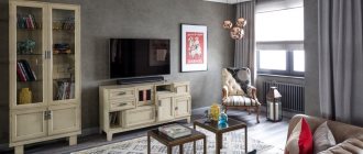
Living room
In a spacious hall, the decoration should be made of light green or purple and complemented by minor dark patterns (or inclusions) in the chosen range. Living room textiles can be brighter and stand out. So, in a light purple spacious room, the presence of bright green and lilac pillows, light green curtains and a light green rug will create an unusual combination. To organize a comfortable recreation area and spend leisure time, it is recommended to choose a set of a sofa and a pair of armchairs (or ottomans) in a light purple color. Near them you can place a coffee table with a glass top. Also, a fairly simple option for introducing the chosen color scheme into the hall would be to paint the walls in a monochromatic light green color and install furniture, choosing textiles in a dark purple color. Living dark green plants would also be appropriate in such a room.
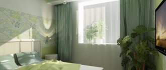
Bedroom
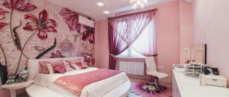
In the children's and adult bedrooms there are quite a few options for implementing the purple-green color scheme. The most interesting solutions are the following:
- glossy light purple ceiling + very light green wallpaper (almost white) + beige upholstered furniture and purple textiles;
- white ceiling and floor + dark purple curtains and sofa + swamp walls and textiles on the bed;
- light green wall decoration + beige furniture + purple inclusions (pillows, bedspreads, paintings and a rug on the floor);
- white trim on three walls (+ green wall behind the head of the bed) + green curtains + purple bed and rug on the floor;
- purple decoration of three walls (+ photo wallpaper with green patterns behind the head of the bed) + beige furniture + green curtains;
- dark purple wall decoration + glossy lime ceiling + yellow and green textiles and furniture.
Kitchen
The right solution for a bright and original kitchen decoration would be to choose lilac as the main finishing color. The set and furniture should be selected in a bright green design. For cabinets and cabinets, glossy facades will be preferable. Light color finishes will create a calm atmosphere, colorful furniture will add liveliness to the interior. It is recommended to pay special attention to the selection of textiles and design of the apron. If desired, the owners can lay out the kitchen apron from purple tiles with soft purple patterns. A plastic panel with images of purple flowers (violets or irises) with green leaves will also look good. As for the curtains, they can be slightly darker than the decoration itself (so as not to blend in with the walls) or be similar to the facade of the selected set.
Bathroom
In a small room, you need to select the color scheme of the design very carefully. We recommend choosing finishes in marsh and lilac colors. Warm colors will create a special coziness and ensure comfortable water procedures. At the same time, laying white flooring and choosing white sanitary ware will help prevent a small bathroom from becoming dark. Against the background of rich tones of wall decoration, they will look really advantageous. If desired, only one wall can be made lilac (or marsh). Vertically dividing lilac walls with swamp stripes is also allowed. Or you can make this division horizontal, thus dividing the wall into two equal parts or highlighting one of the colors at the bottom 1/3 of the wall. The presence of patterns on the selected finish is contraindicated: they will add confusion to the created design.
Study
To create a favorable working atmosphere in your own office, it is recommended to make the predominant color not purple, but green. So, the walls can be covered with marsh or dark grass wallpaper. Dark green curtains will help complement the design. The furniture you choose should be dark brown in color. But you should look for a sofa and armchair in purple or lilac colors. Another design option would be a combination of marsh and purple against the background of a predominant brown. In this format, the office may look like this: brown flooring (a leather sofa and chair, wardrobe and desk are purchased in the same color), marsh wallpaper with dark purple patterns. You can also choose brown wallpaper with light green patterns. But then leather furniture should be decorated in a lilac color.
Hallway
For the hallway, as well as for the plumbing room, you should choose soft colors. The right solution would be to decorate the walls in a grassy color scheme. Regular painting of surfaces or pasting of grassy wallpaper with dark green patterns is allowed. But the installed wardrobe, bench or chest of drawers should have a very dark purple color. Then the combination created will look original. True, for such a room it is better to create bright ceiling lighting (spotlights or flat ceiling chandeliers). Another option for decorating the front room is to paint or wallpaper the walls in a marsh color and install a banquette, chest of drawers and wardrobe in a lilac color scheme. Warm tones will complement each other, so when entering a house with such an entrance hall, both household members and guests will feel a favorable homely atmosphere.
Arrangement of the ceiling surface and walls of the hall
When arranging a lilac living room, you can hang wallpaper in this color scheme. In this case, the shade mainly depends on the expected result.
If you want to highlight a certain zone in the room, choose a rich tone of lilac, intended for wallpaper, which you will use to decorate one wall surface.
Decorate the remaining surfaces of the living room wall with soft lilac wallpaper. This color affects your mood, so you don’t need to use it alone. Combine with cream, snow-white, caramel.
Wallpaper in a shade of lilac combines perfectly with furnishings in a snow-white or milky shade, thereby creating a unique atmosphere of comfort. A living room like this in lilac always looks festive and solemn.
Lilac wall surfaces harmonize perfectly with the decor of blue, yellow, and pink.
The optimal material for such a room would be natural cotton and linen, since with the help of these natural and visually attractive fabrics you can successfully emphasize the purity, as well as the originality of the style.
The combination of lilac in a cool shade with a snow-white tone is used to decorate the hall in a minimalist style.
As for art deco, this style is characterized by catchy lilac wallpaper. At the same time, it is preferable to hang luxurious curtains on the windows that are a tone lighter than the main tone.
By arranging the ceiling surface in the living room in lilac tones, you can create it in a snow-white or lilac color scheme.
A shiny stretch ceiling looks irreplaceable, capable of highlighting the zest of any style, while at the same time it looks chic and fashionable. Also, the highlight of the hall can be a luminous ceiling surface or built-in light bulbs.
Furniture in purple color
When choosing furniture, you need to pay attention not only to the color palette, but also to the texture of the product. For example, soft materials create comfort and luxury. Coarser fabrics, on the contrary, will emphasize the natural coldness of purple shades. But they will also add sophistication.
The interior style also plays an important role. For example, Art Nouveau likes asymmetrical furniture and beautiful armrests. If we talk about minimalism, then the monotony of the upholstery is important. And for more youthful trends, bright and unusual options are suitable.