Gray color in interior design is always a good and practical choice. This color is neutral, calming and suitable for all rooms in your home. Plus, it goes well with almost all colors.
So, what curtains will go with gray wallpaper? The first step in choosing curtains for a room is to determine the overall tone of the interior. If you look closely at the color gray, you will notice that it can have a cold or warm tint.
A cool shade of gray has an undertone of blue or cyan. While warm - contains a red or yellow undertone.
Curtains in cool tones work well for cool-toned walls. If, on the contrary, your interior has a warm gray tone, then it is better to also use warm shades for window decoration.
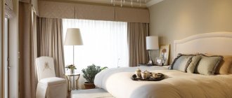
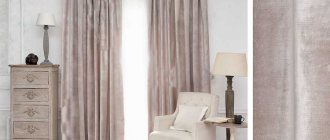
White and cream
Although white is a versatile color, it will look best against walls in a cool gray tone. If the room is dominated by warm shades, then it is better to opt for cream curtains.
White curtains for the hall are an excellent choice. They give the room a fresh and elegant look.
Sand and beige
Sand and beige shades can have either a cold or warm undertone. Curtains the color of wet sand go well with cool gray. The golden-sand shade will harmonize with the warm tones of the interior.
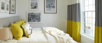
Yellow
Gray and yellow are a stunning combination of colors; together they create a very special atmosphere in the room. However, yellow is a very bright color and should only be used to create accents in the interior. This combination looks especially good in the living room and bedroom.
Recommendations from professionals: methods for combining shades
A stylish and cohesive kitchen interior requires the right combination of basic tone and colored elements. This is especially true for textiles. The kitchen can have a sofa or chair decorated with pillows. The window opening, and sometimes the door, is also decorated with fabric (tulle, curtains, blinds or textile drapery), and on the table or furniture - napkins, towels, potholders. All fabric elements must be combined and form a single composition.
To do this, you need to take into account the rules that have long been known to artists and designers.
One of the brightest and most energetic combinations is the use of two contrasting (complementary) shades. This interior looks especially vibrant with maximum color saturation.
Using a three-color combination of shades located at the same distance from each other will enliven the interior even when using desaturated, pale options.
The interior looks great if several shades are used (no more than 5, preferably 3). They should be similar and located next to each other. For example: pale shades of yellow-orange, yellow, yellow-green, green, blue-green.
Green
Green color can be suitable for both warm and cold toned walls. For cool shades, neutral green, pastel light green, emerald, and aquamarine are suitable. Mustard, olive, and pistachio go well with warm shades of walls.
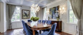
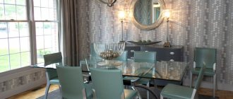
Blue and cyan
All shades of blue go well with cool gray: deep blue, sky blue, turquoise. Curtains with a pattern that combines several shades of blue at once look especially advantageous. This color combination is well suited for a living room, office or bedroom.
Violet
Purple looks harmonious in an interior with gray wallpaper. This color is suitable for many interior styles, the main thing is to choose the right shade: from pastel violet to intense dark lilac.
Briefly about the main thing
So, choosing curtains to match gray wallpaper is not so difficult if you arm yourself with the advice of professionals and recommendations from designers. The main thing is not to use monotonous textures, repeating shades of curtains and wall decorations, and also avoid bright pink tones.
We should not forget about the tone of the chosen color: neutral grays combine well with muted shades, but only warm shades are suitable for warm shades. It is also better to complement a cool palette with the same cool colors. Here, lovers of white and cream curtains will be able to unleash all their imagination!
But you shouldn’t limit yourself to this choice, because gray wallpaper goes perfectly with green and olive, yellow and orange-red tones. Even red and blue curtains can fit into the interior if you choose them in accordance with the tone of the wallpaper.
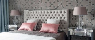
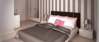
Red and pink
Despite the fact that red is considered a warm color, it can also be combined with the cool tone of gray walls. In this case, you need to choose curtains in shades such as carmine, bardot, raspberry, cherry. In the pink palette you can choose such cool shades as lavender pink, fuchsia, tea rose.
If the walls in the interior have a warm tone, then you should select textiles in scarlet, brick, carrot, terracotta, apricot, salmon, and coral shades.
Color Features
Gray is an intermediate tone between pure white and black. You can adjust the saturation and get different effects: the wallpaper will be just a background for a bright decor or it will become a stylish accent itself.
We also recommend: How to create a harmonious combination of curtains and interior
Saturation makes a hue dark or light, but gray can have a slight hint of red or blue. Then the wallpaper will look warm or cold.
Graphite, pearl, anthracite and wallpaper of any other shades of gray are rarely used to cover all the walls in a room. Wallpaper looks more advantageous when decorating one wall or visually highlighting an area in the room.
If you need to visually enlarge the space, you should use light shades. To make the room more intimate and cozy, you will have to choose dark, warm colors.
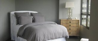
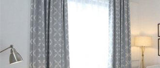
Grey
An interesting effect can be achieved by combining gray curtains with walls of the same color. To prevent the interior from becoming boring, you need to select textiles several tones lighter or darker than the main color of the walls. A good solution would also be to use textiles with contrasting prints, which will highlight the window and add coziness to the interior.
As you can see, there are a lot of options for window decoration. Choose your favorite palette and create your own unique interior.
How to hang curtains
Expert advice will help you hang curtains correctly:
- Asymmetrical curtains. Drapery, made in the form of a longer curtain on one side of the window, will add dynamism and originality to the interior. A long curtain can continue the lambrequin on one side. The room will seem unusual and spacious.
- Mirror symmetry. The curtains are positioned equally from the center center line of the window.
- Complex design. A complex configuration in window decoration is characterized by the presence of lambrequins, complex draperies, and unusual elements. It is possible to use fabrics of different textures and colors. Ribbons and edging can complement the composition.
To add comfort and individuality to the room, it is important to take care of maintaining the style and a unified concept.
Gray color in the interior of walls is a popular modern solution. There are many options for choosing curtains for it. A huge number of design examples in the photo can help when choosing curtains. When this is not enough, you can take the advice of a professional designer.