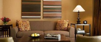
Do gray and brown go together? Absolutely yes. Firstly, they both belong to neutral colors (brown is “near-neutral”, along with beige). All neutral shades get along well with each other.
Secondly, the combination of brown and gray is natural. Their shades are intertwined, for example, in the color of stones, mountains, pebbles. No one will argue that the combinations created by Mother Nature are perfect.
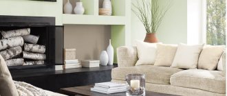
Thirdly, brown can serve as a good complement to gray. Gray is cold, stern and serious. Brown is softer, warmer, more comfortable. If, for example, you dilute the gray walls with a brown floor, this will make the room warmer and more comfortable.
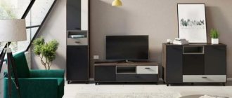
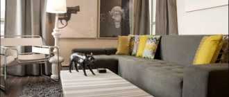
However, the gray-brown scheme still remains quite strict and gloomy. Therefore, it is a common choice for industrial-style interiors. The loft imitates the surroundings of industrial facilities, so severity is more than appropriate here. In a loft setting, the combination of gray and brown is usually dark and rough.
However, the interior with this combination can be quite bright and elegant. Taupe schemes are typical for simple Scandinavian interiors and for sophisticated modern classics.
This combination is often chosen for masculine interiors to add an element of brutality to the environment.
When combined with other neutral colors, gray and brown make up the typical palette of modern minimalism. Neutral and conventionally neutral shades are often perceived as absent, invisible, which is quite consistent with the minimalist concept.
How to choose colors for the interior using tables?
Colors in the interior have many abilities, the main of which is to create comfort and a favorable atmosphere for people. But the color scheme in the room can also expand or narrow the space. That is why you should be responsible in choosing colors for the interior and their combination. A table of color combinations in the interior, where perfectly combined colors are connected by lines, will be an excellent assistant in this regard.
How to correctly combine colors in the interior?
Many people wonder how to use the color combination table in the interior? Sometimes it is difficult and not entirely convenient. Below are tables of color combinations in an accessible and understandable form, where all popular shades are described. The trendy color is the main one, followed by colors that match it, which can be safely combined. An accent color will add brightness and creativity to the interior.
This table will tell you not only about the correct combination of colors in the interior, but also inform you about the meanings of some colors.
| Main color | Combines with flowers | Doesn't match with flowers | Psychology and influence of color |
| Grey | Blue, pink, brown, yellow, red, black, blue, lilac | Green, orange | Gives the room despondency and sadness |
| Lilac | Grey, chestnut, light purple | Red, orange, yellow, brown, black | Mystical, mysterious and mysterious interior |
| Violet | Light green, golden, orange, yellow | Dark green, brown, gray, red | Allows a person to calm down and find harmony of soul. Purple is the color of wisdom and inspiration |
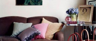
| Pink | Brown, gray, burgundy | Yellow, orange, black | Romantic interior |
| Brown | Golden, grey, beige, pink, yellow | Chestnut, burgundy, lilac | Causes depression when spending a long time in an interior with a predominance of brown color |
| Blue | Red, grey, burgundy, gold | Green, lilac, brown | Makes the room cool, sometimes uncomfortable |
| Blue | Red, orange, blue, light purple | Golden, yellow, burgundy | Makes the interior cold; if the color blue is too much, scandals occur more often in the room |
| Green | Red, black, burgundy, yellow, orange | Grey, purple, blue | Has a calming and relaxing effect |
| Yellow | Grey, purple, brown, green, black | Lilac, blue, burgundy, pink | The illusion of sunlight, yellow color gives good mood and cheerfulness |
| Red | Blue, green, grey, gold, yellow, black | Purple, chestnut, brown | Uplifts the mood, keeps you relaxed, suitable for passionate people |
| White | Combines with any colors and their shades, as it contains all color spectrums | There are none | Instills a feeling of superiority, makes the room cold |
| Black | Red, grey, white, yellow, green | Pink, lilac, beige | Narrows the space, instills fear in a person, makes the interior mysterious |
Ideal range of color combinations
Basically, practice has revealed several of the most successful combinations:
- With snow-white, which in its monochrome is ideal for gray. Modern, art, and a little less classically, offer the most interesting design concept. It can be completely replaced with shades of dark milky or creamy. In this case, it is better to choose different textures of finishing materials. The interior becomes not just cozy, but also as comfortable as possible;
- With brownish, associated with the peculiarities of the rustic style of the countries of Great Britain. It always brings an atmosphere in which a person calms down and relaxes. Elegance and softness are always present with this design. In addition, there is no distraction from the decorative elements. They are perceived in their true purpose;
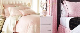
- With the pink palette comes tenderness and freshness. It does not cause any irritation, but it does help you relax. That is why the living room in this case becomes a favorite gathering place for all family members. The brightness of pink in a high-tech or loft style adds originality.
How do colors combine in the interior?
The general combination of colors is presented in the tables above; now it’s time to talk about the most popular colors and how to combine them correctly in the interior.
Important! White color goes perfectly with any color, so it can be safely woven into any interior color scheme.
What color goes with gray?
Gray color has a rich hue. Many people mistakenly consider it faded and boring, because in the photo below you can see how noble the interior looks in gray, especially in combination with splashes of bright colors.
So what color goes with gray in the interior? The answer is simple - any, but the most commonly used colors are:
- Blue
- Pink
- Brown and beige
- Yellow
- Red
- Black
- Blue
- Lilac
The versatility of gray and its many shades makes it possible to implement any bright and creative design idea. Moreover, gray color slightly mutes bright and acidic colors, so with the help of this color you can easily correct a room that is too colorful. More photos of gray in the interior.
What color goes with brown in the interior?
The brown color in the interior must be diluted with lighter shades so as not to create a feeling of gloom. Brown with its beautiful shades (cinnamon, chocolate, coffee, caramel, camel) looks very noble and adds warmth and comfort to the room, symbolizing reliability, devotion and stability.
The main colors that harmonize with brown are the following:
- Golden
- Grey
- Pink
- Yellow
- Beige
- Burgundy and red
- Mint and pastel blue
More photos of brown in the interior.
What color goes with beige in the interior?
Beige color is both a cold and warm shade, which is why it owes its versatility. This color acquired cold notes from white, and warm notes from golden brown. This light color makes the interior light and calm, adding home comfort due to the naturalness of the shade.
So what color goes with beige? Beige goes well with many shades, among which are the following:
- Brown with all its shades
- Gold and bronze
- Yellow
- Pastel and bright blue
- Green and olive
- Lilac
- Red
- Turquoise and mint
More photos of beige in the interior.
What color goes with peach in the interior?
Peach color is a soft and delicate combination of yellow and pink shades. This color gives the room coziness, warmth, peace and security. The rich color of peach brings a festive mood to the home, while muted and pastel peach is calming and peaceful.
You can make the interior colder by combining pale peach with light pink shades, and peach and orange will make the room warmer. The following colors can be called the most suitable for peach in the interior:
- Brown with all its warm and cool shades
- Beige and yellow
- Pink
- Orange
- Turquoise and mint
- Blue and cyan
- Purple and lilac
- Green
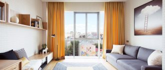
What color goes with orange in the interior?
Orange color is one of the brightest and warmest colors in the interior. Even when combining it with other colors, it will not lose its richness and warmth. Orange color energizes and invigorates perfectly, so the ideal option would be to design the kitchen in orange tones, because every cheerful morning begins with this room.
The most successful combination of orange is its combination with white. This combination will be the sunniest and most energetic; moreover, this color scheme will help expand the room, which is beneficial for the kitchen and bathroom.
Advice! Orange color can be used to highlight some small decorative items. For example, you can put an orange ottoman, which will make the room look brighter and more cheerful.
The following shades go well with the radiant orange color in the interior:
- Grey
- Brown with all its shades
- White
- Red and cherry
- Blue and pastel blue
- Delicate shades of green
- Yellow
- Mint and turquoise
More photos of orange in the interior.
Do not confuse orange with terracotta, which is a mixture of red and brown in different concentrations. Terra, which is a calmer and more comfortable color, is more difficult to combine. If you still decide to contact him, then forget about artificial chemical colors and pay attention to more natural ones, the same applies to the furnishing of the room; terracotta color goes well with folk styles. Colors that will suit you: calm green or light green, lilac, blue, blue, all shades of red and brown, coffee colors (coffee with milk, cappuccino).
What color goes with purple in the interior?
Violet is a cool color of wisdom and calmness, which has light mystical notes. Scientists have also proven that the color purple has the ability to calm and pacify.
The color purple has many shades, the most popular of which are mystical dark purple, natural lavender and delicate lilac.
Purple color gives the room a noble and luxurious look, combining well with the following colors:
- White
- Gold
- Black
- Red
- Turquoise and mint
- Crimson
- Blue and cyan
- Beige and orange
- Natural yellow (egg yolk color)
- Light green
Photo of purple in the interior:
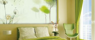
What color goes with green in the interior?
Green color suits absolutely any room and symbolizes peace. All warm and cold shades of green bring with them a good mood, a feeling of comfort and tranquility.
Green is a rich color and that is why it is considered the most difficult color to combine.
The best solution would be to combine the shades of cheerful green themselves. For example, pistachio and lime can be added to the main emerald color, which will dilute the cold color of the gemstone.
The following colors are considered the most suitable for green:
- White
- Black and brown
- Yellow
- Orange
- Gold and bronze
- Red and burgundy
- Blue and cyan
- Turquoise and mint
- Grey
Photo of green in the interior:
What color goes with lilac in the interior?
The lilac color is distinguished by its colossal tenderness and lightness and most often appeals to delicate and creative people. With the help of lilac, you can create a mysterious and mystical interior in cold colors. Such an environment is very relaxing and puts the mind into some kind of trance, which is why many avoid this color.
Most often, lilac is used in pastel colors, which look impressively delicate, as can be seen in the photo below. So the most suitable lilac colors include the following:
- Gray and silver
- White
- Black and brown
- Beige and yellow
- Golden and carrot
- Blue and sky blue
- Turquoise and mint
- Dark purple
- Fuchsia
- Delicate shades of green
What color goes with blue in the interior?
Blue color is used to create a delicate, light and airy interior in cool colors. Even in combination with warm colors, a room in blue will not lose its cool note and freshness.
The combination of blue and white is very popular. This combination perfectly expands the space and makes the room unusually light and delicate. Most often this color is used in bathrooms.
Advice! In order not to lose the lightness and airiness of the blue and white combination, you should not add accenting bright colors, especially warm ones.
The following colors can be called harmonious with blue:
- White
- Yellow brown and beige
- green and turquoise
- Blue and mint
- Orange
- Raspberry and lilac
- Pink
Watch the video
This video lesson will show you how to correctly combine colors in the interior.
From monochrome to avant-garde
If you look at the photo of a living room in a classic style, you will notice that not only the walls, ceilings and floors are made in beige tones, but also the furniture
However, if you pay attention, all items are presented in different colors. Furniture is slightly darker than walls and ceilings
And paintings and other tabletop items have dark brown and yellow frames. This style is called monochrome and involves a combination of smooth glossy and matte surfaces with convex or rough materials. This can be wallpaper with fragments of silk-screen printing on a relief background, or patterned convex furniture upholstery. The wood pattern of the flooring, the roughness of the plastered ceilings, the smoothness of the marble surfaces of the fireplace - all of this serves as a decoration for the room. Even a non-professional can complete such a simple design.
The sandy ceiling and wallpaper on the walls will come to life with floor vases and sofa cushions in bright oranges and bold yellows. With them, any room will seem warmer and more comfortable. And if you are a lover of coolness and seascapes, then the interior of the living room in beige tones can be enlivened by blue and blue additions in the form of accessories, glassware or paintings. The greenery of indoor plants will enliven a seasoned style and add a little freshness. Don’t be afraid to add other colors because of the uniqueness and conservatism of the beige tone.
All shades of red, lilac and purple can give the room a festive look. For example: lilac armchairs and a purple sofa will add a bright note to the monotonous and calm look of your room in a classic style. To visualize such a bold idea, we have placed below a photo with colorful furniture. Anyone who loves avant-garde style and originality can enjoy the designers’ ideas and turn them into reality on their own territory. It cannot be said that light furniture is suitable for a married couple with children. It is bright and dark furniture that will hide small stains that are inevitable in the presence of children and pets. The main thing is not to overdo it with colors so that the main beige background prevails. And the bright additions were not numerous.
How to choose the color of curtains to match the interior?
The choice of curtain color is of great importance for the interior. Using this attribute, you can expand or narrow the space, you can get rid of excess sunlight or add radiance to the room.
Important! Bright and warm colors help add light, while cool tones in curtains will make the room feel calmer and darker.
What to combine curtains with in the interior?
There are no strict rules or restrictions regarding the choice of curtains. They may not be combined with anything at all, or, on the contrary, they may completely merge with the interior. The tips presented below will help you decide on the choice of curtain color for your interior.
- Economical selection promises to choose the color of curtains to match the color of the furniture. After all, you can change the interior of your apartment without resorting to wall decoration. You can simply change the furniture and curtains and voila - a new interior solution is ready.
- Curtains that match the color of the walls can sometimes blend into the background. Here, for monotonous walls, it is better to choose curtains with an ornament, and for patterned walls, it is better to choose curtains without a pattern, although this rule does not always work.
- The current version of the selection of curtain colors states that you can match the color of the curtains to the color of the largest item in the interior of the room . For example, you can combine the color of the curtains in the bedroom with the color of the bedspread.
- A neutral selection of curtain colors (sand, beige, cream) will always be relevant, especially if the interior is designed independently.
- Color combination is a technique where the pattern on monotonous curtains echoes other decorative elements.
- Window in the foreground . This option for decorating a room involves focusing attention on the window and curtains; here you should choose bright and non-plain curtains.
- Monochrome design. Here the curtains should be as close in tone to the color of the room as possible. It is not necessary to choose a color that completely blends with the walls; you can take a different shade of the same color or add a little ornament.
Tips and tricks
- The minimalist style in a room can always be diluted with floral curtains, but the main thing is not to overdo it.
- Small rooms should be equipped with small curtains with a minimum amount of ornament and pattern.
- Complex textured curtains are only relevant for large rooms.
- The brighter the color of the walls, the calmer the curtains should be.
- Playing with contrast will make the room interesting. For example, beige curtains will suit brown walls.
- The simpler and smaller the curtain, the more expensive the fabric from which it is made should look.
Watch the video
In this video you can see many interesting ideas and combinations of curtains with the interior.
Types of structures
When choosing a design, it is important to take into account many nuances: find out the dimensions of the room, determine for what purpose you need a sofa. Depending on the purpose, there are two main types of structures:
- Modular. This type is good because you can choose the elements that will make up the sofa, its size and the number of seats. During use, you can change the shape of the structure as you wish, moving and combining individual elements with each other.
- Folding. This type is more compact, but no less practical. There are several types of folding structures, they are transformed in different ways. If necessary, the folding design will easily provide you with an additional sleeping place.
Both designs can be either straight or angular.
How to choose the color of the floor in the apartment?
A lot depends on the choice of floor color, because the play of colors and light can distort different shades and make the room visually larger or smaller, darker or lighter.
Below are several floor color options with a detailed description of all the effects each shade has.
- A white floor will add brightness to the room and symbolize conciseness and purity. Most often, floor coverings of this color are used in small and dark rooms in a minimalist style.
- A gray floor makes a room calm and noble, but it must be very carefully combined with other colors in the interior. It is important to remember that a gray floor goes best with black and white interiors, as well as yellow.
- Yellow and beige flooring in the interior will add warmth and comfort to the room. This is the most versatile floor color that matches any type of interior.
- Orange and red floors make a room feel bright and warm, but it's important to remember that these colors are highly reflective and transfer to other surfaces in the room. Therefore, it is worth maintaining a warm tone in the interior of the entire room.
- Brown flooring represents confidence, stability and security. The only disadvantage of a floor covering of this color is the absorption of a large amount of color. But in general, this floor is universal for any interior, especially in country style.
- Black floor in the interior it creates an aura of wealth and mysticism. It must be used very carefully, especially in combination with bright colors. Black flooring is most often used in modern interiors and very rarely in classic ones.
How to choose the color of the laminate to match the interior?
Laminate has a wide range of colors and different patterns. You can choose a board that looks like wood, or you can make a stone floor using boards with this pattern.
Laminate flooring can look very strict and noble, or it can give the room a playful country style. Below are several laminate options with a description of all the effects they have on your dream apartment.
- White and gray laminate flooring is most often used in apartments where minimalist or Provence style predominates. Rustic simplicity prevails here, which is perfectly complemented by laminate flooring.
- Light wood laminate is perfect for rooms with windows facing north. This floor finish will add warmth and tranquility to the room, suitable for any type of interior.
- Brown and red laminate adds warmth to the room and is perfect for interiors in autumn colors. But it is important that the room is abundantly illuminated, because dark floors take away light. These floor colors are very relevant in Gothic and Baroque styles.
- Black laminate gives the room a magical mystique. To prevent such a coating from absorbing too much color, it is most often combined with white walls. The styles of minimalism, high-tech and modern are simply unthinkable without such luxurious and elegant contrasts. Glossy black laminate will prevent strong light absorption, but will add charm and luxury to the room.
Watch the video
This video shows several beautiful options and examples of floor and door color combinations.
Materials and design
The living room in the spirit of classicism categorically gravitates towards natural and expensive materials: marble and granite, other rocks, valuable types of wood, bronze, copper, gilding, velvet and silk, inlays and precious metals.
Floor finishing
For a classic living room, there is no better choice than graceful and elegant artistic parquet flooring. A touch of antiquity, abrasions, and small defects will give it a special sophistication. Moreover, the living room is one of the few rooms in the house where it is really advisable to use natural parquet.
If you prefer more modern interpretations of style or don't want to sacrifice practicality, choose laminate. Nowadays there are a lot of collections that imitate any other materials, textures and patterns. An even more radical alternative is stone slabs or porcelain stoneware.
Wall decoration
In the living room, feel free to take all those wall coverings that are not suitable in the kitchen or hallway. For example, these are paper or textile wallpapers - a combination of natural textures with ornate patterns
Pay attention to wood paneling, tiled mosaics, or combinations of several different materials at once.
Ceiling design
Popular stretch ceilings are not very appropriate in classic interiors, but complex plasterboard structures are easy to use in different ways. If you still choose PVC film, take a satin or matte fabric. And if the even base of the ceiling allows, it is enough to simply whitewash or paint it.
How to choose the color of doors in an apartment?
Interior doors should delimit the interior space, and they should do this harmoniously. It is a very difficult question about choosing the color of doors if all the rooms are made in different colors, but for all problems you can find solutions that are listed below.
- A neutral door in a natural wood color will suit any interior and will not disrupt the integrity of either the corridor or individual rooms.
- White door Perfect for a modern interior, because white color goes well with any color combination. This door is also universal for any repair.
- Dark or light doors in cool shades will perfectly complement the minimalist style in modern interiors.
- Doors in dark wood color look great in modern interiors and bring fashionable contrast and richness to the apartment.
- Artificially aged white doors are perfect for apartments decorated in country and Provence style.
- Choosing doors to match the color of the floor is a controversial issue. It’s good if the floors are the same throughout the apartment, but what if not? You can always find a general optimal solution, for example, doors that are several shades lighter. You can also decorate the doorway in the same color as the baseboards, which will give the effect of integrity.
- Choosing a door color to match the color of the furniture . You can easily make the doors resonate not with the floor and walls, but with the furniture. for example, if the room has dark furniture, then you can safely install dark doors against the background of light walls.
- Doors to match the color of the walls . This solution can be used if the furniture and floors in the house are all different colors, but the walls are made in the same tone.
Tips and tricks
- Doors do not have to match the color of the floor and walls.
- You can choose a door of any color, but support it with platbands and baseboards.
- You can install doors and windows of the same color in any interior and not try to tie together the completely different colors of each room.
- The door can be of any texture and color; it does not have to fit the interior perfectly. There is nothing wrong with the door standing out slightly.
Watch the video
This video material will tell you how to choose the right door color to match your interior.
Finishing ceilings, walls and floors
The decoration of walls, floors and ceilings does not depend much on the main palette, but here some nuances must be observed, especially if the design includes a gradient or another transition of shades.
For the floor, it is best to choose linoleum, ceramic tiles, or make it self-leveling. These materials are easy to clean, resistant to wear and tear, and retain their decorative appearance for a long time. Laminate is susceptible to water damage, although its surface is less contaminated than traditional wood planks or parquet. Traditional materials have a limited selection of shades, unlike modern ones, where the choice is very extensive.
The first place among finishing materials for walls is traditionally occupied by wallpaper, despite its short service life and the fact that it is easy to get dirty. Painting is considered the most practical, since painted walls can be easily washed when the need arises, and a modern living room made in white or any light colors will often require cleaning.
Stretch ceilings designed in light colors are an excellent solution for modern decoration of a living room in a modern style. They are very functional and are successfully used on uneven surfaces. Ceiling coverings of this type stretch very quickly, and the stretch ceilings themselves can have a glossy or matte surface, with or without a pattern.
How to choose the color of a sofa to match the interior?
The sofa is the king of the living room, because it is on it that the most attention falls and it is the largest item in this room.
Choosing the color of a sofa is a responsible process, the tips listed below will help you figure it out.
- Monochrome option. This plan of action involves placing in a monotonous living room the same monotonous sofa, which matches the color of the walls and furniture, but is a slightly different shade.
- Neutral sofa . If the walls are painted in calm shades such as beige, gray or cream, then an excellent option would be to place a sofa in the same calm shade, only in a different one. For example, beige walls with a gray sofa.
- Neutral sofa in a colored interior . Surrounded by fairly bright walls, you can place a sofa in a very calm color, such as beige or gray. This way you can maintain balance and not oversaturate the room with flowers.
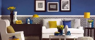
- Colored sofa in a neutral interior will create the only bright spot in the room, which is very popular in the Art Nouveau style. For example, a red, pink or green sofa will look great in a beige room.
- Bright sofa in a bright interior . This solution looks very juicy and unexpected. For example, a yellow or red sofa can stand against the background of blue walls, which will make the room incredibly colorful and positive.
Advice! The color of the sofa can be supported by other interior items: lamps, poufs, flower pots or vases.
Advantages
Decorating a living room in light shades has a lot of advantages:
this technique allows you to visually beat the lack of space, which is especially important in small-sized rooms;
Light colors used to create the interior allow you to create different mixes of the texture of finishing materials. They are not limited in the choice of bright contrasts, they provide a wide range of shades, emphasizing strokes, each time changing the visual perception along with replacing the shade of small furnishing elements, for example, furniture covers, capes, sofa pillows, carpeting, wall lamp decor, painting designs.
Color in the interior according to Feng Shui
There is no specific canon of what the color of a huni or bedroom should be according to Feng Shui, since each color has its own energy and impact, therefore the choice of color depends on what you want to achieve. For example, the color for the bedroom can be chosen according to the criterion of insomnia; if you have such a problem, then dark red, burgundy, brown, and dark green are best suited. If everything is fine with your sleep, then choose lighter colors, beige, cream, peach.
It is better to avoid white color in large quantities, since among eastern peoples it symbolizes death.
Bright red or orange colors in the kitchen will encourage appetite, but if too much of these colors can cause aggression. It's better to use them as accents. It is also better to avoid dark, depressing colors. According to Feng Shui, kitchens should be light and spacious, build on this and make interesting accents.
It is better to balance the hallway, it should be neutral, so if your entrance is too light, feel free to use muted, dark shades, but you should not completely darken the room, it is better to choose a standard cream or beige as the main color. If the hallway is dark, on the contrary, try to use light colors, and just add light sources.
There are many feng shui tips for home improvement, you can divide the entire space into zones, career, family and fame zone, each zone should have certain color accents, career-blue, fame-red, family-green.
Correctly decorating a room according to Feng Shui is not difficult, but sometimes following all the rules leads to absurd decisions, so do not forget about common sense.
Bedroom
As a rule, for many people, the bedroom is a place where you can hide from worries and hustle and bustle.
And the gray color has magical calming properties, which is very important
There is no need to adhere to monotony in everything. This amazing bed is proof of that.
Wonderful dark gray flooring color.
It will be very cozy to sleep on such a bed, right?
Gorgeous print.
In the industrial space, steel color is indispensable!
A nice combination of completely different colors.
Luxurious men's apartments.
Don't want boring monotony? Gray has many shades (from pale to almost black).